Teabox by Pentagram
Opinion by Richard Baird Posted 8 December 2015
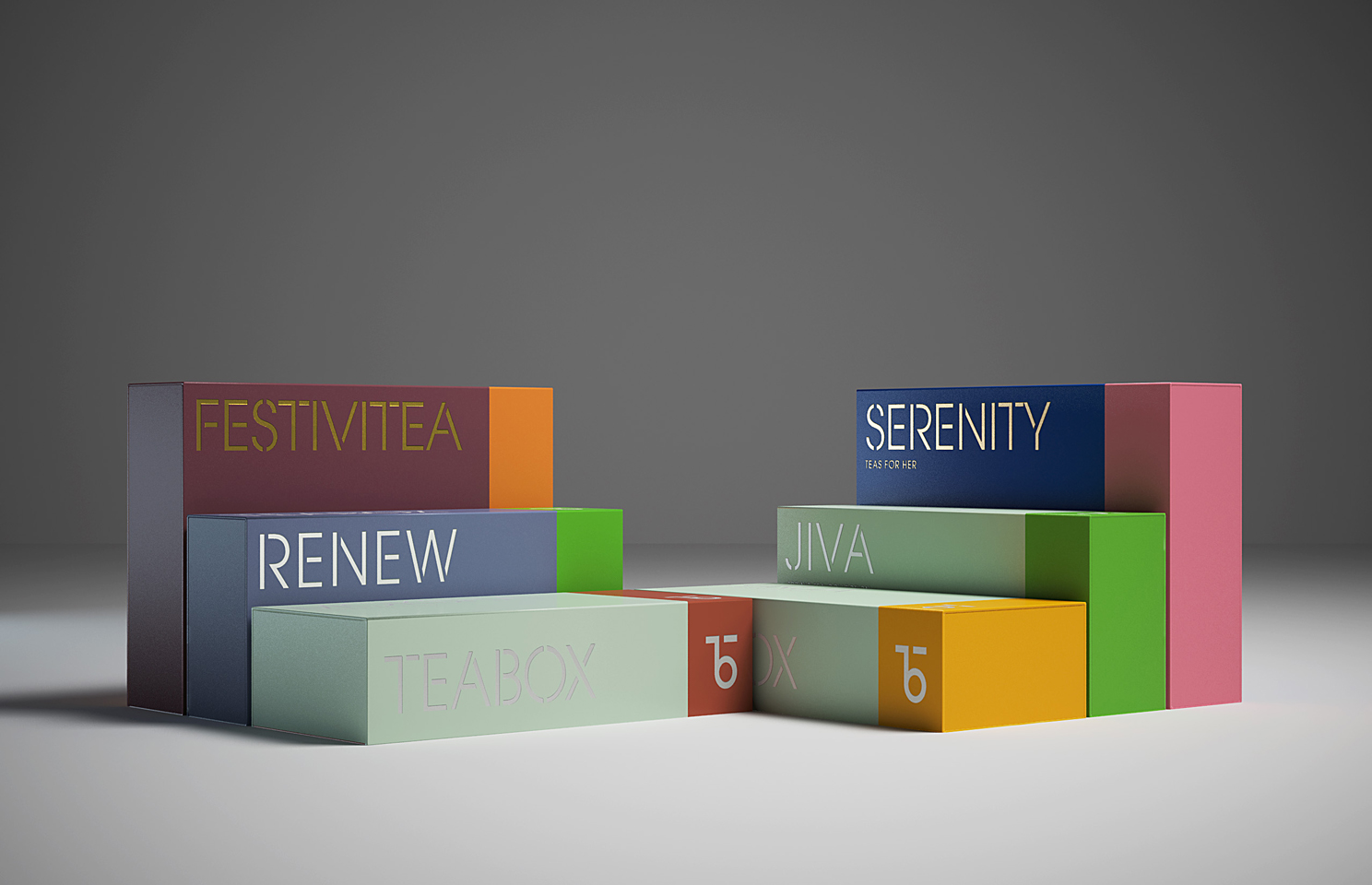
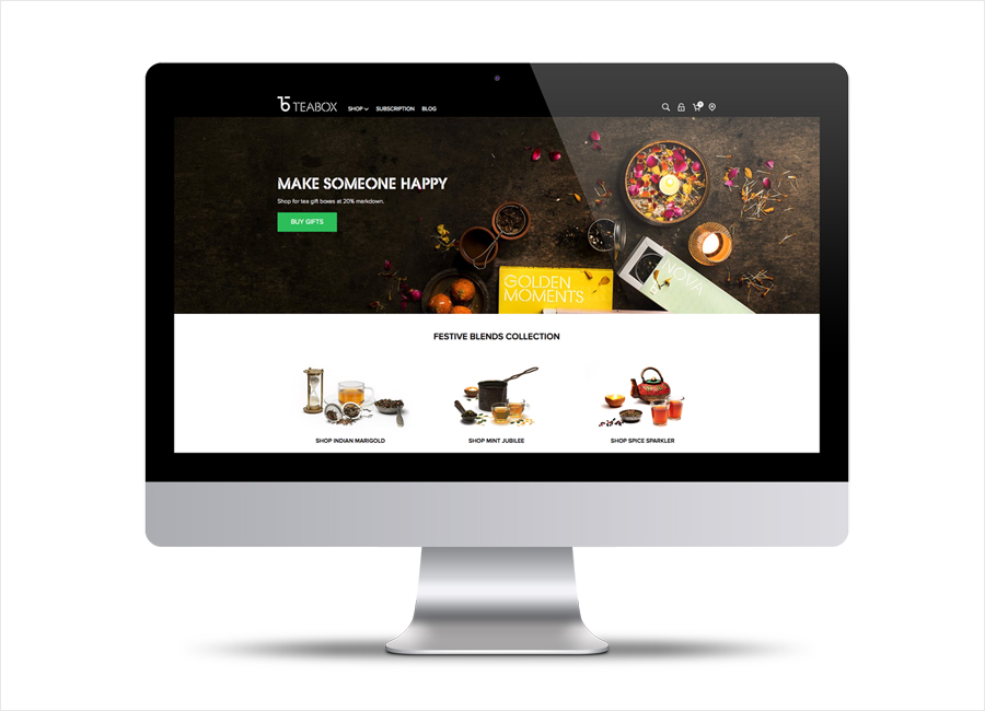
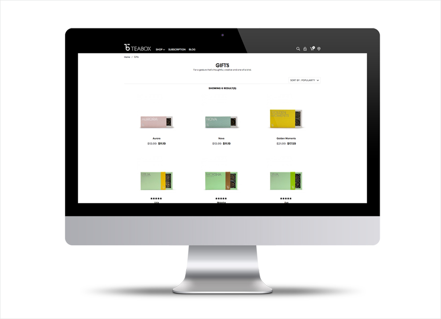
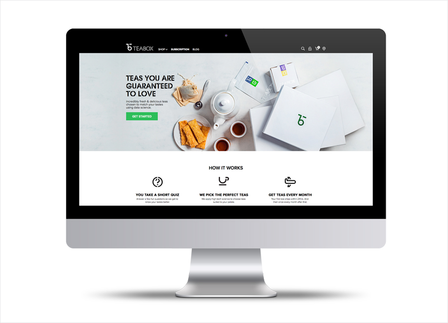
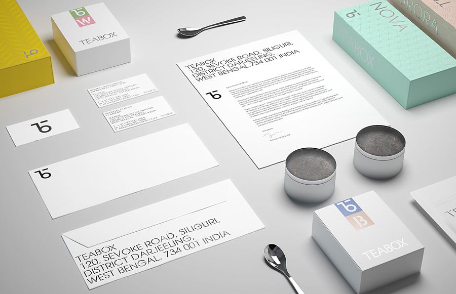
Teabox is an e-commerce tea business, established in 2012 and located at the heart of India’s tea-growing regions, that looks to revolutionise the experience of buying and enjoying one of the oldest drinks in history by bringing it directly to consumers. It is based on the popular monthly subscription model, and uses data science to match teas to subscriber’s personal tastes. Teabox worked with Pentagram partner Natasha Jen to develop a new brand identity, packaging system and website that would help establish it as a global brand.
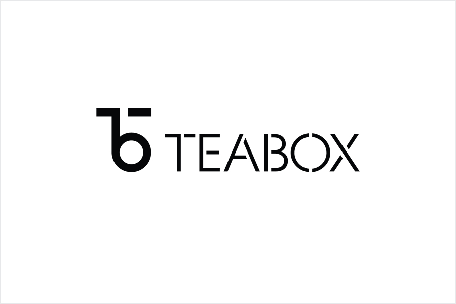
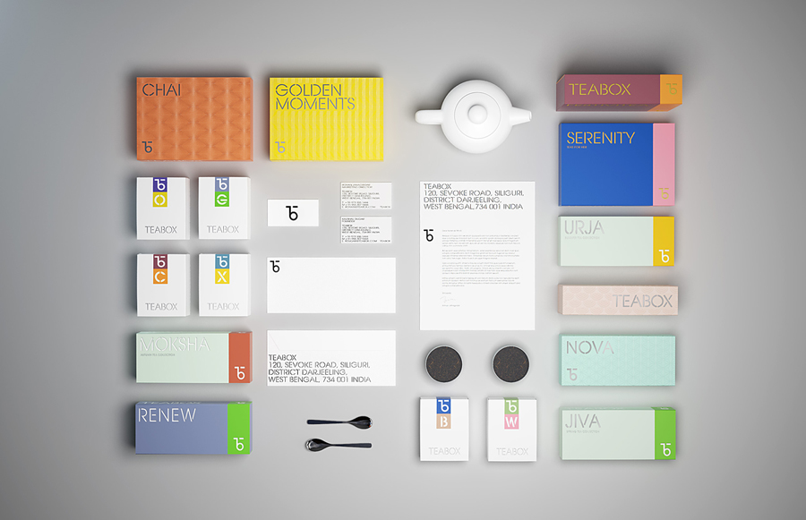
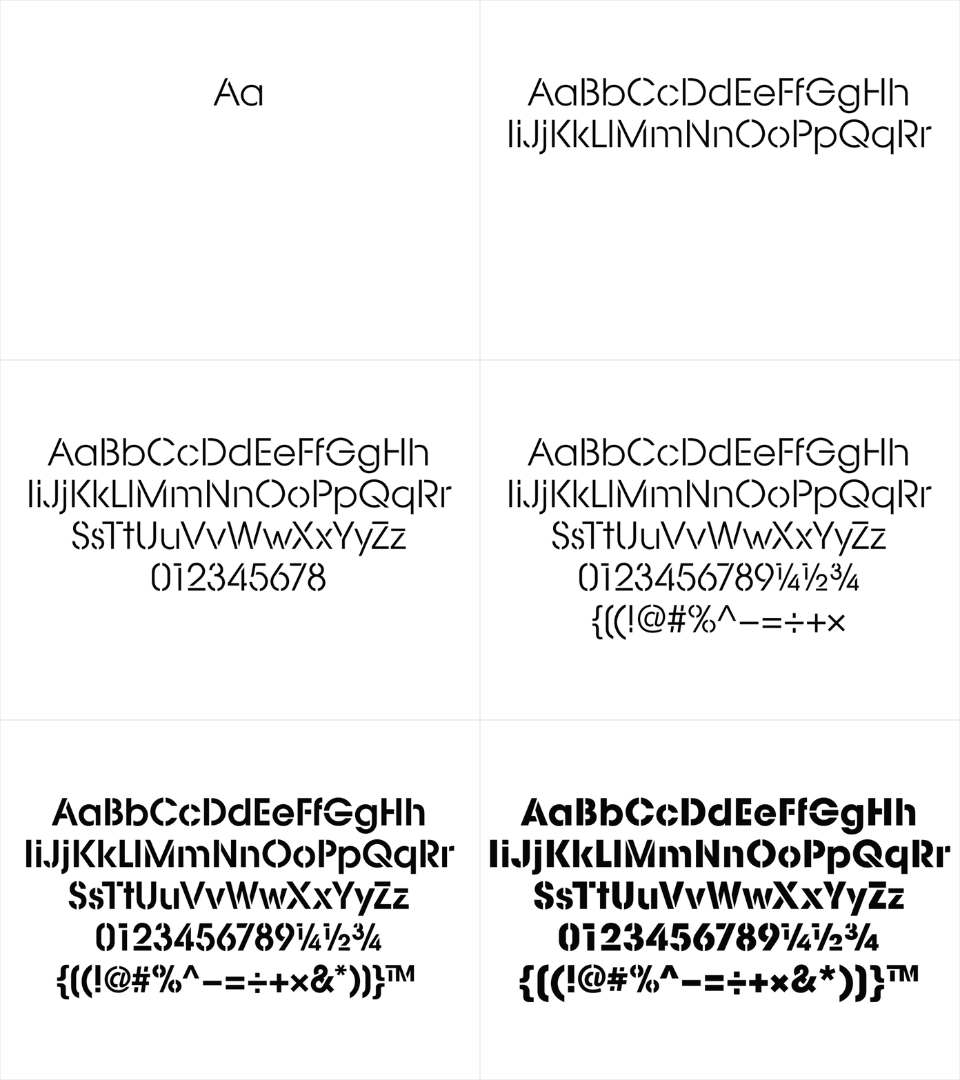
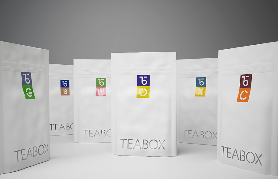
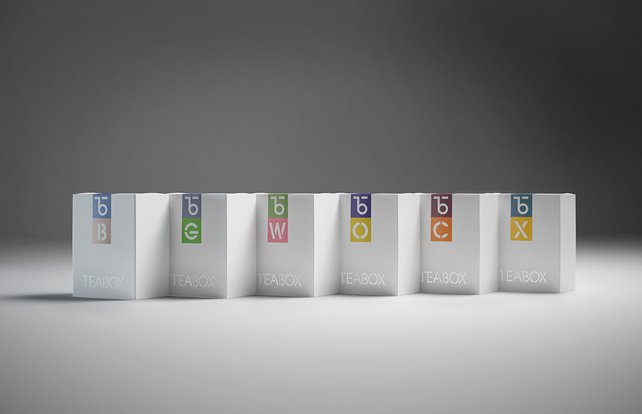
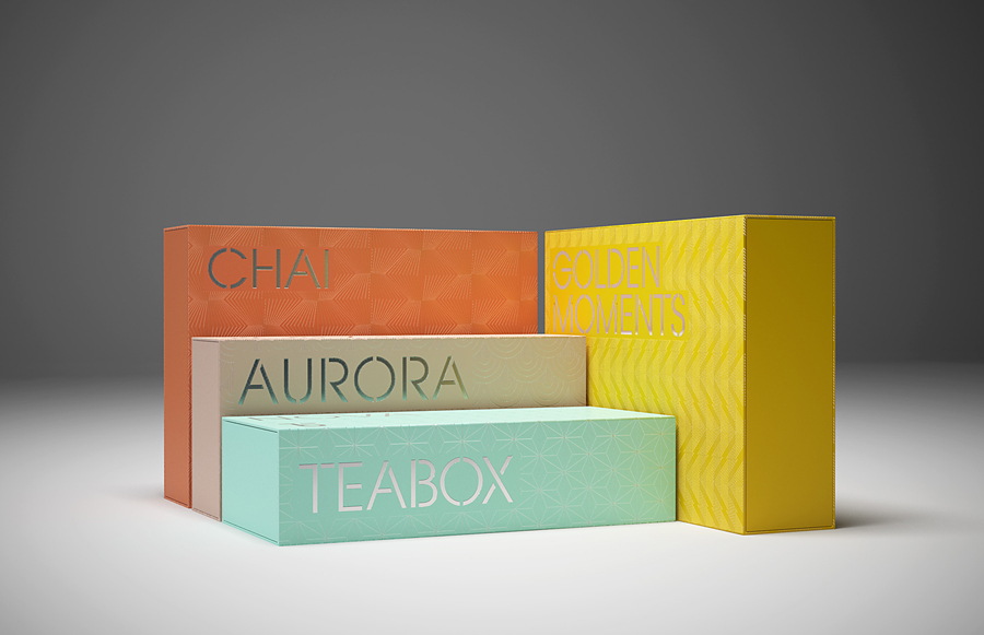
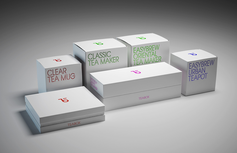
As a subscription business, delivering directly to subscribers and absent the communicative pressures of high street retailing, the simplicity of Teabox’s visual language is immediate. The continuity of custom typography and iconography is effectively used to create an overarching, identifiable and understandable system, while a contrast of contemporary colour and finish functions to sub-divide.
These choices are grounded in some clearly defined and understandable communicative intentions. Utility, as seen in the monolinear and stencil cut qualities of type and similarly styled iconography, and drawing its inspirations from tea production and export, is juxtaposed alongside the luxury associated with die cut detail, foil, UV and surface finishes. It acknowledges the long history of tea and its global export, but also its continued popularity and premiumisation today.
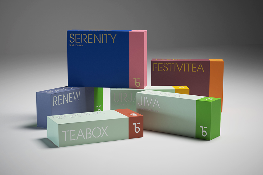
The mix of utility and luxury is not unfamiliar but largely well-handled and covers both visual and tactile detailing. It is succeeds in its desire to establish an accessible connoisseurship through simplicity and high quality cues, and secures visual impact, although there is a tension between the layers of detail you expect from high street packaging and the necessary functionality and practicality of a subscription business.
Space is effectively dealt with through the proportion of type and monogram in relation to structure, the intersection of colour and a contrast of matt and glossy surfaces, as well as the use of patterns.
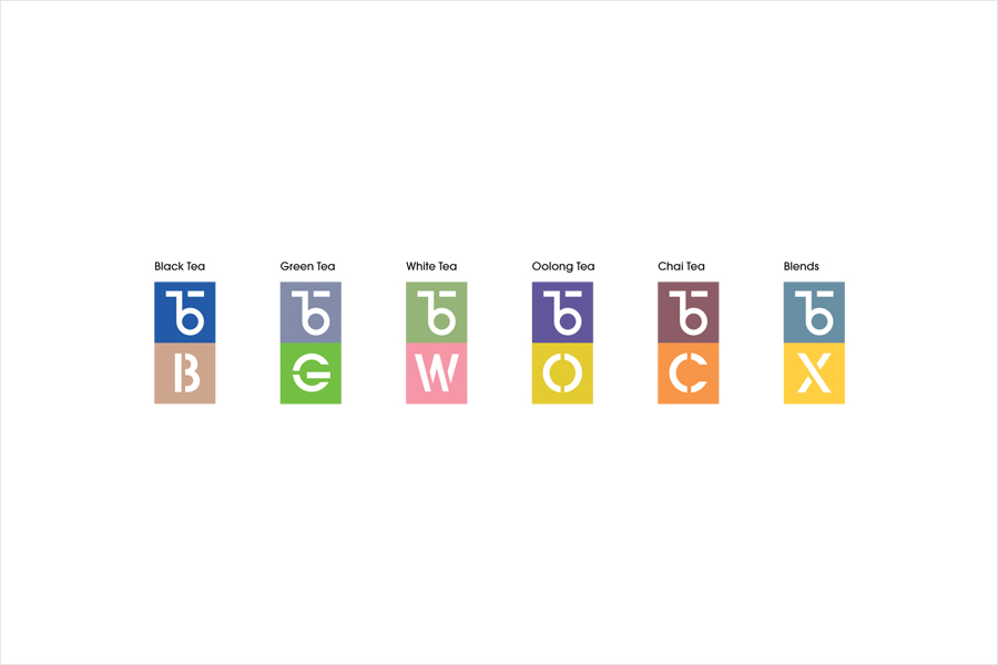
Simplicity runs throughout, from the build of the custom typeface, iconography and monogram, to the panels of uninterrupted colour and the choice of structure. The complexity and nuance of flavour and the extent of tea available—a comparison to wine is made—is acknowledged through diversity of colour combination and pattern. So while visually simple and accessible, there remains a level of variety, potential and nuance to the work.
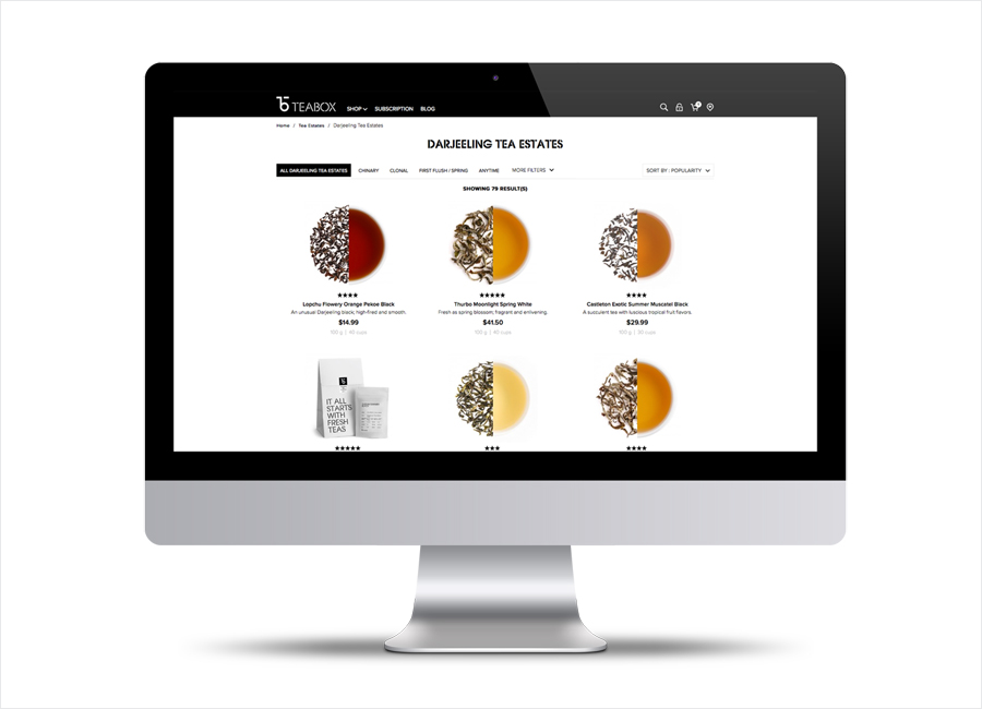
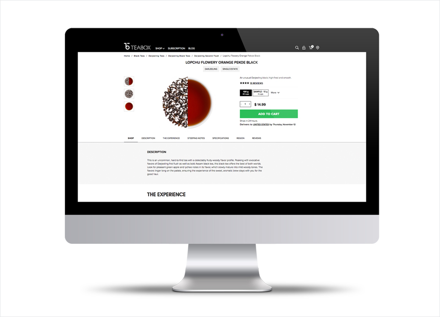
Accessible connoisseurship is further explored through thorough description of the tea, including the packaging date, brewing instructions, and notes on the flavor profile in pack, and a website built around a streamlined, easy-to-use structure that quickly surfaces information in a style that takes its cues from the in-depth notes that often accompany wine. More from Pentagram on BP&O.
Design: Pentagram. Partner In Charge: Natasha Jen. Opinion: Richard Baird.
