The Collection of A Alfred Taubman by Franklyn
Opinion by Richard Baird Posted 9 December 2015

The late A. Alfred Taubman was an American real estate billionaire, philanthropist and former owner and chairman of Sotheby’s, who had built a significant art collection, valued at around $500 million, that included works by Raphael, Kandinsky and Picasso, amongst many others.
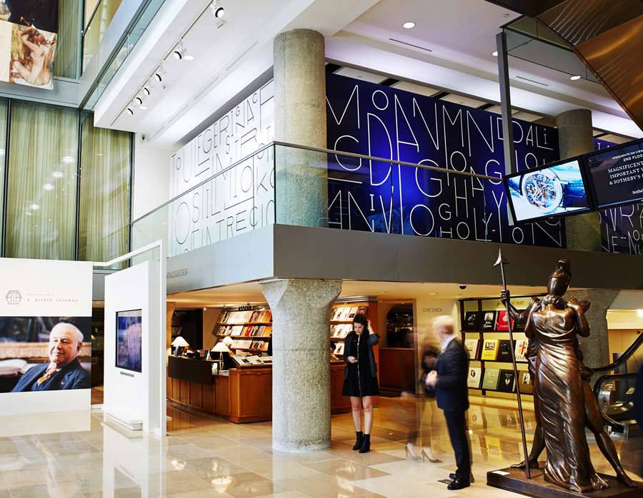
Following Taubman’s death this year, and with the hope of restoring his image after a price-fixing conviction in 2002, Sotheby’s held a private auction of his collection. To mark this event New York based graphic design studio Franklyn created a visual identity system that draws attention to the high-profile nature of the artists and the artwork for sale, and would share some of the personal aesthetic sensitivities of their former owner. The project went on to include monogram, signage and brochure design.
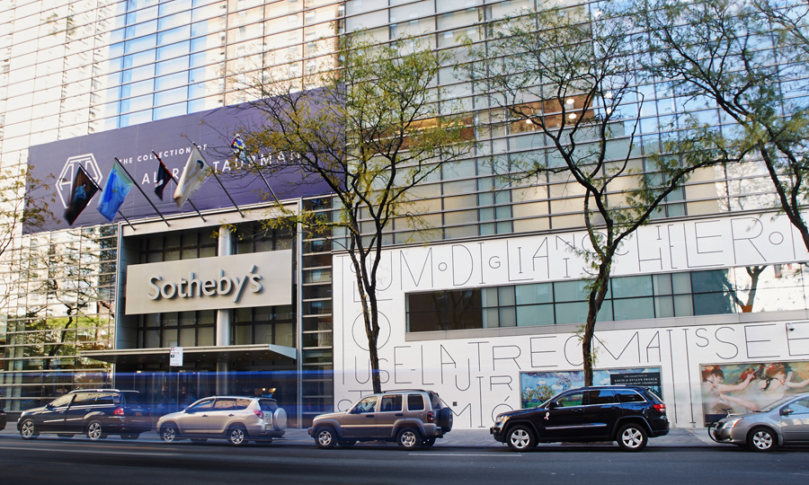
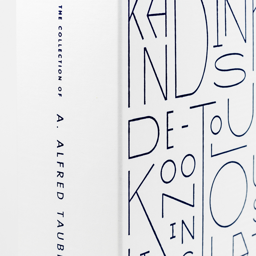
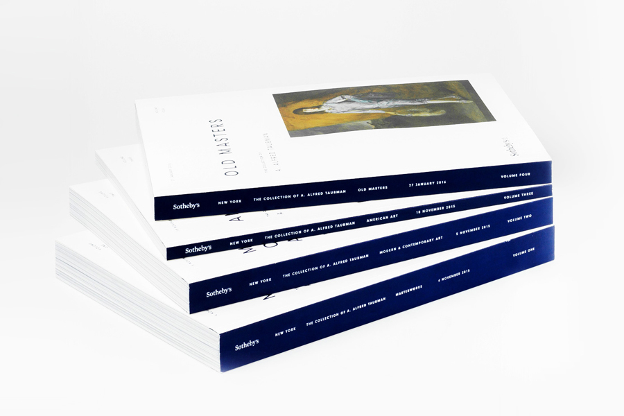
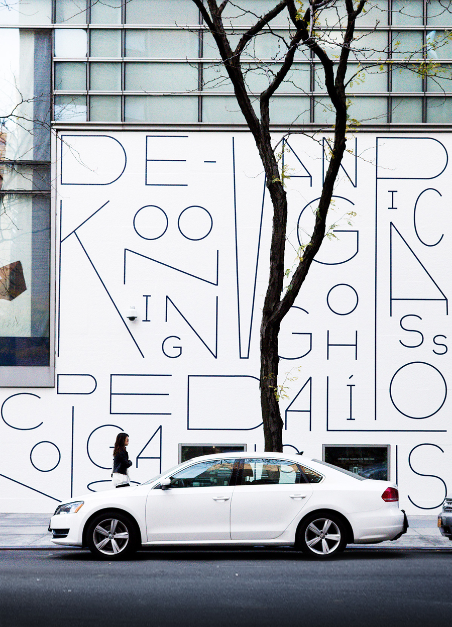
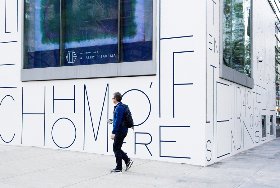
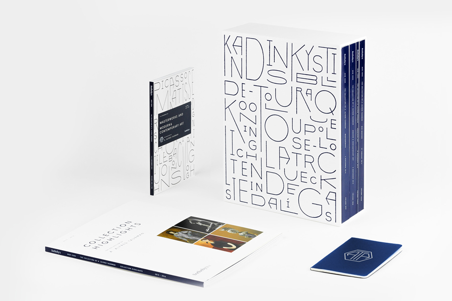
Franklyn’s approach is based around custom typography inspired by the mid-century modern aesthetic loved by Taubman, and is in line with Sotheby’s redesign of its Manhattan exhibition space, created to evoke what the New York Times described as Taubman’s Bauhaus aesthetic. It comfortably extends across a variety of collateral, from the comparatively small four-volume 400 page auction brochure, to the large two-story vinyl banner that wrapped the exterior of Sotheby’s New York headquarters.
The project really benefits from an unusual and contrasting set of extended and condensed characters, moments of irregularity and geometry but the continuity you get from a shared monolinear line weight, limited colour palette and a concept rooted in Taubman’s love for mid-century modernism.

Both as static panels and in motion, the typographic mosaics are well-composed and animated, have an individual, distinctive and expressive quality with a good use of space in and around characters, and a clear period influence that unites a collection of quite disparate artists and artistic styles. Although challenging to pick out each artist, Franklyn finds a balance between communication and a compelling and well-founded aesthetic.
These fit well within the context of window decals, Sotheby’s linear facade, and across the catalogue, and, as you might expect from a contemporary gallery, frames the rich detail and colour of artwork. Other highlights include a block foil print finish across the texture of the brochure, and areas of white space alongside panels of blue. More from Franklyn on BP&O.
Design: Franklyn. Lead Designer: Kenneth Lian. Opinion: Richard Baird.
