Hernesaaren Ranta by Werklig, Finland
| Author: Richard Baird | Filed under: Leisure and Tourism, Logo Reviews | Tags: Brand Identity, Brand Identity Reviews, Branding, Branding Agency, Branding Blog, Branding News, Branding Reviews, Brochure Design, Business Card Design, Custom Typefaces & Logotypes, Custom Typography, Design For Print, Design News, Design Opinion, Design Reviews, Designed by Werklig, Designed in Helsinki, Finnish Design, From Scandinavia, Graphic Design, Graphic Design Blog, Graphic Design Trends: Monolinear Illustration, Icon Design, Illustration, Line Craft, Logo Design & Branding Blog, Logo Design Inspiration, Logo Design Resource, Logo Designs, Minimal Logos, Monolinear Typography, New Logo, Resort Logos, Sans-serif Logotypes, Sign Design, Still Life in Brand Identity Design, The Best Brand Identities of 2016, The Best Custom Logotypes, The Best Graphic Design Work of 2016, The Best Logo Designs of 2016, Typography, Visual Identity Design Blog |Comments Off on Hernesaaren Ranta by Werklig, FinlandOpinion by Richard Baird.
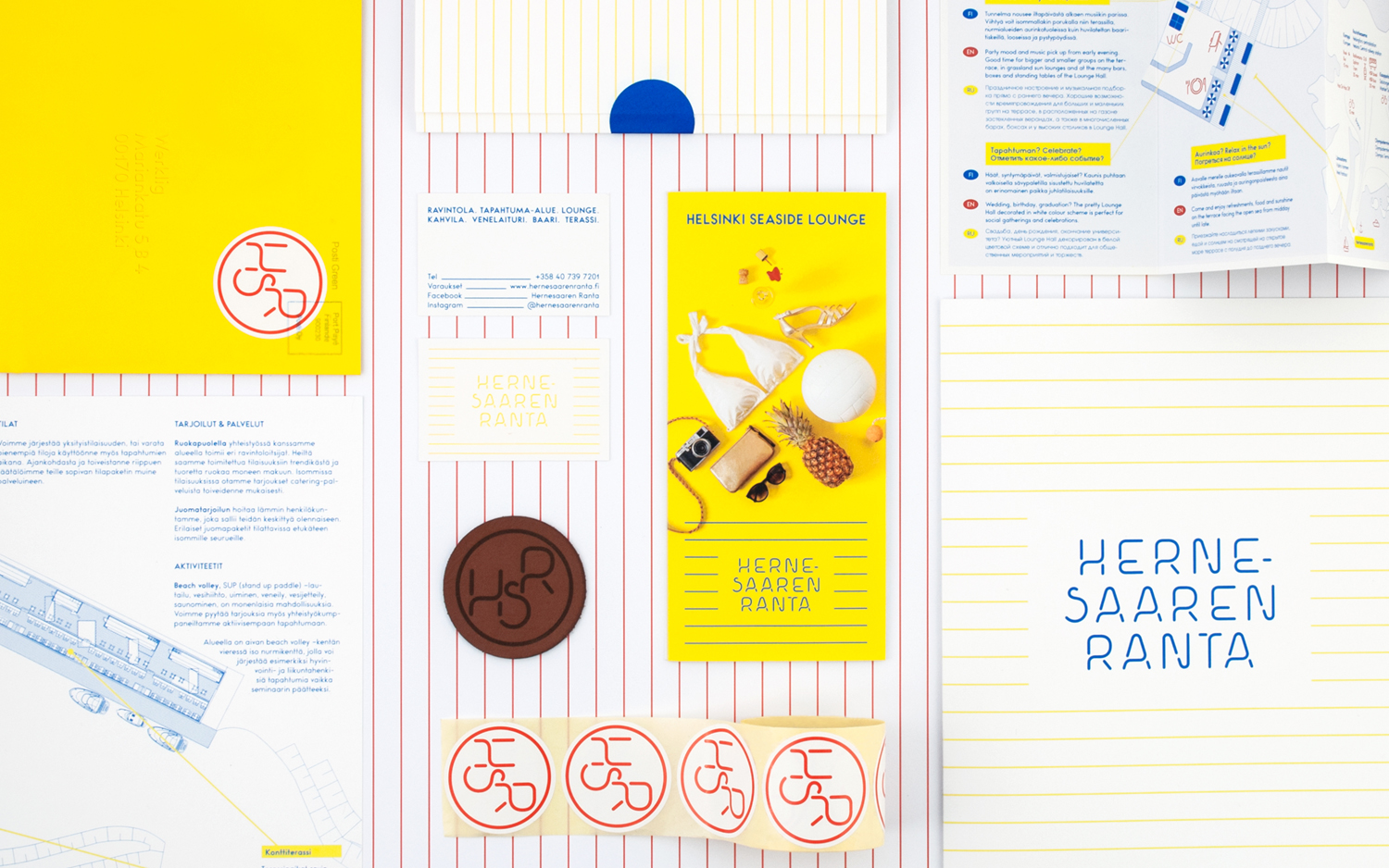
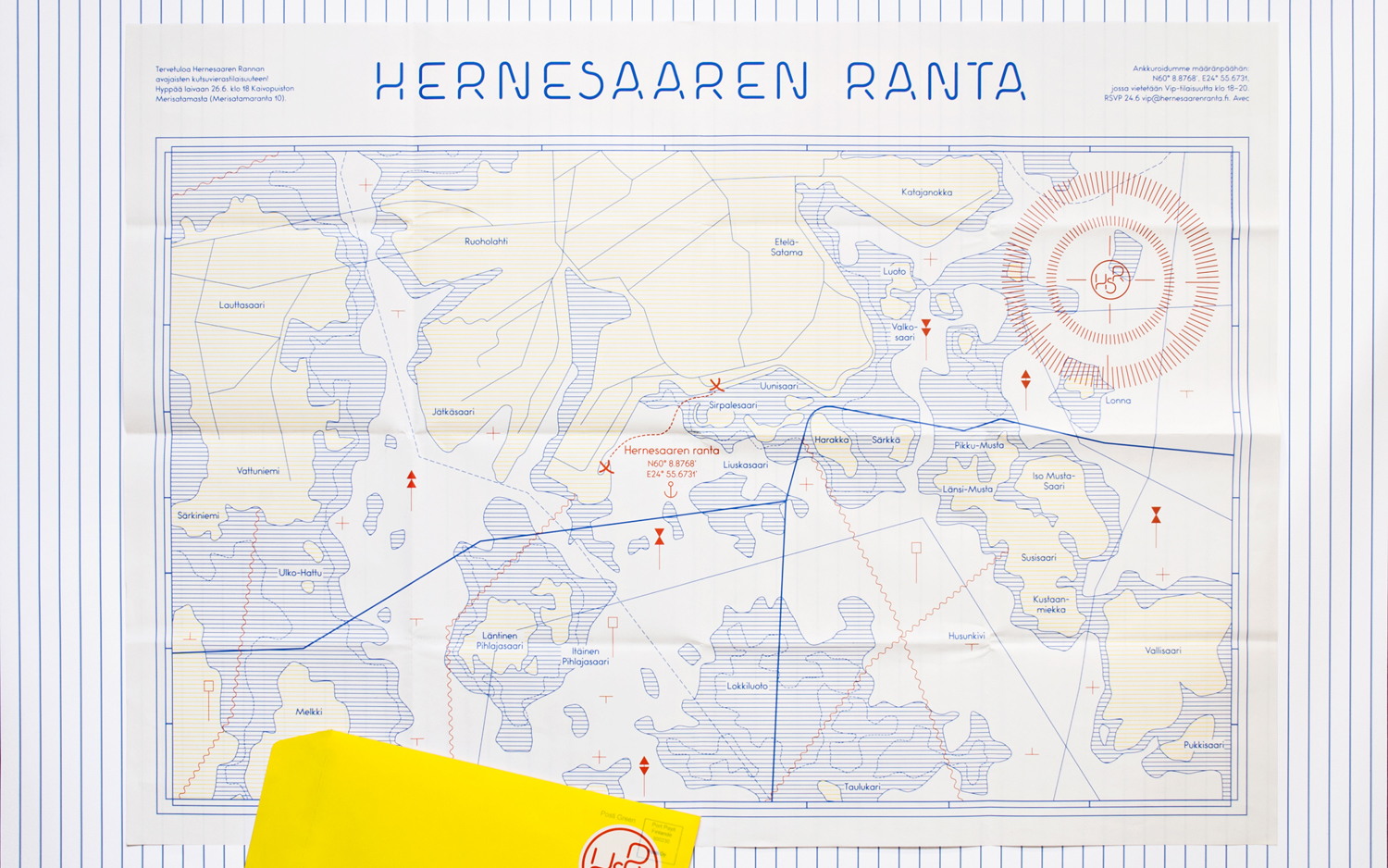
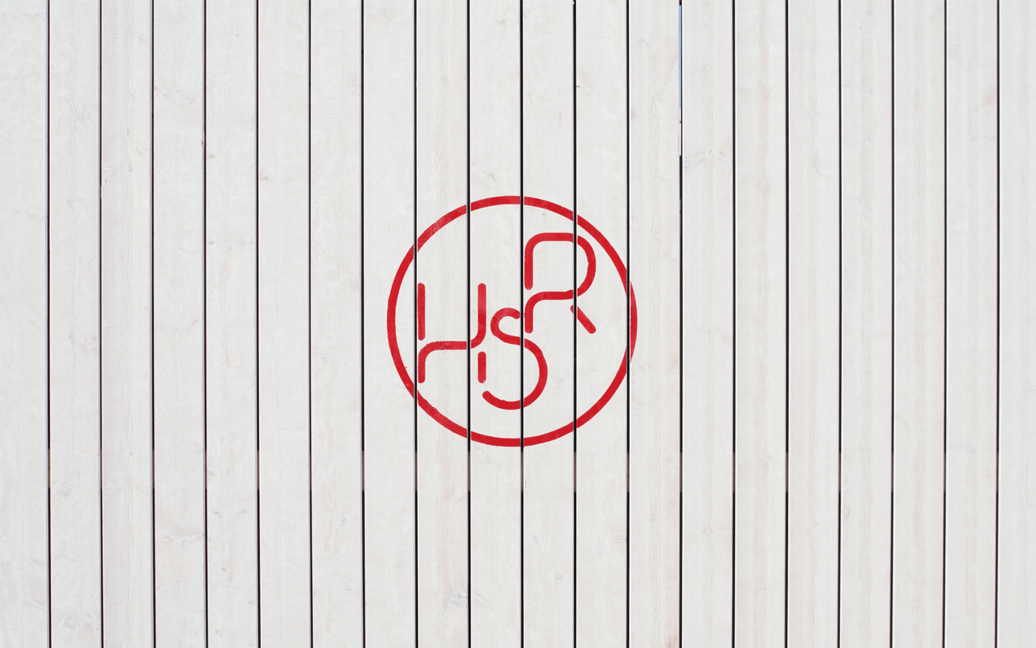
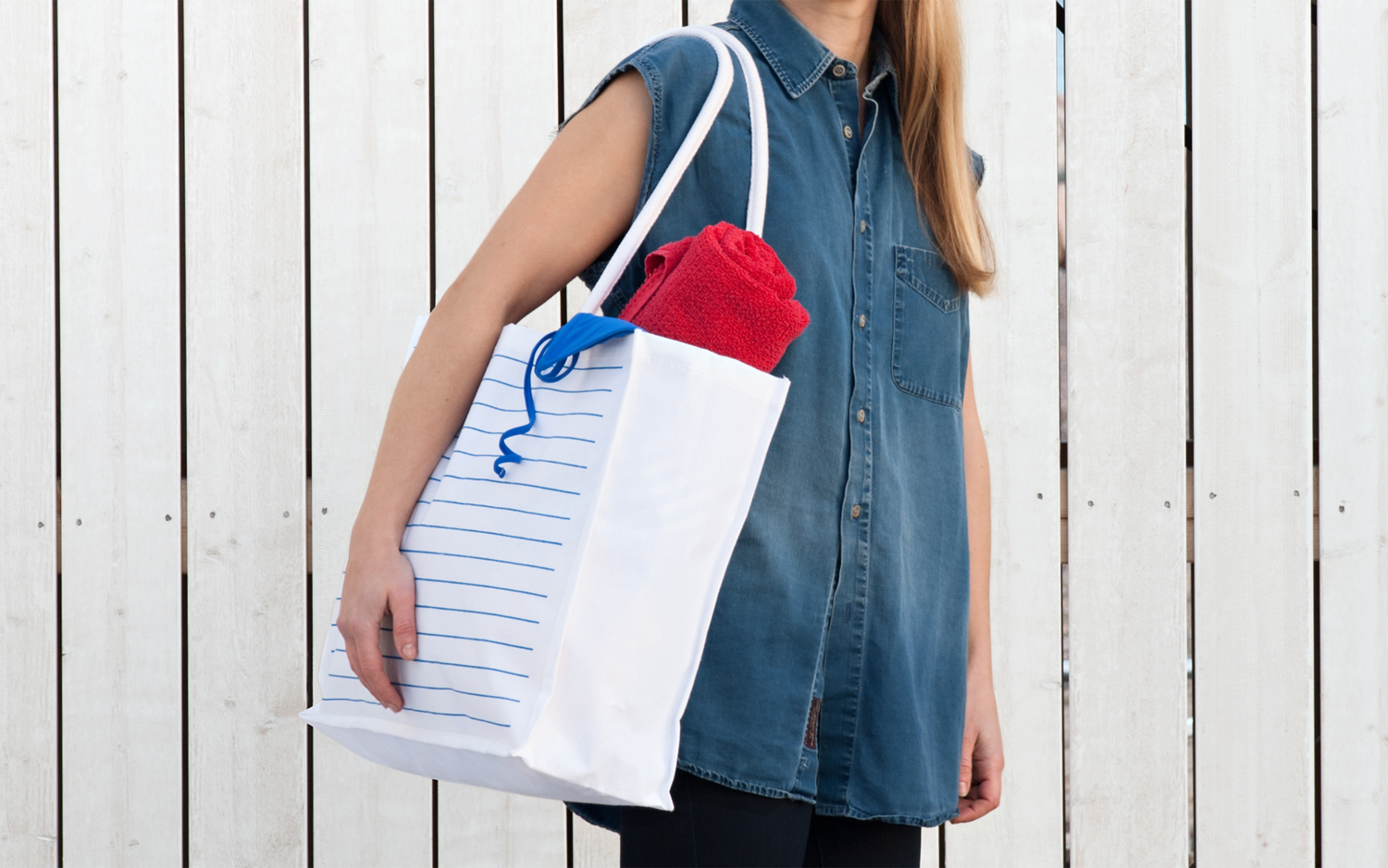
Hernesaaren Ranta is an outdoor seaside area, located to the south of the Finnish capital of Helsinki, open during the summer months. It has food vendors, boat docks and terraces, and is part of an ongoing development project that also includes residential buildings. Graphic design studio Werklig were commissioned to create a comprehensive brand identity system for the entire area that, alongside assets such as business cards, stickers, still life photography, animation and signage, also included a multi-channel marketing strategy for pre-launch, launch and follow up.
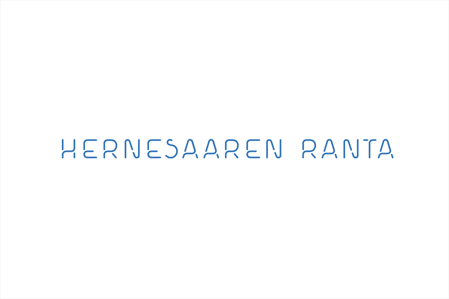
Werklig confidently blend elements of contemporary utility in type and iconography, the creative and communicative qualities of still life images with a light and bright colour palette.
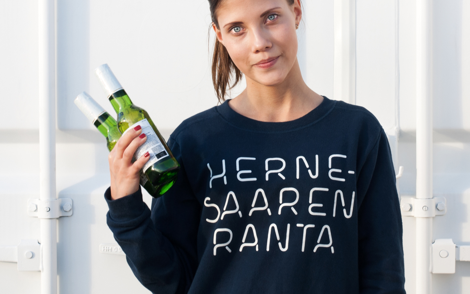
Type appears thoroughly modern in its monolinear build and cuts, existing somewhere between stencil print and neon signage. It is a familiar and current aesthetic, however, some unusual letter forms and breaks, particularly the S, H and E, lend it an idiosyncratic quality which also plays out well through similarly styled iconography.
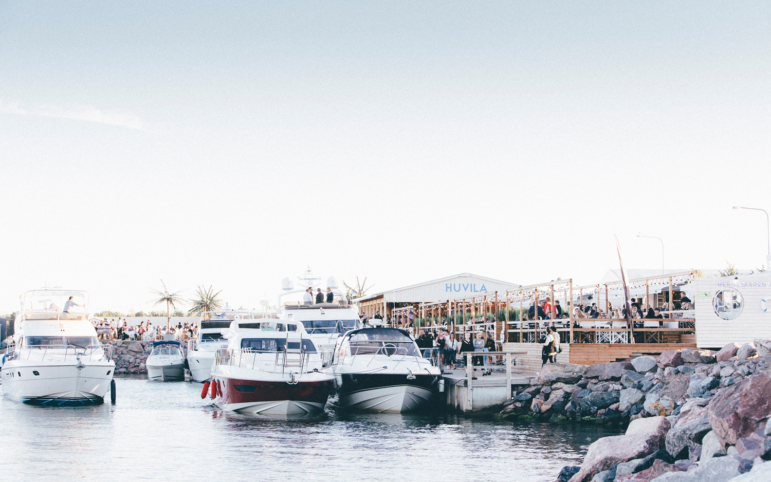
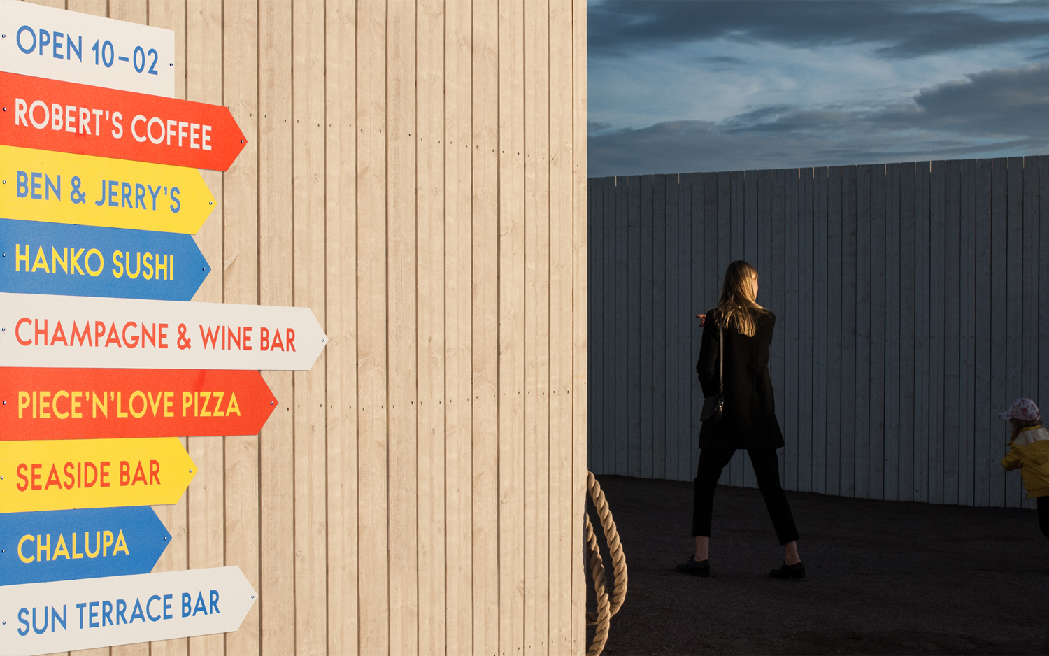
A colour palette of blue, yellow, red and plenty of white space balances the light and nautical with a youthful energy that effectively touches upon the seaside location (also emphasised using stripes and waves) and its summertime opening. The colour of signage, in conjunction with a geometric sans-serif, also adds a touch of the retrospective.
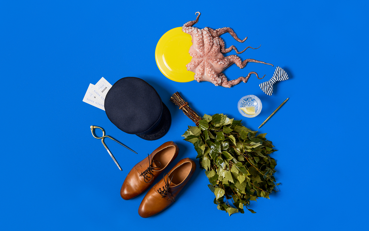
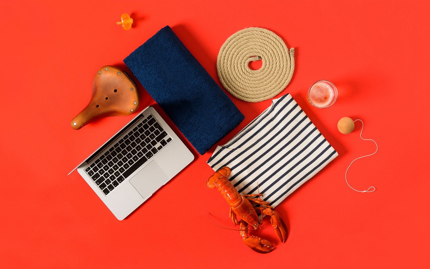
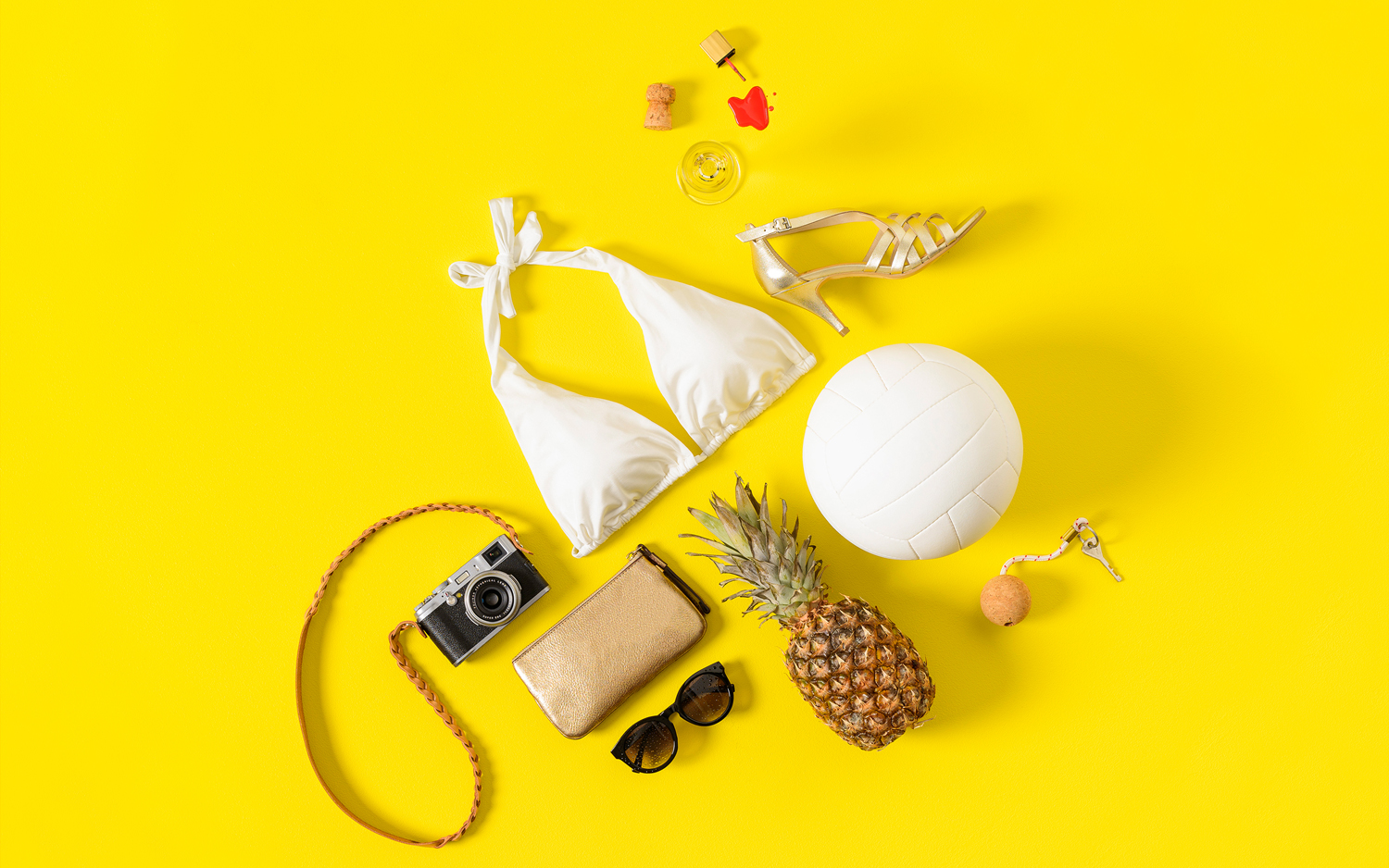
The still life photography, much like monolinear type, feels current and communicative. Through disparate objects these images add further character to identity and function to set tone, and convey some of the facilities and utilities of the area. Items such as the birch broom and laptop, octopus and high-heels do a good job of touching upon tradition and modernity, seaside location, entertainment and style while composition, top down shoot and colour effectively links these.
Design: Werklig. Opinion: Richard Baird. Fonts Used: Bambino.
Follow BP&O:
Twitter
Feedly
Facebook
Instagram
What do you think of Werklig’s brand identity for Hernesaaren Ranta? Share your thoughts in the comment section below or get the conversation started on Twitter.
If you liked this then you may also like:
Support BP&O
Thank you to everyone who has visited BP&O since its beginning in 2011. As many of you know, BP&O has always been a free-to-access design blog that seeks to offer extended opinion on brand identity work. It has sought to be the antithesis of the social media platform that often disentangles form, context and content. Writing articles can take 2-4hrs and are carefully researched.
I am passionate about design writing and believe that spending time to write about work, rather than just posting images, furthers design discourse. If you have enjoyed this article, have been with the site from its early days and would like to help contribute to its future, please consider supporting the site with a small PayPal donation. This will go towards the costs of hosting, CDN (to make the site quick to load) and Mailchimp, and cover some of the time it takes to research, write-up, format and share posts.