Lune Croissanterie by A Friend Of Mine
Opinion by Richard Baird Posted 11 February 2016

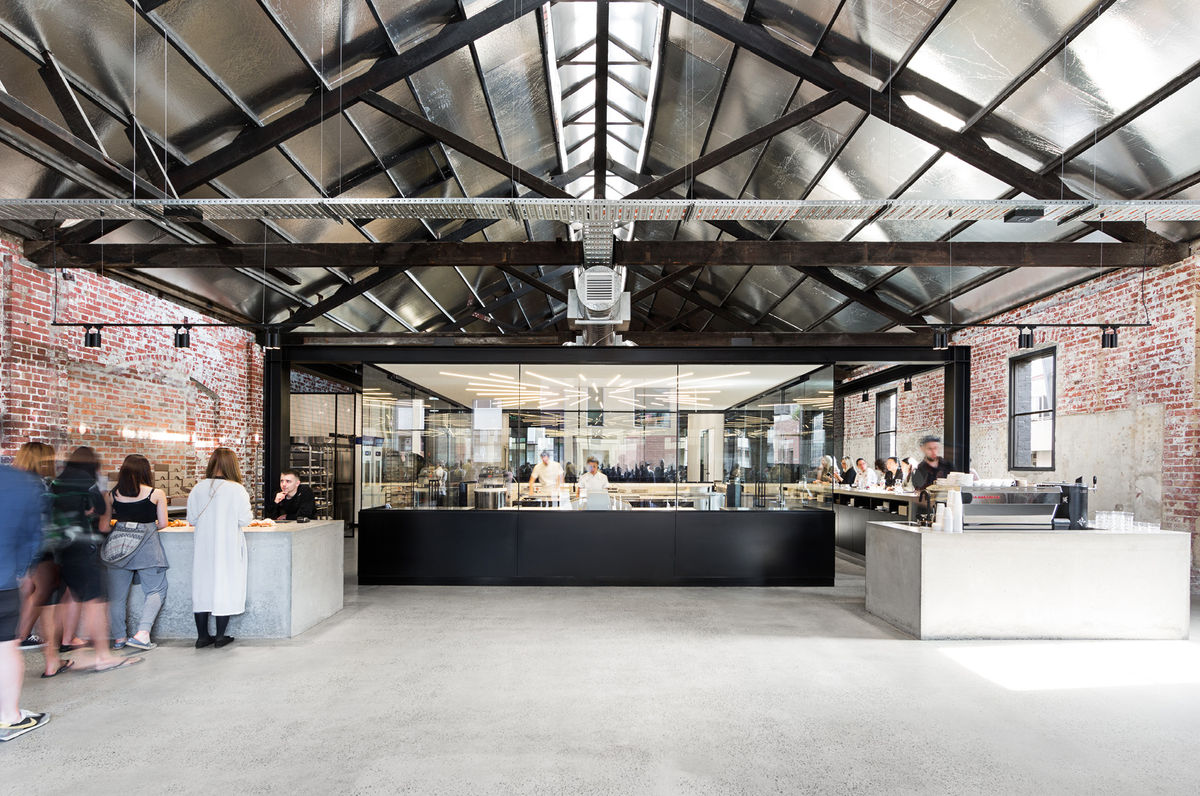
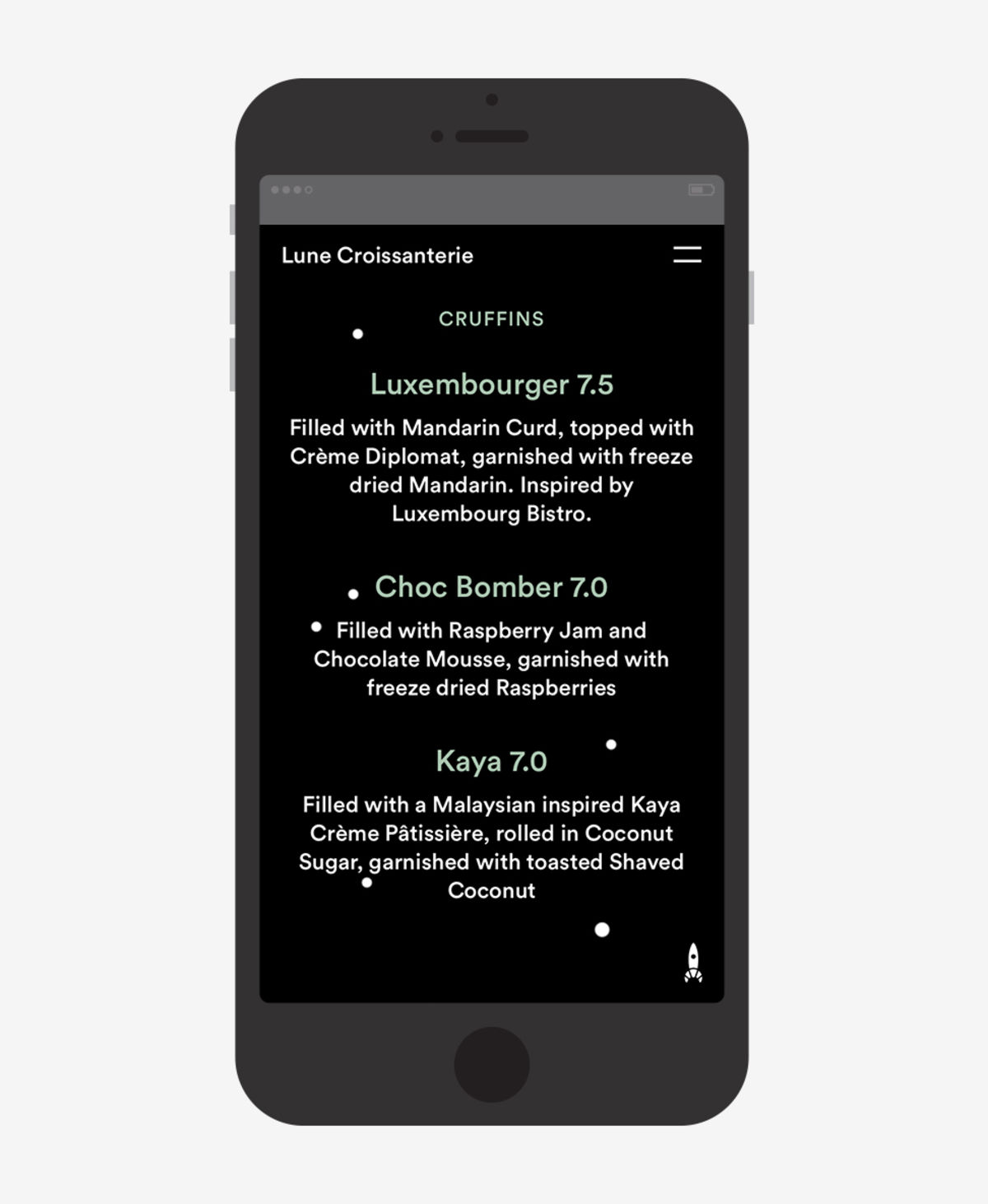
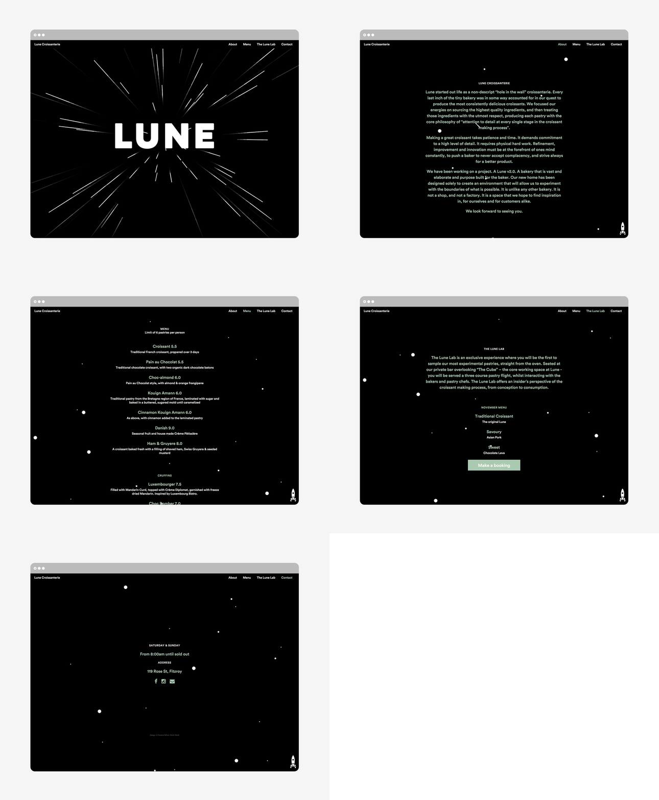
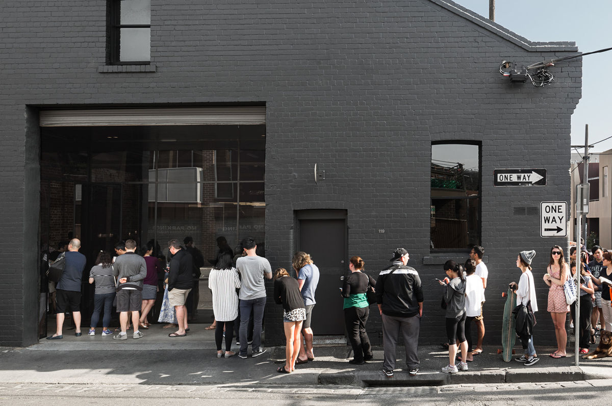
Lune Croissanterie is a Melbourne based bakery dedicated to the craft of Viennoiserie. After gaining a cult following and amassing long cues it quickly outgrew its small shop and moved into a larger warehouse space in the suburb of Fitzroy which features a distinctive interior design by Studio Esteta. To coincide with this move, Lune Croissanterie worked with the Australian graphic design studio A Friend Of Mine to develop a new brand identity. This takes the name, space theme and rocket of the previous identity and refines and expands on it with a few extra playful details. These link packaging, signage, interior and website.

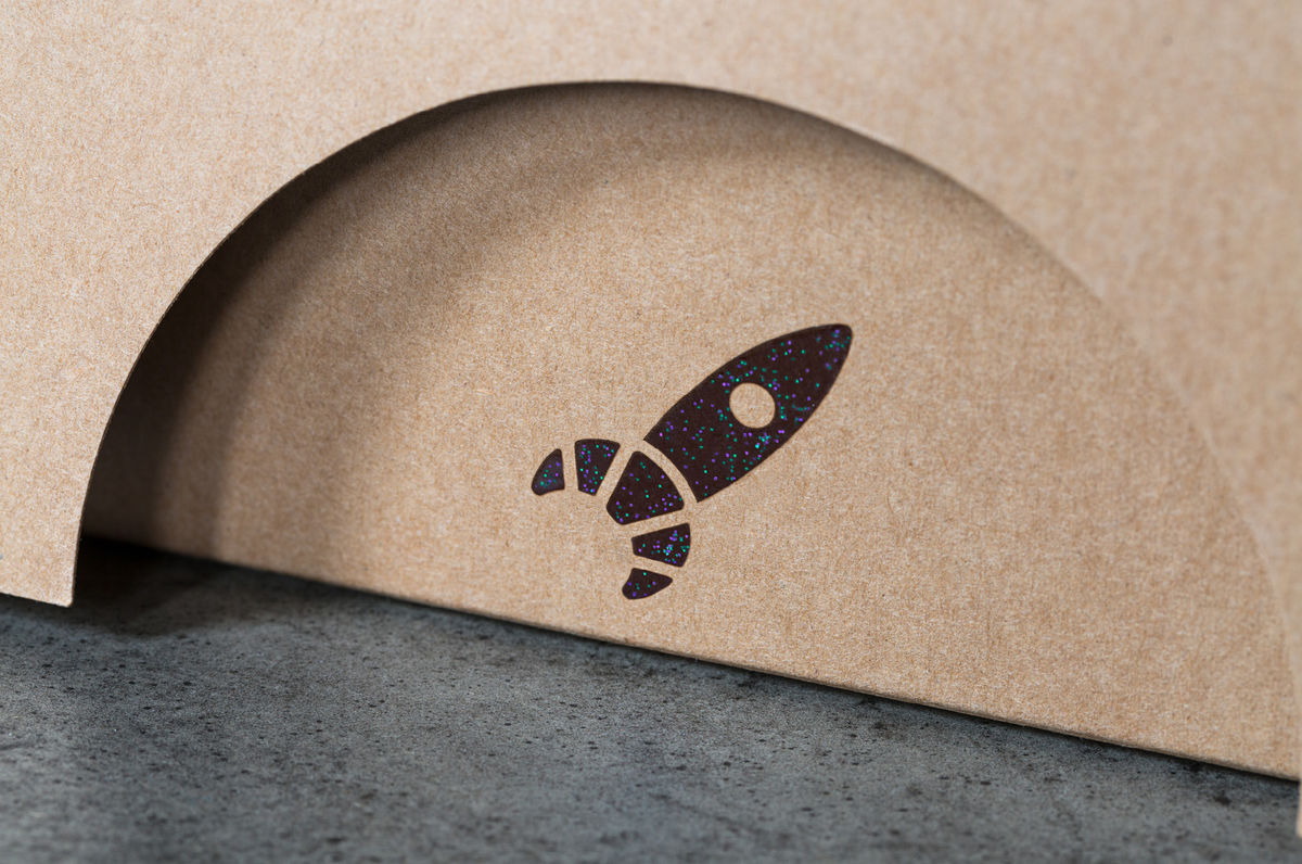
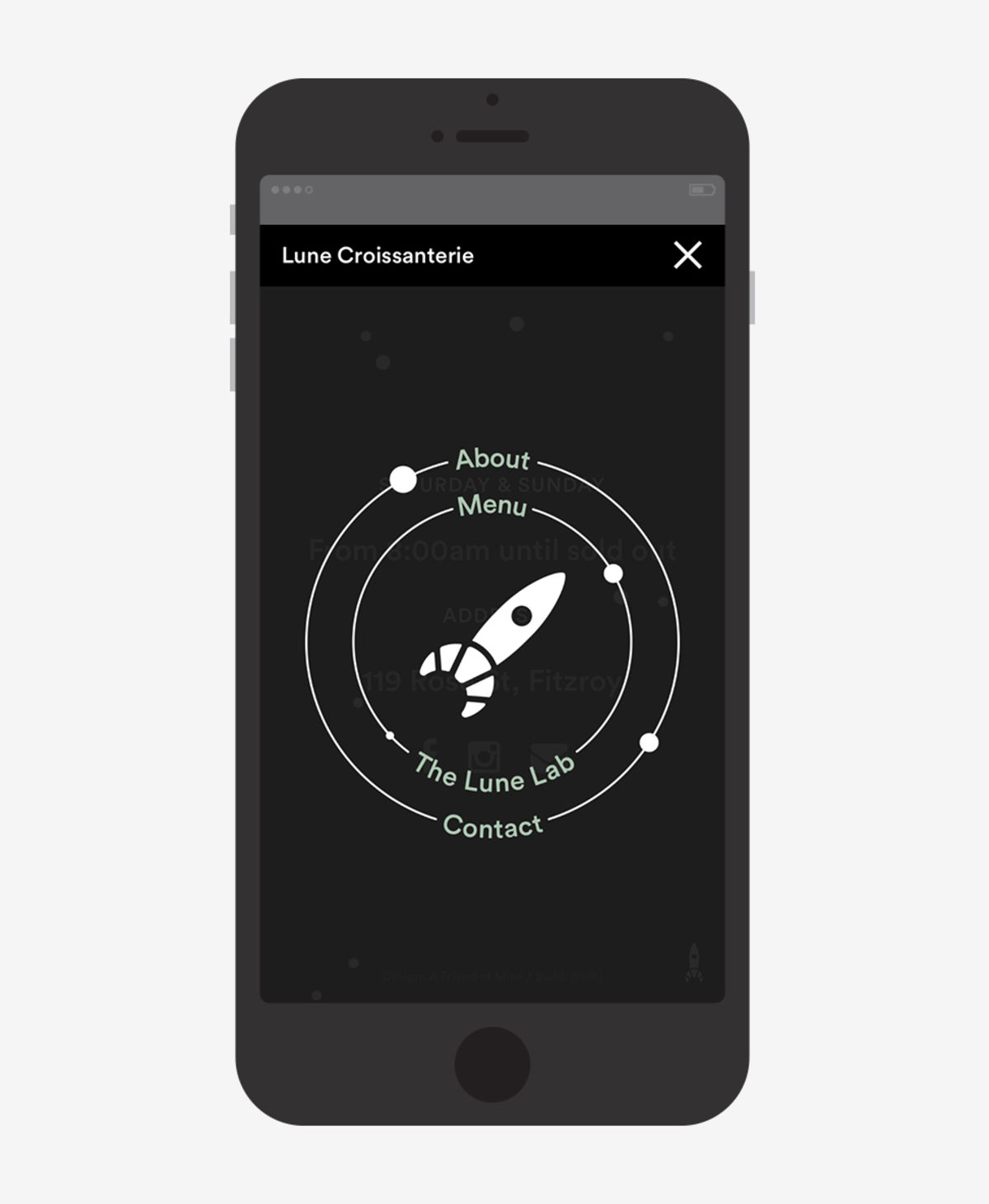
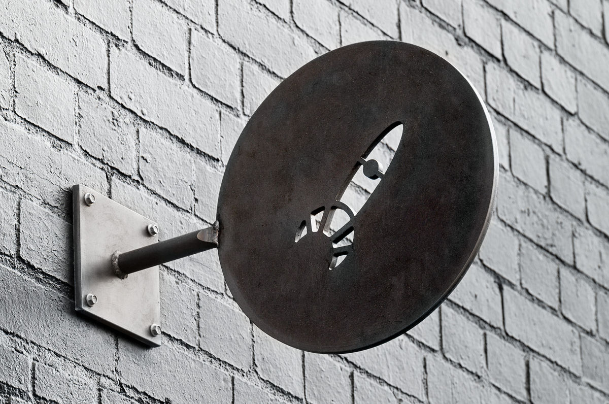
The identity does away with the twee, hand drawn qualities of the original logo, and gives it a contemporary update. It is playful in its compounding of rocket and croissant, a union that feels natural and unforced, modern in its reduction and simplicity, and has a good balance of positive and negative space. It stands up well both small online and as a larger detail cut into metal signage.
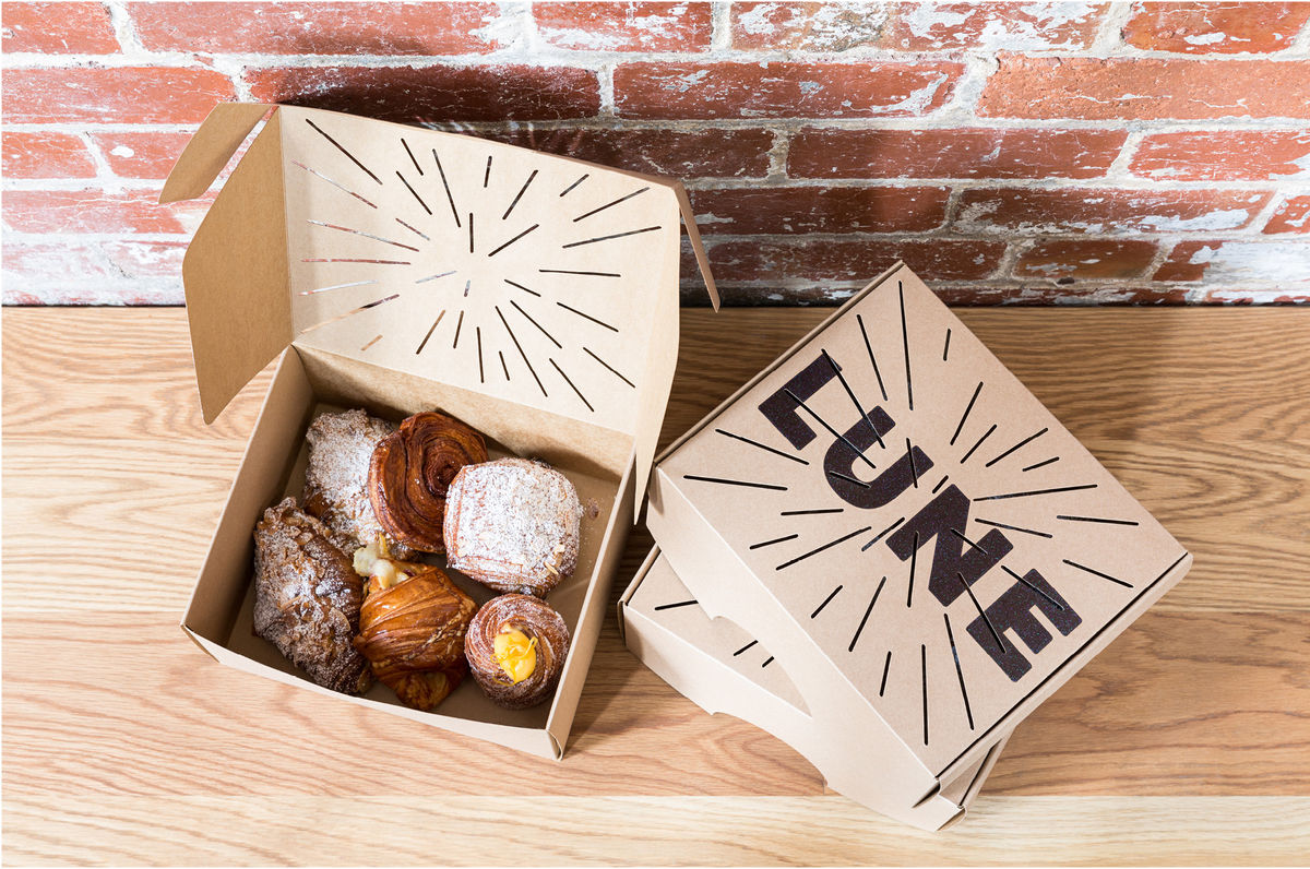
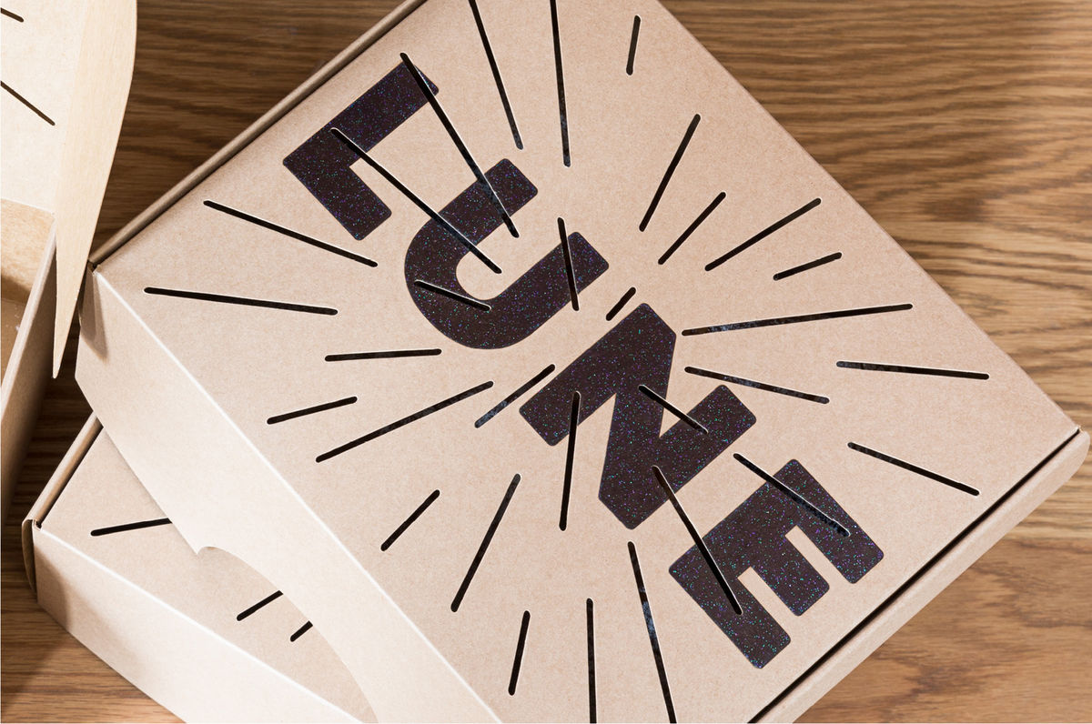
The logotype shares a similarly reductive quality with bold, uppercase, monolinear letters subverting the conventions of the industry, one that often favours the delicate and ornamental as a reflection of handcraft. This choices feels impactful and well-suited to Lune Croissanterie’s new warehouse premises and looks great across packaging.
Where the previous identity began and ended with the rocket logo/illustration, A Friend Of Mine has expanded on the space references through print, print finish and lighting.
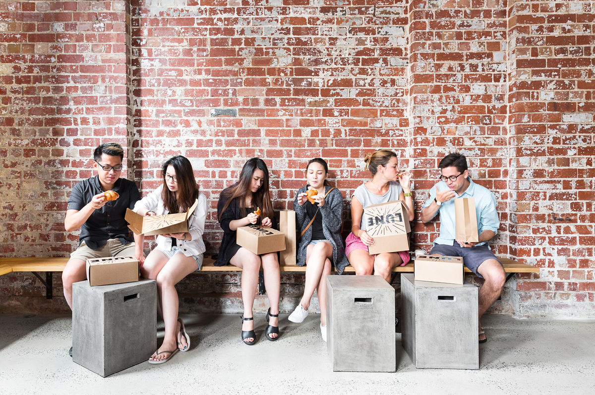
A black ink with a glittery and starry quality running through it is fun and unusual, and the die cut hyperdrive lines balance a bold and distinctive aesthetic impact with a practical use that allows moisture to escape the boxes. This balance of distinctive aesthetic underpinned by practical value, and creativity drawn from necessity, is to be commended and a real highlight.
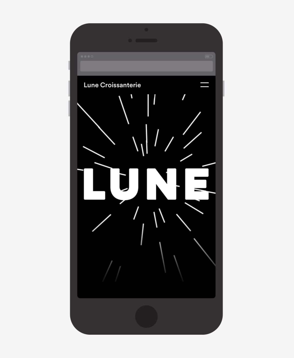
The way that these lines have also been used within the interior as lighting, and animated online, is particularly neat, establishing a continuity between Studio Esteta’s interior design, packaging and digital experience with interest and variation.
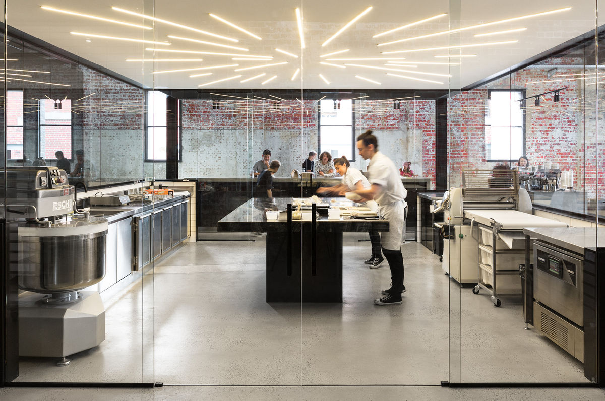
Other neat details include what looks like silver insulation across the ceiling (an unintentional pre-existing feature but “space-age” nonetheless) and the clinical capsule-like box of the kitchen within the rough industrial qualities of the warehouse designed by Studio Esteta. Where identity is fun and playful—whilst avoiding the gimmicky—interior is smart, distinctive and sophisticated. More from A Friend Of Mine on BP&O.
Design: A Friend Of Mine.
Interior Design: Studio Esteta.
Photography: Sarah Anderson.
Website Build: Netki.
Lighting: BREC.
Packaging Print: PressPrint.
Opinion: Richard Baird. Hat Tip: Amanda Cole / Shorthand Studio. Fonts Used: Circular.
