Héctor Ayuso by Mucho
Opinion by Richard Baird Posted 17 February 2016
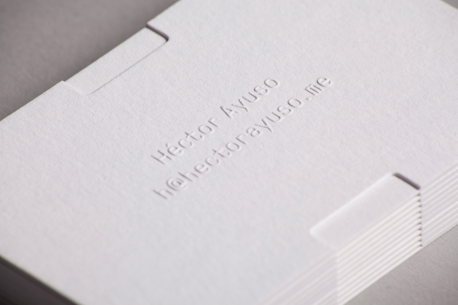
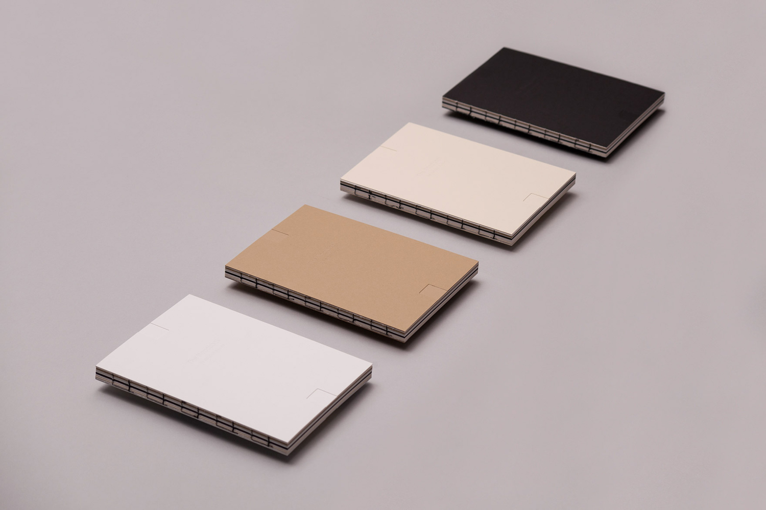
Héctor Ayuso is the founder and director of renowned festival OFFF, a celebration of creative process that takes place each year in the Spanish city of Barcelona. Héctor recently looked to graphic design studio Mucho to help define and express who he is and how he works through a new visual identity. This extends across business cards, postcards and moodbook, and features loose hand drawn type, diverse imagery, material texture and craft finishes.

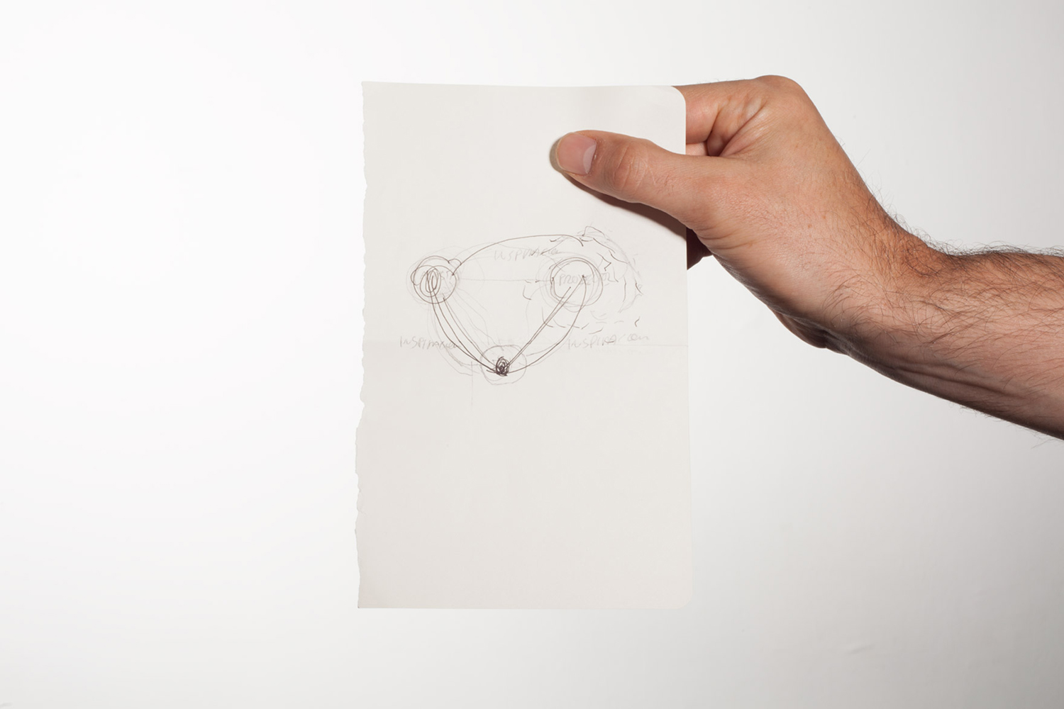
Taking their cues from the foundation of OFFF Festival, the relationships formed between Héctor, artists and the public, and the understanding that creation comes from inspiration, Mucho defined Héctor as an inspirer. This is conveyed visually through blank sheets of paper—the beginning of creativity—a type choice with imperfect qualities and the connection made between paper and type through relief printing.
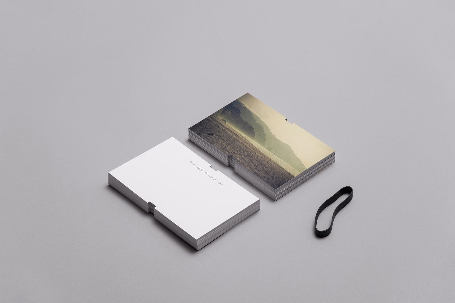
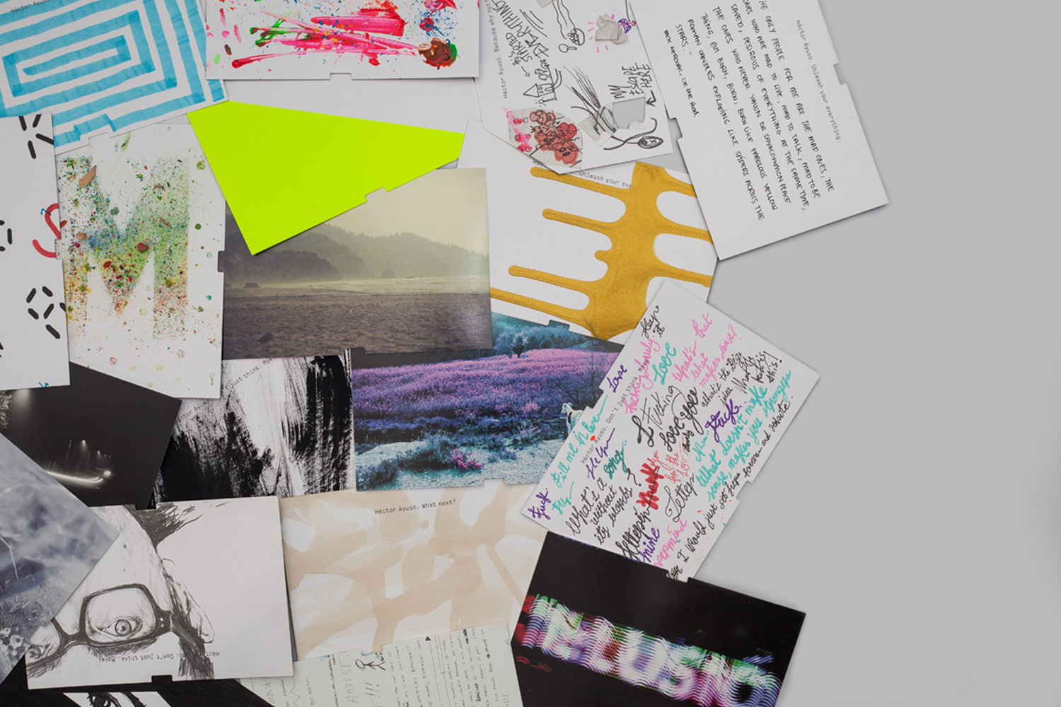
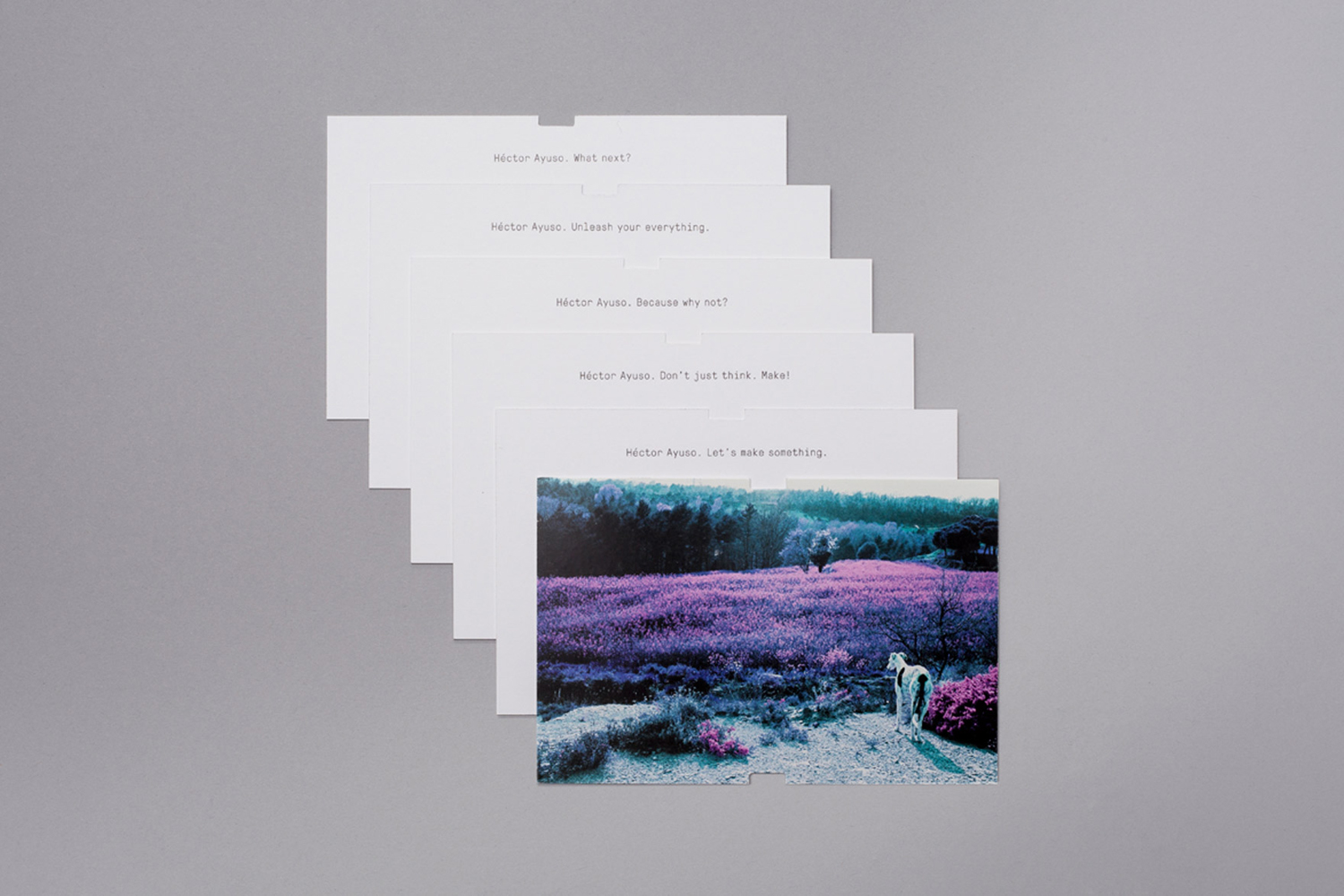
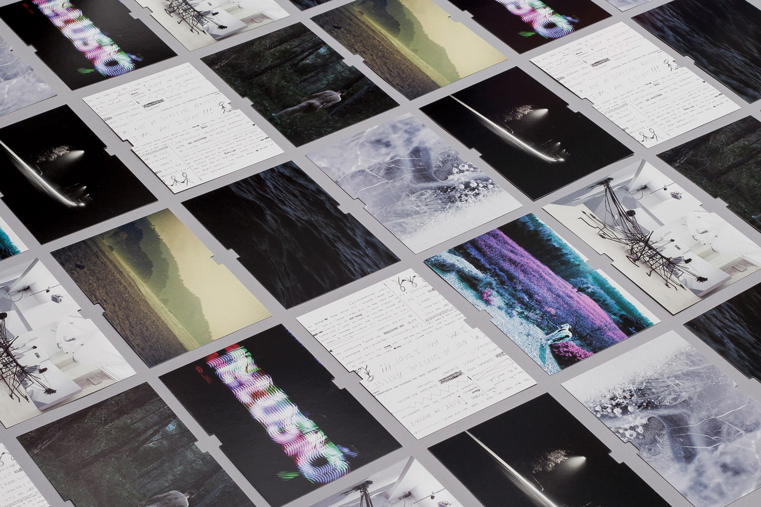
The positioning of Héctor as an inspirer plays out well in print through postcards that collate a series of unusual, diverse and cross-discipline images described as portraits and informed by the concept of a creative challenge.
These images span bright paint splashes, moody photography, writings and illustration, and tie in well with Héctor’s curatorial role—borrowing a little from contemporary art galleries—his rich personality and interest in creative expression. These are linked by their consistent format.
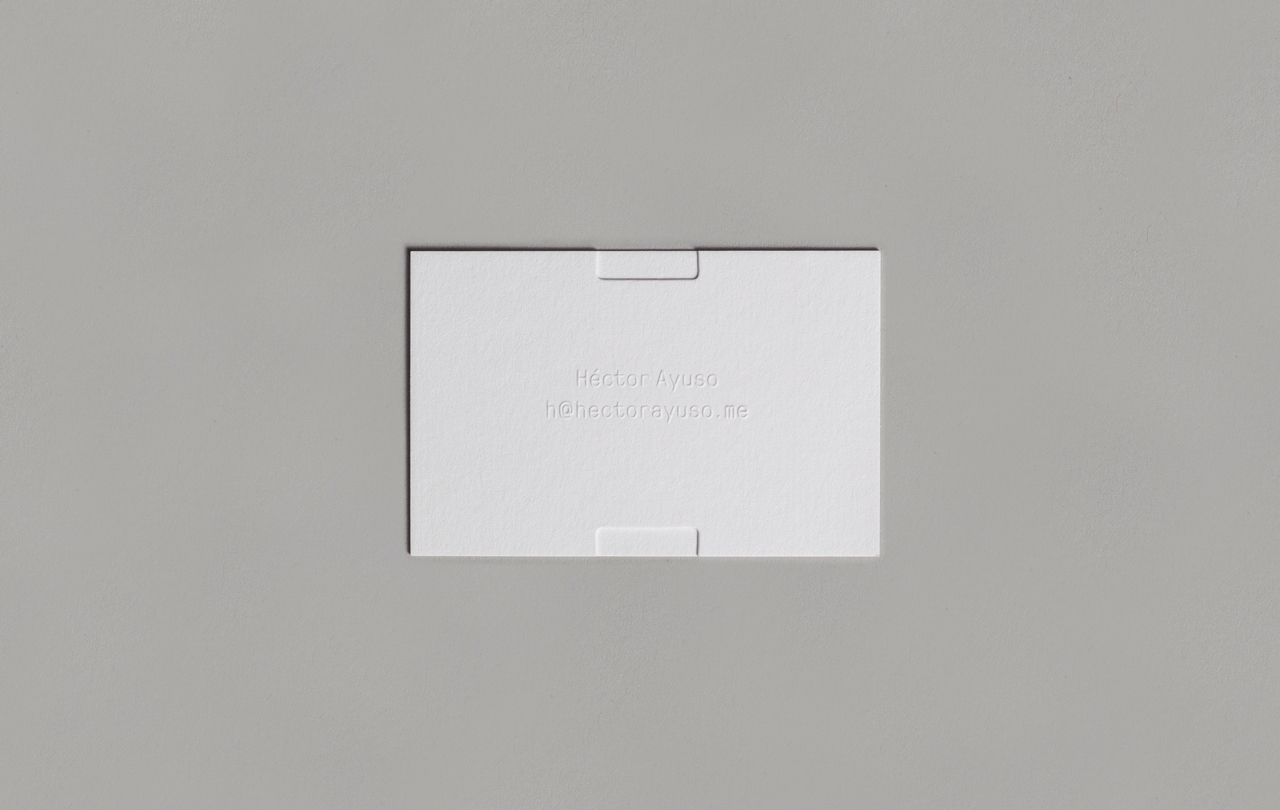
The business cards are literal depiction of a blank canvas and creative opportunity, functioning as a space for Héctor’s own personal message. Although perhaps a little optimistic, it remains a nice idea rooted in the themes of creativity, individual expression and the relationships Héctor forms in his role as OFFF director.
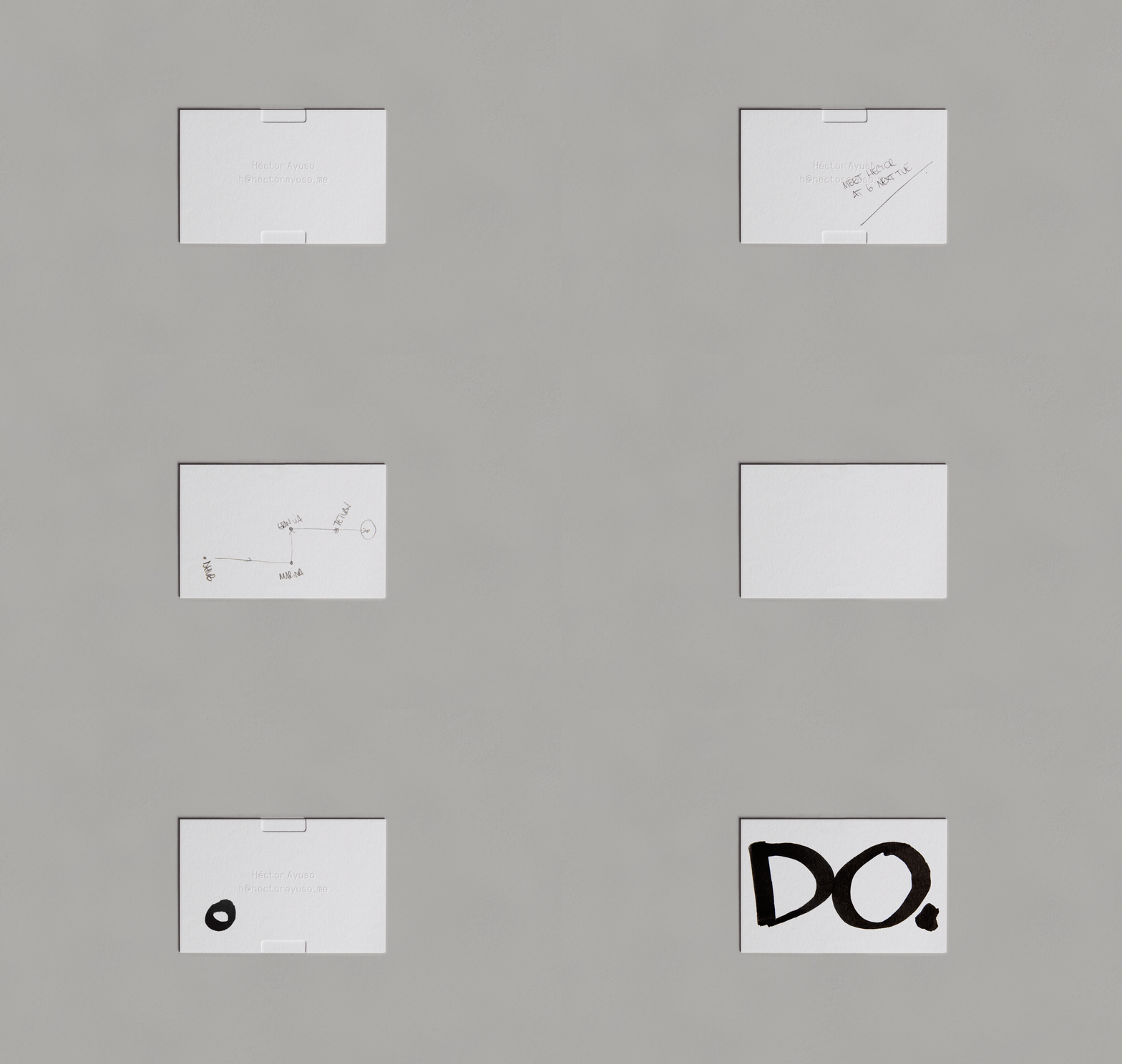
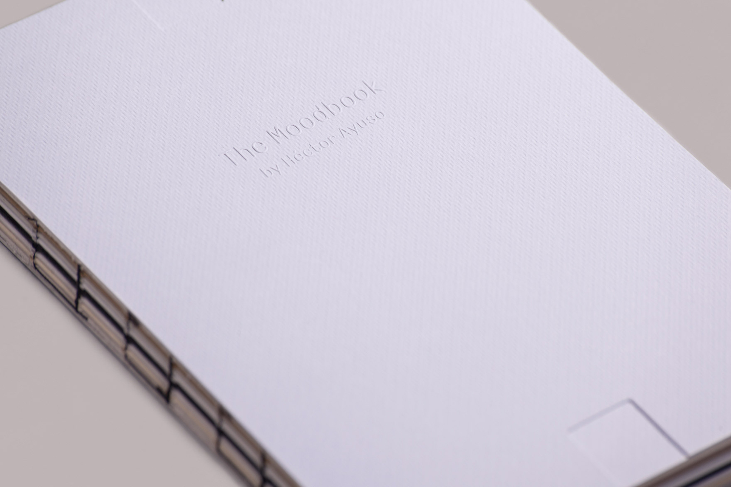
The second component of identity is an H motif which is drawn out through print finish. This moves between an aesthetic flourish across the business cards and moodbook as a deboss along the top and bottom margins, and as practical cuts for a rubber band to collect the postcards.
As documented here, this is a very subtle detail, perhaps not immediately recognisable as an H, nor explored more explicitly as a conventional brand mark or social media avatar. This does, however, give identity, alongside the other details, a progressive quality that has the potential to link further assets without becoming logo-centric.

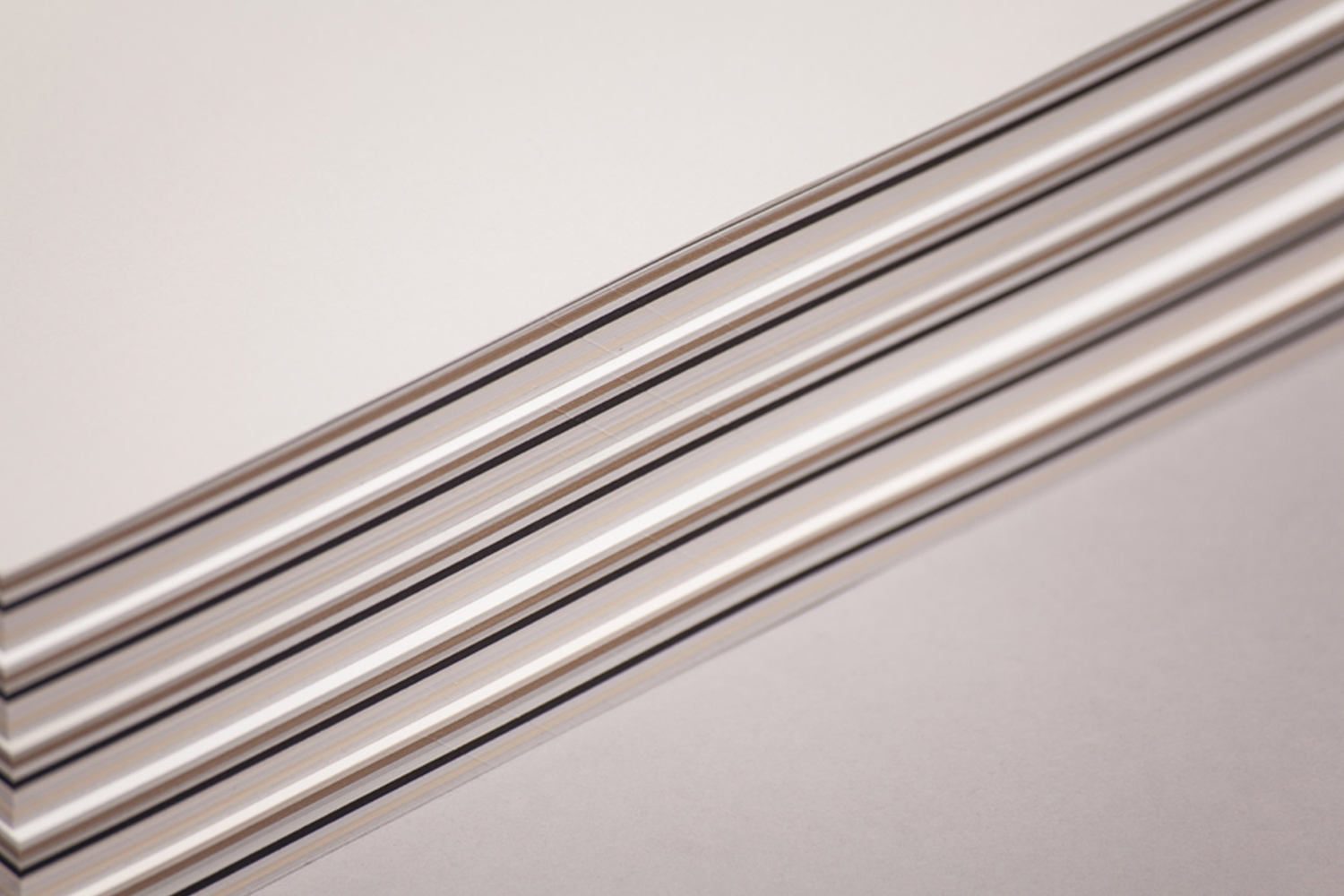
Hector’s love for artisanal production and craft is expressed effectively through a variety of uncoated papers, dyed and embossed boards, a mix of paper weights, and in the use of a blind emboss print finish and open stitching. More from Mucho on BP&O.
Design: Mucho. Photography: Roc Canals. Opinion: Richard Baird.
