Thanda by Karoshi
Opinion by Richard Baird Posted 19 February 2016

Thanda is a luxury home accessory business bringing high-end artisanal products crafted by people in South Africa to the UK market. It does this with the intention of helping to support local communities, promoting ecological awareness and proving that sustainability does not have to compromise aesthetic.
Thanda worked with London based graphic design studio Karoshi to articulate and express this positioning and the quality of its products through a new brand identity that would run across stationery, business cards, packaging, tags, promotional materials and website. This included bespoke patterns, custom typography and photography, and detailed product information online.

Taking their inspiration from the name Thanda, the Zulu word for ‘love’, Karoshi developed a series of colourful forms inspired by Zulu heritage, and set these within a modernist geometric grid structure and alongside custom typography.
This meeting of Zulu and European design heritage is well-founded and distinctive. It is not explicit in its reference and as such avoids any sense of awkward cultural appropriation, but finds a relevant reference point and develops it into an ownable and memorable visual asset. It also acknowledges that, while the first set of product’s are from South African, as is Thanda’s founder, the brand will look to source products internationally in the future.
Colour similarly plays with intersections, bringing together an earthy clay brown and bright synthetic inks. Again, it is not particularly explicit in its communicative intention but does feel informed by sustainability, ecology and aesthetic delight.


Although many of the assets that make up Thanda’s new visual identity system are considered and well-built, it is the patterns that are the real highlight. Currently, these feel sorely under-utilised, either toned down, or wholly absent, only really appearing in their full colour across postcards.
This gives many of the assets a conservative quality. Within the context of a crafted product, one of colour and material texture, this begins to make a little more sense, with a restraint you would expect from a luxury brand with a humble and socially conscientious positioning.
There are plans to use these patterns more extensively in the future. This will include printed tissue paper and mailing bags, gift vouchers and offline communications such as exhibition and environmental graphics, as well as online sales campaigns.
The absence of patterns is tempered by some small but thoughtful details. These include the orientation of the tag, which ties in with pattern, the clear crafted qualities of burlap string, and the value associated with dyed materials and a white foil print finish.

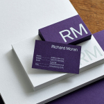
The geometric forms and monolinear qualities of the logotype, the low bar of the H and the flat top of the A plays with European design sensibilities and tie in with pattern, both in form and its cultural origins, drawing from hand painted signage, but lacks personable character. It leans more towards technology and neutrality, and its proportions in print, often appearing very small within the context of large surfaces, feels a touch awkward.
It would be easy to keep falling back on the humility of brand or a luxury restraint, but it simply could do with a touch more warmth, particularly when products are rooted in an individuality and hand craft, and the brand in supporting communities. This is certainly not overlooked when contemplating identity as a whole, as these values are explored more effectively in product descriptions, however, it need not have completely escaped type.


Some very well-staged, lit and shot product photography bring colour and life to a mild-mannered and slightly conventional website. These highlight craftsmanship, how these work within a contemporary home environment and are paired with thoughtful product background and material information. This information is hidden under tabs as Thanda wanted purchases to be “led by product rather than pity”.

Karoshi succeed in conveying Thanda’s core belief that sustainability does not have to compromise aesthetic through form language and colour palette, and while not obvious, is rooted in the origins of product, and explored more appropriately online through product descriptions. There are moments were certain assets appear bare, be that through too much space, and the proportion of type to space, however, material texture and finish work well to balance this out.
Although patterns have yet to work their way more extensively into identity, there is an intention to explore this further. The form and colour of these do underpin other design elements such as the diamond motif into carousel links, the shape of tags and the colour of buttons and rollovers which add cohesion and an element of continuity. More from Karoshi on BP&O.
Design: Karoshi. Opinion: Richard Baird. Fonts Used: Optimo Programme & Source Sans Pro