Coffee & Co. by Bond
Opinion by Richard Baird Posted 11 March 2016
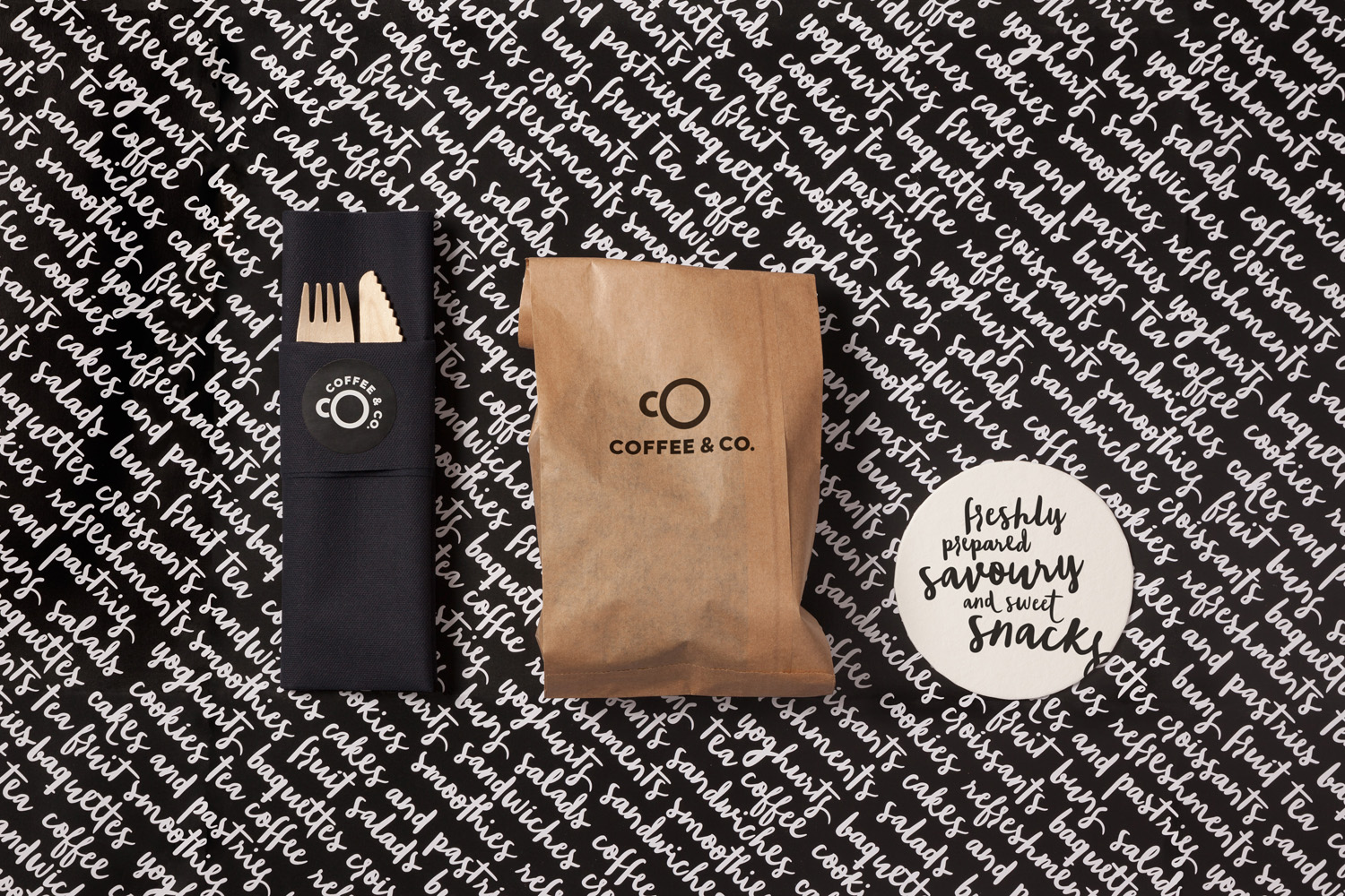
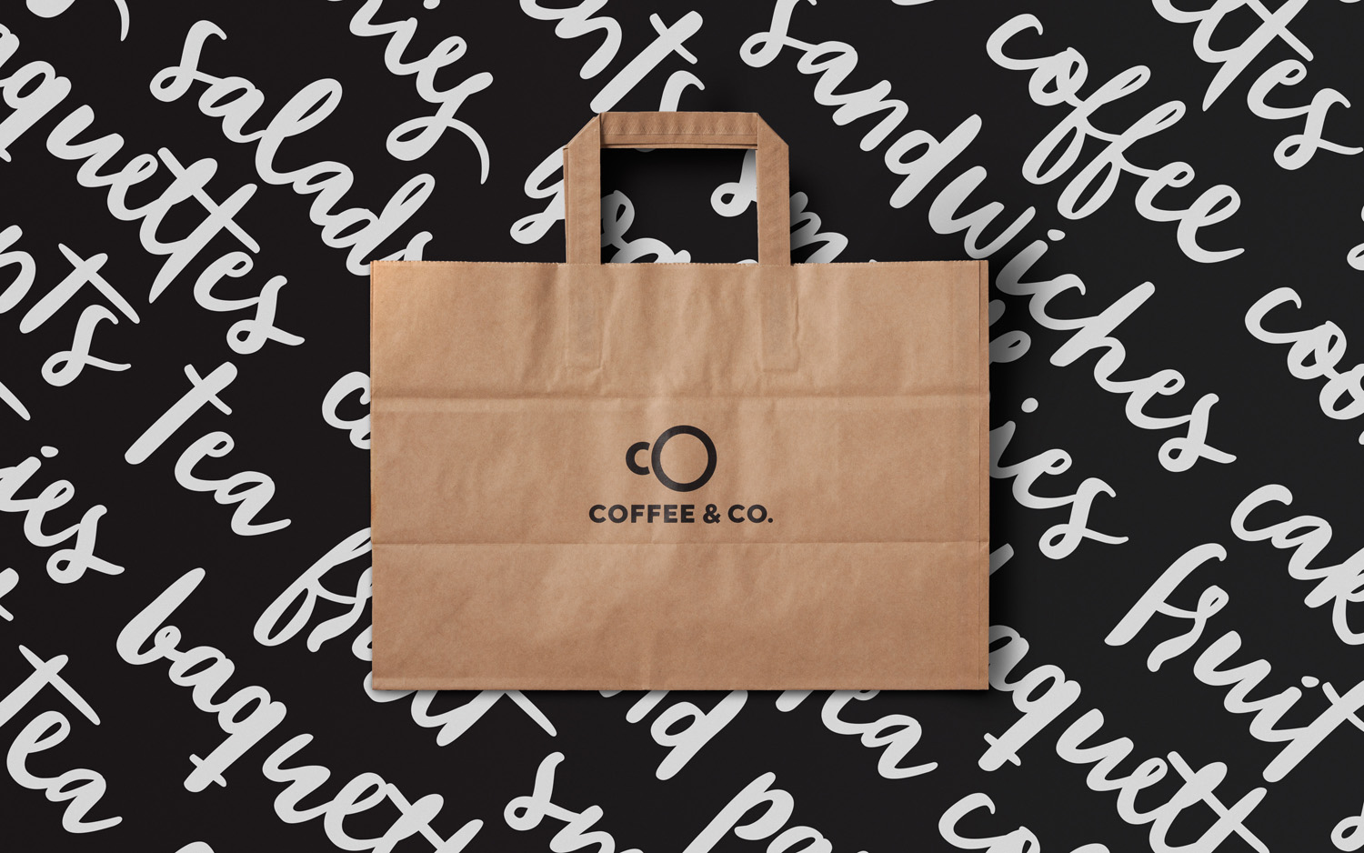
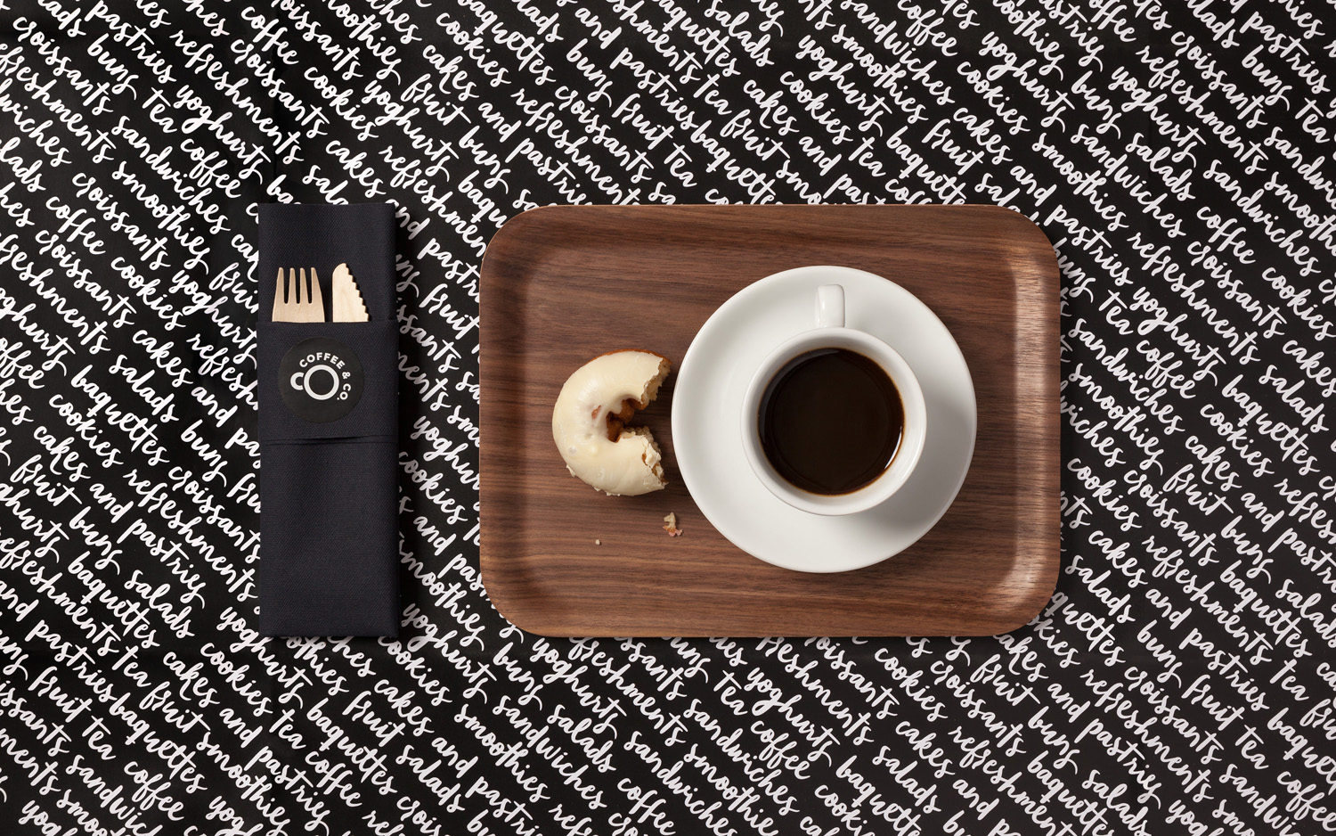
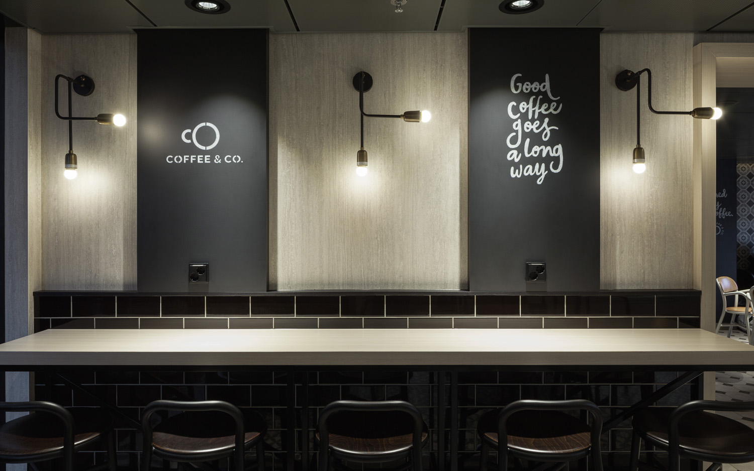
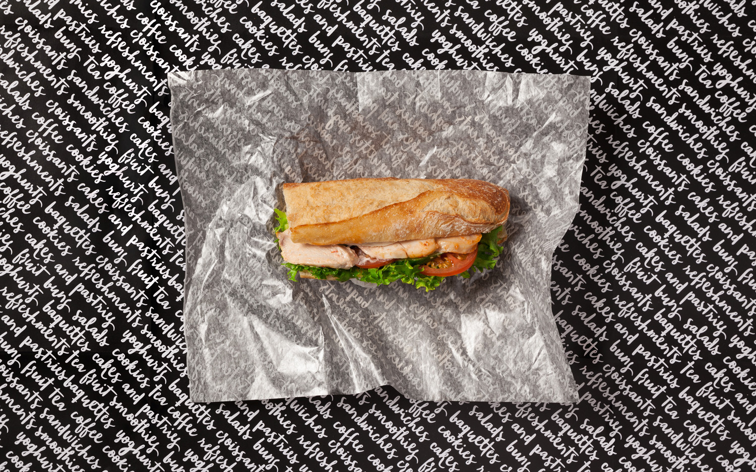
Coffee & Co. is a new cafeteria and coffee shop concept onboard the Finnish cruise ship the MS Silja Serenade. It offers freshly prepared sweet and savoury snacks, has a light interior design of tiles and wood, and features a visual identity of hand lettering and sans-serif typography created by graphic design studio Bond. This runs throughout the cafe, linking signage, packaging, interior communication and graphics.
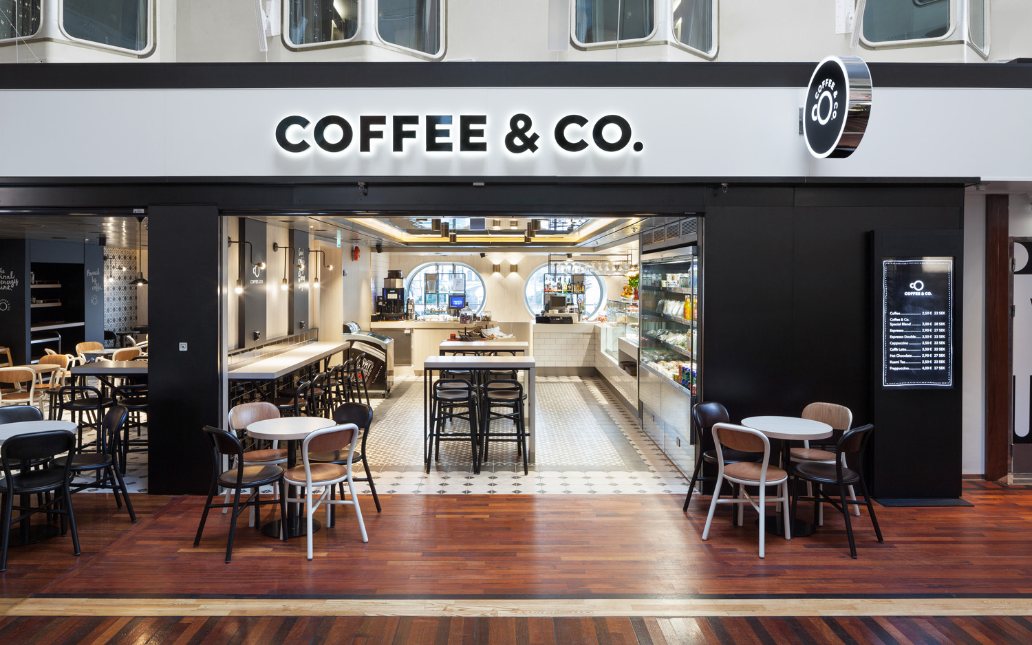
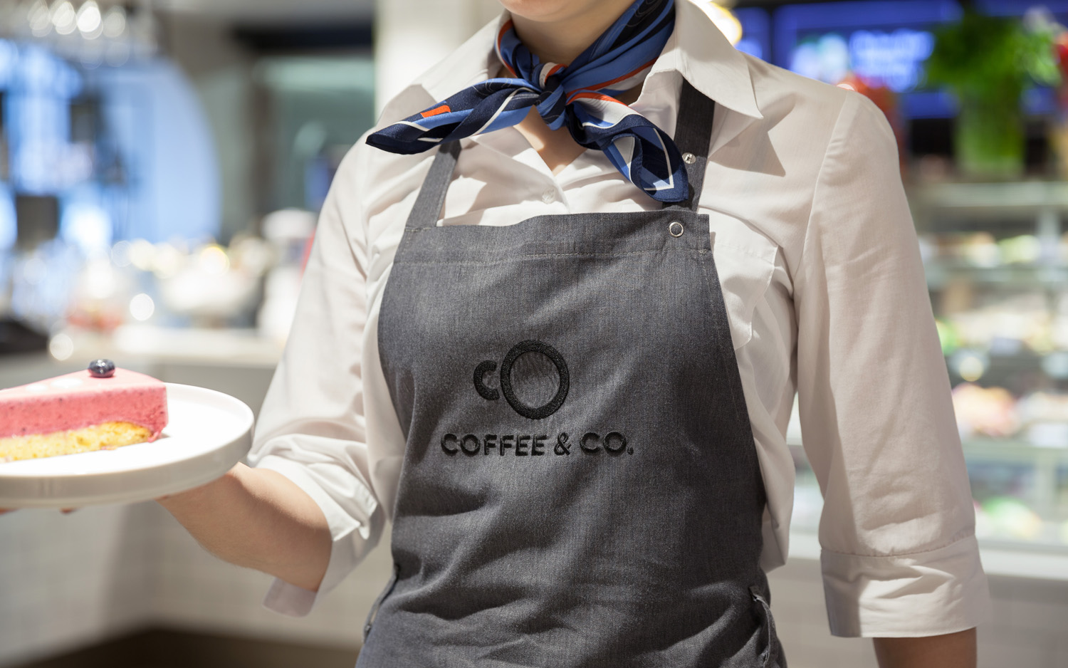
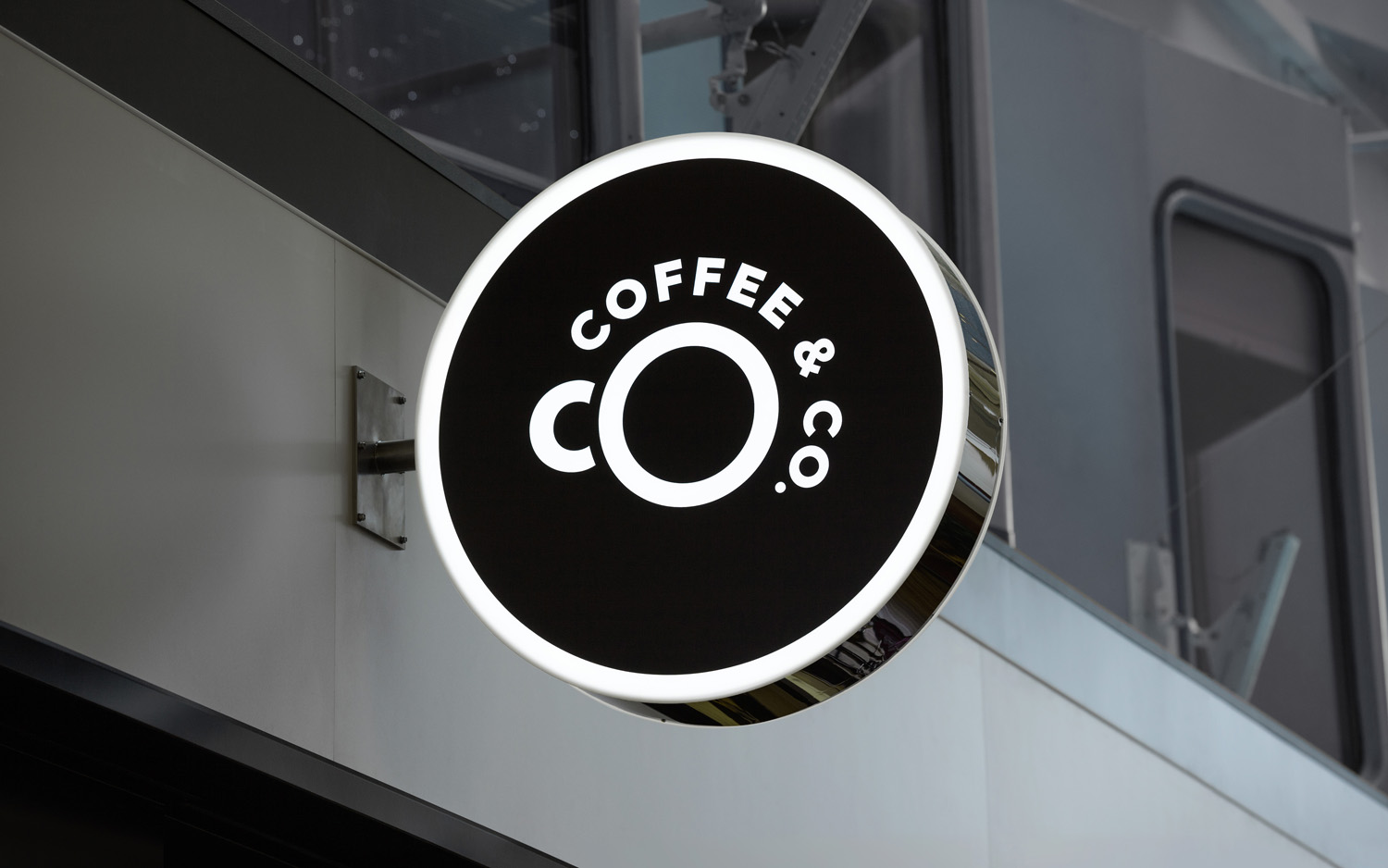
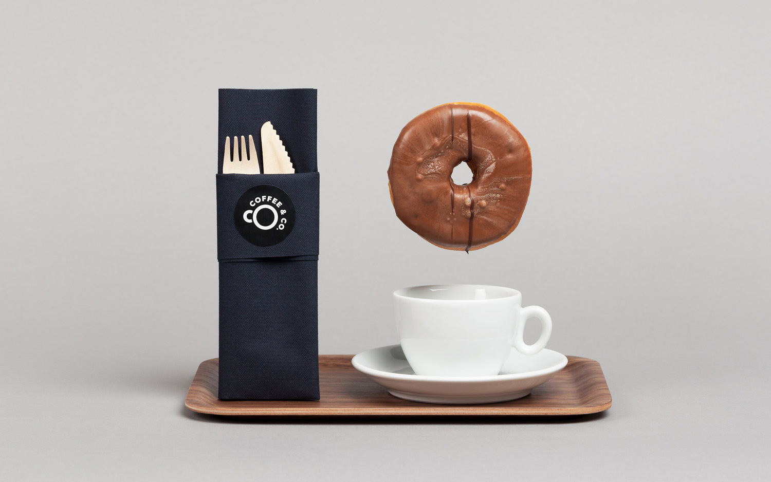
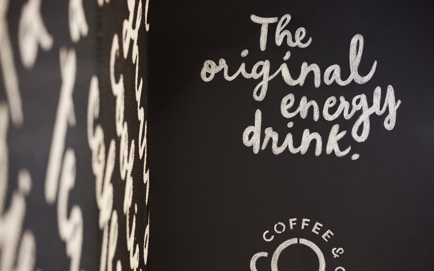
Bond was tasked with establishing a friendly, casual and straightforward identity for passengers of all ages. This is achieved through personable and rather lovely hand lettering, the modernity of a straightforward but well-spaced sans-serif logotype, and a monogram that exists somewhere between coffee cup and porthole. This is a particular highlight. Its reference to product and location, and the reductive yet understandable visual expression and duality is smart but simple, and stands up well as signage, stickers and as a stitched detail across aprons.
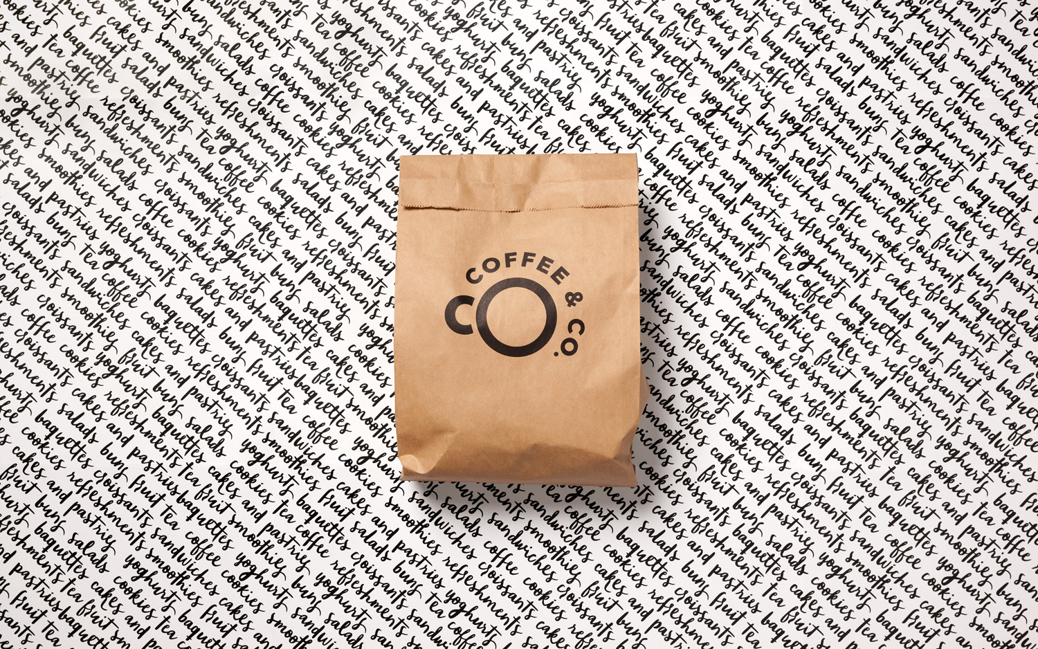
Although brand identity does not deviate from some well-established industry conventions in type contrast, material choice and form language, leveraging the personable, the modern and the playful, these are done effectively, with good intention and in a way that compliments interior and aware of a captive audience, with hand lettering bringing a lovely layer of detail and visual texture. More from Bond on BP&O.
Design: Bond. Opinion: Richard Baird.
