LeMise by DIA
Opinion by Richard Baird Posted 24 March 2016
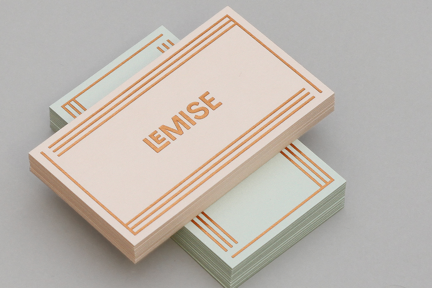
LeMise is a Brooklyn based art and design advisory business, established by Andi Potamkin, described as being guided by the concept of mise-en-scene. LeMise considers the environment as a whole and works with its clients to bring together works of art and design, drawn from a vast network of designers and artists, to enhance space.
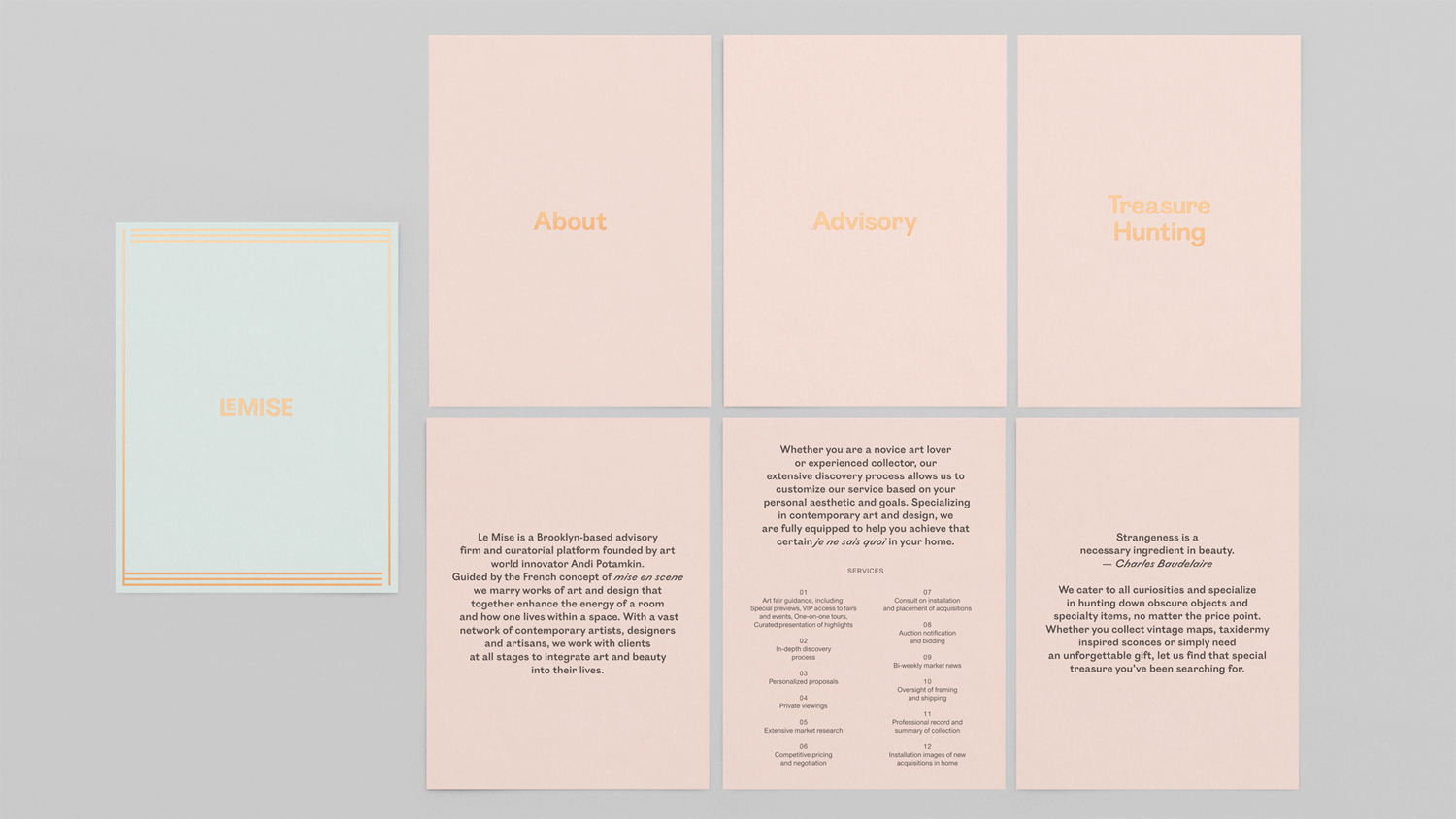
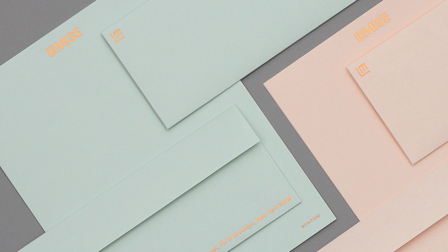
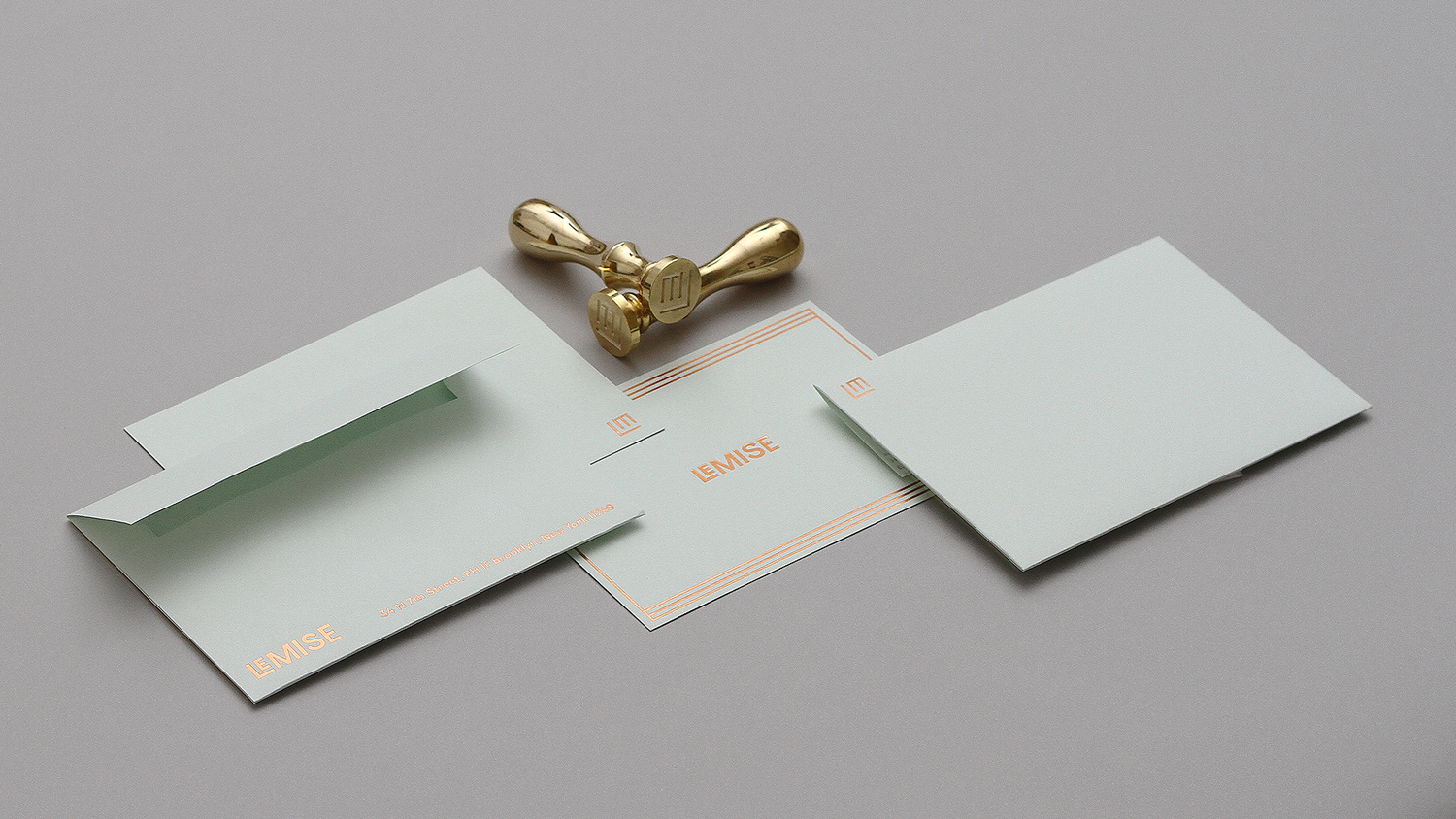
New York graphic design studio DIA worked with Andi to develop a visual identity for LeMise. This embodies Andi’s personality and eclectic taste, and expressed through characterful type, a warm and current colour palette of pastels and copper, a monogram and framing device across business cards, stationery and website.
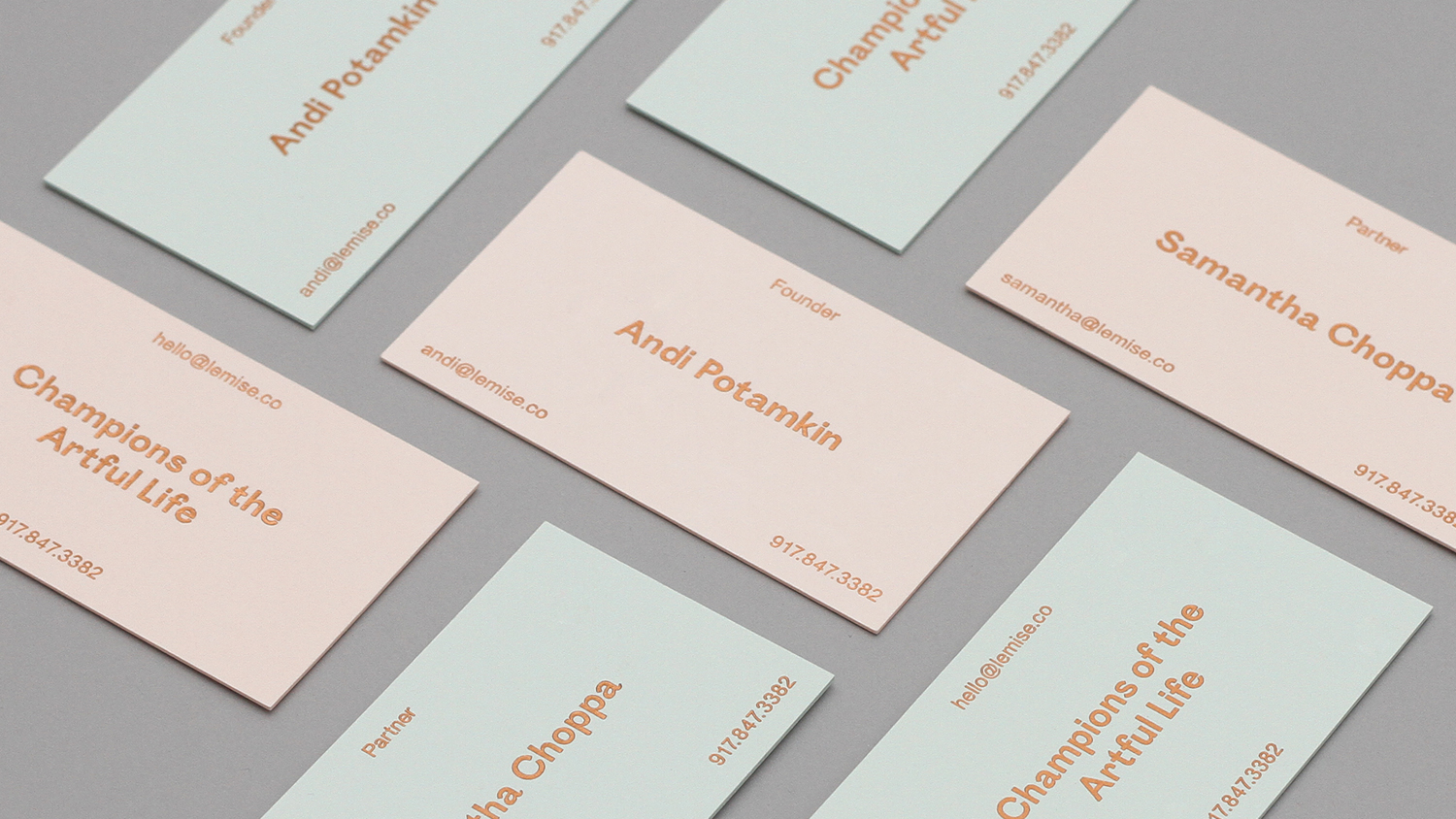
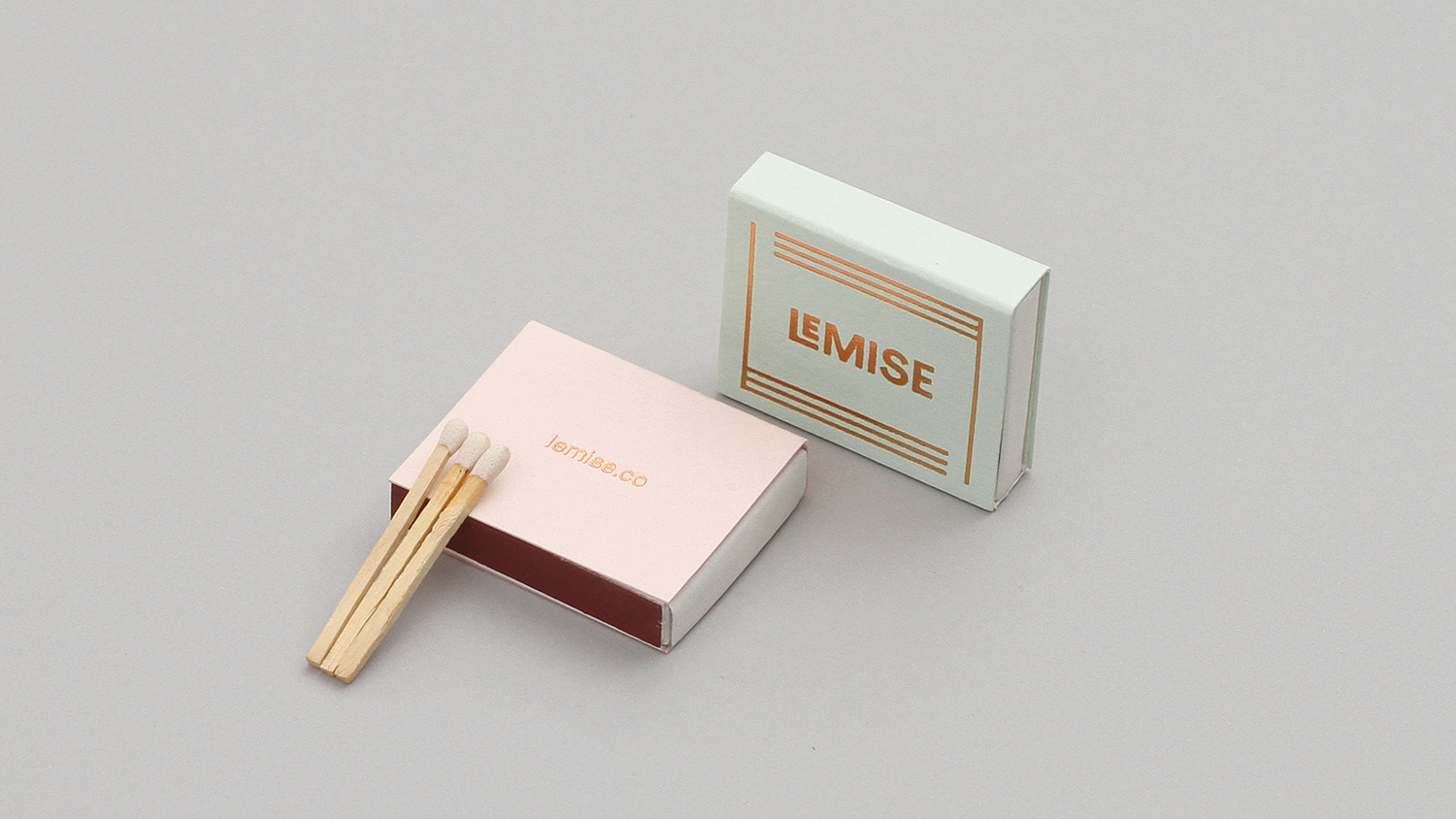
Within the context of a business that talks about space and the concept of mise-en-scene, and involved more literally in the framing of artwork and environment, the use of borders, be that through text (above) or lines (below) to link various assets, while perhaps a little on-trend in many other situations, finds a comfortable balance between appearing current, visually interesting and grounded in a relevant communicative intention.
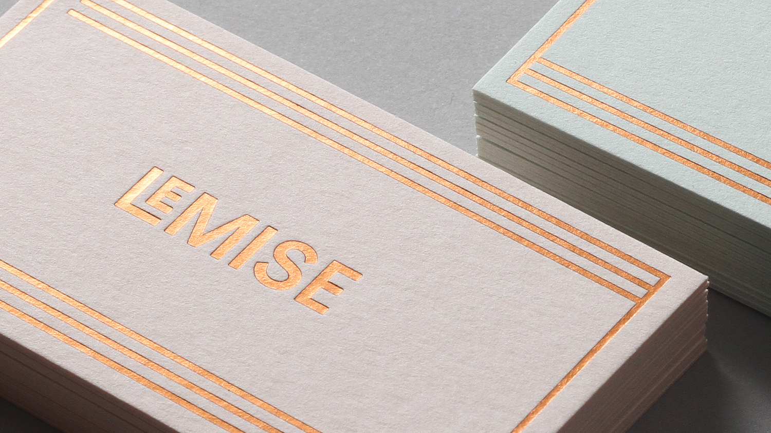
Femininity, artfulness and high-quality are effectively, if a little obviously, touched upon through a pastel colour palette and copper foil print finish, which also plays with modernity and the more classical, and where often you see a lightness and fine detail, or an international-style neutrality, type choice and line weight appear robust, individual and quirky in places.
The logotype is well-spaced and benefits from some letter shapes that naturally coalesce. The LE functions well to define the two components of the name, secure some further distinction, and ties in well with a simple LM logo and framing device. While simple in its rendering, as a monogram, the logo is grounded in the makers marks of the past.
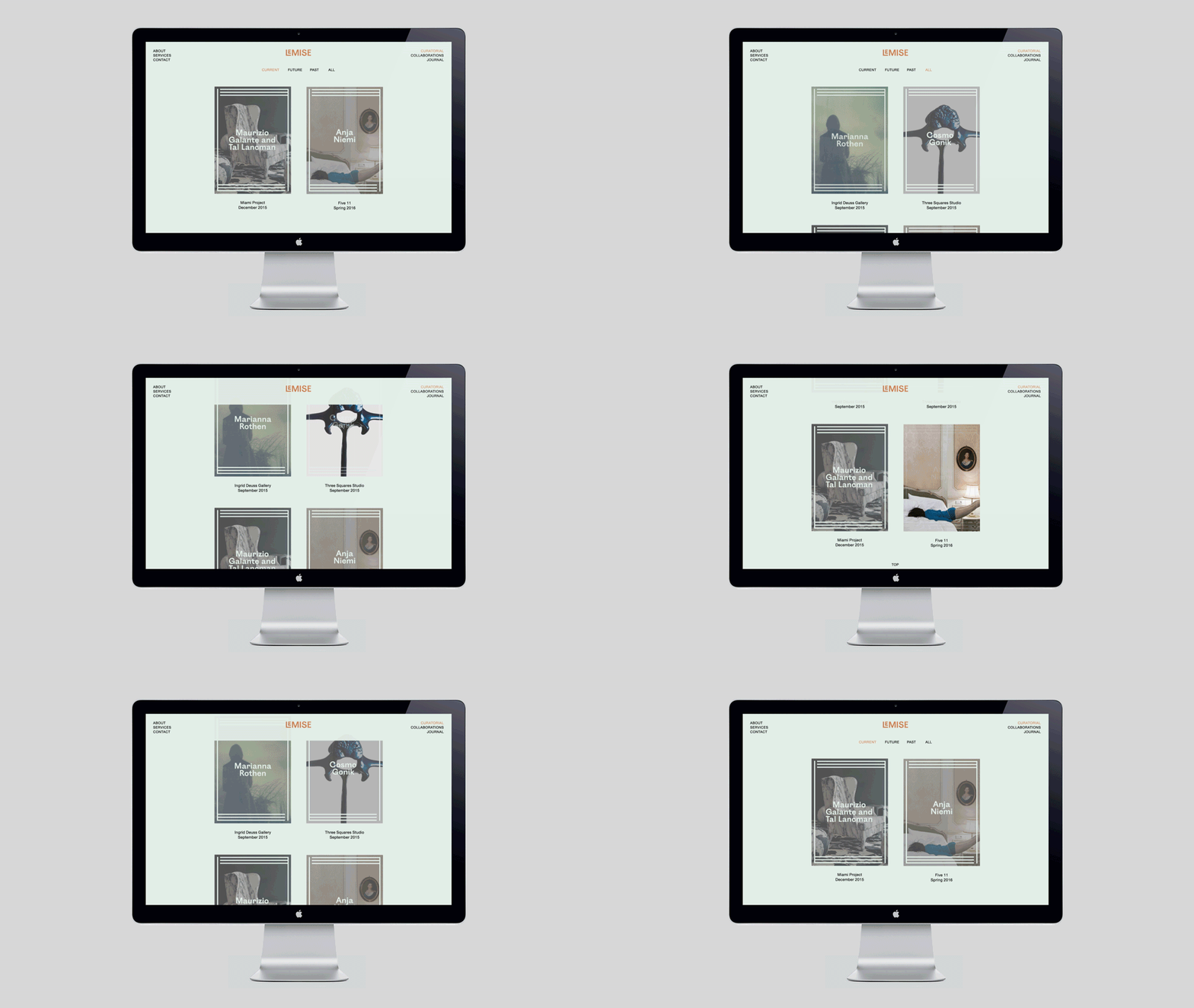
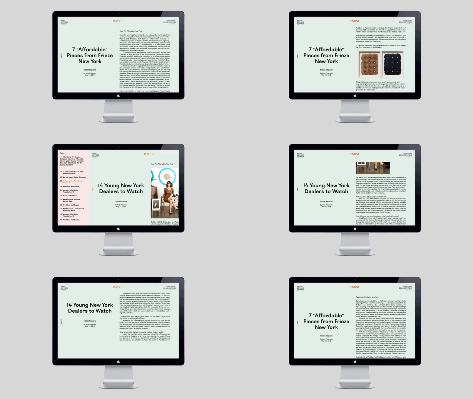
There is a strong and pleasant continuity between brand identity as expressed in print and digital experience. Although this appears not to have been fully launched, the documentation above suggest that the site adds detail and insight.
Much like the choice of type and colour of the stationery and print communication, website subverts a little of the visual vernacular and conventions of the industry, avoiding neutrality or the overly stuffy, in favour of a little more warmth and character, and a modernity in functionality, layout and type proportion. It borrows a little from slow-lifestyle and fashion, lending it a current, youthful and accessible quality well-suited to a business establishing itself as a leading voice for a new generation curators, collectors and gallerists. More from DIA on BP&O.
Design: DIA. Opinion: Richard Baird. Fonts Used: Ostia & Union.
