Madrina by Mast
Opinion by Richard Baird Posted 6 April 2016

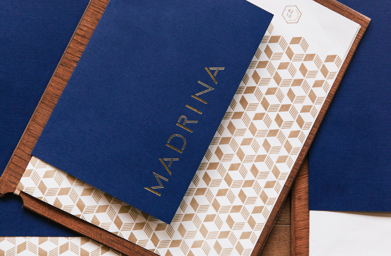
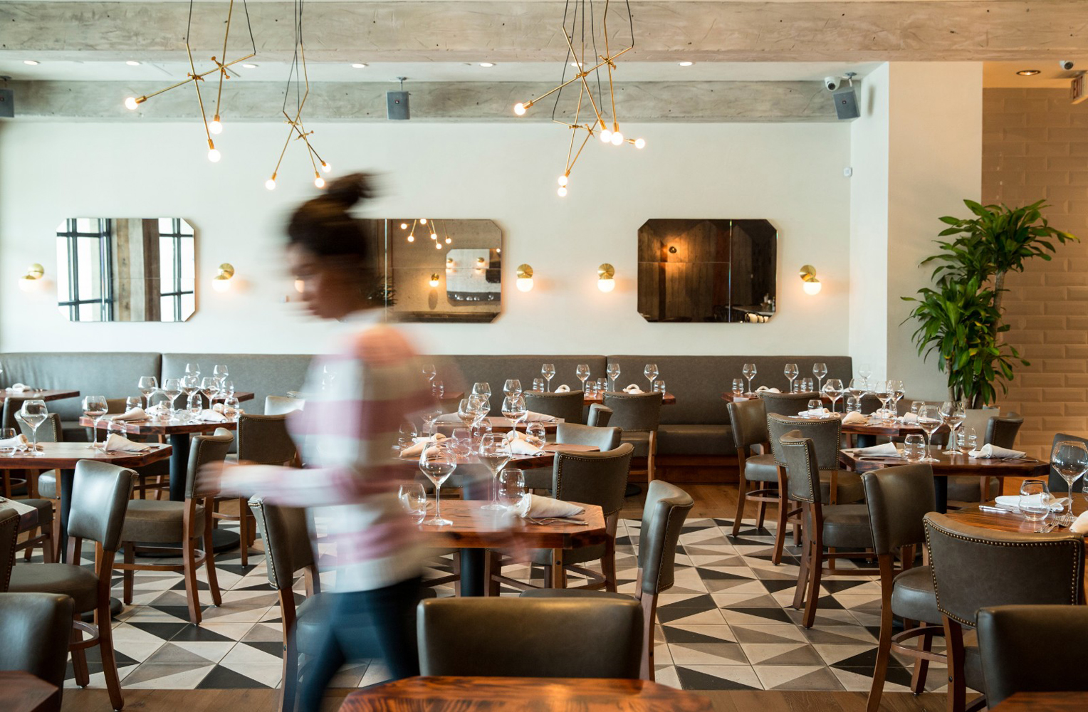
Madrina is a Dallas based Mexican restaurant with a menu that plays with French culinary influences and Mexican tradition. The restaurant has a distinctive interior of exposed concrete beams, delicate gold light fixtures, leather upholstered chairs, beveled mirrors and tiled flooring. Like the menu, the interior is a fusion of influences, yet remains cohesive and distinctive. American graphic design studio Mast set out to create a brand identity that would align with this unique combination of cultures and would link in with interior detail. This extended across business cards, menus and signage.
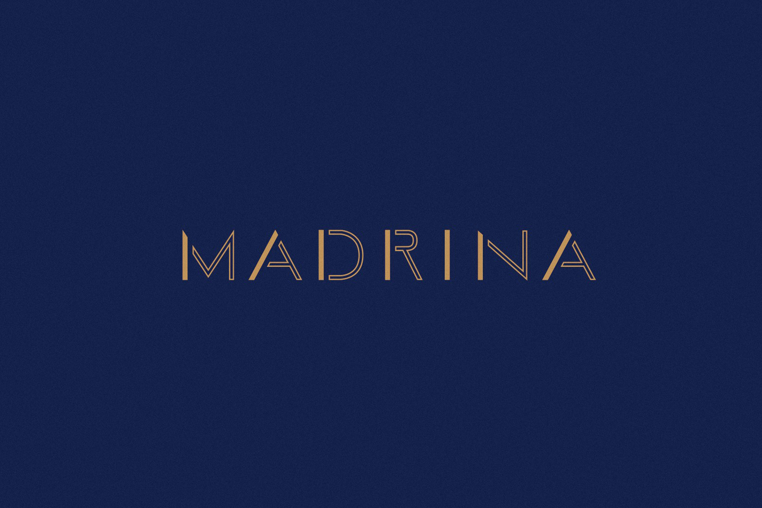
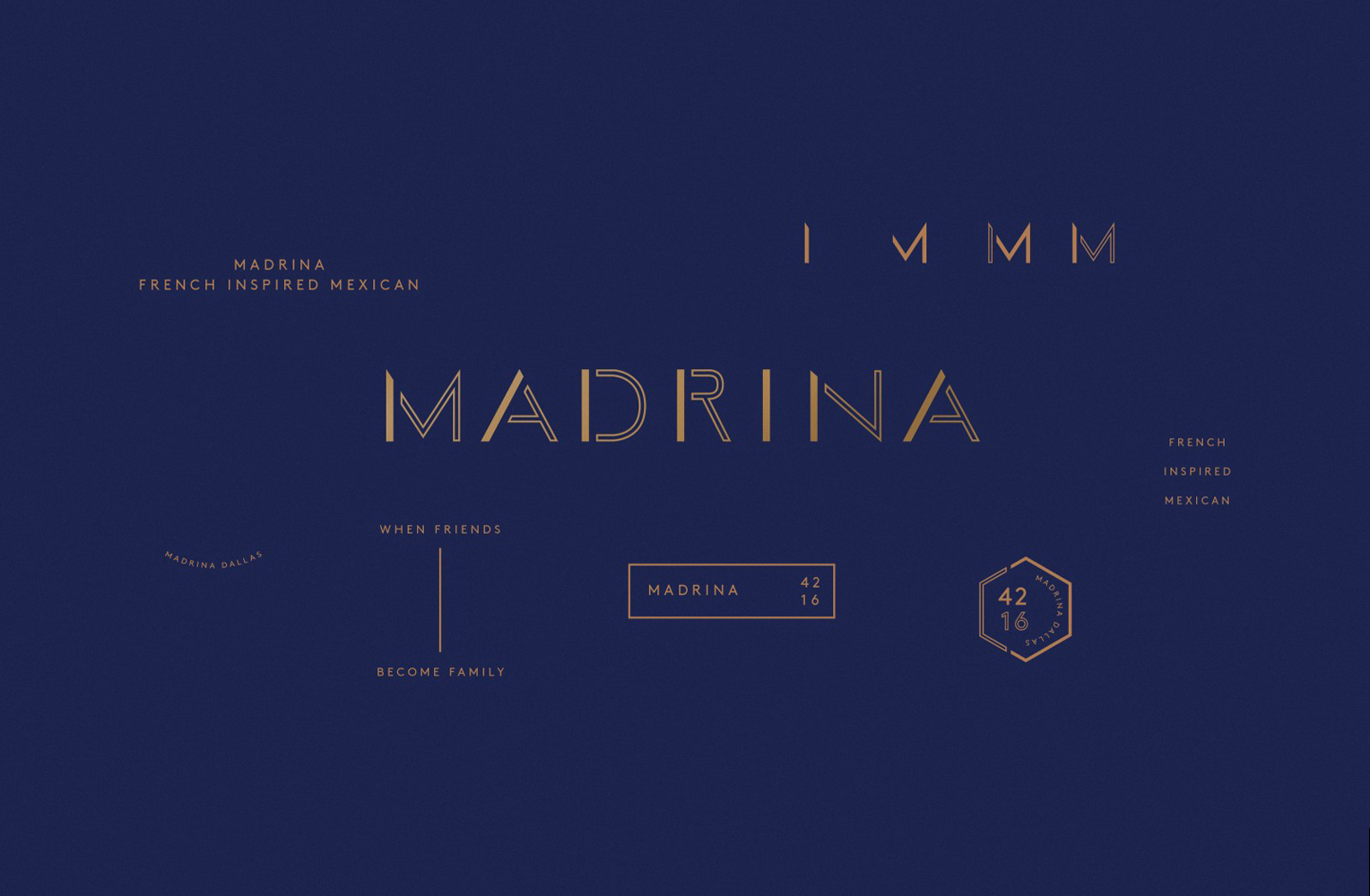
Mast’s approach is conceptually straightforward but aesthetically nuanced, avoiding an uncomfortable mash-up of references. The logotype plays with duality, albeit rather subtly, in the mix of inline and solid letterform and, alongside a rather unusual R, appears distinctive and largely well-balanced regardless of some difficult letter combinations.
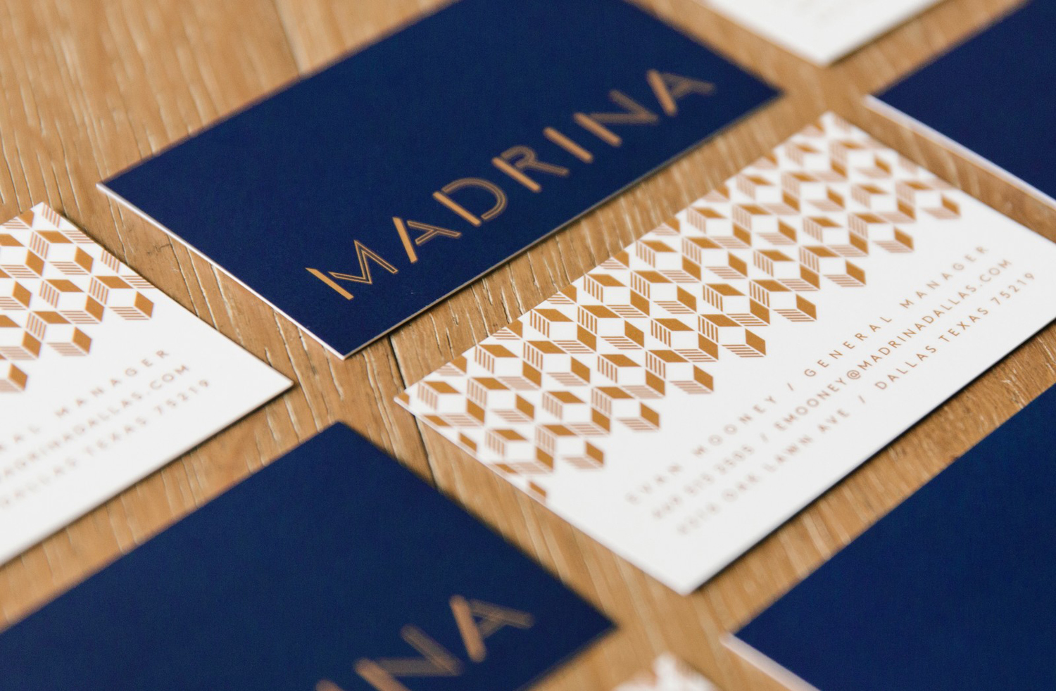
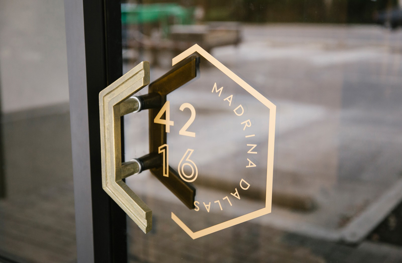
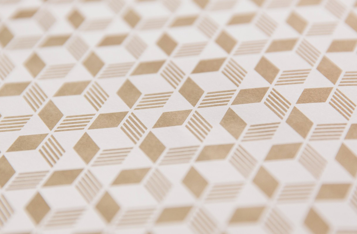
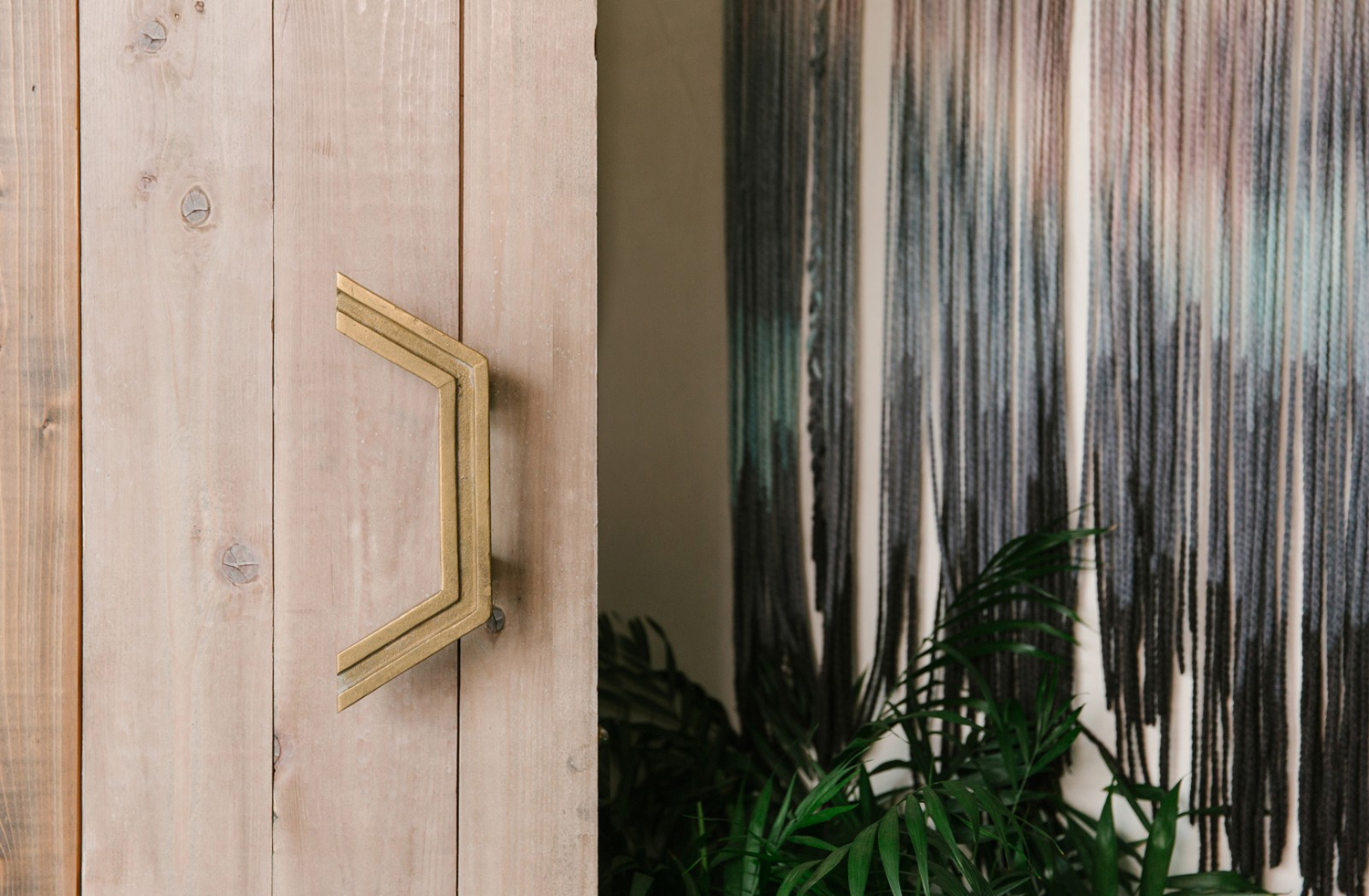
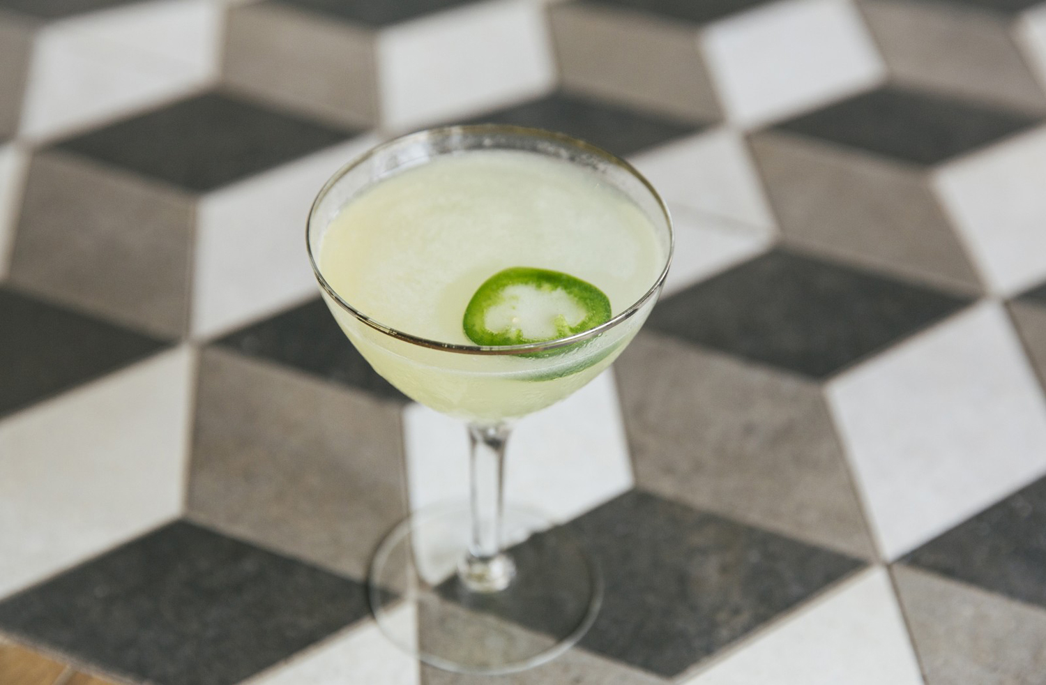
There is a pleasant continuity between identity and interior design, particularly in the use of pattern. Highlights include gold light fixtures and gold print finish, wooden surfaces and wooden menu backs, the texture of papers and tables, the European qualities of a geometric sans-serif and the period style of furnishings. This also extends to the use of hexagons. These link logo and signage—a neat feature that directly connects identity and space—with bar surfaces, but there is plenty of variation in colour and material to keep a simple shape interesting and avoiding repetition.
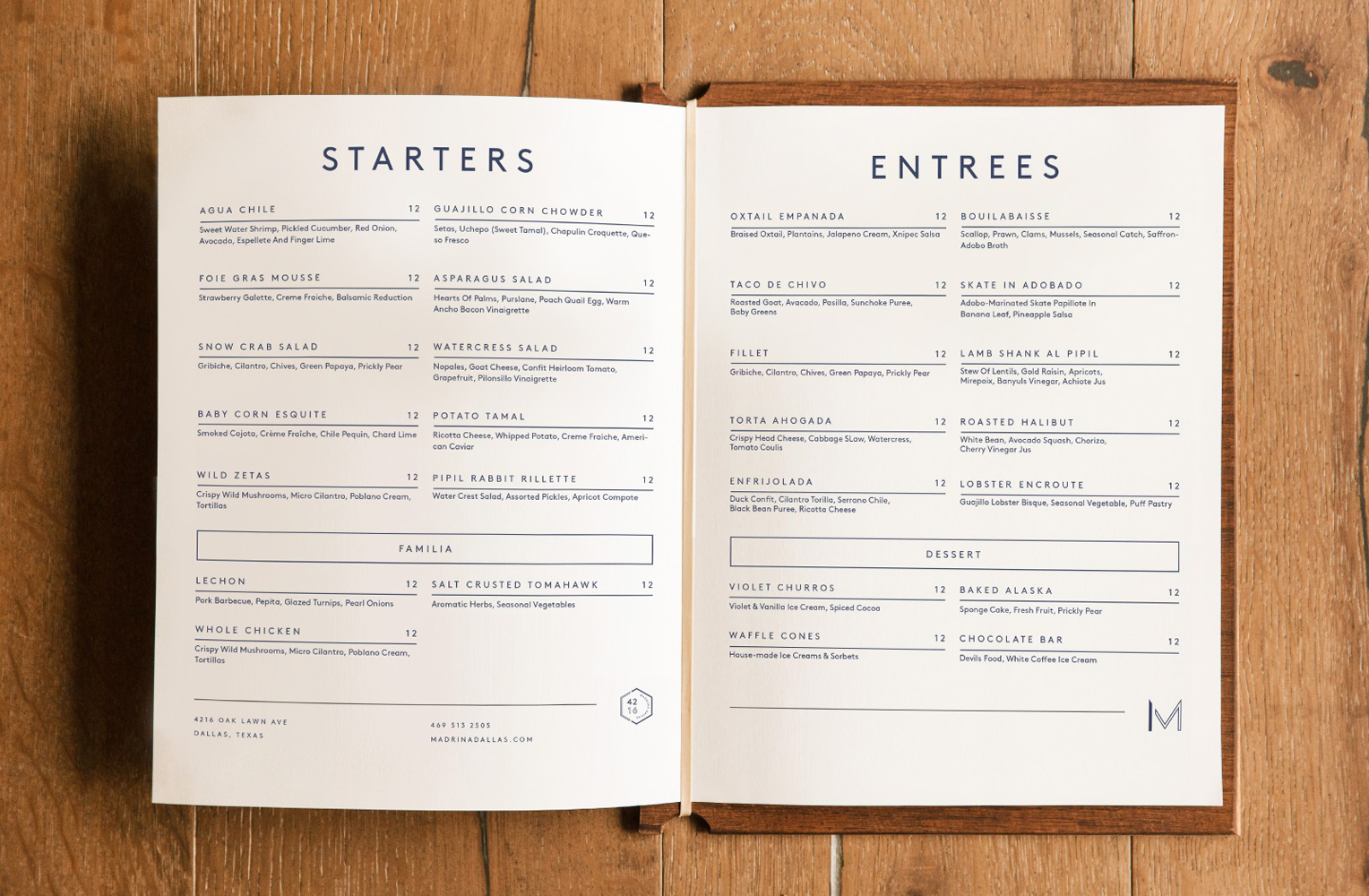
Uncoated dyed blue boards in conjunction with white papers, glossy print finish, some clear typesetting, layout and good font choice across menus provides moments of space, manages to punctuate interior whilst referencing it, and has a general sense of good quality. Overall, identity leans far more towards the restaurant’s French inspirations rather Mexican tradition, but the abundance of wood and tiles tempers this, and together clearly emphasises its point of difference. More from Mast on BP&O.
Design: Mast. Opinion: Richard Baird. Fonts Used: Brown.
