Hedeker Wealth & Law by Socio Design
Opinion by Richard Baird Posted 1 June 2016

Hedeker Wealth and Law is an American independent business group dedicated to helping people protect, preserve and grow their wealth through services based around four key areas of expertise—investment, management, financial planning and tax advice. This complete and holistic combination marks Hedeker out from what is a crowded market of individual businesses providing fewer services.
To better express their experience and breadth of service, and to help reposition the group in a way that would attract more affluent clients, Hedeker worked with London-based studio Socio Design to create a new brand identity. This included logo and logotype design, stationery, business cards, quarterly newspaper and website.
The logo’s tapestry of lines, loops and intersections, informed by the integration of four key areas of expertise, feels well-founded and functions as a compact shorthand for the name. It is not particularly distinctive, however, its geometric shape, good balance of internal space and consistent line weight clearly plays with the legacy and authority associated with crests and heraldic seals but rendered in a contemporary way. This addresses initial perceptions, with proximity, frequency and quality of service ultimately giving real value to the logo.


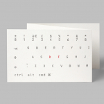
The logotype’s mixed stroke widths and serif detail, within the context of the logo, favours contrast over continuity, and plays up legacy / experience in a fairly familiar, straightforward but effective way. Again, much like the logo, it is not particularly individual, but it is reassuring, professional and legible.

The desire to appeal to the more affluent market is satisfied, if a little conventionally, through the expense and abundance of material detail and print finish. These include uncoated, dyed and metallic substrates, white and copper block foils, light papers and weighty boards. There is a variety but consistency, with a distinction in the combination of colour whilst individual hues are reassuring in their corporate familiatry.
Pattern is a nice touch and a particular highlight, softening those more corporate elements. Like the logo, the shield, a symbol of heritage and authority, is well-founded and given a modern twist. It adds an unexpected visual flourish without undermining the other assets and overall tone, and acknowledges that affluence has a lot less to do with seniority, stuffy stereotypes and unwavering austerity.
There is a pleasant balance between the communicatively universal graphic and typographic elements, and the materially more exclusive. Convention is heavily utilised, but worked together in a convincing, well-designed and thoroughly restrained manner.


Alongside logo, logotype and stationery, Socio Design worked on Capital, Hedeker’s quarterly newspaper dedicated to reviews and summarises of the behaviour of the financial markets from the previous 3 months.

The magazine is a bit of a departure from the restraint of the stationery, yet uses many of the same assets, finishes and preference for good quality and tactile material choices. There are some nice moments of continuity, the dots of the pattern recur in the plotting of graphs, and the traditional qualities of the logotype and a copper block foil becoming a modern stacked detail over black and white images with generous borders.

From the spreads documented by Socio Design, format appears diverse but structured, with bold, modern and playful typographic character drawing out key points, borrowing a lot from broadsheet supplements inside, and slow lifestyle, design and fashion magazines on the out. Like the stationery, the newspaper plays with expense in the quality of stock and is more extensive in its contrast of traditional elements and those of modernity.
There is a younger, more energetic and expressive quality in these choices that adds breadth and an accessible quality to the formal tone of stationery. It does, however, feel a touch disjointed, although it does feel like a fair acknowledgement of wealth and an interest in the markets reaching a younger generation.


There is not a big concept but rather a reflection of simple repositioning, expressed through some familiar but reliable visual tools and techniques. The perceived value of good quality materials and the craft of print finish can easily be undermined by poor execution, but this is not the case here. There is a good use of graphical detail and space, moments of restraint and bold character. Choices are underpinned by some straightforward, appropriate and clear intentions, with professionalism, experience, legacy and modernity, as well as new and old money, financial seriousness and accessibility all touched upon and largely well-balanced. More from Socio Design on BP&O.
Design: Socio Design. Opinion: Richard Baird. Fonts Used: Plantin, Johnston & Rhode Condensed.