Giant by Also Design
Opinion by Richard Baird Posted 14 July 2016

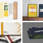
Giant is a restaurant on Chicago’s Armitage Avenue with a menu of what is described as unpretentious Midwestern food. It is a small and intimate space with a contemporary and utilitarian interior of solid wood tables, simple chairs, brick and wood panelled walls, and chipboard skirting. Giant’s brand identity, designed by Also and extending across business cards, website, signage and menus, is an articulation of the the restaurant’s tongue-in-cheek name and plays against its modest interior space through type, typesetting and image.
Also’s concept for Giant, which plays against intimate experience, itself is an unusual idea, is expressed in a variety of ways. In type this comes through in the spacing and expanding qualities of logotype, its condensed uppercase characters and the way that these characters are then implemented, at size, in print. Across business cards, concept is conveyed through some lovely images of giant redwoods, large mountains, and vast open spaces. Menus, signage and a single page website effectively utilise proportion as a way to set a sense of scale, while typesetting does this through a contrast in size and weight, reduction and detail, stacking and cropping.


There is a disjointed quality in the use of earthy illustration and photography of the outdoors, and the more reductive, bright and impactful qualities of menus. However, type shape and texture (drawn from a font family based on woodtype), the use of wood and geometric form throughout the interior, and the approach to social media (below) goes some way to resolving these, giving Giant’s brand identity depth and visual variety. This is linked by an understandable concept within context and delivers distinction and impact outside.


Other neat design decisions include the menus, which are printed directly from the website so that these only need updating in one place, the changing background letters of the website, a quality that introduces a little variety to what is a single page, and the way service and interior is worked in through the more personable qualities of Latin Modern Italic, and the utility of Latin Modern, alongside the big personality of Mader.
Design: Also. Opinion: Richard Baird. Fonts Used: Latin Modern & Mader.