Smithey Ironware Company by Stitch
Opinion by Richard Baird Posted 22 July 2016
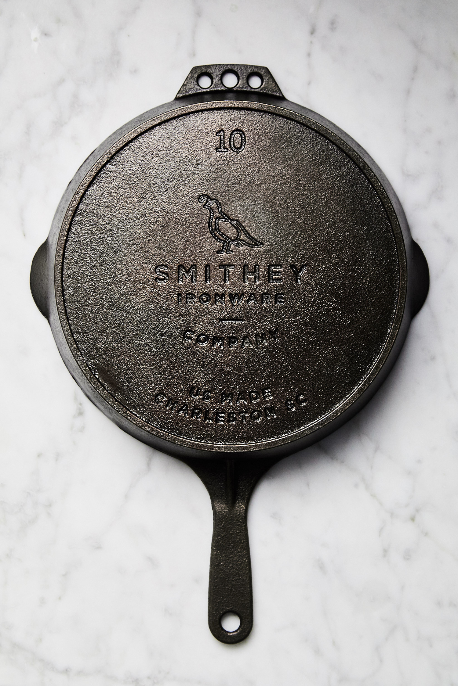
Smithey is an ironworks producing kitchenware from its location in Charleston, South Carolina. Smithey’s first product, a 10 inch skillet, features a smooth, non-stick cooking surface, created using a handcrafted method of finishing and polishing. This process was developed in response to the rough, coarse and sandpaper-like finish that proliferates the ironware market, which creates an uneven surface temperature, makes it difficult to cook with and uses a lot of energy.
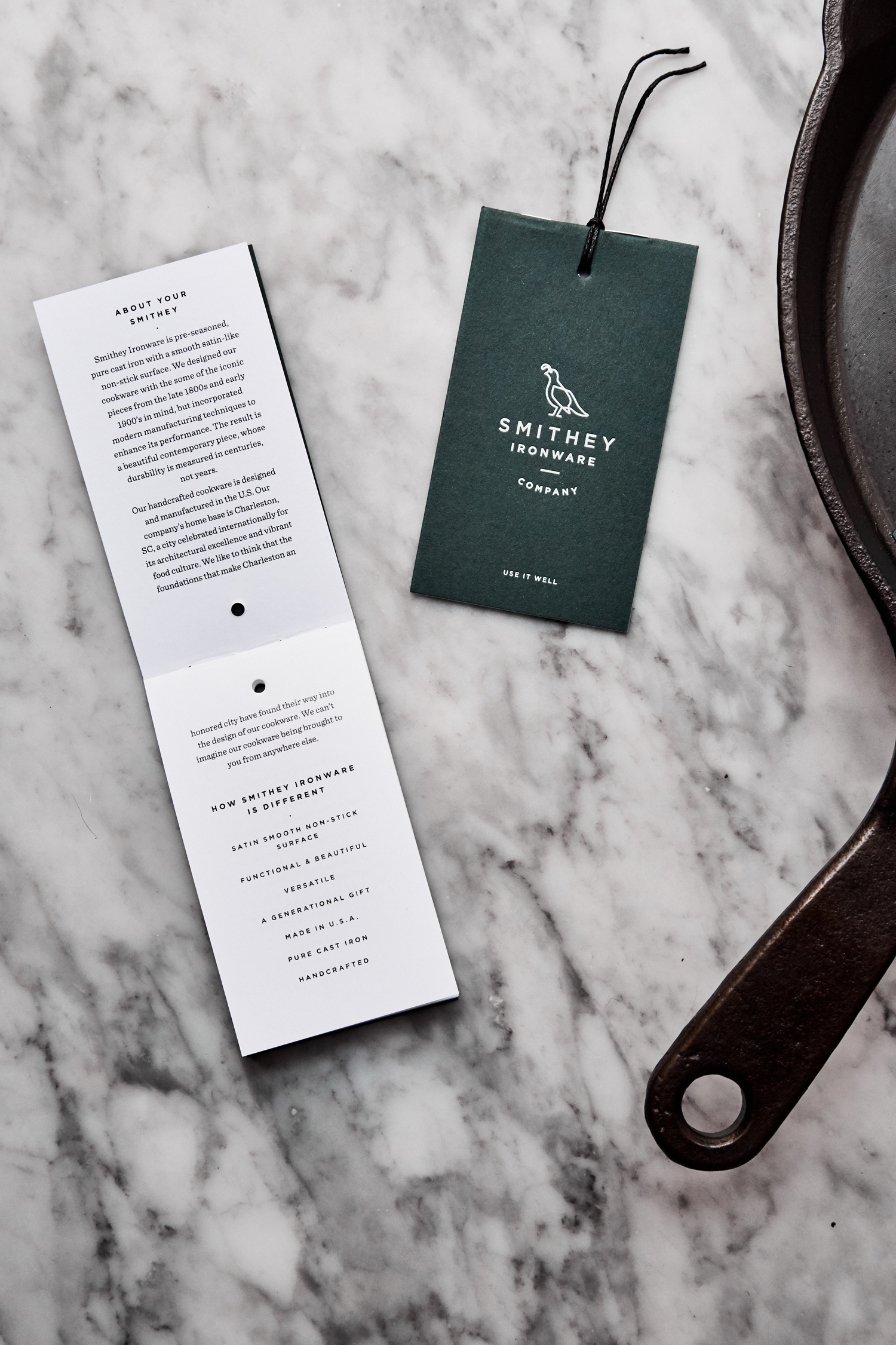
Stitch Design Company, also based in Charleston, worked with Smithey to develop a visual identity that would extend across website, print communication and tags. Much of this is informed by the robust and crafted qualities of Smithey’s products, but also builds in a touch of character. This is expressed through type, materiality and motif.
Gotham lacks the character or nuance you might expect from a brand with uniquely handcrafted process, it does, however, have something in common with the hardwearing, robust and utilitarian qualities of iron, is absent the finer details likely to get lost when cast as part of a pan, and is well-typeset across both flat and curved baselines.
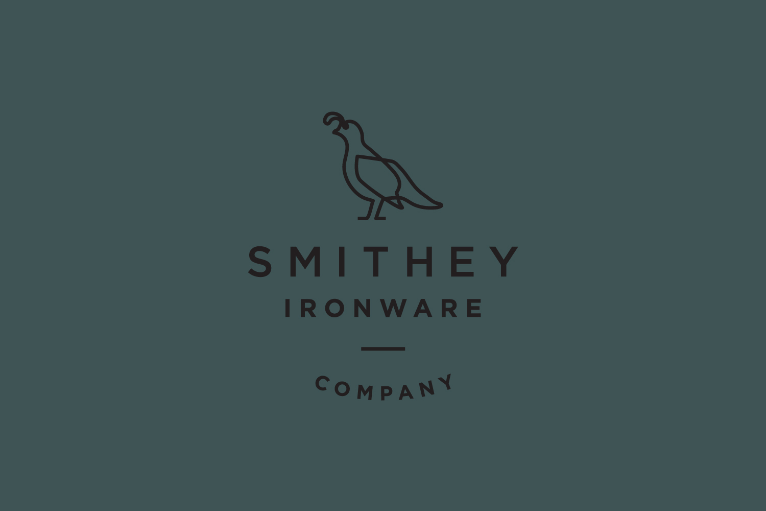
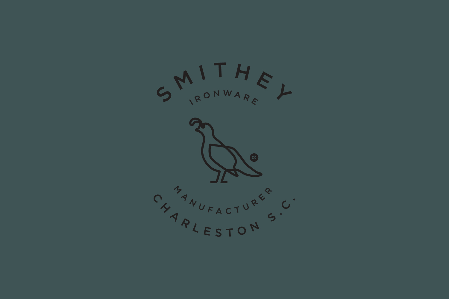
The bird works well to introduce character, and is grounded in a bit of brand storytelling outlining Smithey founder Isaac Morton’s years spent in Northern California and trips hunting before returning to his roots in the Carolinas. It is a motif in opposition to the robust and heavy, but as a game bird, based on the California Quail, it speaks to the finish of the pan and the way it delivers a more controlled cooking experience, and a way to honour good produce.
Type and mark find that balance between the longevity of iron and the way Smithey has managed to refine it, a sense of utility and individual brand character. Together these are nicely weighted, translating well onto the pan, with a continuity in the use of space, and an overall balance across various lock-ups. Although these lock-ups play to a sense of heritage and skills acquired over a long period, the monolinear qualities of the logo appears current.
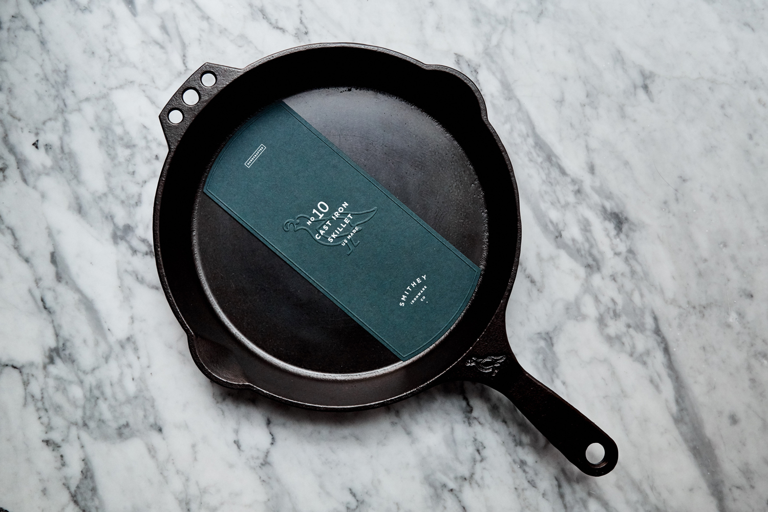

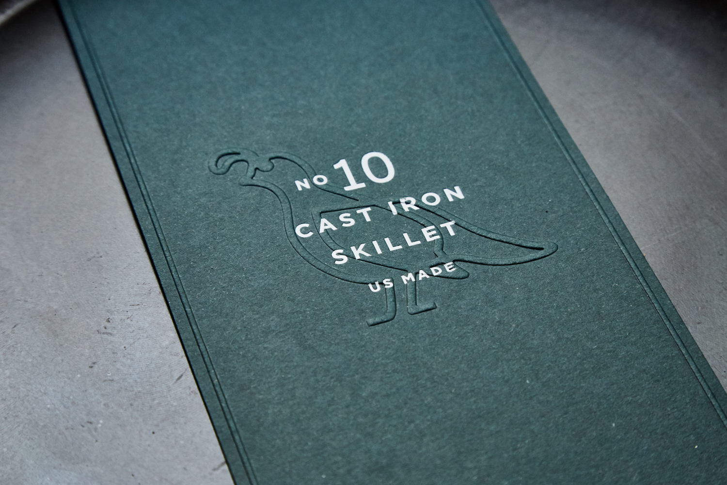
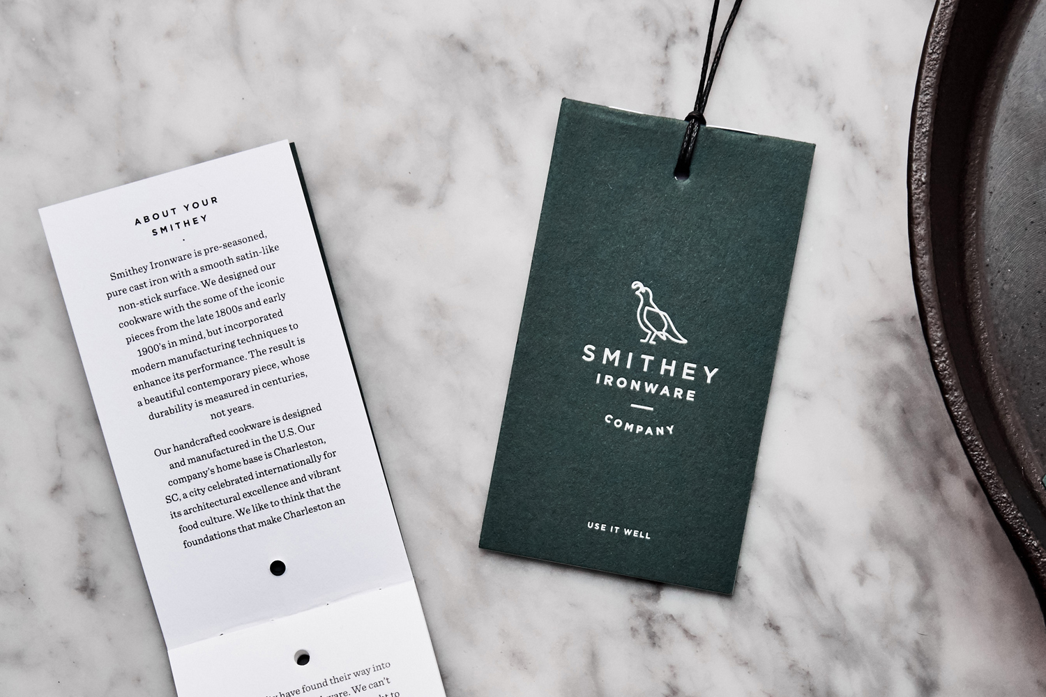
The material qualities of Smithey’s pans makes its way into identity through uncoated dyed papers and boards and the tactile qualities of a blind emboss. These link labels and tags. The colour palette, a pleasant green with white ink, could easily be attributed to the green credentials of the pan, its distribution of heat and the use of less energy, as well as its longevity and generational hand-me-down value, however, it is probably really just there to look great and distinguish, which it does.
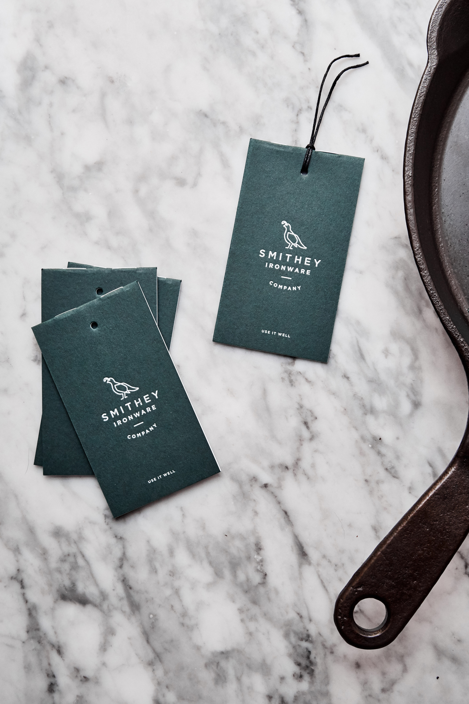
Hoefler & Co’s Sentinel provides contrast to the consistent lines of Gotham, adds a subtle heritage and generational component much like the lock-ups of logo, which works well for the storytelling element. Label hierarchy is simple and clear, in structure and use of type. This also plays out in a similar way online, but alongside compelling image and further brand insight brought together by a contemporary build.
Design: Stitch Design Co. Opinion: Richard Baird. Fonts Used: Gotham & Sentinel.
