David Rowland by ico Design
Opinion by Richard Baird Posted 11 August 2016
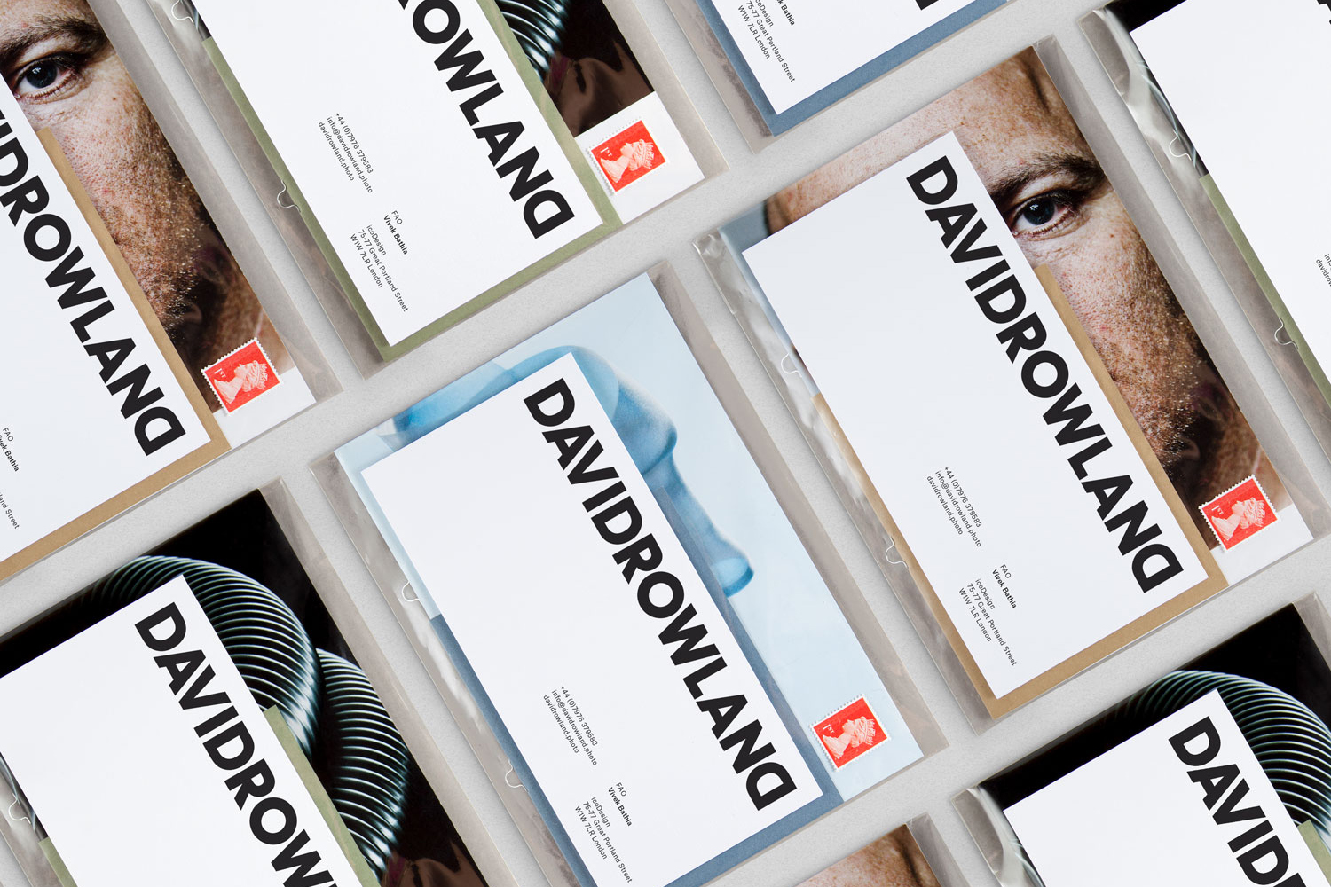
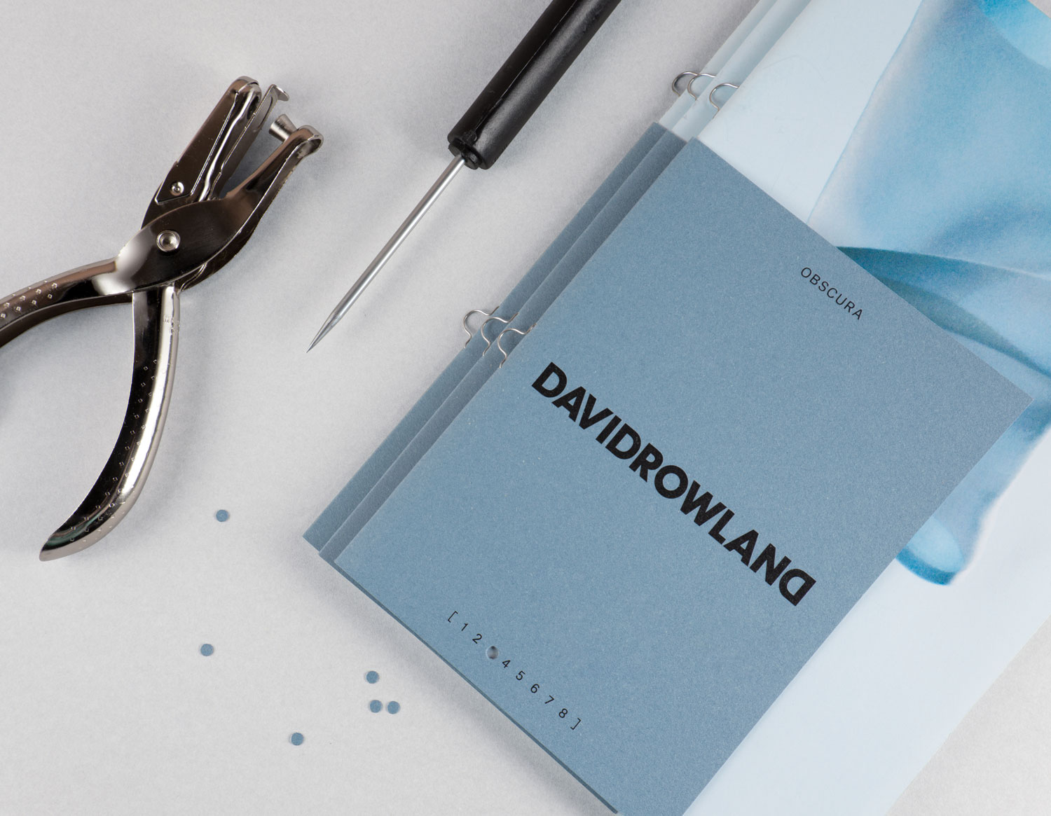
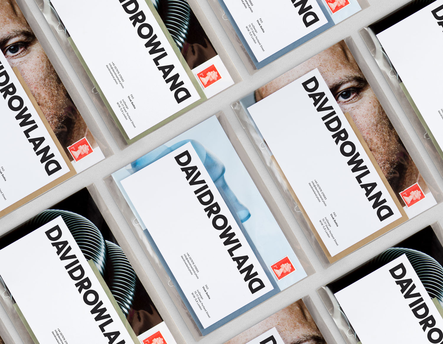
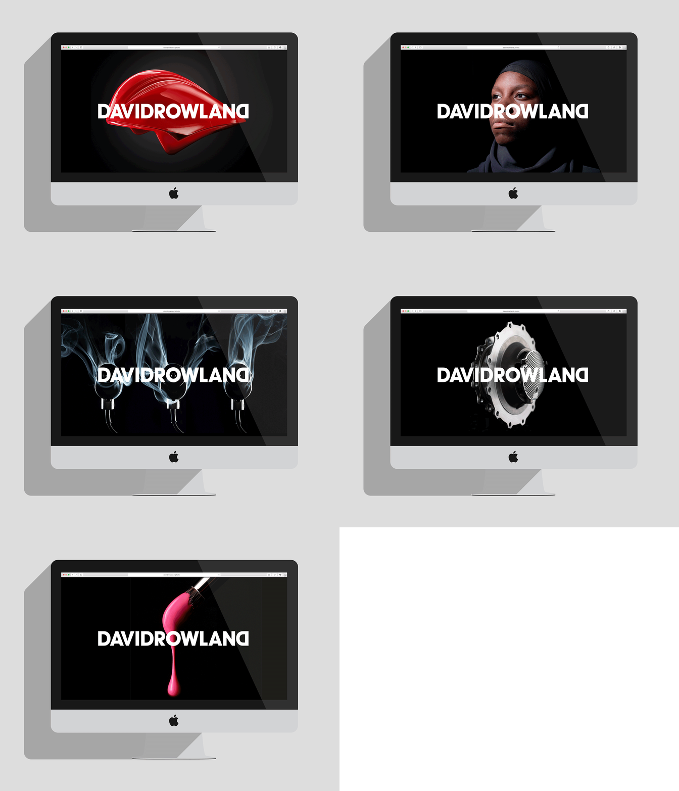
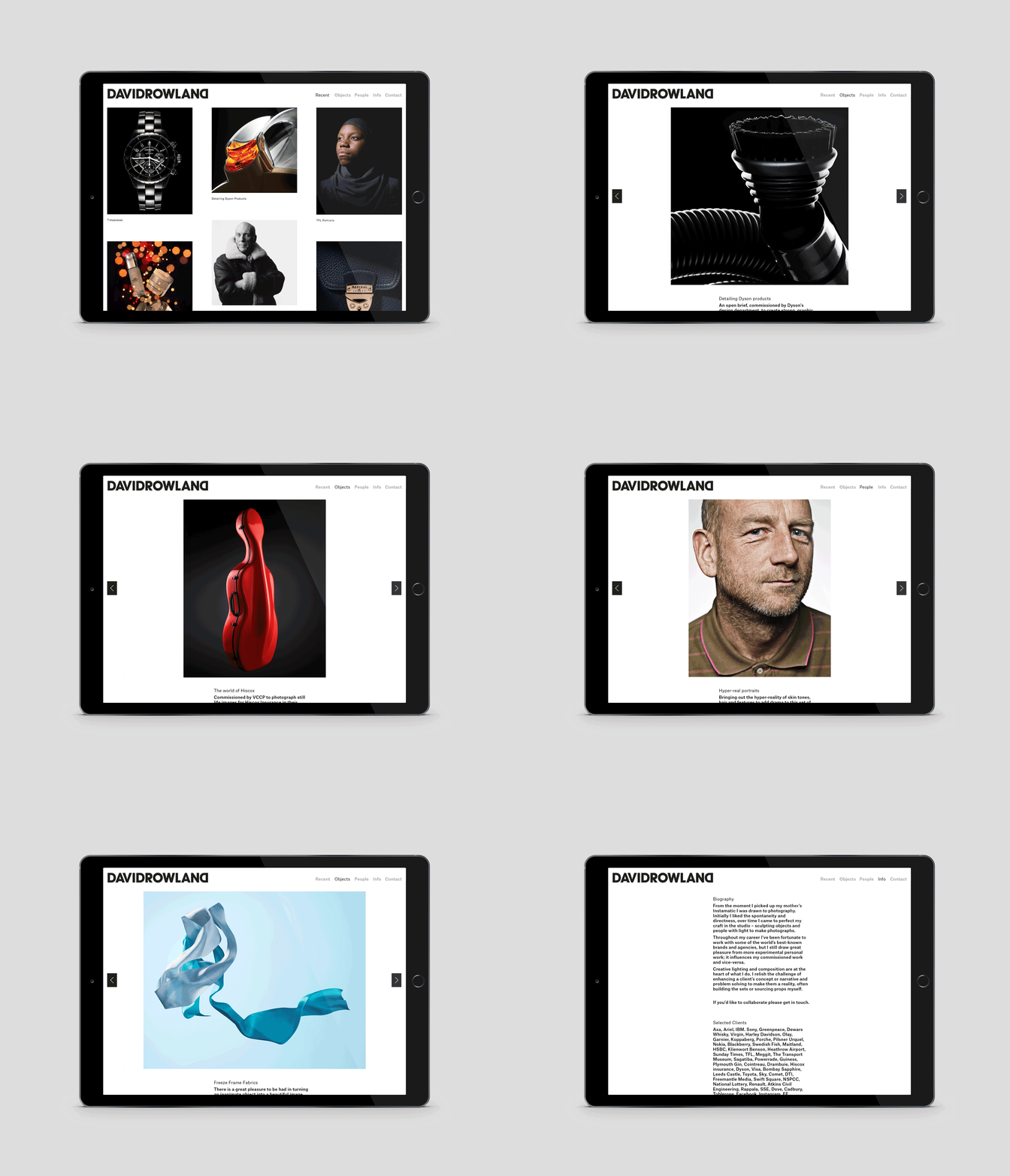
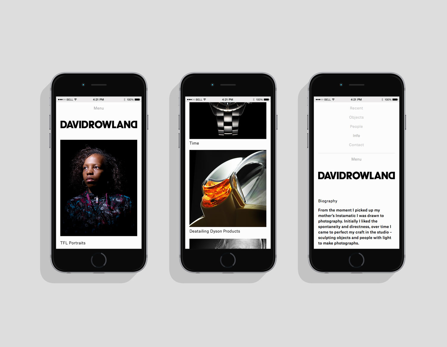
David Rowland is an award-winning and straight-talking London-based photographer who has been capturing images for leading brands and agencies for over two decades. With a desire to remind existing and potential clients of his expertise and technical know-how David worked with graphic design studio and client ico Design to develop a new brand identity and supporting collateral. This included, alongside a new logotype, business card, stationery, lookbook/mailer design and website.
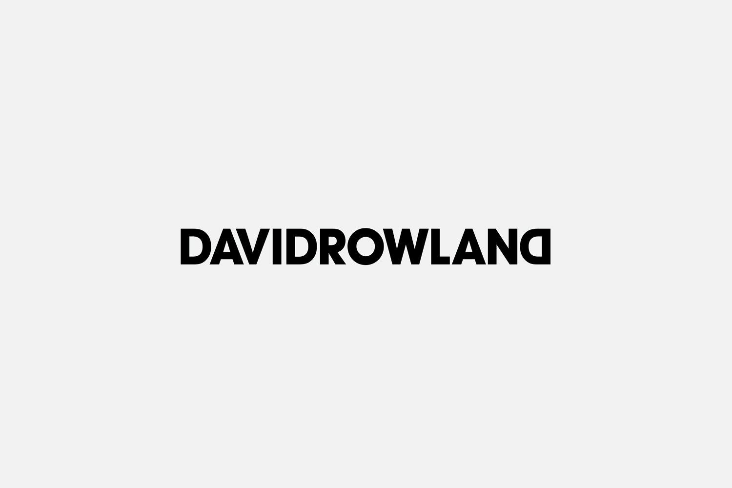
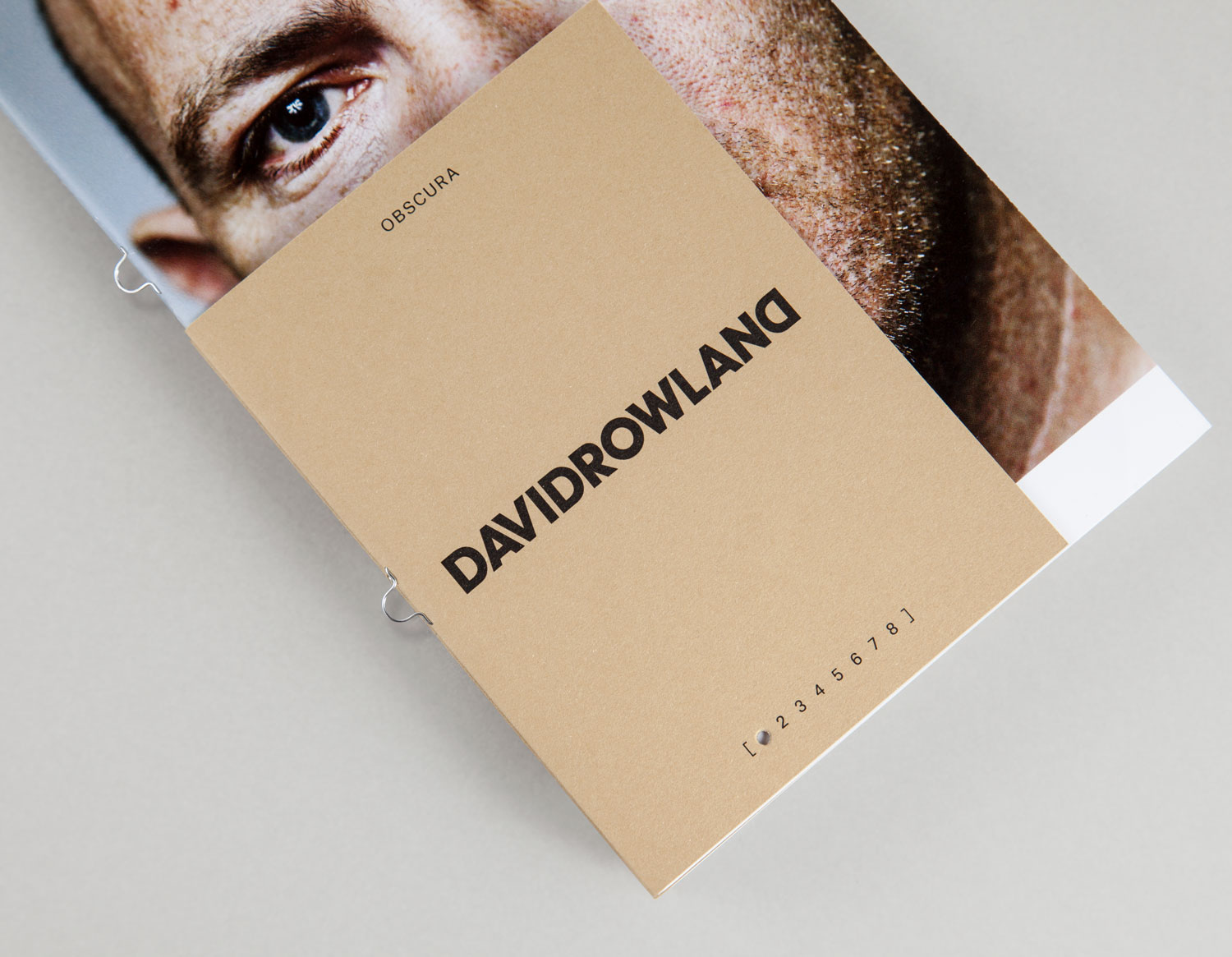
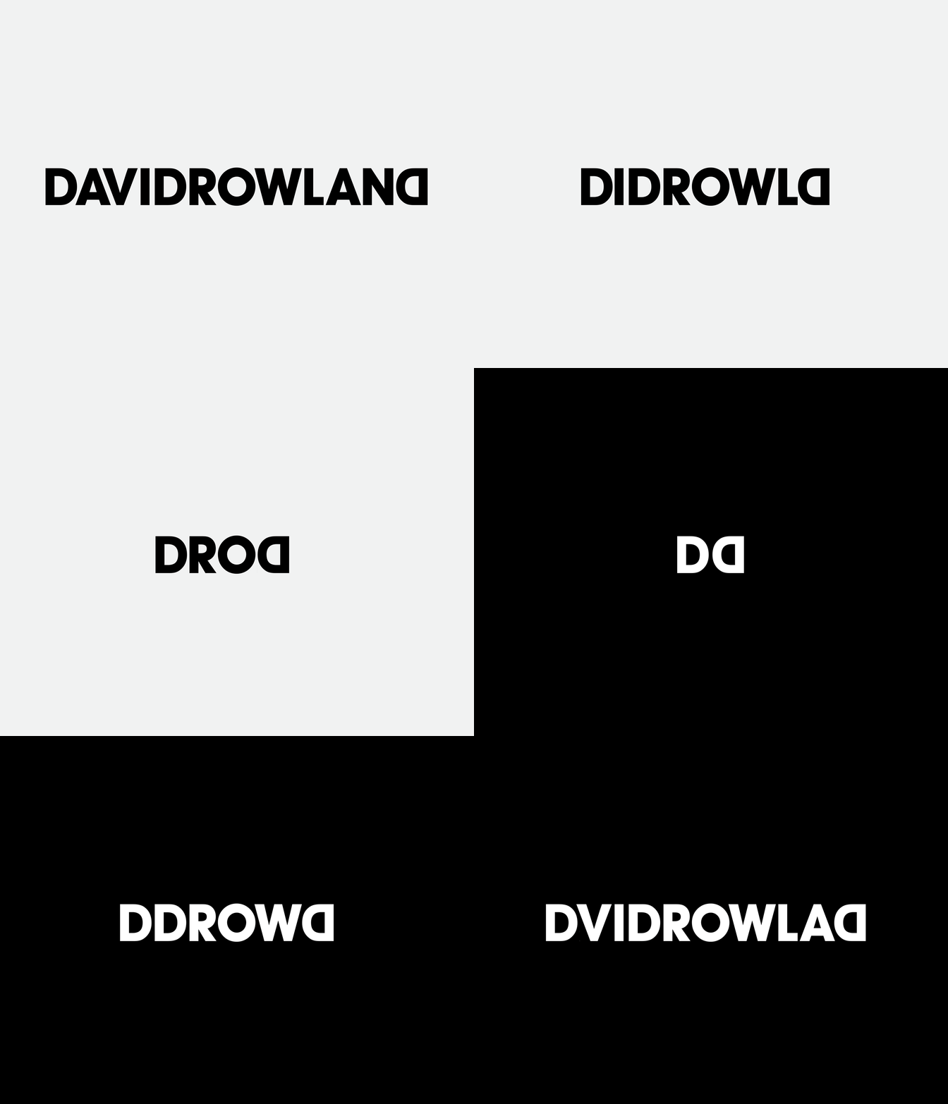
Although mirrored letters are a bit of a bugbear, often an awkward, unjustified and quick way to add character, the double D here works incredibly well to frame logotype and draw the eye towards the middle, emphasising the O at the centre, making the most of happenstance and appearing as something approximating a camera lens. ico Design describe the mirrored Ds as being an expression of David’s mastery and manipulation of light. It is subtle but brings distinction to some basic but weighty character shapes, clearly informed by the straight-talking approach David takes to his work. This is further articulated in its oversized implementation in print and online.
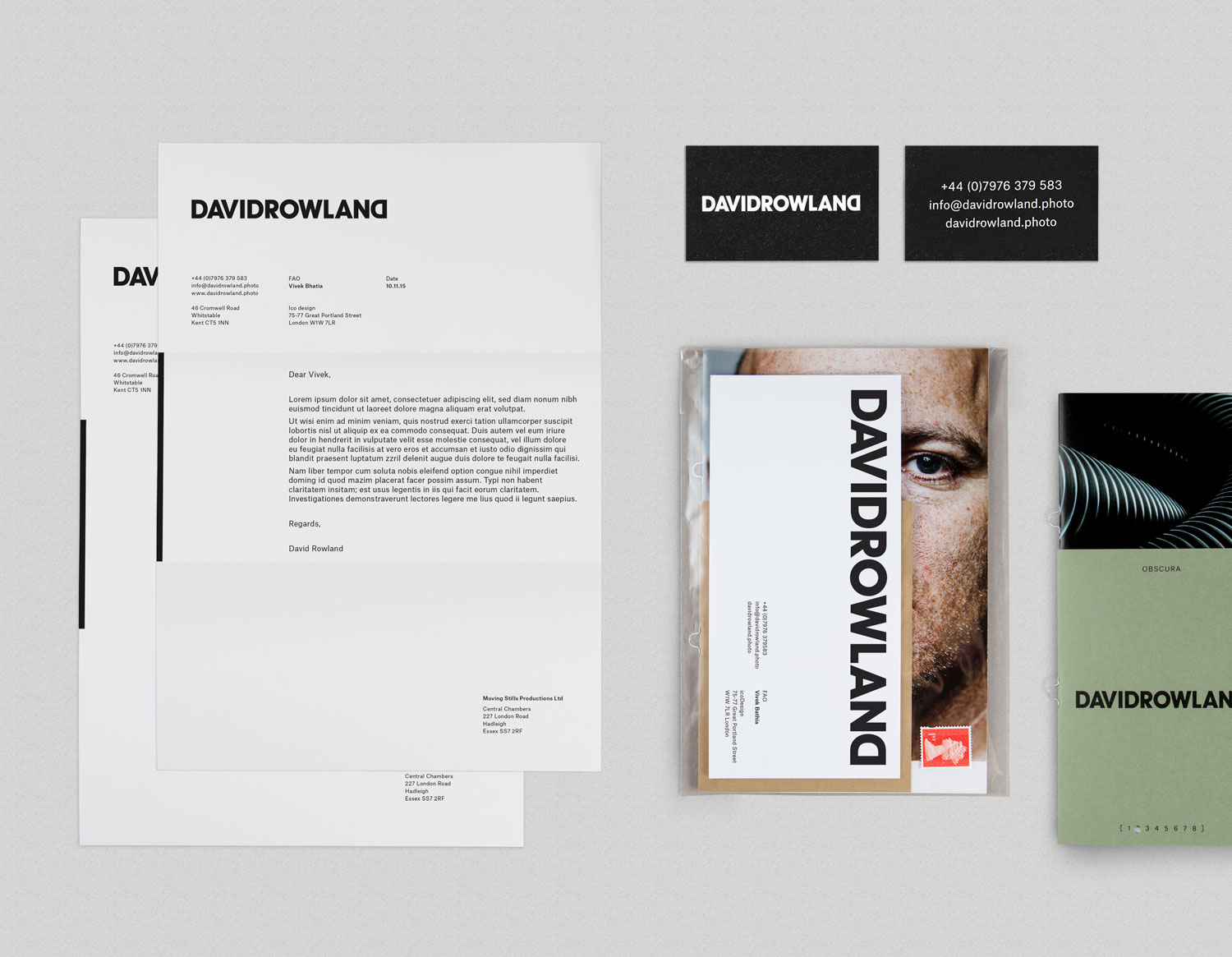
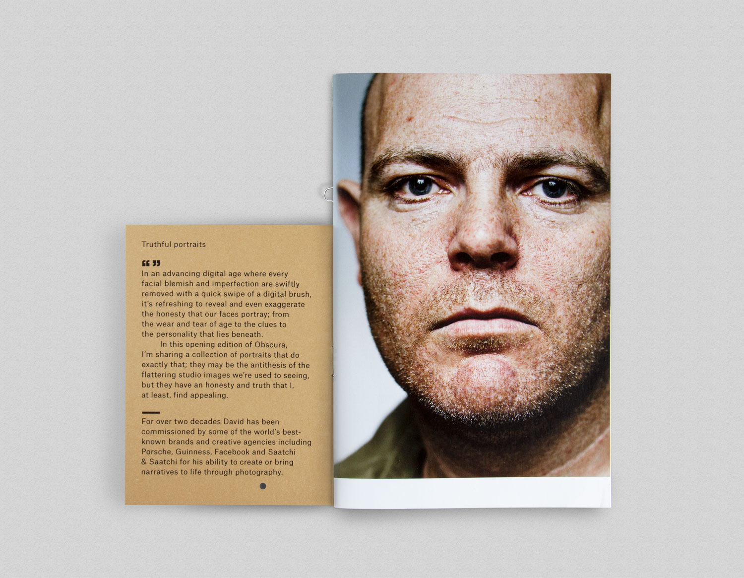
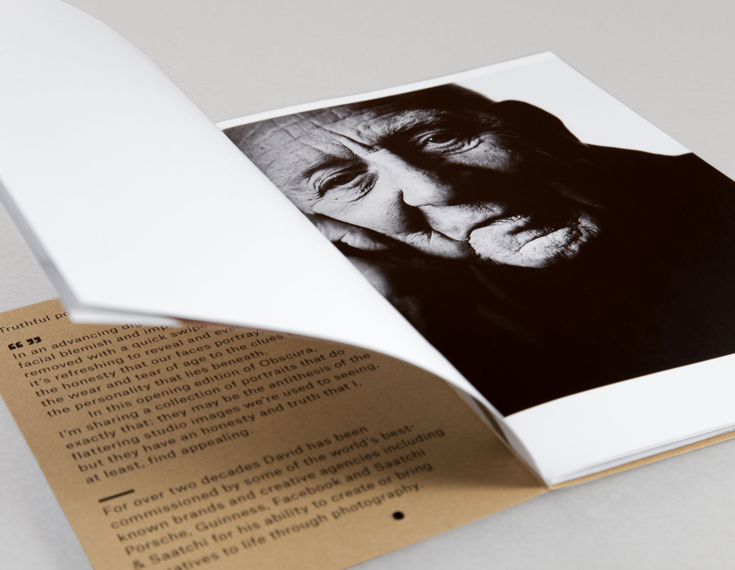
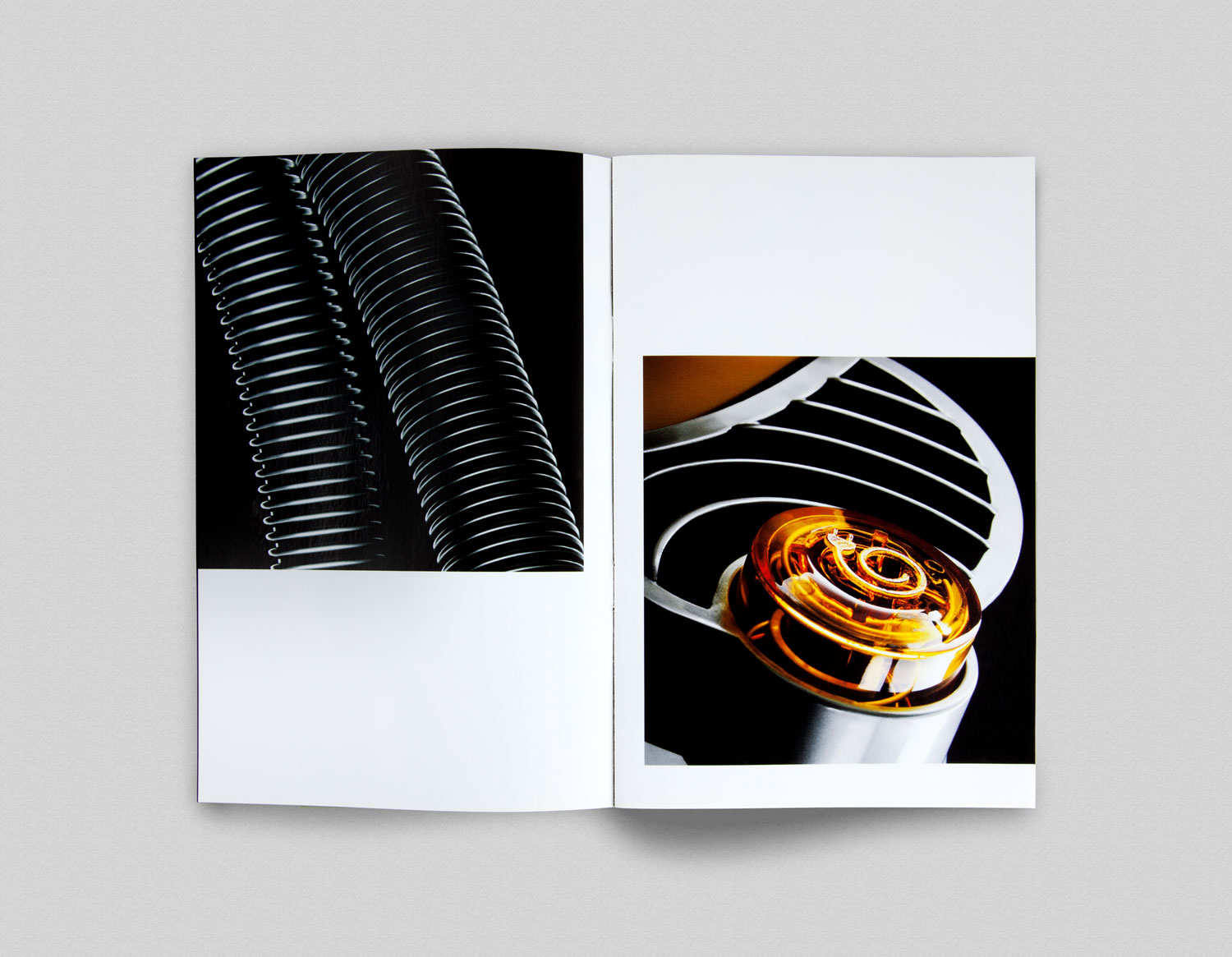
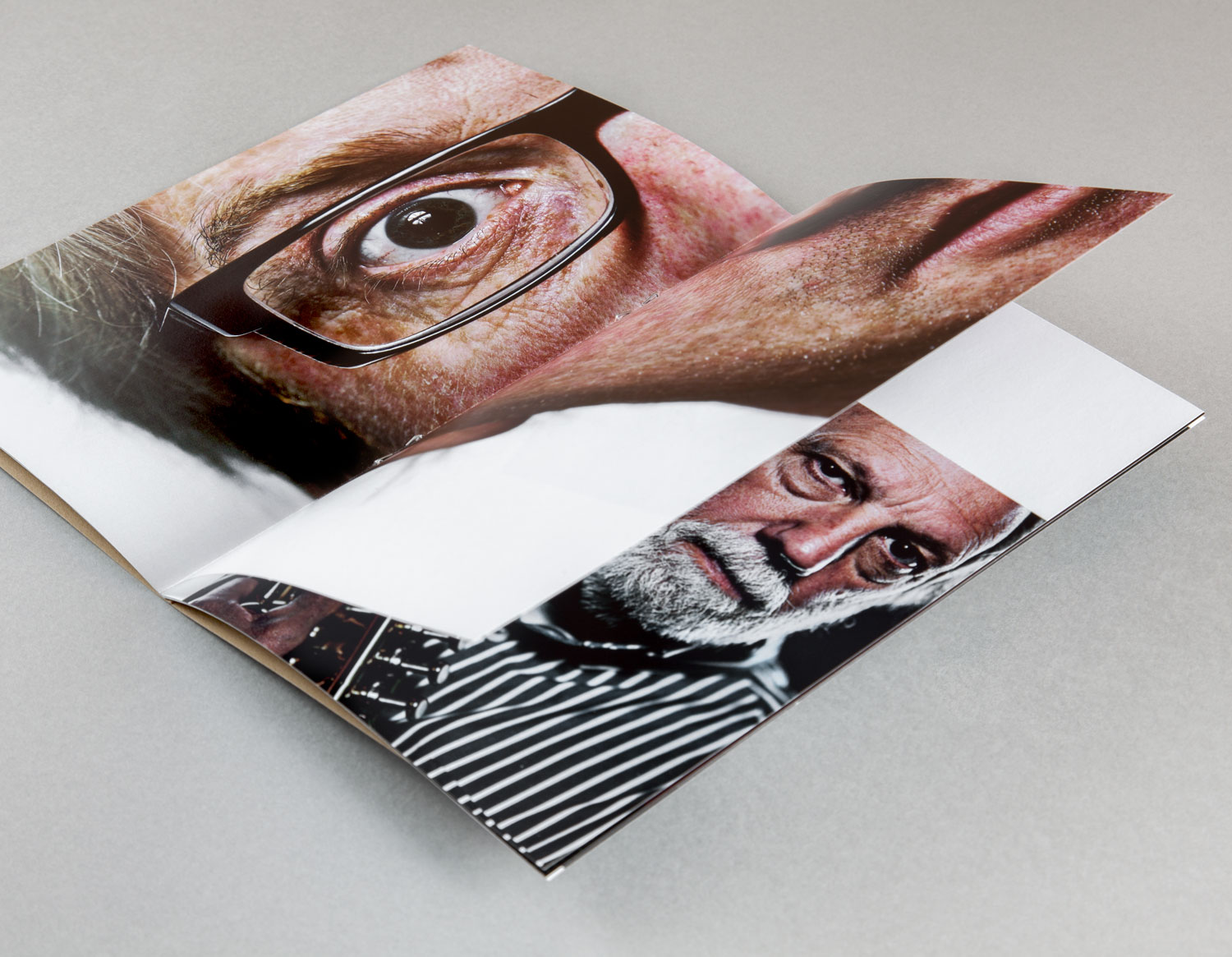
Where often you see brand identities for photographers understandably weighted in favour of image, here there is balance between a few different details. Where you might observe a preference for white and black there is colour, where you might see large and unimpeded image here they are punctuated by sheets of paper, and where there is often an abundance of space here there is large type. These make for an interesting visual expression, one that confidently builds out individual personality, alongside some professional client work.
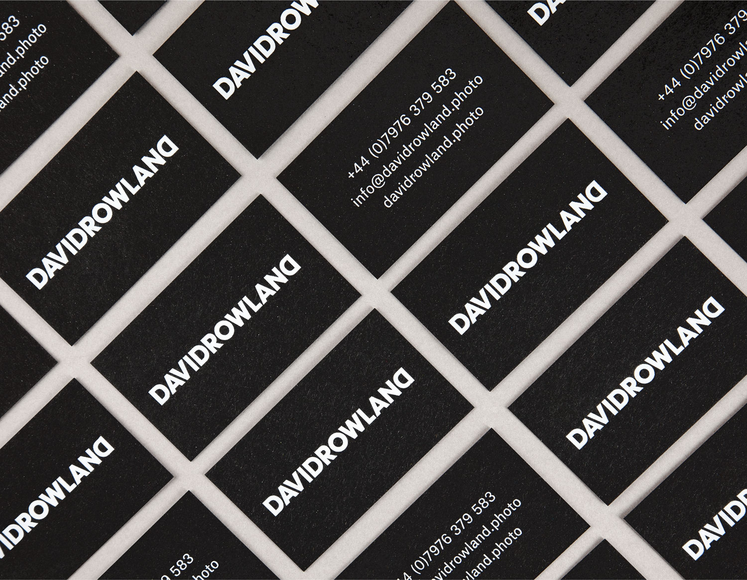
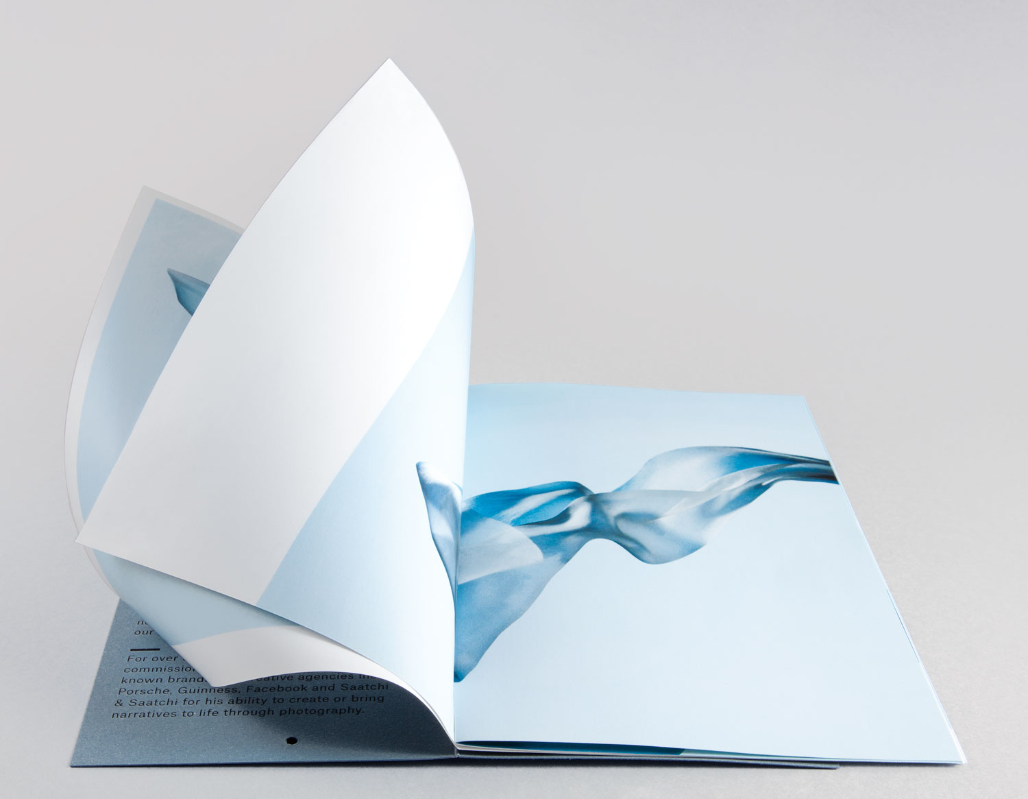
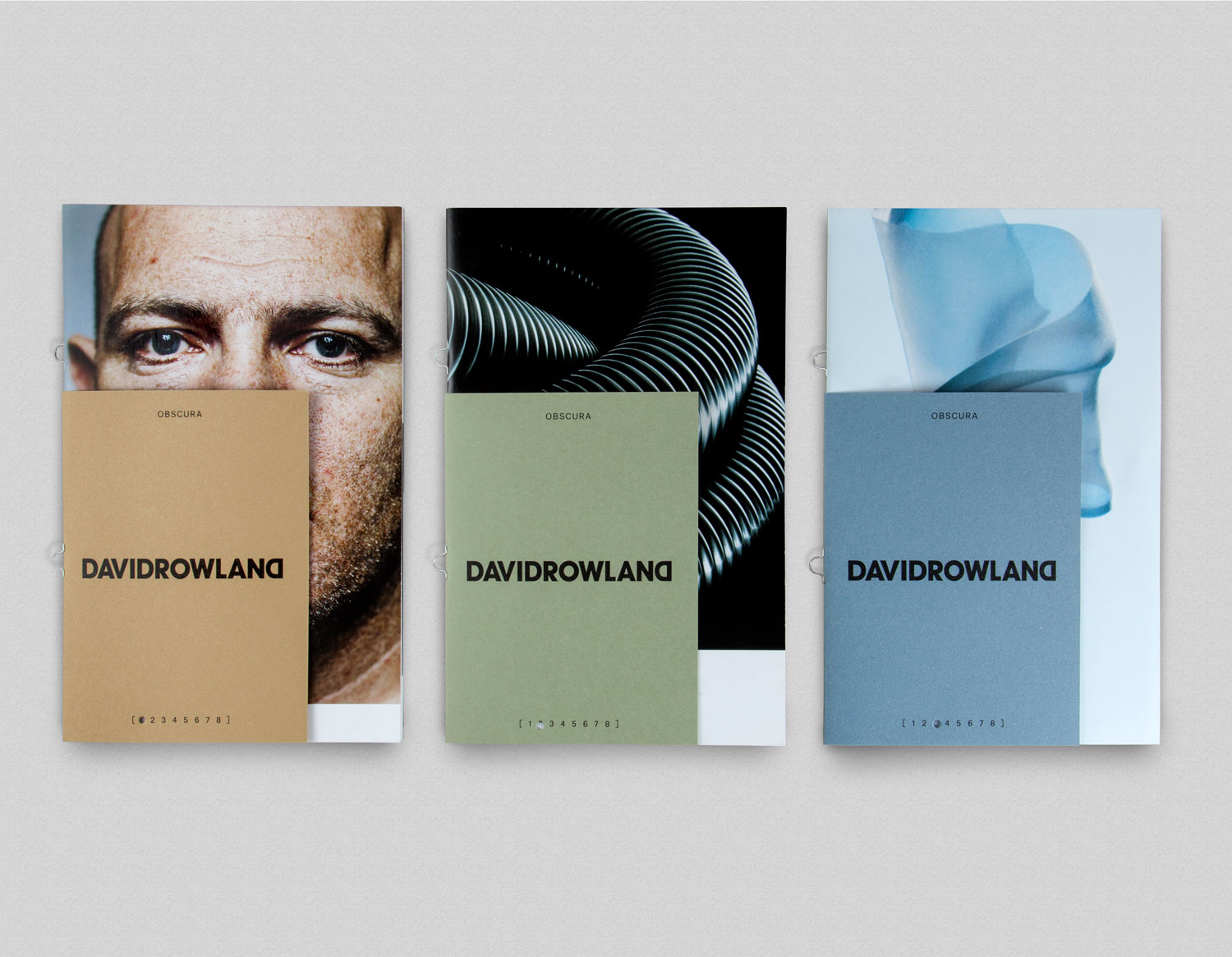
Type size, style and typesetting effectively play to the straight-talking personality of David Rowland, while material colour, texture and quality, as well as punched component, loop saddle stitch, white and black foils work in element of material craft, details that exist behind the camera. This makes sense within the context of images that satisfy a client brief rather than those with a strong sense authorship. Other neat details include the use of orientation, which is well-suited to a profession dealing with landscape and portrait formats, Commercial Type’s Atlas Grotesk, and the simple but effective layout and materiality of the mailers. More form ico Design on BP&O.
Design: ico Design. Opinion: Richard Baird. Fonts Used: Atlas Grotesk.
Specifications:
The business cards are made up of Paperback 650 mic Cairn Board Charcoal with a matte white foil print finish. The cover of the mailers feature 250gsm Fedrigoni Uncoated, Materica Kraft, Verdigris and Acqua boards with a black foil print finish, and the inside is made up of 150gsm Phoenix Motion Xenon from G.F Smith. These are bound using a loop saddle stitch.
