Full of Luck Club 福乐 by Bravo
Opinion by Richard Baird Posted 5 September 2016
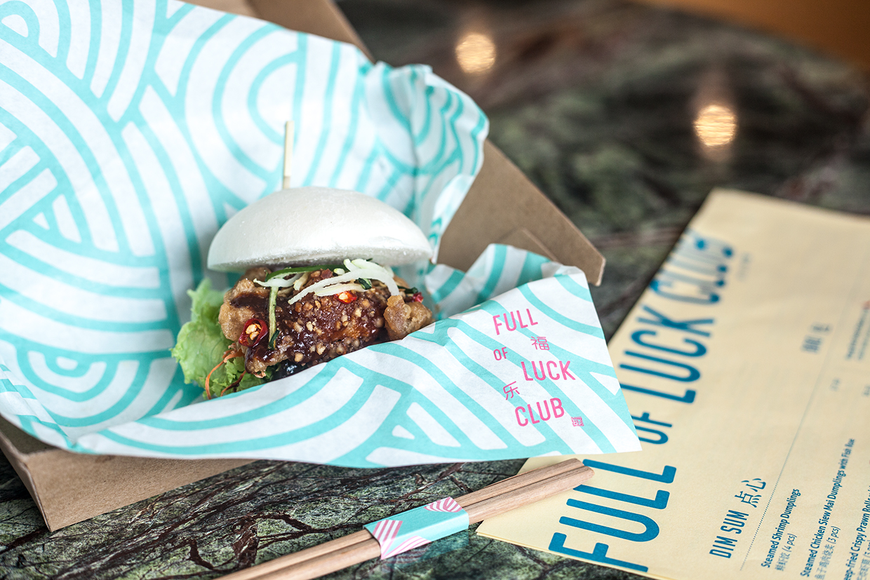
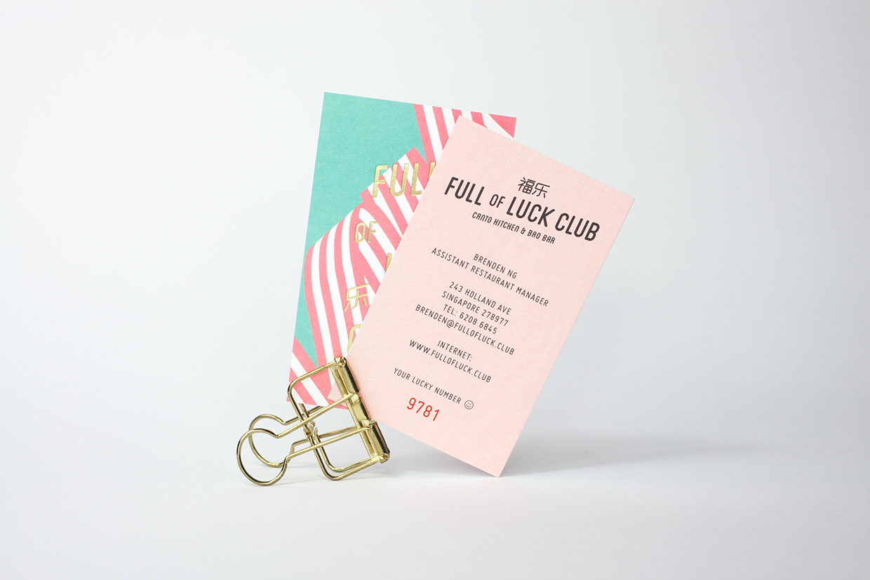
Full of Luck Club 福乐 and Bao Bar is a combined Cantonese restaurant and takeaway, located in Holland Village, Singapore, serving authentic Chinese comfort food. The restaurant was created by the team behind Li Bai Cantonese Restaurant at Sheraton Towers Singapore, and has a menu that combines timeless plates such as roast meats, fresh noodles and dim sum with more contemporary items such as Chinese-inspired salads, craft beers and speciality ‘baos’. This meeting of modernity and timelessness plays out across the restaurant’s brand identity, designed by Bravo, in the meeting of dynamic lettering, a pastel colour palette and a gold block foil print finish.
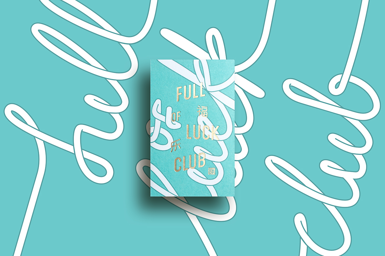
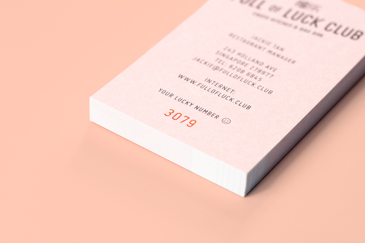
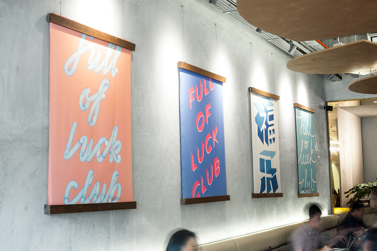
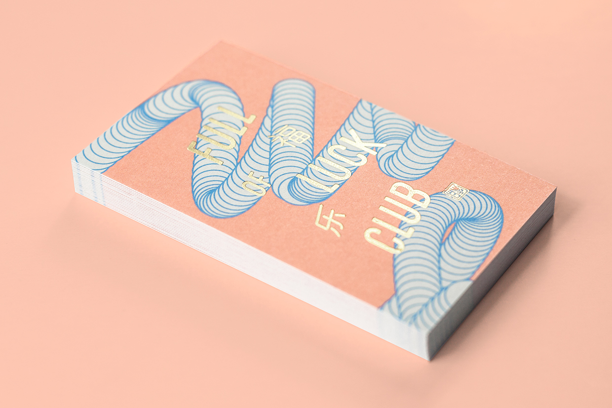
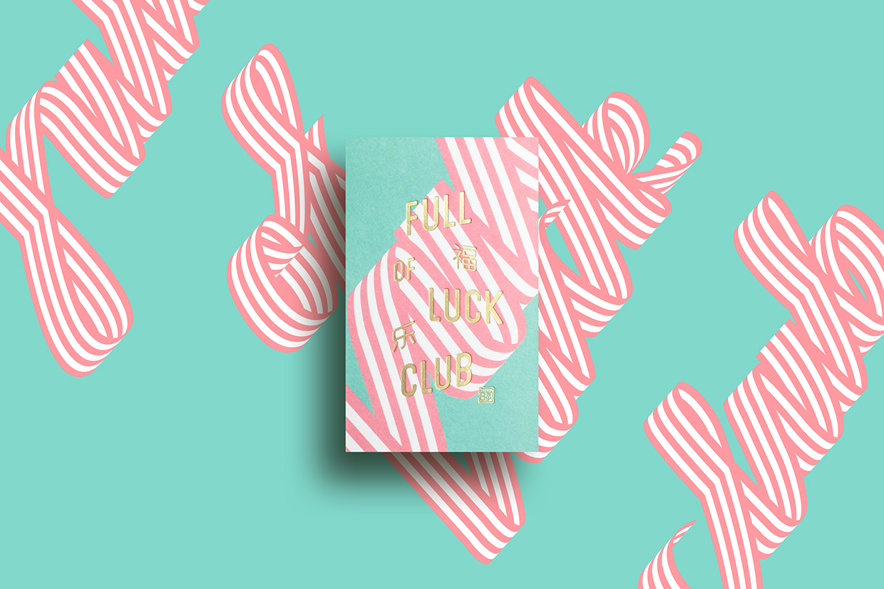
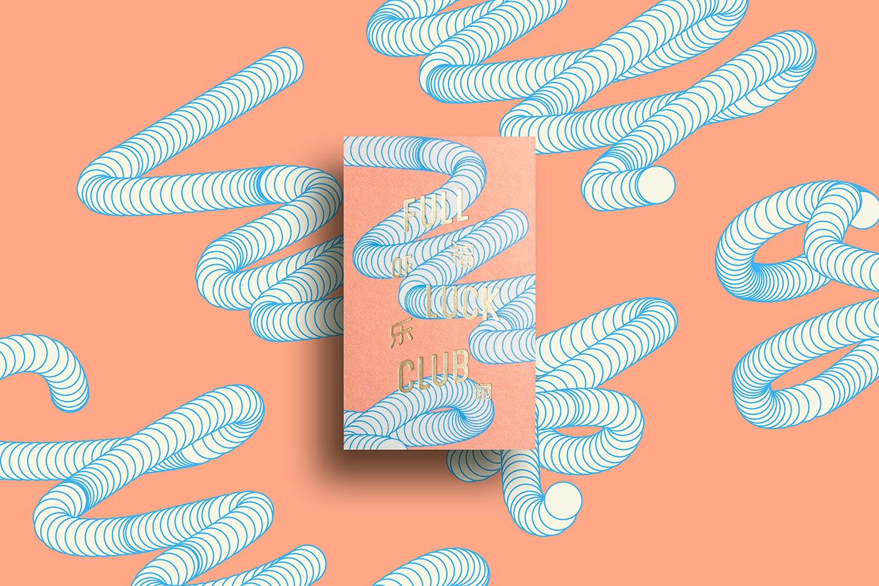
Although Full of Luck Club does have a logo; a simple mark of looping lines, it is a side note to the character and memorablity of hand lettering and colour palette which forms the body of the restaurant’s visual identity. These are dynamic and dimensional in nature, playing with cursive Latin and extruded Chinese characters, cropped by the context of business cards and on full display within the interior of the restaurant. There is plenty of variation between these yet are held together by colour and a consistent use of a condensed, uppercase and monolinear sans-serif. There is a familiarity in the individual aesthetic of these but together establish a distinctive brand expression.

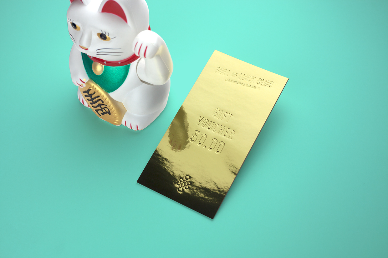
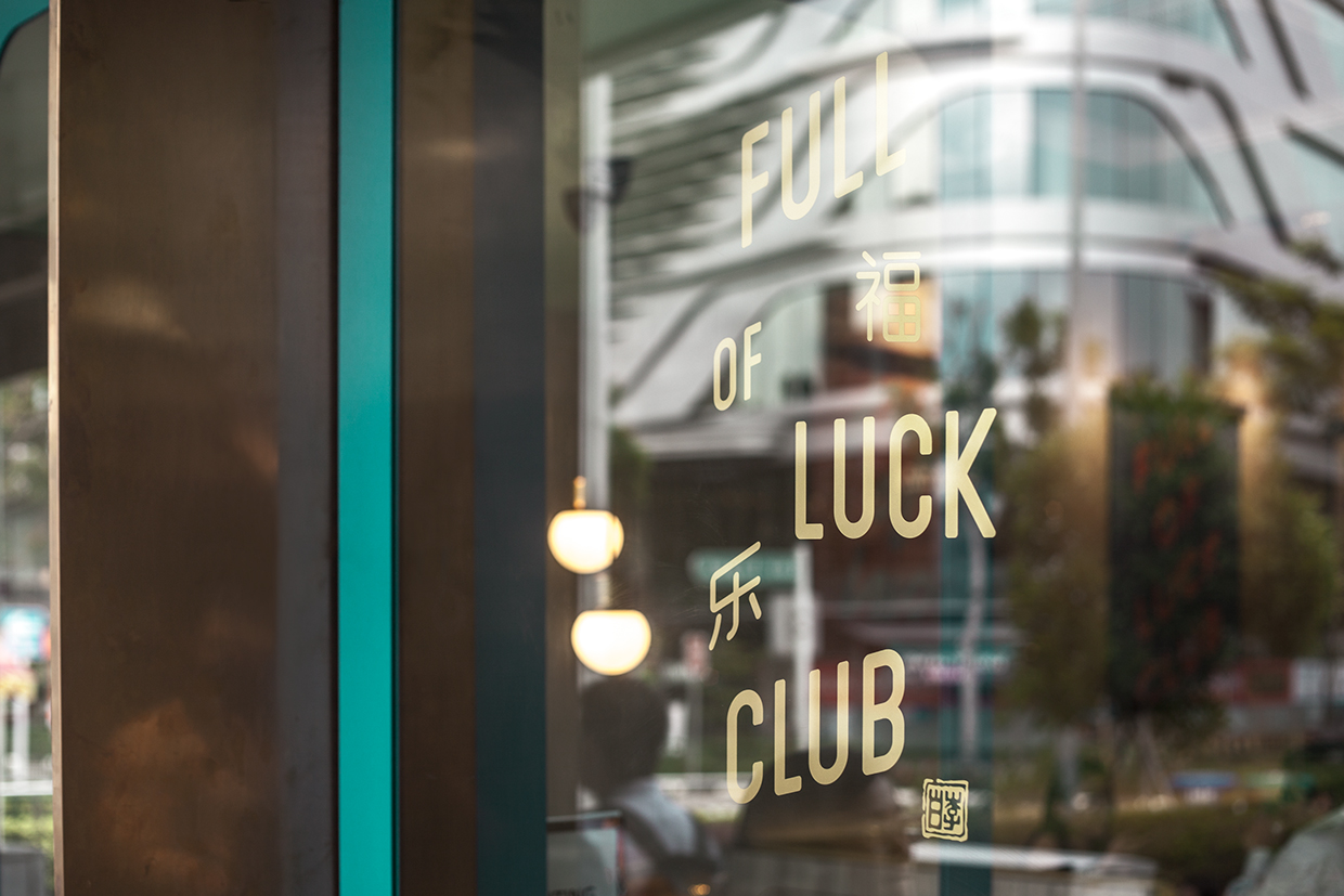
Where the colour of lettering and backgrounds appear thoroughly current, a gold block foil, set directly over these, plays with timelessness and cultural association with luck and wealth. So, while aesthetically making for a compelling pairing, the approach is grounded in a clear communicative intention and appears as a fair reflection of a menu that blends modern and traditional dishes.
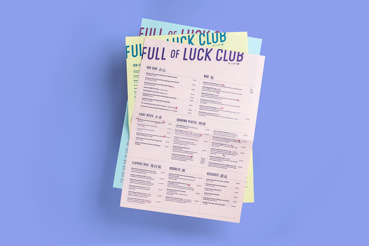
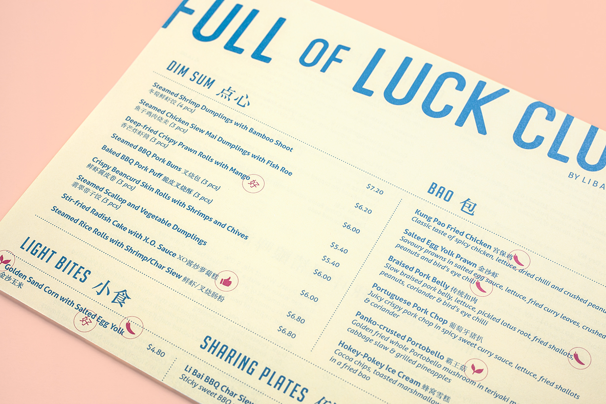
The menus do feel a touch conventional, absent the character of the lettering or the flourish of a gold, however, are clear in their structure, tied to identity through type and colour, and practical in their single sheets.
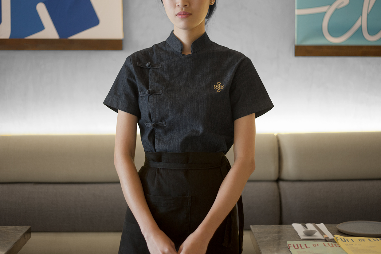
The shape of, and gold-embroidered finish of the logo, and the material and cut of uniforms lend the restaurant something of an upmarket quality, where lettering and colour feels youthful and informal. Neither feels particularly in opposition to one another but worth noting.
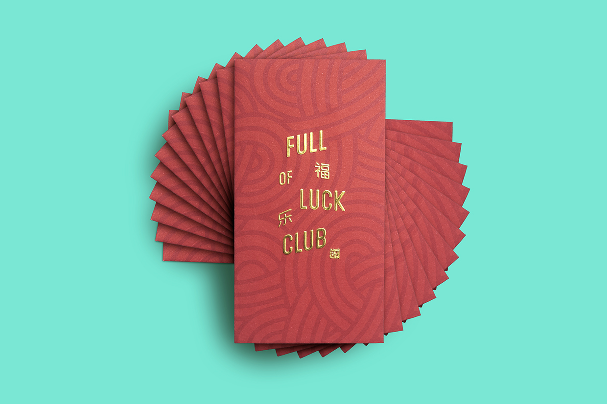
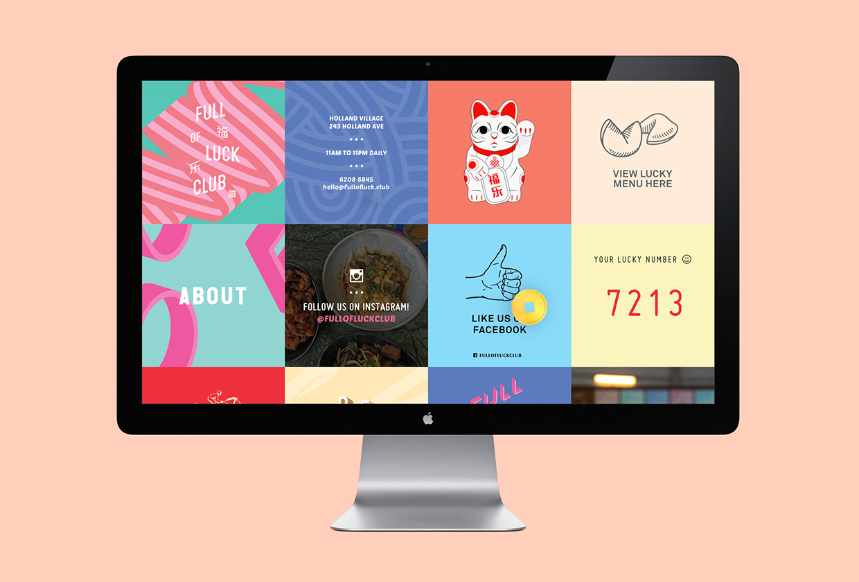
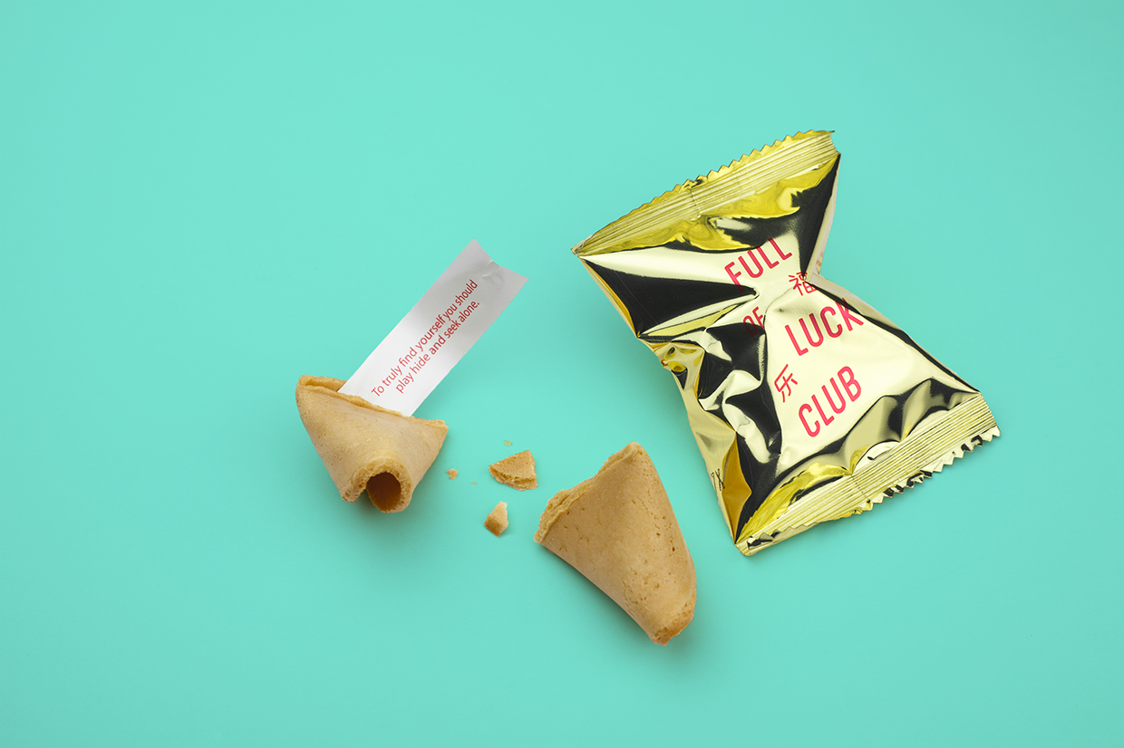
Other neat details include the gold embossed card of the gift voucher; a very well-suited material choice and print finish, the gold bag of the fortune cookies, lucky numbers with the chance to win discounts, the panels of the website, and the contrast between the utilitarian qualities of uncoated concrete walls of the interior and the colour and more personable qualities of the illustrative panels that hang over these. More from Bravo on BP&O.
Design: Bravo. Opinion: Richard Baird.
