WallpaperSTORE* by A Practice For Everyday Life
Opinion by Richard Baird Posted 22 September 2016
WallpaperSTORE* is the online store of UK architecture, interior, fashion, art and contemporary design magazine Wallpaper*. It features and ships worldwide a broad but tightly curated catalogue of tabletop, lighting, desktop, stationery, grooming, technology and travel objects. Many of these objects, while individually distinctive, share a sense of contrast; in form and finish, materiality and colour, but also in their contemporary crafted quality.
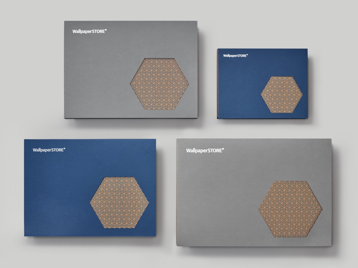
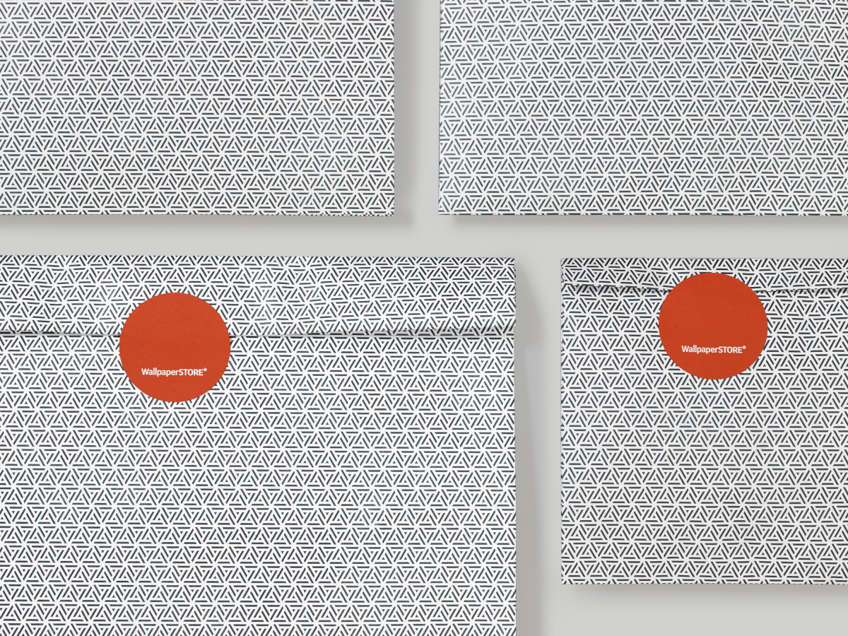
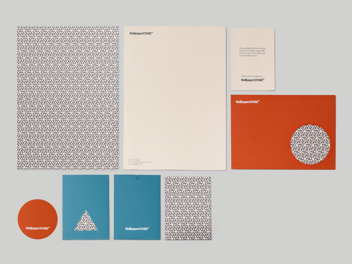
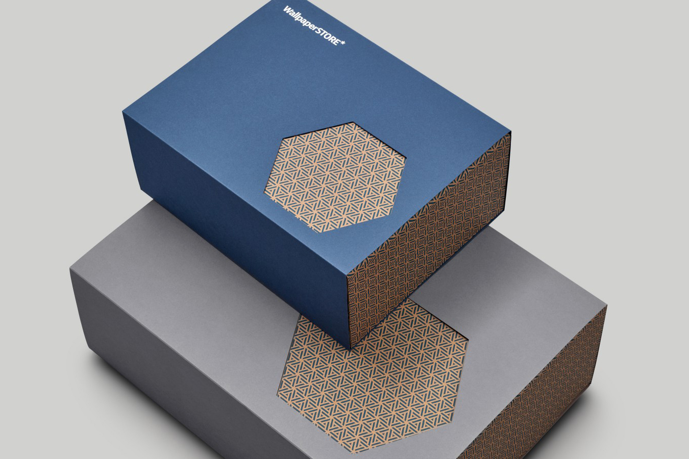
WallpaperSTORE* worked with London-based graphic design studio A Practice For Everyday Life on a broad range of packaging. This included gift and shipping boxes, tissue paper and box tape, gift bags and stickers, document sleeves and information cards. These needed to be suitable for holding everything from letter openers to large-scale pieces of furniture.
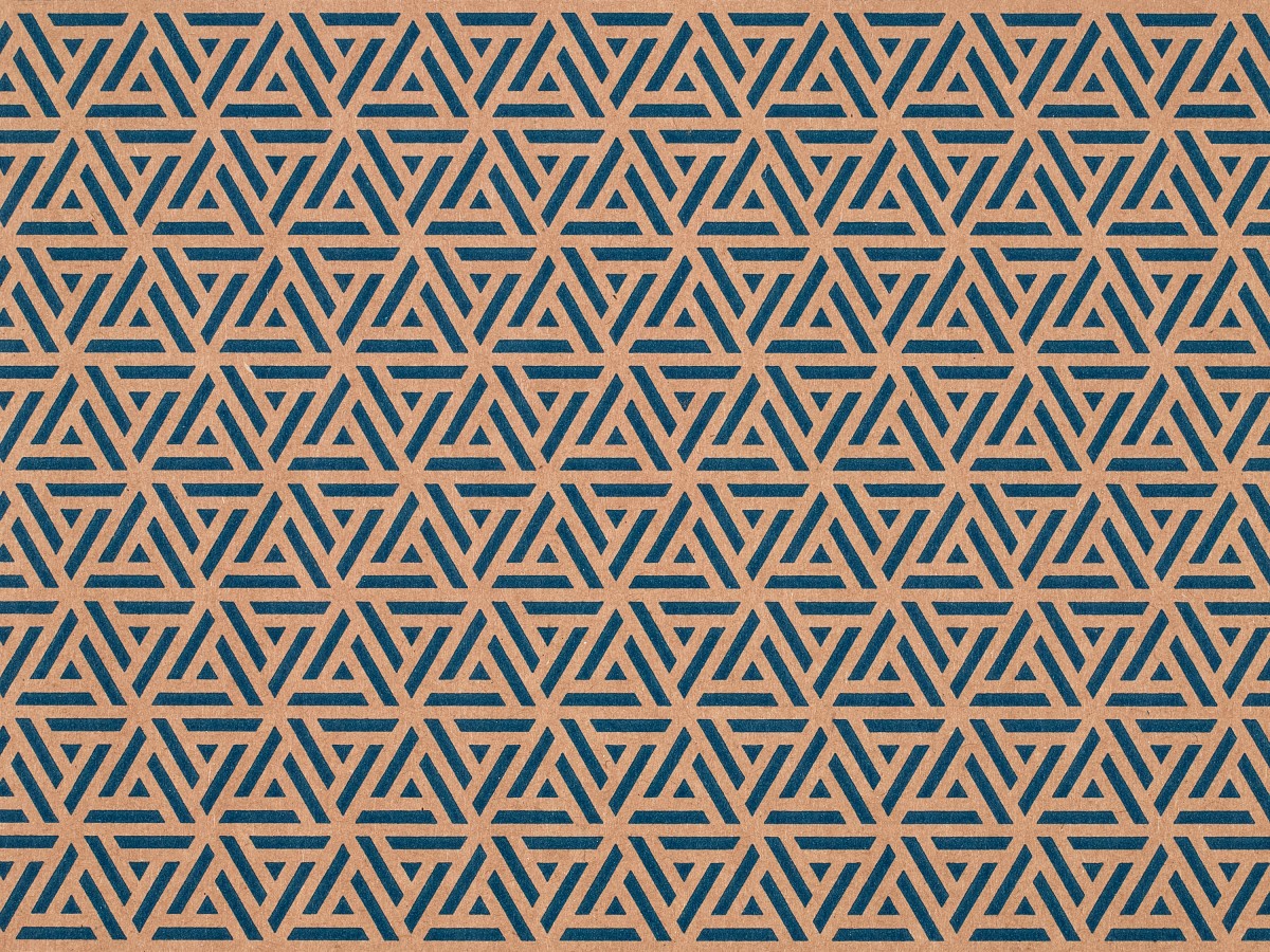
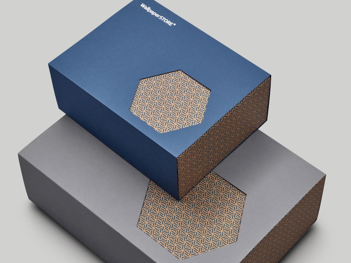
Drawing their inspiration from the Wallpaper* asterisk and brand colour palette, and leveraging the material language of standard packaging, the studio created a system of geometric patterns, kraft cardboard boxes and coloured sleeves that together are robust, visually appealing and add value. Although WallpaperSTORE* launched in summer of 2015 A Practice For Everyday Life documented their packaging work and recently added it to their website.
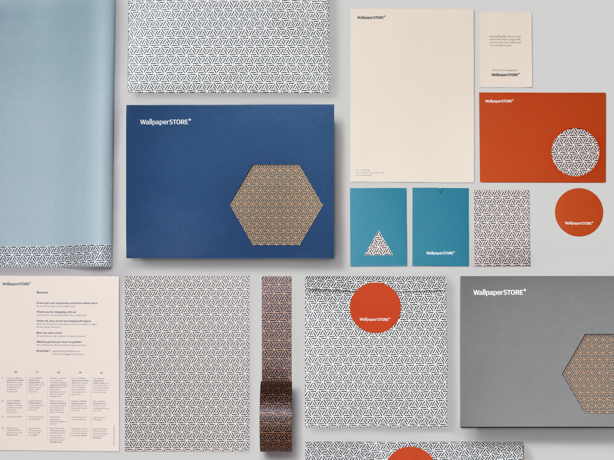
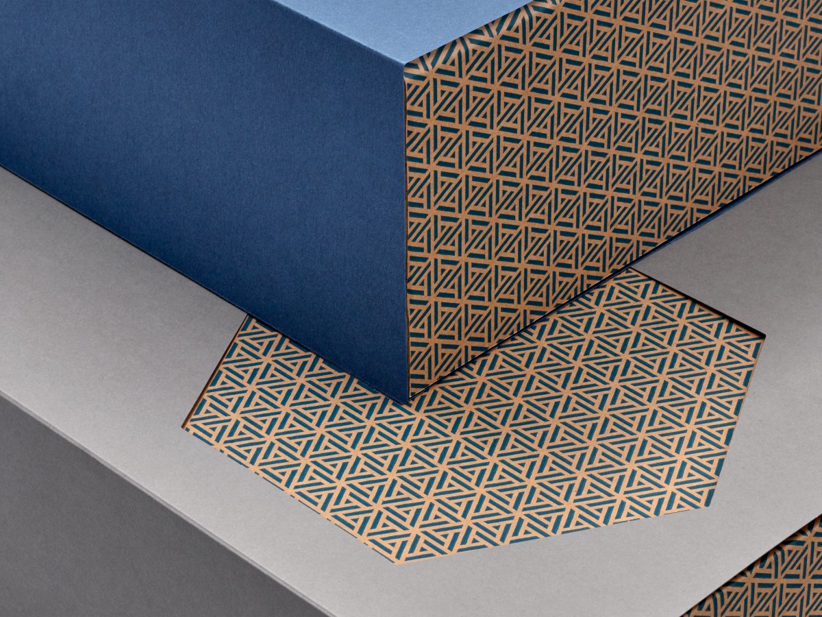
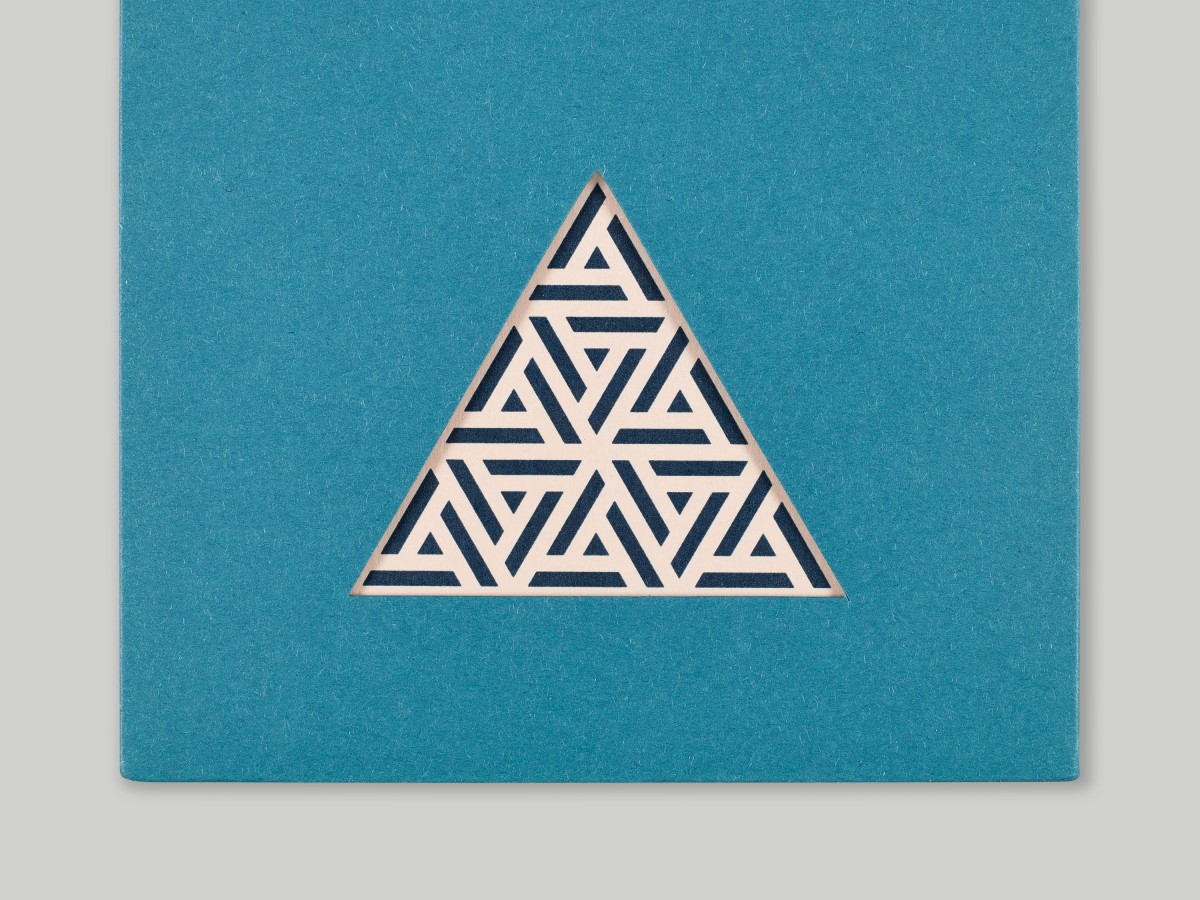
A Practice For Everyday Life’s packaging system for WallpaperSTORE* makes great use of contrast, in the choice of colour, material and finish, and in the juxtaposition of complex and dense pattern alongside solid colour and simple shapes, qualities that characterise the objects of the WallpaperStore*, and tied to Wallpaper*’s own brand identity. This continues in the high-quality associated with finishes such as die cutting, screen-printing and block foiling and the typesetting of logo.
The system’s mix of consistent pattern and kraft board, and the change in geometric die cuts and coloured sleeves delivers a flexibility and variety but also a clear sense of continuity, and although not particularly unique, but always compelling, plays with contemporary craft and a very current favour for the utilitarian.
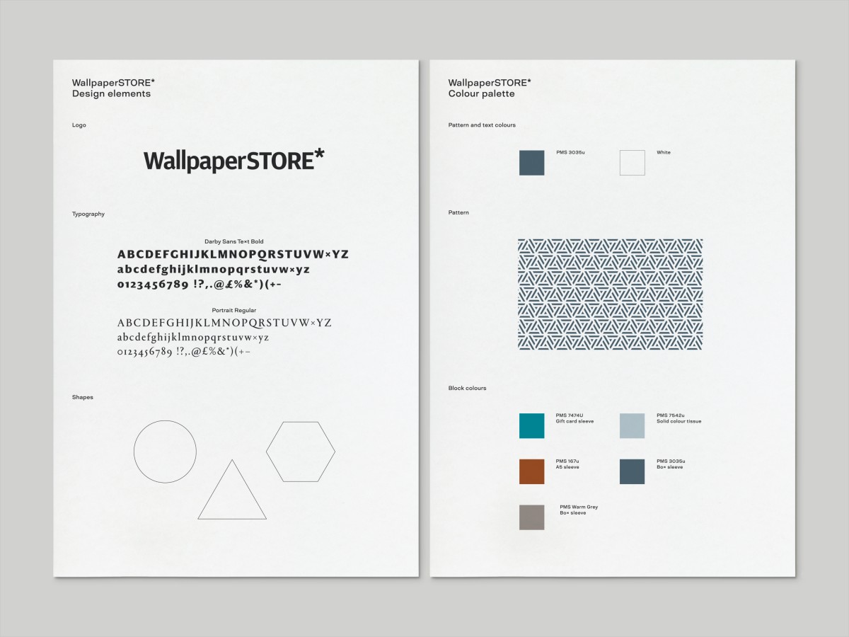
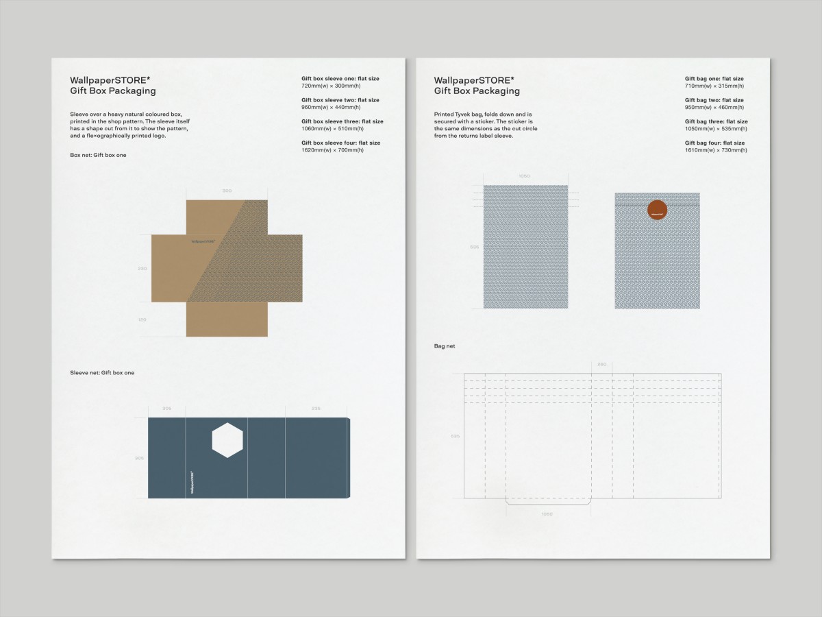
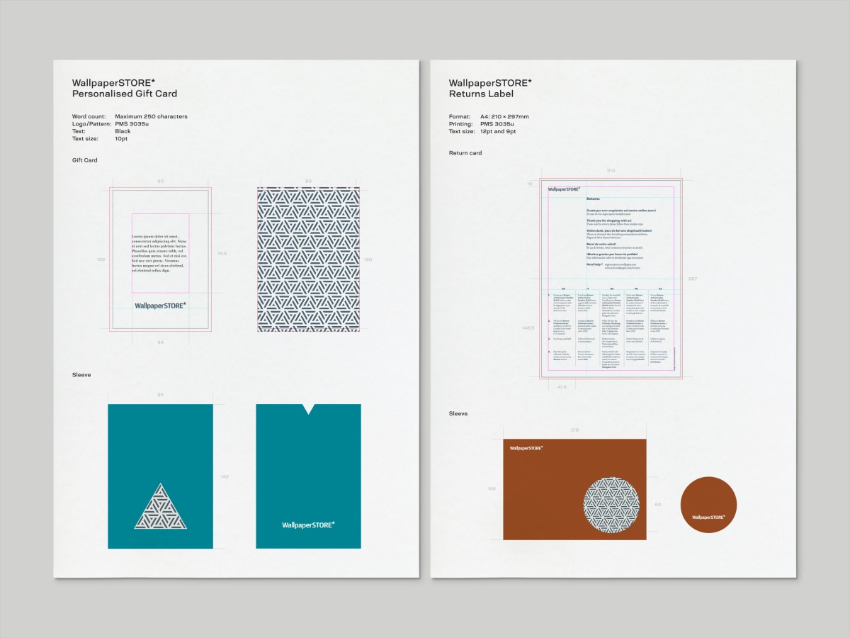
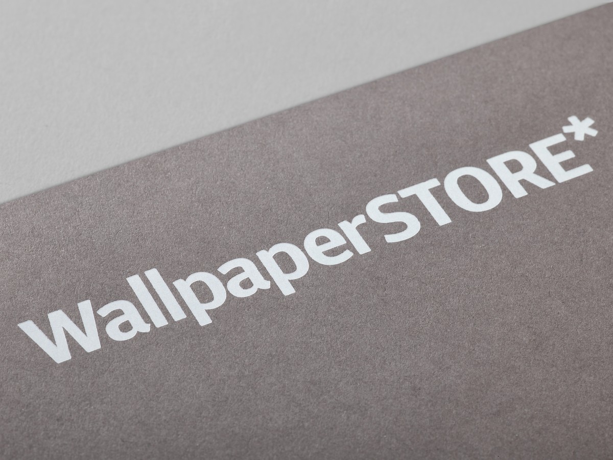
Colour and material palette, one that brings together grey, blue and warm orange, Tyvek and Newsprint, work together the urban and the crafted, modern and the more classical, Wallpaper*’s own brand colours and a number of other complimentary colours. It is a visually interesting, structured and high-quality piece of work that feels grounded in the objects that make it into the WallpaperSTORE*.
Design: A Practice For Everyday Life. Opinion: Richard Baird.
