Uproot by Believe in
Opinion by Richard Baird Posted 23 September 2016
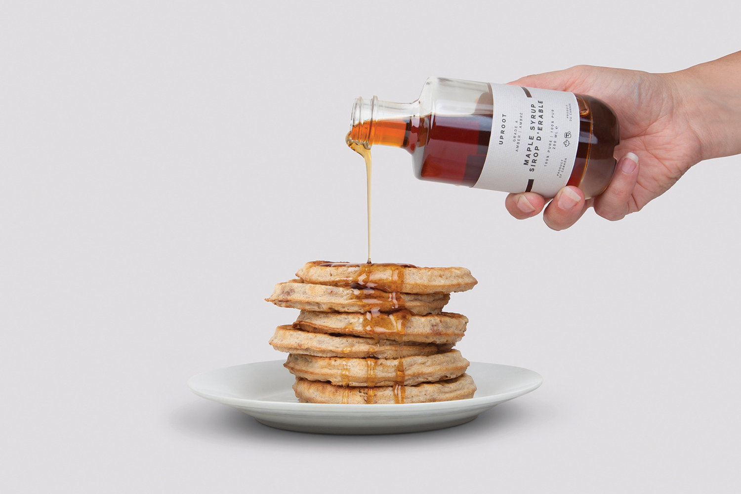
Uproot is a premium and limited edition maple syrup created to celebrate the opening of UK-based Believe in’s second design studio in Canada. It features a distinctive packaging design that takes a Canadian icon and infuses it with what the studio describes as a European design sensibility. Believe in, from its two studios and through their collaborative effort, will now support clients from the UK, Europe and across North America.
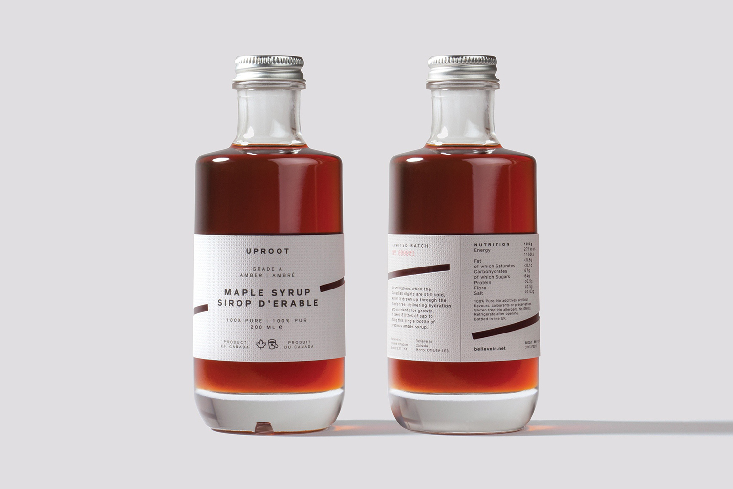
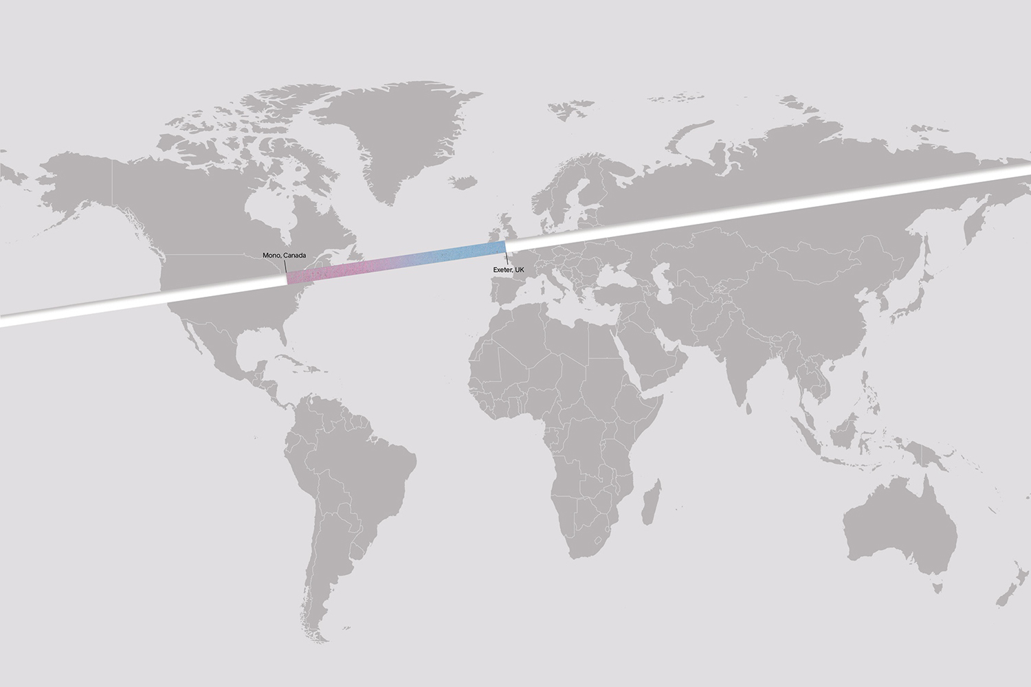
The studio’s move is conveyed through naming, a dual reference that reflects the studio’s arrival in Canada and the process of drawing water up through the maple tree, and in the simple graphic expression of a diagonal line, a representation of the geographic connection between Exeter in South West England and Mono in Ontario.
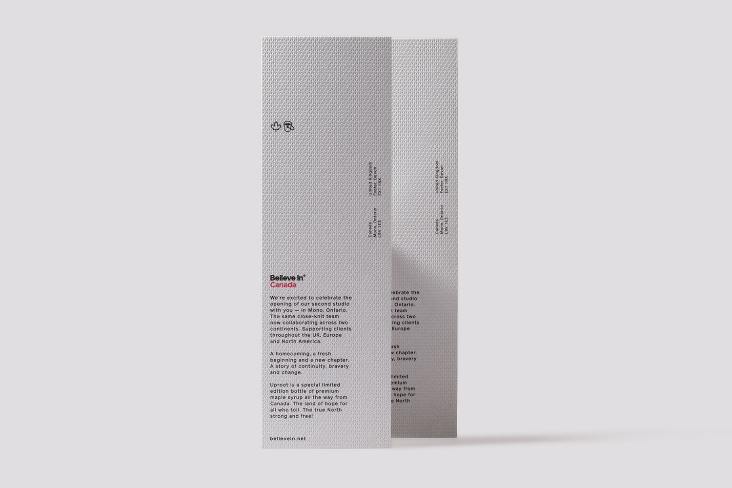
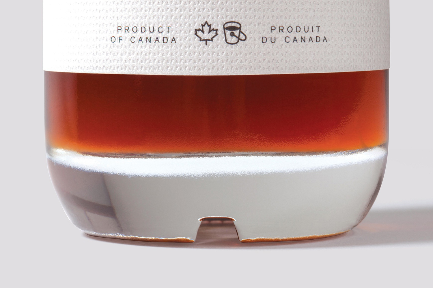
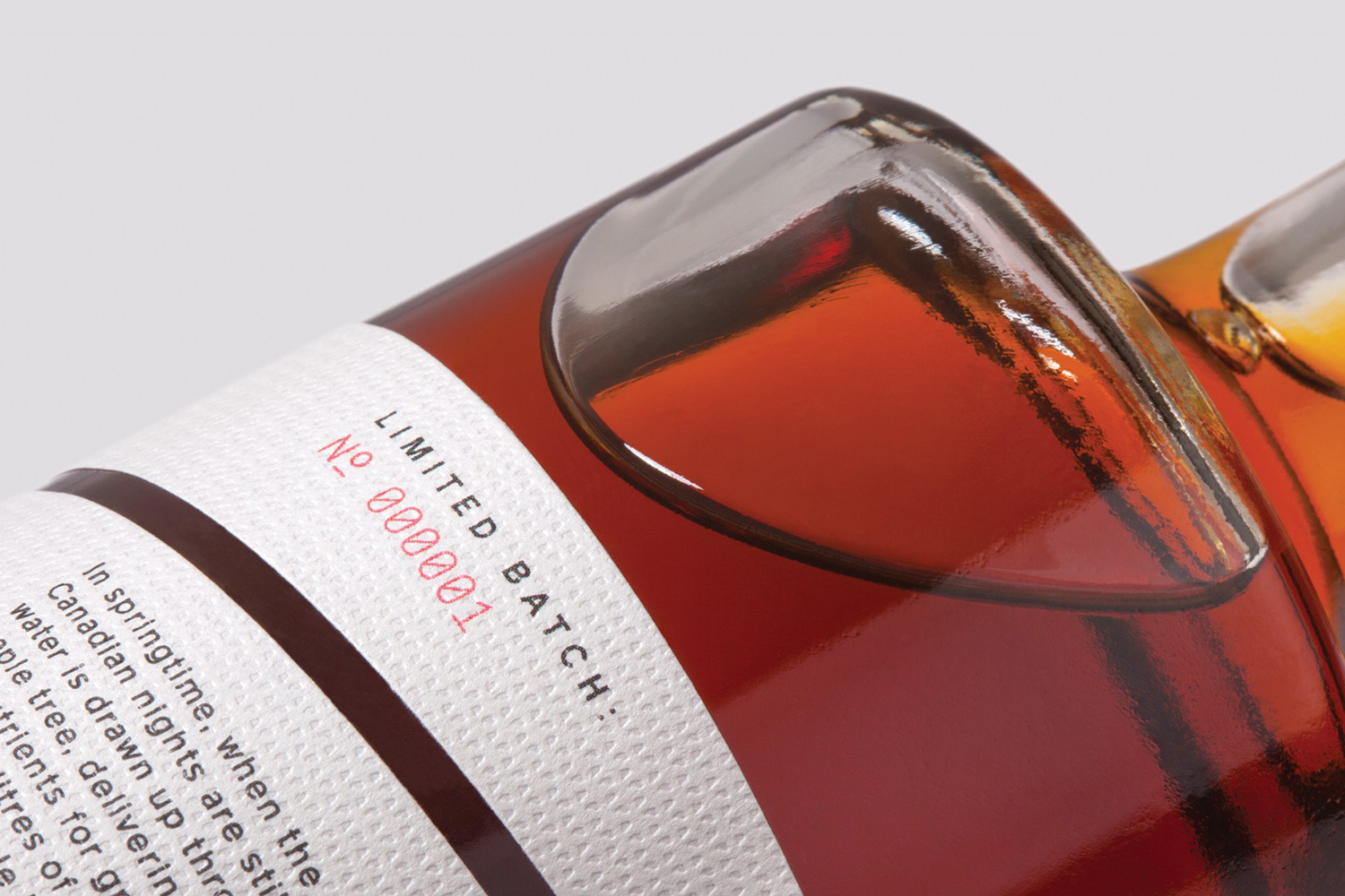
Name and line are used in conjunction with some clear luxury cues and a European design sensibility in the structure and weight of glass bottles sourced from Italy, a label of embossed light grey paper from Japan, generously spaced uppercase sans-serif, plenty of space, and the numbering of each of the 200 bottles.
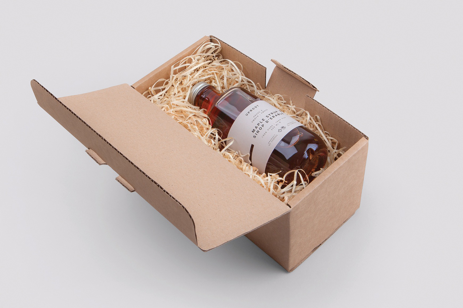
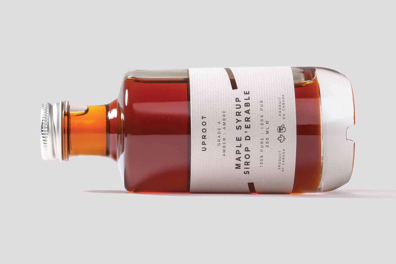
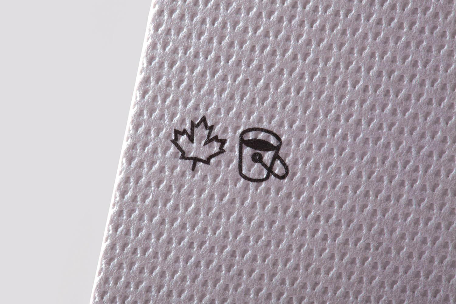
Uproot is a lovely mix of concept, materiality, graphic expression and form, and clearly the product of a design studio exercising its own aesthetic sensitivities, particularly in the choice and sourcing of glass and paper. Although not limited by commercial constraints, it is easy to see this standing up as a retail product, discounting what is probably a high unit cost, in its blend of story and compelling visual expression. Highlights include the diagonal line cut into paper—a detail that appears as a holographic foil on Believe in’s business cards—the weighting of the base, which feels good in the hand, and the debossed surface texture that links label and leaflet. More from Believe in on BP&O.
Design: Believe in. Opinion: Richard Baird. Papers: Takeo Tassel. Fonts Used: Reader & Monosten.
