L’Observatoire International by Triboro
Opinion by Richard Baird Posted 7 October 2016
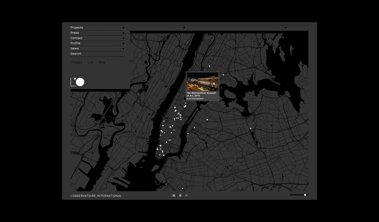
L’Observatoire International is a American lighting design studio co-founded in 1993 by Hervé Descottes. The studio is made up of architects, interior designers, engineers, artists and lighting designers working on a variety of projects, illuminating and accentuating both modern and classical architecture and spaces. These include retail premises and museums, airports, landscapes and concert halls. L’Observatoire International worked with New York-based design studio Triboro to develop a new visual identity. This runs across printed assets that included business cards and a new website.
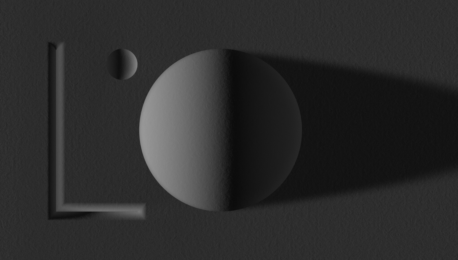
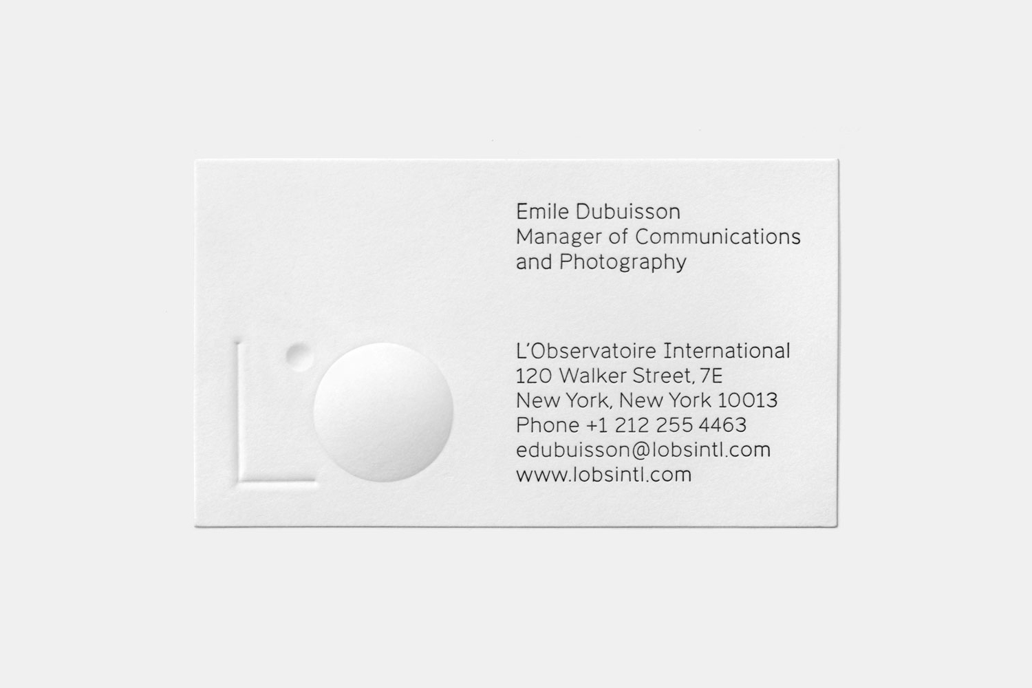
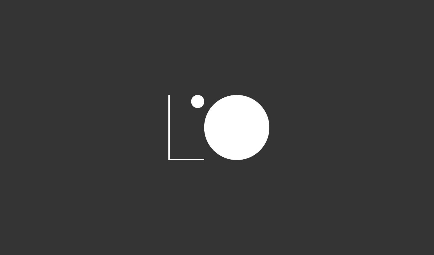
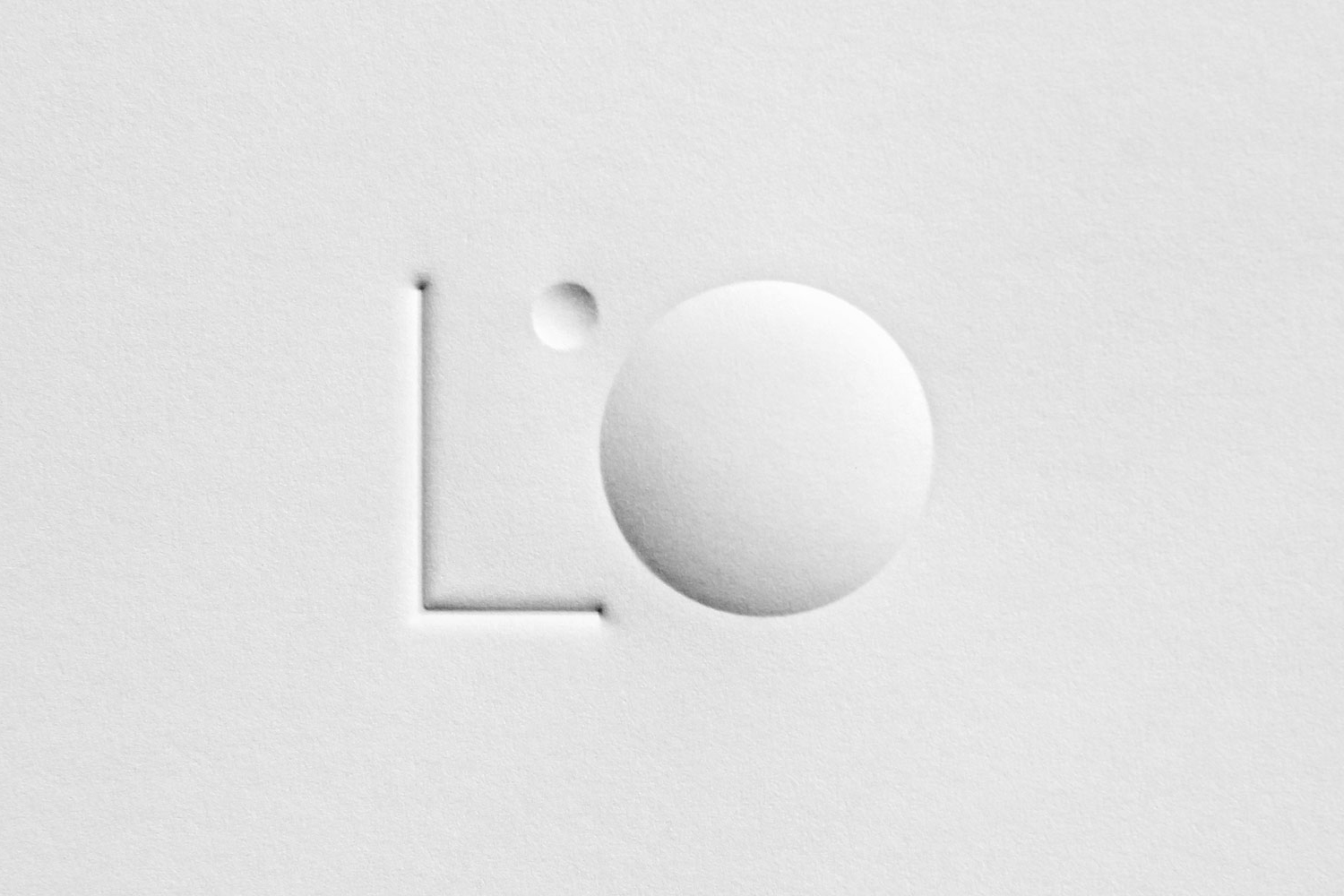
Triboro’s work for L’Observatoire International, as you would expect, effectively plays with light and shadow. This comes through in print with a blind deboss and emboss print finishes, casting shadows and creating highlights in different directions across an uncoated white board, and in the use of black and white, a clear expression of light and the absence of light. The two together work well to capture both the extremes and everything in between, with the business card working in an element of interaction, play and materiality.
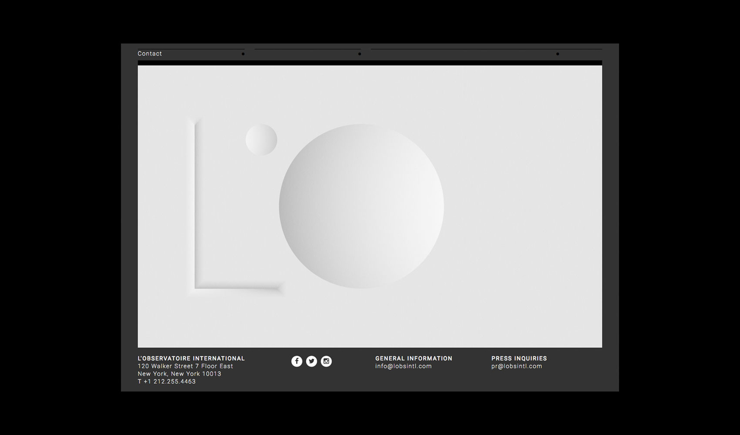
The logo is nicely balanced, with the fine line of the L and the fill of the O also playing with duality. The ‘, drawn as a circle, set over the O, appears as what you might consider a source, creating tension between illumination and object, which is likely to resonate with architects, designers, and anyone who has dealt with modelling objects and environments.

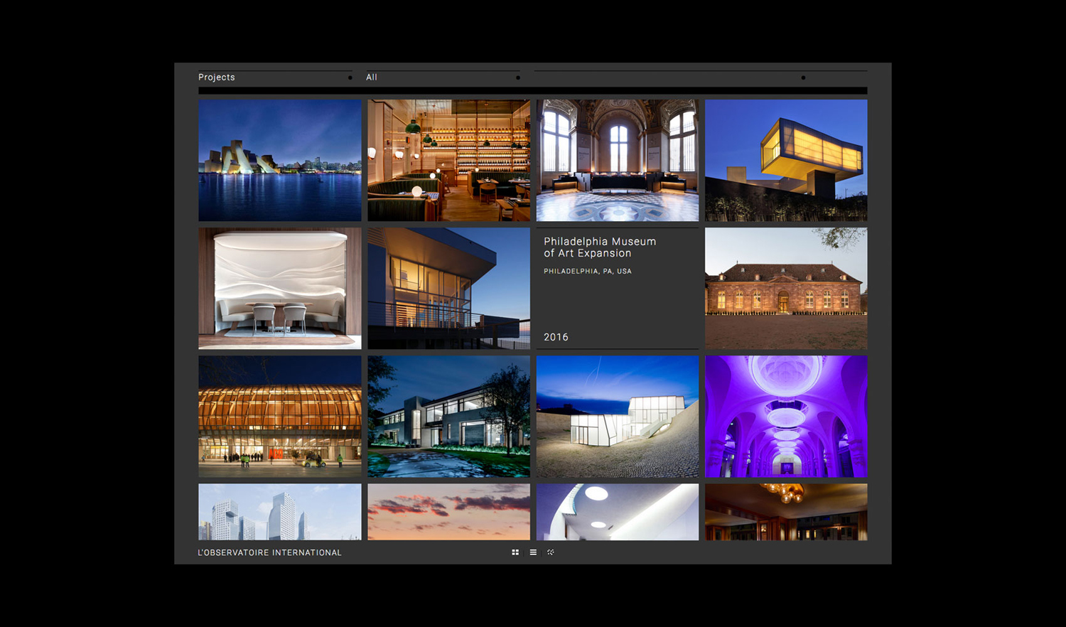
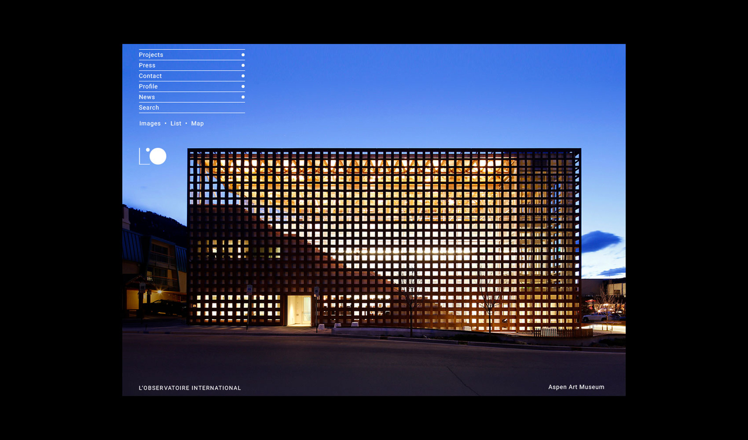
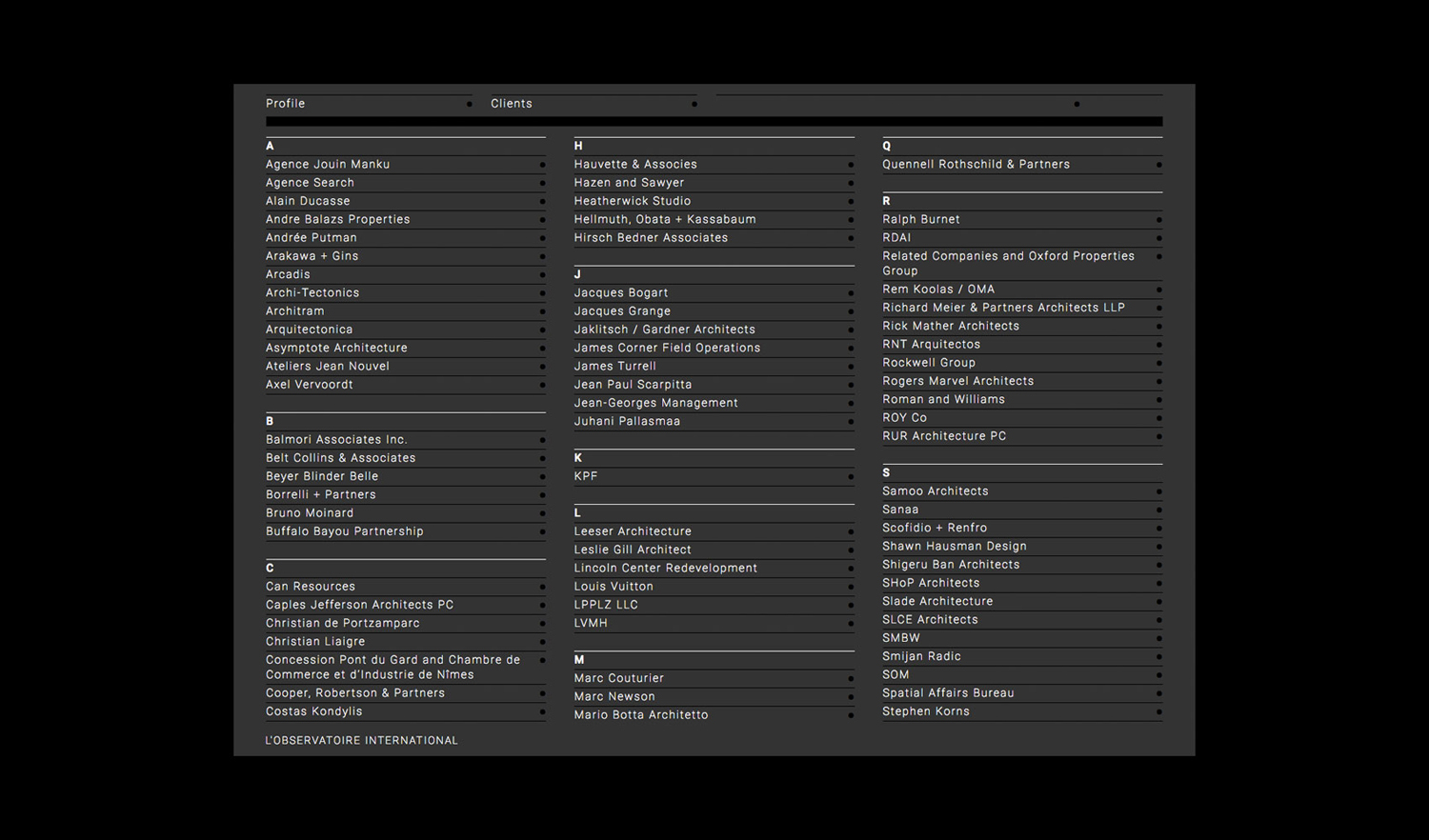
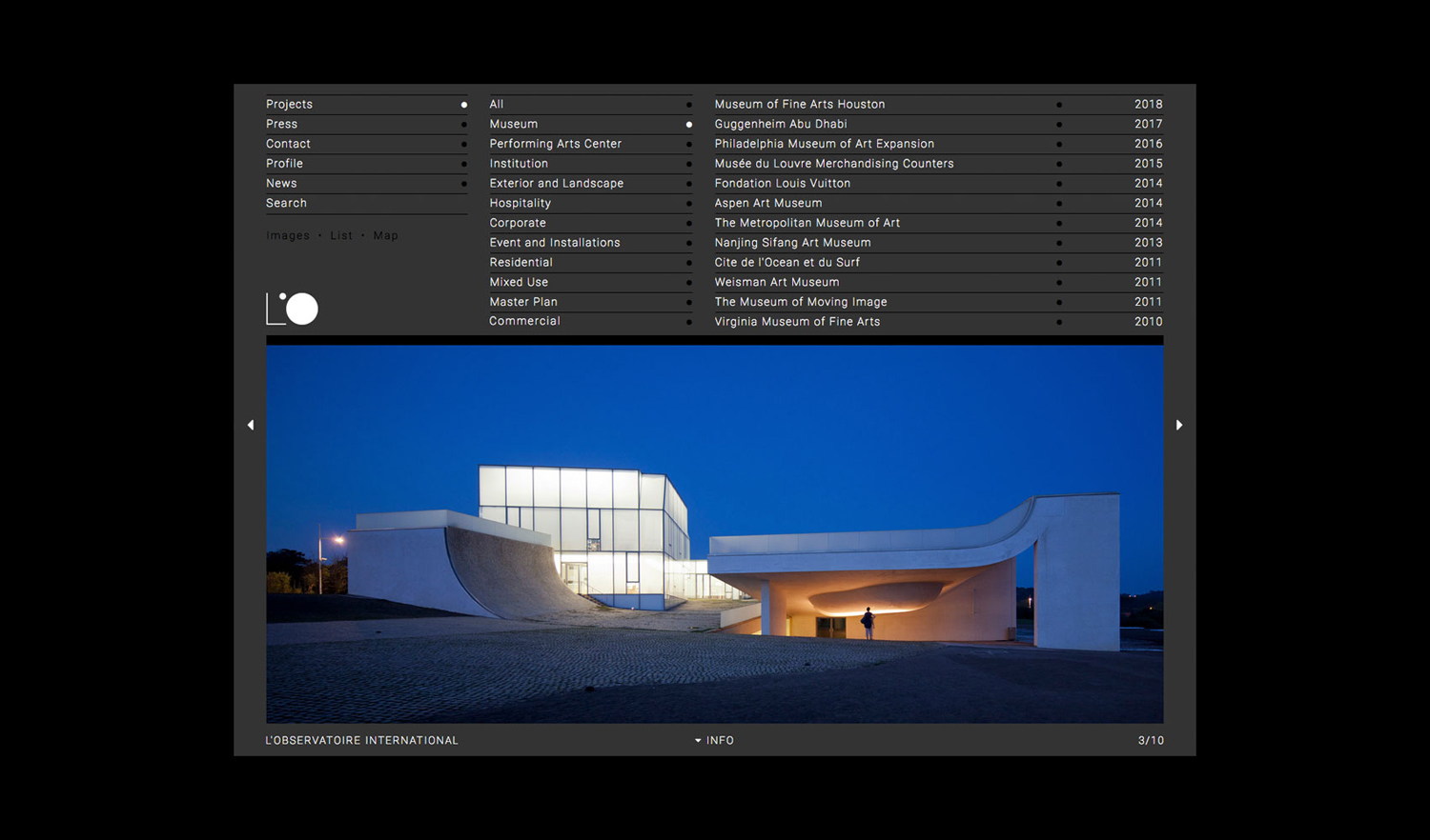
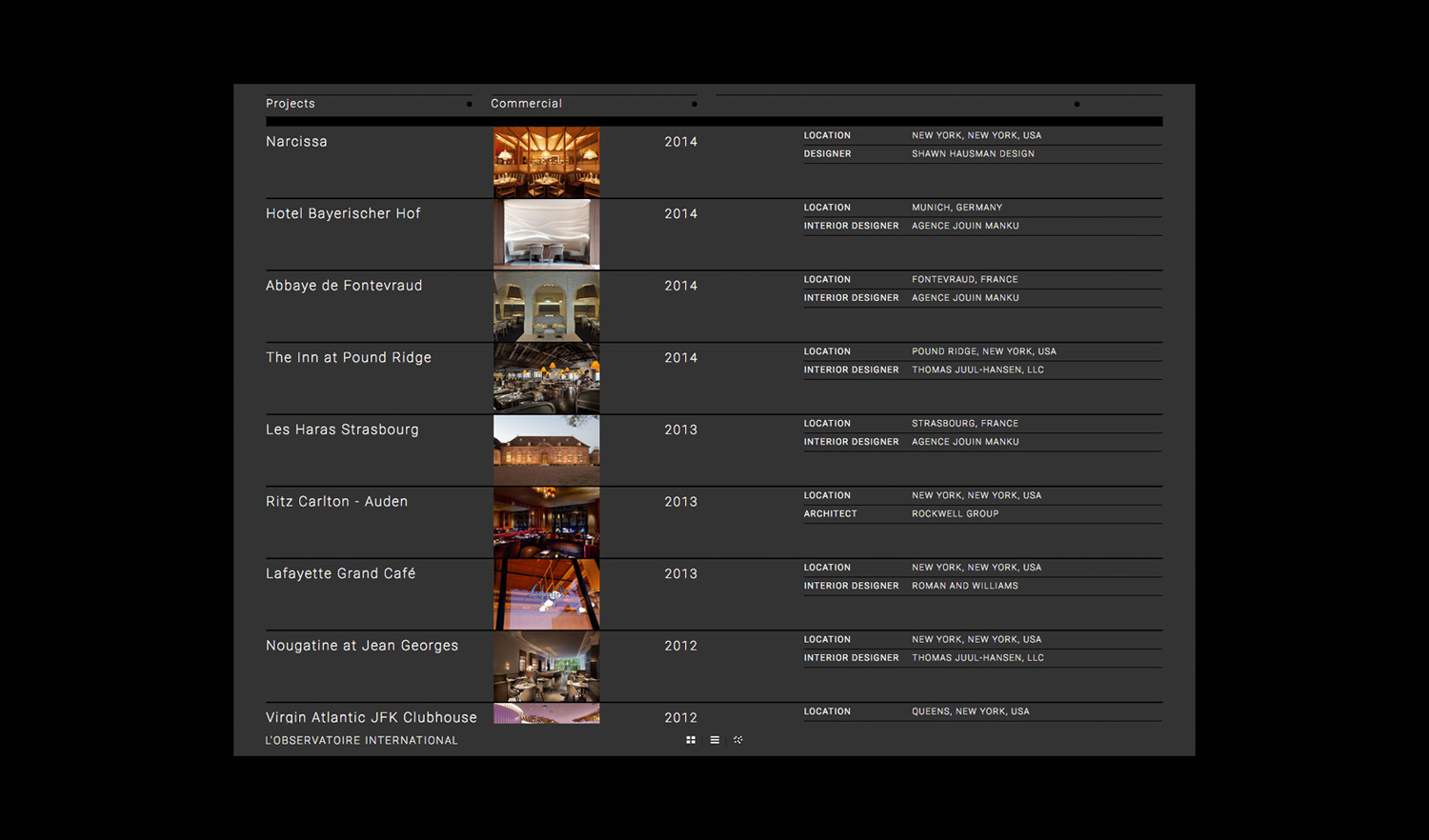
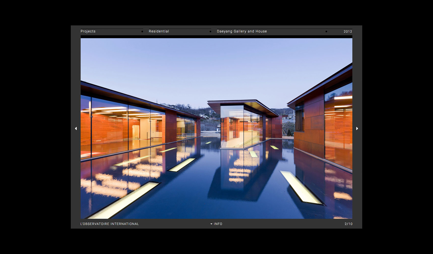
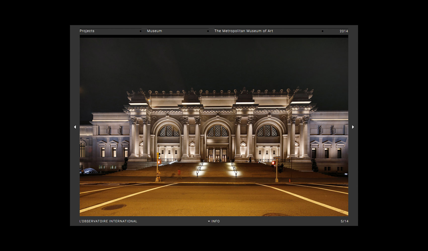
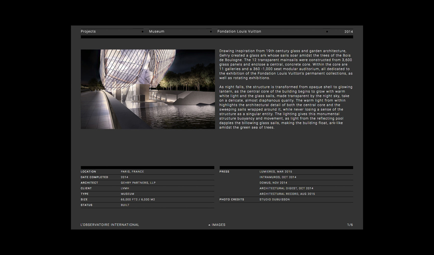
The website’s use of a cool dark grey background and white copy functions to draw out and emphasise the colour and nuance of the studio’s portfolio, and makes a connection with, but inverts, the aesthetic associated with contemporary architecture visual identities, whilst leveraging a strong sense of structure and modularity.
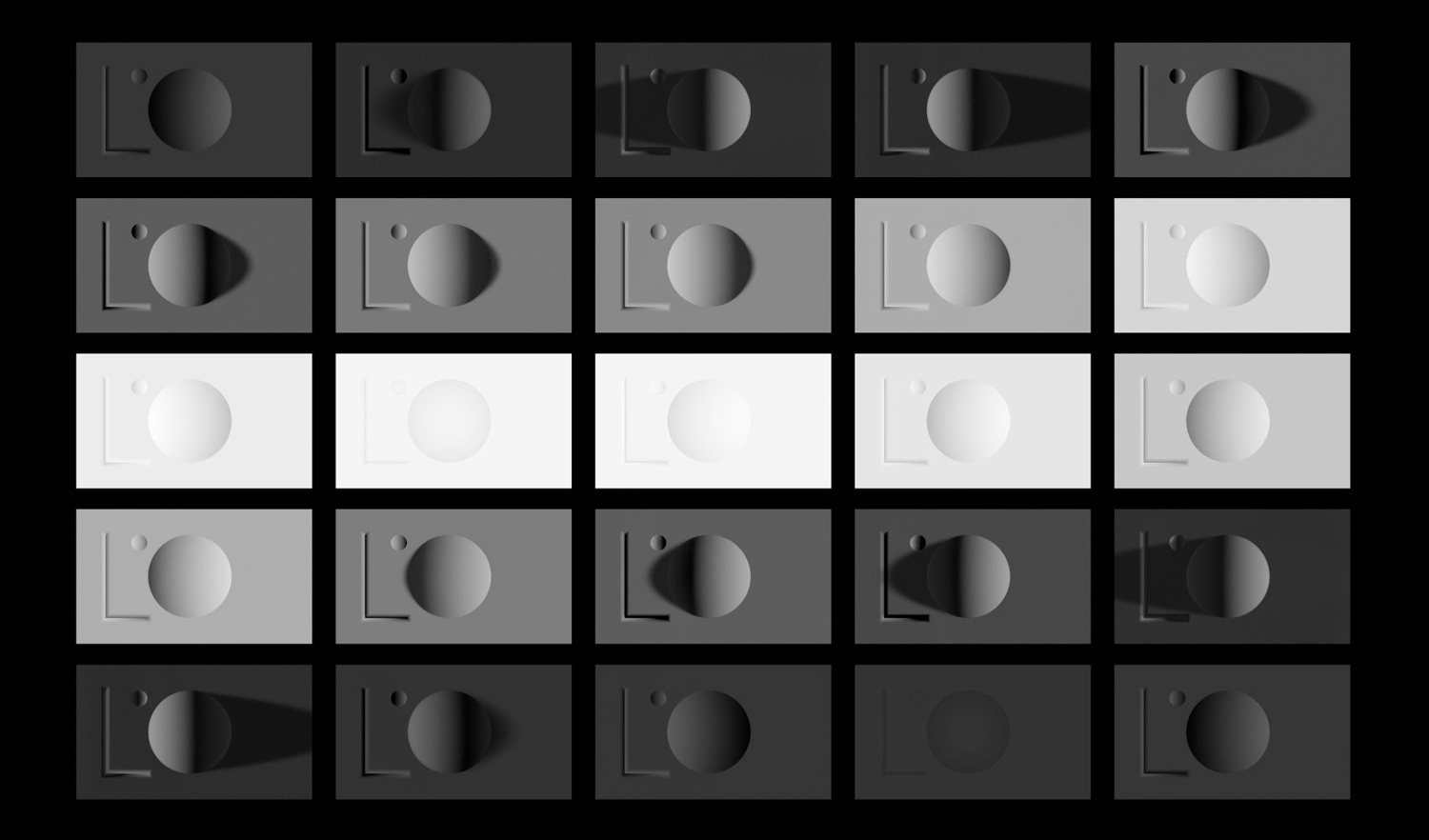
The contact page features a rendering of logo (above) with its lighting tied to time of day. It is a small but neat detail that effectively emphasises the theme of illumination with a single light source, some basic forms with an accentuated depth and height, distilling down what is complex and nuanced service into a very clear graphic expression, whilst also acknowledging the changes in natural light throughout the day.
Design: Triboro. Opinion Richard Baird.
