Tangent GC Soap by Carl Nas Associates
Opinion by Richard Baird Posted 17 October 2016

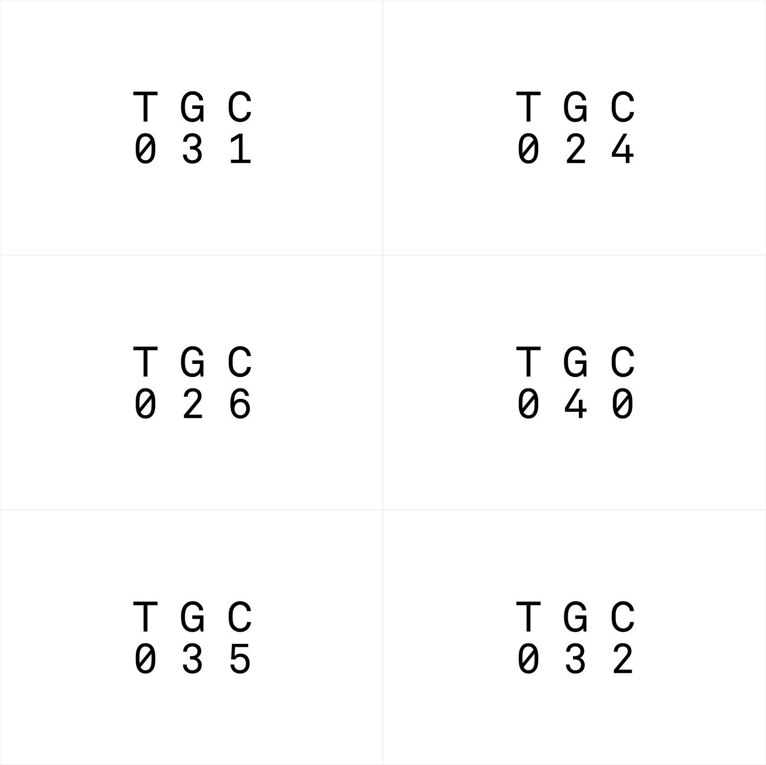
Tangent GC is a Scandinavian organic garment and shoe care company developing products that intend to ensure longevity. The company’s brand identity, a simple utilitarian typographical expression, designed by Essen International, delivered a sense of informational immediacy through the absence of superfluous stylistic detail and colour, dividing content in the arrangement, orientation and typesetting of Akkurat Mono.
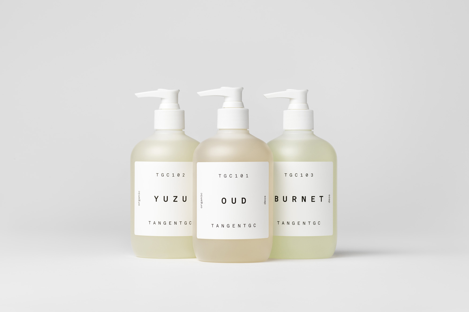
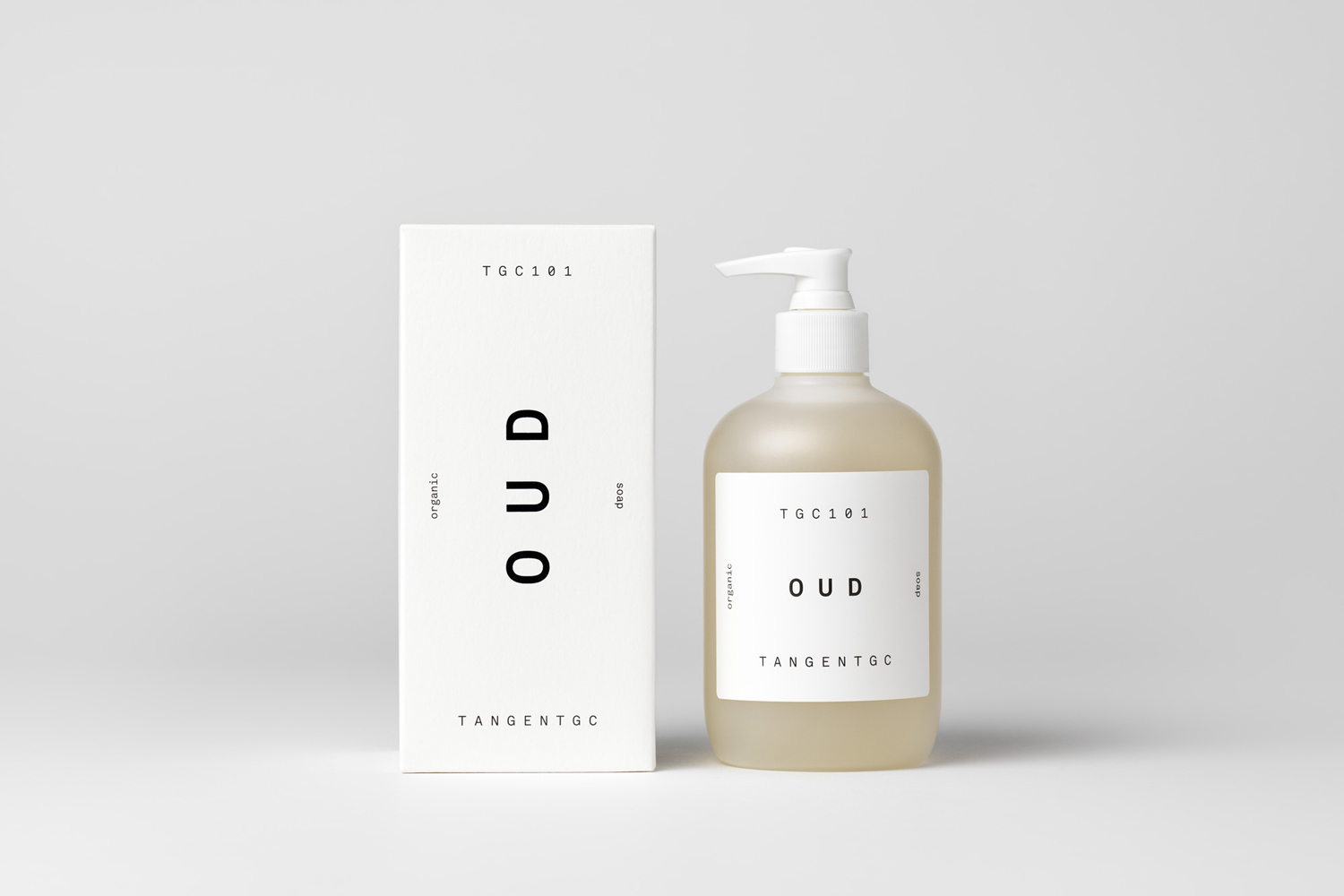
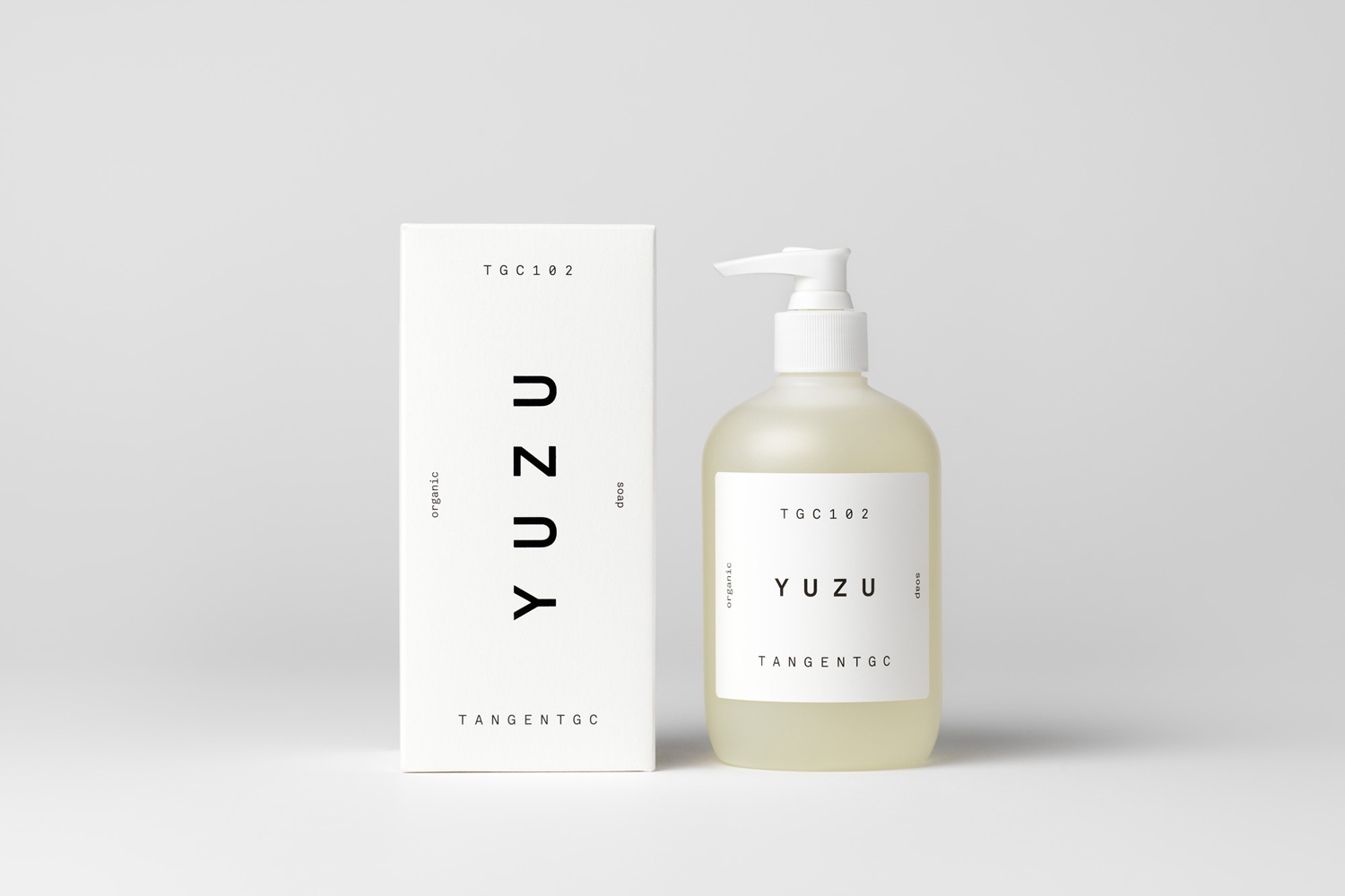
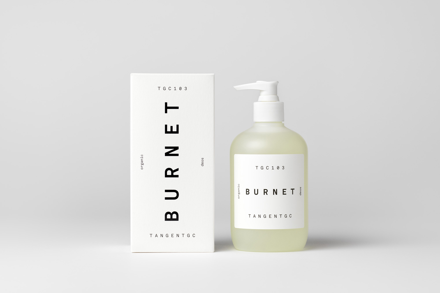
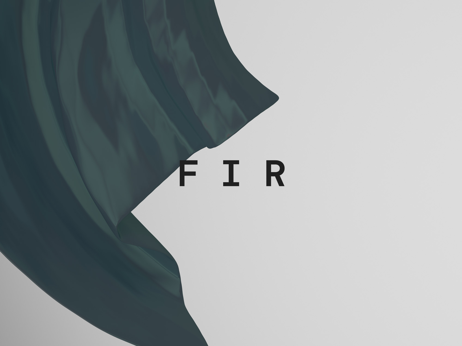
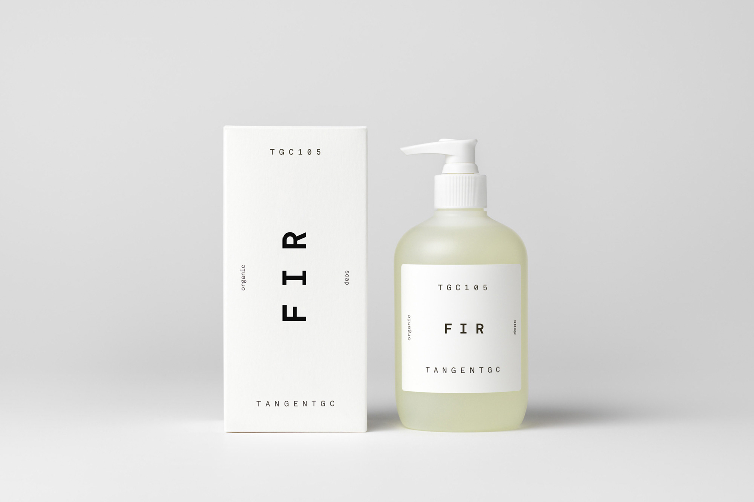
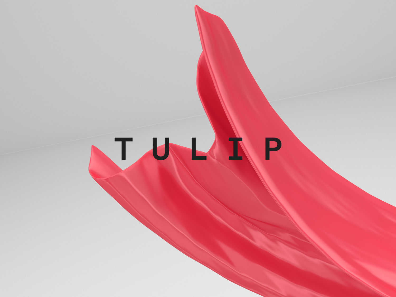
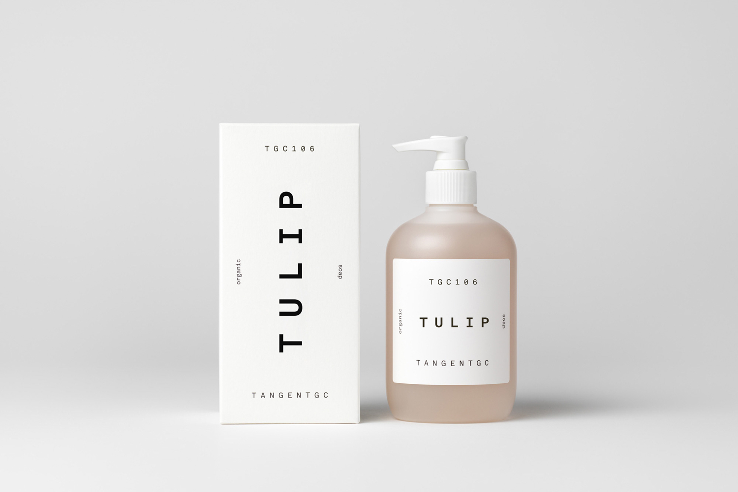
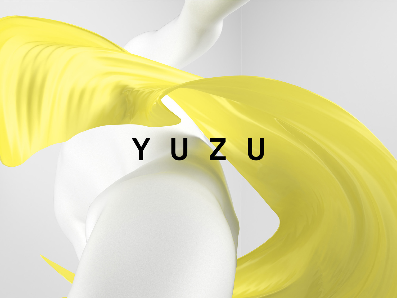
Venturing into organic personal skincare, Tangent GC worked with London-based Carl Nas Associates to build on the visual language laid down by Essen International, with a similar approach to packaging, whilst introducing a beta version of Akkurat Mono Bold and a launch campaign of dynamic image that makes a connection with the brand’s beginnings, visualising fragrance as swirling fabric. This post was updated October 2017 with more campaign and packaging images as TangentGC launch new products.
Essen International’s combination of basic typographical form and the absence of colour effectively communicated the practicality and researched effectiveness of Tangent GC’s garment and shoe care products, and their open use of natural ingredients.
Although a clinical and reductive visual expression is by no means unique, within garment care, it stood out. However, moving into skincare, this becomes a touch more commonplace and, to some degree, lacks a more personal connection, particularly when closely tied to the utilitarian nature of TGC’s products.
The introduction of swirling colour and white unclothed human form set in a white environment addresses this but in keeping with the visual restraint of TGC’s brand identity system. Although garment care is utilitarian in nature, collaborations with A.S.P. has tied TGC closely to fashion and this is now more explicitly worked into brand.
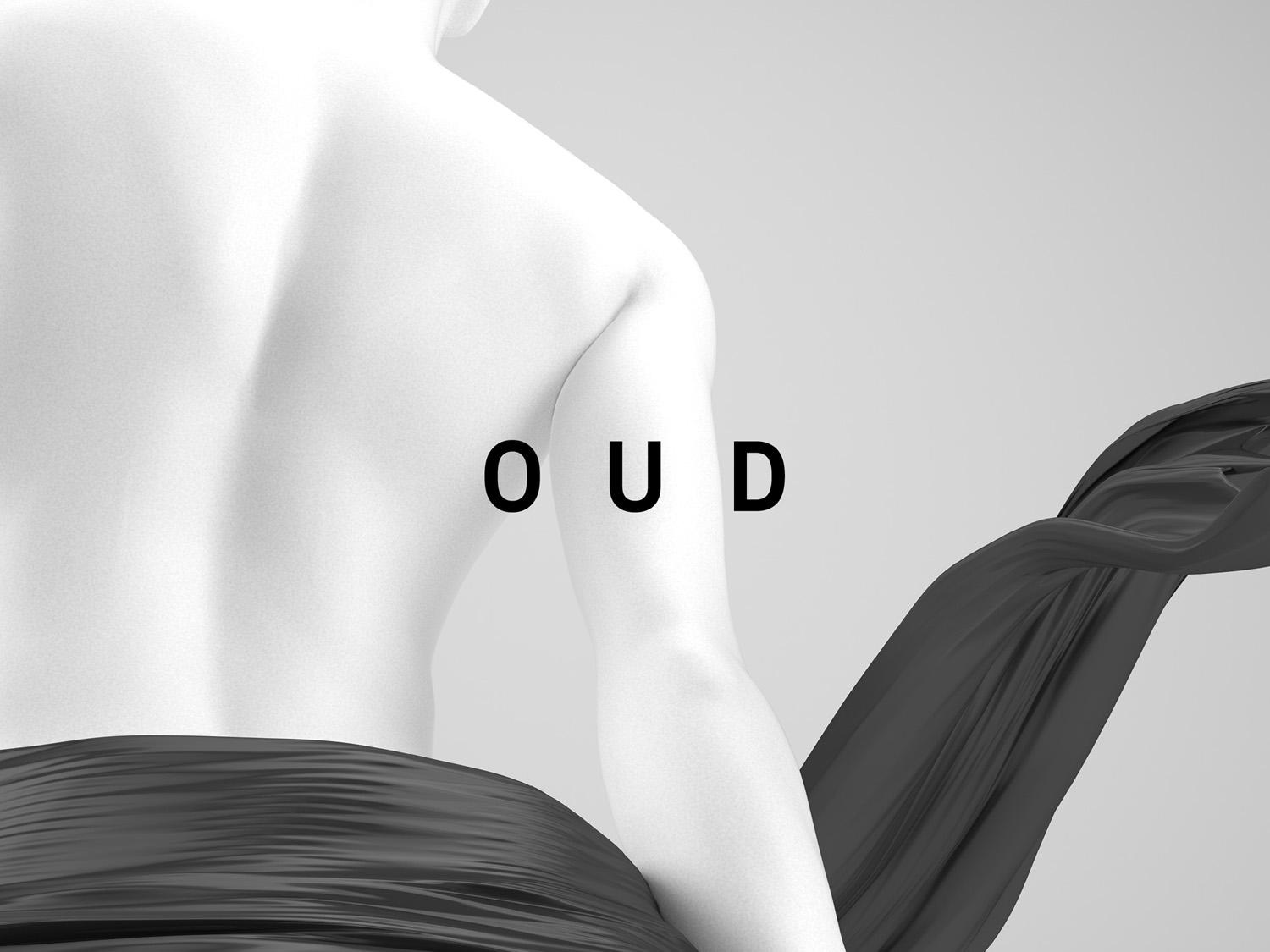
A choppy editing style, punchy soundtrack and smooth floating fabric imagery makes for an interesting mix that feels youthful and more obviously fashion-led, which also plays out in the layout of posters.
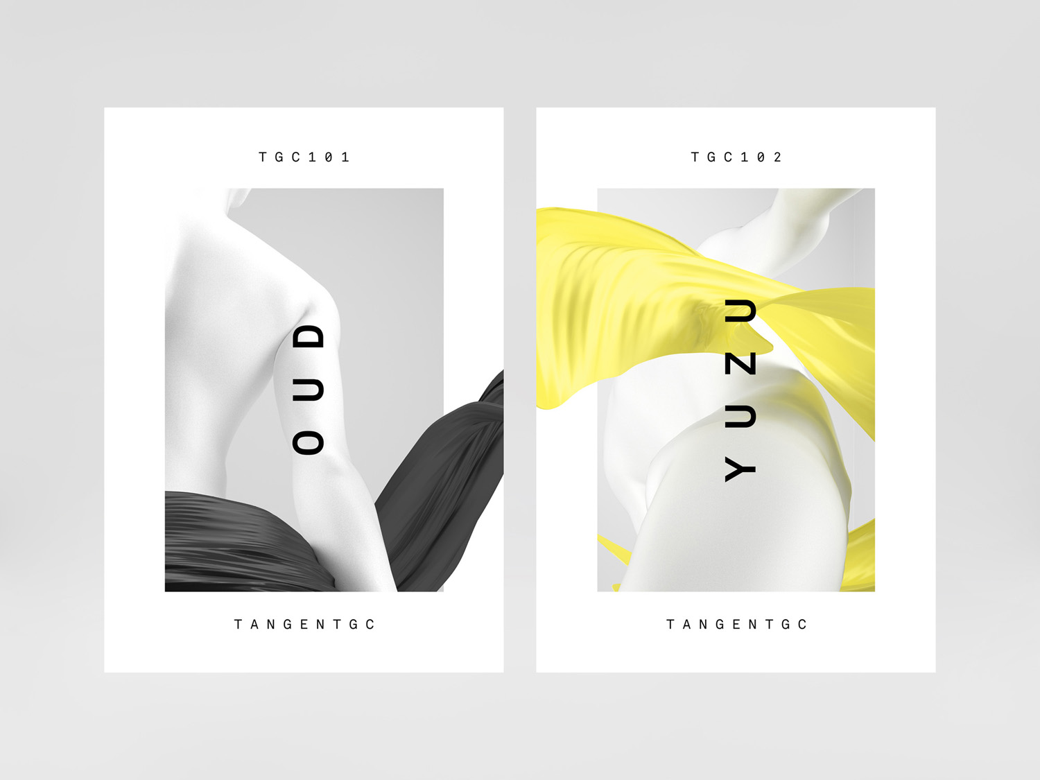
The use of a beta version of Akkurat Mono Bold from Lineto shares the monospaced structure and monolinear qualities of the type used throughout TGC’s garment care range, however its weight, and orientation across boxes provides some form of differentiation, and comfortably falls in line with the contemporary cosmetics and fashion brands.
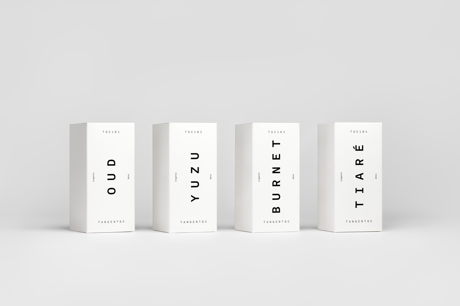
Packaging does not stray too far from what has come before, there is a clear continuity, however, campaign image makes a connection between garments and fragrance and gives the project a more notable visual style and conceptual distinction.
Design: Carl Nas Associates. Opinion: Richard Baird. Fonts Used: Akkurat Mono Bold Beta.
