Royal West of England Academy by Spy
Opinion by Richard Baird Posted 1 November 2016

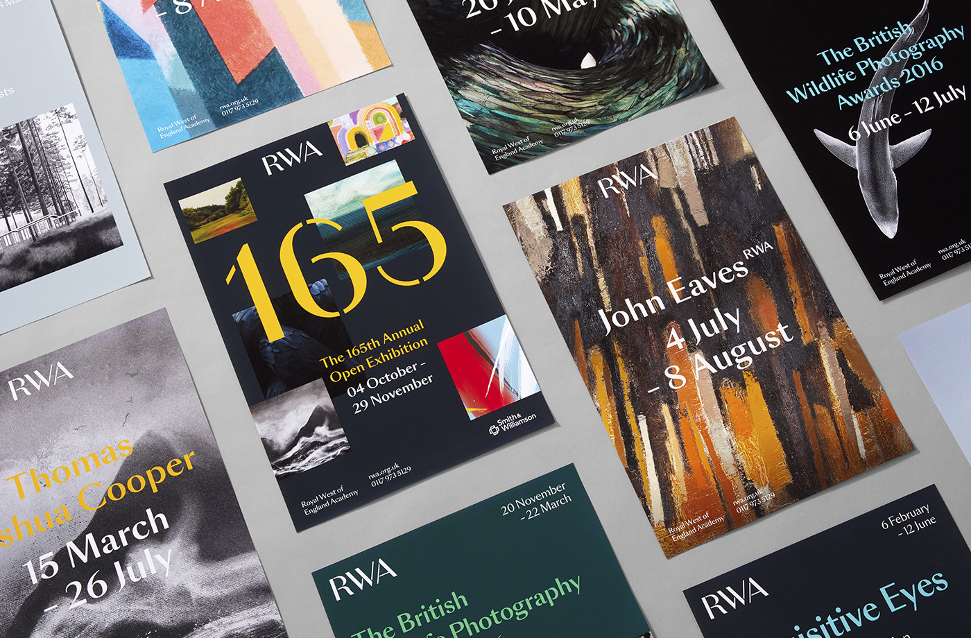
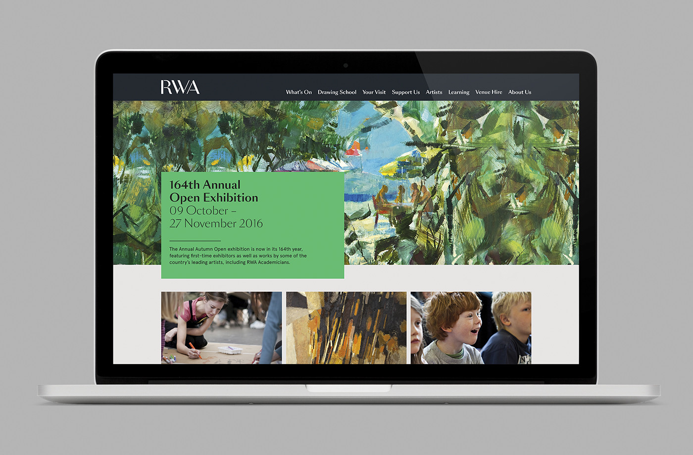
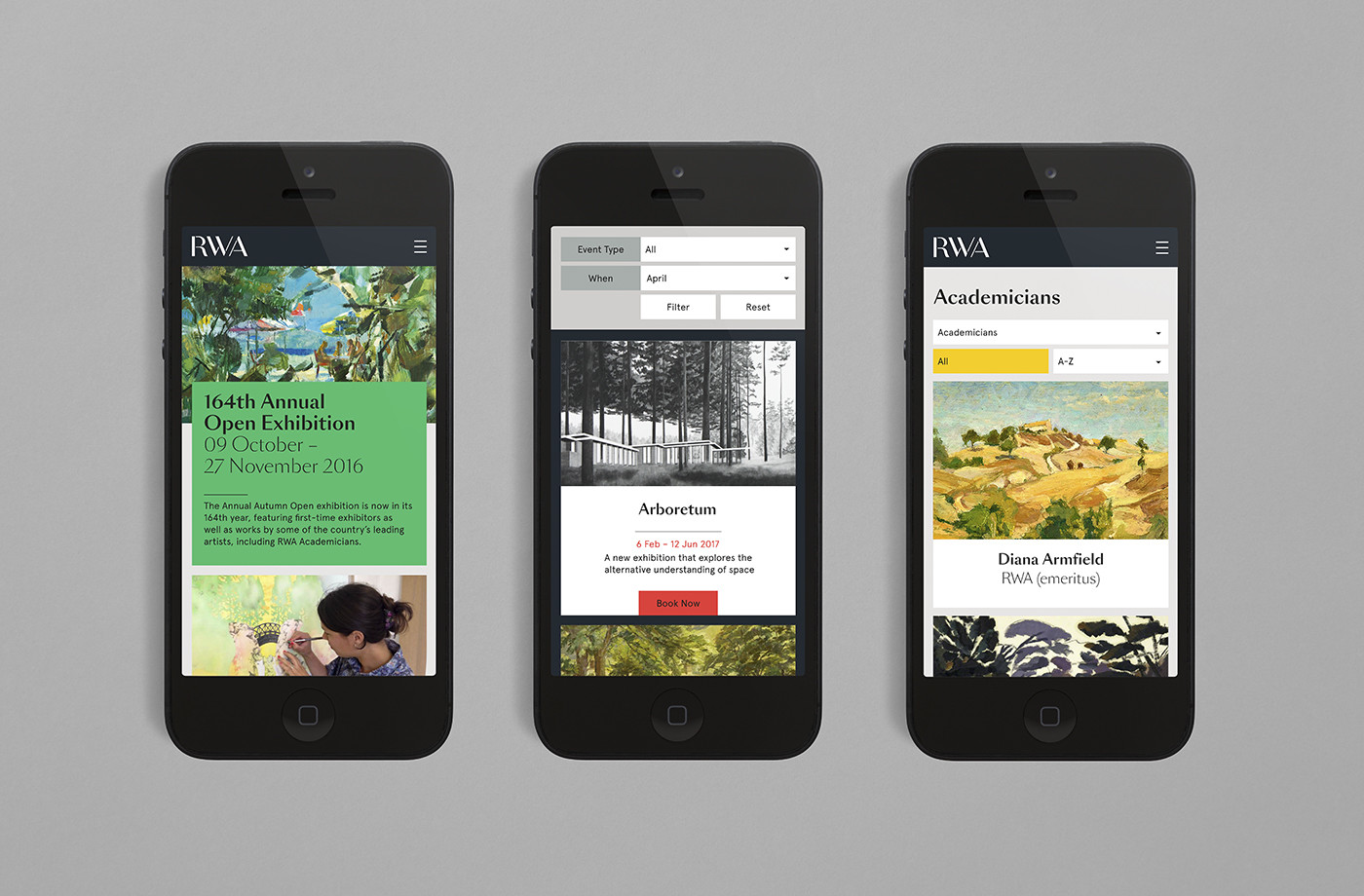
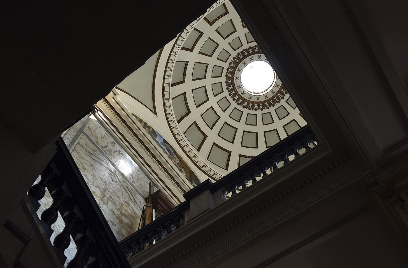
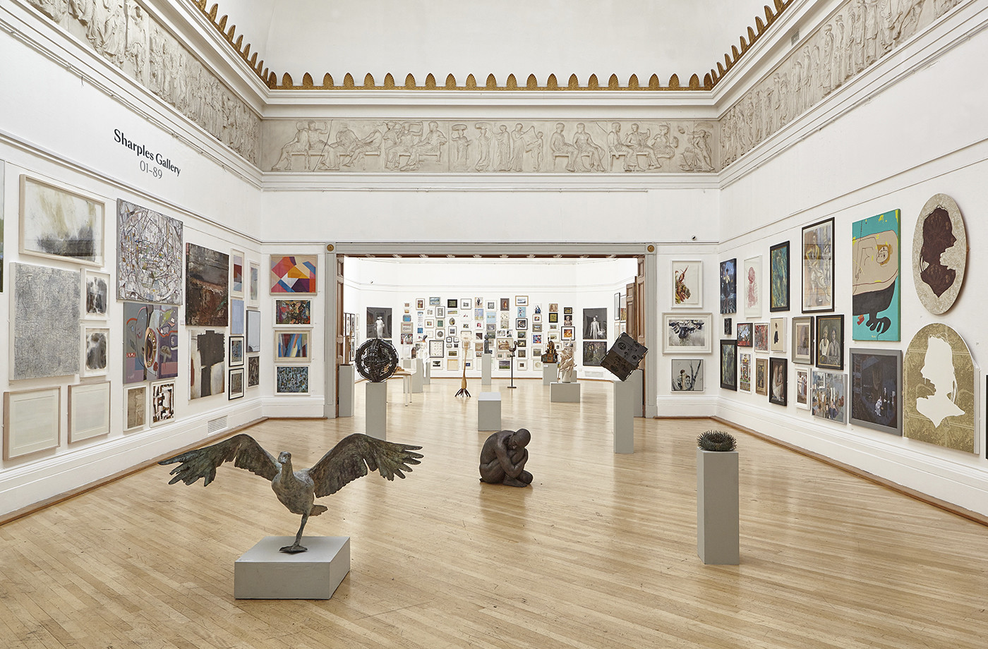
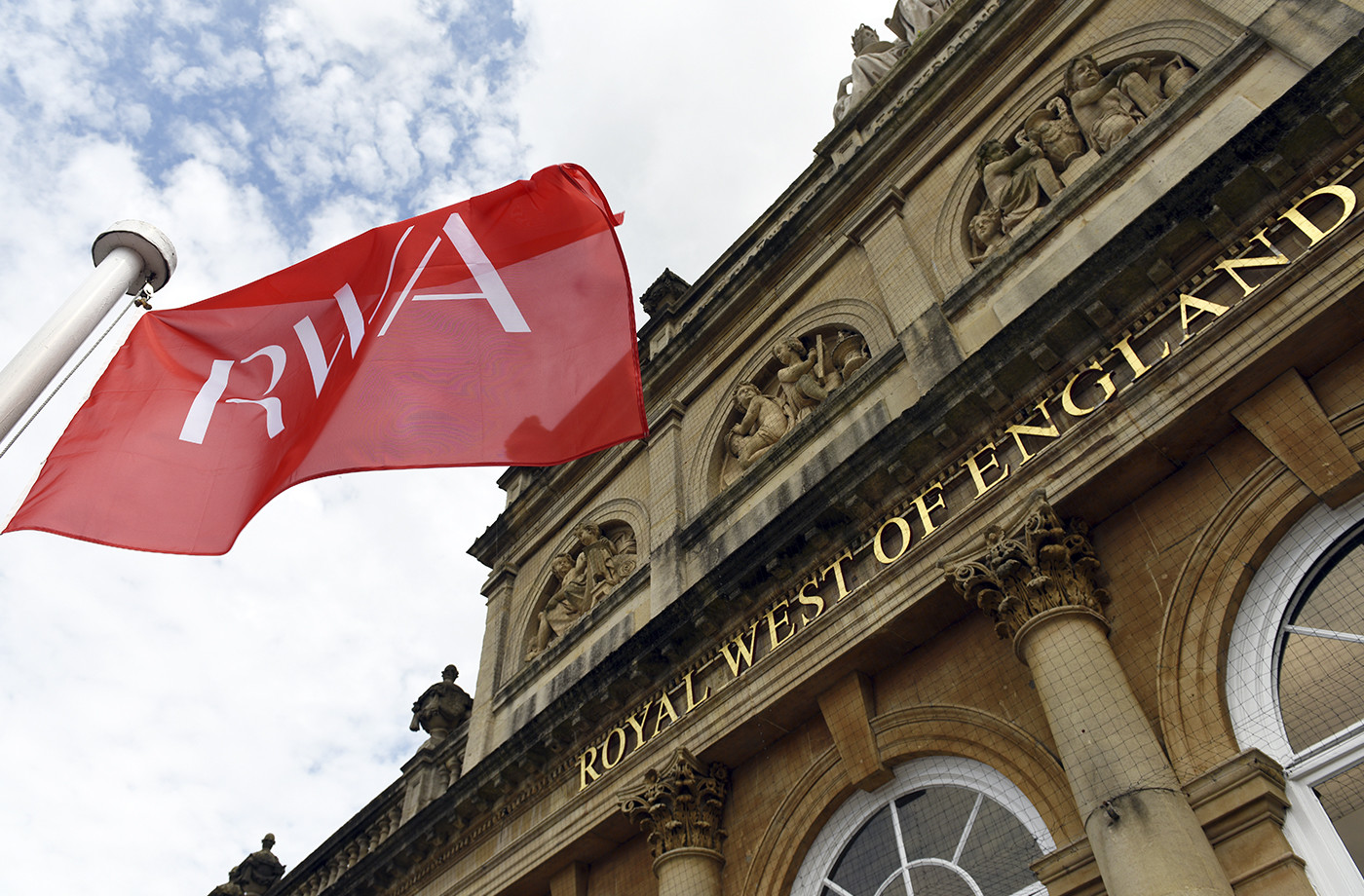
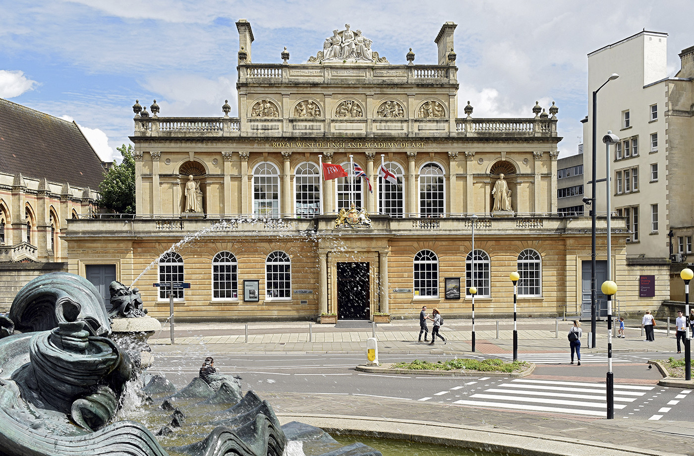
Royal West of England Academy brings world-class visual art from around the world to Bristol. It is the city’s first art gallery, the UK’s only regional Royal Academy of Art, and is located in a grand Grade II listed building. RWA worked with London-based graphic design studio Spy to develop a visual identity that would feel relevant and engaging, and re-establish confidence in the institution’s mission, both internally and externally. Spy developed a system that works with a vast library of content, and provides staff with the tools to effectively communicate with visitors and potential patrons. This runs across and links a variety of assets including brochures, posters, business cards and website.
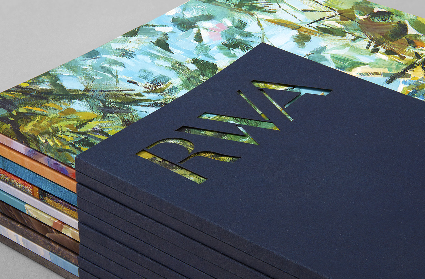
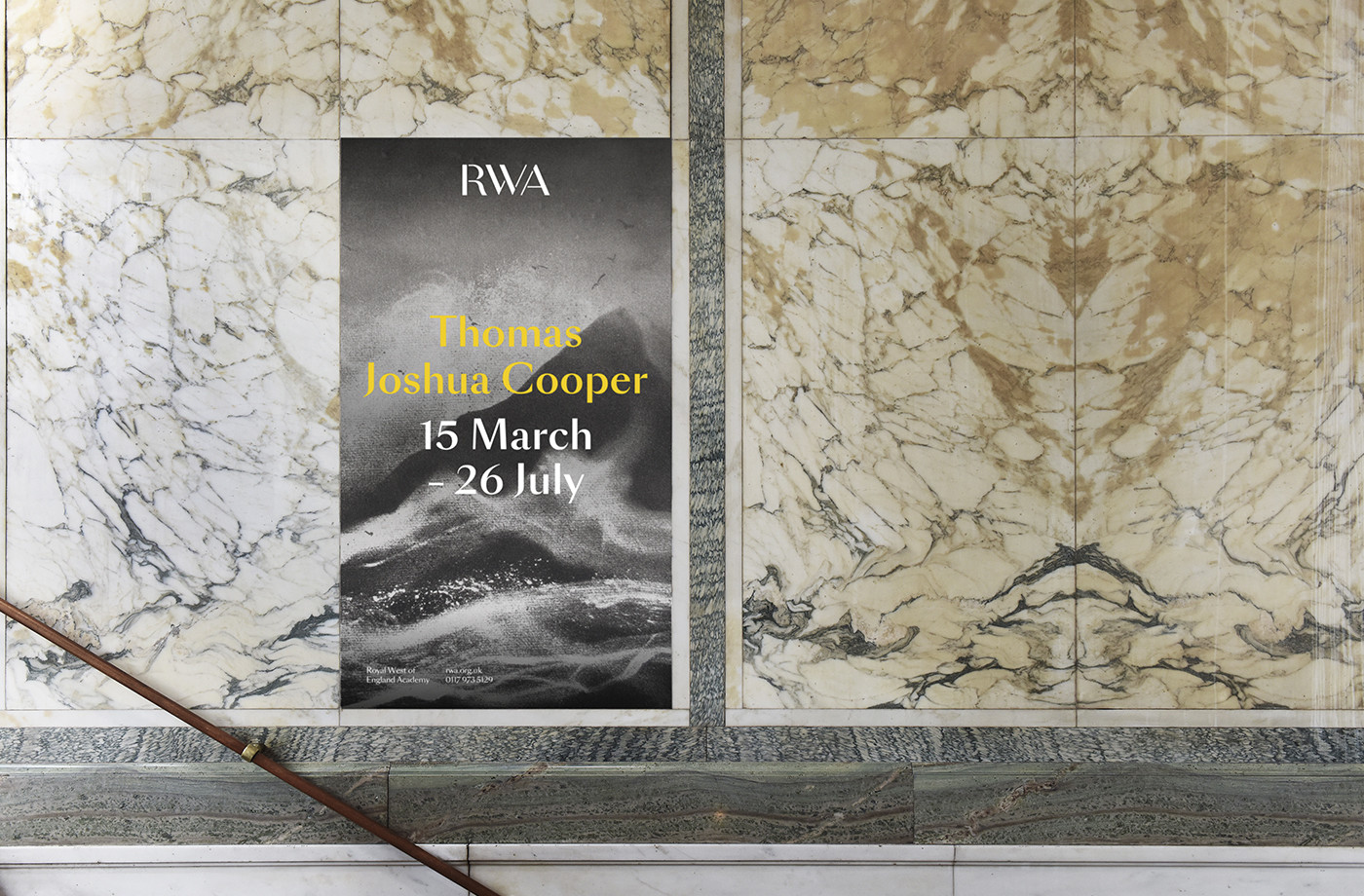
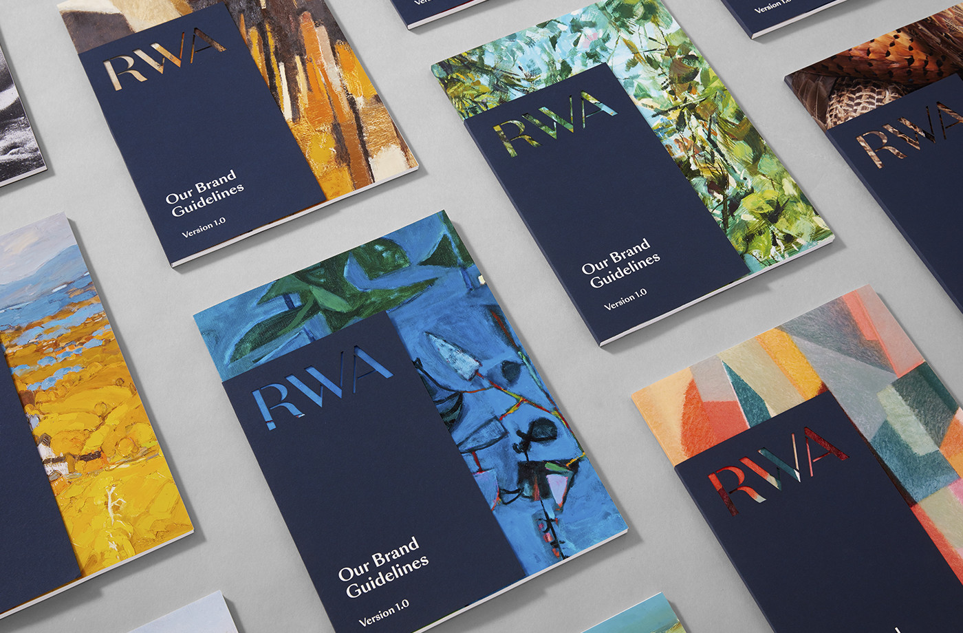
Spy’s work for RWA effectively plays with contrast in a way that is sensitive to the history of the gallery but also addresses the need to appear current, and makes great use of the gallery’s catalogue of image. Logotype is perhaps the most simple and explicit articulation of this in the cuts through the more elegant and calligraphic foundations of the logotype’s letterforms, but can also be seen in the way bright colour, movement and irregular forms of artwork that punctuate a robust interior of marble blocks through posters.
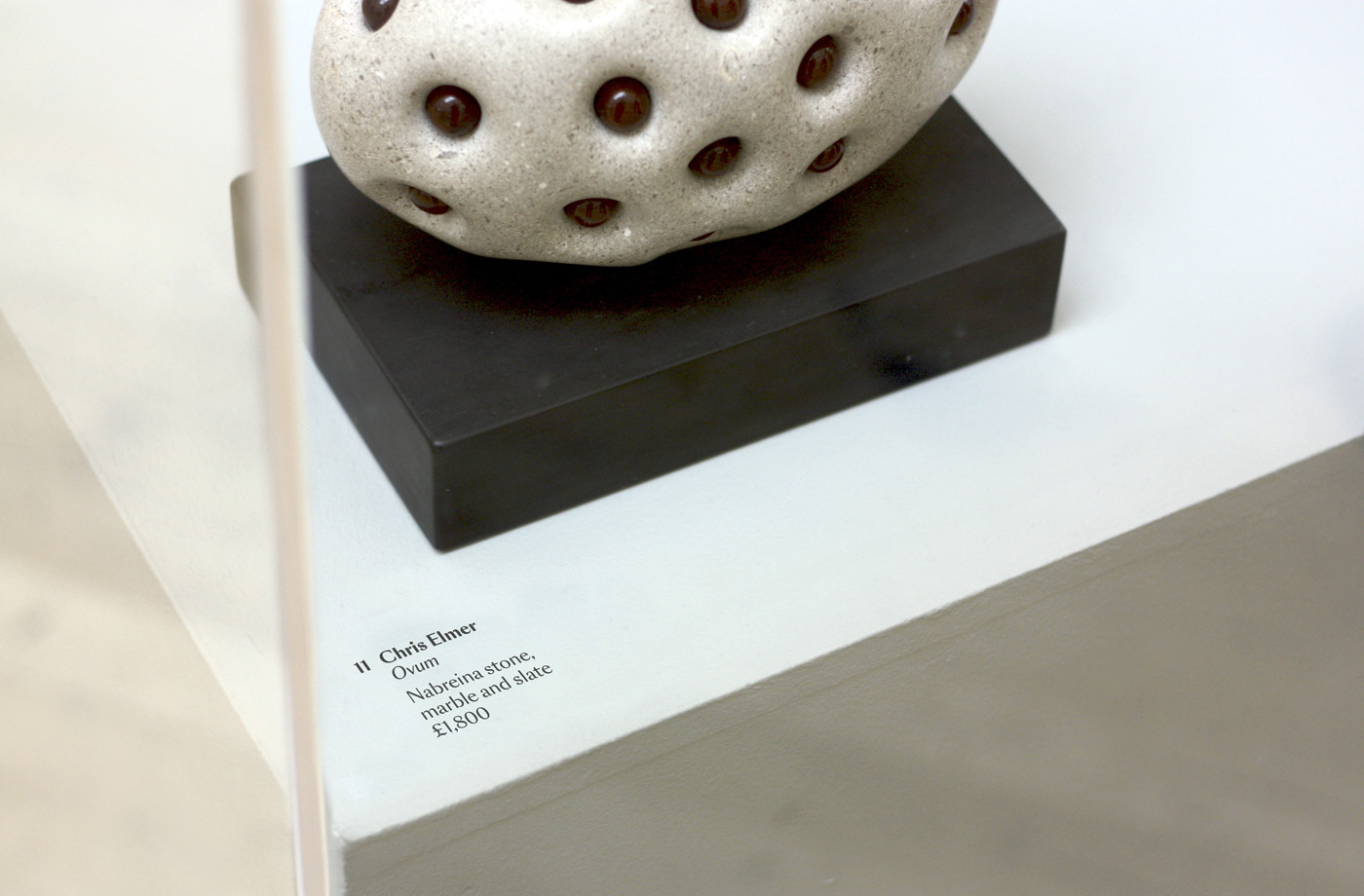
The oppositional typographic nature of logotype, which is a vast improvement on a very awkward previous iteration (both restrained and communicatively well-intentioned), also plays out in the choice of Swiss Typeface’s SangBleu Sans across posters, flyers and brochure, and the use of Colophon’s Aperçu online.
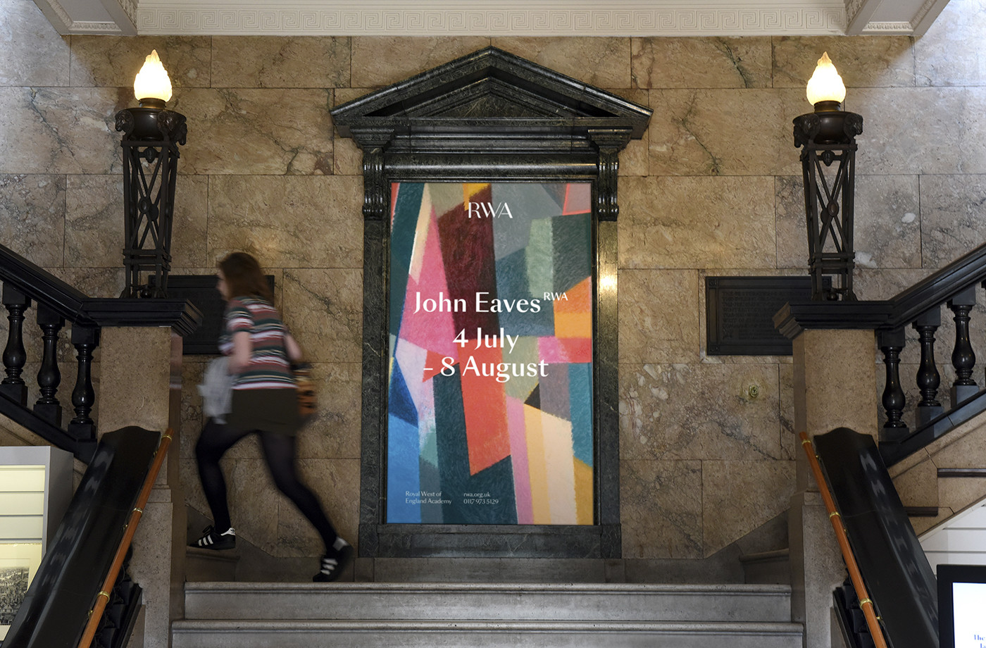
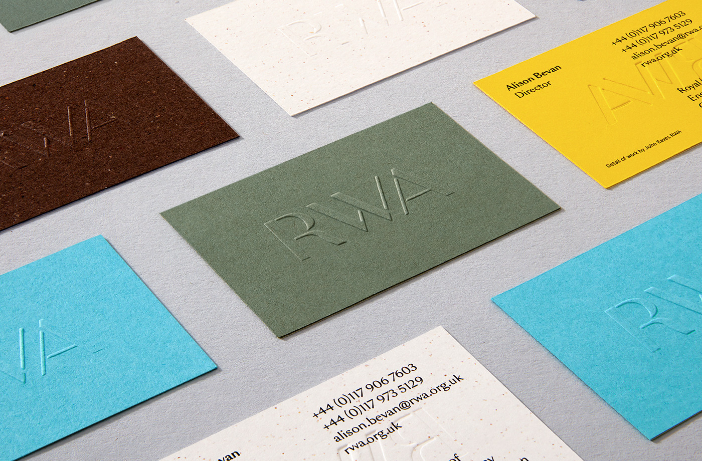
The juxtaposition of image, full of colour and visual texture, alongside panels of solid colour and dyed paper, which forms a strong continuity between website and print, is a particular highlight. Again, the communicative intention is clear and familiar, but the choice of artwork, making the most of the unique collection of the gallery, and the colour palette, alongside small details such as die cut sleeves that place colour inside logotype, uncoated papers, blind emboss and mixed fibre boards, lend the work distinction, impact and a crafted quality. More work by Spy on BP&O.
Design: Spy. Opinion: Richard Baird. Fonts Used: SangBleu Sans & Aperçu.
