Sardine by Here Design
Opinion by Richard Baird Posted 28 November 2016

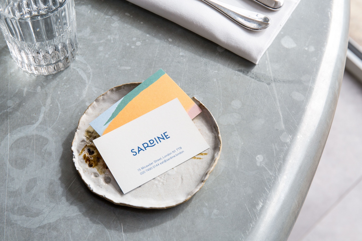
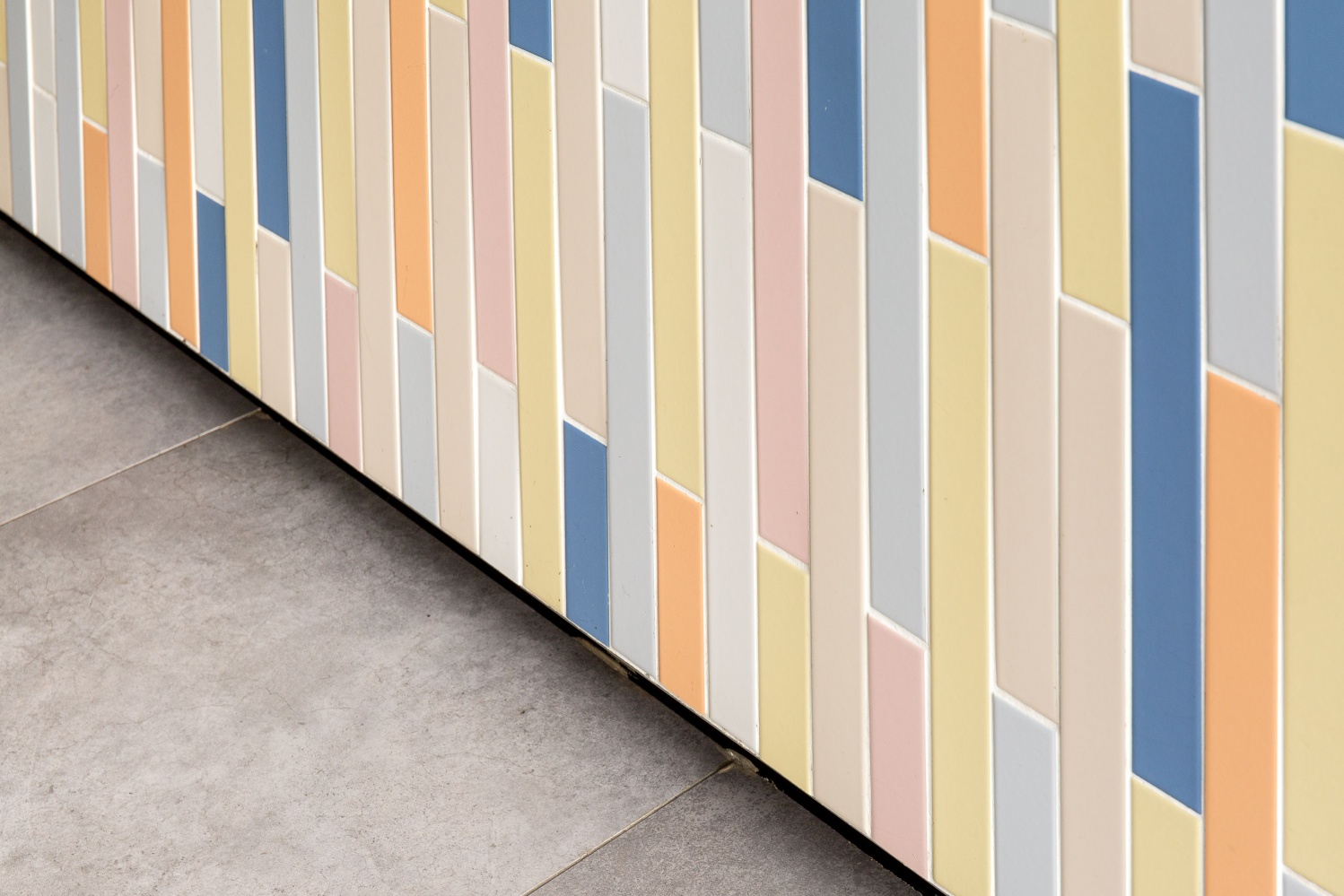
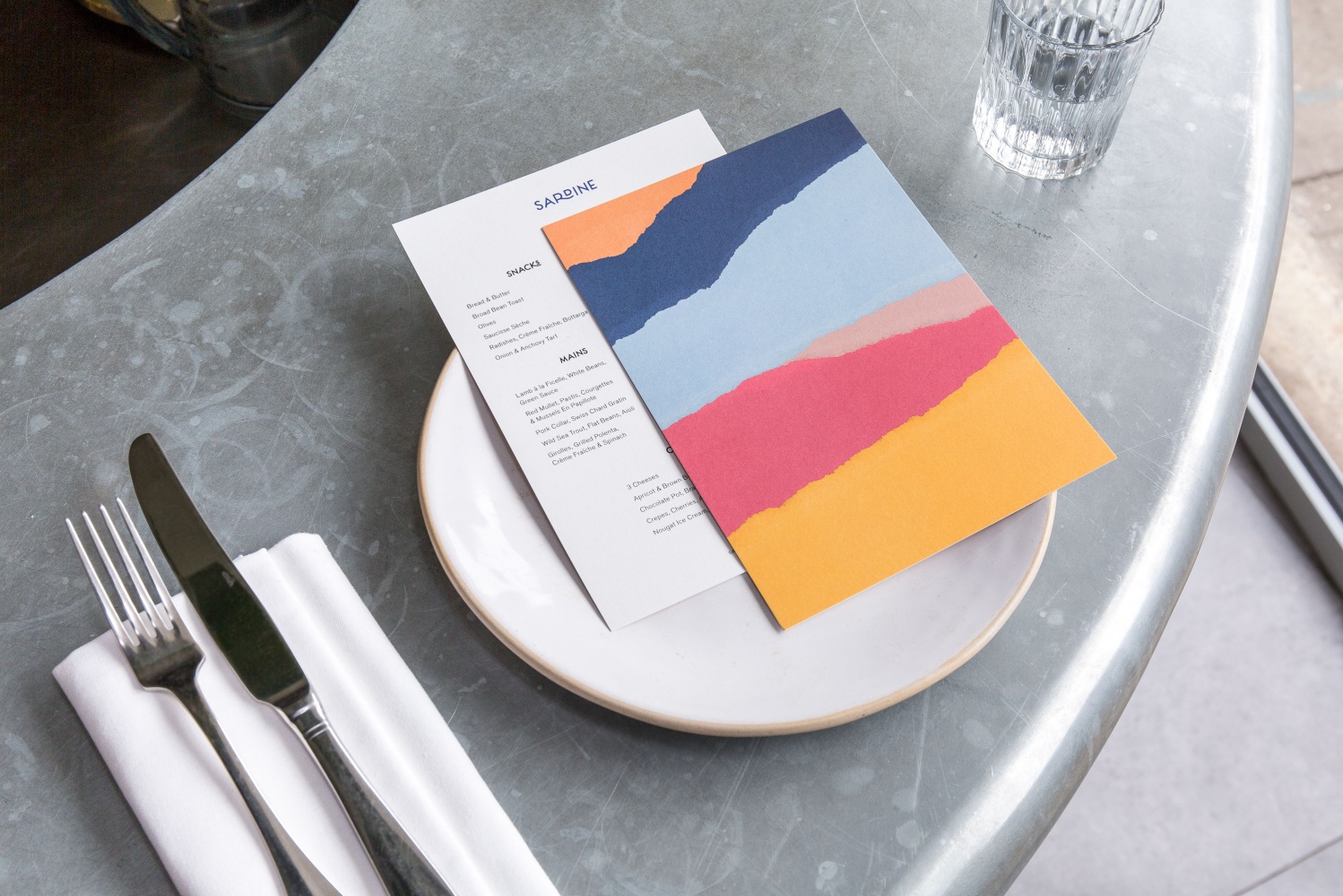
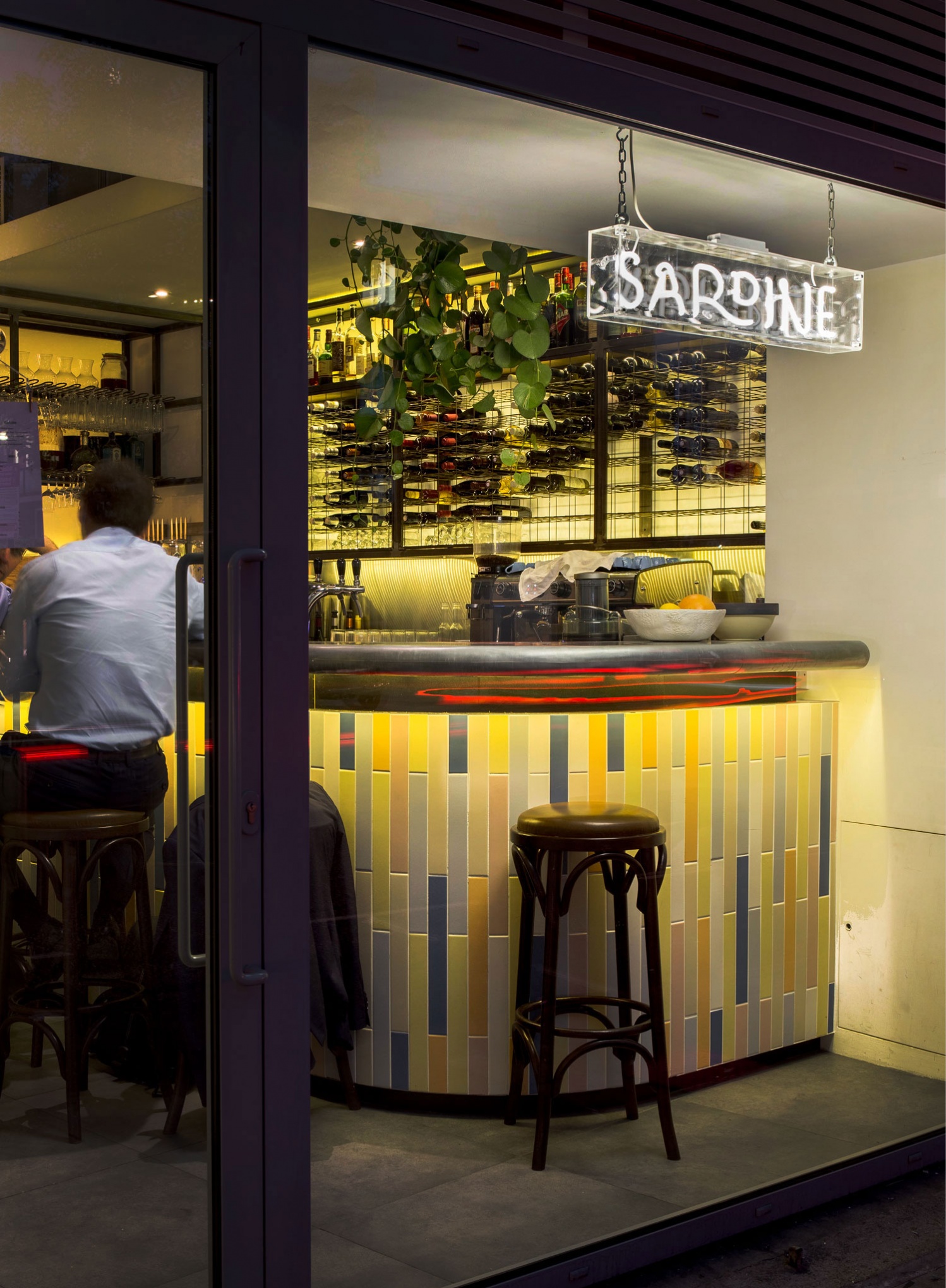
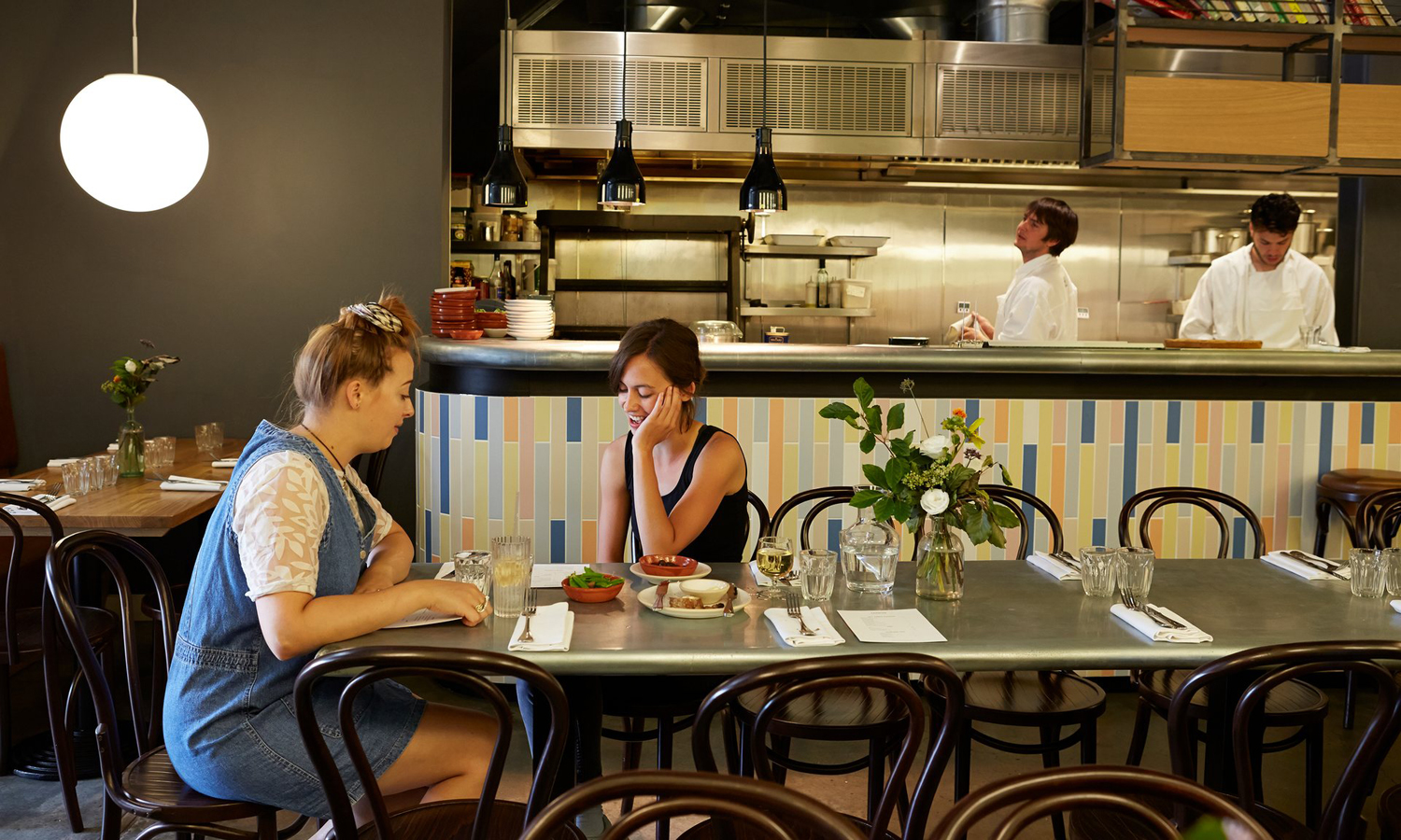
Sardine is a restaurant, located on London’s Micawber Street, with a simple menu of rustic, Southern French and Mediterranean-inspired dishes cooked over a wood fire. It features an interior design of bent wood chairs, open kitchen, steel and light wood table tops and a brand identity created by Here Design. This adds a touch of a mediterranean colour to interior through menus and tile detail, while also linking other assets such as business cards and website.

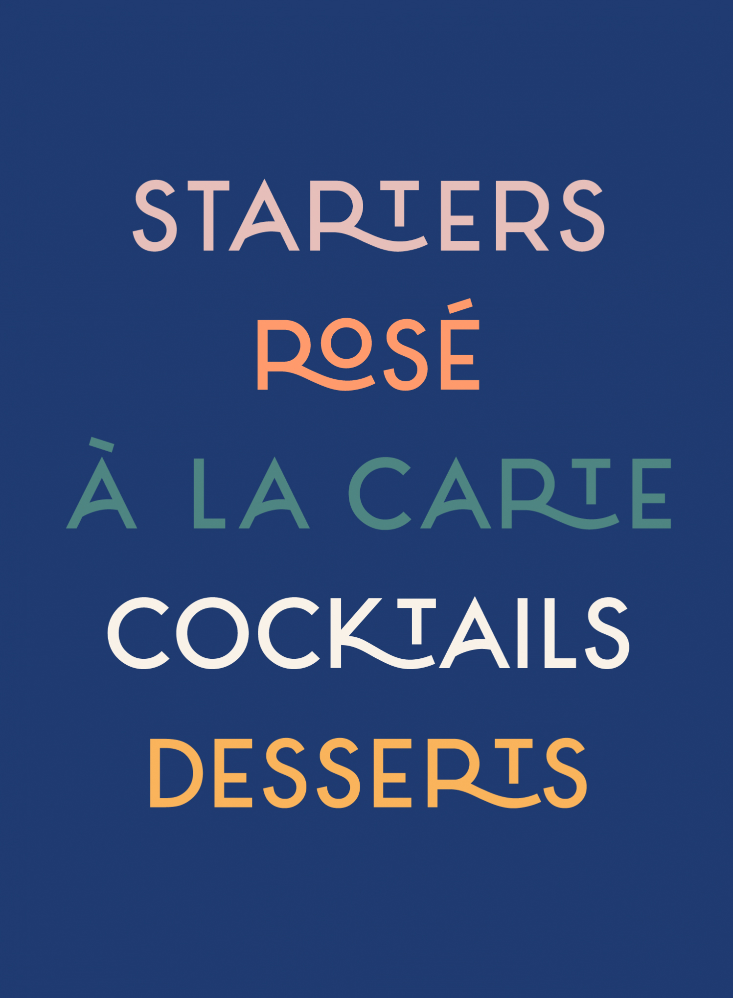
Here Design manage to weave together a bunch of familiar references, draw character from their combination and link them to interior. Type, much like the studio’s work for Little Italy, does a good job of touching on hand drawn Italian signage through geometric forms, monolinear lines and small flourishes. These flourishes occasionally appear a touch awkward but find a balance between authenticity, contemporary polish and memorability.
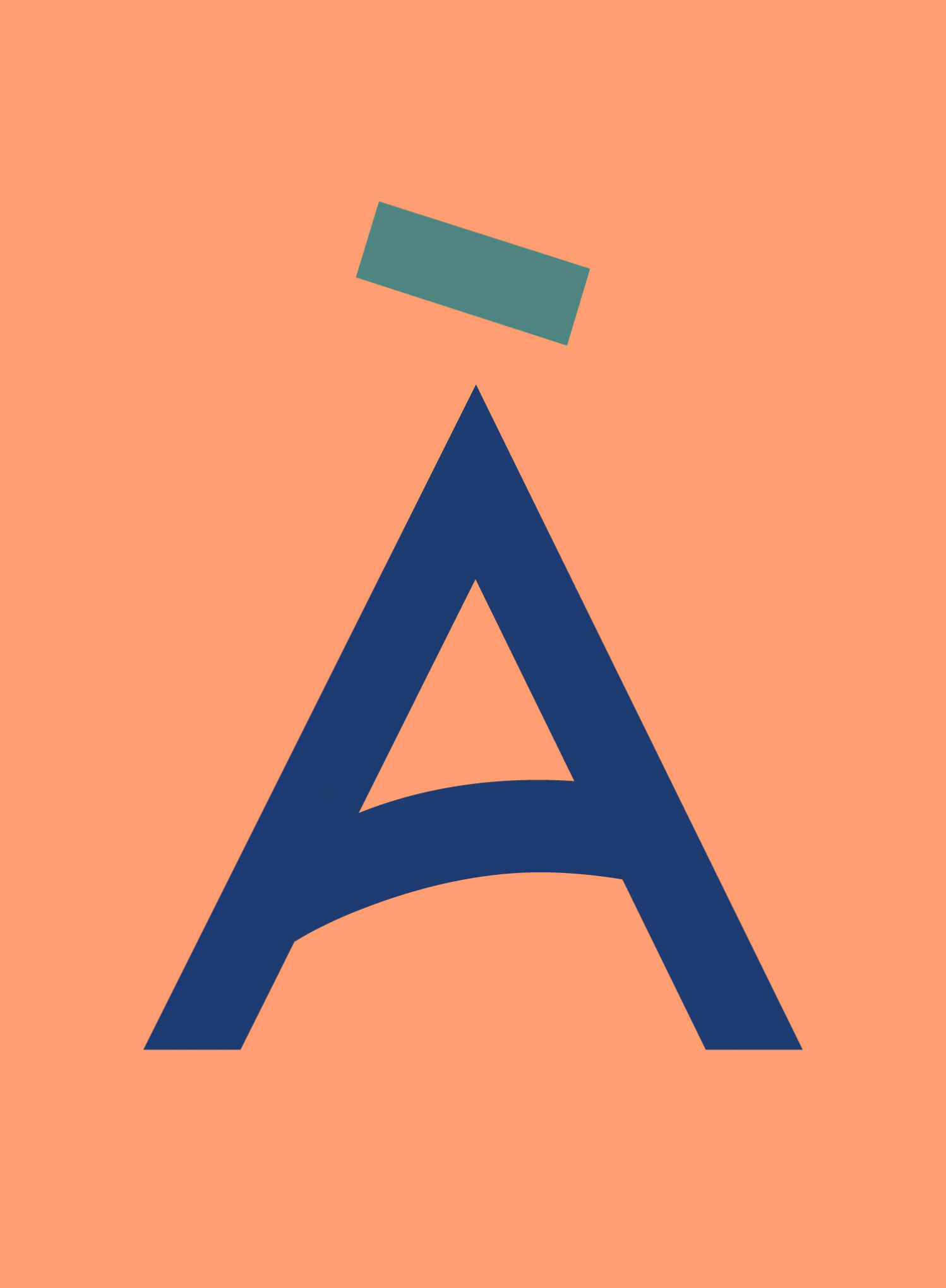
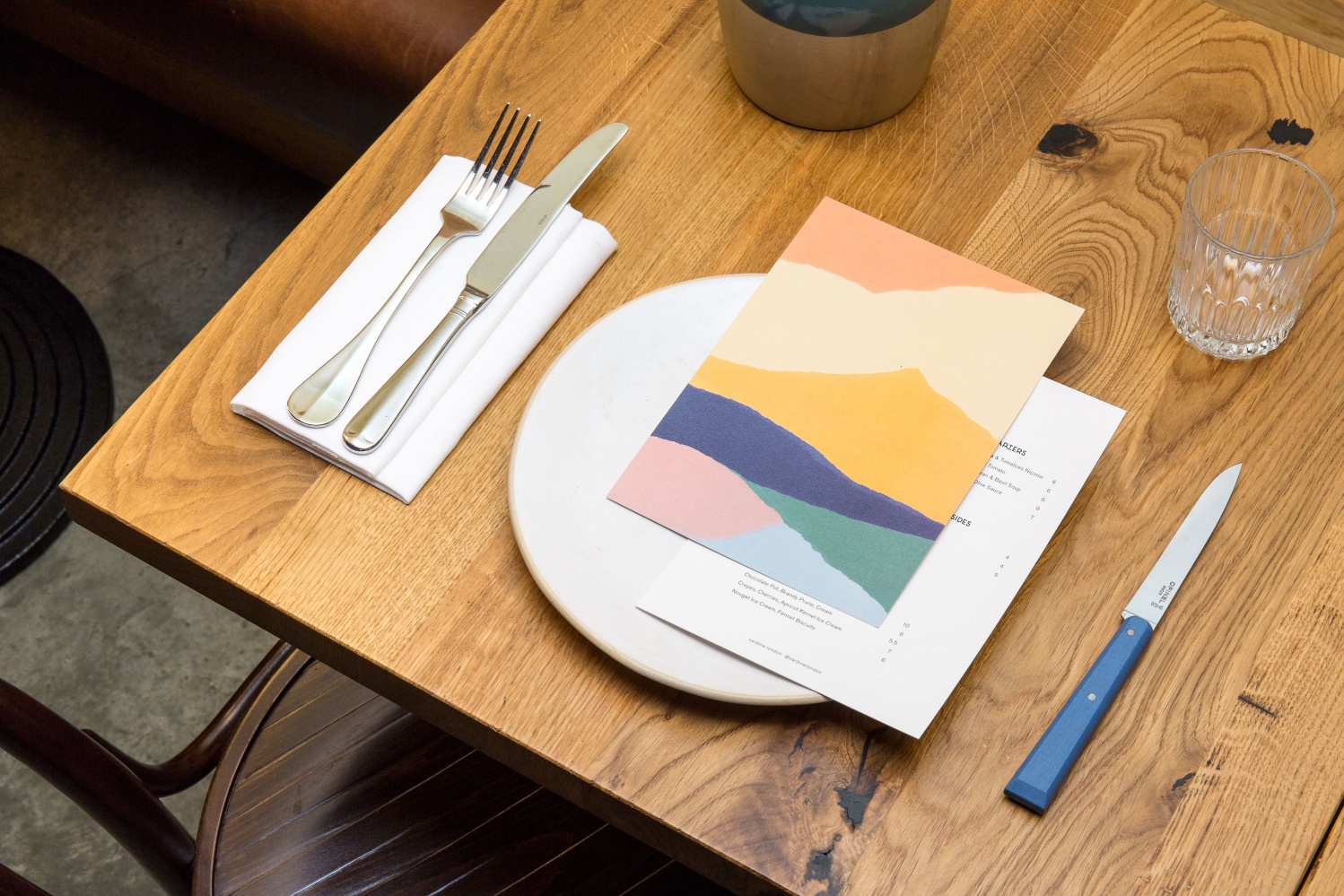
The rough lines, composition and texture of image that runs across menus, business cards and website, inspired by Matisse cut-outs, make a good connection between art and culinary craft, and offer contrast to the wood, steel and concrete of interior. These are simple and discernible in concept, and varied and visually interesting in execution.
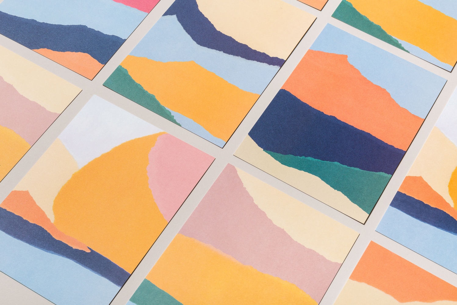
A bright colour palette, in conjunction with form, effectively draws on mediterranean coastal landscapes. This also makes its way into interior through tall vertical tiles. These are particular highlight, sharing colour with organic image, and shape with geometric typographic form. Although identity is made up of few assets, their clear referential nature, the tone they set and the way some of these works their way into interior is neat, thoughtful and inline with a restaurant with a simple menu.
Design: Here Design. Opinion: Richard Baird.
