Verso Architecture+Interiors by Studio South
Opinion by Richard Baird Posted 21 December 2016
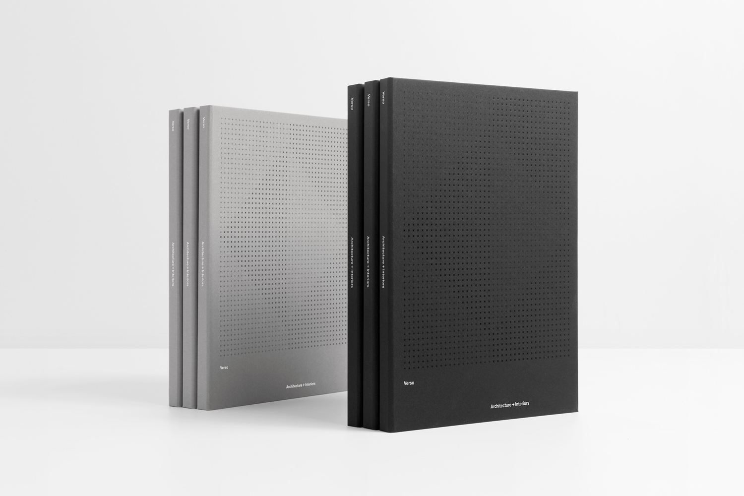
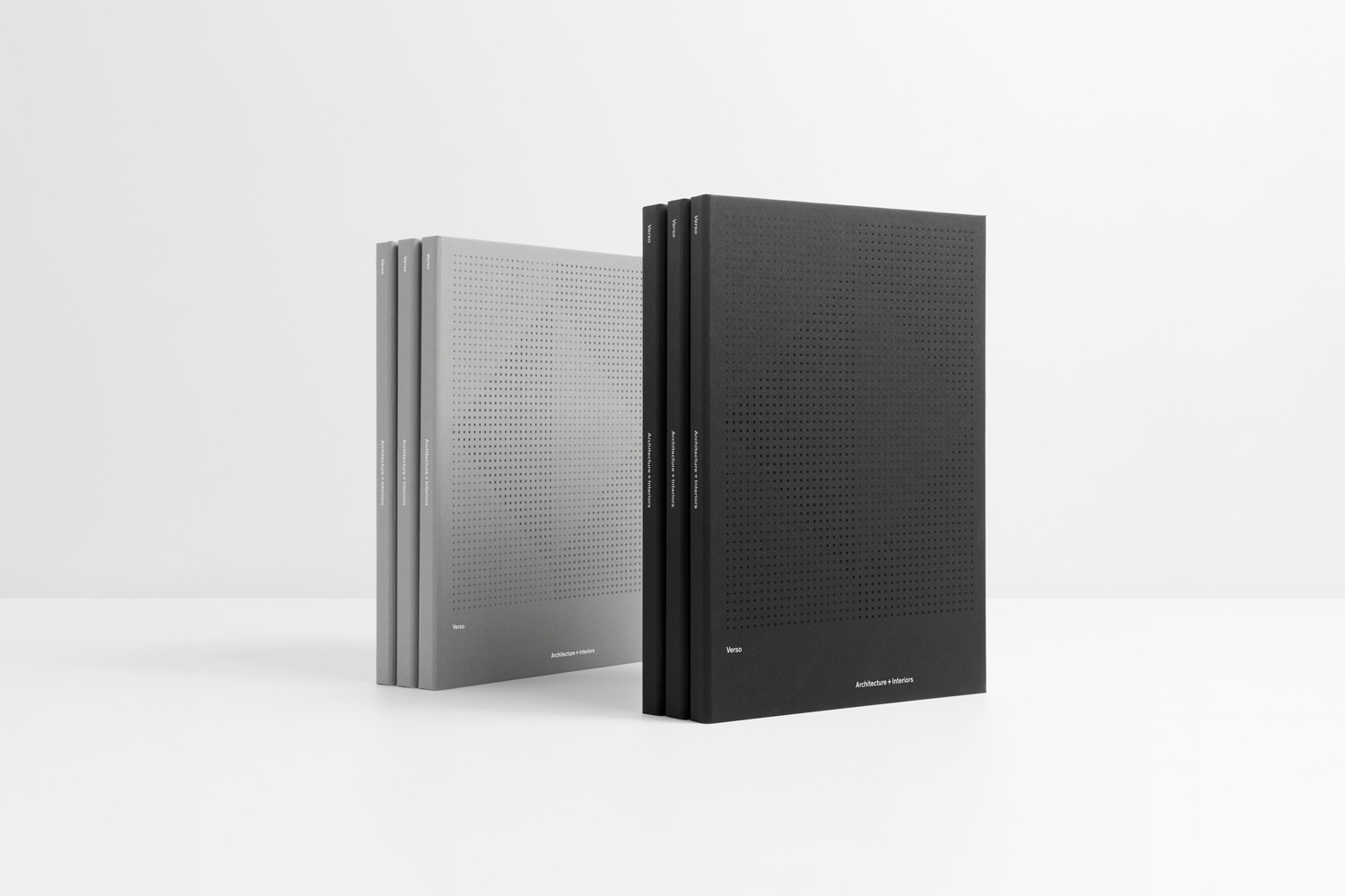
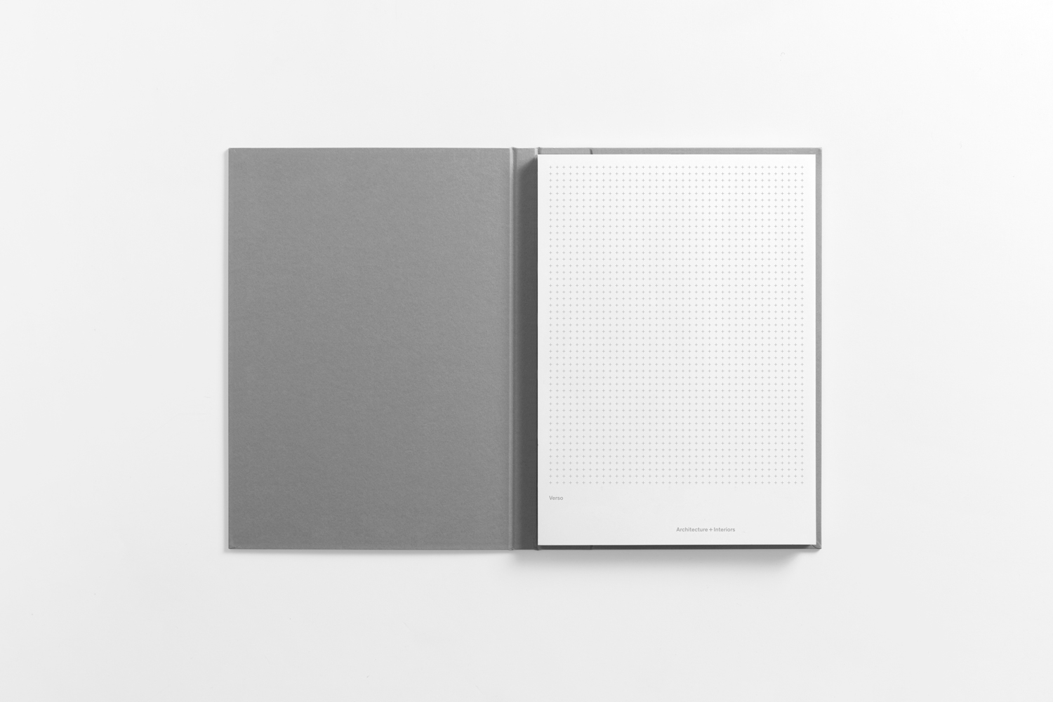
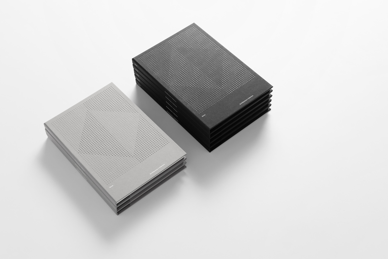
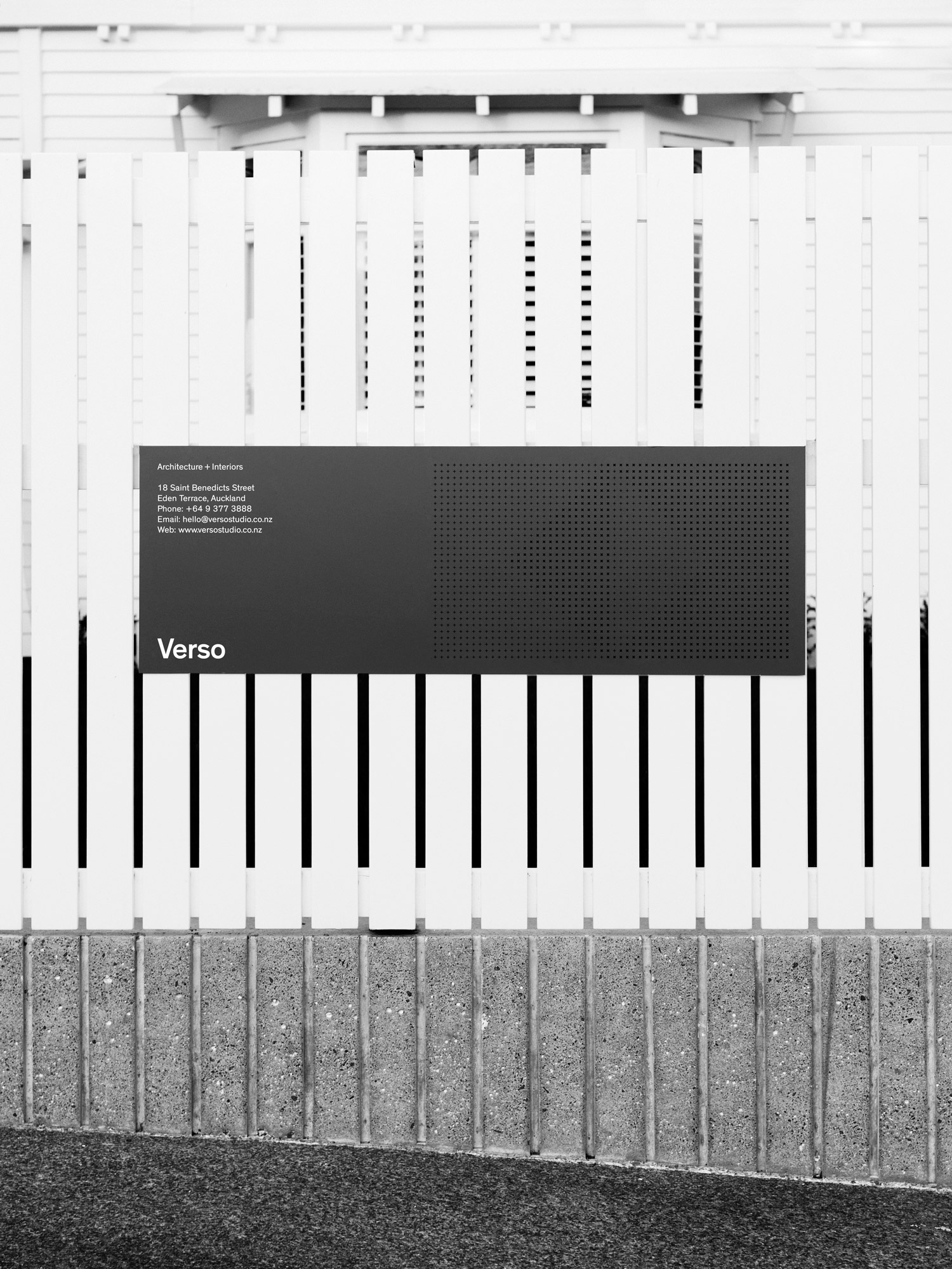
Verso is a small Auckland-based architecture and interiors business working within the residential and commercial sectors. Drawing on the oppositional nature of name and using a mix of simple typographical form, high-quality materials and print finish Studio South developed a new visual identity for Verso that is described as being both sophisticated and playful, whilst effectively working in some universal architectural principles. This links a variety of printed assets that included stationery, business cards, notepad and signage, with website soon to launch.
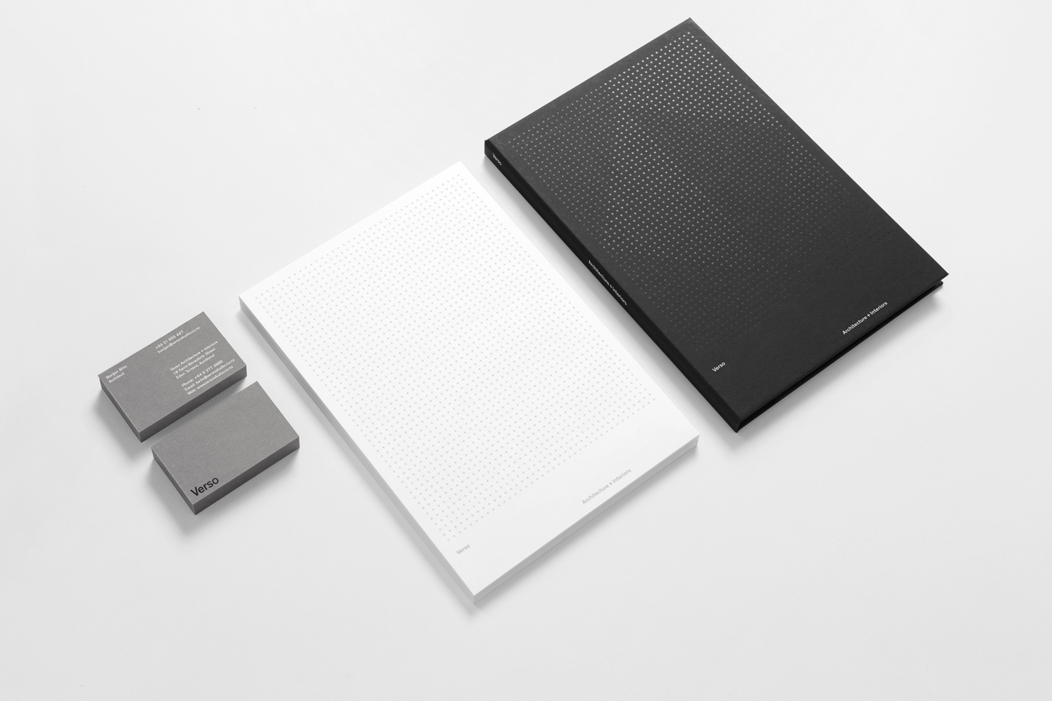
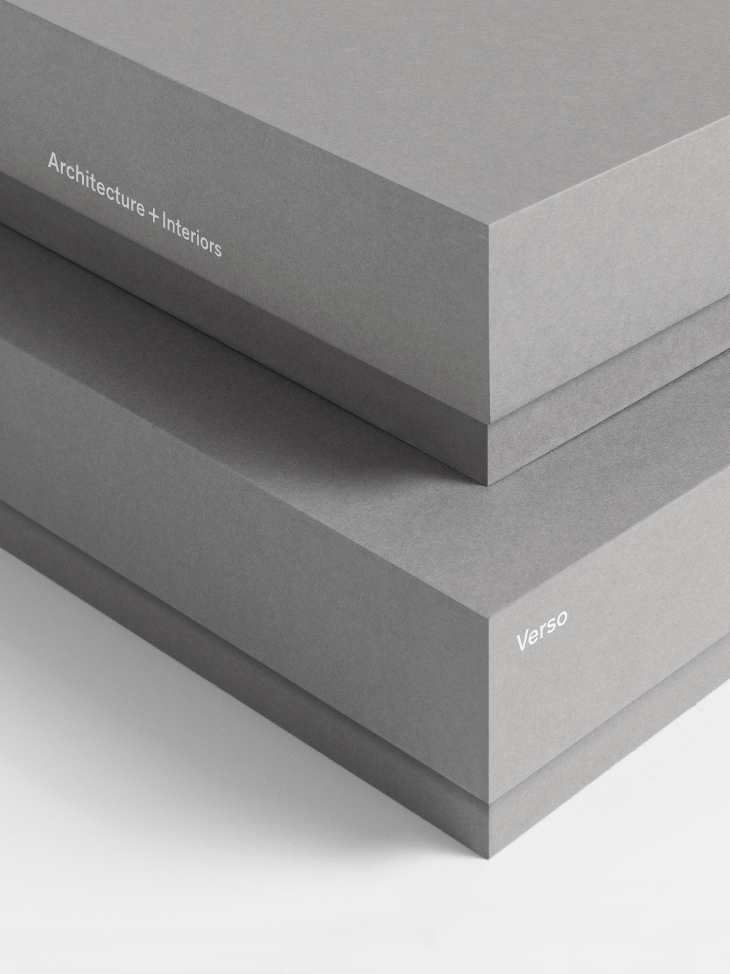
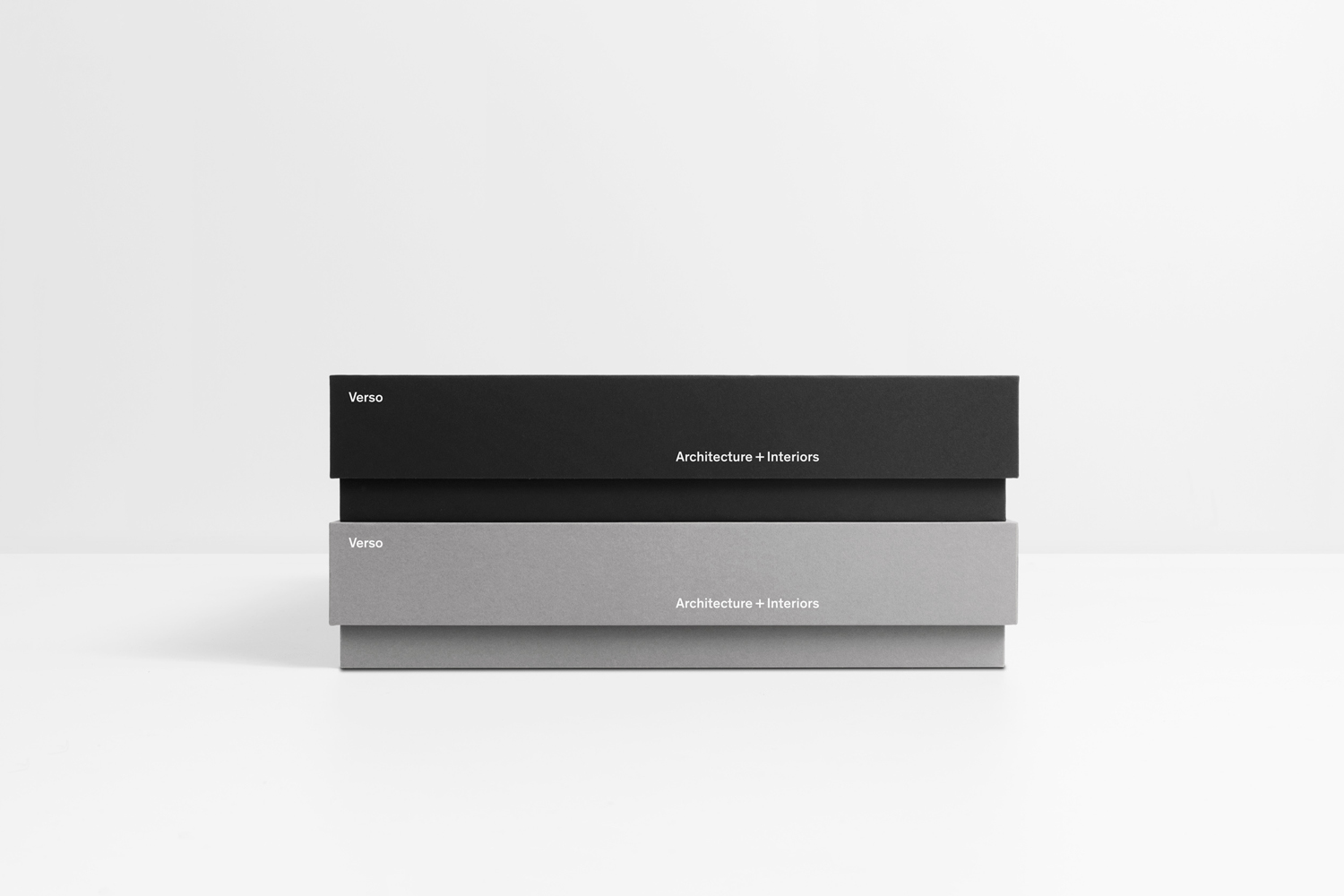
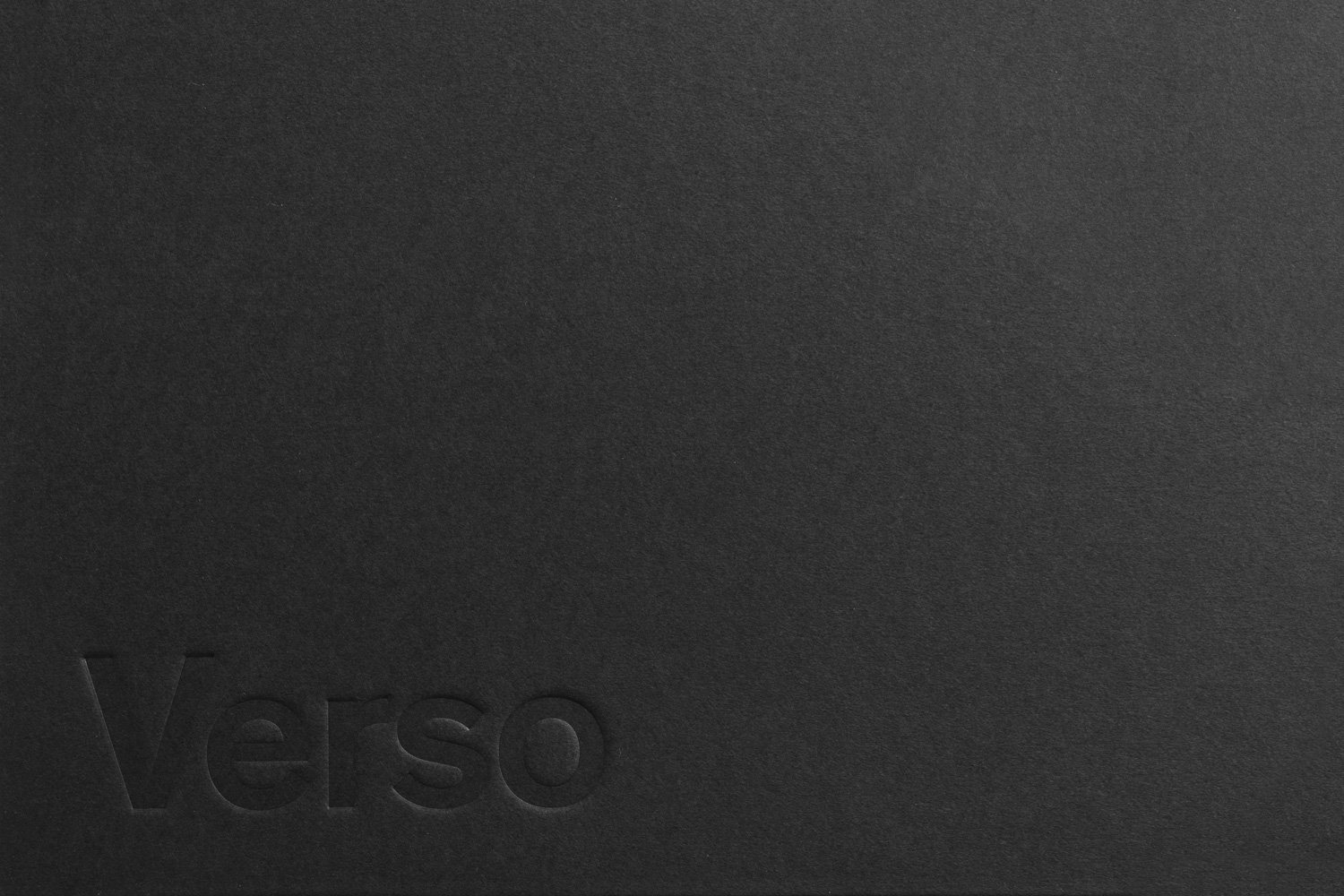
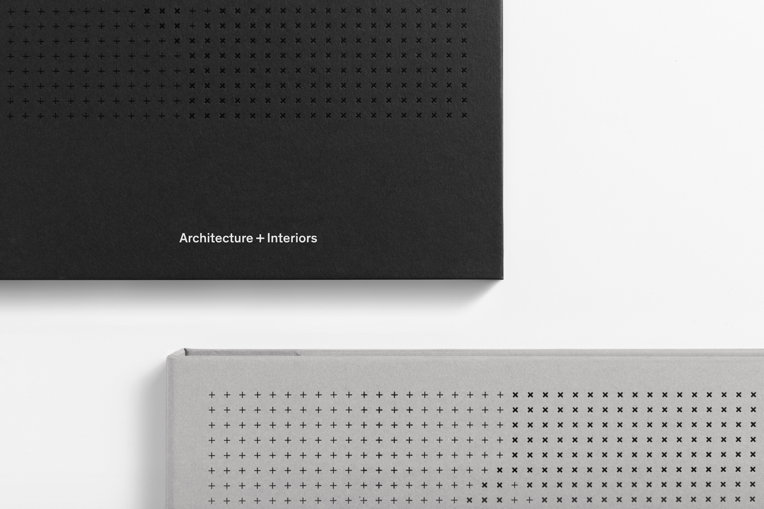
Studio South’s work for Verso is a textbook architectural brand identity project in the themes it draws from and intends to express and resolve. Functionality, modernity, the structural, light, shade and the material are all touched upon. This can be felt in the reductive letterforms of Theinhardt, its typesetting, layout and finish (ink, block foil and blind emboss) across white, black and concrete grey uncoated papers and boards, as well as the use of grids and areas of space.
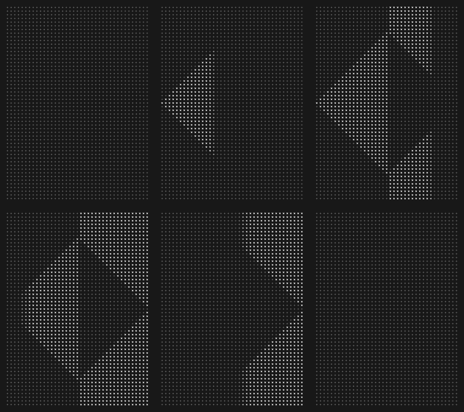
The themes and corresponding aesthetic expressions mentioned above are explored in a slightly more playful and distinctive way in the use of pattern; in its grid-based structure, the use of line weight and density to reveal larger geometric form. Animation then manages to work in a sense of flow while a glossy black block foil leverages, much like an interior space, light.
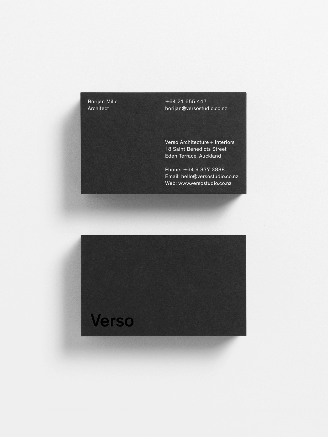
The name Verso—the reverse of an object—gives a bit more conceptual weight to some familiar aesthetic choices, with black and white boards and ink, unprinted space and pattern, and the glossy and the matt all having a sense of the oppositional to them. The result is reductive but well-intentioned, familiar yet with moments of distinction, and just enough in the way of the conceptual and visually interesting to keep it feeling memorable. More from Studio South on BP&O.
Design: Studio South. Opinion: Richard Baird. Fonts Used: Theinhardt.
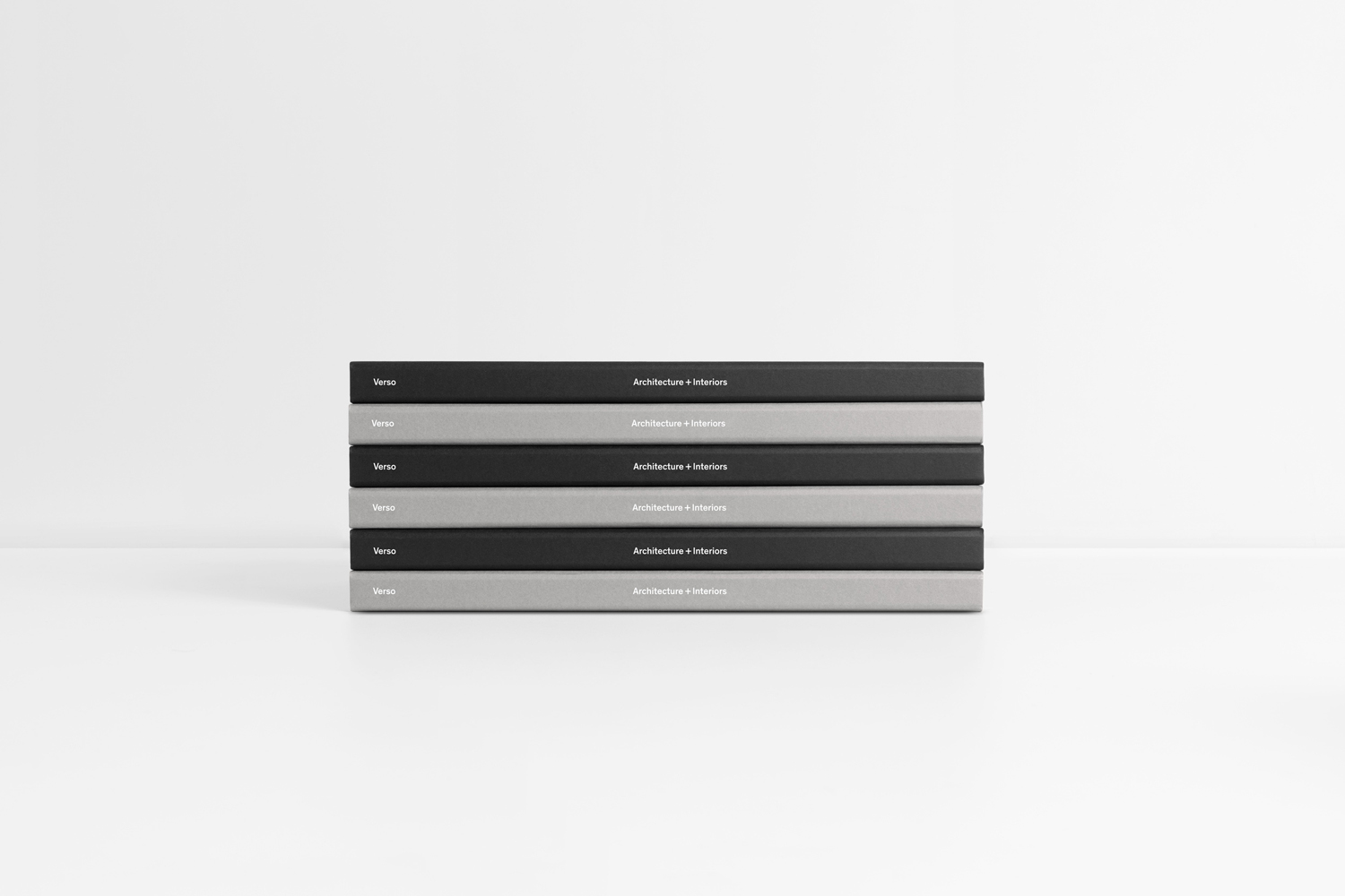
Material & Print Specifications.
Colorplan Ebony Black, Smoke & Pristine White
Gloss Black & Matte White Foil.
Grid Pads: PMS 877u
