Vi Novell 2016 by Atipus
Opinion by Richard Baird Posted 7 February 2017

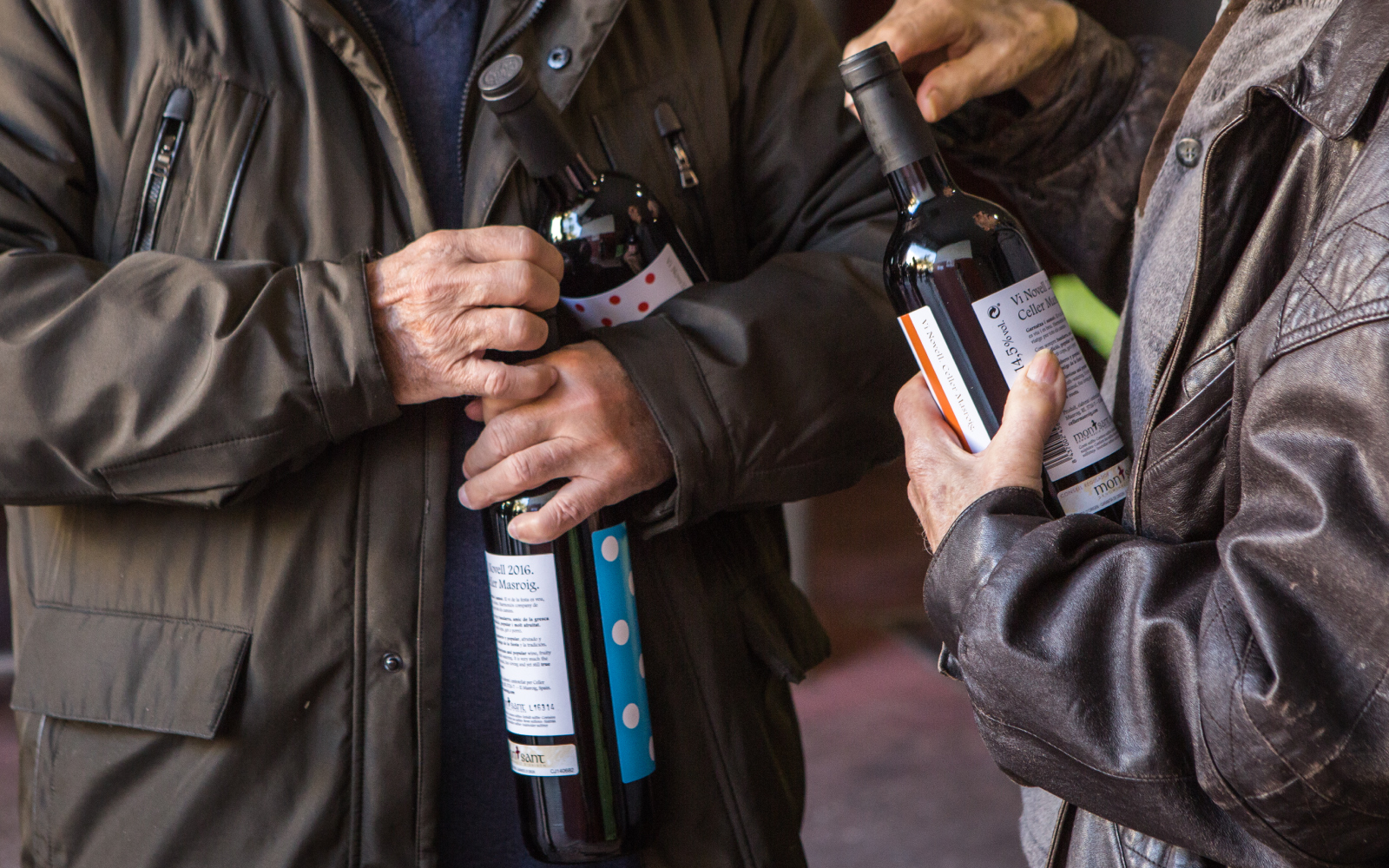
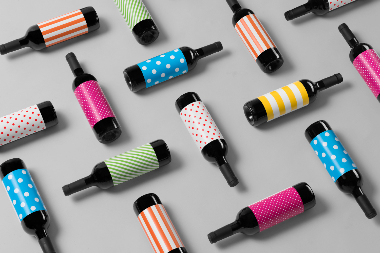
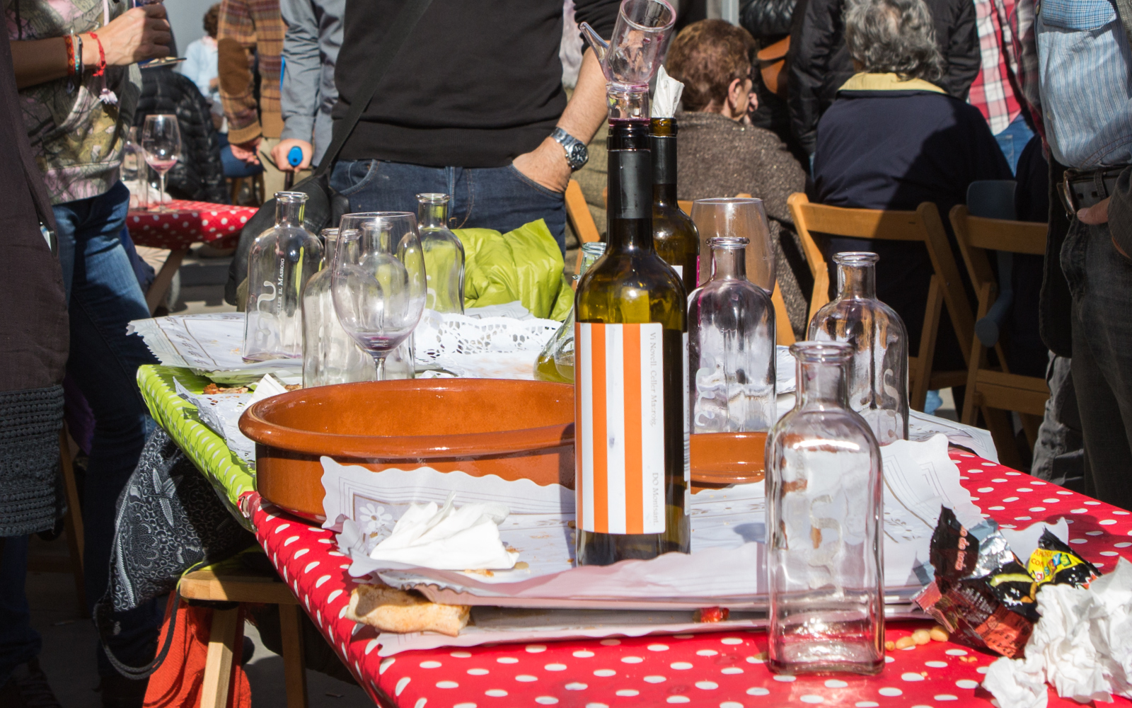
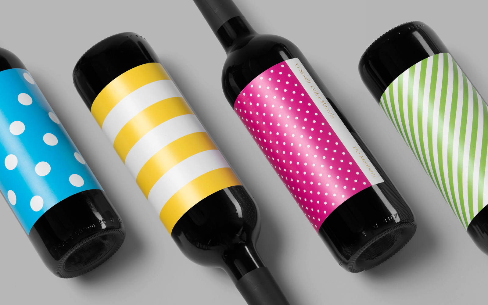
Vi Novell 2016 is a young wine from Catalonia with an intense ruby colour and a fresh and fruity flavour profile. It is the seventh in an ongoing series, and is dedicated to the party; the open-air dance, the joy and celebration of the beginning of the season, the first sip of wine, shared with friends, and the continued enjoyment of a long tradition yet in tune with modern times. Wine producer Celler Masroig worked with Barcelona-based graphic design studio Atipus to capture this moment and spirit with a striking label design of simple form and multi-colour, followed up online with a site that blends dynamic pattern and story.
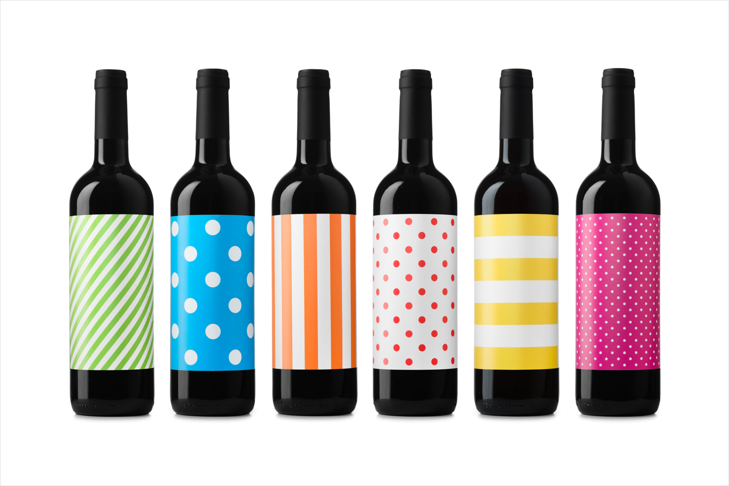
Occasionally you get a project that defies category conventions, be that in way it tells story, establishes a sense of legacy or articulates complex flavour profile. This is it. Instead of the detail and nuance you would expect from a wine label, Atipus embraces a bold singular graphic expression, going all in on the celebratory with a mix of bright colour and simple pattern.
As a young wine that is best enjoyed within a short space of time, visual expression and the collective impact rather than singular nature of label and a connection to occasions; the coming together of groups of people (more than one bottle), appears as a natural fit.
Atipus derives impact and value, not only from visual expression, but from the reassurance of quality from seven previous years, and in their more conservative but thoughtful labelling. It breaks from convention to surprise longtime customers and draw interest from those who might be new to brand.
Although pattern is interesting, conceptually grounded and strategically fairly sound with the context of previous years, the highlight is in the use of contrast, the elevation of modern imagine in its juxtaposition alongside a period-inspired type choice of irregular lines, and in particular, the way pattern and type intersect online. Communicatively it is blunt but effective finding a visual balance between the simple and more detailed, and successfully touching upon legacy, experience and craft, celebration and youth (young wine and a long-life), and in the spirt of our times, follows this up with a dynamic and impactful online experience of storytelling.
Design: Atipus. Opinion: Richard Baird. Fonts Used: Footlight.
