Helvetimart by Anagrama, Mexico
Opinion by Richard Baird Posted 15 February 2017
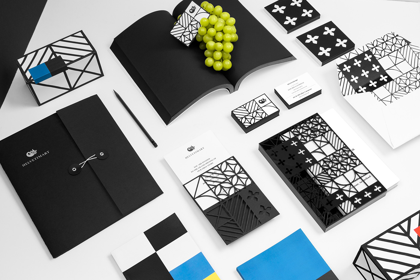
Helvetimart is a supermarket in the Swiss city of Lausanne. It offers a broad range of groceries and high-quality Swiss specialities sourced from across the country. The supermarket also holds daily tastings and workshops, has an informed staff and a tablet-based service that gives shoppers access to information on the Swiss cantons and their products. Drawing on regional flags and antique architecture, Mexican graphic design studio Anagrama developed a brand identity for Helvetimart that, through a strong favour for colour and form language, delivers significant impact for an independent store, draws a modern system from historic structure and touches upon the regionality of its products.
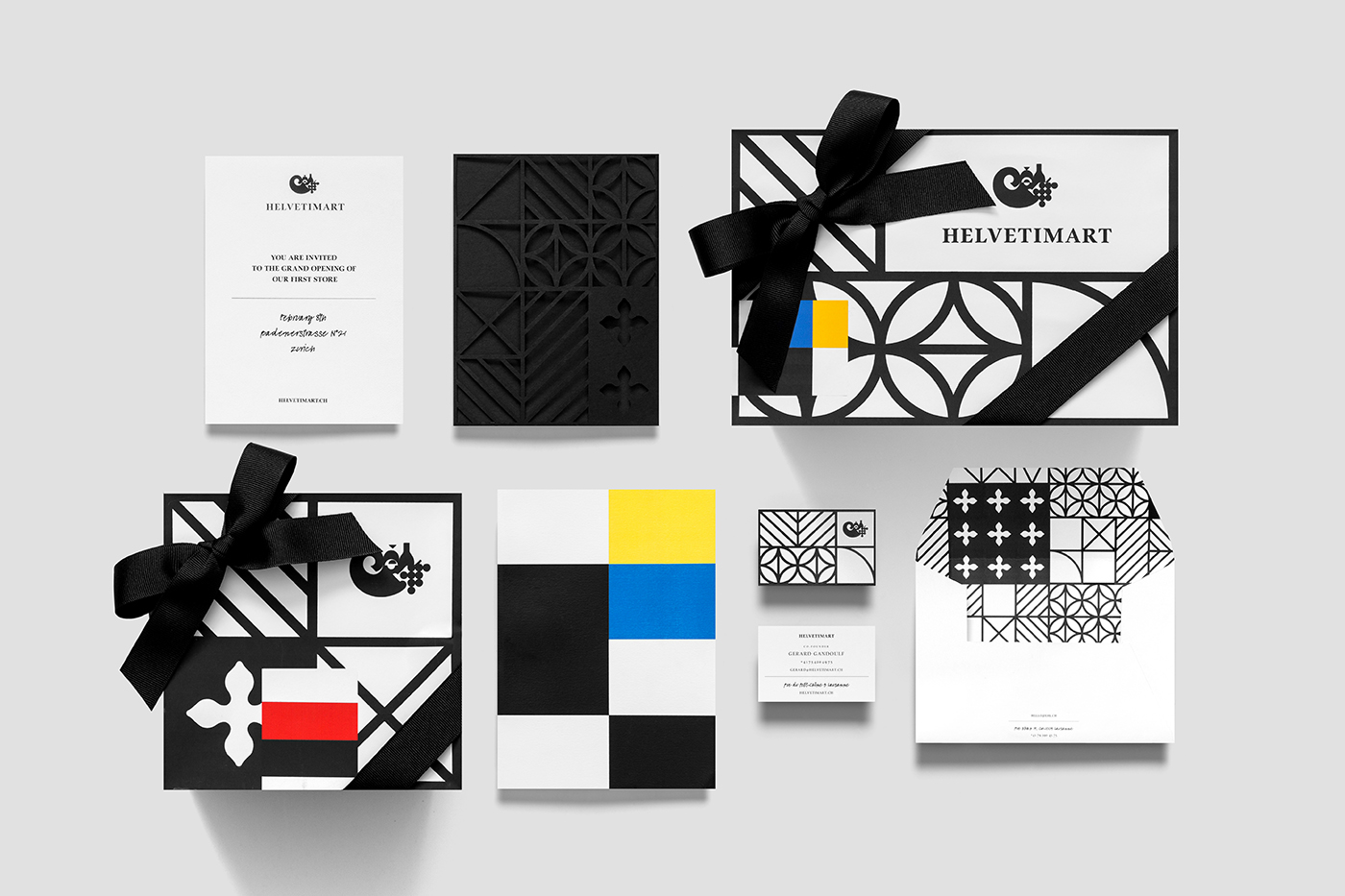
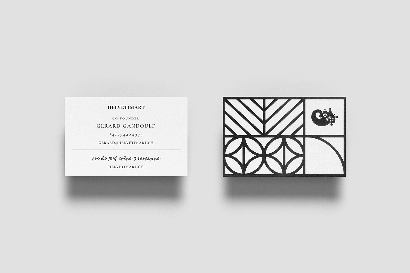
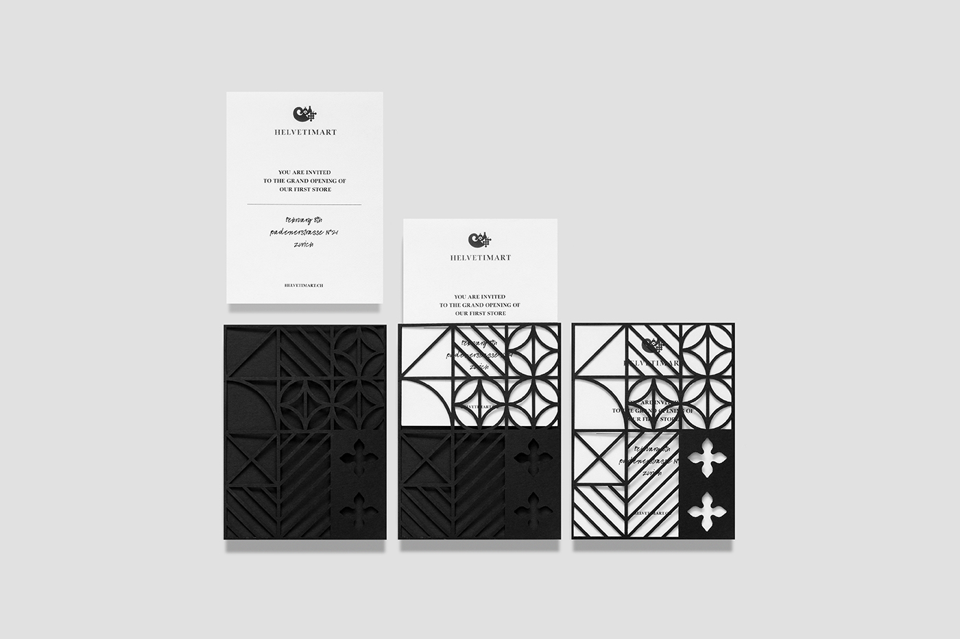
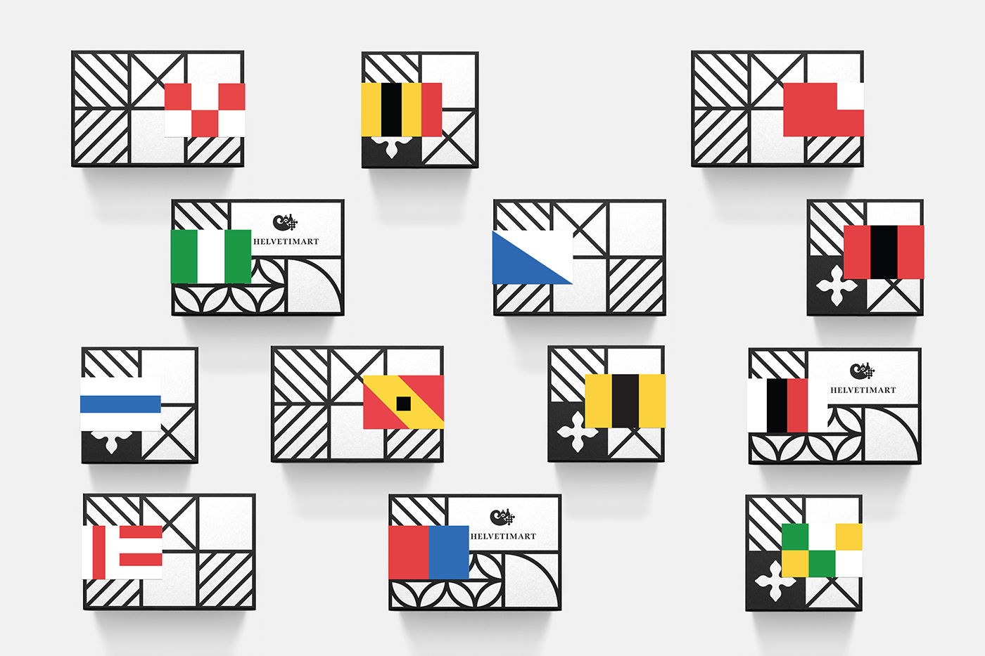
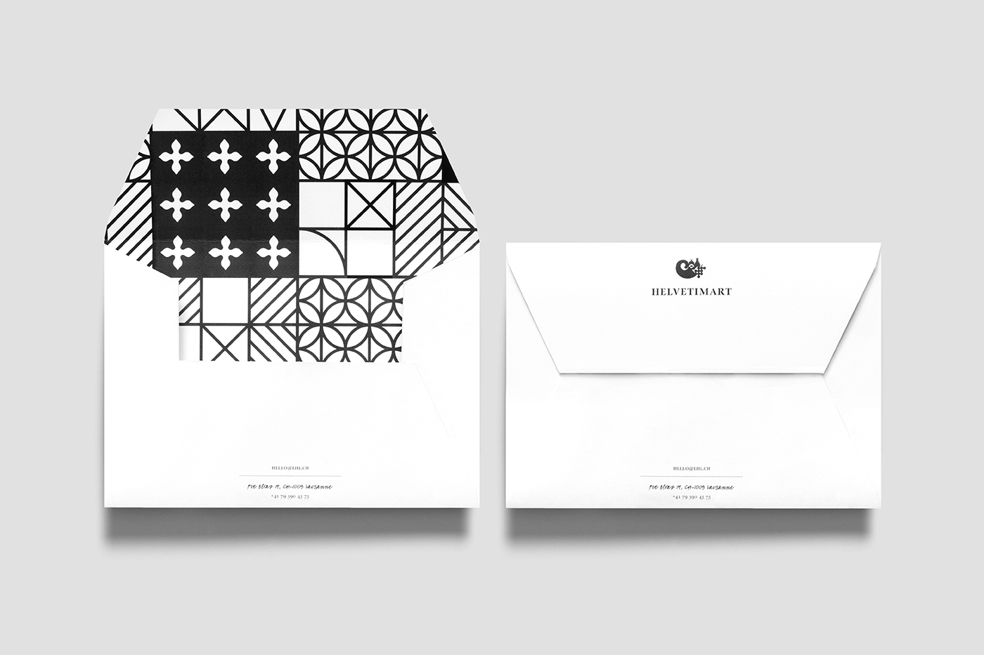
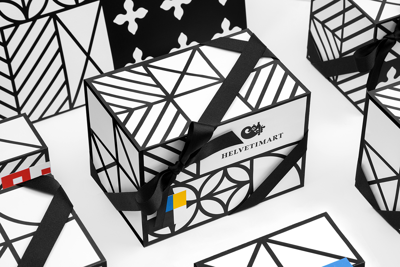
What it lacks in subtlety it makes up for in distinction and visual impact. As an independent retailer, visibility and memorability is often a desirable trait, and Anagrama certainly satisfies this. There are two clear components that make up identity. The colour combination and grids inspired by the flags and coats of arms of Switzerland’s 26 sovereign cantons, and the detail, structure and monochromatic qualities of pattern, inspired by the architectural flourishes of the past.
The way these work together, and their referential nature is a highlight, drawing a satisfying visual vernacular from some discernible communicative intentions. Not only do these address regionality and an element of craft, but, in their rendering and intersection, manage to draw a very modern expression from heritage references. The connection made between period architecture and its craftsmanship, and the speciality products and the experience necessary for their production is conceptually well-founded and aesthetically compelling. You certainly get a sense that there is an international audience being acknowledged by some of this.
With a staff happy to talk about products, access to Swiss canton information via tablets, and alongside workshops and tastings, the concept of brand identity is rooted in and continue through to shopping experience.
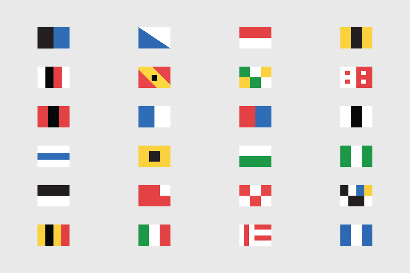
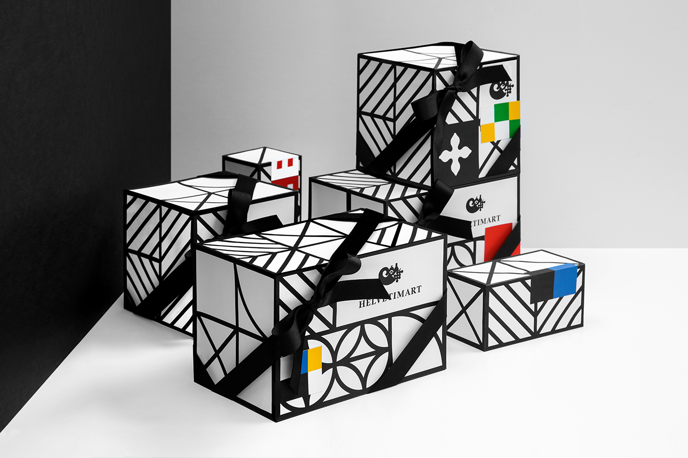
As documented here, packaging appears more like mock-ups rather than practical structures, it is difficult to get a sense of context and the specificity of their everyday use, however, stickers and tags seem like a smart way to work in the canton references and ground them in the practical. These coloured blocks are also said to function as a way to group products and distinguish between categories in store.
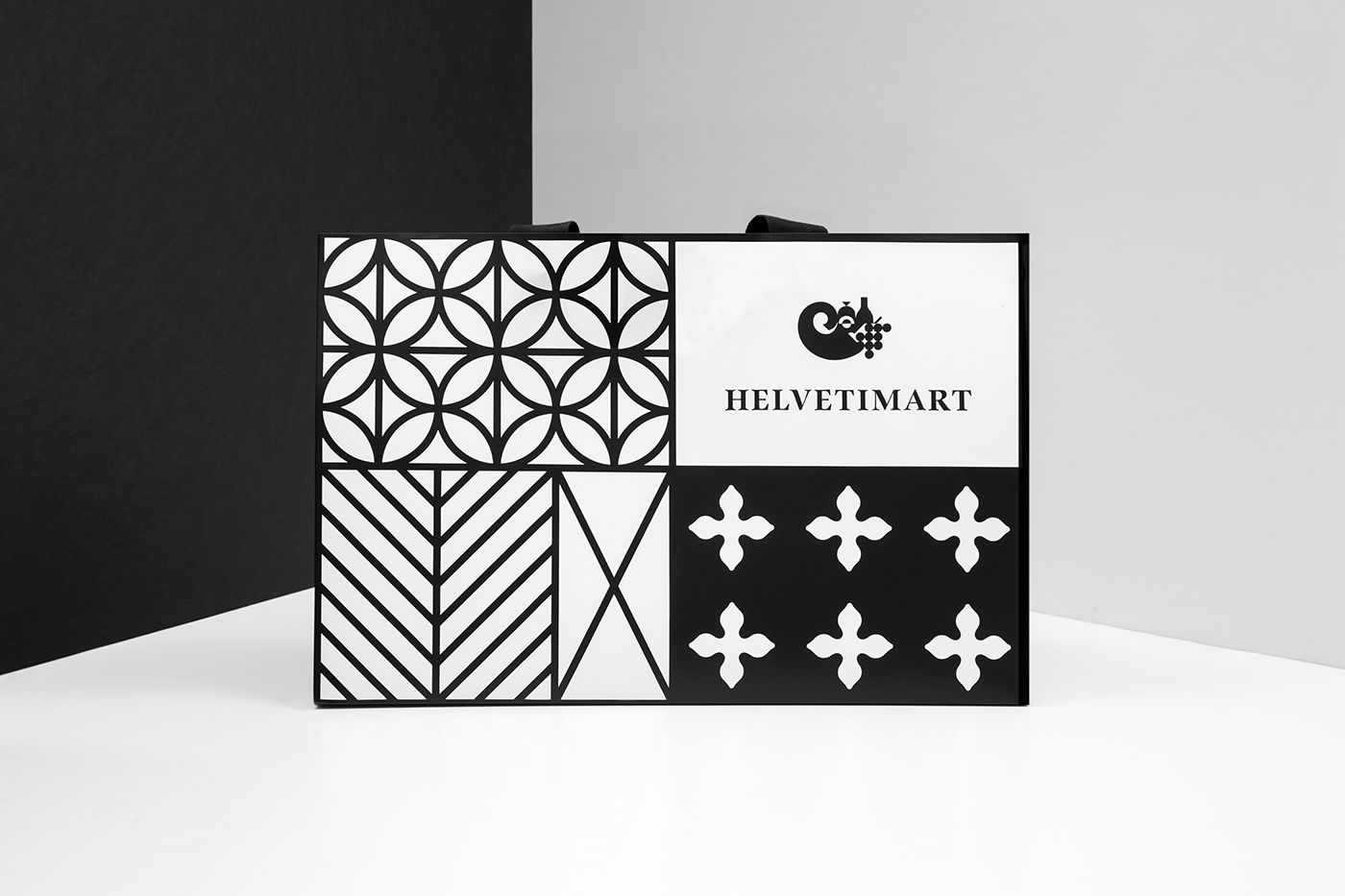
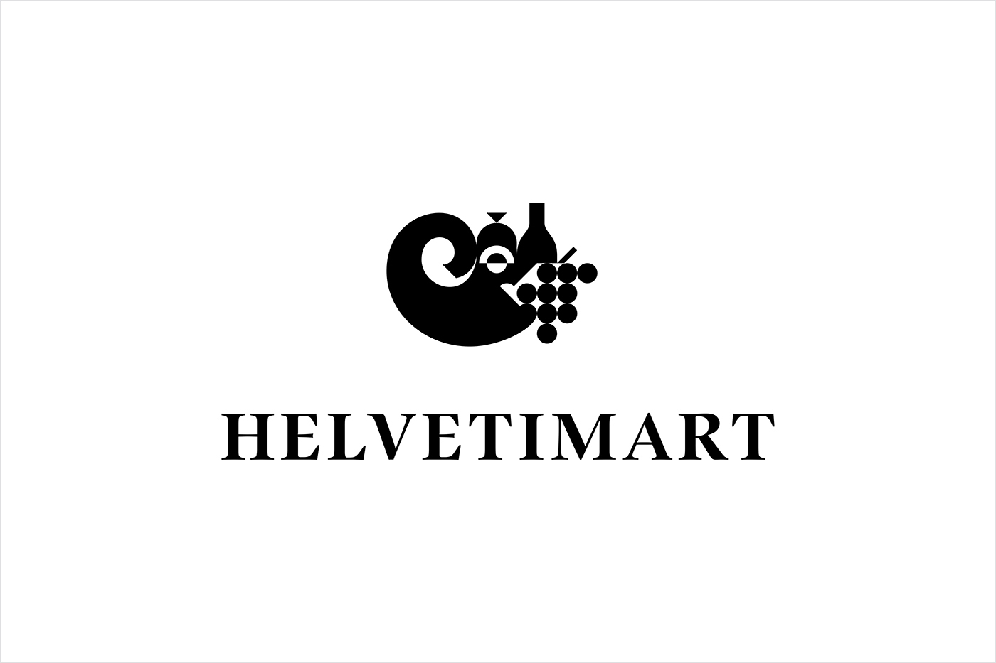
Much like the interplay of architectural forms and regional colour palettes, logo also works with modernity and heritage through geometric abstraction and serif flourish. The cornucopia icon is a curious but distinctive image. As a symbol of abundance, and in its mix of wine, meat and grapes, this feels well-suited to a speciality market with plenty of variety. The approach to rendering just about holds everything together, is reductive yet remains discernible for the most part, although slightly off balance in its lock-up. There is an effort to utilise negative space, however, this appears a touch haphazard.
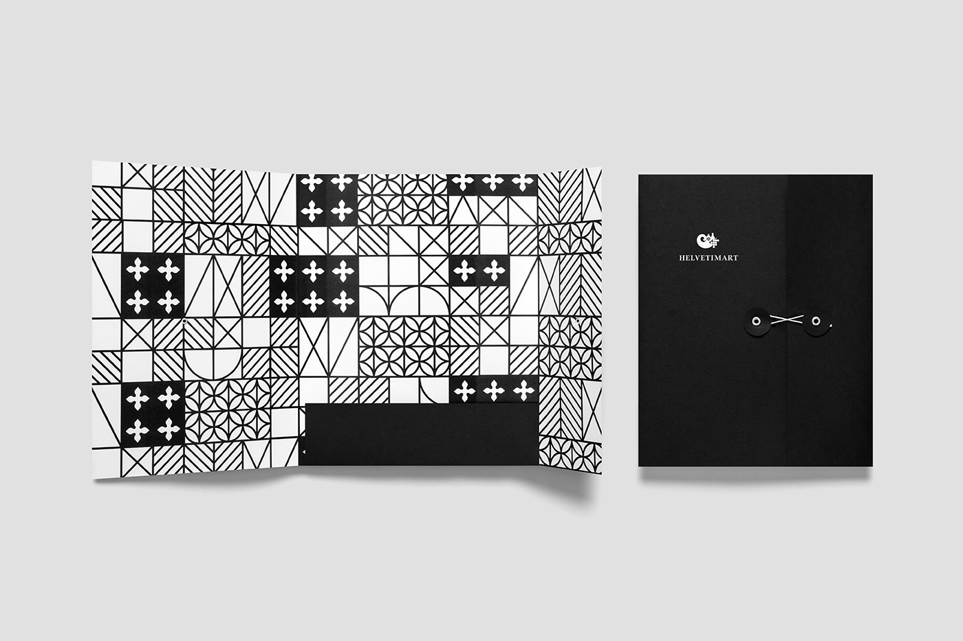
When mark and type are implemented as white ink across plain black boards, absent the bold statement of pattern, or when pattern is scaled down, identity begins to feel like it has a touch more range, the potential to dial down the loud, and function more in a conventional yet reassuring manner when it needs to. More work by Anagrama on BP&O.
Design: Anagrama. Opinion: Richard Baird.
