Designed by Anagrama

Skinsmiths by Akin
Ki Sunscreen was developed by national skincare clinic Caci to protect against the harsh New Zealand sun, and the skin damage and premature ageing that UVA and UVB rays can cause. This is been expanded into a larger and broader range of skin treatments and renamed Skinsmiths. The range is made from the latest generation of ingredients proven to protect and those...

El Pintor by Anagrama
El Pintor is a high-quality tequila and mezcal brand said to have been handcrafted by the world’s second certified maestro tequilero. El Pinto’s approach intends to create perfectly equilibrated spirits through the intersection of science and artistry. This artistry forms the basis of El Pinto’s graphic identity and packaging design developed by Anagrama. This is characterised by colour blocking, tapered bottle, distinctive screw...

Orson Burger Kitchen by Anagrama
Taking inspiration from the work of artist Edward Hopper, and the style of the American diners of the 1920s and 1930s, Mexican design studio Anagrama developed an interior and visual identity design for Orson, a restaurant in the city of San Pedro pairing burgers with a wide selection of wines and milkshakes. The project, alongside a distinctive interior design of material detail,...
Helvetimart by Anagrama, Mexico
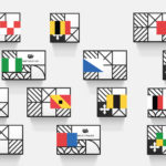
Helvetimart is a supermarket in the Swiss city of Lausanne. It offers a broad range of groceries and high-quality Swiss specialities sourced from across the country. The supermarket also holds daily tastings and workshops, has an informed staff and a tablet-based service that gives shoppers access to information on the Swiss cantons and their products. Drawing on regional flags and antique architecture, Mexican graphic design...
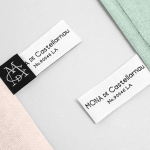
Mona De Castellarnau by Anagrama
Mona De Castellarnau is a US based luxury lifestyle brand that creates and retails a unique collection of crafted and meaningful objects that are said to reflect timeless beauty, simplicity and authenticity. Objects include home furnishings, accessories, bags and throws. Each are designed with an appreciation for tradition and provenance, an understanding of artisanal disciplines, and utilise simple forms, prints, patterns and...
El Semillero by Anagrama
El Semillero is a large residential development program, managed by Fraterna, that intends to create a sustainable environment with expandable housing solutions based around basic needs and “economic flexibility” – presumably spaces that keep pace with current economic changes, improved social mobility and are accessible to a variety of income groups. Set at the heart of the Mexican city of Monterrey,...

Neat Confections by Anagrama
Neat Confections is a San Pedro-based pastry shop creating handmade biscuits and cakes using organic spices and fruits, are absent decoration and specifically developed as a wine or tea accompaniment. Neat Confectionery’s brand identity and packaging solution, designed by Anagrama, draws its inspiration from the theme of perfection and craft, which is then visualised through what the studio describe as a “pureness” of their...

Violeta by Anagrama
Violeta is described by Anagrama, the design studio behind its new brand identity and packaging treatment, as an Argentinian bakery, named after its founder, that creates hand-crafted breads, cakes and pastries from its location in the Buenos Aires district of Las Lomas de San Isidro. Following more than 30 years of business and in lieu of a plan to begin...

Alberto Senties Catering by Anagrama
Alberto Senties Catering is a Mexican ‘food experience’ company established by chef Alberto Sentíes that designs and prepares large and small banquet menus, offers cooking classes, provides bar tending, equipment rental and consultation services, and has built up a reputation for culinary excellence over its ten years of business. Design studio Anagrama recently worked with Alberto Senties to develop a new brand identity, which went on to...

Anthem by Anagrama
Anthem will be a scouting and transfer business within the professional football market working predominantly across Spain, Switzerland and Mexico. Anthem will also be responsible for organising and promoting a variety of sporting events. Design agency Anagrama were recently commissioned to develop a new brand identity for the company—which included a logo, logotype and stationery set—that would communicate the prestige,...

Interior XIII by Anagrama
Interior 13 is a distributor of Mexican and international auteur films and promoter of independent cinema. Design agency Anagrama were recently commissioned by Interior 13 to develop a new visual identity that would be “easily relatable to the cinematographic world” as well as being “functional in terms of online promotion.”...

Checklist by Anagrama
Checklist is a Mexican event planning business that specialises in ‘milestone occasions’ such as birthdays, anniversaries and graduations as well as corporate events. Checklist caters ‘exclusively for their client’s unique needs’ and can also provide options that are environmentally friendly. Design agency Anagrama recently devised an ‘institutional’ visual identity solution for Checklist that mixes the age and authority of a heraldic shield,...