Yumn by Filthymedia
Opinion by Richard Baird Posted 10 March 2017
Yumn is a casual luxury restaurant located within Croydon’s Boxpark, a pop-up mall for independent and global fashion and lifestyle stores, cafes and restaurants, housed within converted shipping containers. Yumn is a smaller and more intimate version of Yumn Brasserie with a similar approach to interior in its mix of blue pinned leather upholstered seating and high quality finishes, but shares something of Boxpark’s utilitarian build in its unpolished concrete walls, some of its fixtures and fittings and the industrial qualities of its brand identity, created by Brighton-based graphic design studio Filthymedia. This included menus and business cards, window graphics and signage.
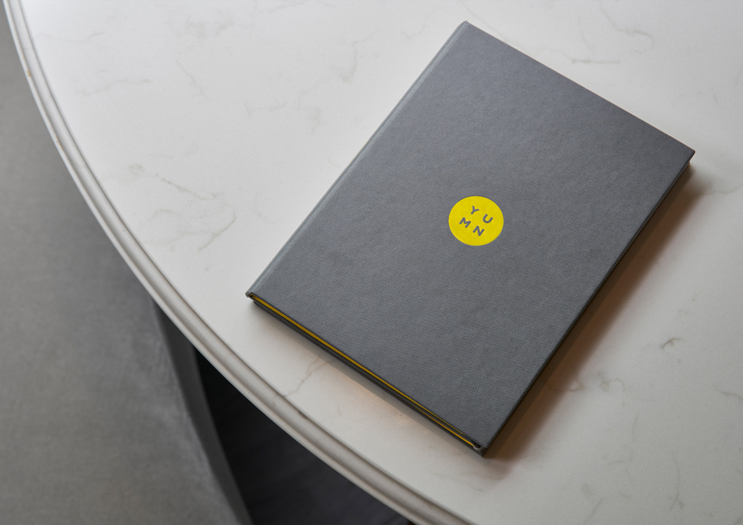
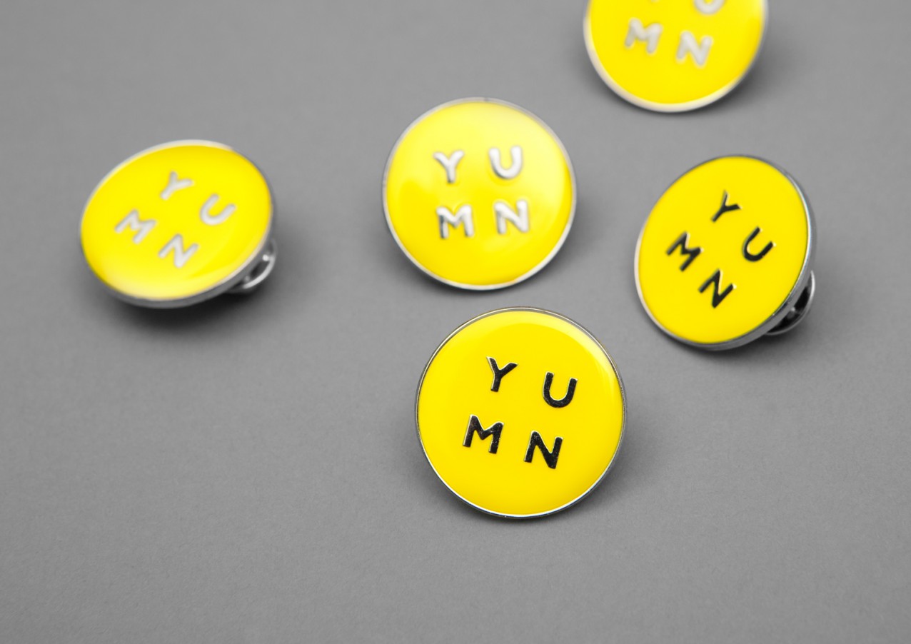
Logotype is a reductive take on the Yumn Brasserie identity. Where Yumn Brasserie feels a little over-designed, Yumn goes the other way, channelling something of Boxpark’s own industrial character (which continues through to a limited colour palette and single type choice throughout). Isolated, logotype is absent character, and a little loose in the YU pairing, but feels appropriately reflective of the restaurant’s location, with the roundel adding a touch of versatility and variation, and naming being compact and visually, if not phonetically, memorable.
The similarities between Boxpark’s typeface and that of Yumn’s logotype create something of an uncanny valley situation, neither offering enough in the way of differentiation or firmly establishing continuity (for obvious reasons). This can be seen in spacing and in the shapes of the the U and M. However, this is only really apparent around the entrance where restaurant and Boxpark signage are in close proximity, and unlikely to be noticed by those without a sensitivity to typographical nuance.
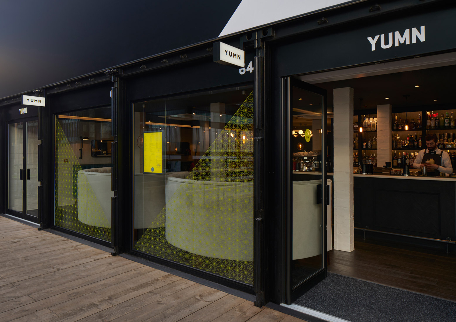
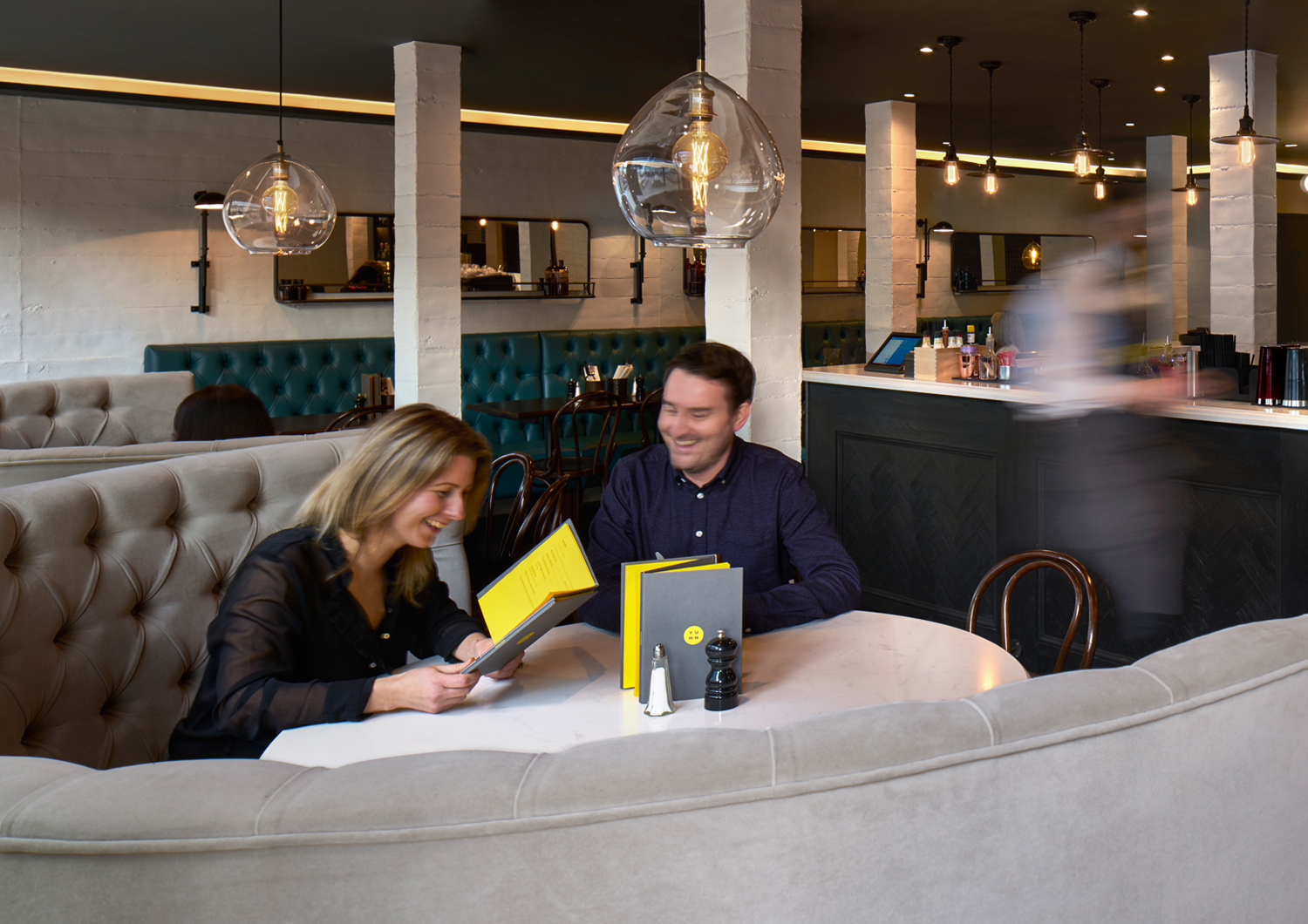
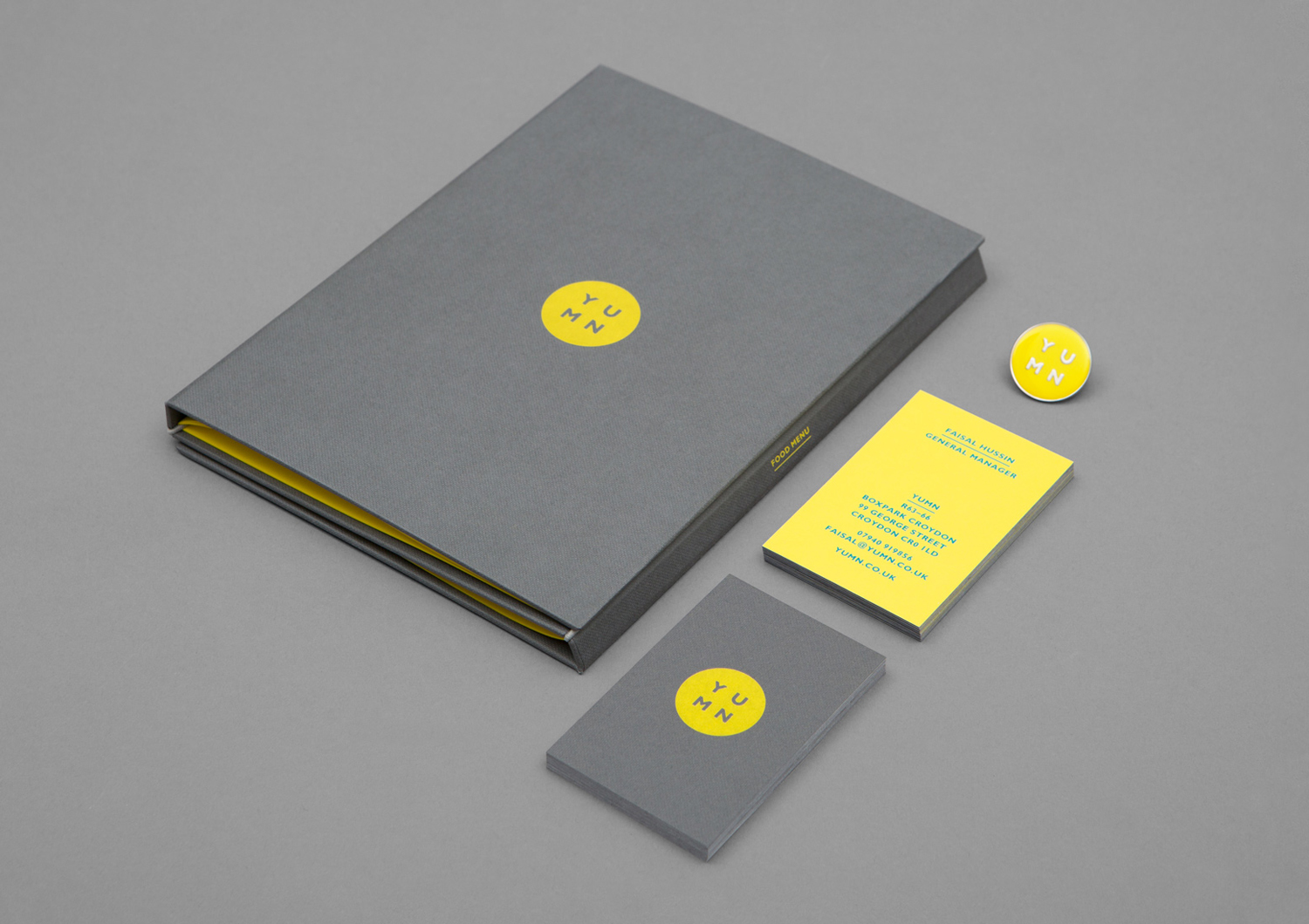
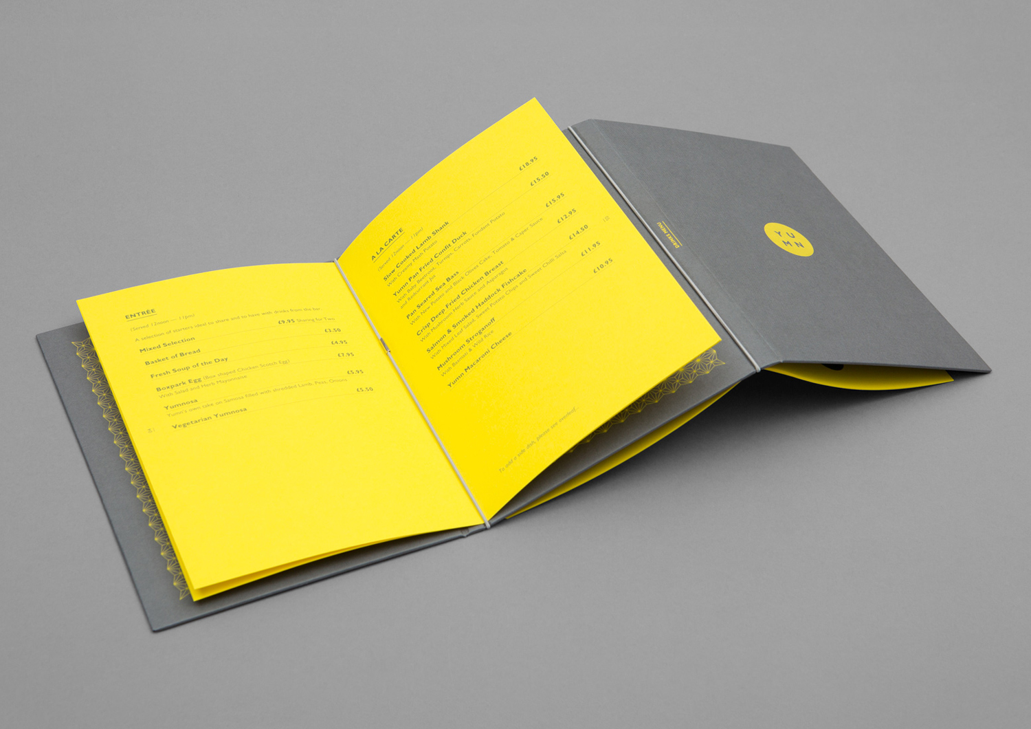
Colour palette, much like type, feels like a neat interpretation of Boxpark’s industrious associations in its pairing of a high visibility yellow and a cool concrete grey. The blue ink of business cards and menu is unexpected, but neither offers something of real interest or sits comfortably within a visually reductive concept.
Where you might expect continuity between restaurant environment and brand identity, colour introduces significant contrast and impact, drawing the outdoor context of containers and their industrial associations in amongst an interior of ornamental detail and materiality. This is the real highlight, both aesthetically and conceptually.
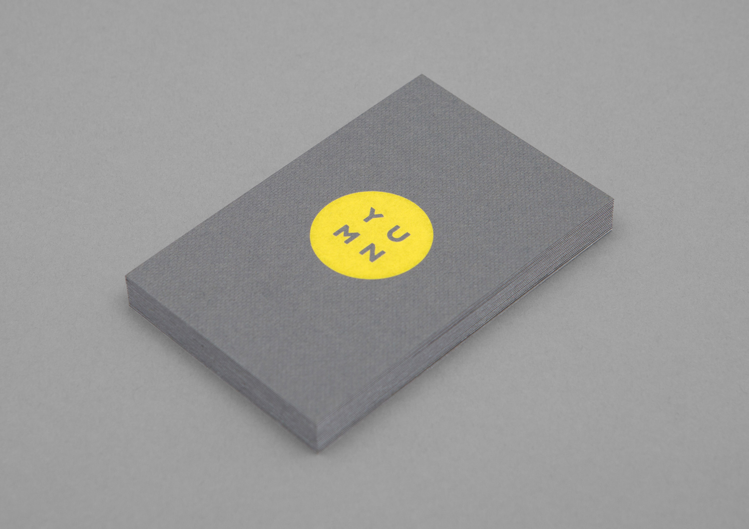
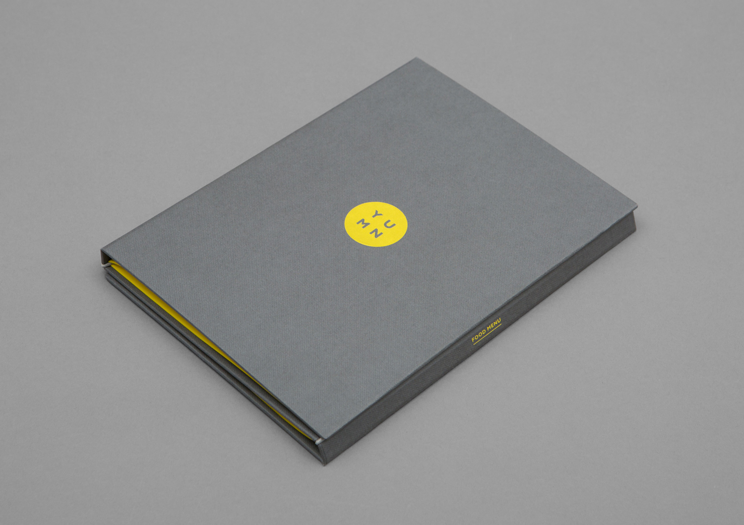
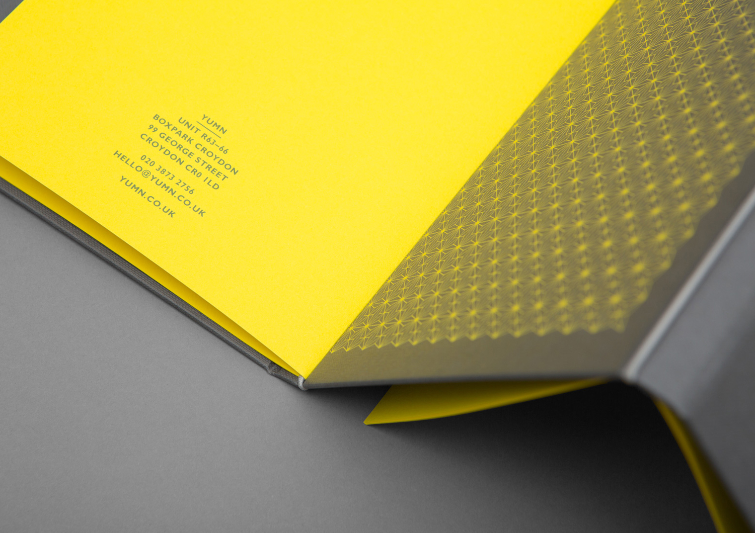
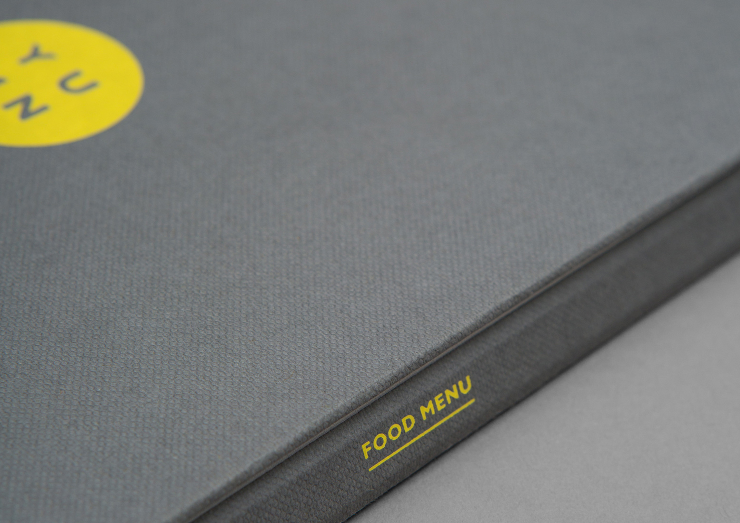
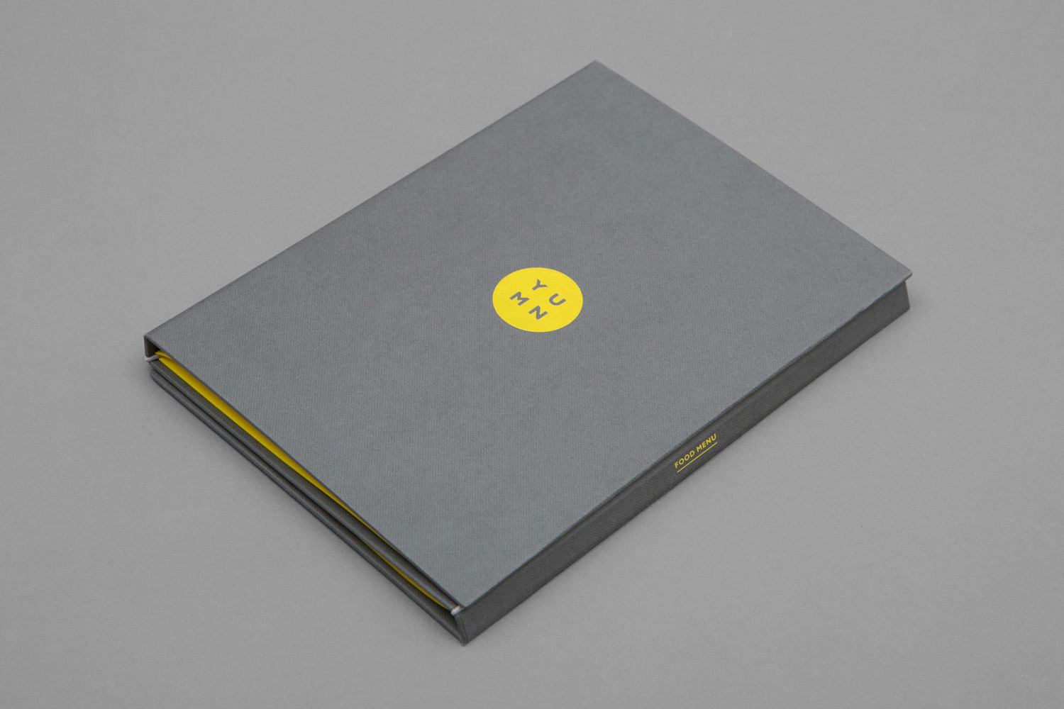
A connection is made between interior and brand identity in the use of pattern across menus and windows, in the use of high quality materials that include dyed and embossed papers and boards, and the choice of print finish. Menu finds a neat balance between subtle material detail and robustness, space and pattern, visual interest and the delivery of information, and functions as a simple and rather neat distillation of casual luxury within the context of a pop-up mall built from containers.
Design: Filthymedia. Opinion: Richard Baird. Fonts Used: Gill Sans.
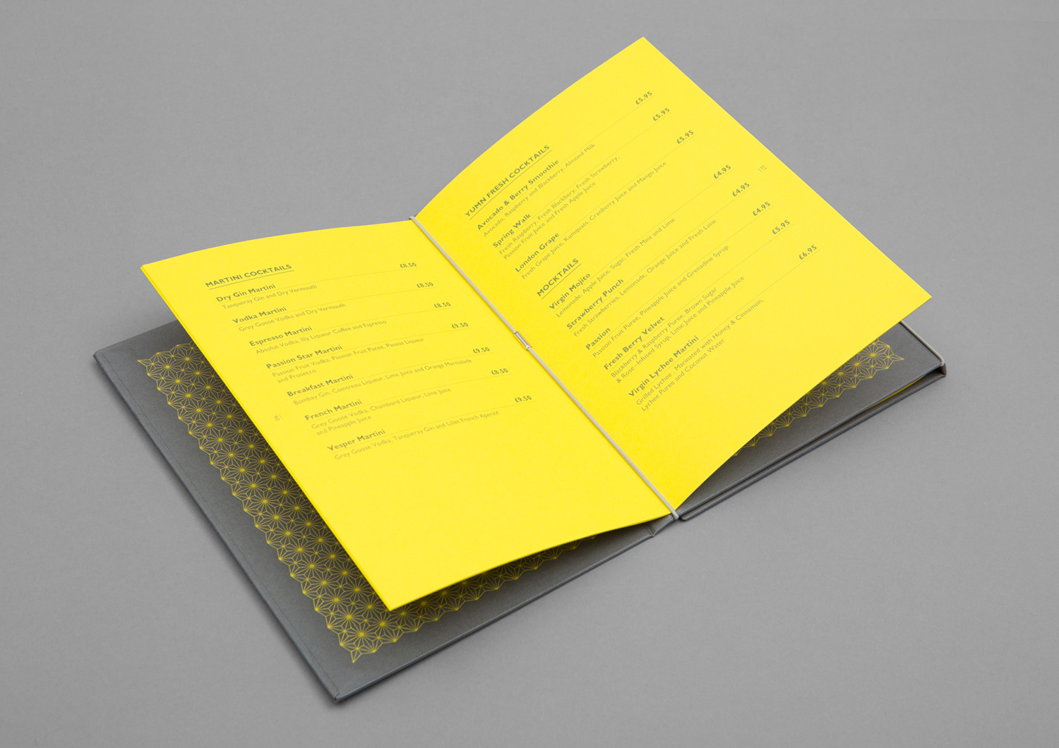
Material Specifications.
Colorplan Silk Weave Embossed Dark Grey
Neferta Buckram 842 Slate
Colorplan Factory Yellow.
