H+J by Spy
Opinion by Richard Baird Posted 21 March 2017
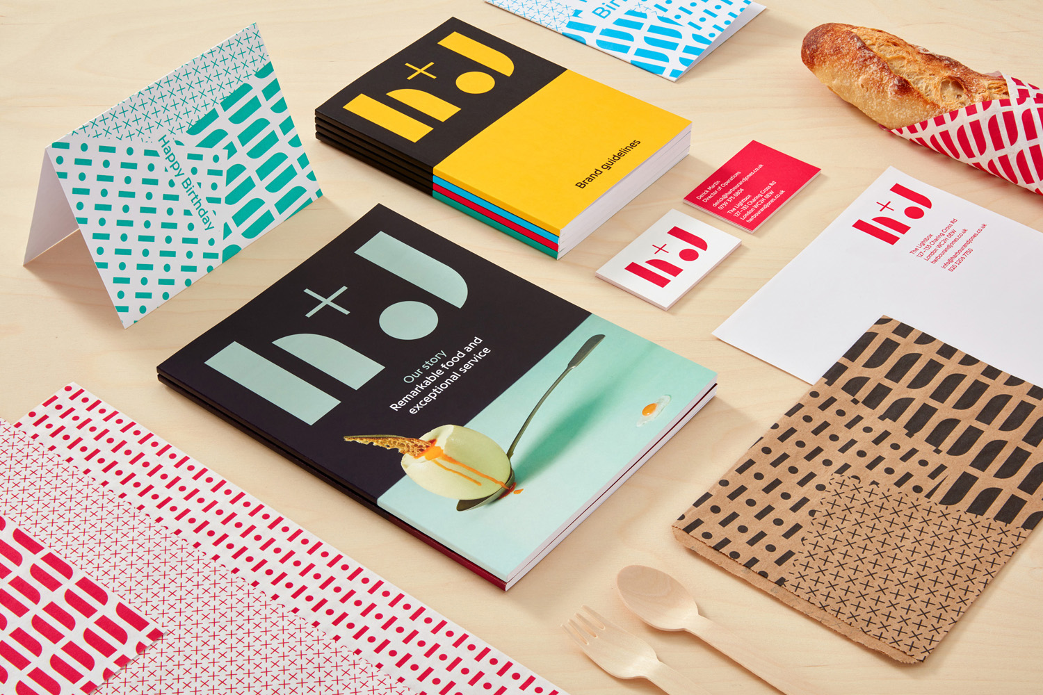
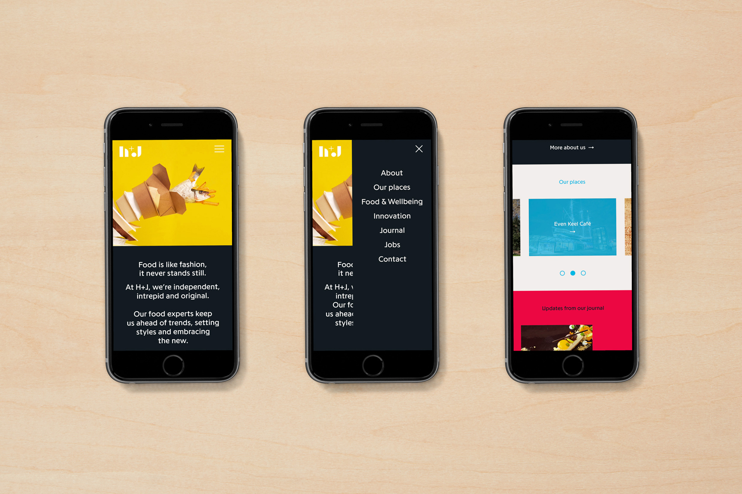
H+J is a UK independent catering business, established in 2004, that has provided food and catering solutions to venues such as The Cutty Sark, Moët & Chandon, Abbey Road, RIBA and Selfridges. Their services include working lunches and private dining rooms, large scale food courts, cafes and deli bars. London-based graphic design studio Spy worked with H+J to develop a new brand identity that would better express their growing ambitions and help them stand out within a highly competitive industry. This included logo design, still life photography, tone of voice, stationery, business cards, packaging and website design.
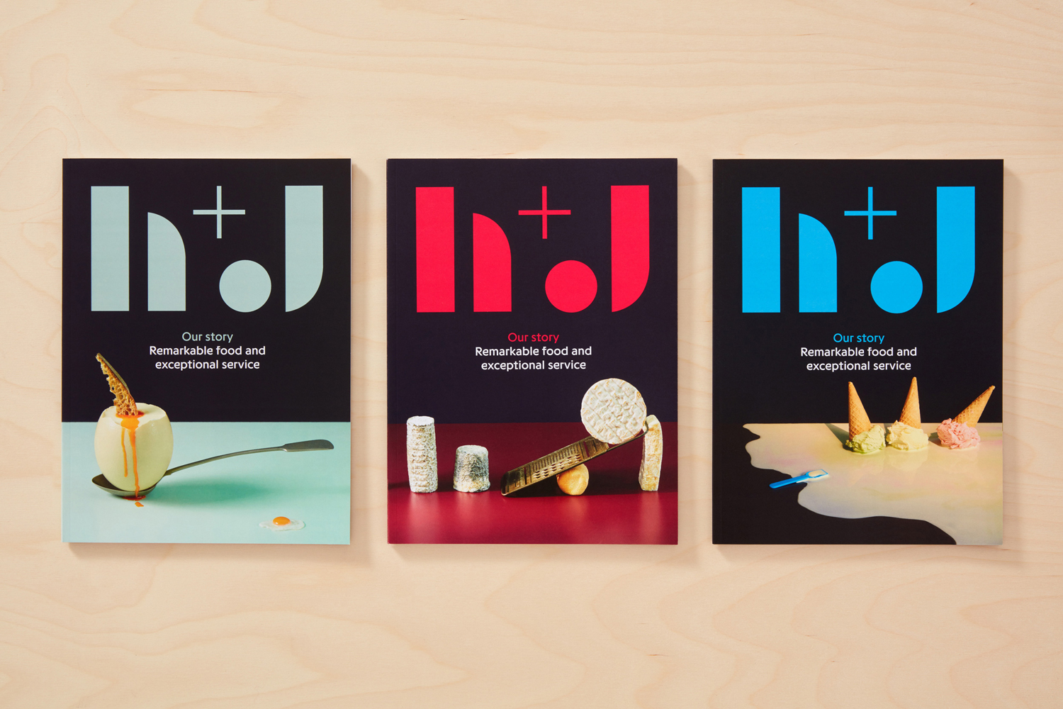
Spy’s brand identity work for H+J is characterised by two distinctive components, the bold utilitarian quality of logo and the way this is broken down and reassembled into patterns, and the playful nature and changing tone of still life images, created in collaboration with photographer Angela Moore and food stylist Peta O’Brien. Short but sharp copywriting from Jim K Davies and a broad but complimentary colour palette build out the conceptual foundations of type and image, and introduce communicative breadth.
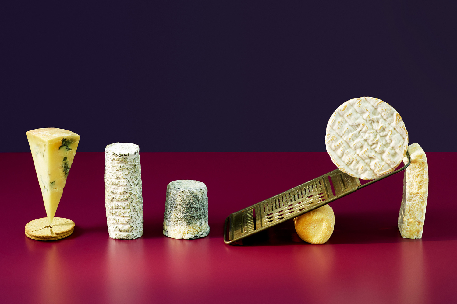
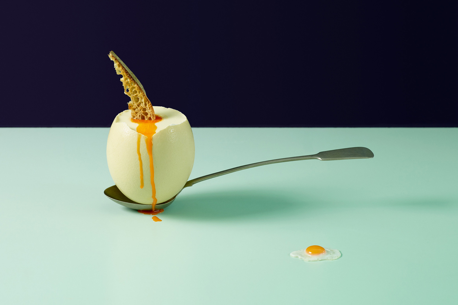
The visual language of image is clear. These effectively touch upon a variety of catering themes such as street food, cheese boards, office lunches, desserts and early morning breakfasts, and comfortably move between the sophisticated and the playful, comfort food and high quality specialties. These are linked by playful and artful compositions and a predominantly two colour setting.
There is a nice use of form, colour and texture, tension and motion, and an interaction between food and prop that give each a unique character, and collectively a sense of variety but continuity and a discernible communicative intention. Highlights include the the motion of the fish and chips, the tongue-in-cheek tone of the egg and spoon, and the balance and tension of the cheeses. Head over to the new Spy website to see a couple more.

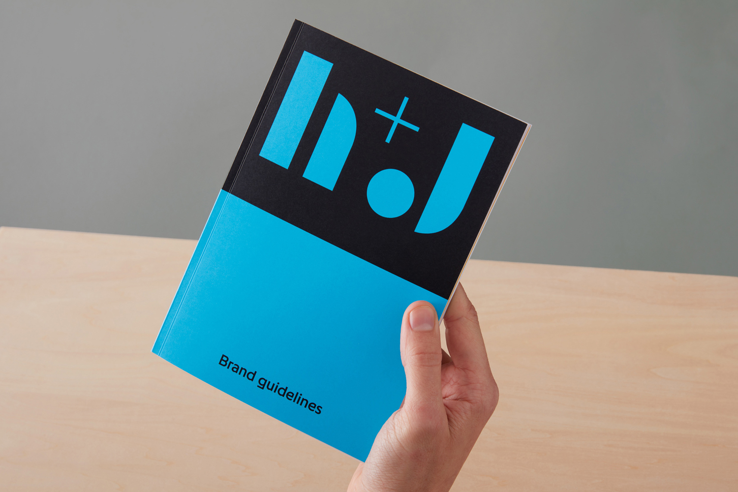
Where image is rich in detail, type is, in opposition, reductive. The use of contrasting forms, heavy fills and fine lines draw visual interest from simple character shapes whilst maintaining something of a modular and construction-like utility, positioning H+J as courageous and practical, and establishing something that really stands out within the industry that favours traditional flourishes and the conservative. This is emphasised by the logo’s proportionality in print.
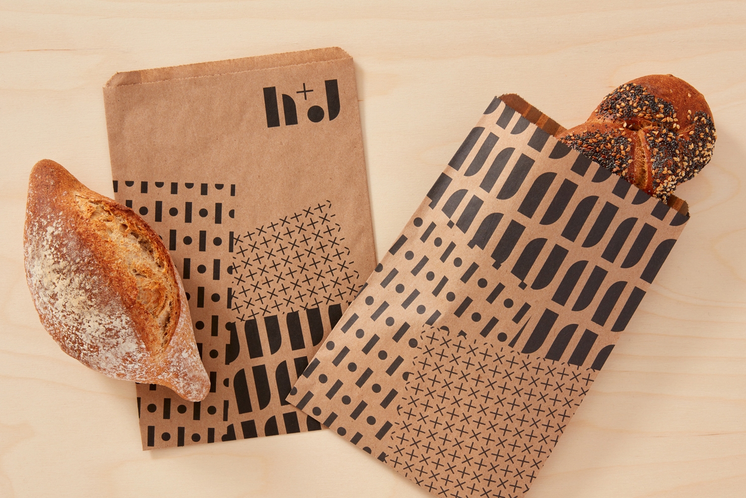
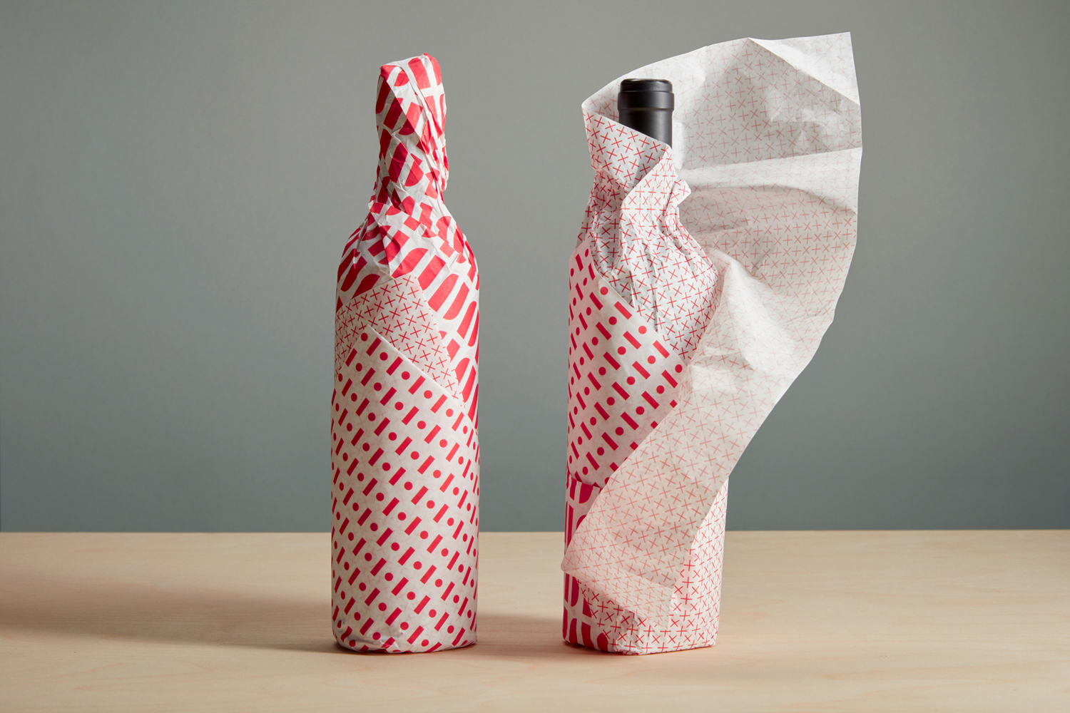
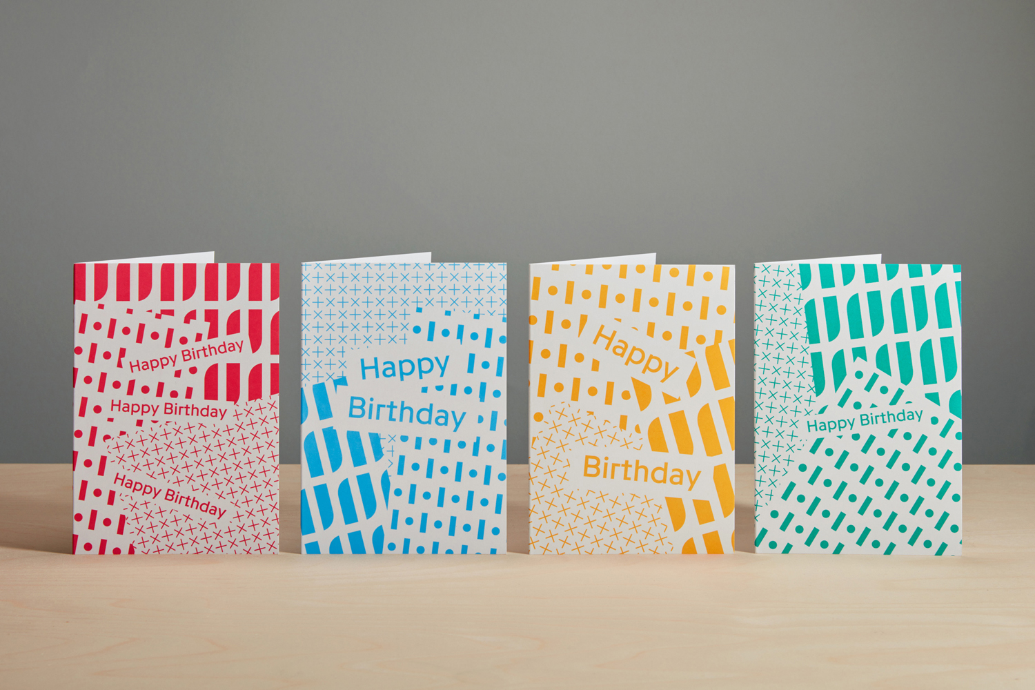
The choice of forms that make up logo is particularly smart when pulled apart and rearranged into patterns. Spy get plenty of visual equity from these, with patterns appearing distinctive in both their build and mix of the fine and heavy, but also the way these intersect at angles like sheets of paper across packaging.
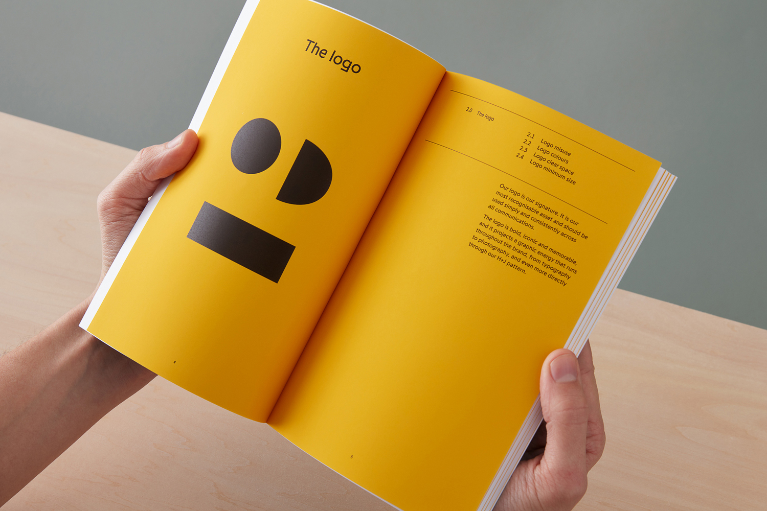
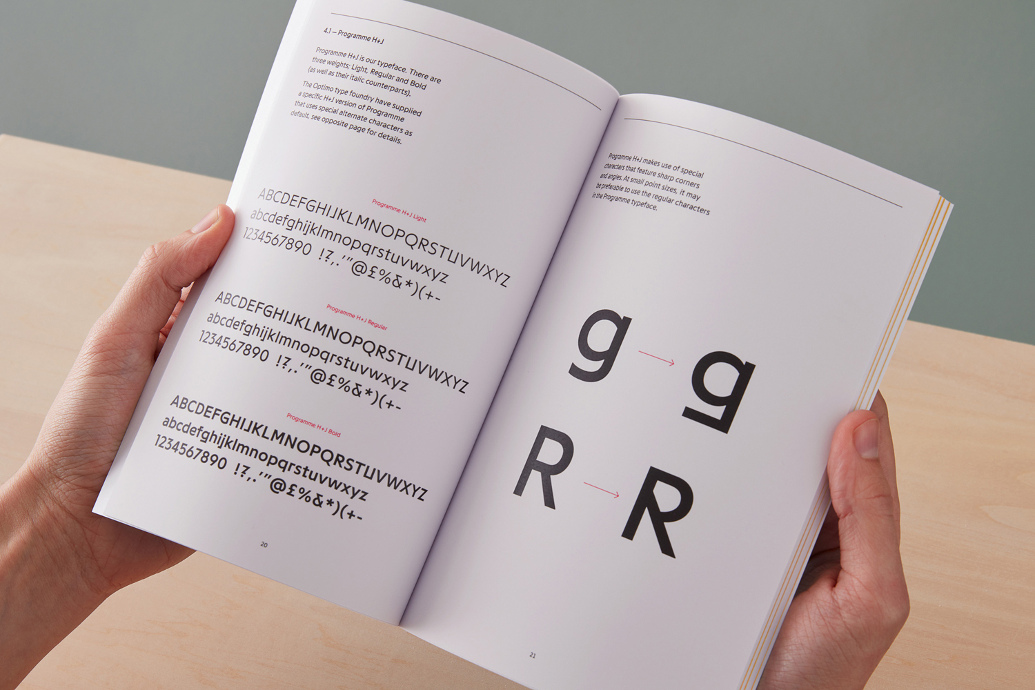
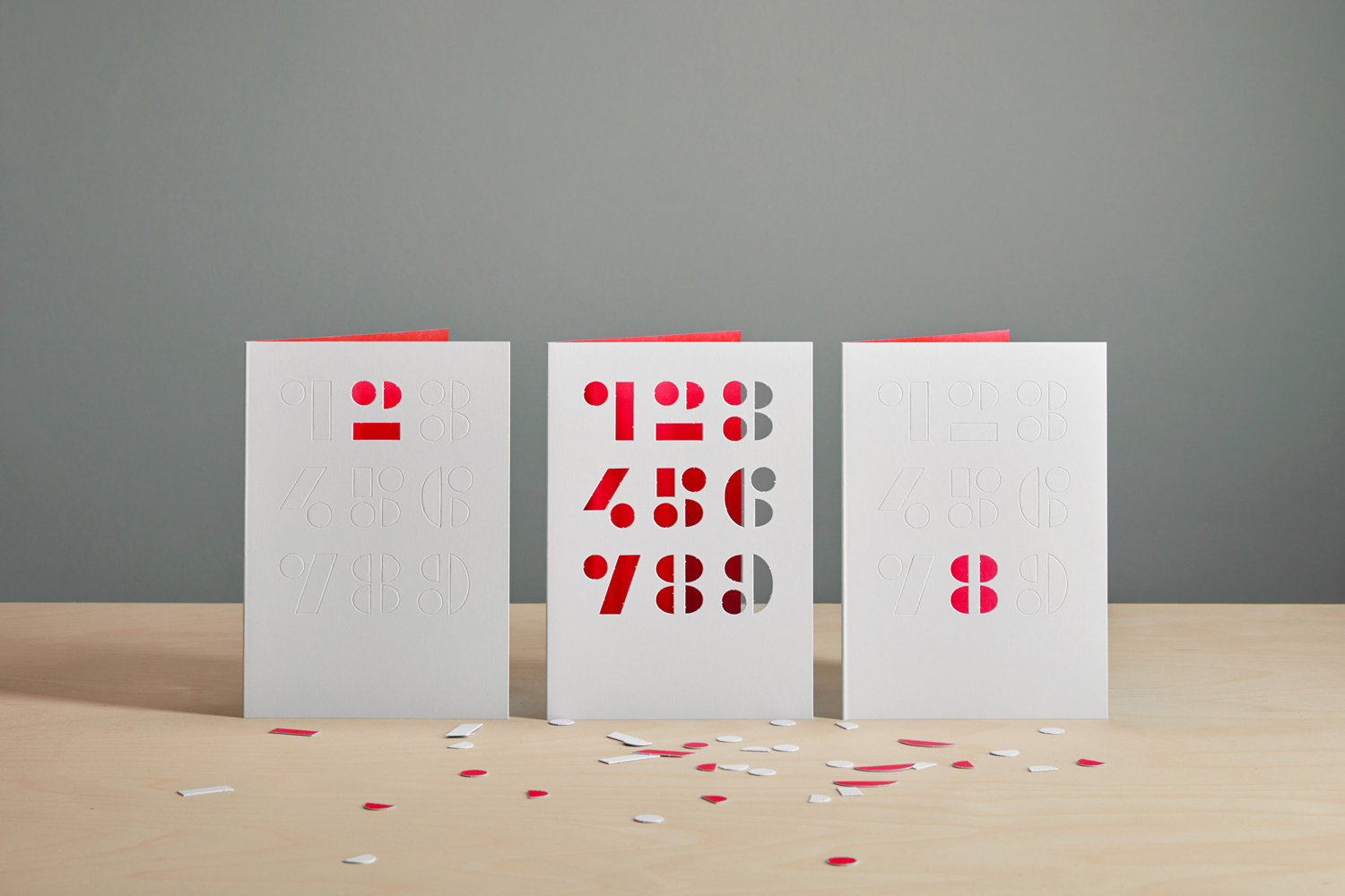
The project also includes a version of Optimo’s Programme which features a number of alternative letterforms. These feature sharp corners, angles and unusual intersections. These are certainly in line with the H+J’s desire to stand out. There is character in image, logo, colour palette and language, the use of the occasional unconventional letterform makes sure this exists within the context of every asset.
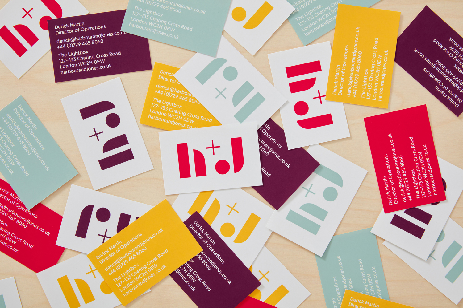
Colour works well to link type and image, and convey the different tones of events. These cover a cheerful yellow, fiery red, cool green and a sophisticated grape. This also continues through to copywriting, developed by Jim K Davies of Total Content. Simple statements convey personality, share a commonality with logo in its brevity, and the playfulness and communicative intent of image. More work by Spy on BP&O.
Design: Spy. Photography: Angela Moore & Peta O’Brien. Copywriting: Jim K Davies. Opinion: Richard Baird. Fonts Used: Programme.
