tvN by Studio fnt
Opinion by Richard Baird Posted 27 March 2017
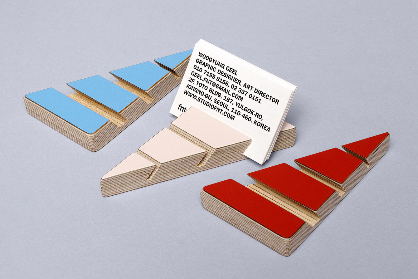
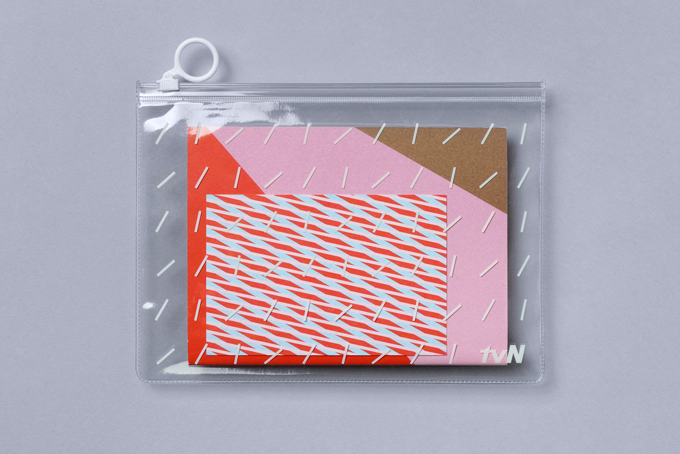
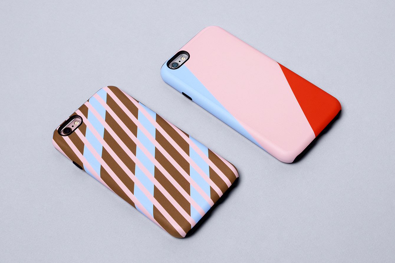
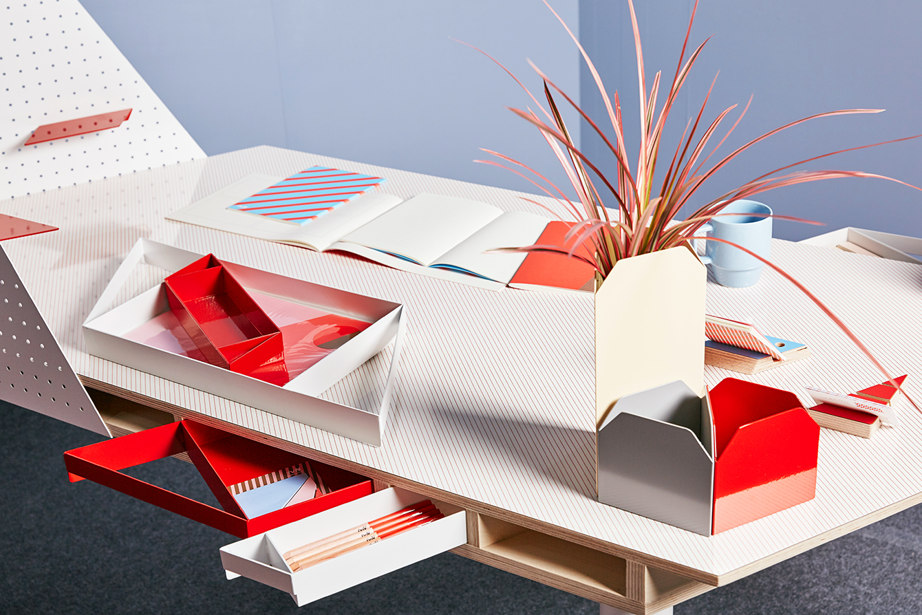
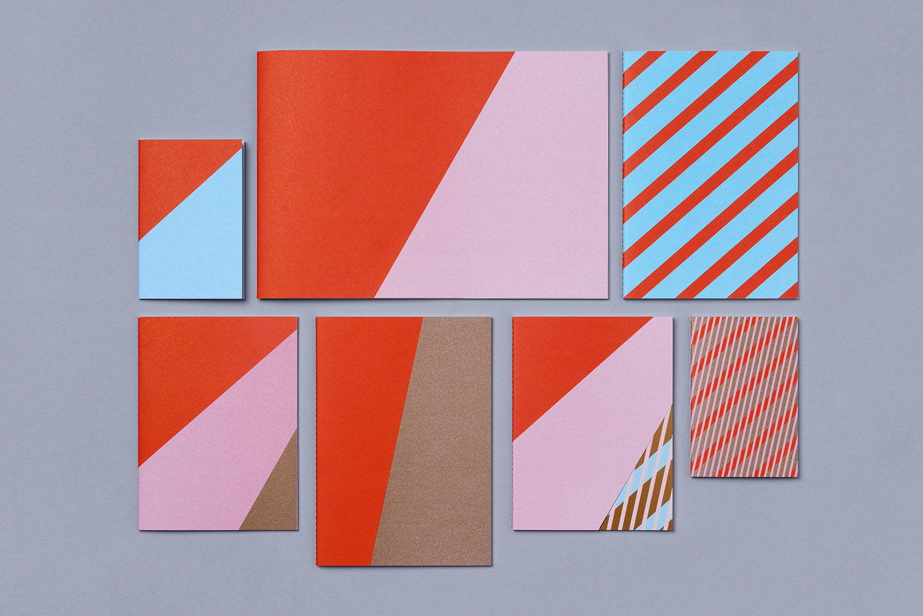
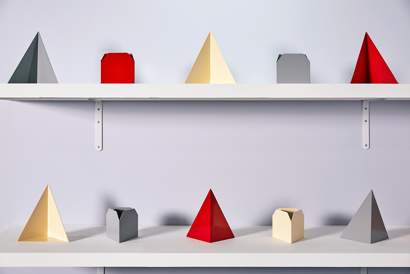
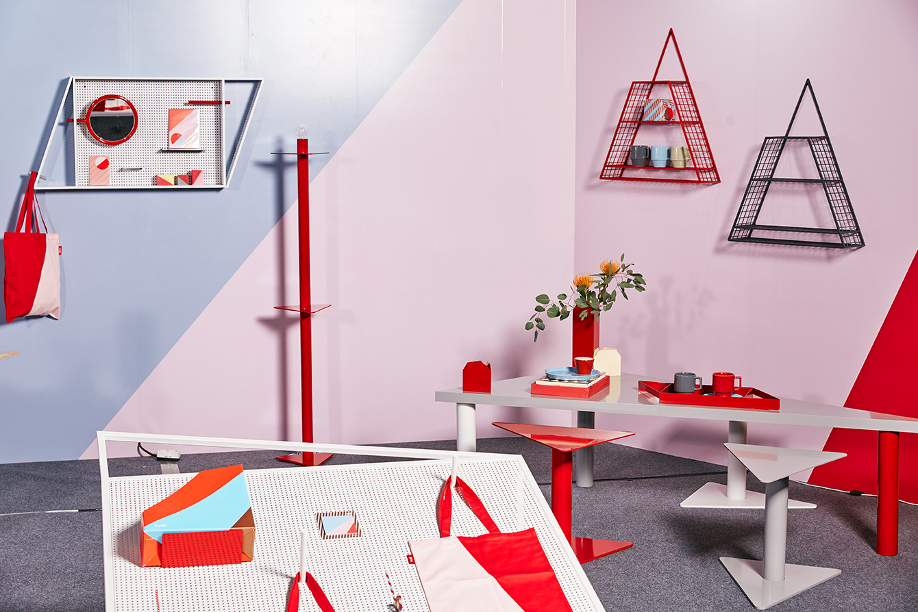
Total Variety Network (tvN) is a South Korean nationwide television network, founded in 2006, that offers a wide variety of general entertainment programming. tvN recently worked with Studio fnt on the creation of an offline visual identity for its store, expressed through its products, a mix of office stationery and furniture. These include adhesive notes and notebooks, pen and business card holders, wrapping paper, tote bags and tape, iPhone covers, tables and storage. There is broad variety to these yet they share a commonality in the use of simple geometric forms drawn from the angles of the tvN logo and interpreted both graphically and structurally.

It is a curious project in that it only covers a small part of tvN’s offline activities. There is no change to what makes up its visual identity onscreen. Online, after a quick bit of research, appears to really only amount to a logo and a container of contrasting white and red that functions to link a variety of programmes which have their own visual identities, and the occasional header of facets and diagonal lines. It is not particularly distinctive or memorable. The shop, however, has a consistent and cohesive visual identity system, conveyed through product and display that, through colour, form and pattern, expresses something of a modern, cheerful and quirky brand personality when presented together, but also individually distinctive.
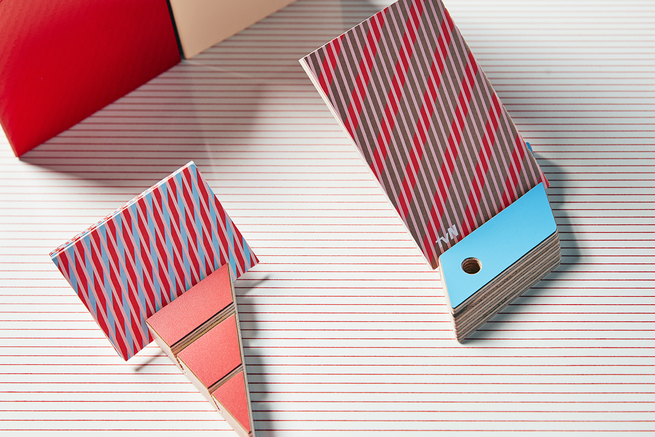
Informed by the tvN logo, a typographic treatment characterised by diagonal lines of italic sans-serif characters, a playful mix of case and proportion, and geometric forms within both positive and negative space, Studio fnt developed a series of high impact patterns with an underlying grid system. These move between the simplicity of two colours that bisect the cover of a notebook or the surface of a tote bag to the multitude and density of overlapping parallel lines used across iPhone cases and notecards.
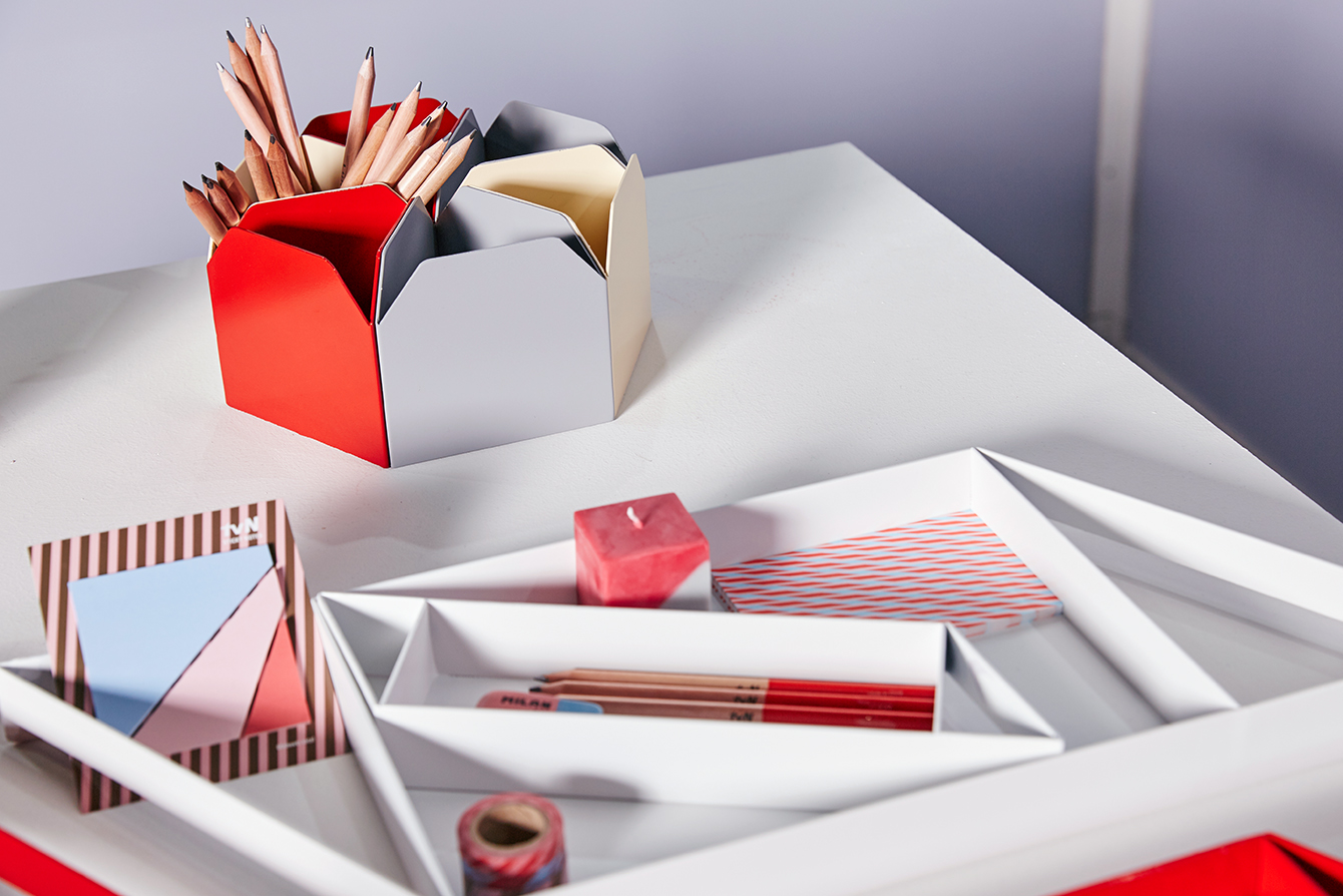
Office products and furniture, created in collaboration with celebrated Korean designer Park Kiljong, share more in common with logo than stationery, with distinctive and perhaps less practical surfaces and structures but a commitment to unique character. Together, there is a shared retrospective tone to these, with a slight Memphis quality, but within an office of other brands, these are likely to work well as feature pieces.
Highlights include the modular pinboard functionality of desk and cabinets, and the glossy qualities of powder coated steel alongside plywood profiles. Some are clearly practical, while others, such as the diagonal cuts of adhesive notepad, favour the stylistic.
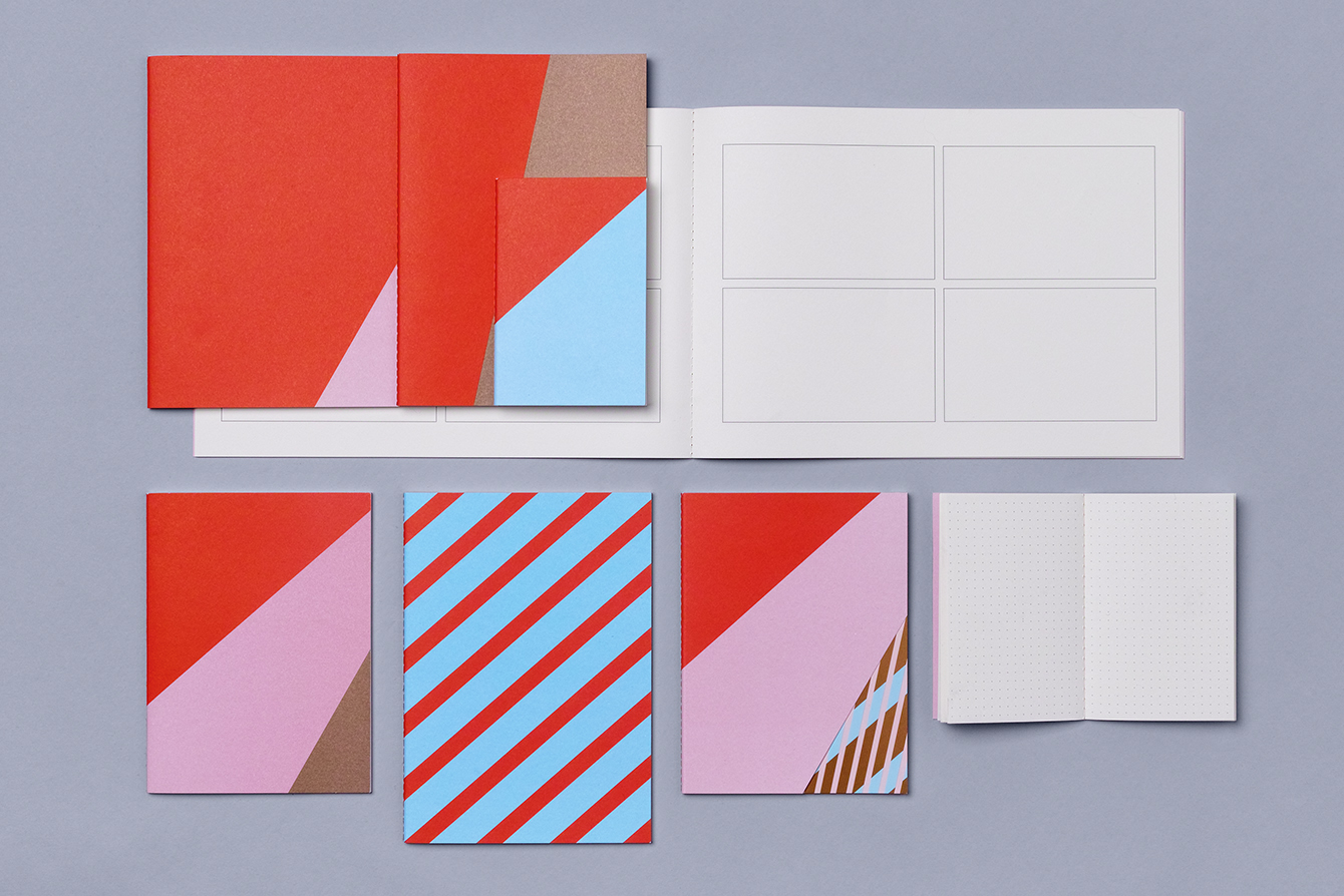
Both furniture and stationery share a pleasant tactile material quality, with the uncoated and unbleached boards of notebooks and the layered plywood of card holders and desk surfaces being left visible and used effectively alongside a colour palette of red, pink and blue in print and the addition of white and grey across furniture.
In print the strength of the underlying system is evident in the combination of items, building to a distinctive and memorable visual identity that, for the most part, is absent logo, but subtly informed by it, but functions to give individual assets an appealing quality outside of retail environment. More work by Studio fnt on BP&O.
Design: Studio fnt. Furniture & Ornaments: Studio fnt & Park Kiljong. Opinion: Richard Baird.
