Hill Of Grace Restaurant by Band
Opinion by Richard Baird Posted 11 May 2017
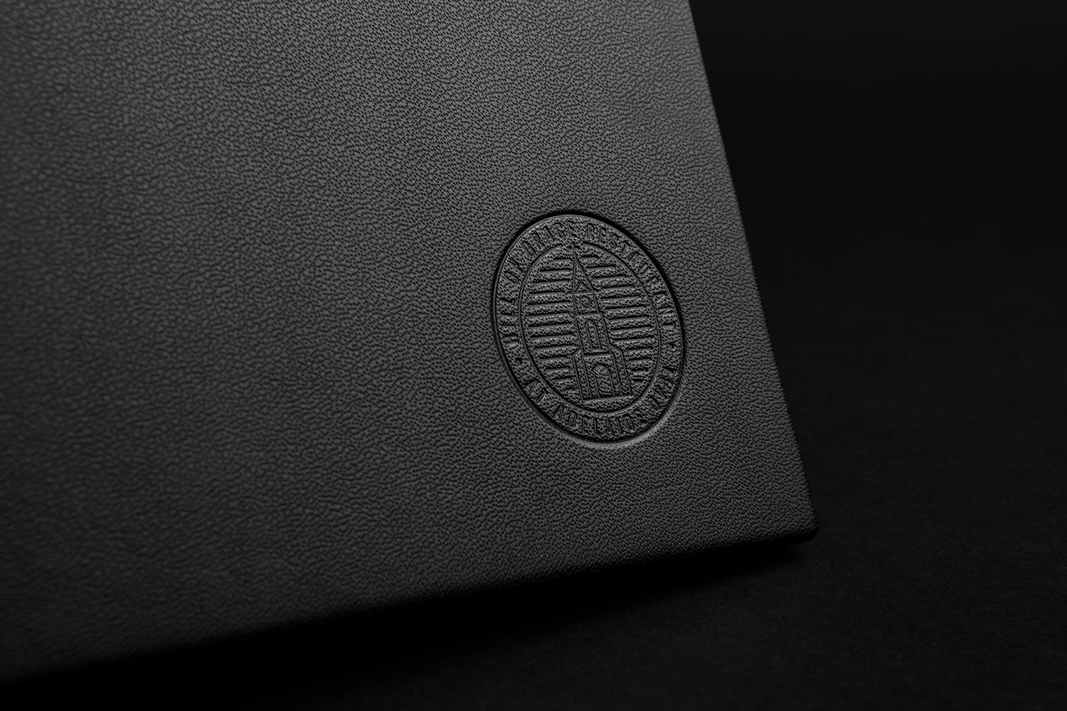
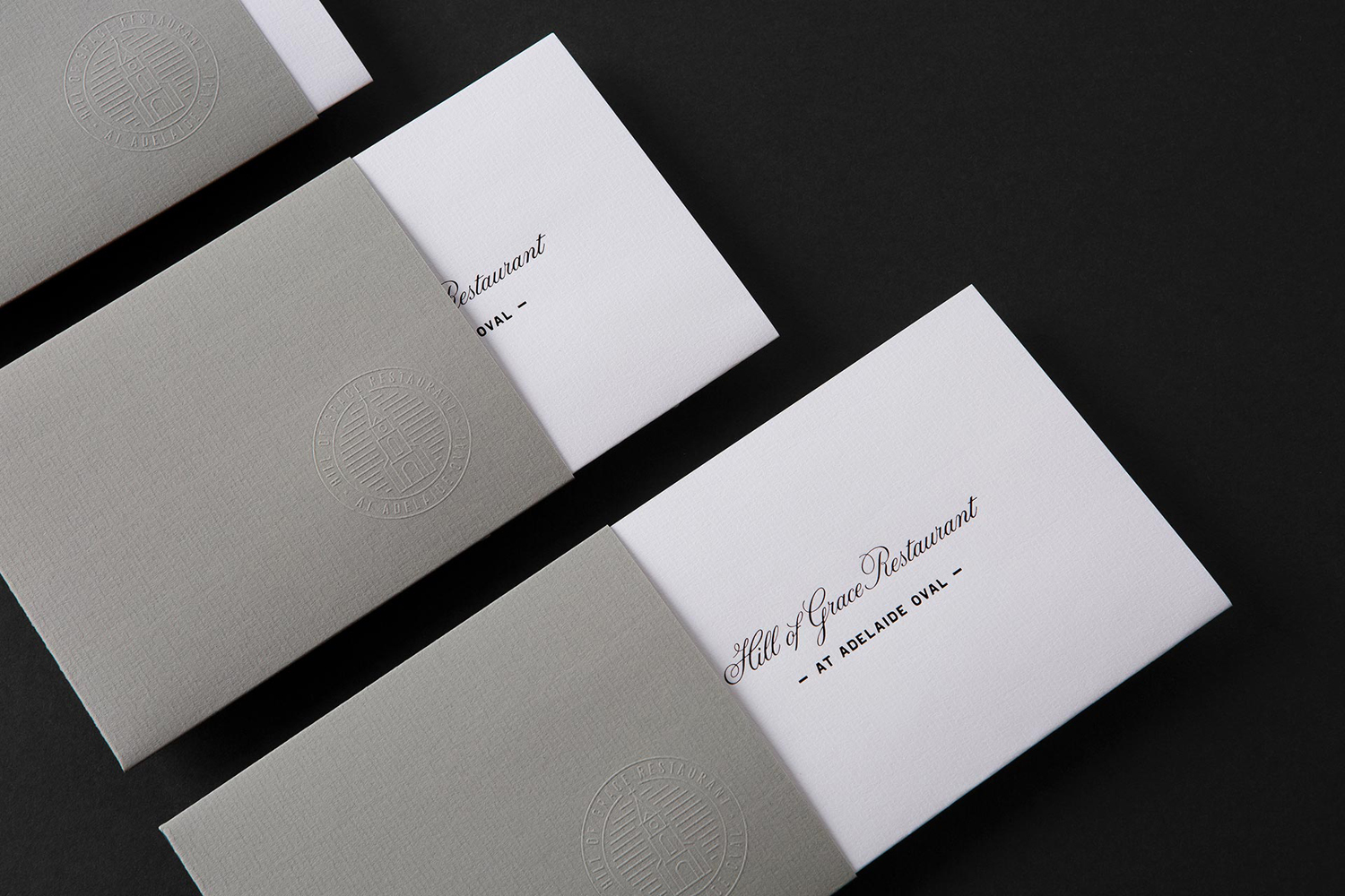
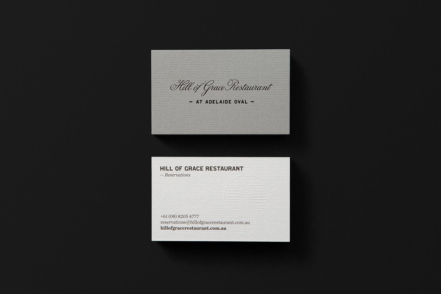
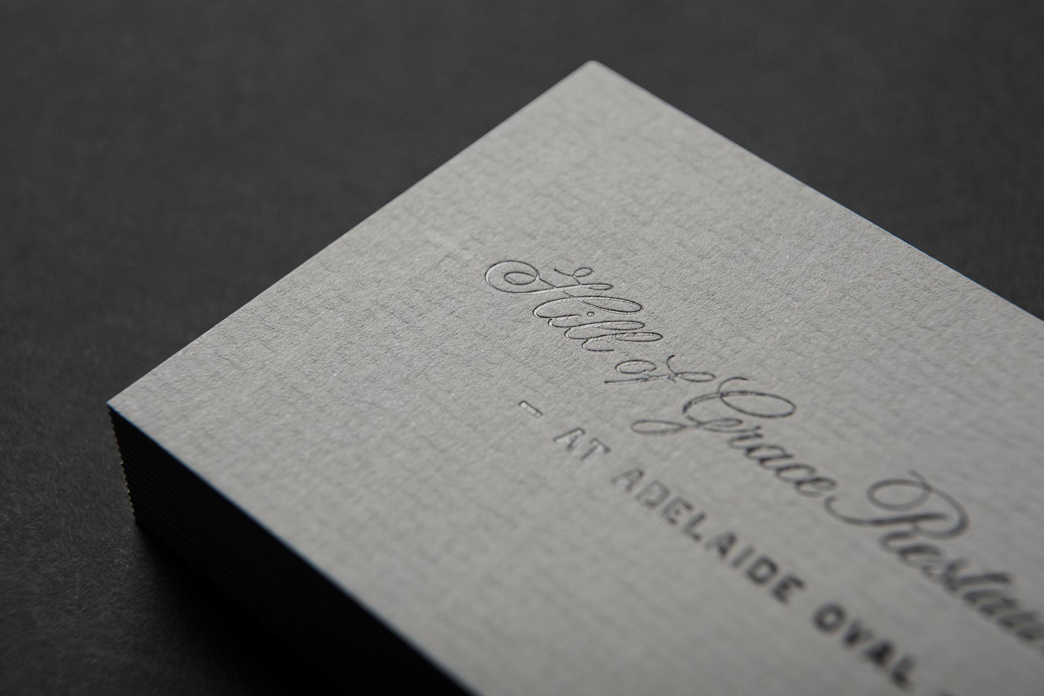
Hill of Grace Restaurant was created by renowned Australian wine maker Henschke and is located at the historic Adelaide Oval. With the intention of elevating experience, Henschke worked with design studio Band to develop a new brand identity that would match the quality of its food and wine, and establish a stronger connection with the roots of the brand, the Henschke vineyard. This is explored through photography, features custom typeface and redrawn logotype, and included the design of menus, stationery, invitations and business cards with a strong material quality in the use of laid paper, textured surfaces and blind emboss and black block foil detail.
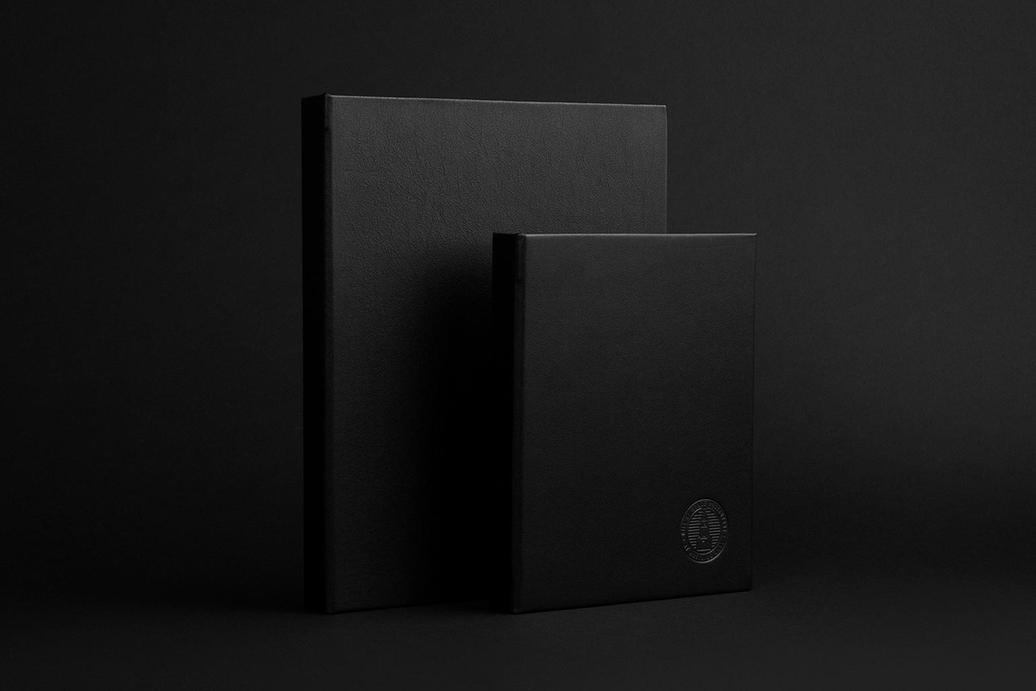
The restaurant’s character really comes from the quality of its food, the presentation of its dishes and its view of the Adelaide Oval ground, rather than interior design, which is formal and conservative. So brand identity does a lot of the heavy lifting when it comes to articulating and expressing something of the Henschke brand.
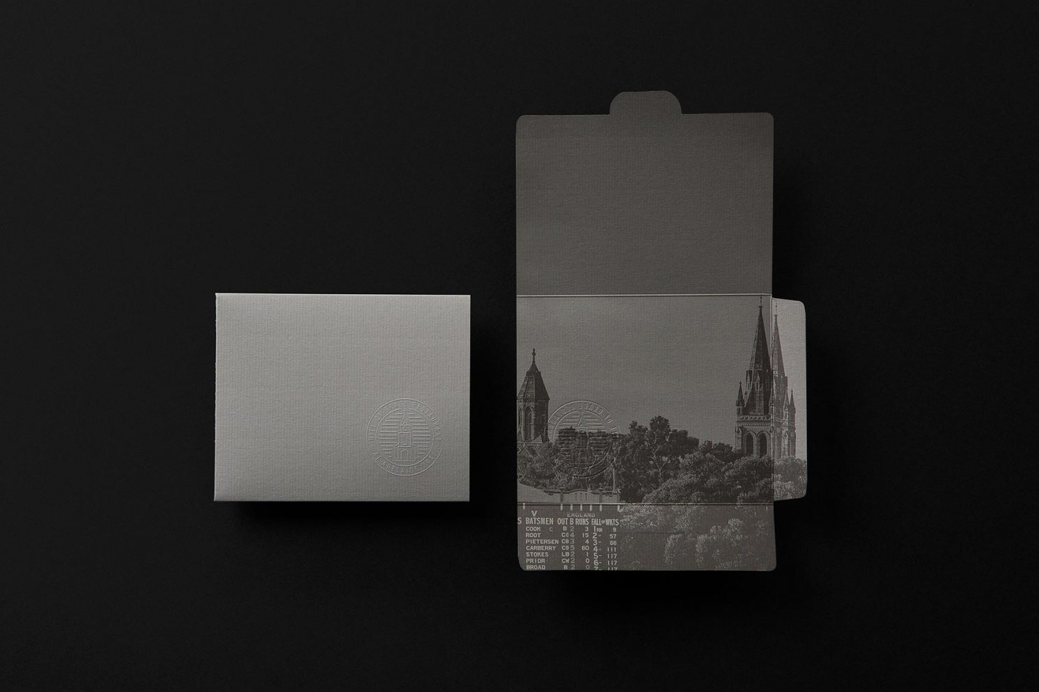
Band’s work is made up of a couple of neat ideas. The studio makes an interesting connection between the prestige and legacy of the restaurant’s location at the Adelaide Oval and the vineyard’s locality and heritage using photography. Spires and trees create a smart visual parallel between locations, and is said to be explored further with “footy boots and gumboots, a 1950s pitch-roller and an old Henschke truck, cricket stumps and vines.”
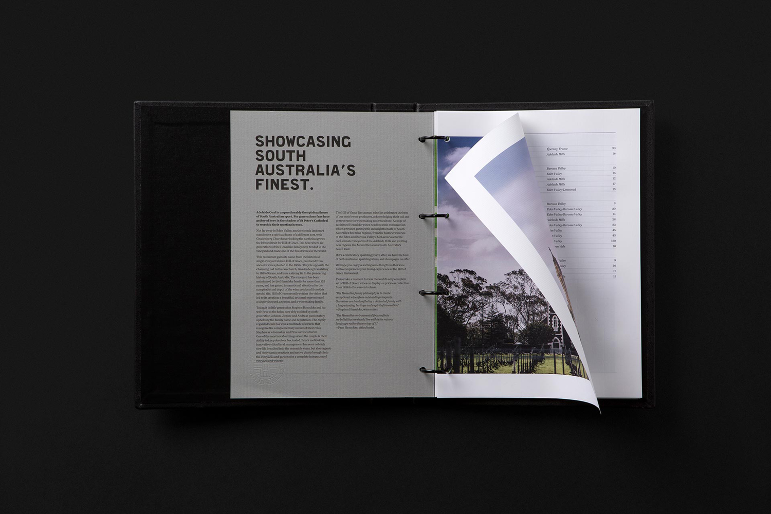
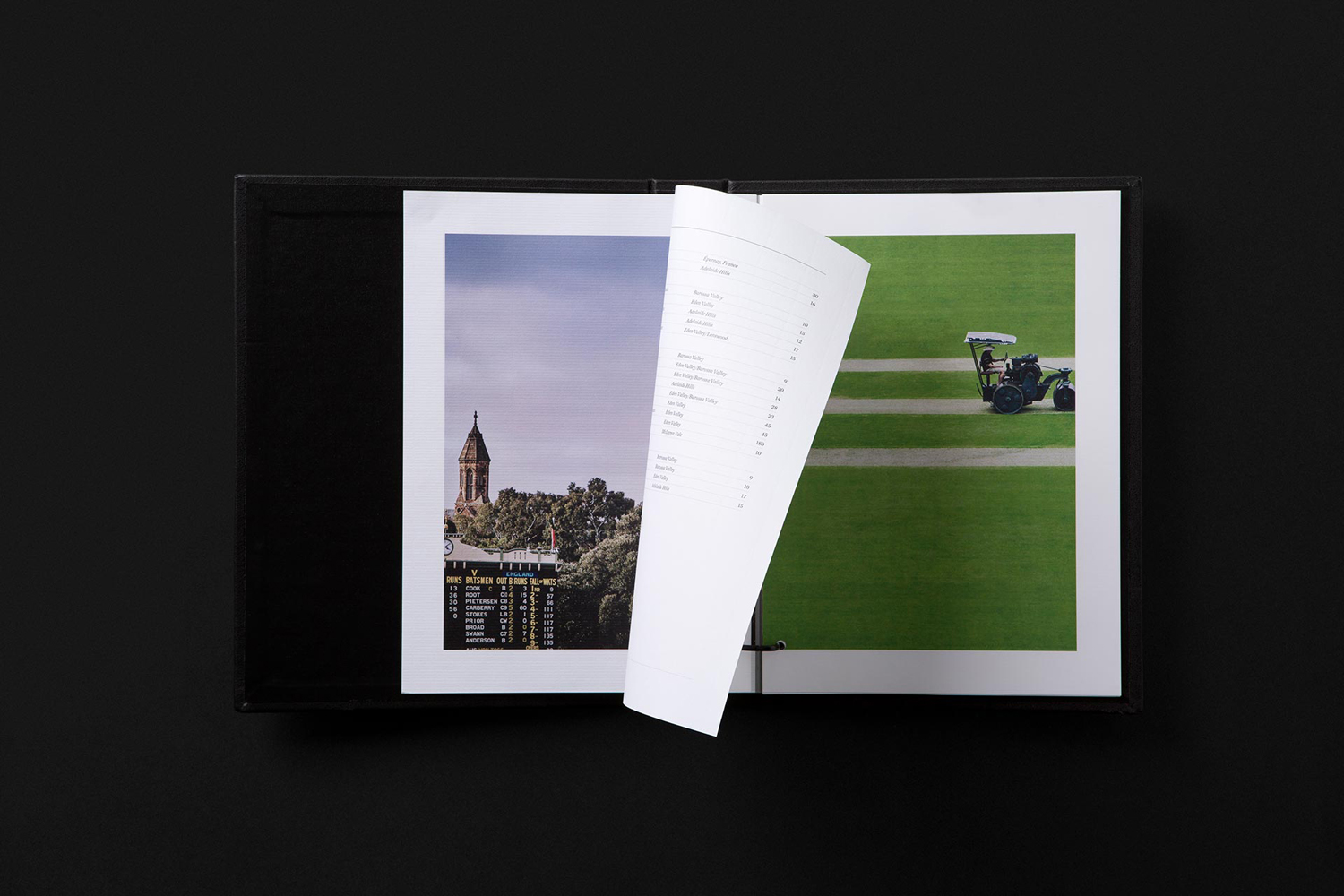
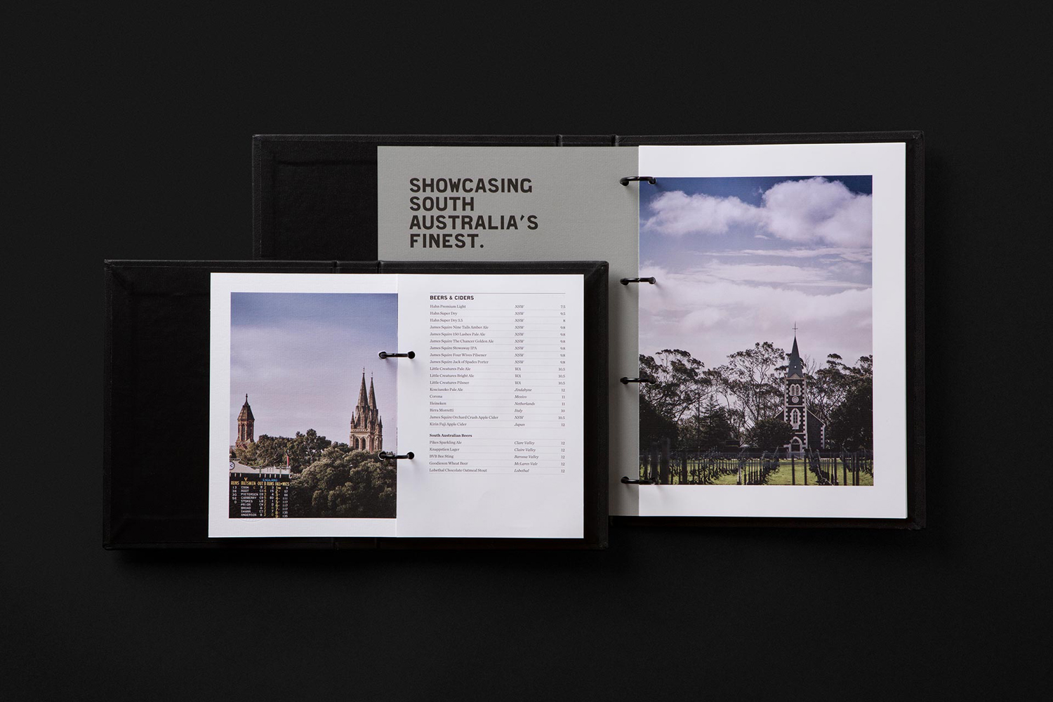
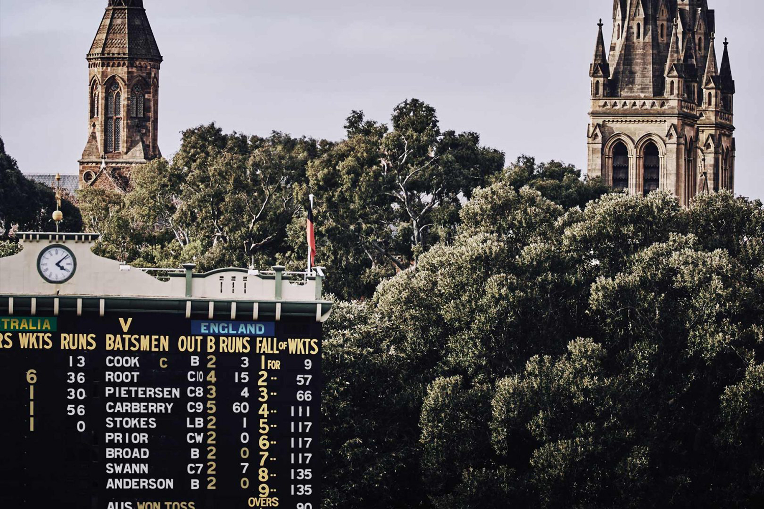
Custom typeface, alongside the use of image, is a particular highlight. Milne Bold, drawn from the iconic scoreboard of the Oval grounds, which can been seen from restaurant, and named after the architect of the Adelaide Oval scoreboard—Kenneth Milne, is distinctive. It effectively translates the nuance of the sign maker’s brush strokes into a working typeface, with its irregular spacing also making its way into print. The connection to ground is evident. There is a neat parallel here between winemaking heritage and the legacy of the Adelaide Oval.

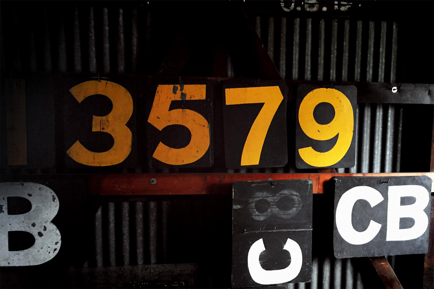
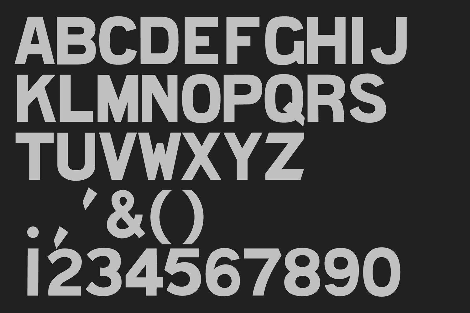

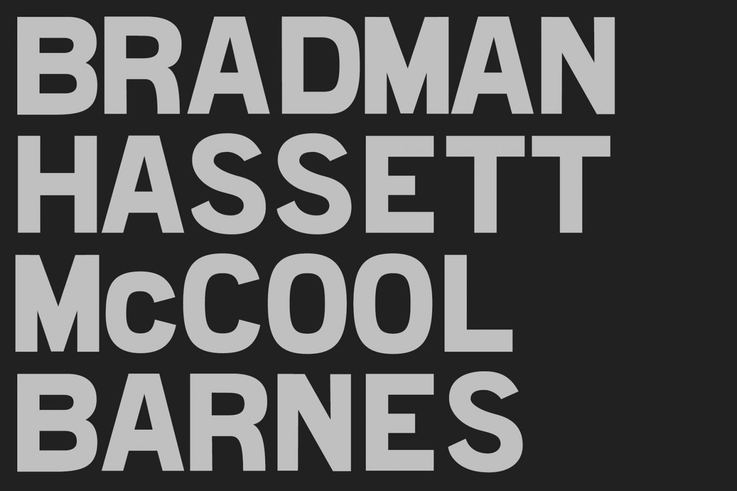
Band’s work also touches upon a sense of past and present through the retrospective flourish of a logotype of loops and ligatures and the more recent monolinear lines of a roundel. Colour, material texture and print finishes, work well to hold together these together.
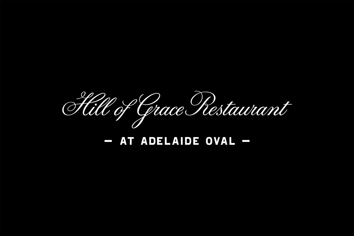
Custom type and image are great. They effectively draw on a recognisable, idiosyncratic and iconic asset of the ground, and make a connection to the locality of the Henschke vineyard in a thoughtful way. Although there is a legacy and heritage through line, assets have a slight dissonance. Contrast can be effective, but the elegant calligraphic lines of logotype (a bit of tired but useful shorthand for luxury and sophistication), the hand-painted origins of custom typeface, and the precise lines of roundel feel fragmented. The dominant and unifying detail is in the material, where perhaps custom type, in conjunction with materials and finish, could have achieved a balance of the bold and the sophisticated with a stronger sense of cohesion and character.
Design: Band. Opinion: Richard Baird.
