Brighton & Brighton Beach ELC by Studio Brave
Opinion by Richard Baird Posted 7 June 2017
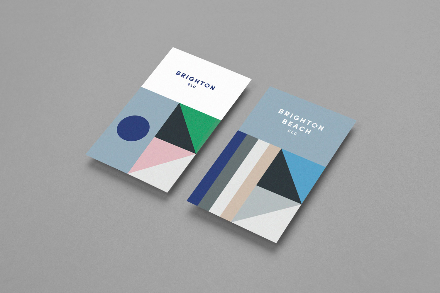
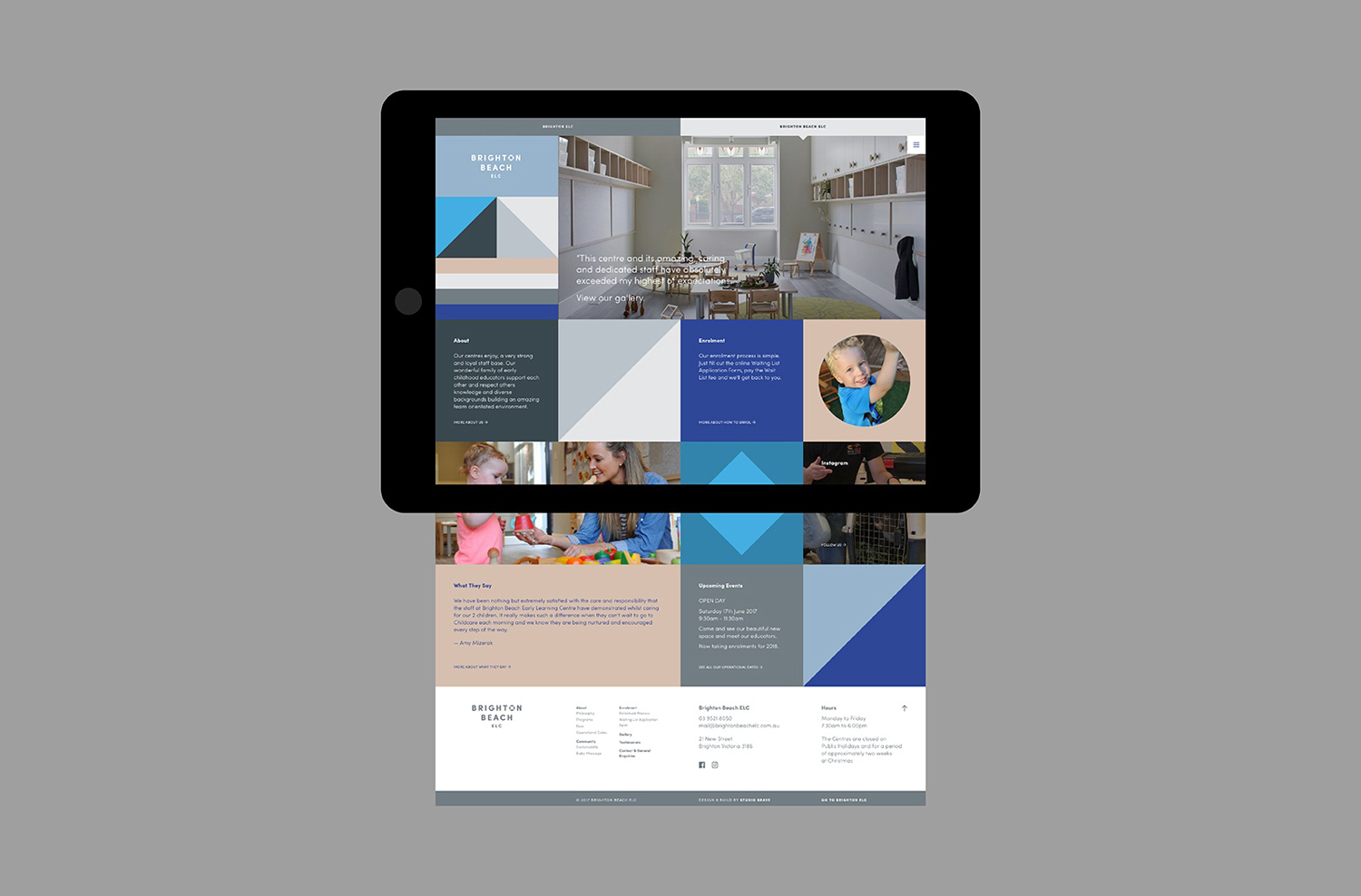
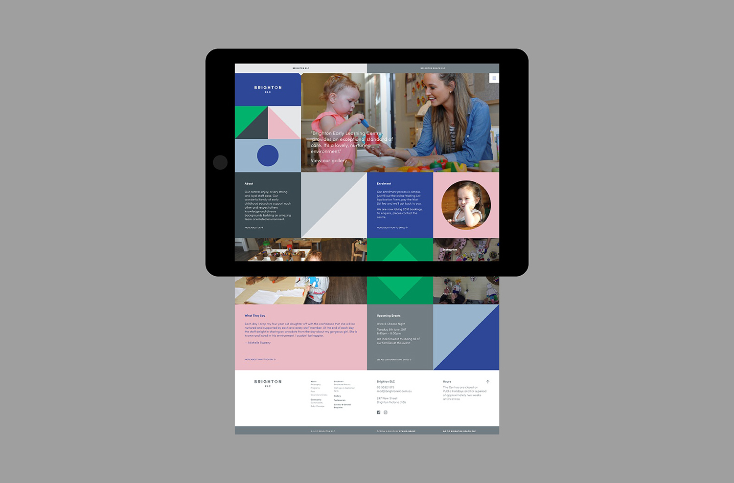
Brighton & Brighton Beach are privately owned boutique childcare and early learning centres in Brighton, Australia. Brighton ELC, the first of the two, opened in 2001 and caters to 60 children, aged between the ages of 8 months and 6 years, and recently underwent renovations, led by Christopher Elliott Design. To coincide with this renovation, Brighton ELC worked with Studio Brave on visual identity for both centres. Taking their inspiration from the bayside location and Brighton Beach’s iconic beach boxes, as well as referencing the geometric forms of maritime flags, the studio created a playful visual expression that finds a commonality between play and seaside location.
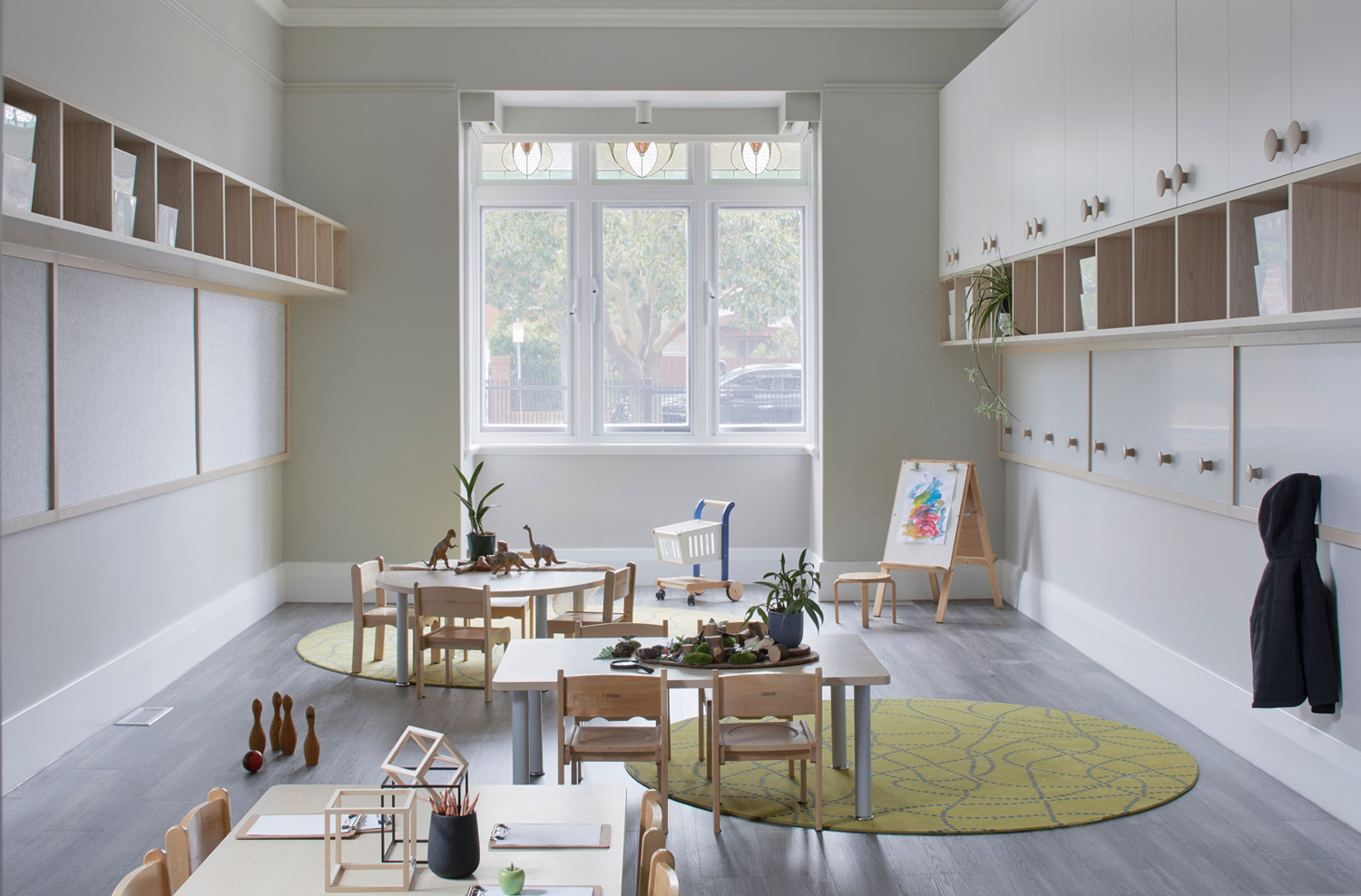
Brighton ELC, following its recent renovation, finds a balance between the warm and homely, and the modern, useful and space conscious. This is achieved in the keeping of period features such as cornicing and stain glass. The introduction of light wood and white surfaces. In the approach to storage, a mix of open shelves and closed cupboards off the ground. And how space incorporates rooms for small groups and leads outdoors to age appropriate play areas.
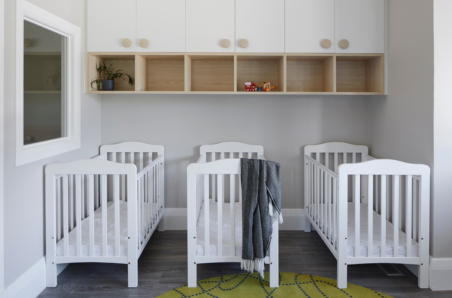
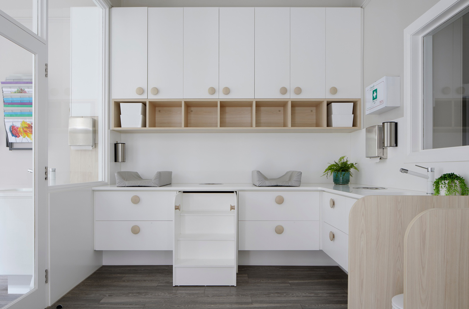
Maritime flags are an often-used motif in the building of visual identities for seaside brands and businesses. They can be an easy go-to, yet here, benefits from an unexpected context, and in the way it finds a comfortable intersection of associations, moving between the modular blocks of child’s play, the recurring shapes of the ELC’s interior storage, maritime flags and the iconic beach huts nearby.
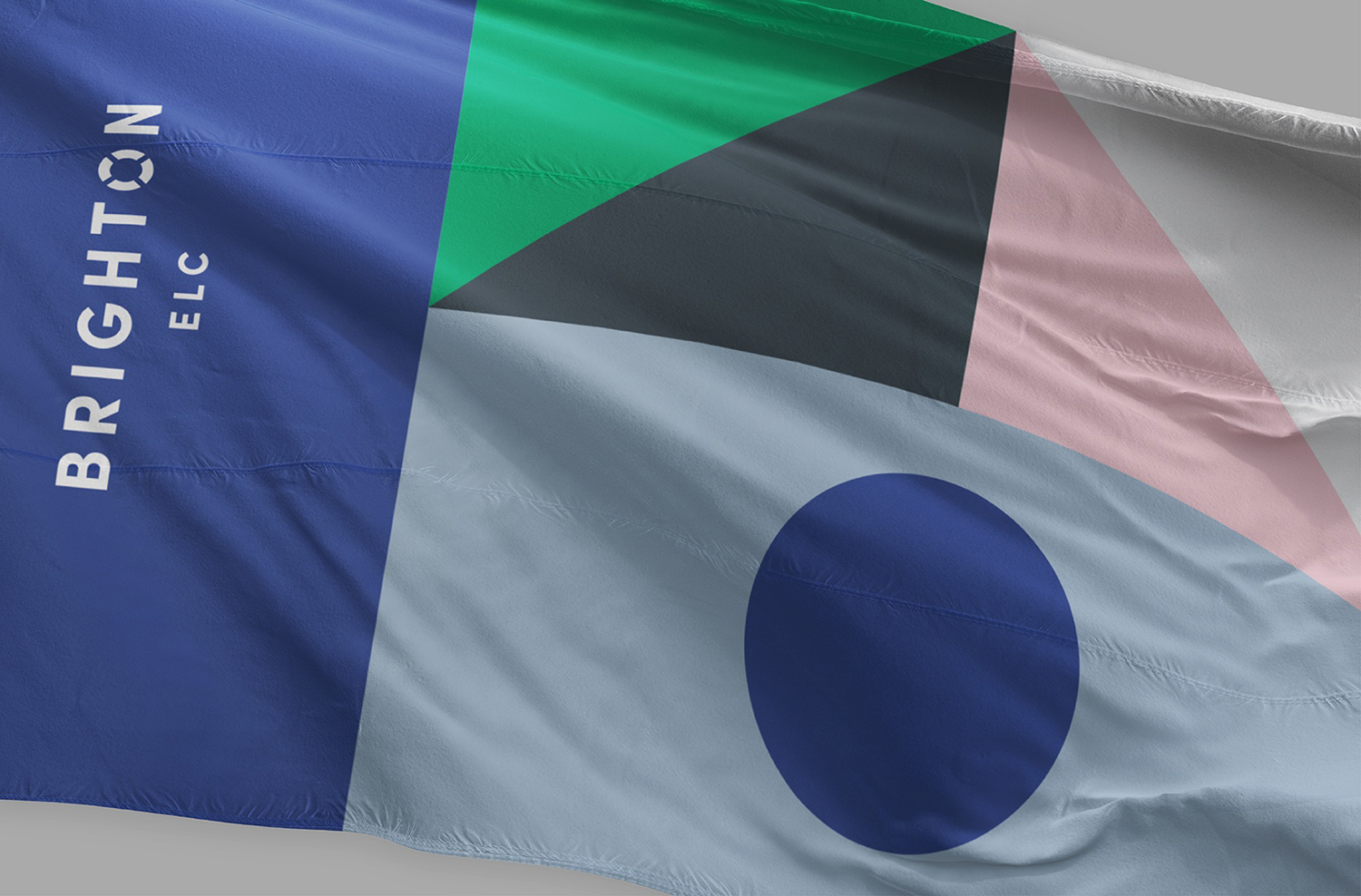
Visual identity channels something of the recent renovation, its furnishing of natural materials and wood rather than plastic toys. Although visual identity introduces colour, there is a restraint. When there could have been the temptation to directly reference the bright beach huts nearby and the synthetic colour of modern toys, offering significant contrast to interior, here there is a more a natural, serene and reassuring quality to colour palette.
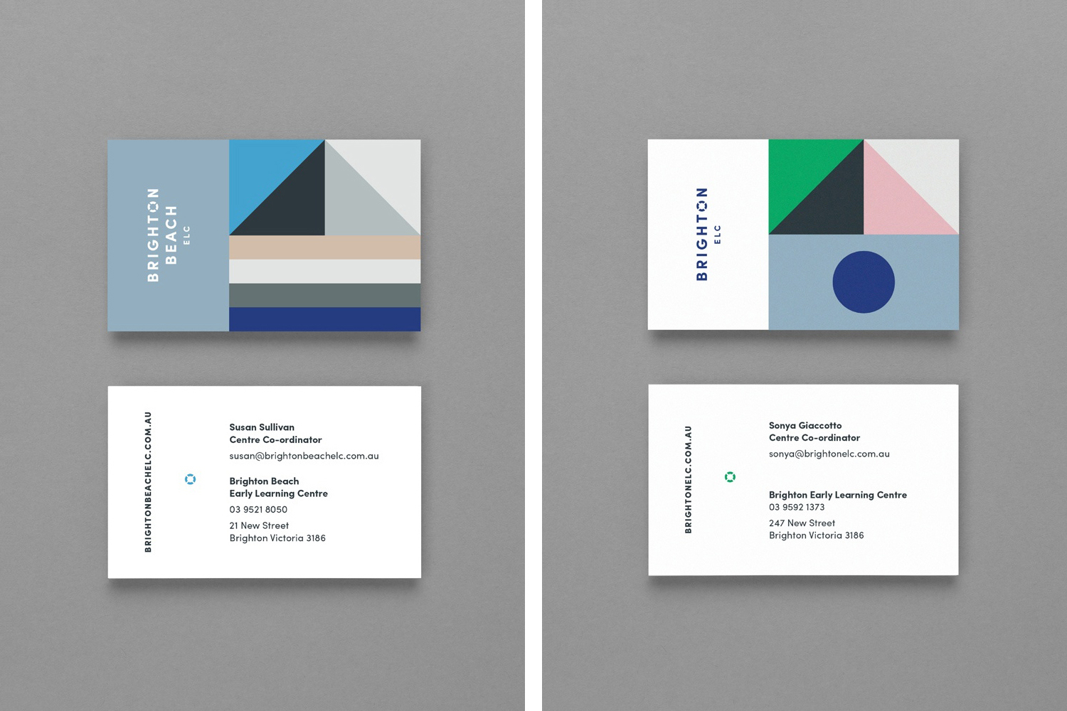
Logotype, like the use of form and colour, similarly finds a balance between modern expression and a moment of play in the choice of a monolinear sans-serif and the cuts and negative space of the O to create a life ring. This also works well for child supervision and safety.
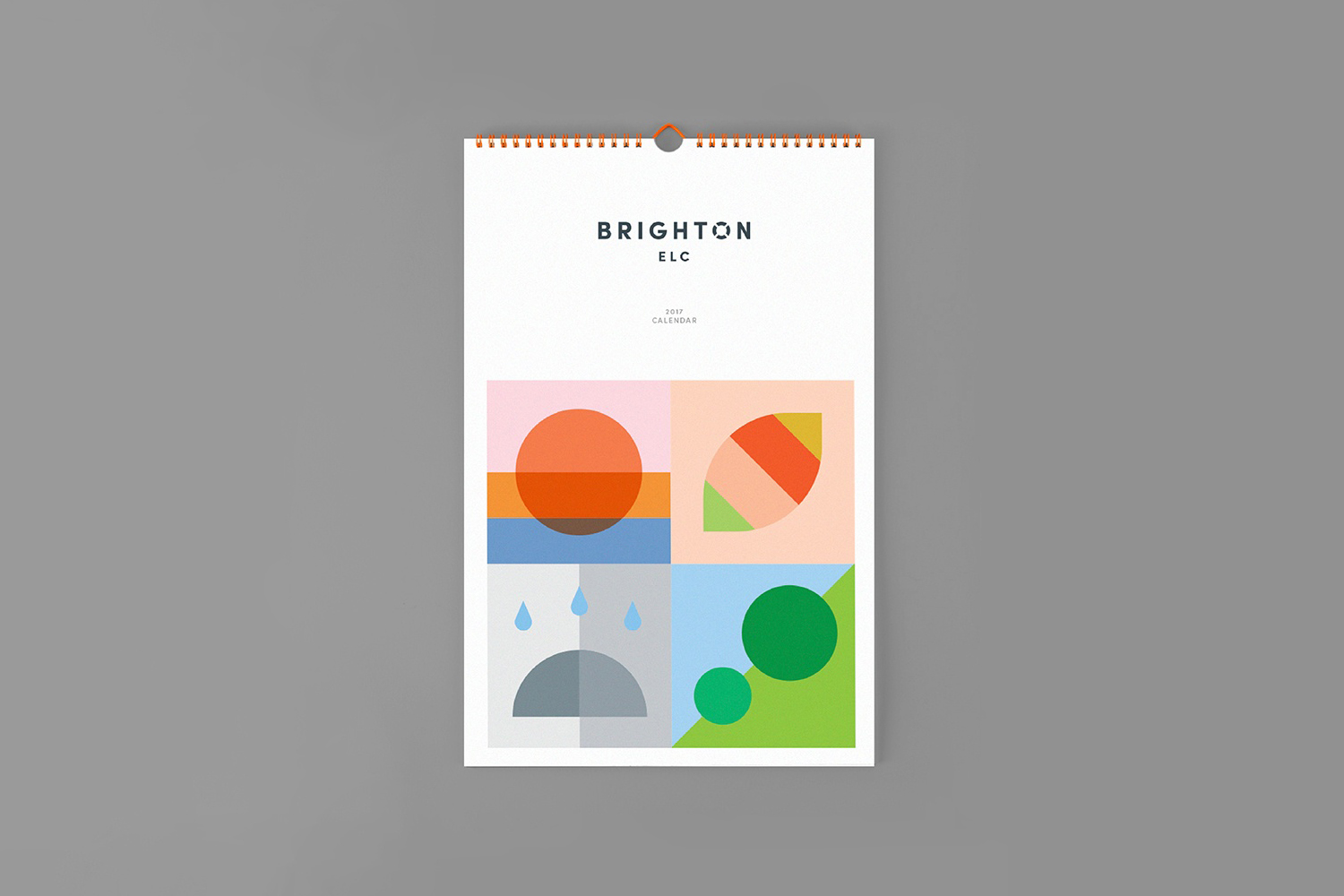
In print pattern dominates and is the primary visual expression, with room for variation. The calendar is a useful tool to convey potential outside of the maritime reference whilst retaining some form of continuity.
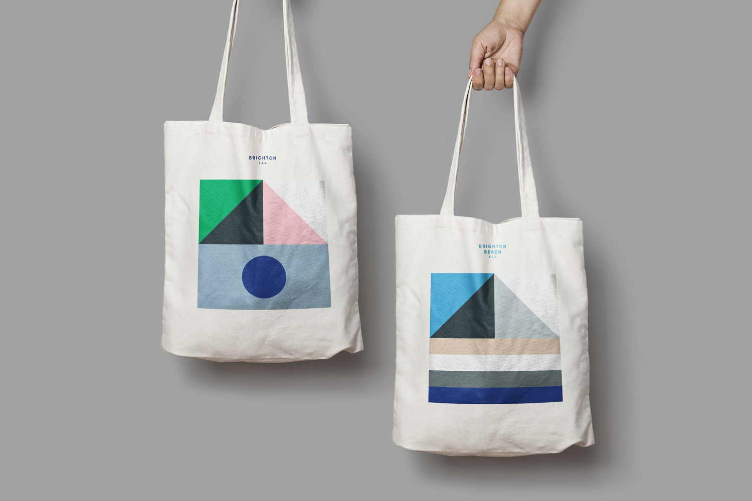
The result is bold, modern and distinctive within the context of early learning centres. It benefits from a couple of other discernible associations, outside of the maritime, that includes child’s play and beach huts, avoids the logo-centric, and clearly links the two centres whilst avoiding repetition. It is applied in print with confidence, with logo taking a backseat and, as you might expect, working well within the context of modular and responsive web design. More work by Studio Brave on BP&O.
Design: Studio Brave. Opinion: Richard Baird.
