Kristin Jarmund Architects by Snøhetta
Opinion by Richard Baird Posted 30 June 2017
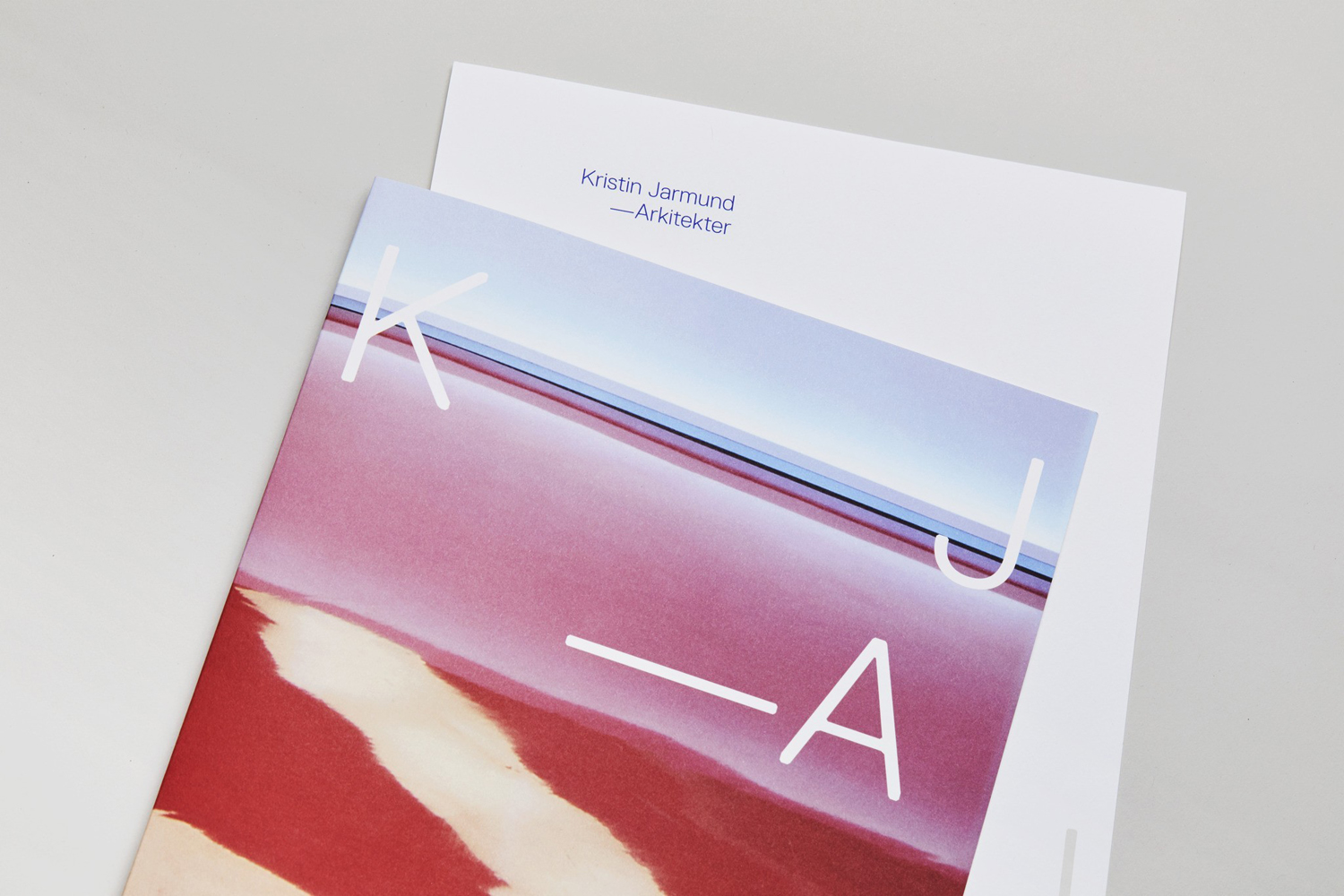
Kristin Jarmund Architects is an oslo-based architectural studio with a design philosophy that is focused on using a simplicity of form and a clarity of purpose to address complex problems, while at the same time, allowing for a contextual and human sensitivity. Reduction, as well as the duality inherent to the studio’s work, was the founding principles of their new visual identity, created by Scandinavian studio Snøhetta. This can be seen in the juxtaposition of type and image, and the recurring motif of extracts within both of these.
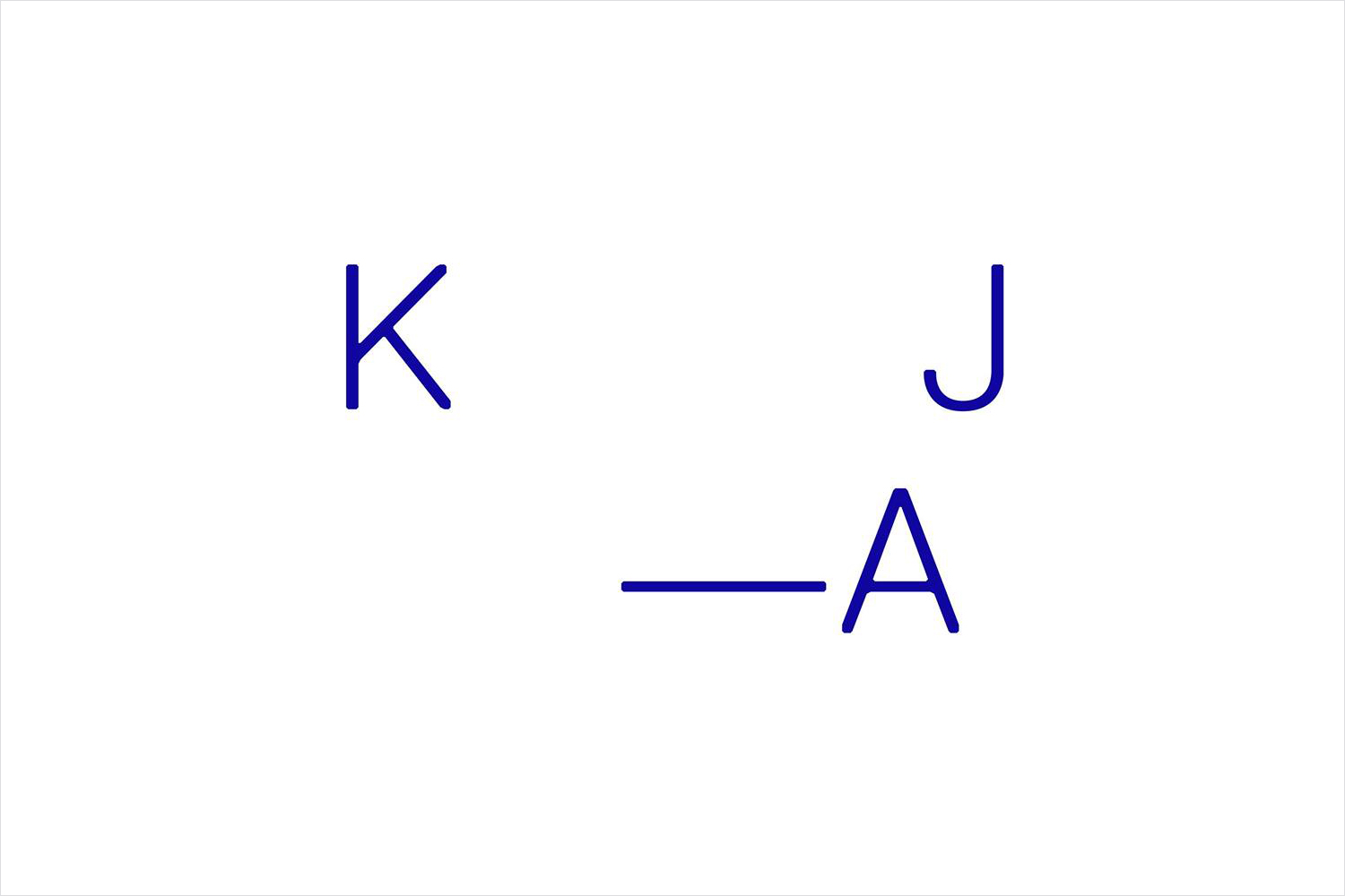
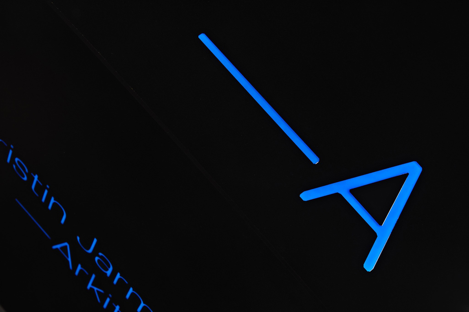
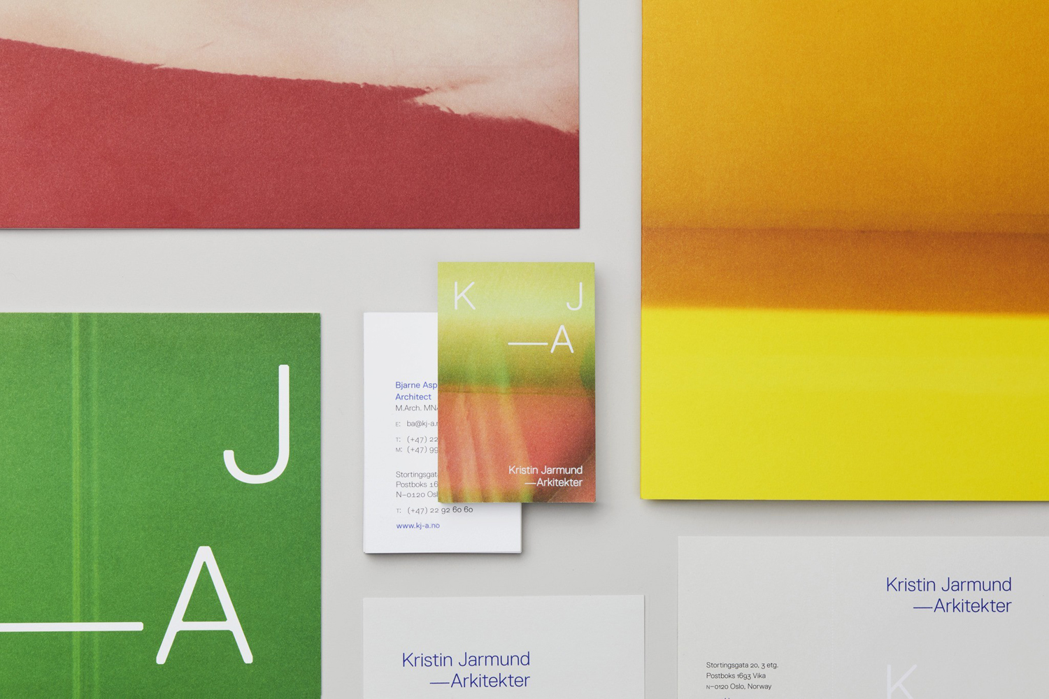
Rather than a singular concept, Snøhetta employs a confluence of themes and ideas (contrast, duality, and reduction); some familiar architectural cues, and moments of unusual warmth and distinction. This can be seen in the angular cuts yet soft rounded corners of a logotype built from Replica, which sets a technical and structural tone in letterform, arrangement, and blue ink, and the use of colourful image; a detail or extract from one of Kristin Jarmund Architects’ projects.
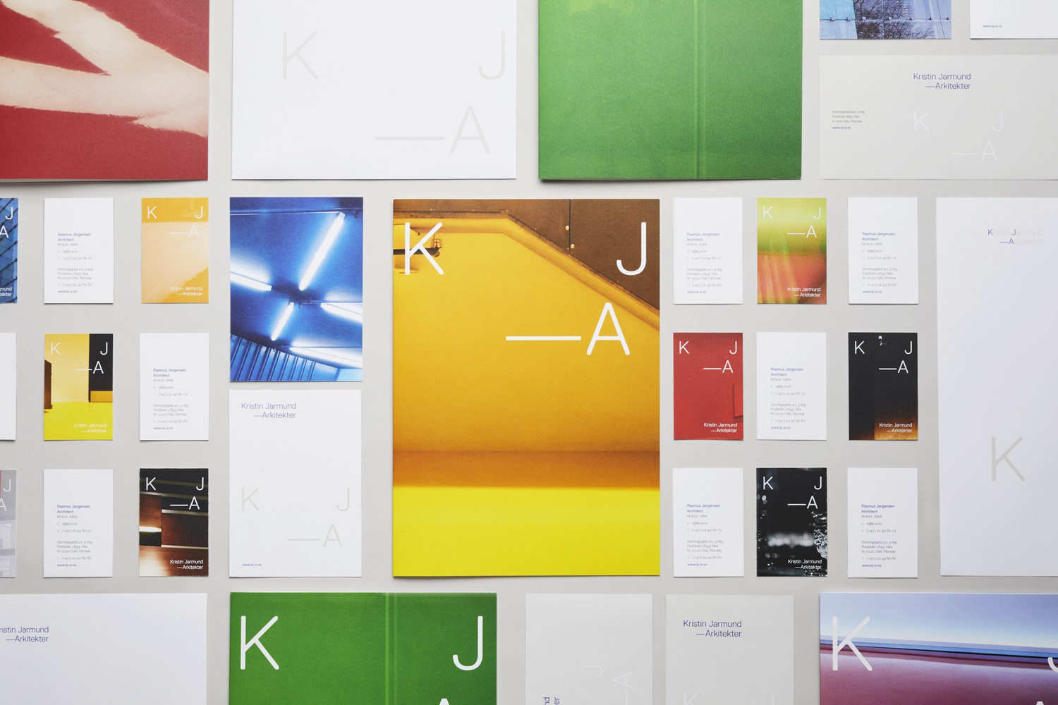
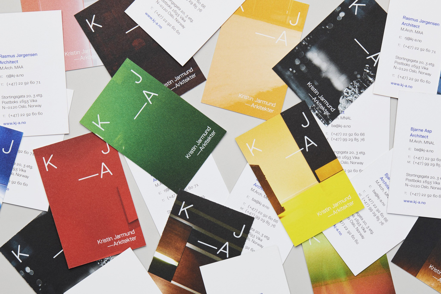
Visual identity draws a unique character and a useful flexibility from the variety of image, with twelve different crops used across business cards. These move from close-up detail to more of an overview, and from what looks like internal architectural elements of precise lines and well-defined forms, to something more natural and external. Form becomes abstract, detached from function. This lends visual identity, alongside the reductive, technical and architectural components, an element of the more emotive and visceral, in line with the studio’s contextual and human sensitivities.
The flexibility of image continues through to the two states of the logotype; existing as the full name of the practice and, much like image, as an extract, or more conventionally put a monogram. The action of reduction has a practical application online in conjunction with the motion of a single page of image. The interaction of type and image of print also makes the transition online, but the colour, full bleed and emotive qualities of stationery are lost to a more formal grid-based structure and images that reveal the complete nature of a project.
The familiar architectural themes of space and structure, light and shadow, scale and proportion are all touched upon. Where other architectural visual identities might be more nuanced in their articulation of these, be that through paper choice, type, layout, and print finish, the use of image is refreshing in its more literal expression but distinctive in colour and cropping.
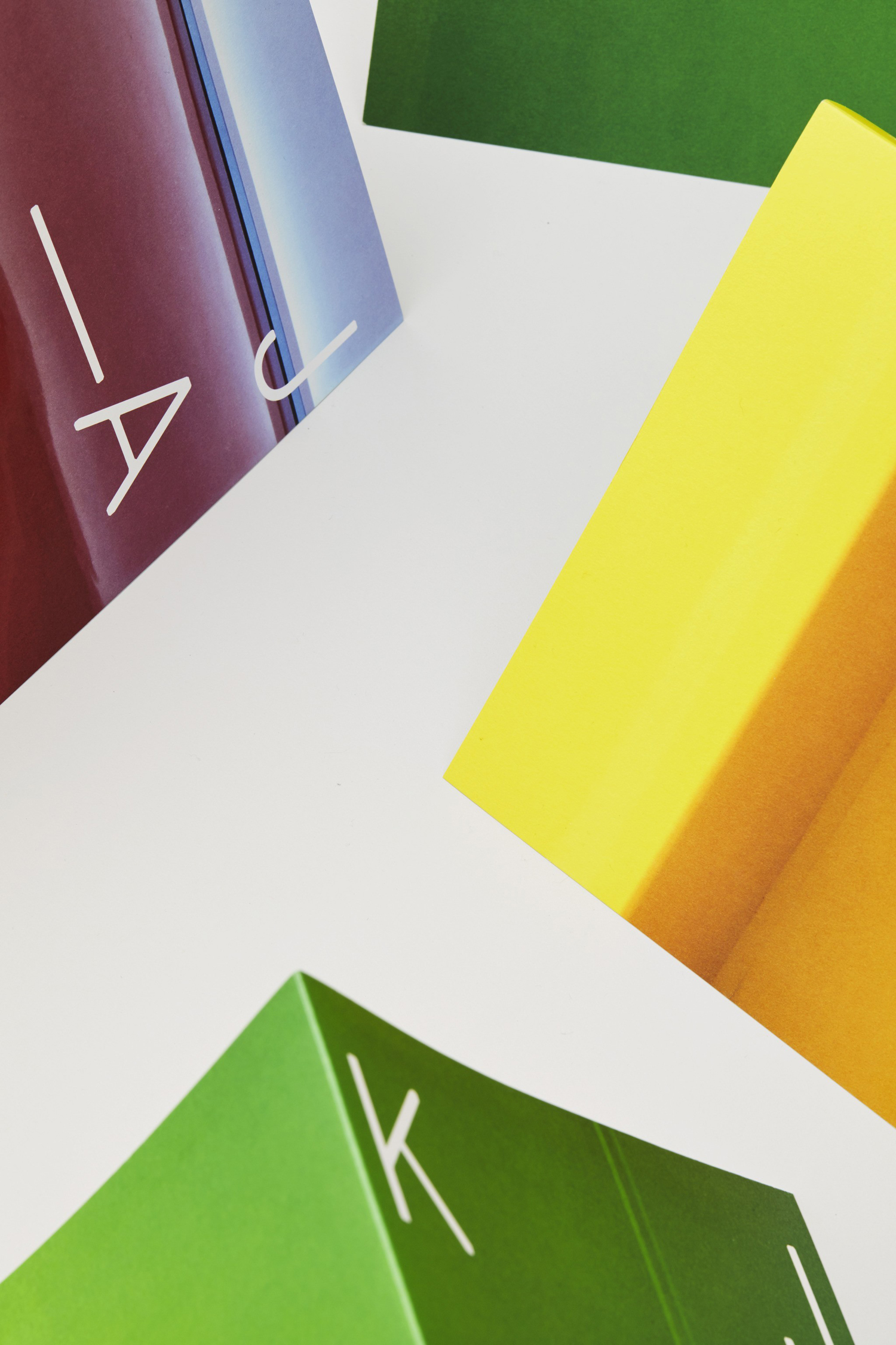
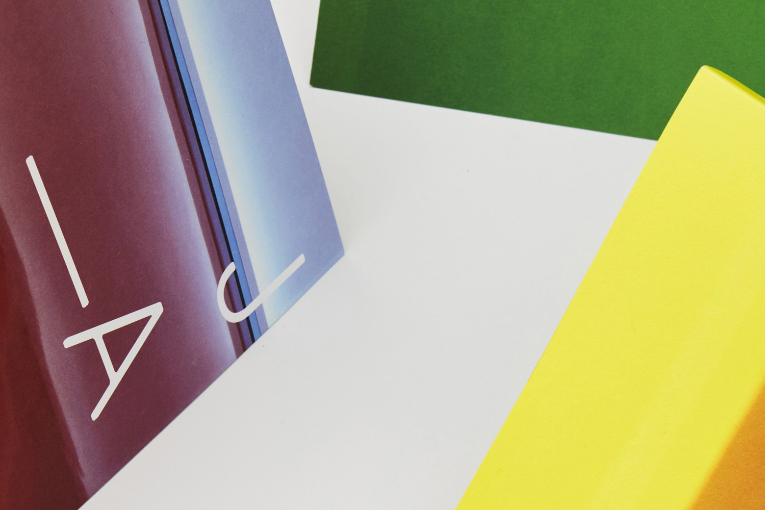
Although image is the dominant expression, and given the opportunity to evoke feeling rather than critical interpretation, and type effectively offering a technical contrast, there is also a subtle high-quality material dimension to the work. Contrast and duality continue to play out in the interaction of the matt surfaces of uncoated papers and boards and the glossy white of a block foil print finish. More work by Snøhetta on BP&O.
Design: Snøhetta. Photography: Calle Huth. Opinion: Richard Baird. Fonts: Replica.
