Old Spike Coffee by Commission Studio
Opinion by Richard Baird Posted 27 July 2017
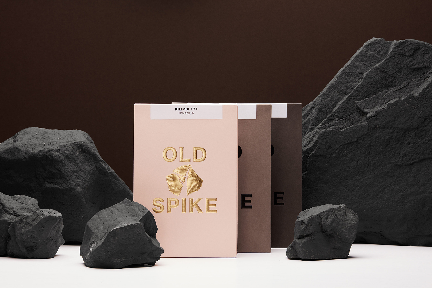
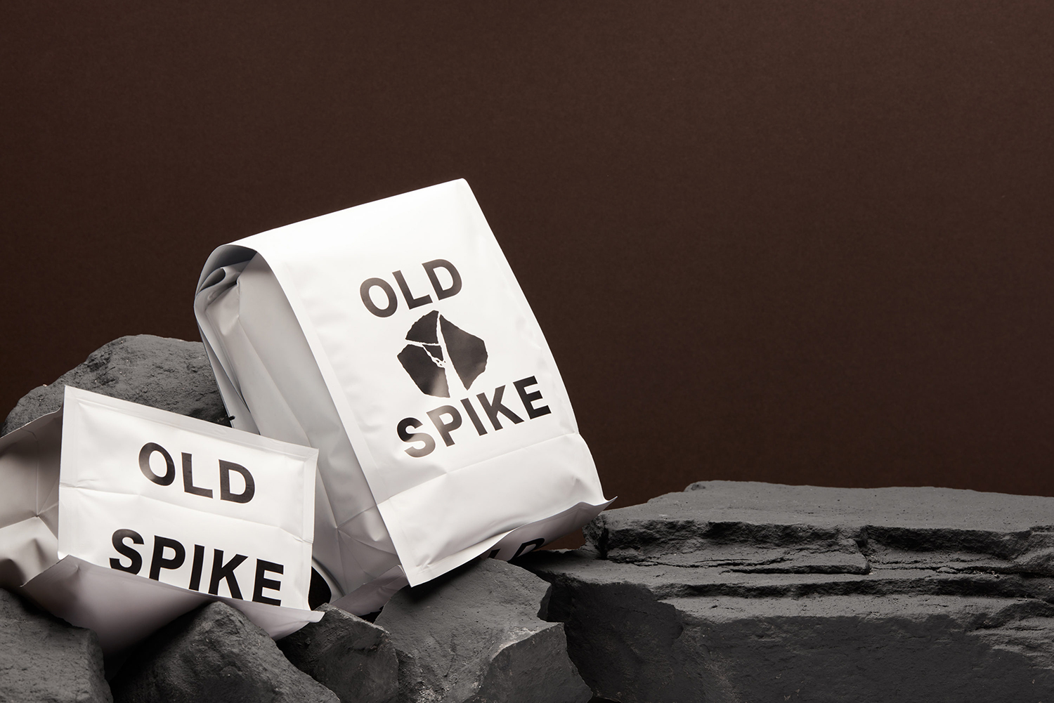
Old Spike is a coffee roastery, subscription service and wholesaler, cafe and social enterprise working with the homeless, located in South East London. It is situated on the site of a former workhouse, a place where the poor would break rocks over metal spikes for food and lodgings, and where the roaster gets its name. With a desire to separate the roastery’s commercial and social activities Commission Studio worked to develop a retail and subscription packaging design that avoided the conventions of the market, and worked together a sense of the artisanal and wholesome and the eye-catching and luxury.
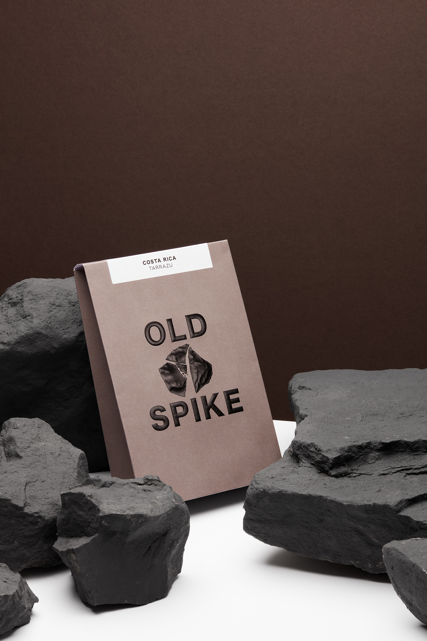
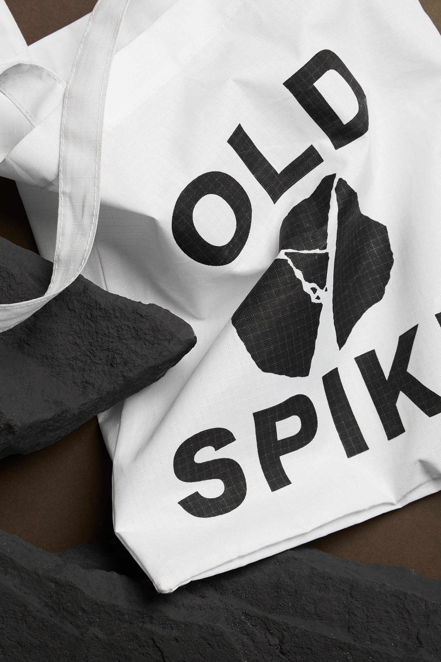
There are a few of neat ideas at play here. Some are universal like the use of a block foil, high quality boards and the structural language of luxury boutique shopping bags. Some are subtle and conceptual like naming and the connection between hard manual labour and wholesomeness and premium quality. Others are practical such as structural design that satisfies a need for strong shelf presence and a robustness for subscriptions sent out by post. There is stylistic and communicative value in the concept, the meeting of the graphic and the material, but also in the concise nature of their implementation and interaction.
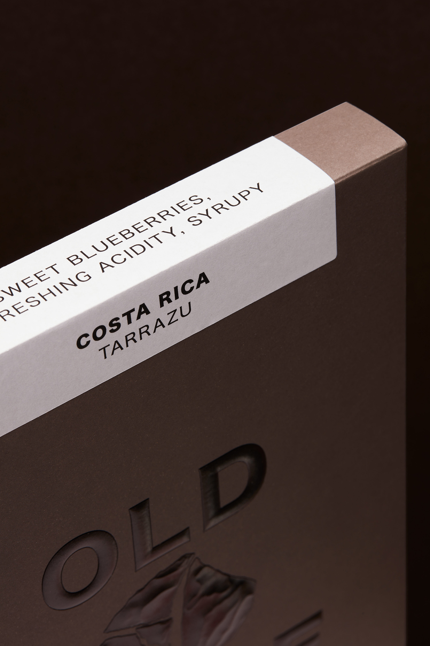
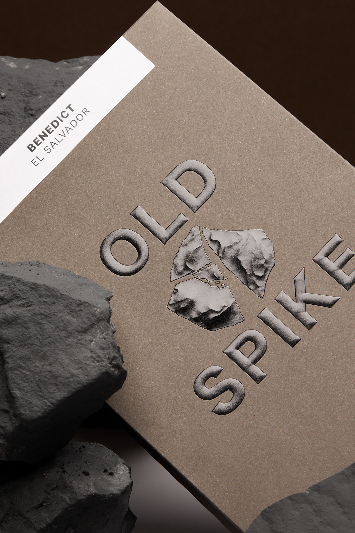
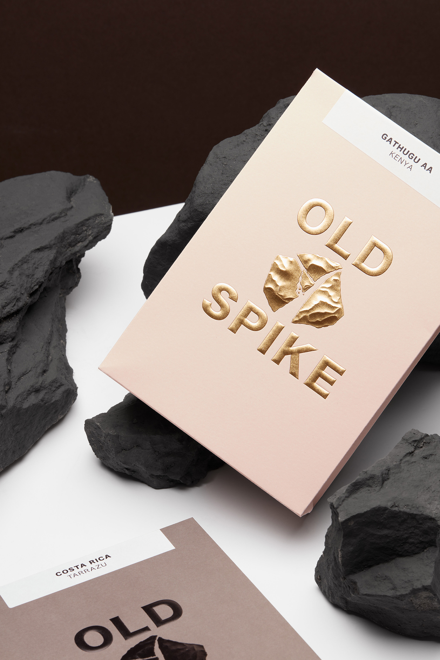
There is strong and pleasant balance between the graphic, which is bold, eye-catching and rooted in the legacy of the site and present day batch roasting of coffee, and a refined and modern luxury. There is a lovely story here in the workhouse, and how it relates to the industriousness of coffee roasting today, and the tension between the rough and robust type and mark, and the refined high quality of a block foil, uncoated boards and structural design.
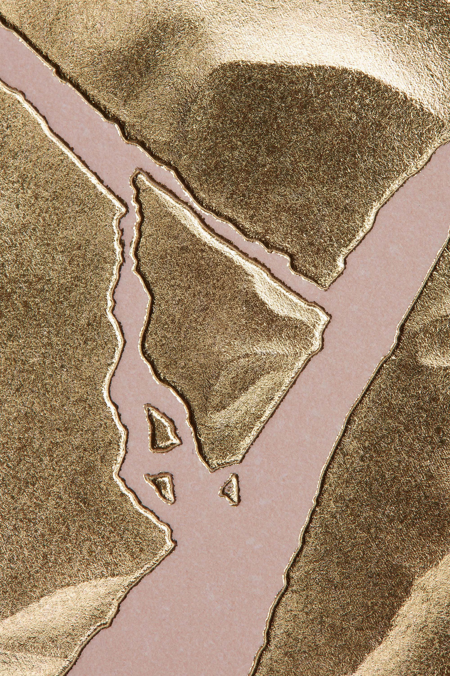
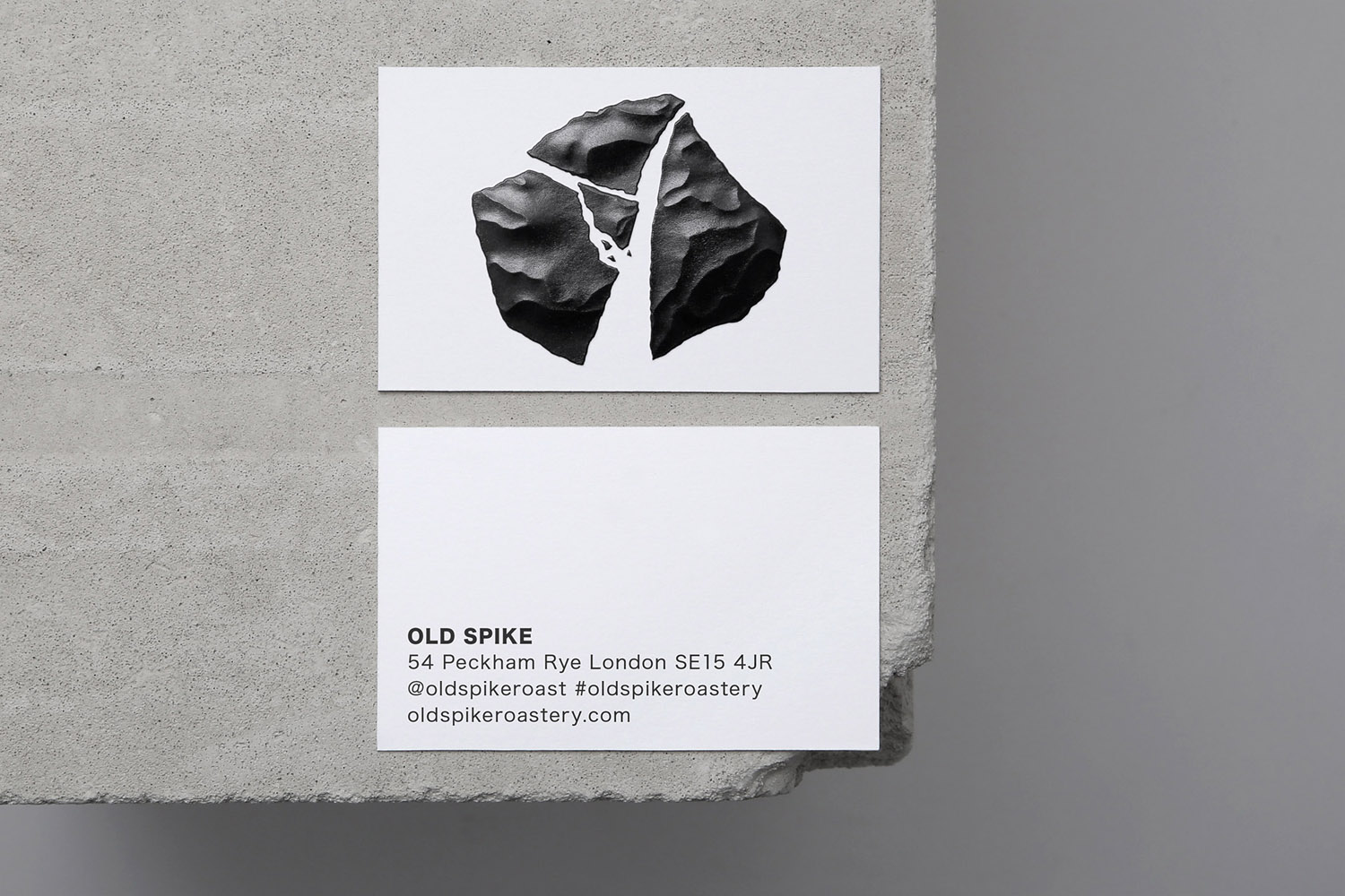
The use of a sculpted emboss makes the most of a fairly universal visual language of quality, but in its expense and rarity, its grounding in concept, natural relationship with the graphic, giving it a visceral and tangible dimension that neither illustration or image could manage, finds a way to add layers, physically and figuratively.
BP&O tries to find work that employs material thinking. This is defined as a relevant, appropriate and distinctive conceptual foundation to substrate, structure and finish. An approach that delivers both an aesthetic pleasure and thoughtfulness, and satisfies a communicative intention with a precision and clarity. This feels like a good example. More work by Commission Studio on BP&O.
Design: Commission Studio. Opinion: Richard Baird.
