Institute by Commission Studio
Opinion by Richard Baird Posted 31 July 2017
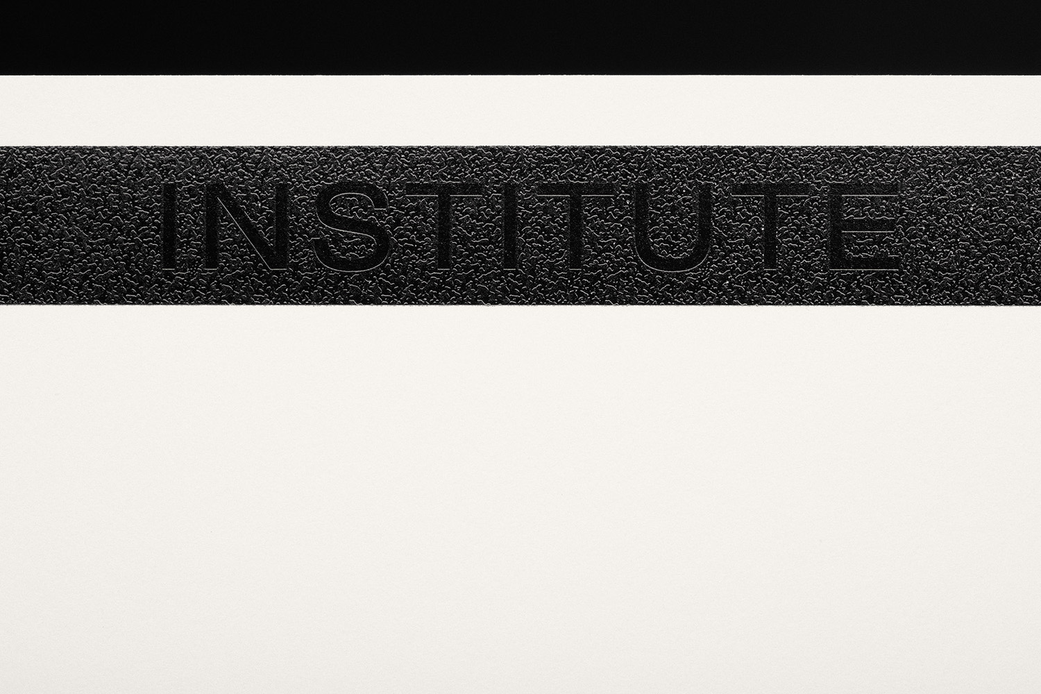
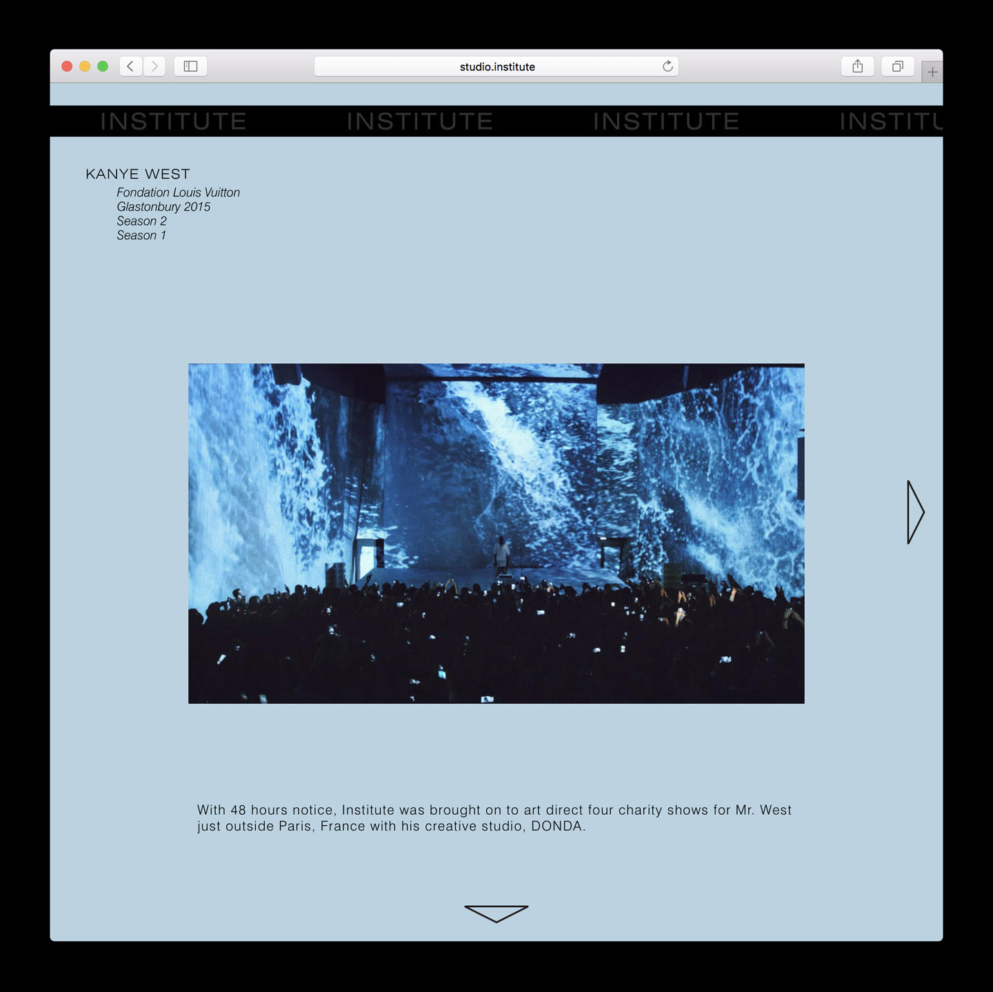
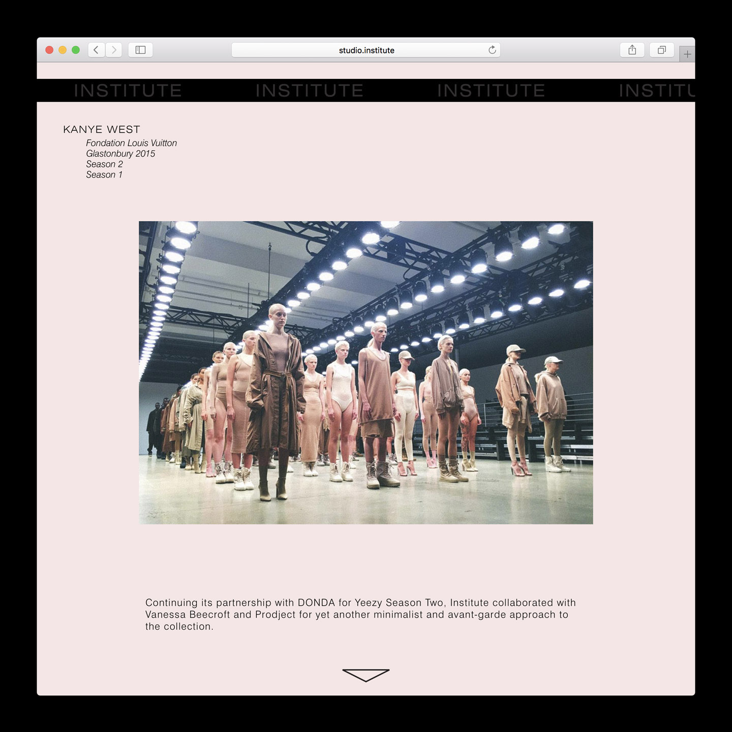
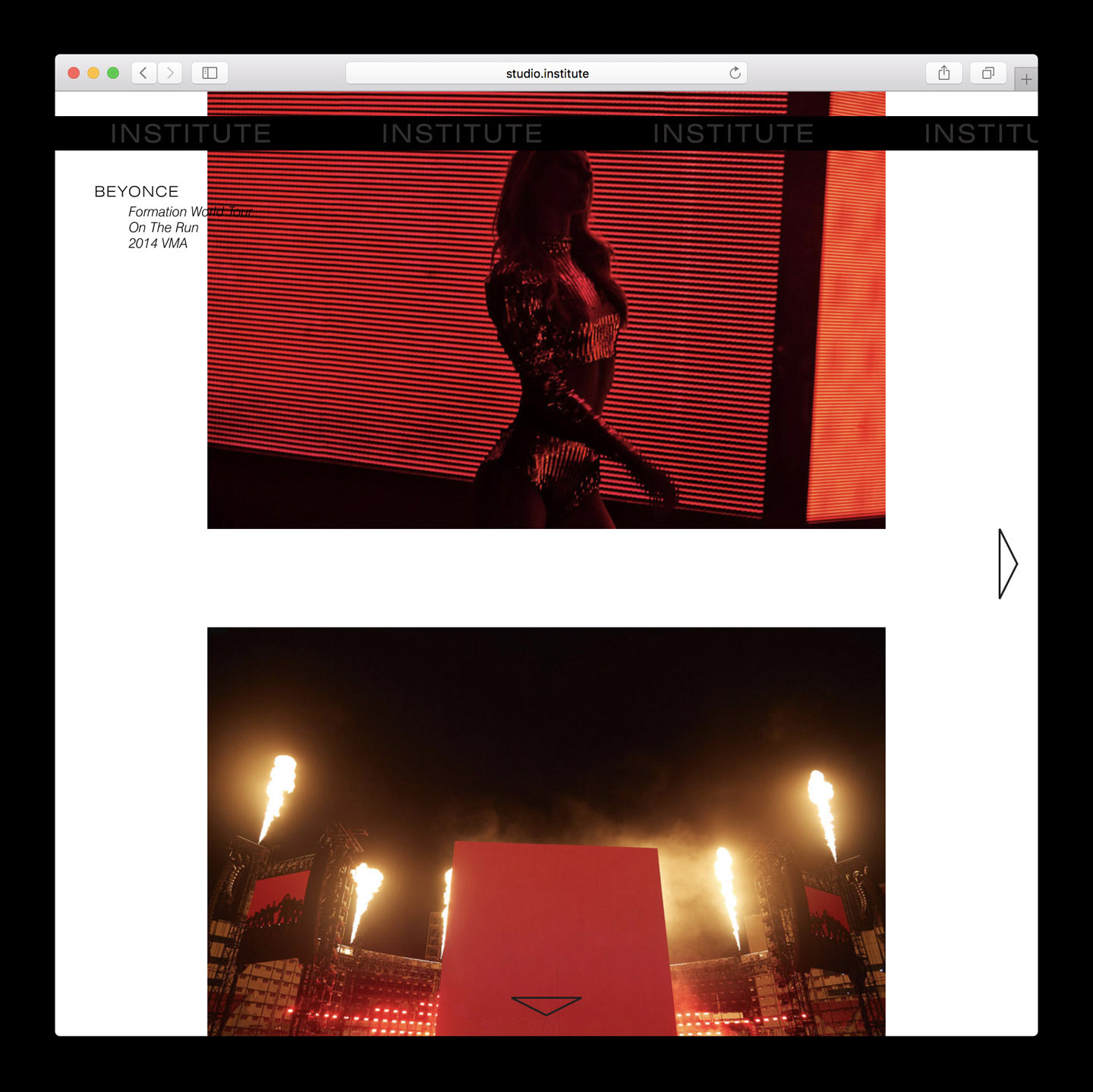
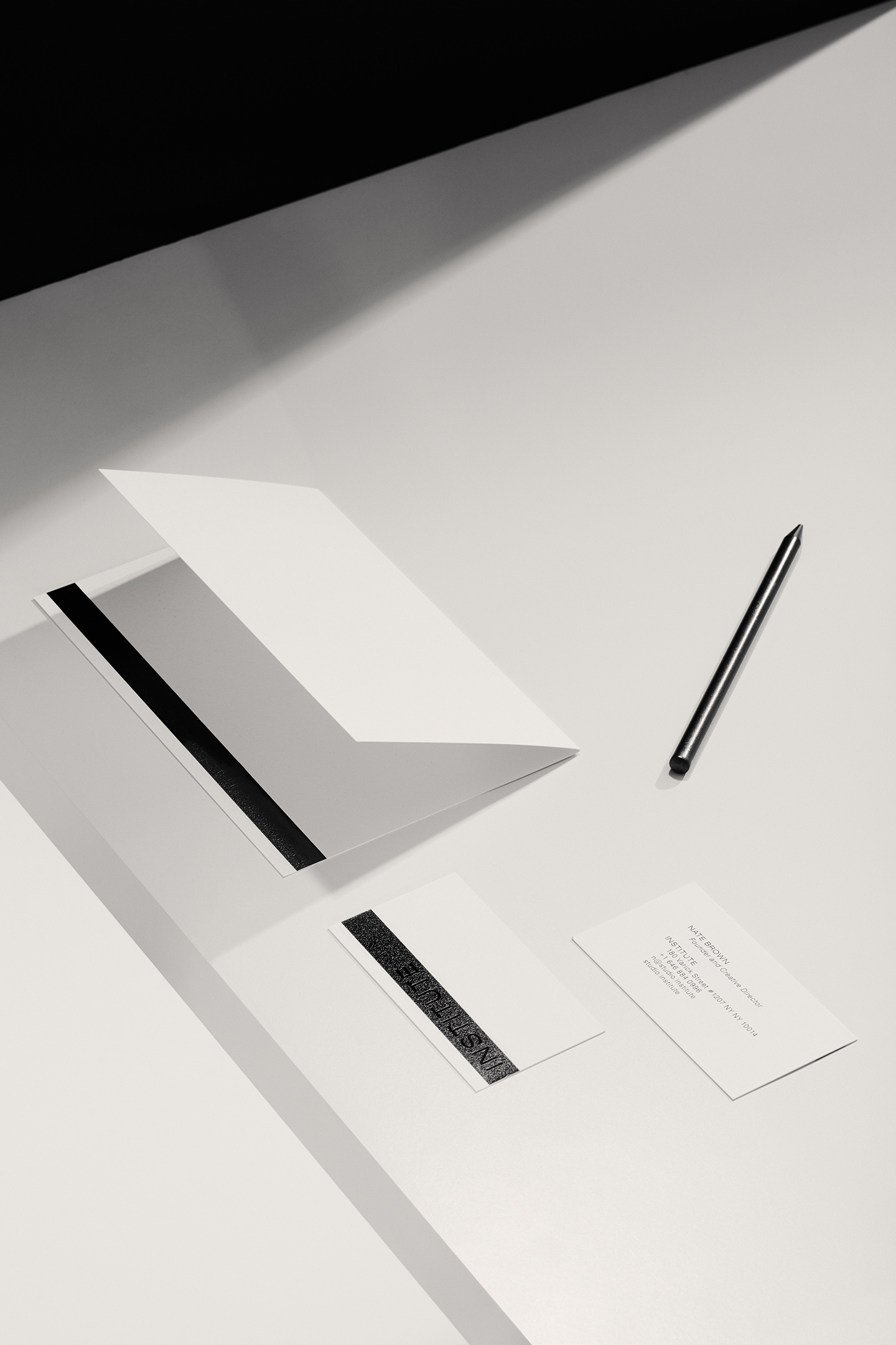
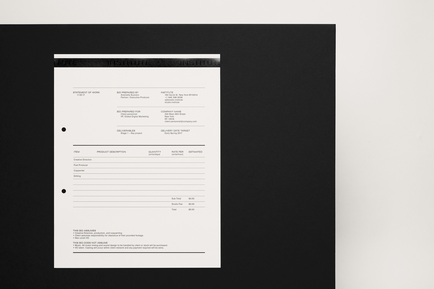
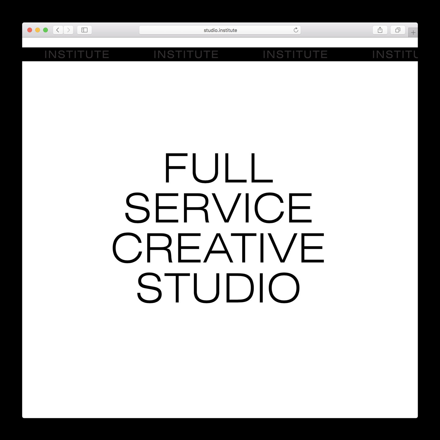
Institute is a full service creative studio from New York working with clients to connect with people through creative direction, live experiences, concept development, content creation, production and post-production services. Institute’s work is described as being underpinned by thoughtful and meaningful creativity, and although their clients are often high profile, their presence is intentionally modest. London-based Commission Studio worked with Institute to develop a visual identity that would not overshadow their work and express their taste and attitude. This included stationery set, business cards and website, linked by the concept of magnetic strips, a technology that can open doors.
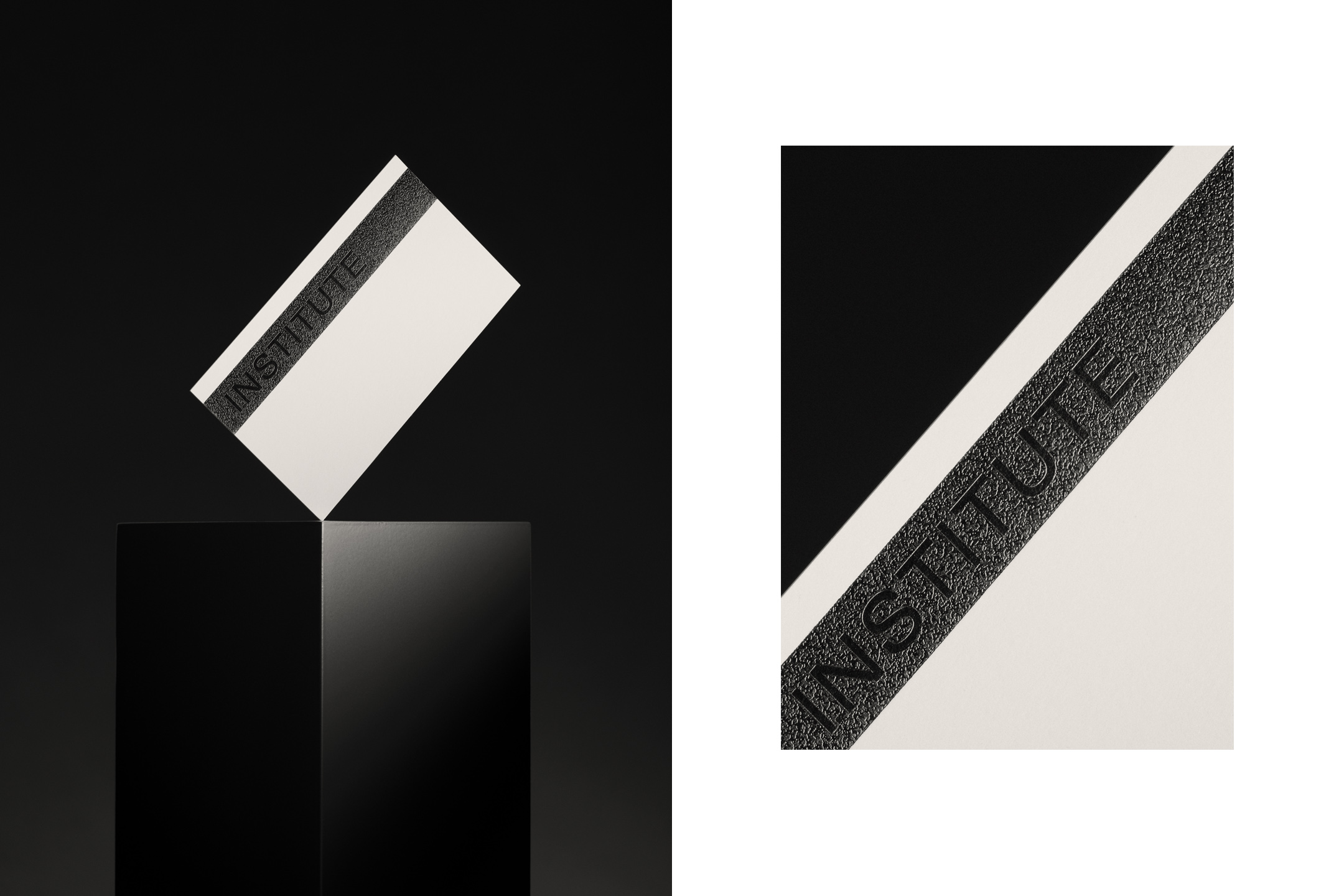
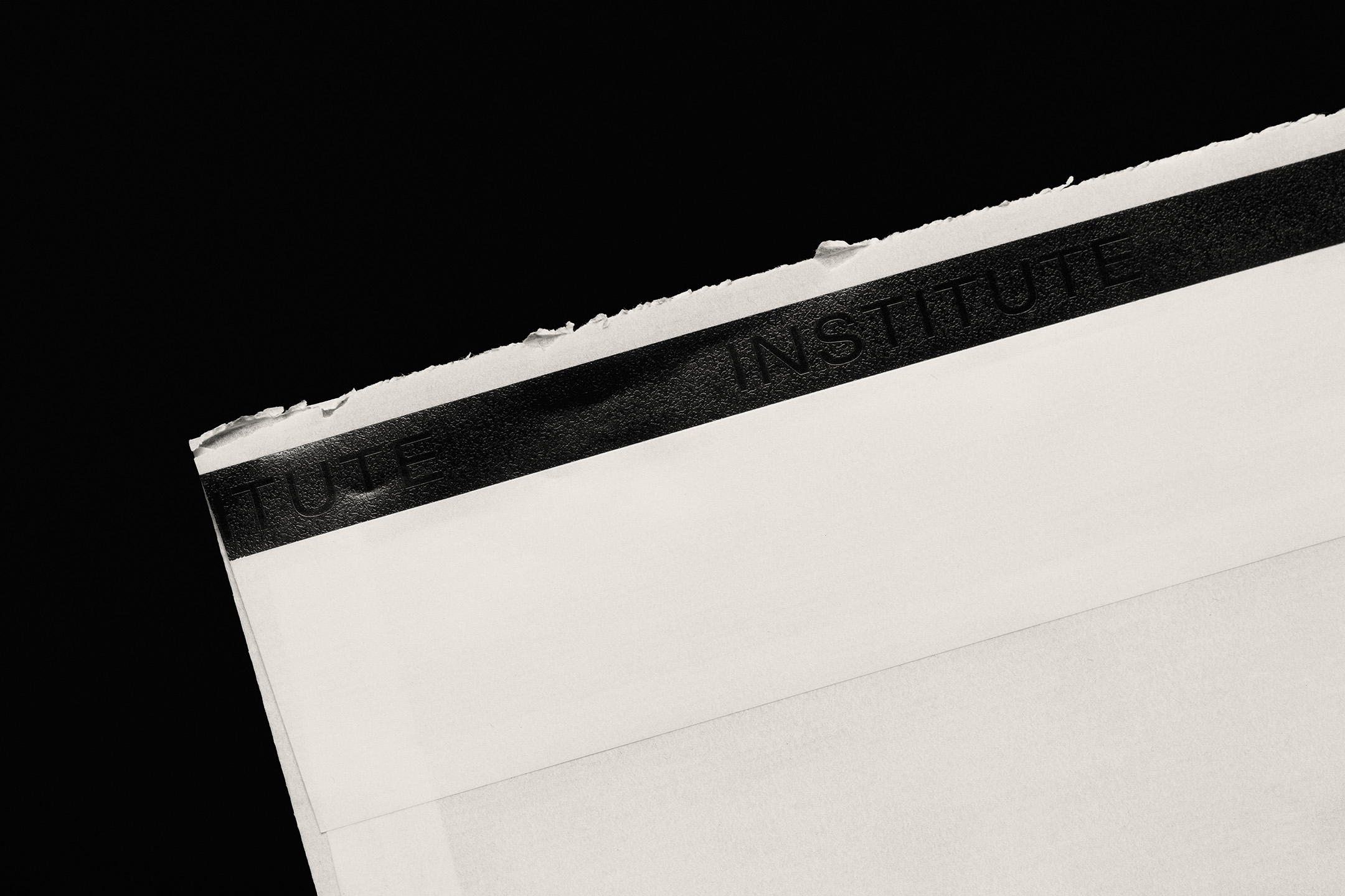
Commission Studio find a neat balance between graphic impact, materiality and concept, interesting ideas and stylistic simplicity, and draws from the ubiquitous, something distinctive from a new context. It benefits from the universality of the magnetic strip. Making a clear and obvious connection to this in the glossy solid black bar and its positioning in print, and leverages a couple of associations. Be that the storage of information (insight) and the opening of doors (opportunities).
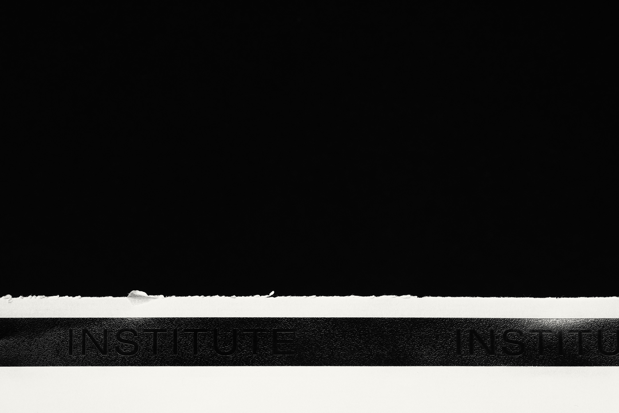
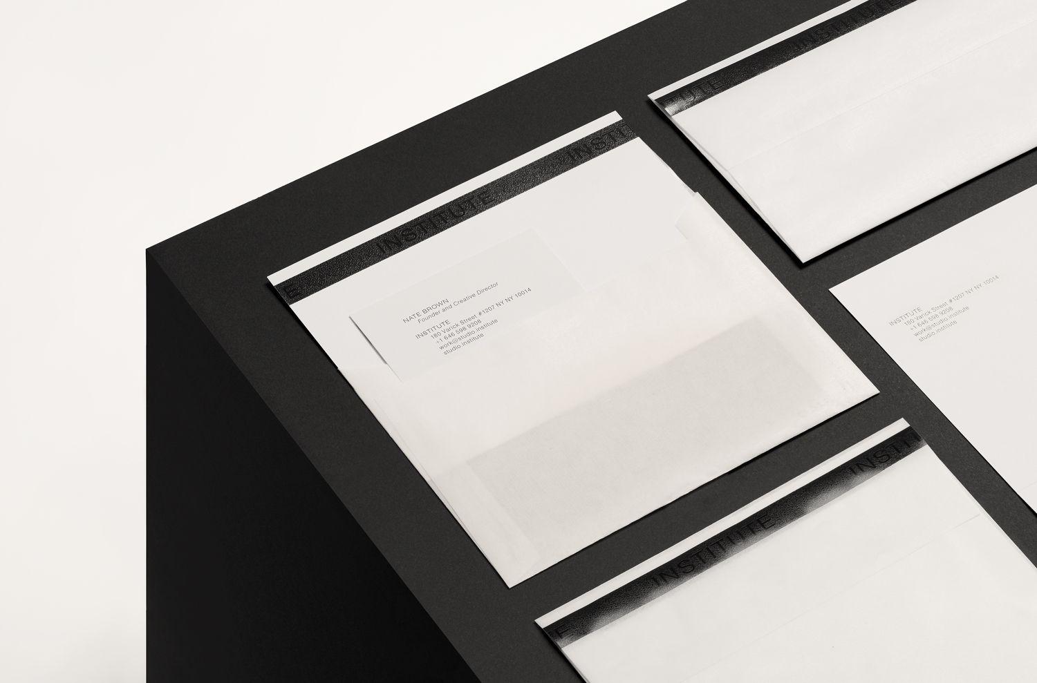
The graphic device holds the Institute logotype amongst a security pattern. This is given an interesting material quality through the technique of microfoiling with a tonal approach and animation approximating this effect on screen. Both fly close to anonymity in the hiding of the logotype, with the intention of focusing on the work, yet is distinctive in the unavoidable presence but reductive quality of the black bar. This tension lends the work something unusual and interesting. The materiality of microfoiling, and the play between the visible and the invisible, also continues through to a glassine envelope.
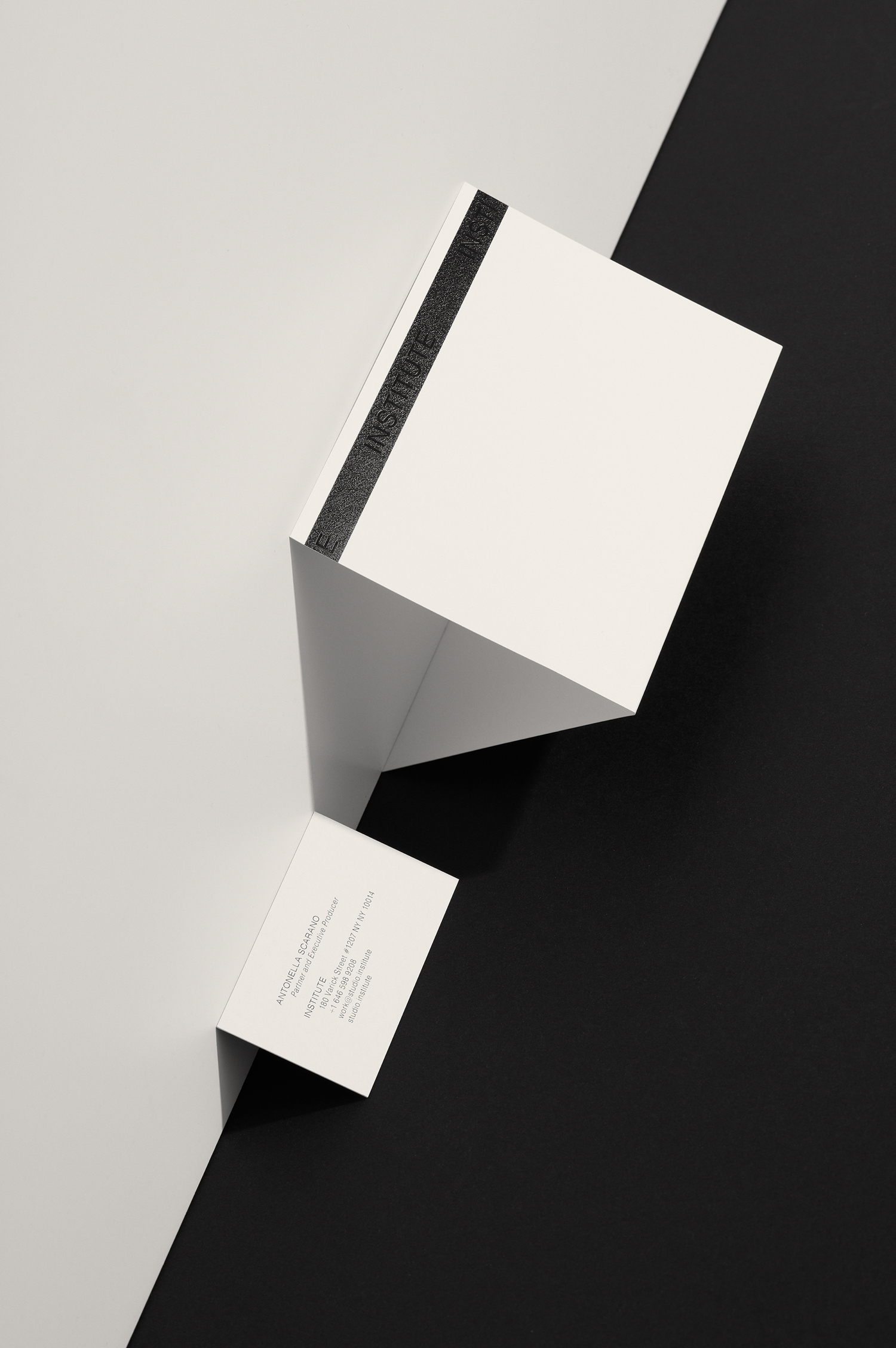

Although the referenced technology is becoming an artefact of the past, it still retains, and likely to continue to retain, it associative qualities until it is well-established. The approach has both conceptual and stylistic value, a visual continuity from which a recognisable identity is derived. The quality of the work is in the balance of impact and subtlety, form and materiality, and in the appropriation, recontextulisation and new meaning of something once common place. More work by Commission Studio on BP&O.
Design: Commission Studio. Photography: Luke Evans. Opinion: Richard Baird. Fonts: Swiss 721.
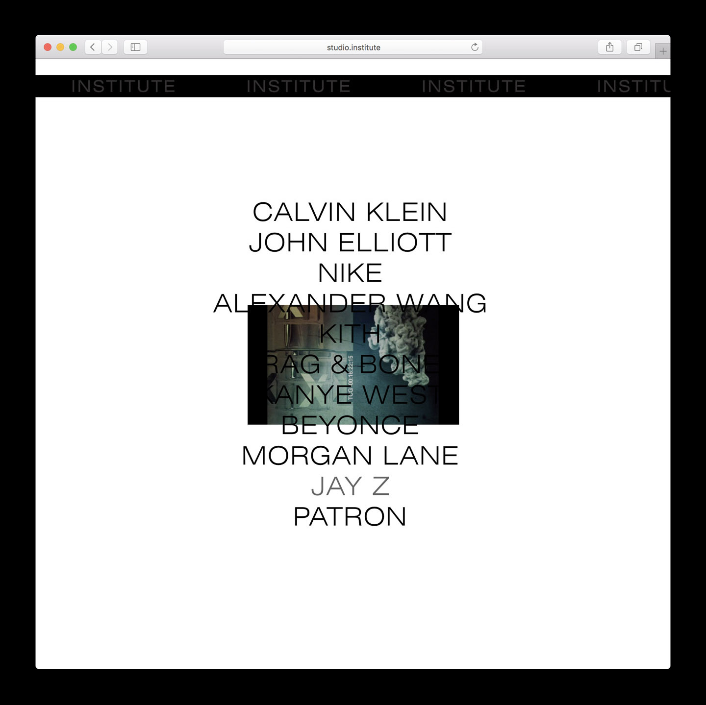
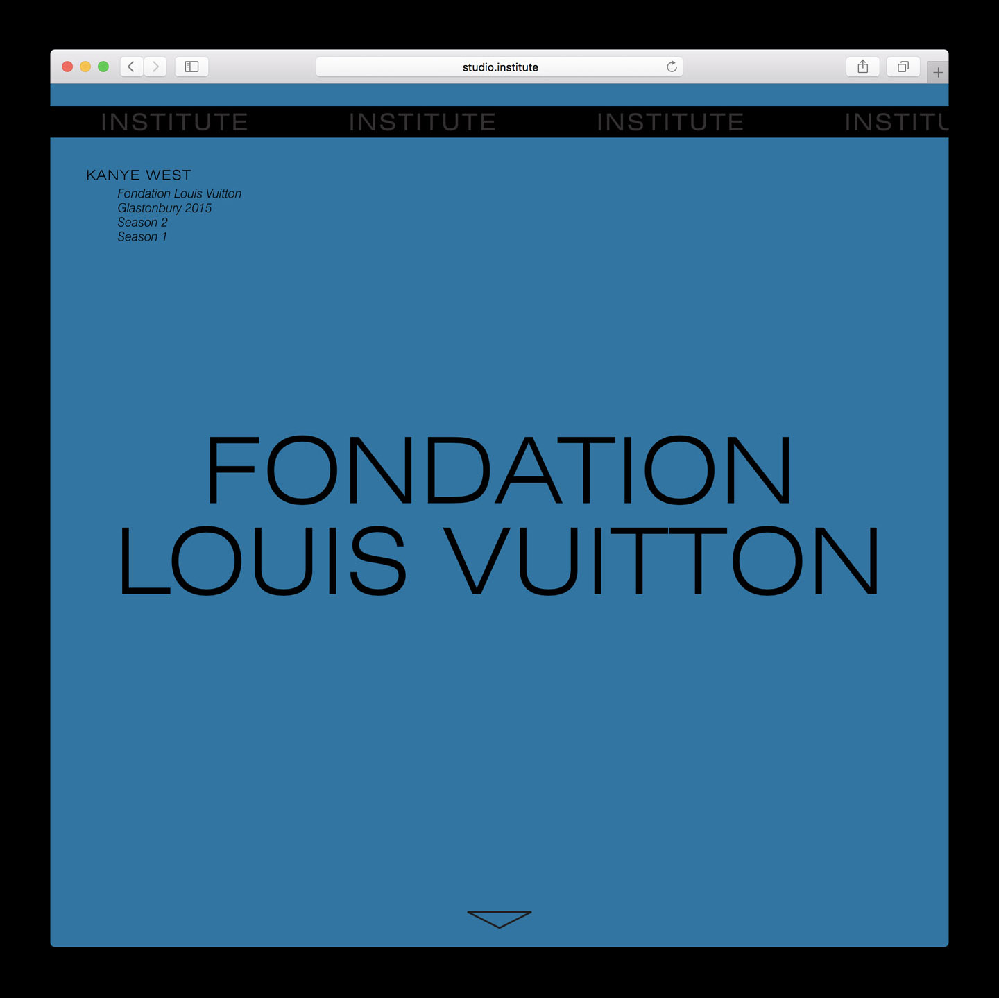
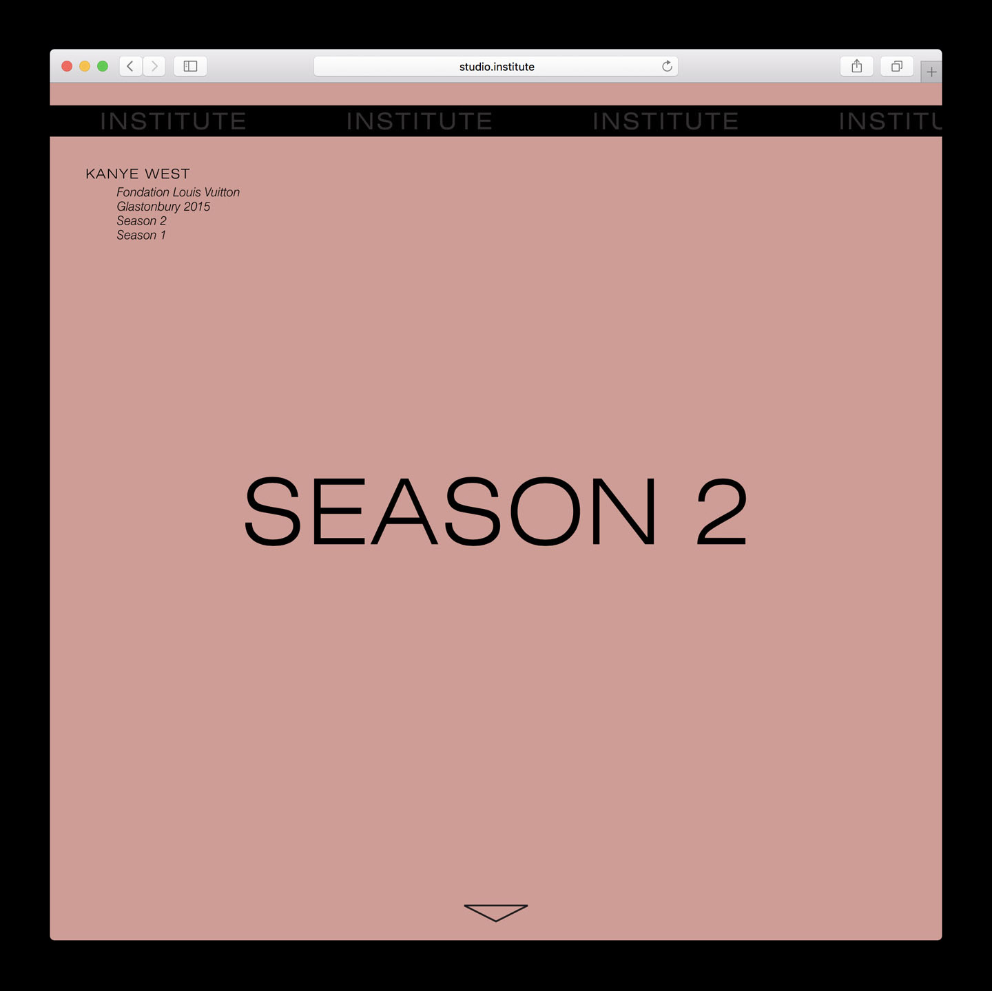
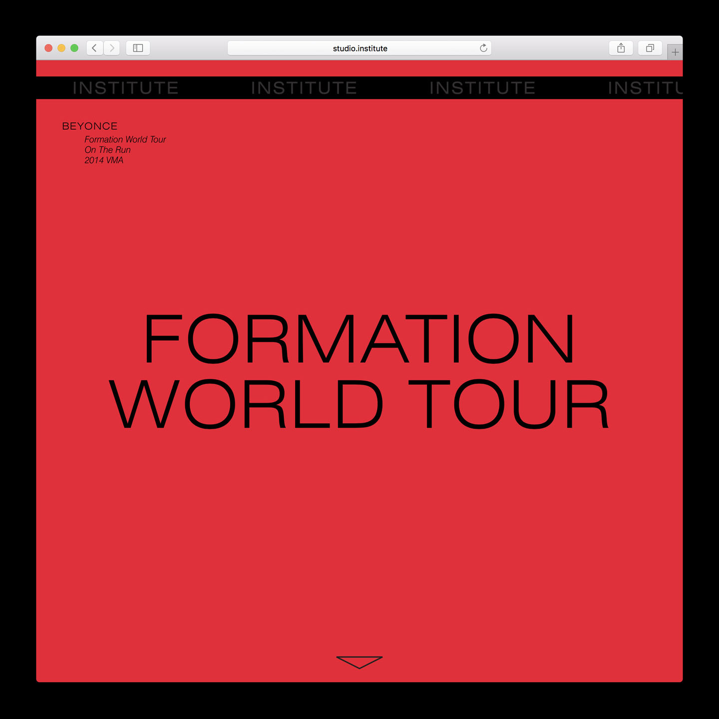
The introduction of colour, pulled from photography, breaks free from the monochromoatic qualities of visual identity. This functions to break up and give life to projects, to separate them from each other and Institute’s visual identity, with Swiss 721 maintaining a continuity, a practical format for insight and clear titles.
