Deptford X by IYA Studio
Opinion by Richard Baird Posted 25 October 2017

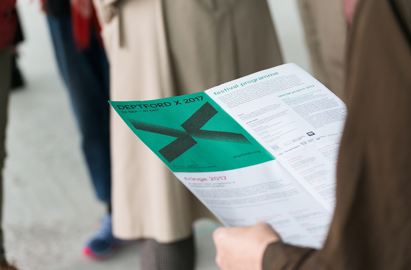
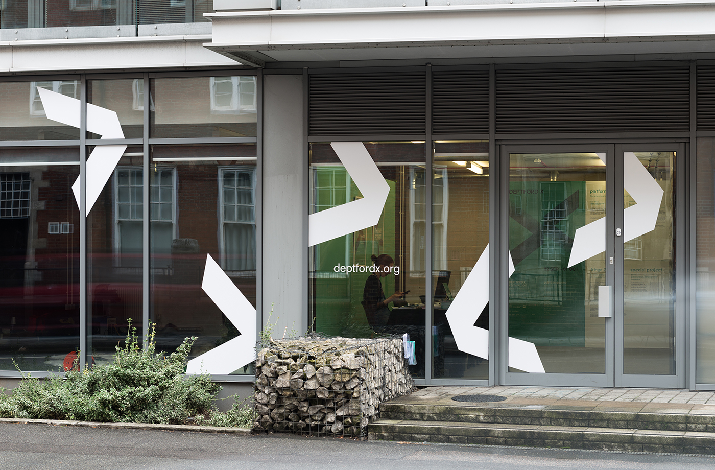
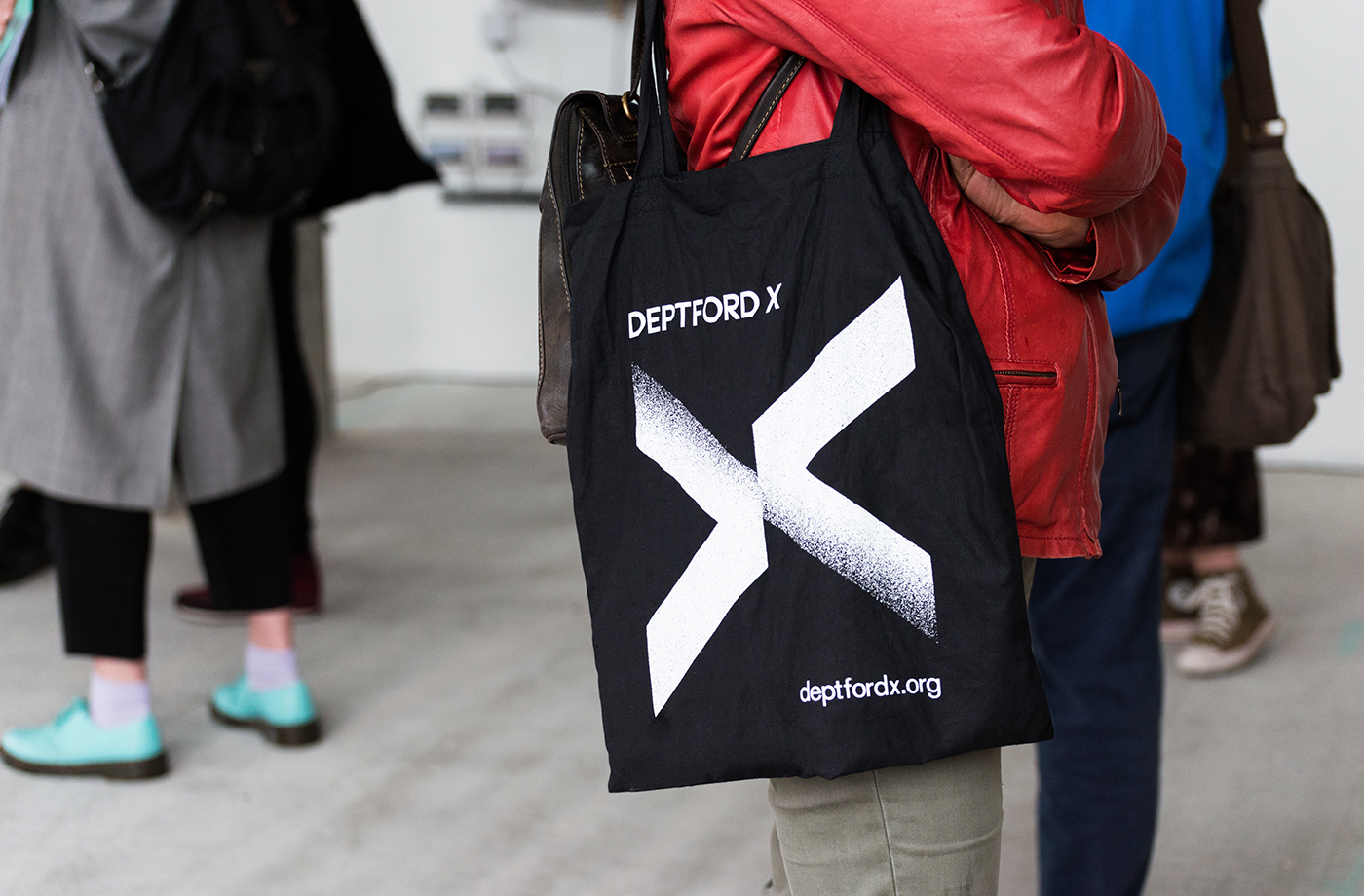
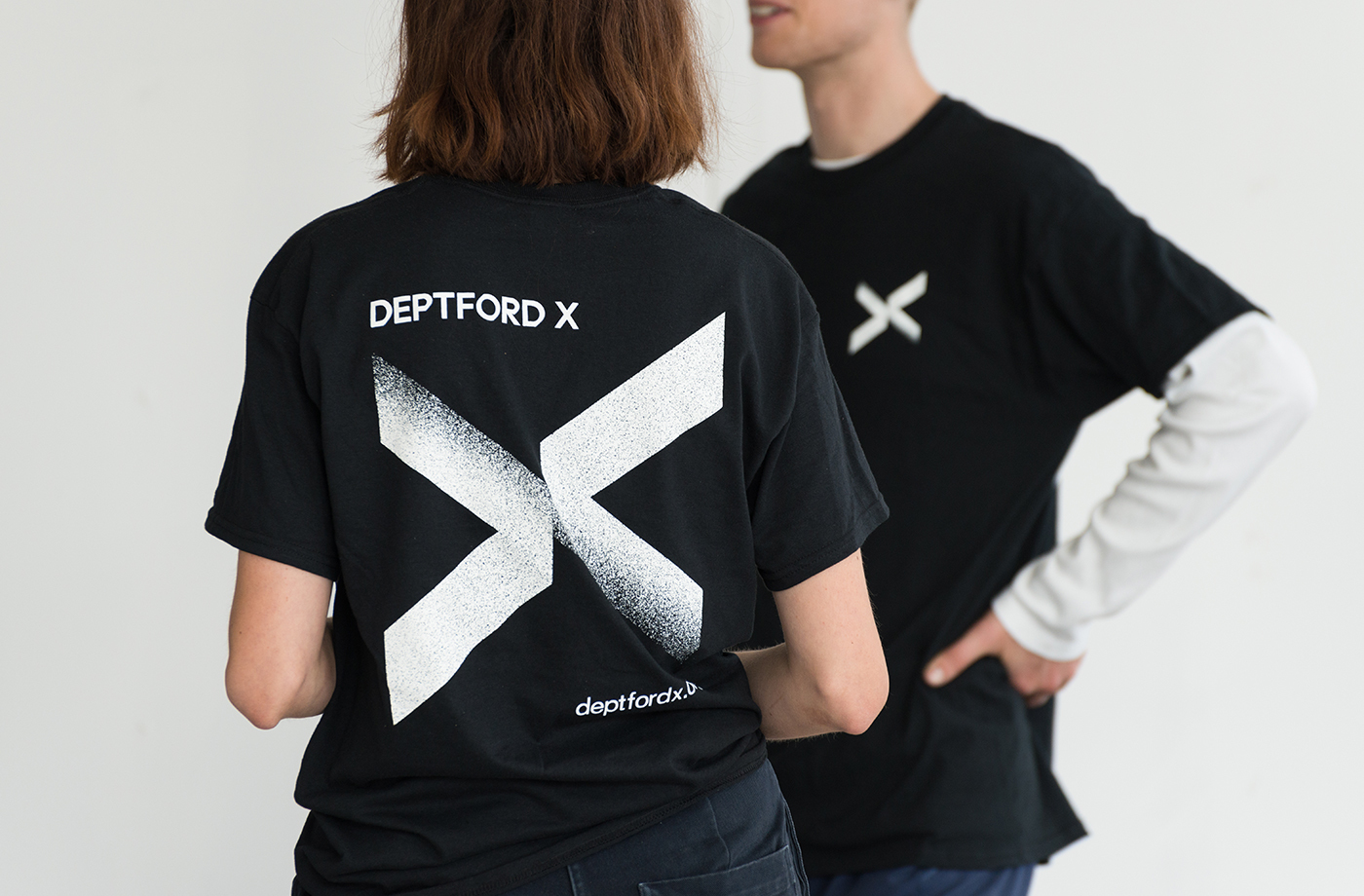
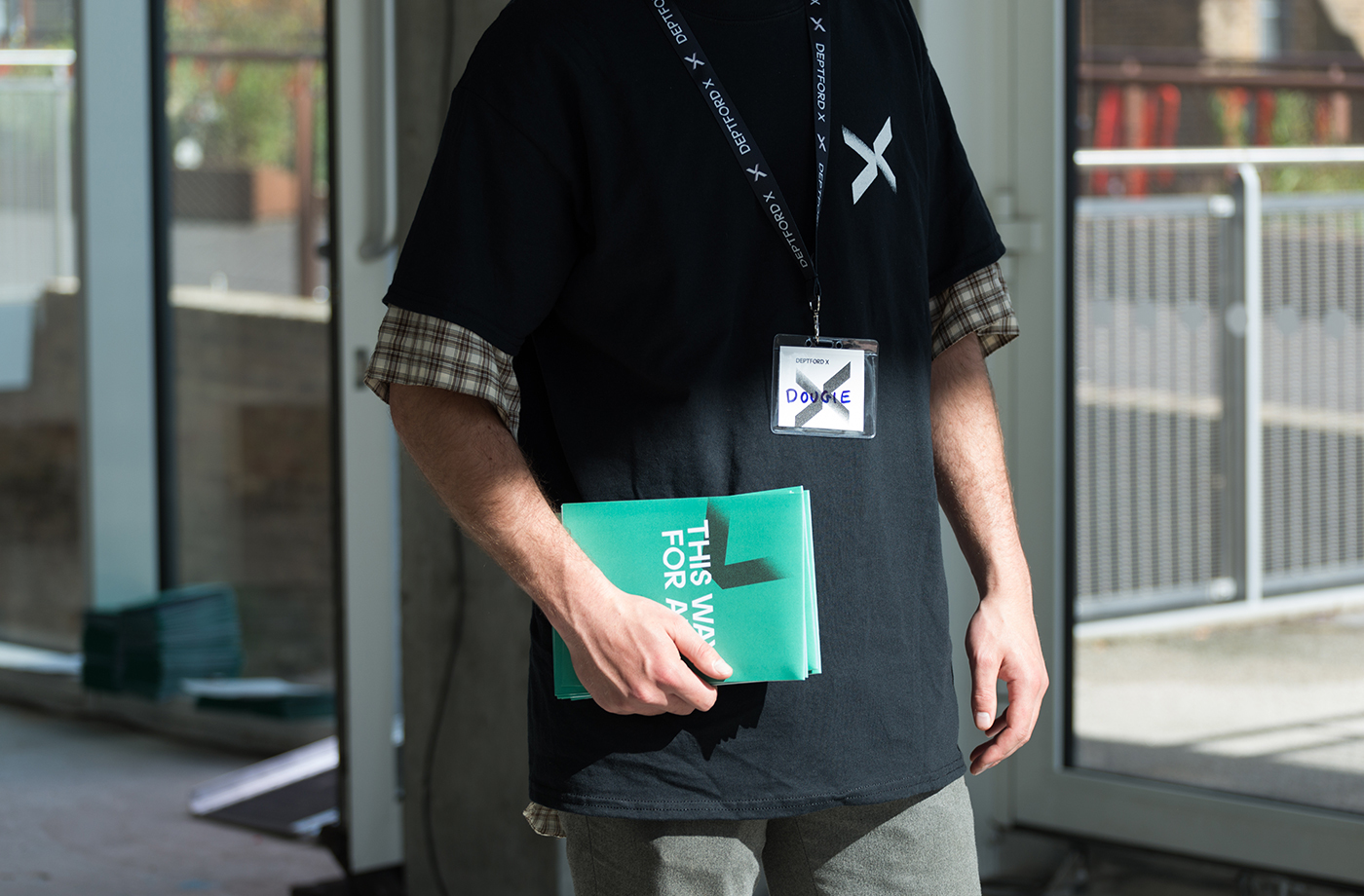
Deptford X is an arts festival that takes place over ten days across a number of public sites and spaces throughout the district of Deptford, south-east London, with the intention of engaging audiences in active and unexpected ways. This year’s festival, the 18th, builds on a new curatorial approach which was first trialled in 2016. To coincide with and mark this change, the festival worked with IYA Studio to develop a new visual identity. This included a flexible logo and system of arrows and x’s that link programmes, posters, supergraphics, t-shirts and tote bags, and express the dual nature of the festival and some of the character of the area.
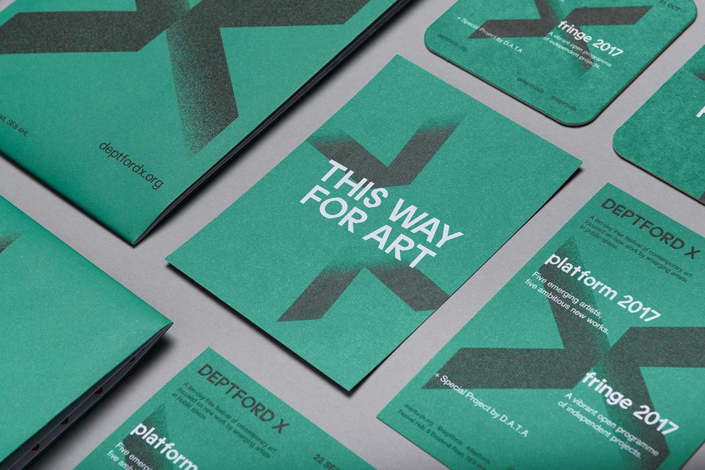
Deptford X is made up of two programmes. Platform, a set of five commissions given to emerging artists and displayed in public spaces, and Fringe, a programme of independent projects, talks and tours. Combined, these give the festival its unique character.
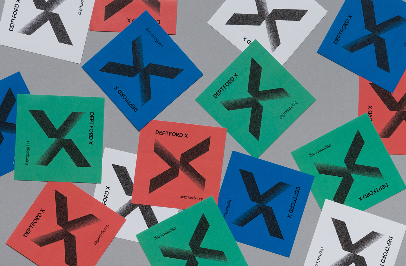
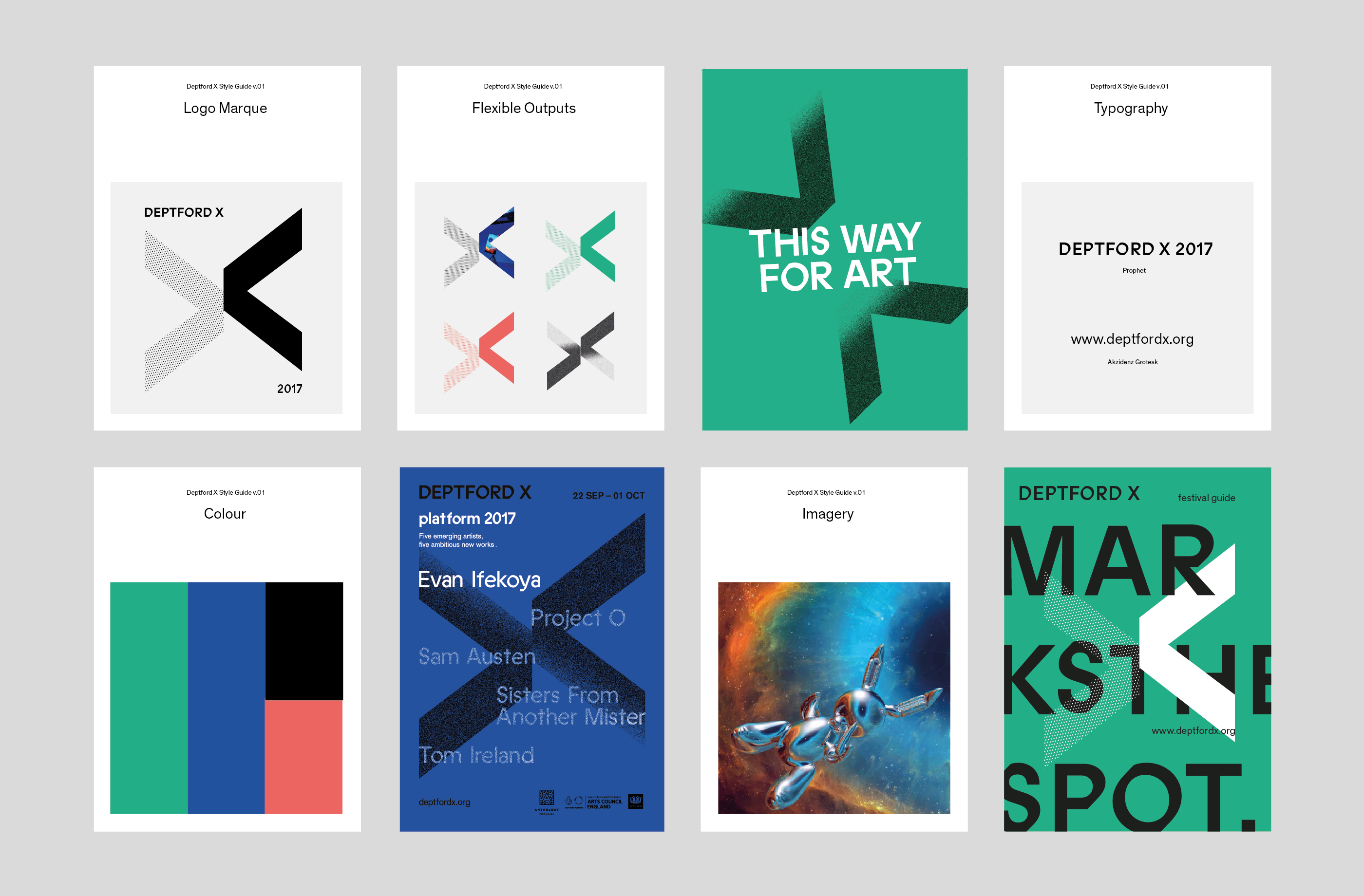
Taking their cue from this coming together of two programmes, IYA Studio created a flexible new ‘x’ of converging arrows to replace the old, able to evolve and take on different styles and textures, to become an integral part of the visual language of Deptford X and convey something of the spirit and changing nature of the neighbourhood.
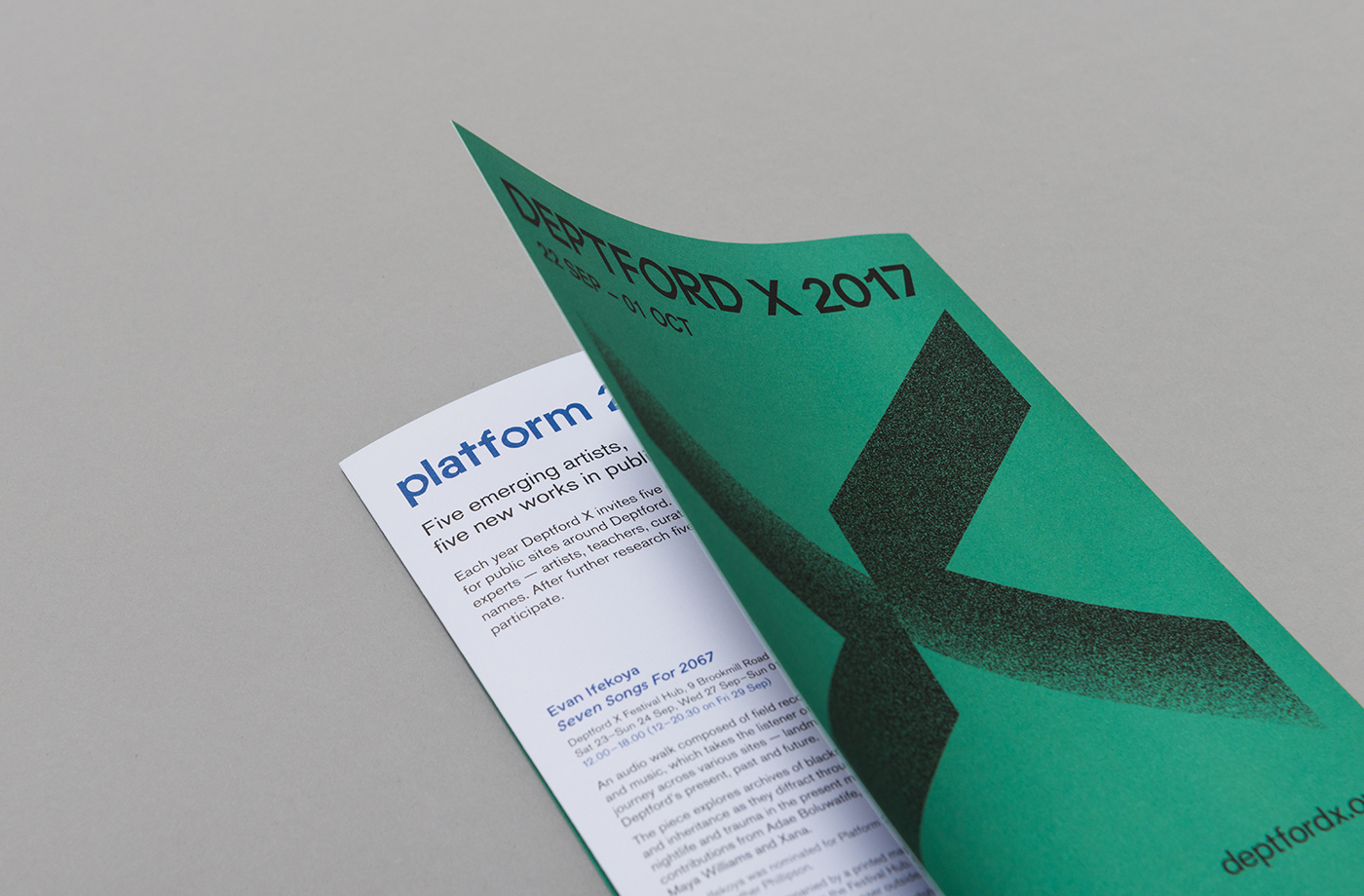
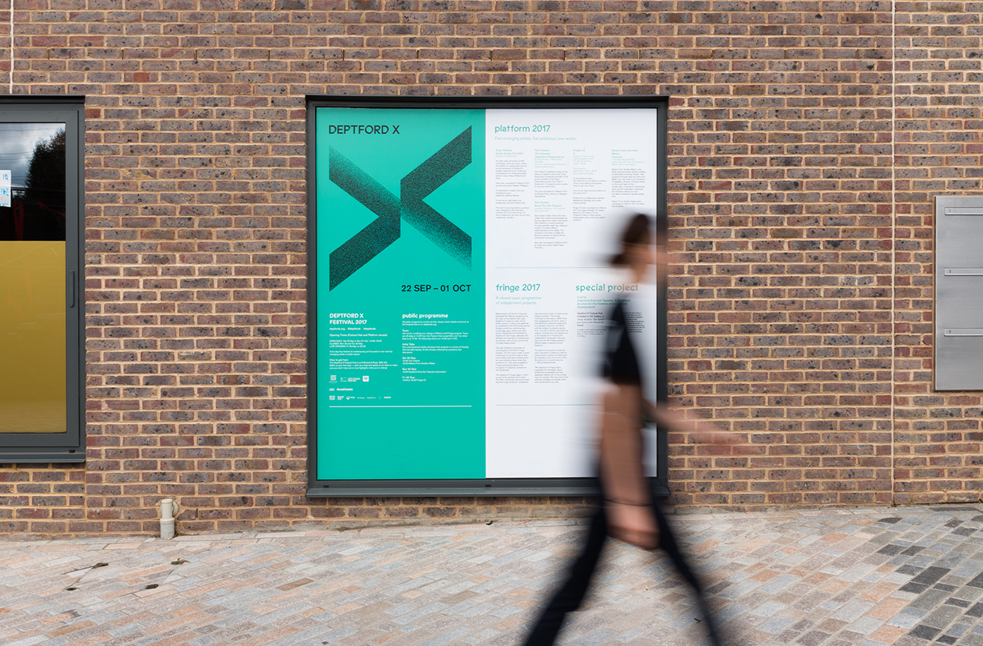
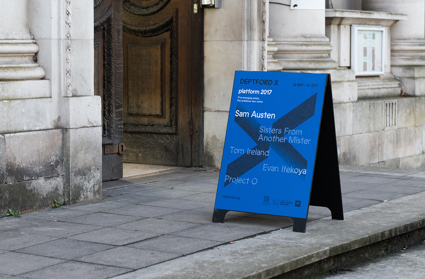
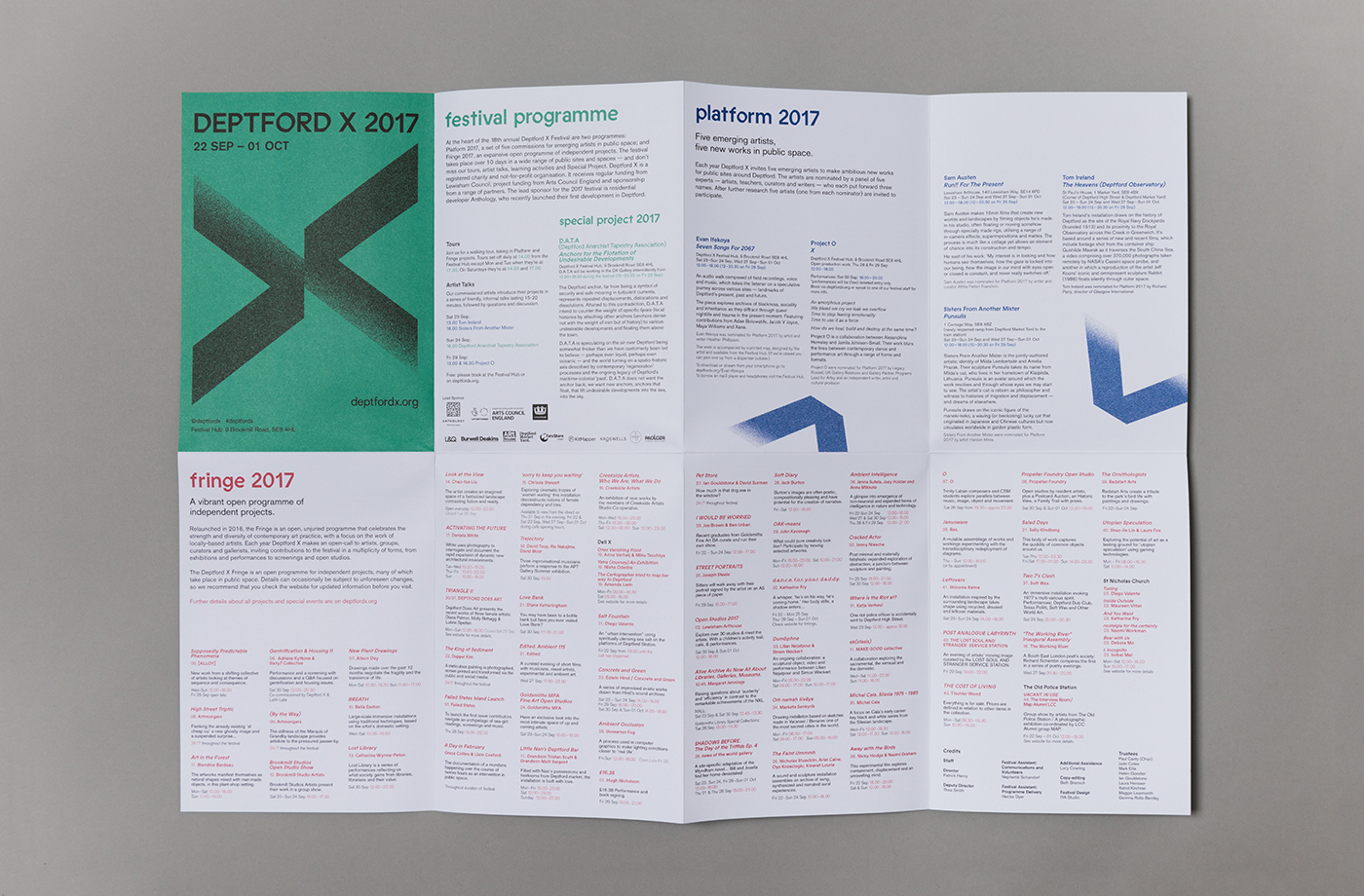
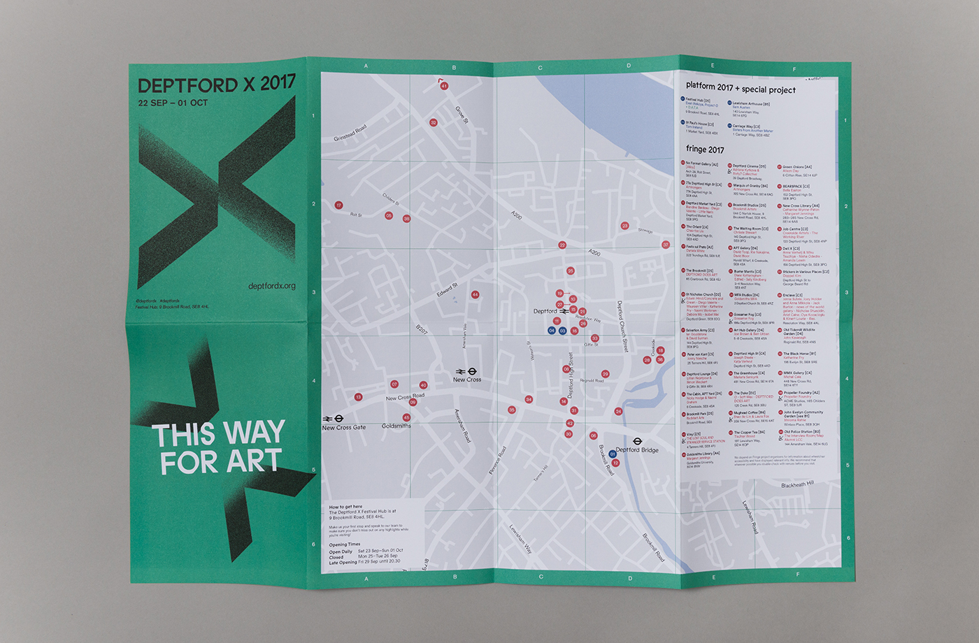
The simple lines, bold weight and dual nature of the logo establishes a simple but distinct visual motif—marking the spot but also functioning as a directional cue as two independent arrows—that can reference, through different finishes, elements of Deptford. The first of which is a grainy texture, the slow fading of printed and painted graphics. These call to mind the wearing down of road markings, and the stencils and graffiti that make up the urban landscape. As the first to represent a new curatorial approach this does feel a touch conservative. It does, however, tie in with the theme of guiding visitors around a series of sites within the built environment, touch upon creative expression using a universal visual language, and looks neat and distinctive across a variety of printed assets. Other small details include a similar effect applied to text across the blue poster, and arrows used as a framing device.
Deptford has a rich and varied history. For example, from the mid-16th to the late 19th century Deptford was home to the first Royal Navy Dockyard. To see historical elements come into play in the future, juxtaposed alongside the modern qualities of type, colour and form, would be neat, alongside a more resolved online presence.
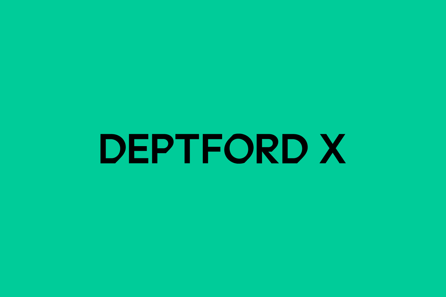
Type offers contrast to logo in its solid rather than worn fill, and finds commonality in shape and monolinear weight. Small slices to the letterforms make for an unusual detail that gives certain letters a calligraphic touch, well-suited to the long history of the area, and something of the more experimental in line with contemporary art.
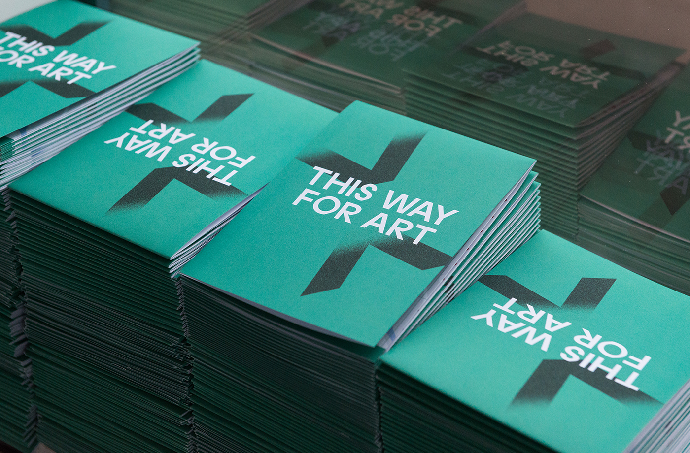
Colour palette functions in a similar way to logo, catching the eye with an immediacy in its solid single ink and edge to edge coverage. This marks identity out within the urban environment, while the bisection of posters feels grounded in the dual nature of programme. Colour and logo work together to secure an impact from a distance, which is then followed by plenty of detail up close. It is easy to imagine a clear continuity existing in type and form, yet a difference and distinction between each new festival through colour and texture. More from IYA Studio on BP&O.
Design: IYA Studio. Opinion: Richard Baird. Fonts: Prophet & Akzidenz.
