Exploratorium After Dark by Collins
Opinion by Richard Baird Posted 2 November 2017
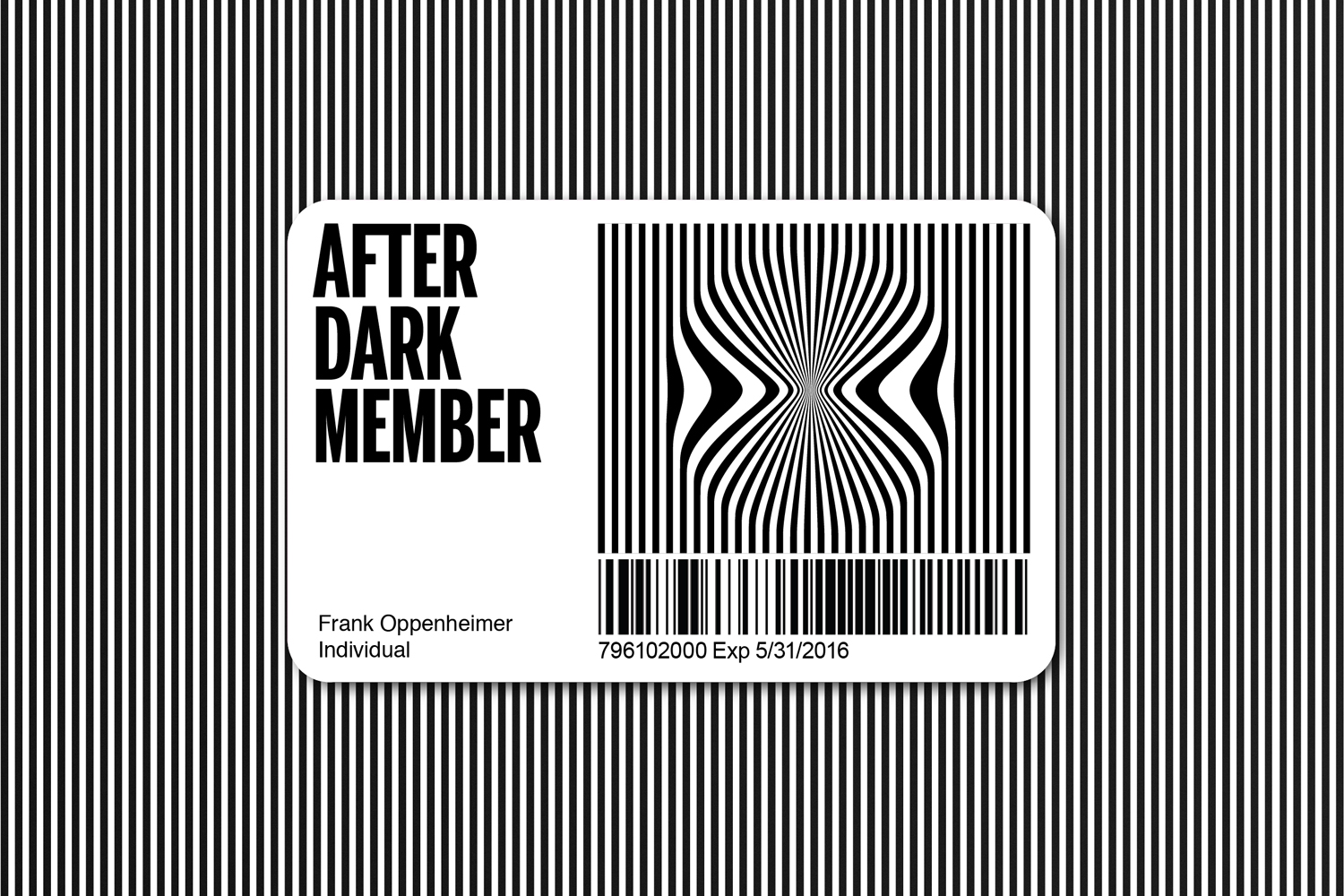
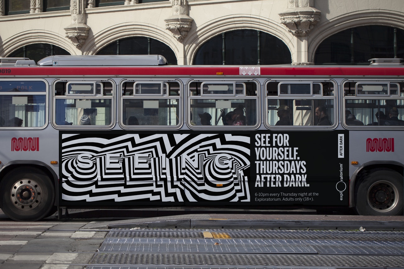
Exploratorium is a “public learning laboratory” and San Francisco based museum that enables visitors to question and make sense of the world around them through hands-on exhibits that touch upon science, art and human perception. These include a pitch-black dome, fog bridge, large-scale kaleidoscope, light displays and array of image bending mirrors. Every Thursday the museum hosts After Dark, an adults-only event. It is a chance to experience the museum’s over 650 interactive exhibits during the evening, to socialise, listen to guest speakers, watch films and listen to music. Exploratorium worked with design consultancy Collins to reimagine After Dark, to give it a stronger sense of identity and a distinctive campaign concept across membership cards, magazine covers, online banners, large format posters and social media. This is the first part of an ongoing collaboration that will help promote the museum’s work and programming over the next two years.
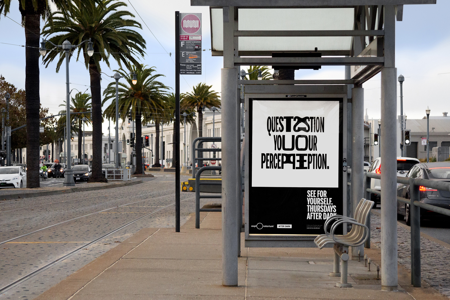
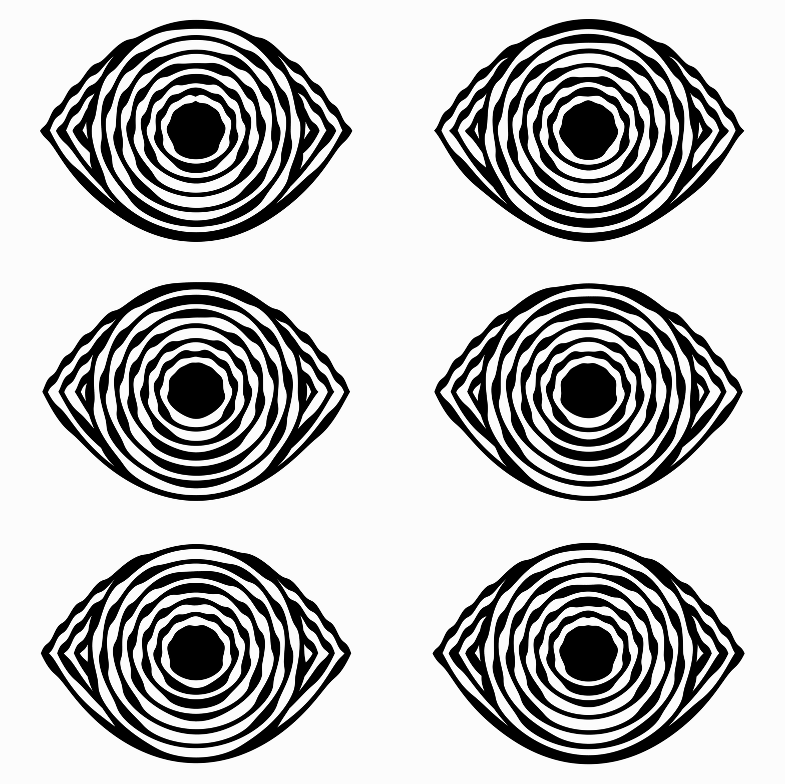
Drawing inspiration from and recontextualising the historical optical art from the museum’s archives, Collins explore altered perceptions and sensorial states through a visual language of distorted form and type, the blurred lines between language and image, the interplay of positive and negative space, the dyadic and the dynamic.
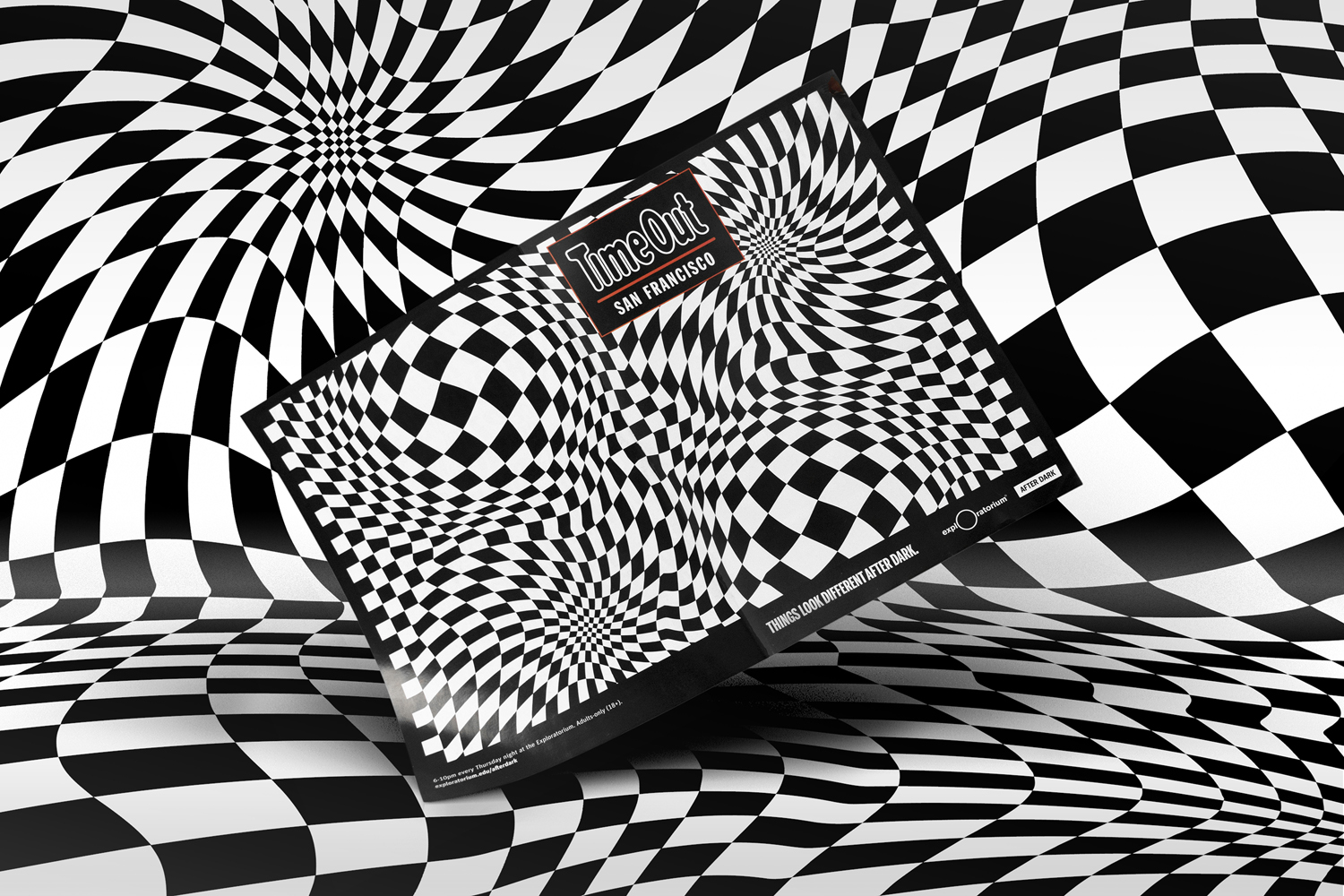
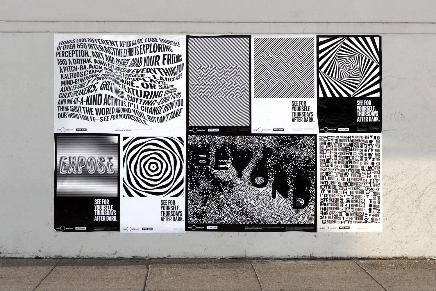
Designers will recognise many of the techniques and references at play here. Individually, a general audience will be familiar with some, a reassuring entry point into concept, but distinction really comes from the extent, the breadth of these images within one campaign, and the way that these work as static pieces in print and as dynamic banners and videos online. Although there is diversity to the work, the images are unified by an intelligible grid-based format, a consistent black and white colour palette with perhaps a day and night association, clear thematic continuity and a smart “See For Yourself” call to action.
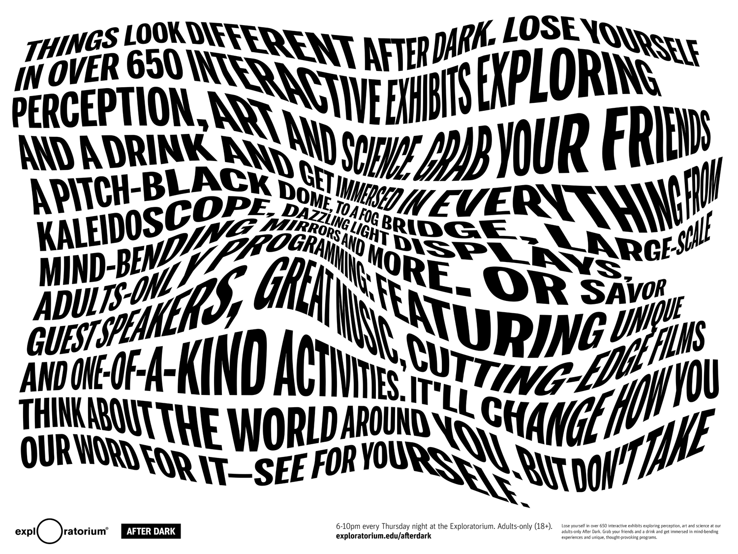

Each of the images feel individually distinctive, well-drawn and brought to life. Follow the After Dark Instagram account here for more. The frequent interplay between small components that build to larger images, hidden and revealed words, the simple and the complex is engaging, and finds a singular and compelling way to express the concept of the museum, unite many of its diverse experiences, yet bring distinction to the unique after hours event.
There are of course some neat singular ideas that stand out. These include images that break with grid and warp outside of it, the motion and transformation of static image when scrolling past these online, and the commonality between image and the utility of barcode across the membership card. This idea of playing with the everyday is particularly interesting, bringing a new perspective to a common graphic strip. It would be interesting to see more of this.
The strength of the approach also lies in the ease at which it crosses platforms and adapts to different formats without undermining recognition or concept. Posters become dynamic panels across Instagram or as banners online, and images and grid comfortably adapt to wider contexts, it is perhaps surprising not to see some kind of augmented component in the mix. The combination of simple colour palette and complex image also serves to effectively punctuate many of these contexts and draw the eye. More work by Collins on BP&O.
Design: Collins. Opinion: Richard Baird.
