Holvi by Werklig, Finland
Opinion by Richard Baird Posted 22 December 2017
Holvi is a digital bank account created for entrepreneurs and micro-businesses with the intention of making banking, paperless bookkeeping and invoicing simpler and more efficient. Holvi is positioned as more than just a digital bank account, and comes with a plethora of integrated features. These include the seamless syncing of information between different systems, sending invoices in a few clicks, a way to set up online sales, and save and record receipts.
Scandinavian design studio Werklig helped Holvi to develop its strategy and graphic identity as it continues its expansion further into Europe. Working with key personnel, the studio identified and refined Holvi’s values, defined brand tonality, fine-tuned competitive advantages and clarified market positioning.
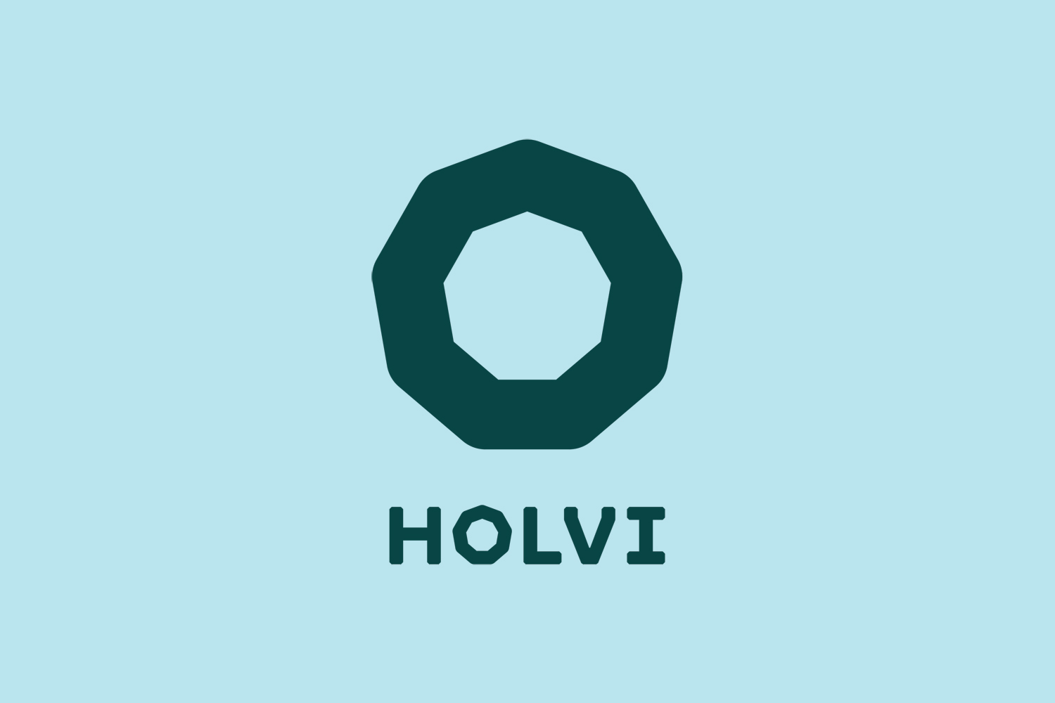
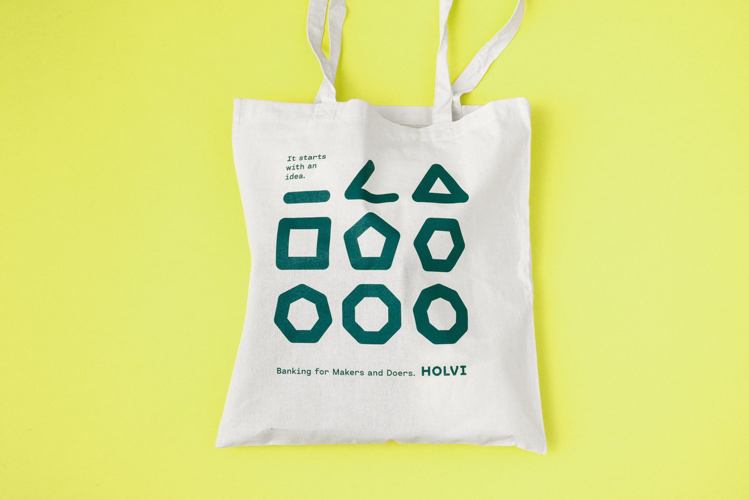
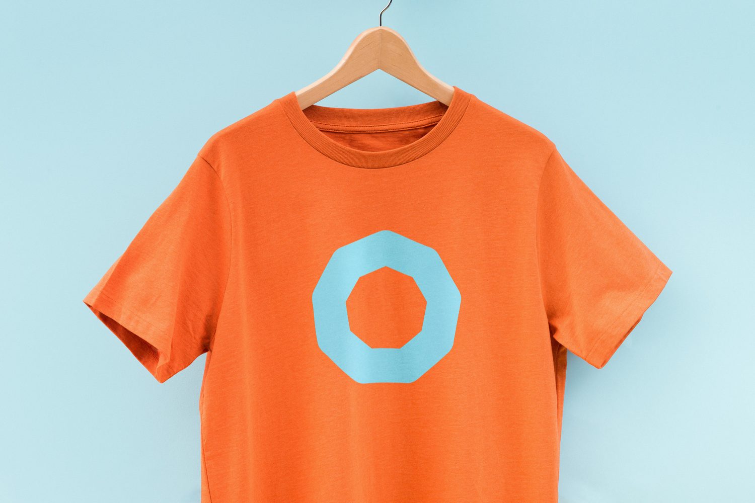
Holvi is personal and professional, a cheerful and reliable utility. This is expressed by its new graphic identity. Using simple form language, a soft and modern colour palette and Cartographe Sans, Werklig finds a smart intersection between the mechanical and the playful. This links a variety of printed assets such as business cards, stationery, merchandise and tote bags, and digital experiences that included website and mobile app.
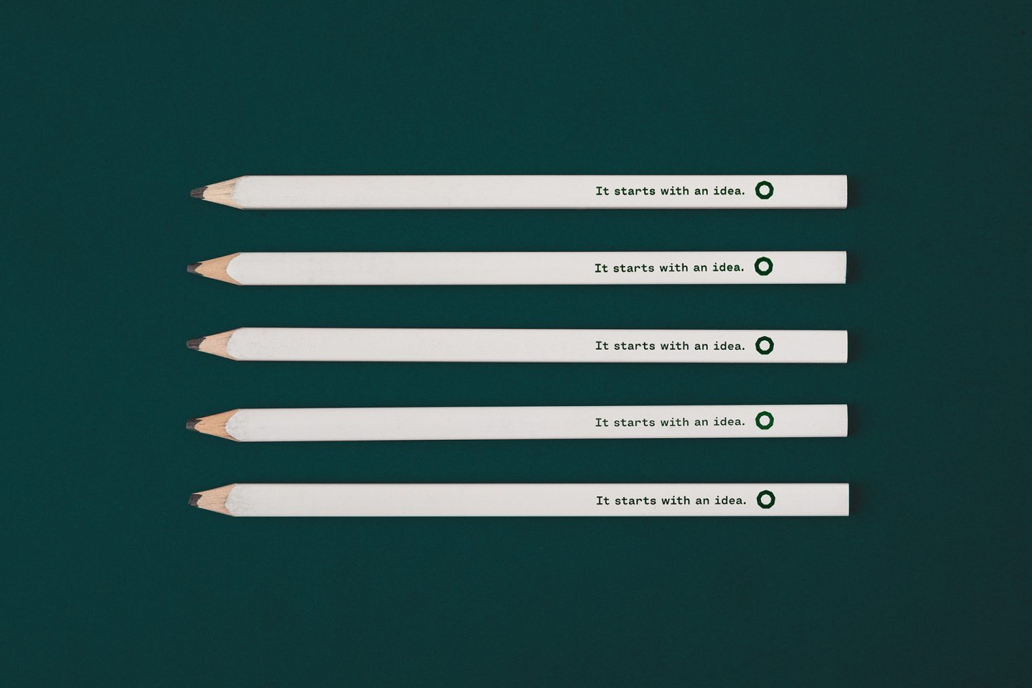
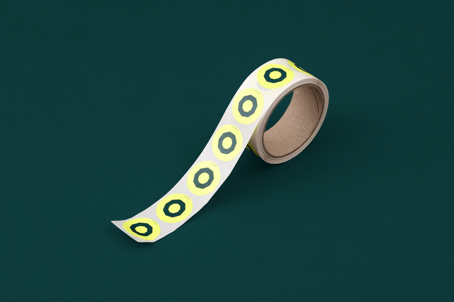
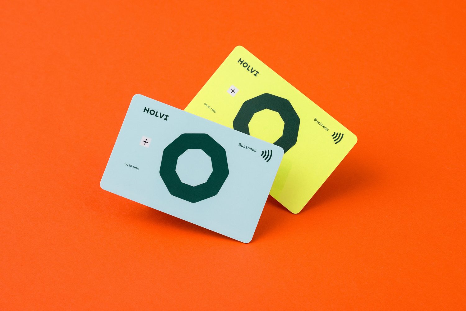
Holvi’s graphic identity is a simple but distinct meeting of product utility and an accessible brand character. The technical associations of a nonagon, a reference to vaults and the Holvi name, are softened by rounded corners. The mechanical qualities of Cartographe Sans are given a levity, fluidity and action in its italic state. Colour is cheerful in its hues and variety. And tone of voice, although perhaps a touch fragmented, focuses on ease of use, the personable and the proactive, and the beginning of new ideas. The phrase “makers and doers” introduces something of an interesting material quality to a digital tool, as does the choice of branded flat pencils, but is not pushed too far.
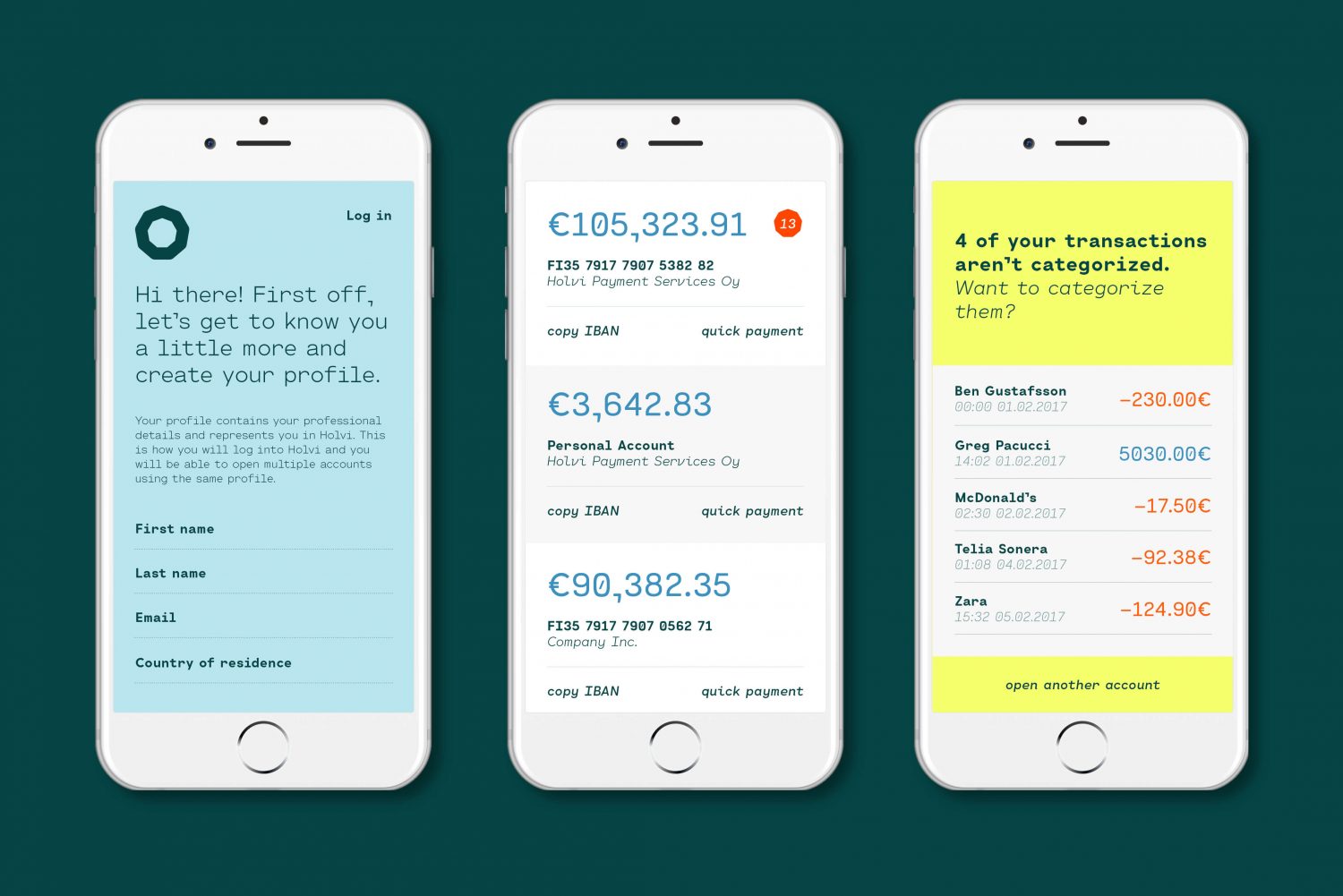
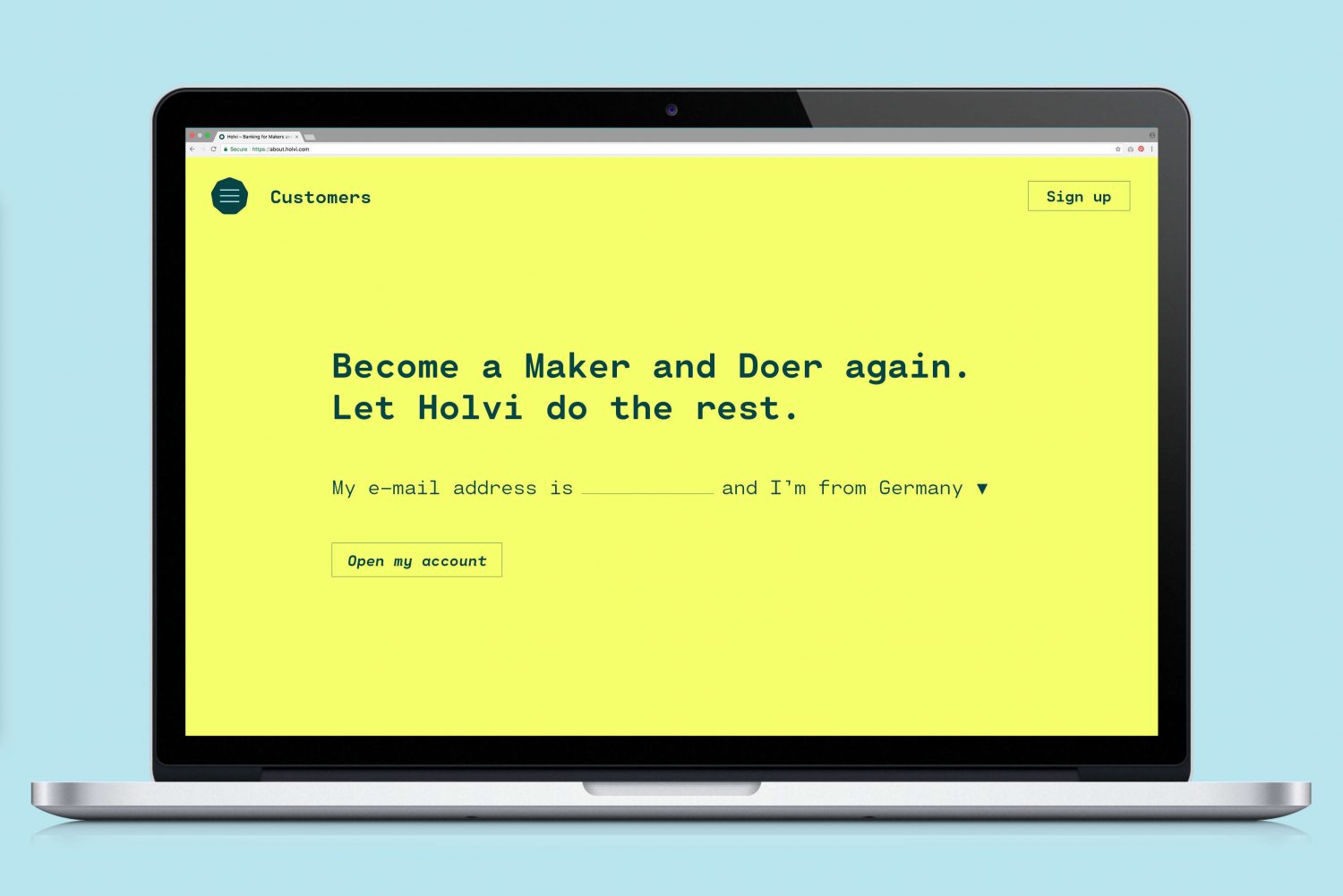
There is a fairly clear and universal visual language at play here in form, type and colour. There is a familiarity and current quality to these individual choices, yet in their resolution, proportionality and contexts (the contactless cards look particularly neat), establish a distinctiveness. Werklig keeps graphic identity from veering too far towards either a characterless utilitarianism or a childish playfulness, and responds to the challenges within the banking sector, an enduring mobile ubiquity and evolving digital language, and the changing demographic of today’s new business owners. More from Werklig on BP&O.
Design: Werklig. Opinion: Richard Baird. Fonts: Cartographe Sans.
