Sumer And The Modern Paradigm by Clase bcn
Opinion by Richard Baird Posted 2 January 2018
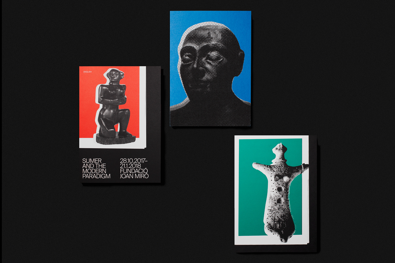
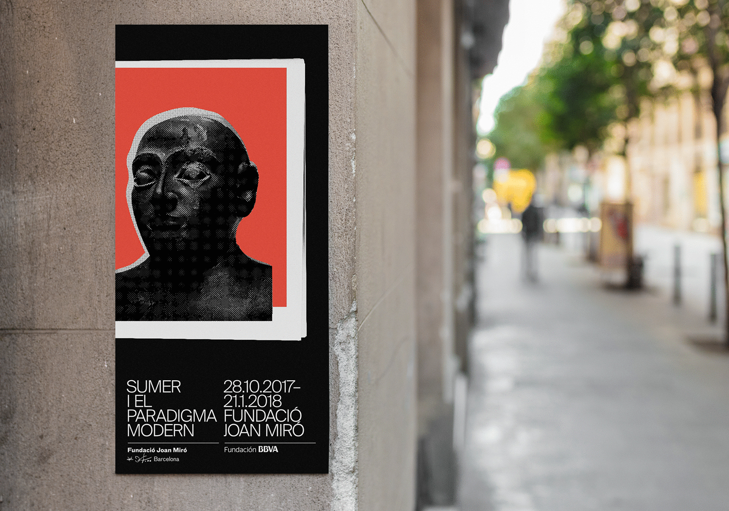
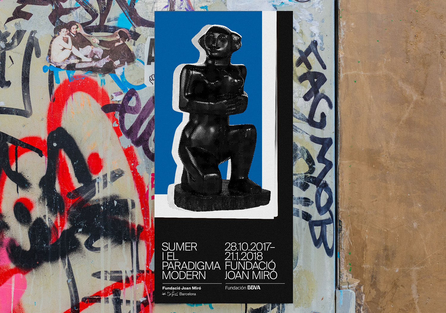
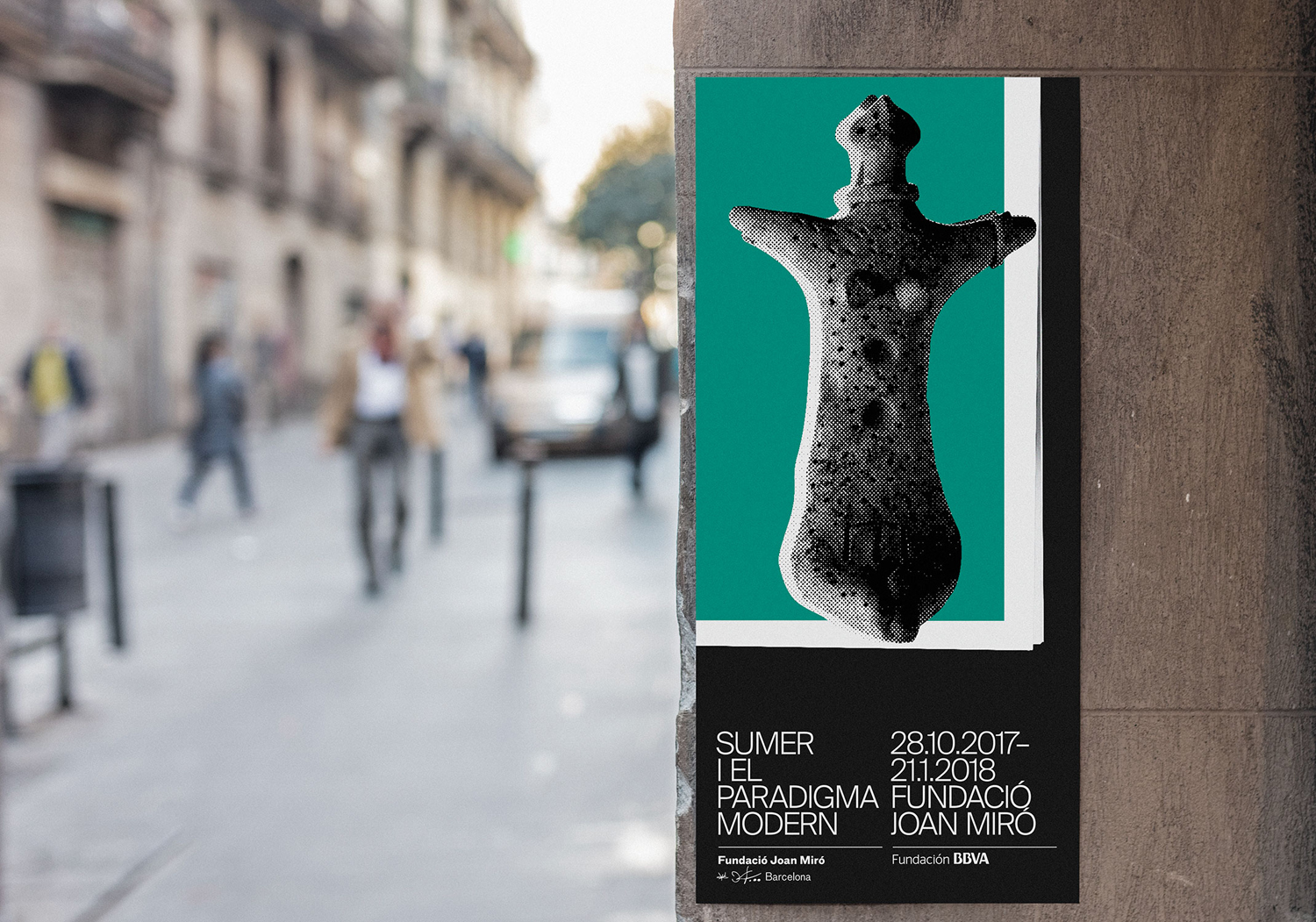
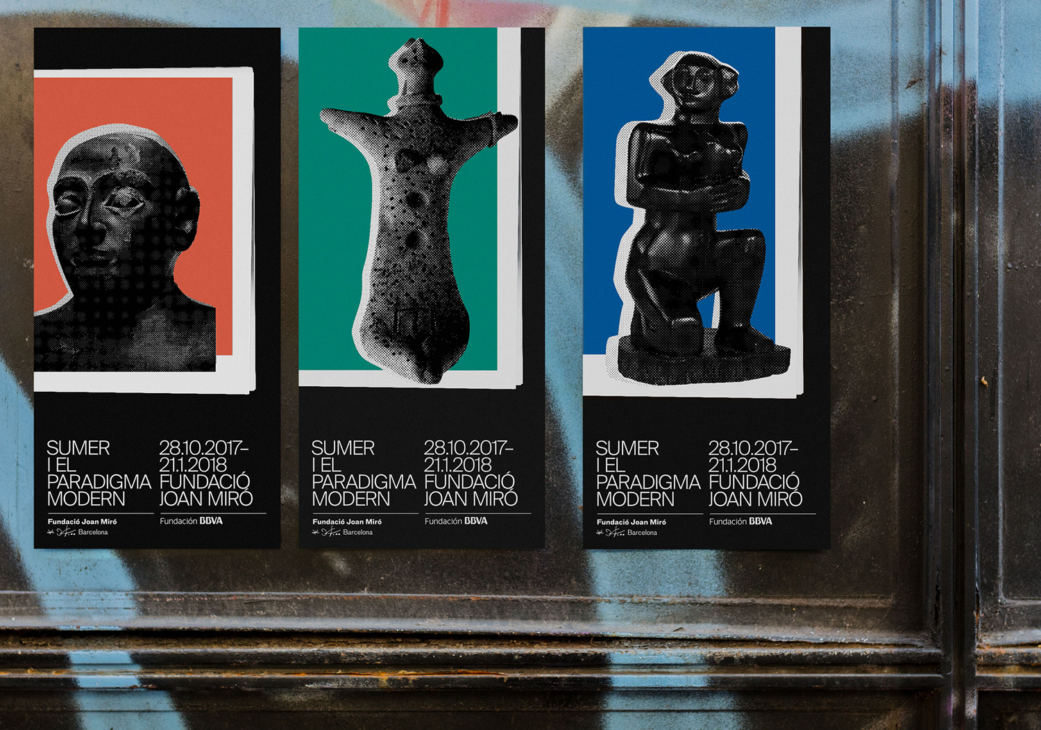
Sumer And The Modern Paradigm is an exhibition at Barcelona’s contemporary art gallery Fundació Joan Miró, and runs from 28th October 2017 to 21st January 2018. It intends explore and attempt to explain the influence of Mesopotamian art on modern artists, with a particular focus on the interwar period. The exhibition analyses work produced between the twenties and forties, takes a look at the documentation of Mesopotamian art that modern artists encountered and were inspired during this time, and looks to find the reasons for their fascination with the discoveries of ancient Near East artefacts. This relationship between between antiquity and modernity is expressed through the graphic identity of the exhibition, designed by Spanish studio Clase bcn, using a contrast of form and colour. This links a variety of printed communications and merchandise that included posters and flyers as well as tote bags and books.
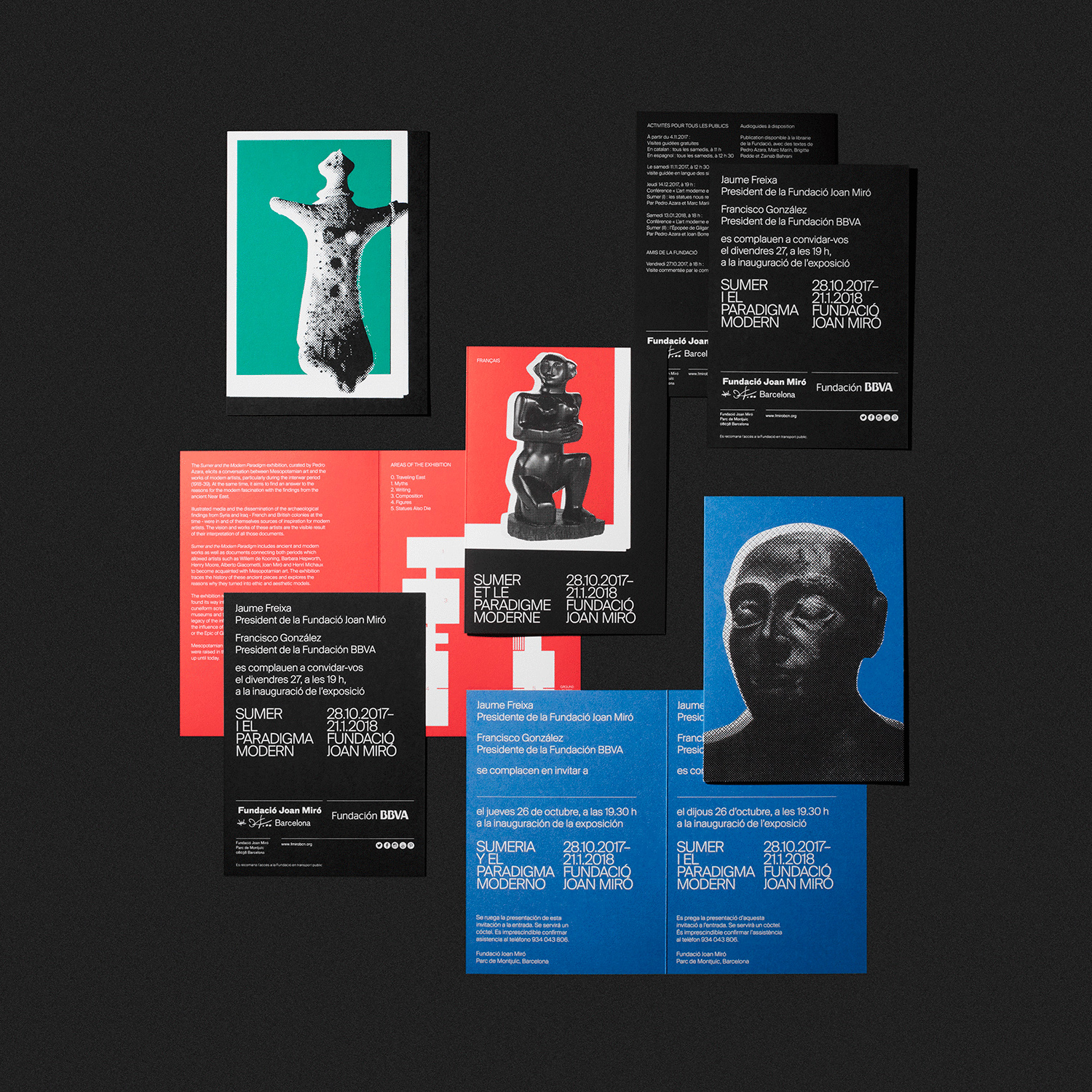
The intersection of past and present is a recurring motif in graphic communication. Finding an interesting and unique interpretation of this is challenging. Here, in the mixed medium of colour (modernity) and form (antiquity) rather than using, for example, the continuity of type but a difference in style, establishes something distinctive.
A contrast between solid rectilinear blocks of bright modern colour and the figurative nature, organic form and light and shade of sculpture makes for both a conceptually thoughtful and visually intriguing expression. It is perhaps also important to note the interrelated nature of colour and form, just as Mesopotamian art influenced modern artists. Colour emphasises silhouette, it brings new meaning to sculpture, and hints at dialogue, ideas well-suited to the intent of the exhibition.
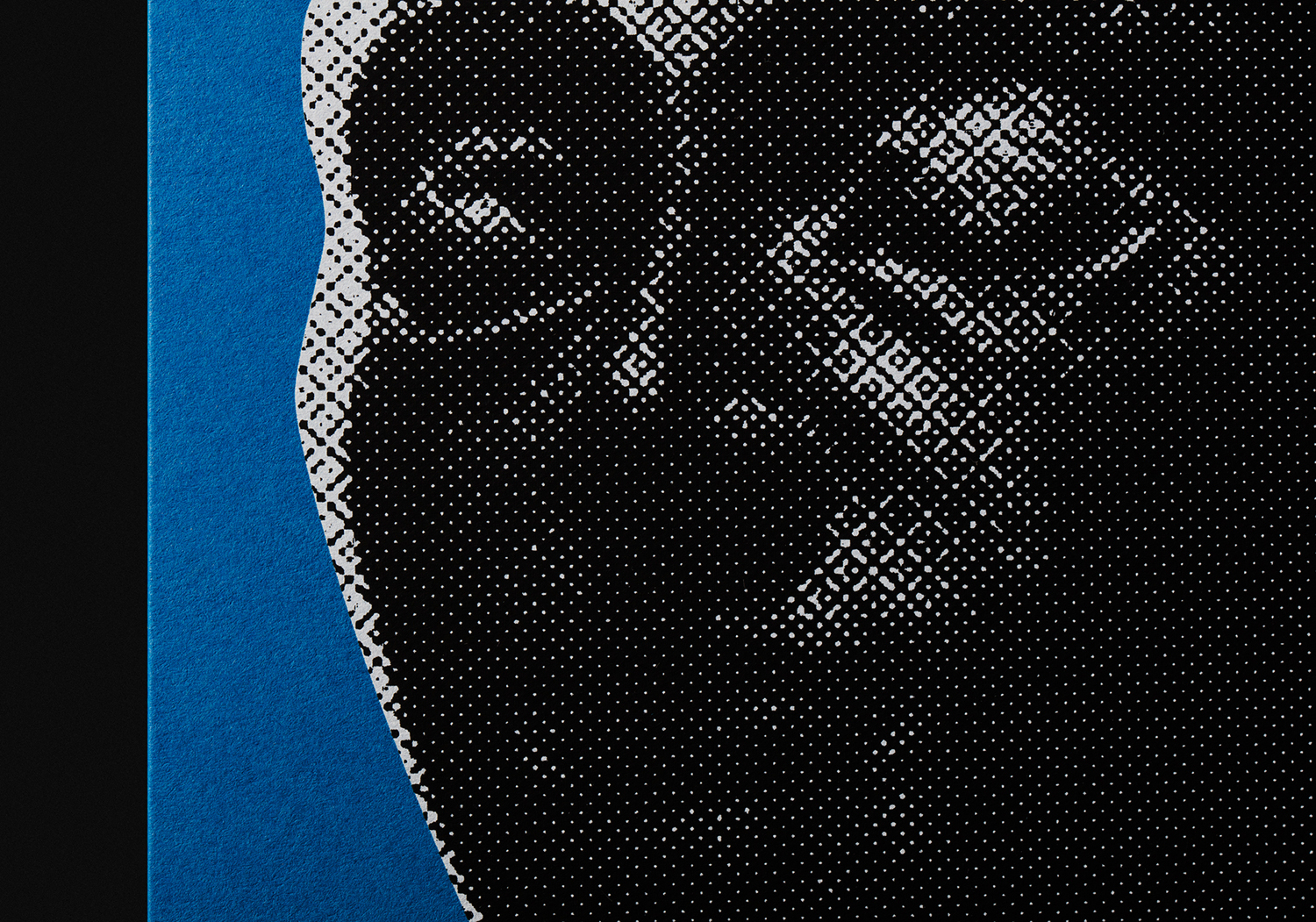
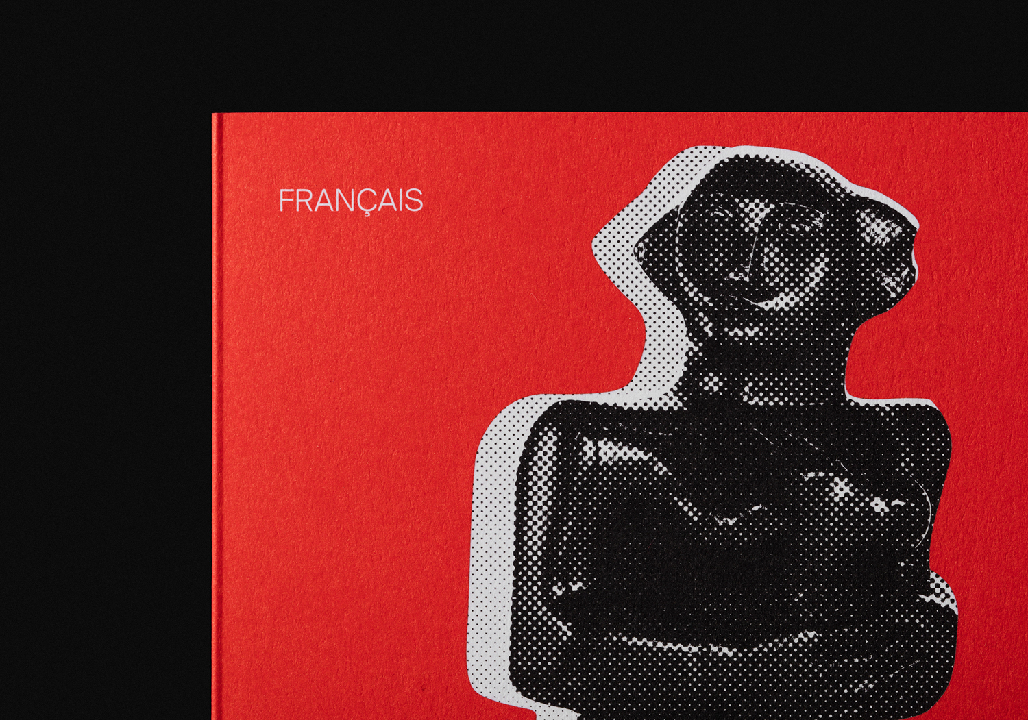
The interplay of period reference also extends to type, which favours a light modern combination of mono linear letterforms, the cropping of what looks like newsprint, and the halftone reproduction and exaggerated plate miss-alignment of imagery. This halftone effect helps to establish a clear continuity between quite different sculptures, and helps to draw out the use of light and shade.
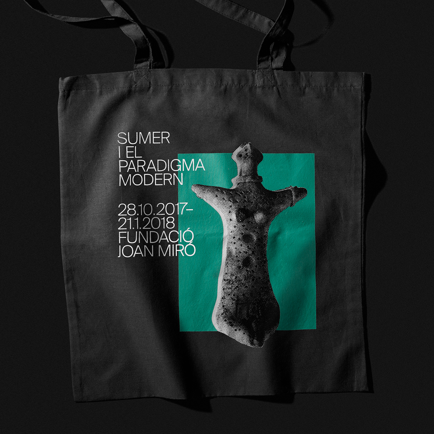
The result is a simple, accessible and intelligible concept expressed in a compelling way. It draws the eye through blocks of colour, and a contrast of colour, form and a pronounced period opposition. There are few components, yet these are well-defined visually, and grounded in communicative intention. There is also a contextual sensitivity, with the black borders really emphasising colour, drawing out the light and shade of sculpture and setting posters out from a busy urban environment. More from Clase bcn on BP&O.
Design: Clase bcn. Opinion: Richard Baird. Fonts: Suisse International.
