Nth Fitzroy by Studio Hi Ho
Opinion by Richard Baird Posted 17 January 2018
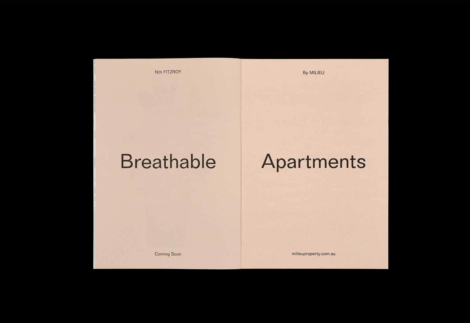
Nth Fitzroy is a residential property development project from Milieu located in the heart of the inner north of Melbourne. It features 26 uniquely breathable apartments within an innovative architectural structure with an exterior skin of single and double story shutters.
In response to seasonal environmental conditions, the changing light of the day, and the minute by minute activities of its occupants, the intrinsic nature of these shutters within exterior structure give the impression of a living building and a daily rhythm.
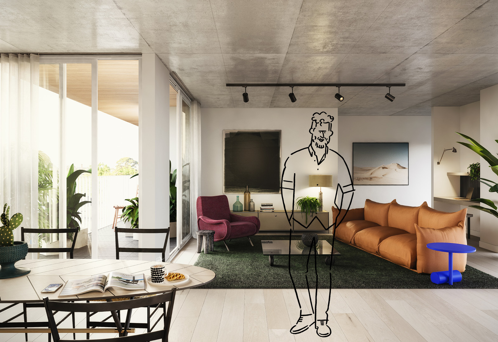
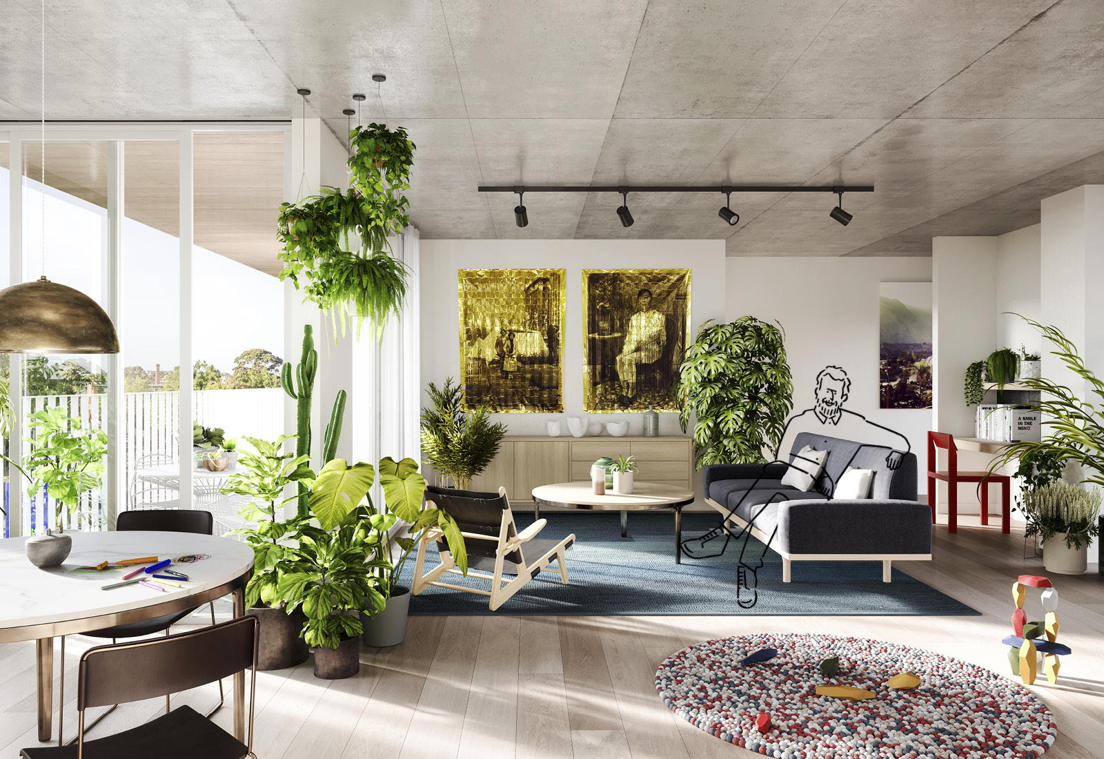
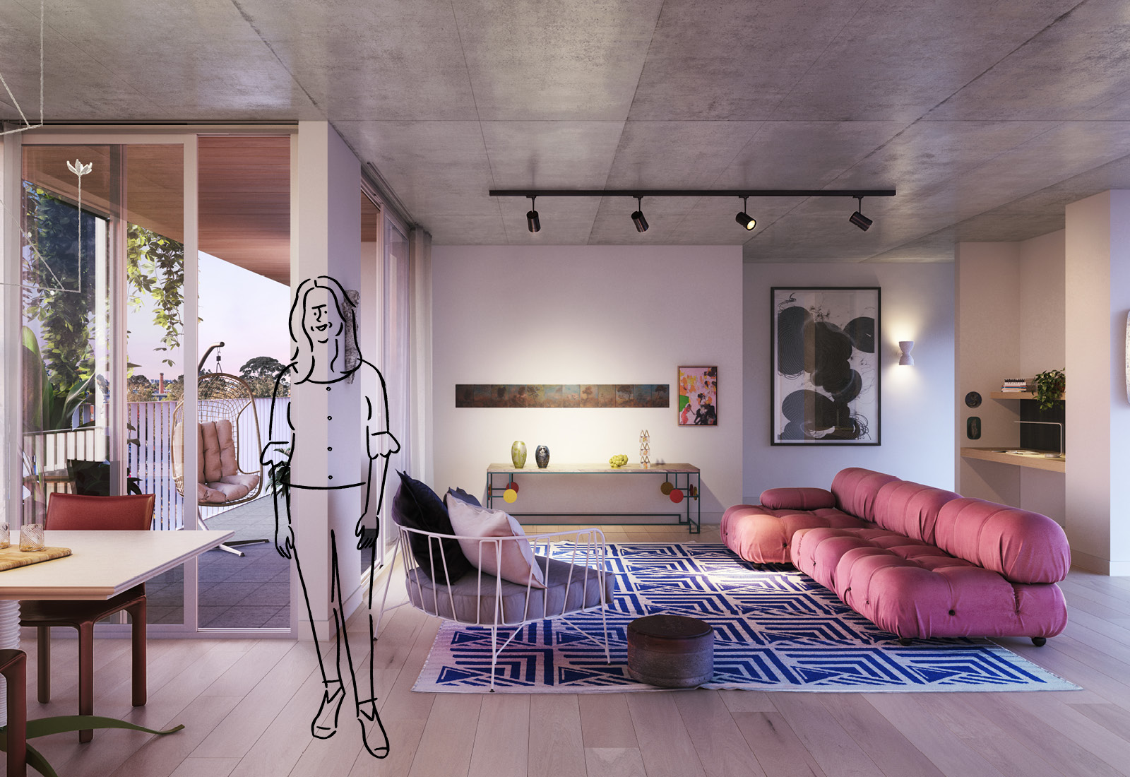
Inside, apartments are highly functional but also warm and welcoming, encouraging interaction and engagement. Smart storage space sits alongside moments of simple aesthetic pleasures that include natural material details and tactile high quality finishes. Working with Loose Leaf, Milieu helps to bring nature right into private and shared spaces of Nth Fitzroy’s spaces, to compliment its architectural concept, through a variety of indoor plants.
To help bring to light the unique qualities of the property and its apartments Studio Hi Ho developed a strategy and promotional activity with two distinct components, united by the concept of Breathable Apartments. The first, titled Plants, is a mix of document, website and event run by Plant Hunter, which is dedicated to indoor plants. The second, AM/PM, is a document that explores the life of the building and its surroundings through a cycle of 12 hours. Although this project was completed in 2016, this is the first time it has been published in its entirety online.
Plants
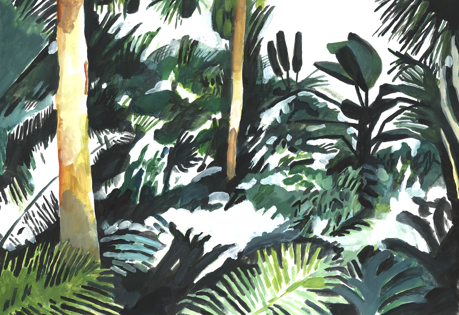
Plants and AM/PM explore the concept of Breathable Apartments in two distinct ways, yet build into a strategically mindful and compelling promotional activity. The themes of light and air, an indoor and outdoor connection, and the natural world intersecting the built environment run as through-line with the Plants functioning a motif for a well-balanced environment—their observable response to air and light quality is universally understood and smart relationship between architectural sensitivities and interior decoration, and associated harmony and well-being.
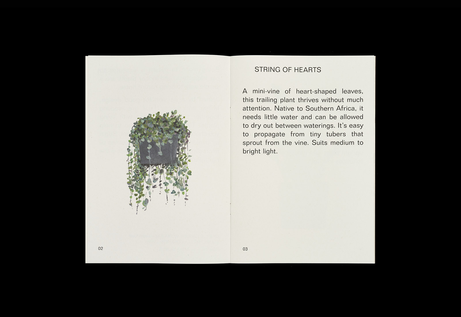
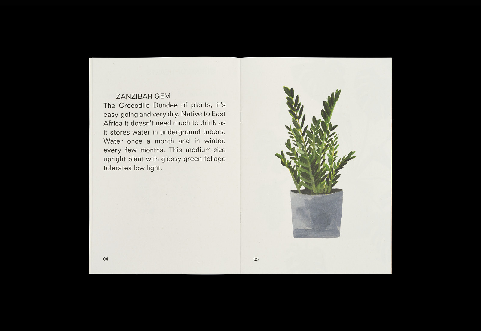
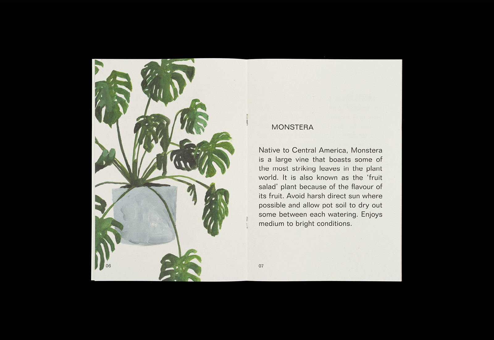
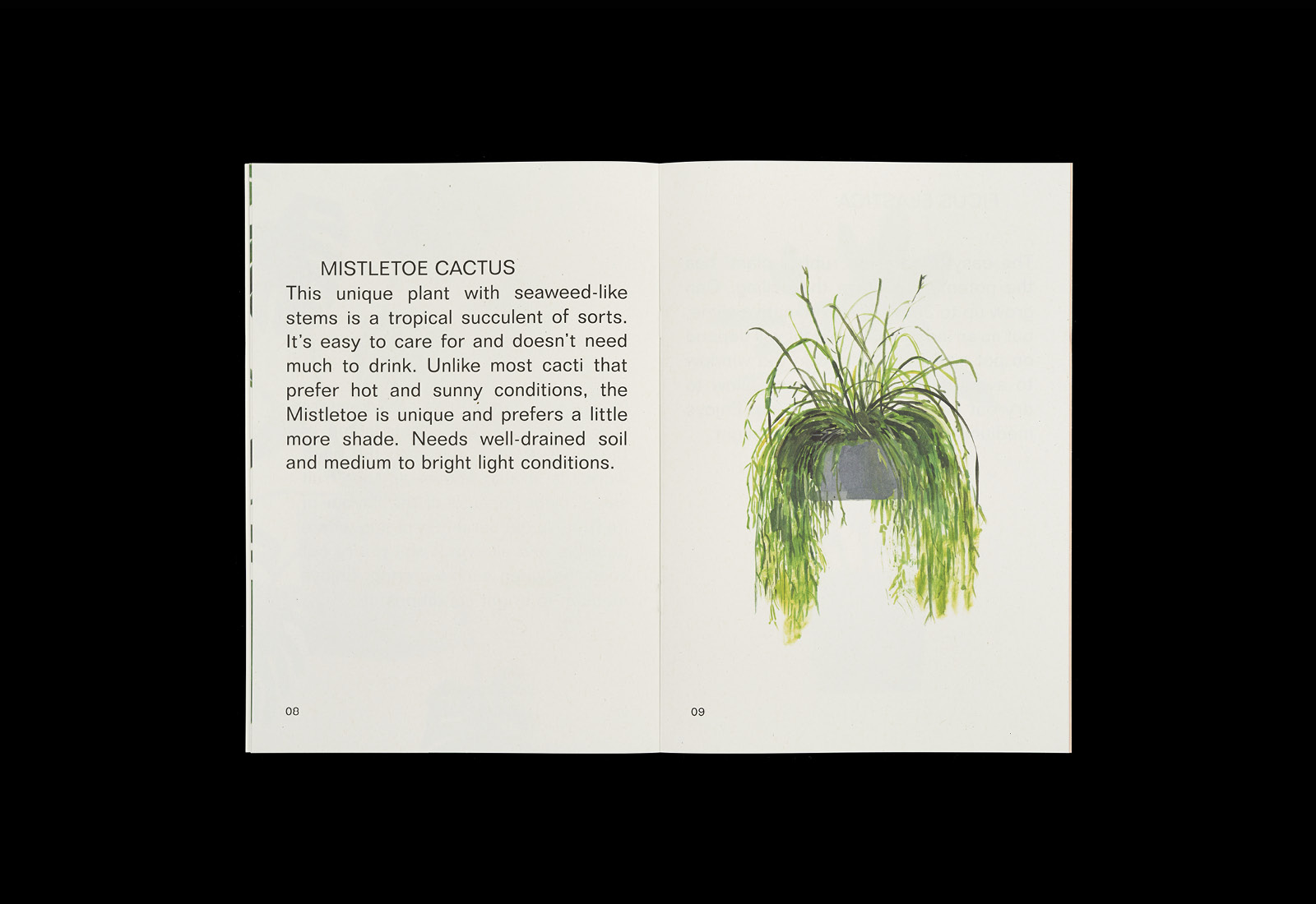
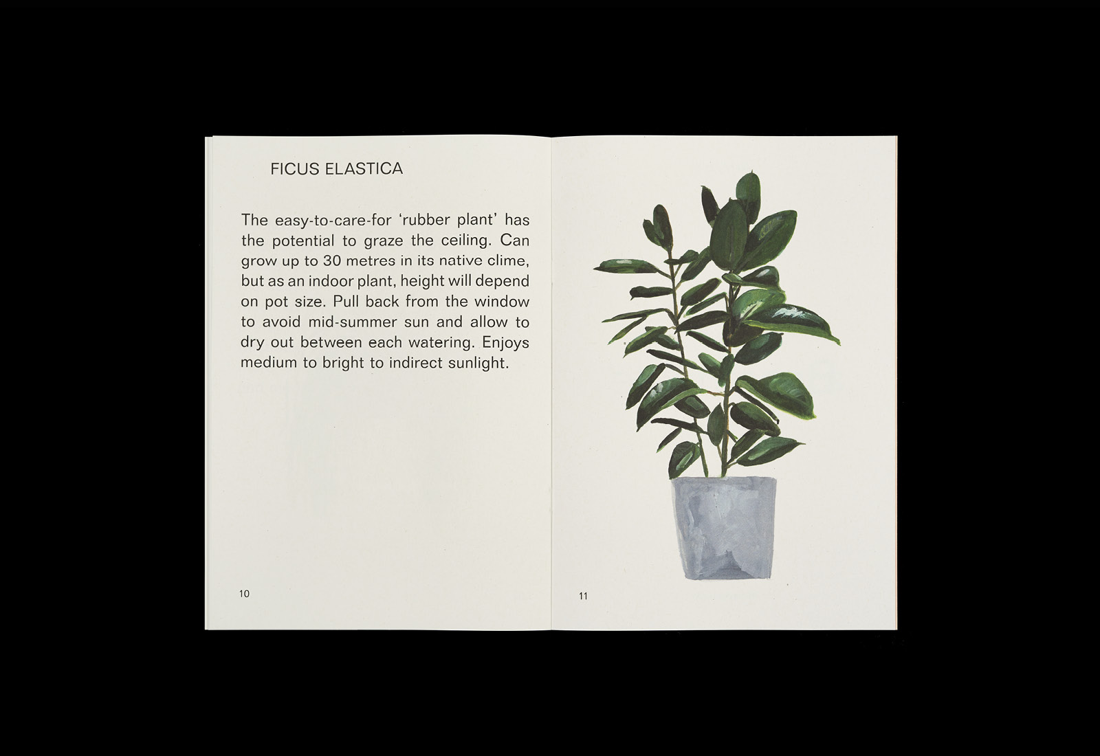
Building this out into a house plant guide and event, and introducing plenty of plants and trees into external rendering, creates a new and distinct entry point into property purchasing and the conceptual foundations of the building. Much like the design of the apartment space, Plants has a practical as well as an aesthetic dimension, blending a simple yet compelling storybook quality, featuring illustrations of Anna Skeels, with useful insight.
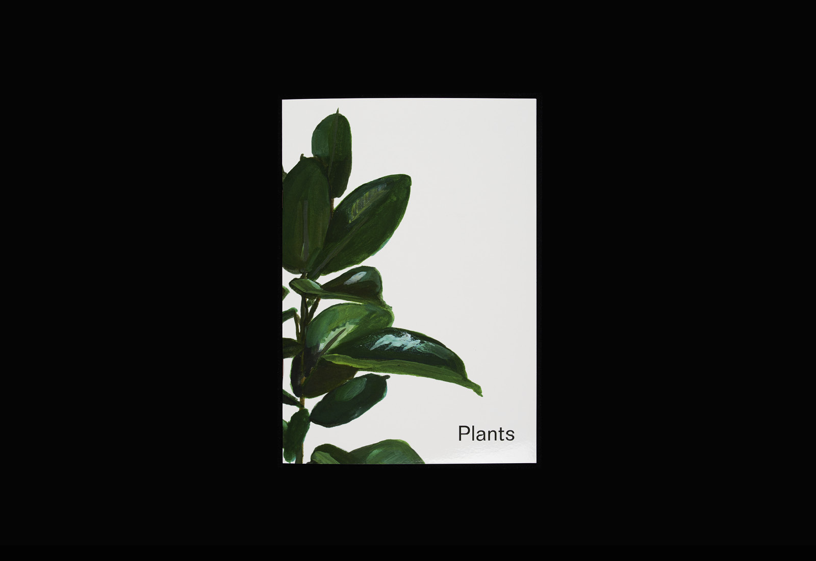
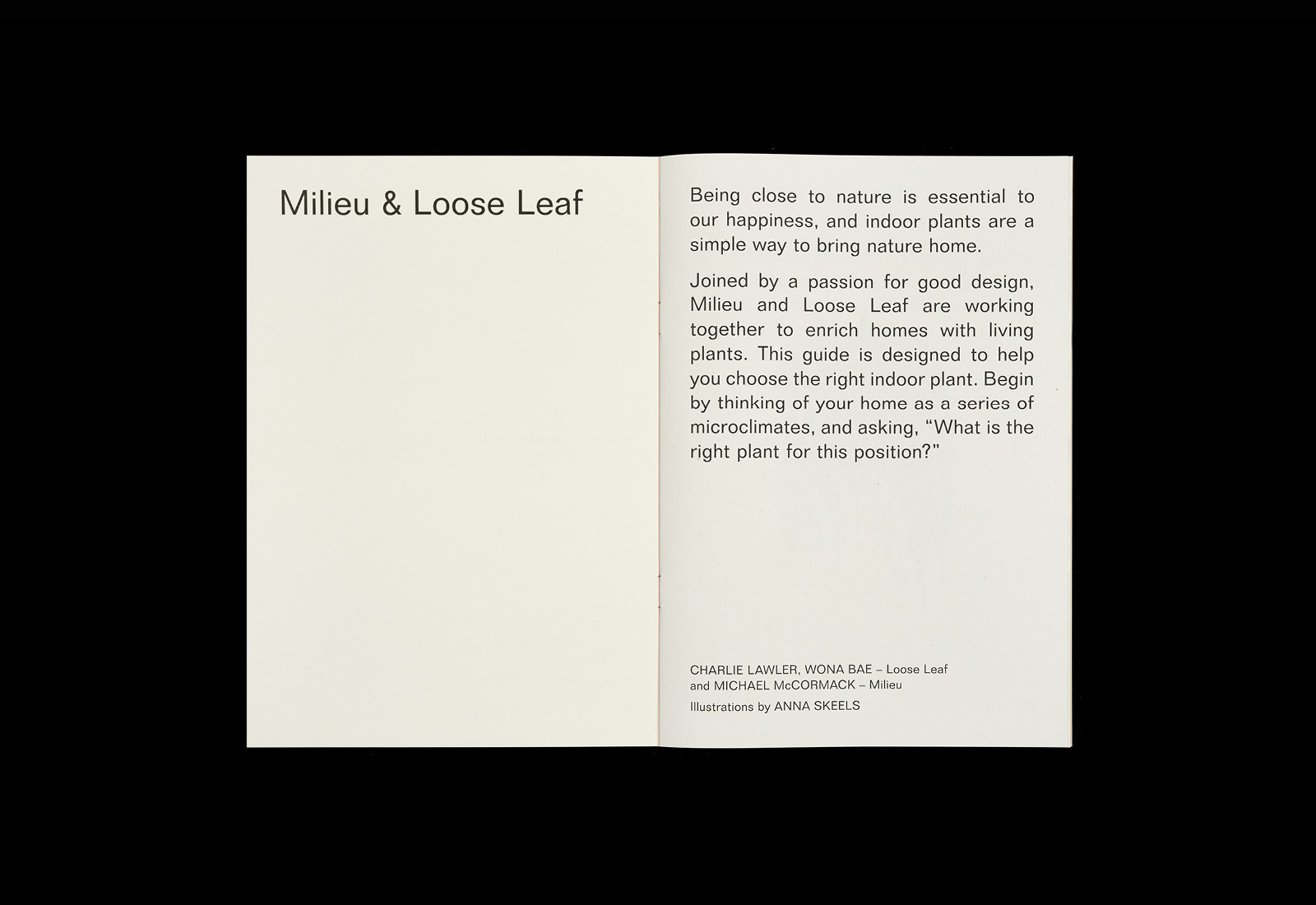
The abundance of available plants, the nuance of each of their needs, and the consideration of the home as a micro-climate is given an accessible storybook-like quality of single illustration, page space and generously line spacing. This brings a sense of ease and rhythm to their care, and an overall lightness that ties in with the breathable. The stylistic continuity of Anna Skeels‘ illustrations, their placement on the page, potting and occasional cropping, as well as a lovely sensitivity to shades of green, effectively convey size, growth profile and colour, making these easier to imagine and consider within the modern space of the property.

AM/PM
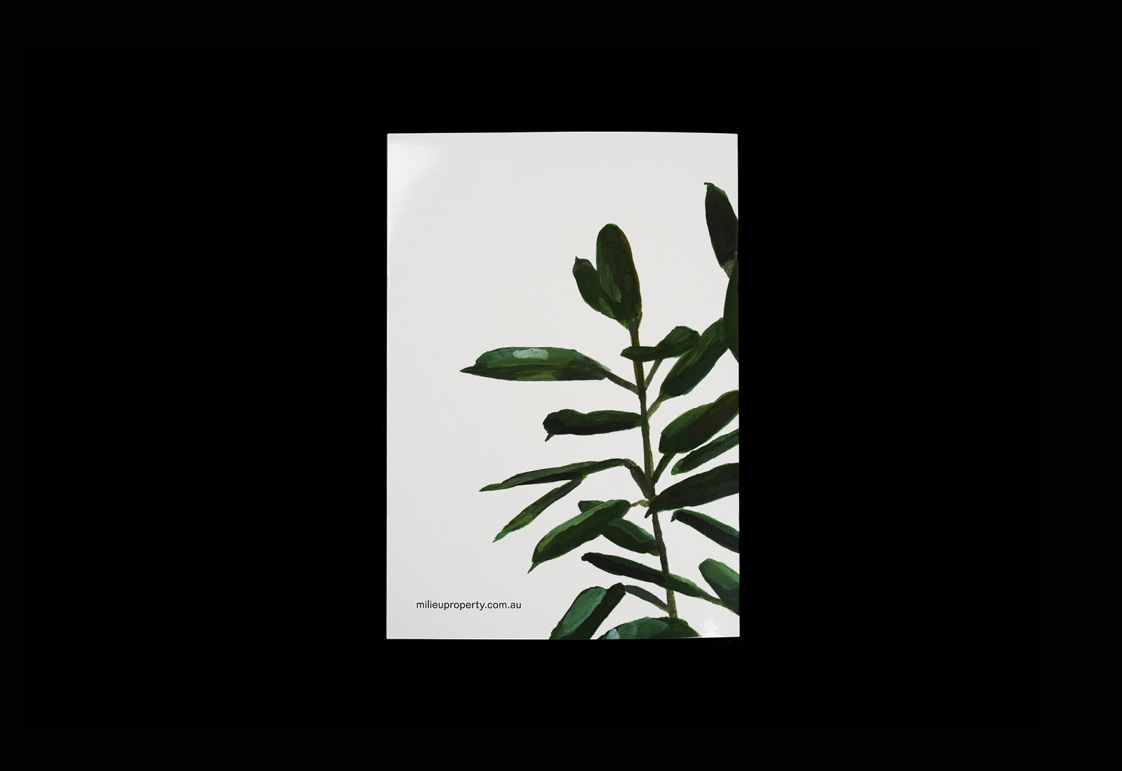
The strength of the approach lies in the conceptual continuity of the two documents, and how each tackles this in different ways. Where Plants explores Breathable Apartments from a natural angle and internal space, AM/PM looks at Breathable Apartments from the exterior, through architecture and its relationship to the outside world. The visual language employed is bookended and articulated by the front and back cover.
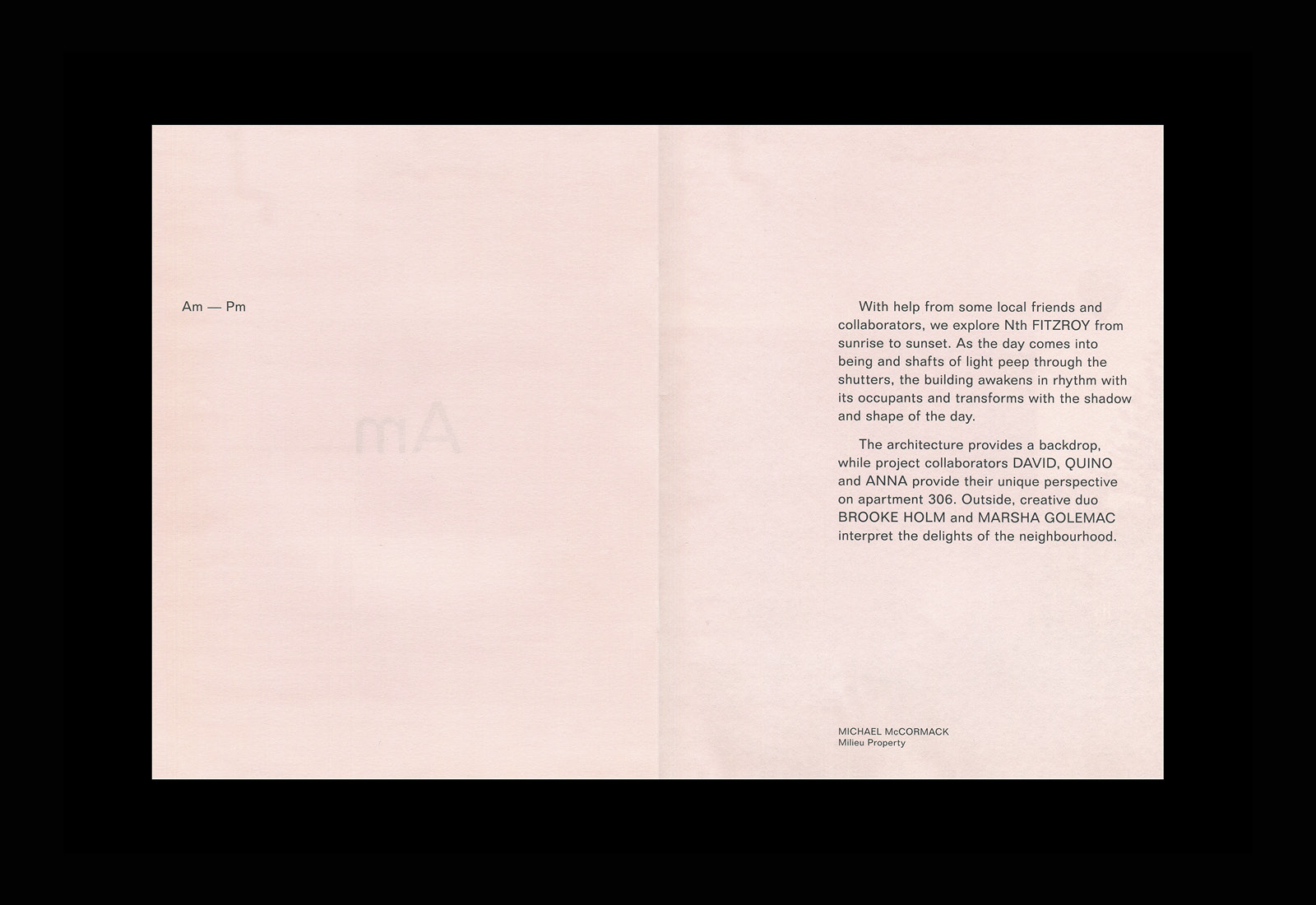
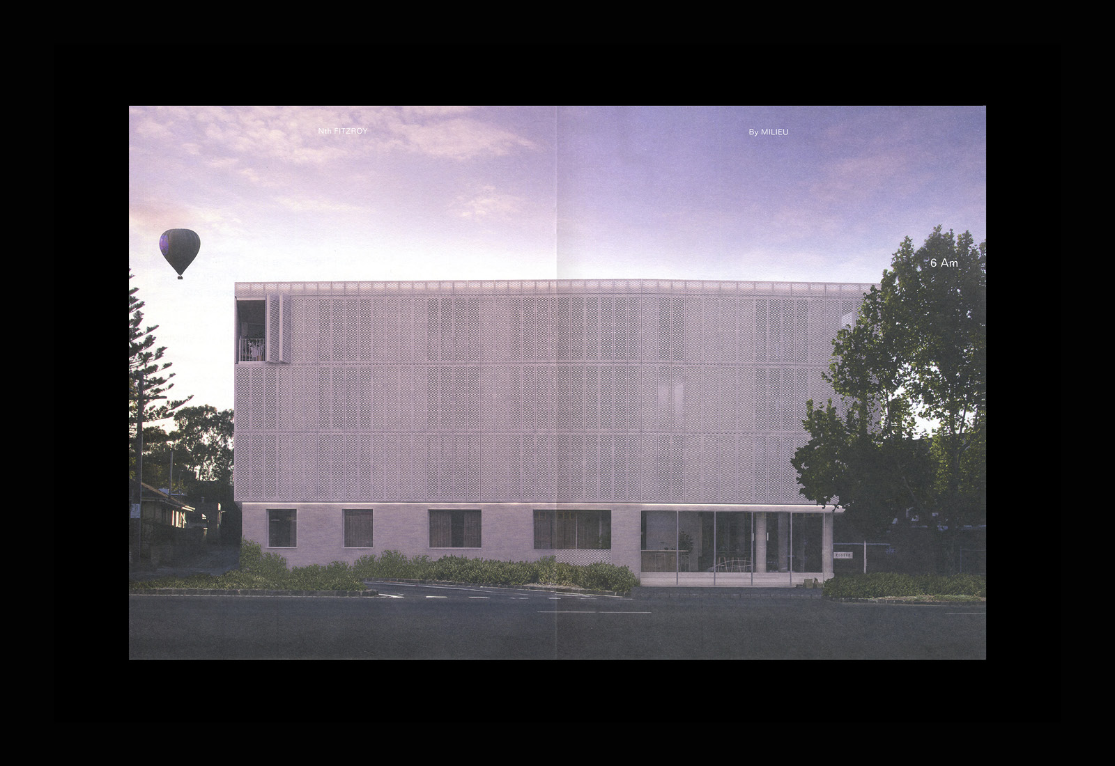
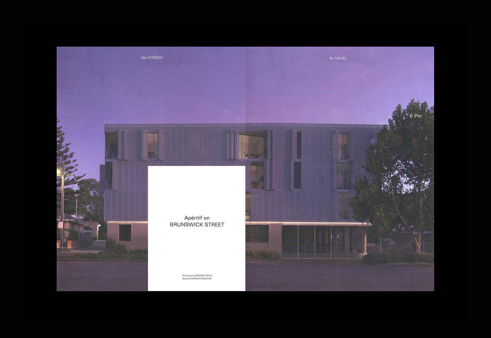
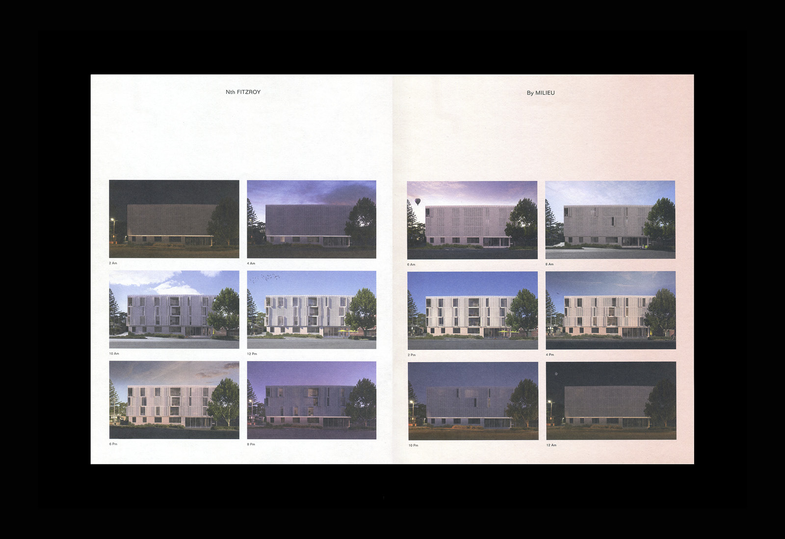
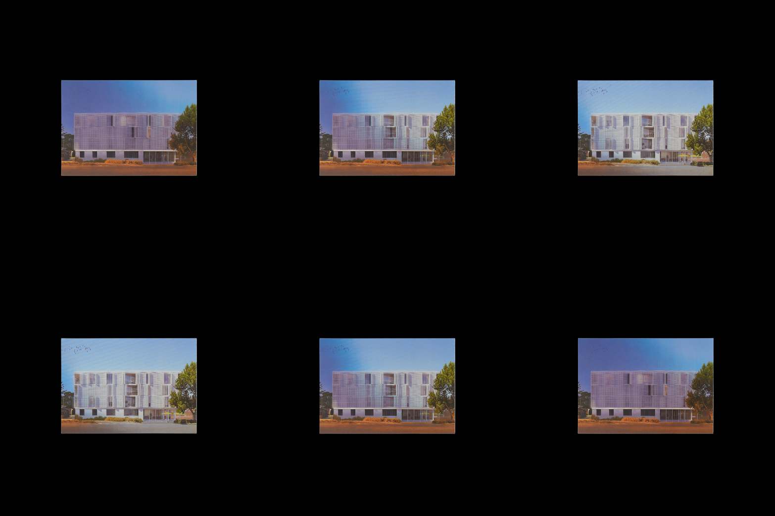
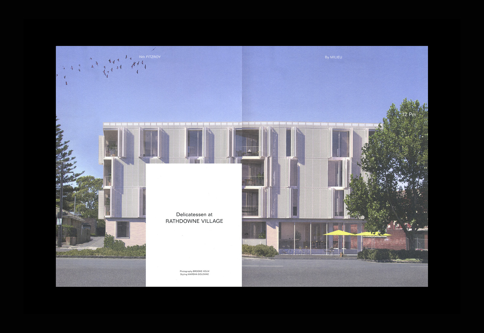
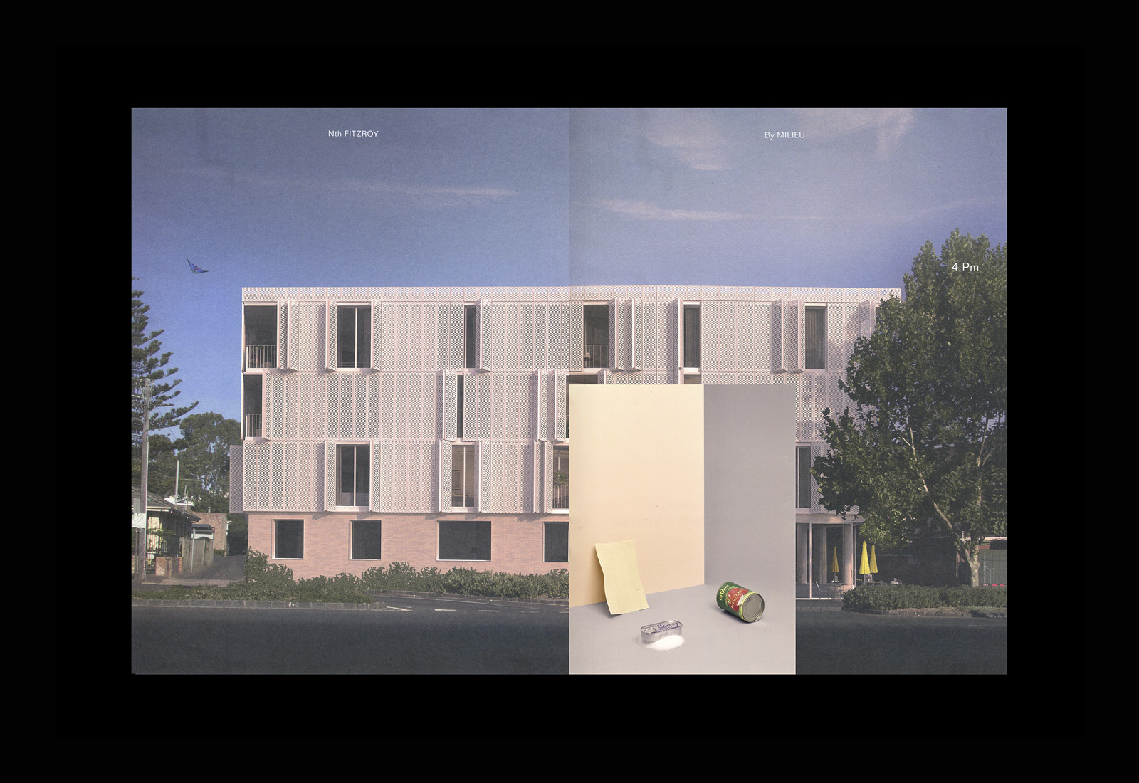
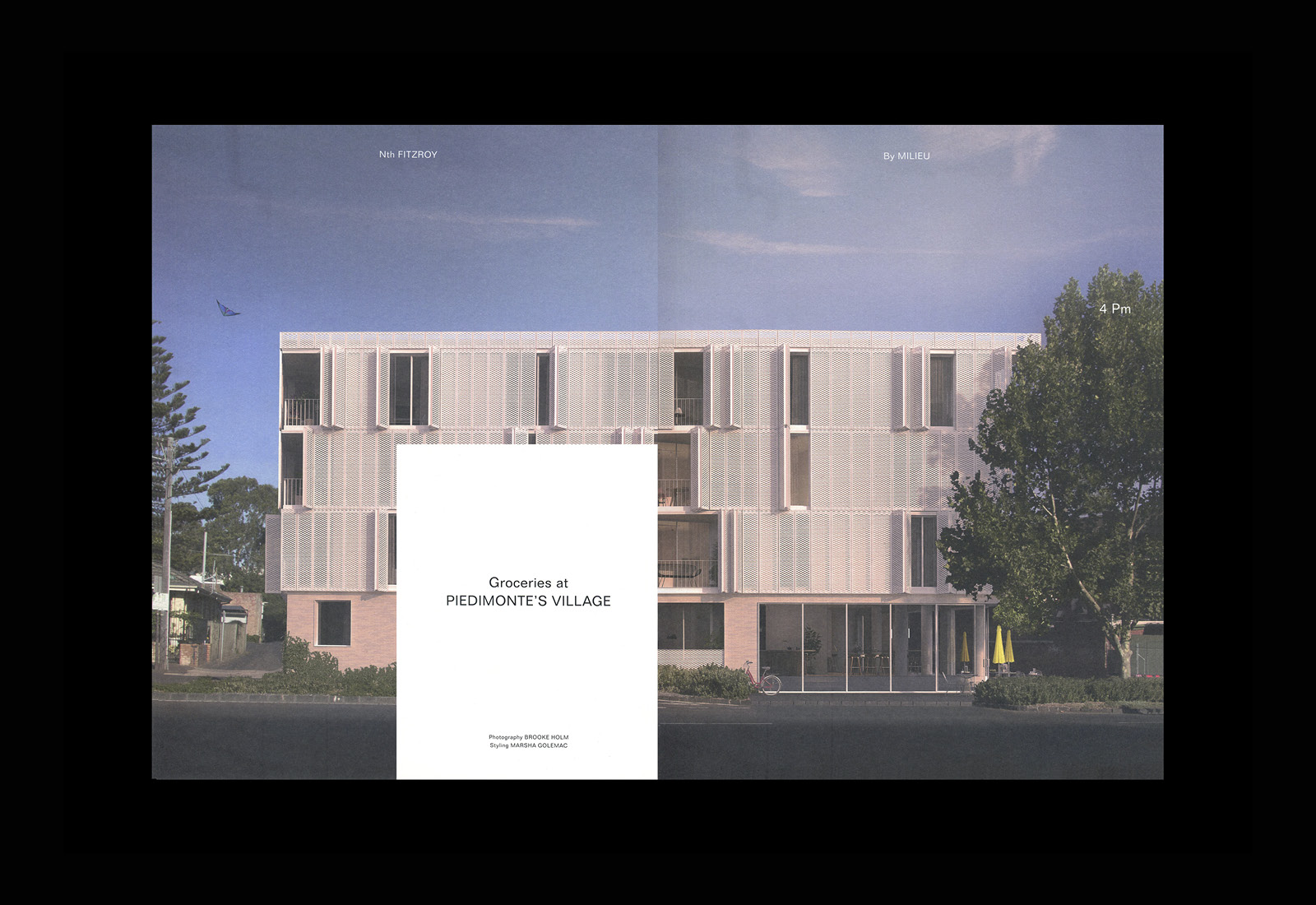
Positive living spaces, much like the life of plants, require air flow and light. These change throughout the day and seasonally. They both have a rhythm. Nth Fitzroy, through its shutters, brings this human rhythm to life. Through shutters, the building externalises the interior life of building and connects it to the surrounding community. This is captured by the AM/PM document using sequential imagery, rendered to express the changing and living nature of the building over a 12 hour period.
The building’s structure is really well-suited to the format and proportions of the page. Its rectilinear form anchoring each of the images as its surface changes and responds to changes in colour, light and shade, and life moves around and into it. Trees and foliage give the renderings a lovely sense of depth, and the way the natural world interacts with the built environment, a common thread between the two documents.
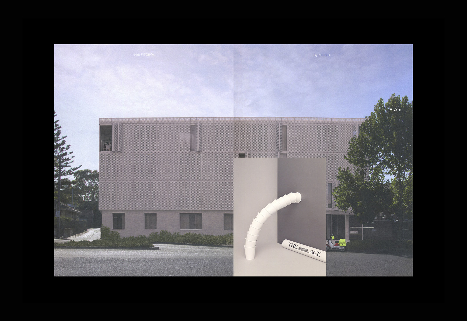
The storytelling component of sequential images is augmented by some other thoughtful ideas. These journey with the images through the day, and establishes an intriguing relationship by punctuating architecture using the form, colour, content and proportionality of inserts. These can be broken down into four essential components. Still life, words, interior photography and illustration. These build to create a multi-faceted visual language and provide a contextual and conceptual richness to architecture.
Still life photography weaves together the time of day with local conveniences. Paper and coffee in the morning, a light lunch, early evening cooking essentials and late evening drinks. The medium and conveyance of this is unexpected, and in their composition, work well to explore the themes of space, structure and arrangement. They unite the components of modern architecture with those of community living.
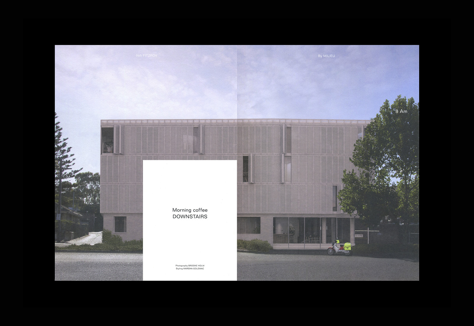
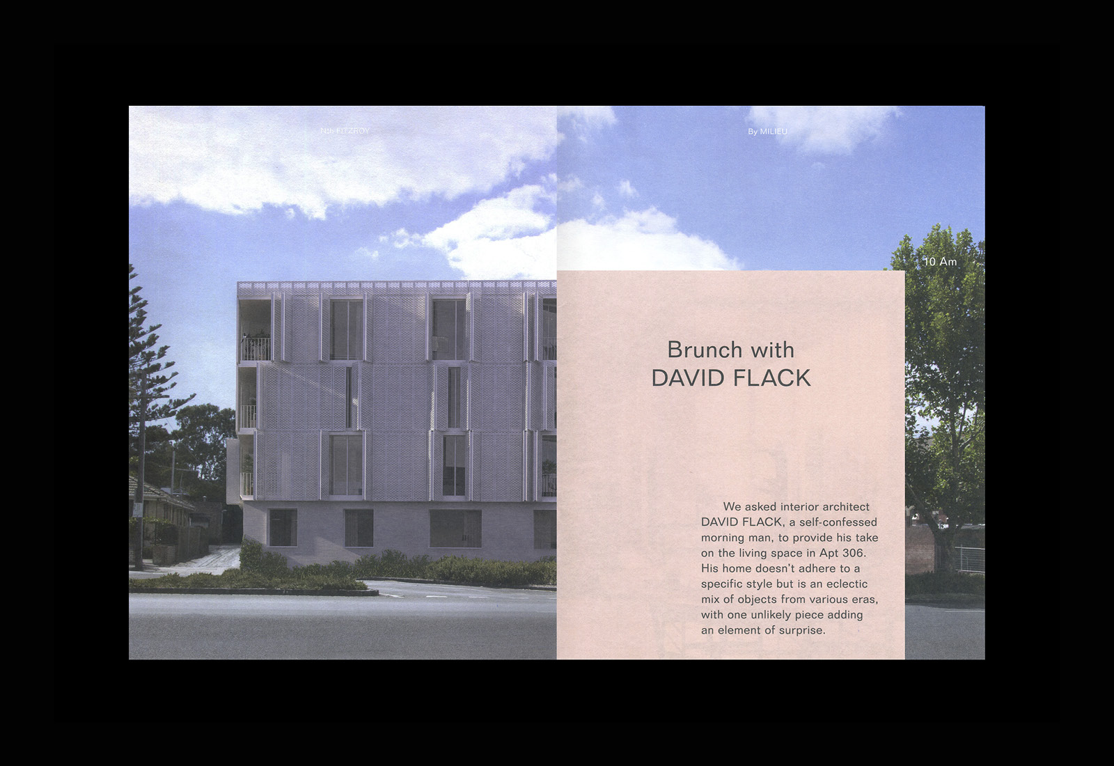
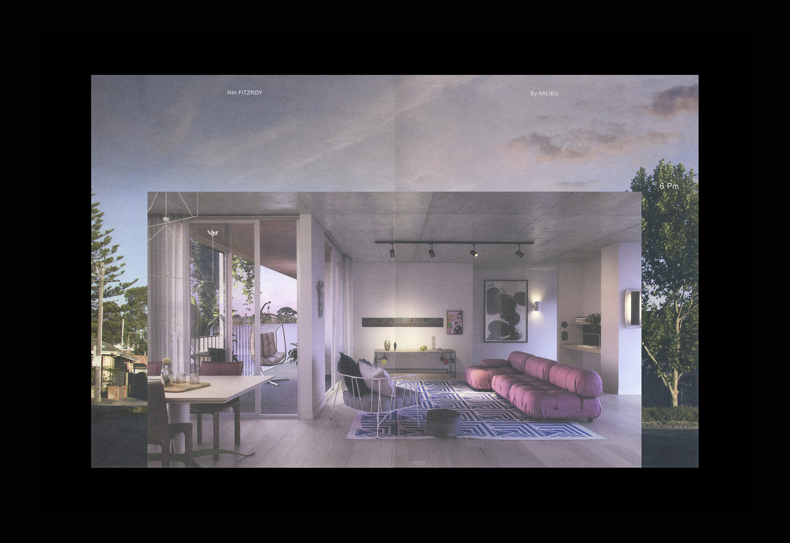
Highlights include the intersection of interior space, styled by interior architect David Flack, and exterior form. The small rectangular open insert, with a full bleed image covering the whole of building, creates a lovely relationship between indoors and outdoors.
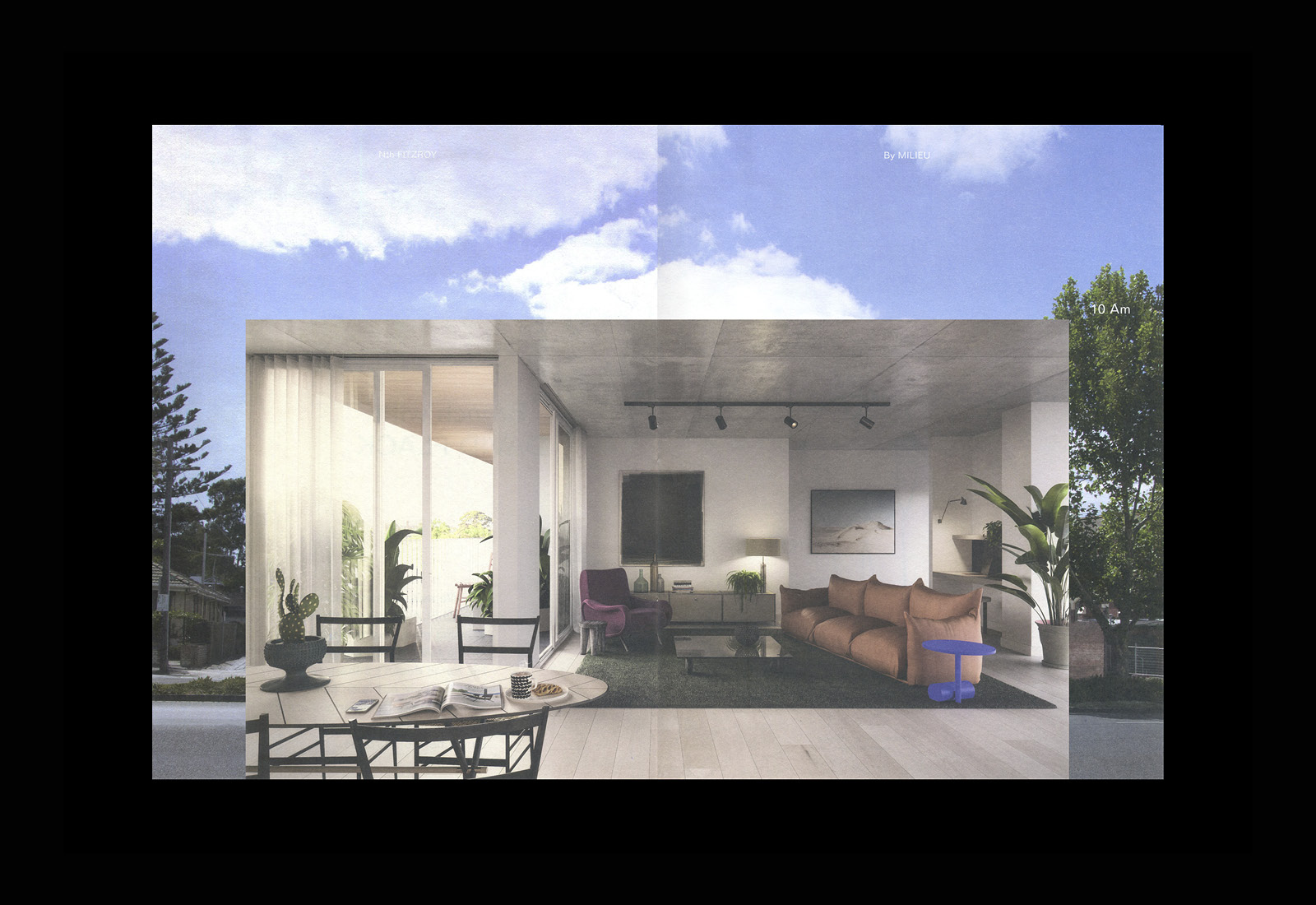
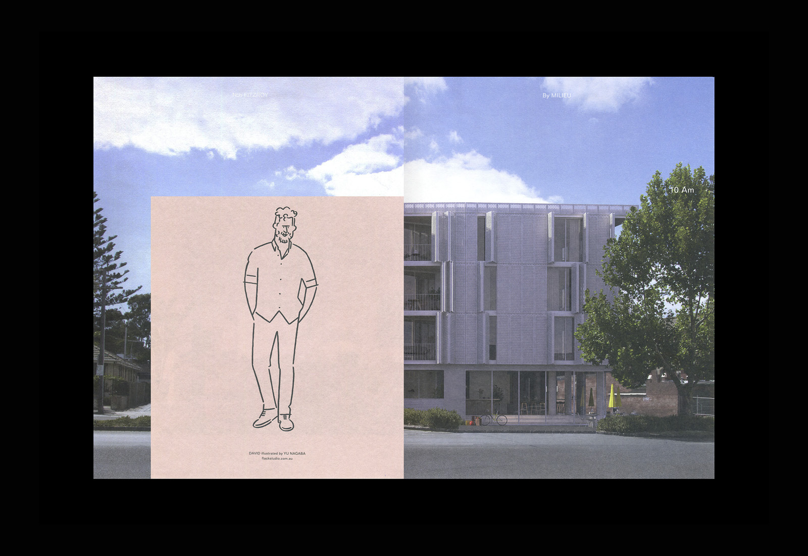
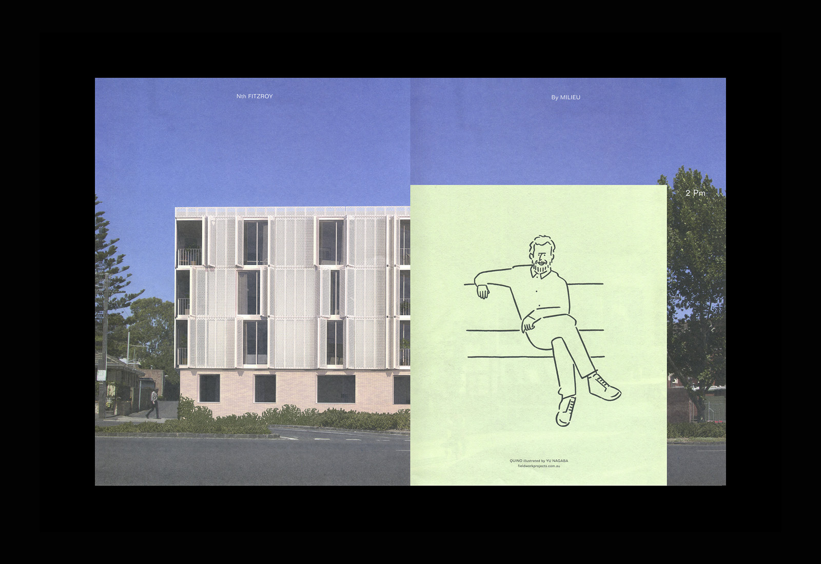
The inserts are tied to an individual, and bring to light the various facets of the building, experiential and physical. Each individual features as a sketch by Yu Nagaba on the back page of their insert. This serves to give both credence to the insight, but also express the human component of architecture, the life that is also explored in Plants. This is also explored further down, in the intersection of illustration and interior styling and photography.
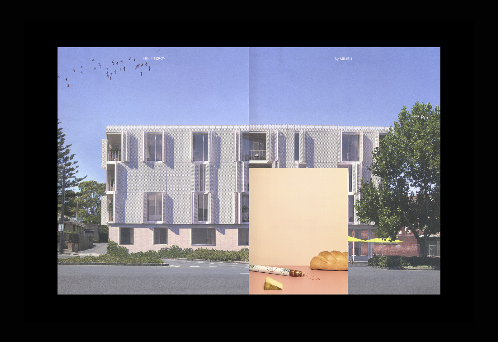
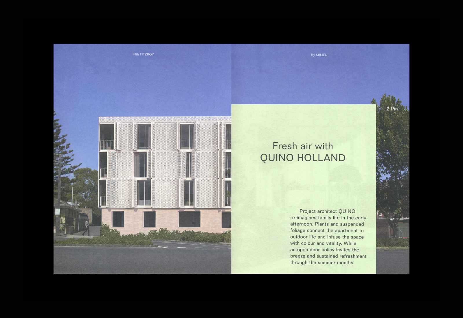
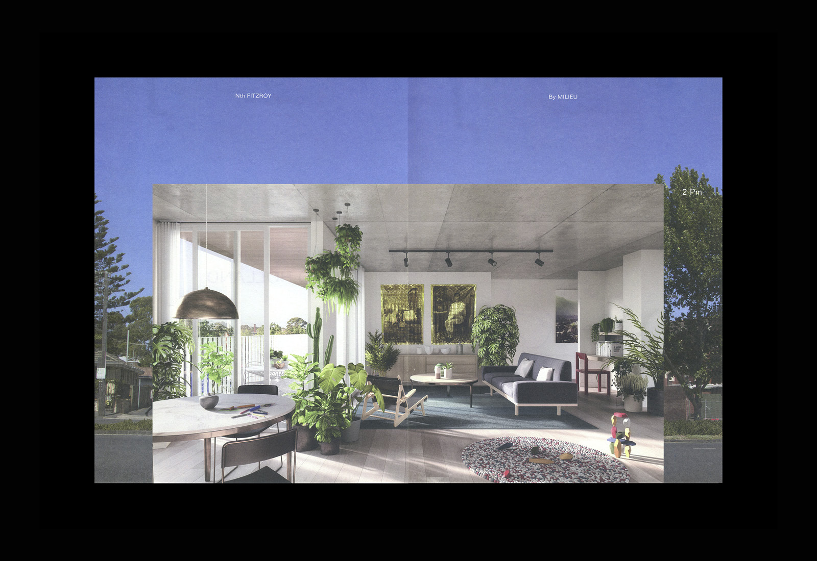
The Quino Holland insert makes a more literal connection to the Plants document, an essential practical link through dressing of interior, the interplay of fabrics, furniture, natural light and foliage. As with other inserts, colour functions to augment content. The continuity, modernity and contrast of pastels against architectural form remains, and in this instant employs a pleasant light green. Words conjure up a time and situation, linked to architecture of the building and the overarching narrative of the document, and touching upon the connection to the outdoors; clean air, summer warmth and natural colour.
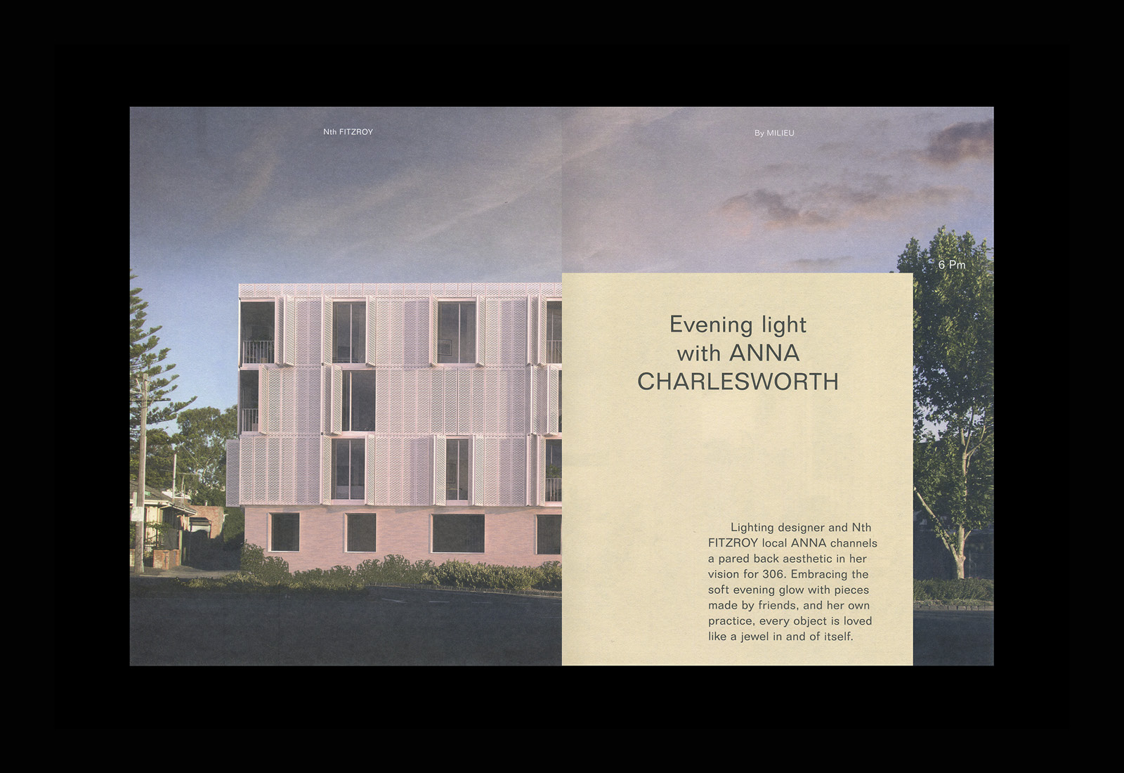
Finally, the Anna Charlseworth insert, a pastel yellow page tied to her experience as a lighting designer, plays off the interior architect Quino Holland. By placing this further into the document, and corresponding this to the evening, and within the context of her professional experience, the possibilities and richness of experience is brought to the forefront in an interesting way. Where Holland’s was naturally lit, airy and open, Charlseworth’s is cosy and intimate. The clear continuity of the space, shot in the same apartment, serves to emphasise stylistic disparity and difference, the capacity for individual expression and a multitude of experiences within one space. The colour of furnishings and choice of lighting, and the way the insert intersects the evening light and colour, again works incredibly well to connect inside and out.
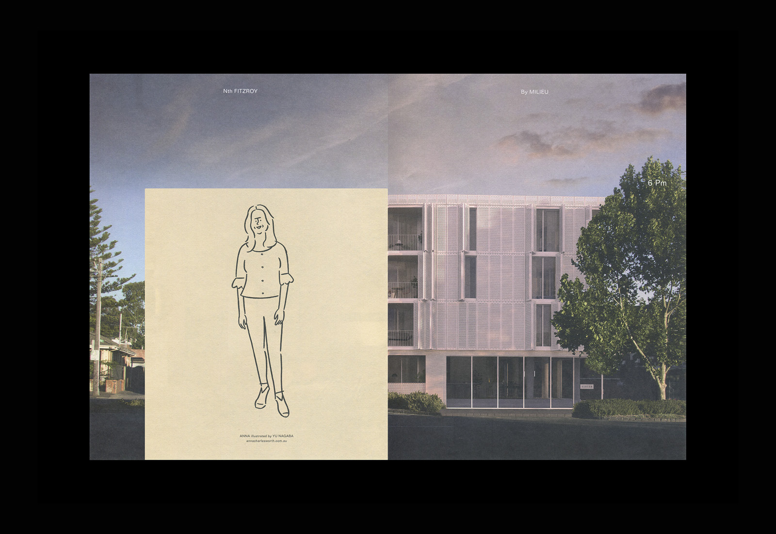
Colour is employed to great effect, weaving together time and occasion, and the external and internal life of the building. It is aesthetically beautiful and elevated by the changing proportionality of the inserts. Small details such as the way the lines of still life follow the lines of the building are thoughtful, intelligently connecting the two components in a subtle way, alongside time and occasions.
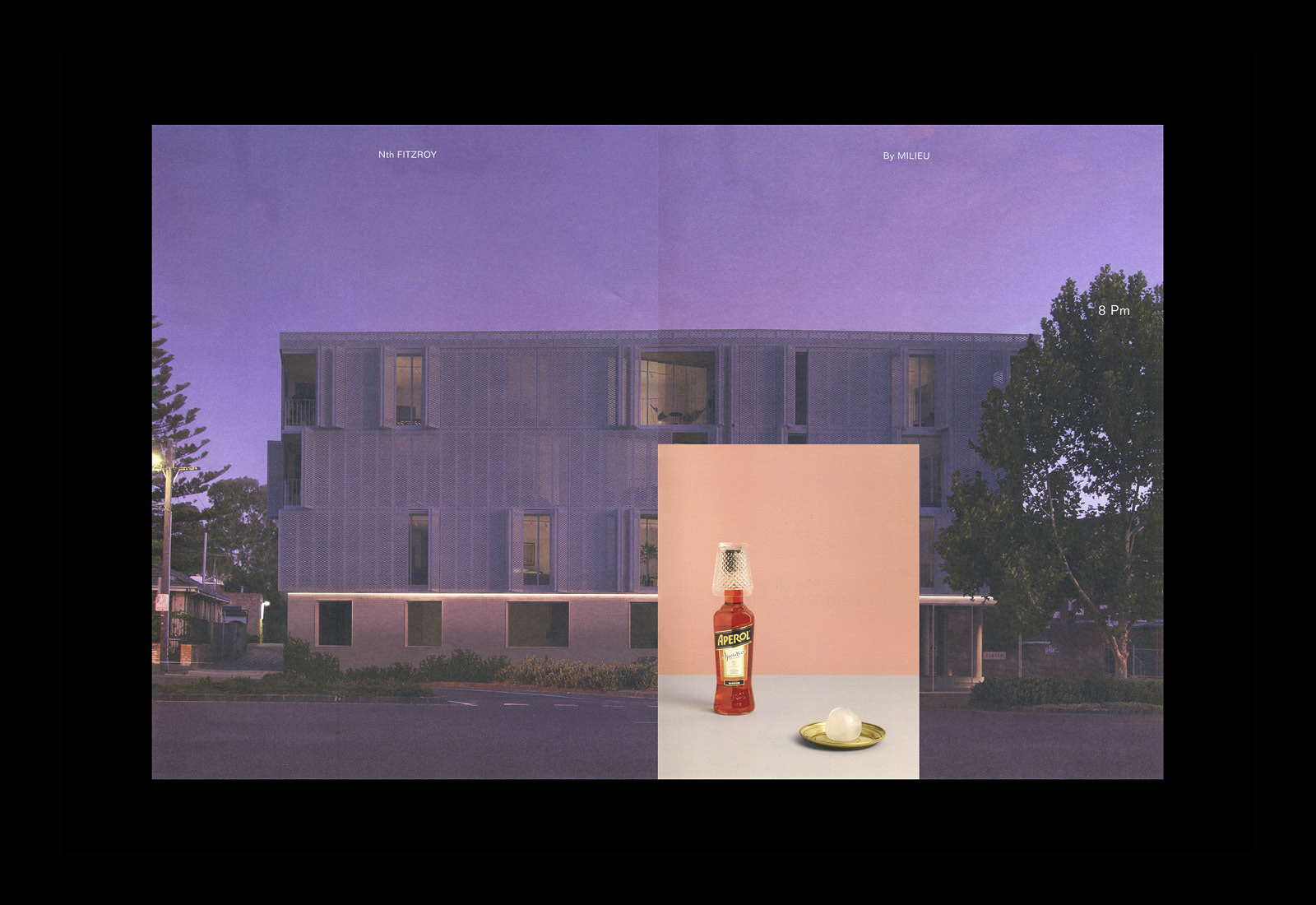
Sequential images alone, and the relationship between changing architectural structure and the surrounding environment is visually and intellectually satisfying, yet, to see this as a vehicle in which to explore the experiential and material components through words, illustration, colour and still life, is impressive. The initial disparity between the two documents is resolved through an intelligible concept and recurring themes expressed in a number of ways and comfortably moving between the literal and abstract, the visceral and intellectual. More work by Studio Hi Ho on BP&O.
Design: Studio Hi Ho. Photography: Brooke Holm. Styling: Marsha Golemac. Copy: Clare Kennedy. Renders: MR.P Studios & Large Arts. Plant Illustration: Anna Skeels. Character Illustration: Yu Nagaba. Opinion: Richard Baird.
