Zebra Dream by TCYK
Opinion by Richard Baird Posted 26 January 2018
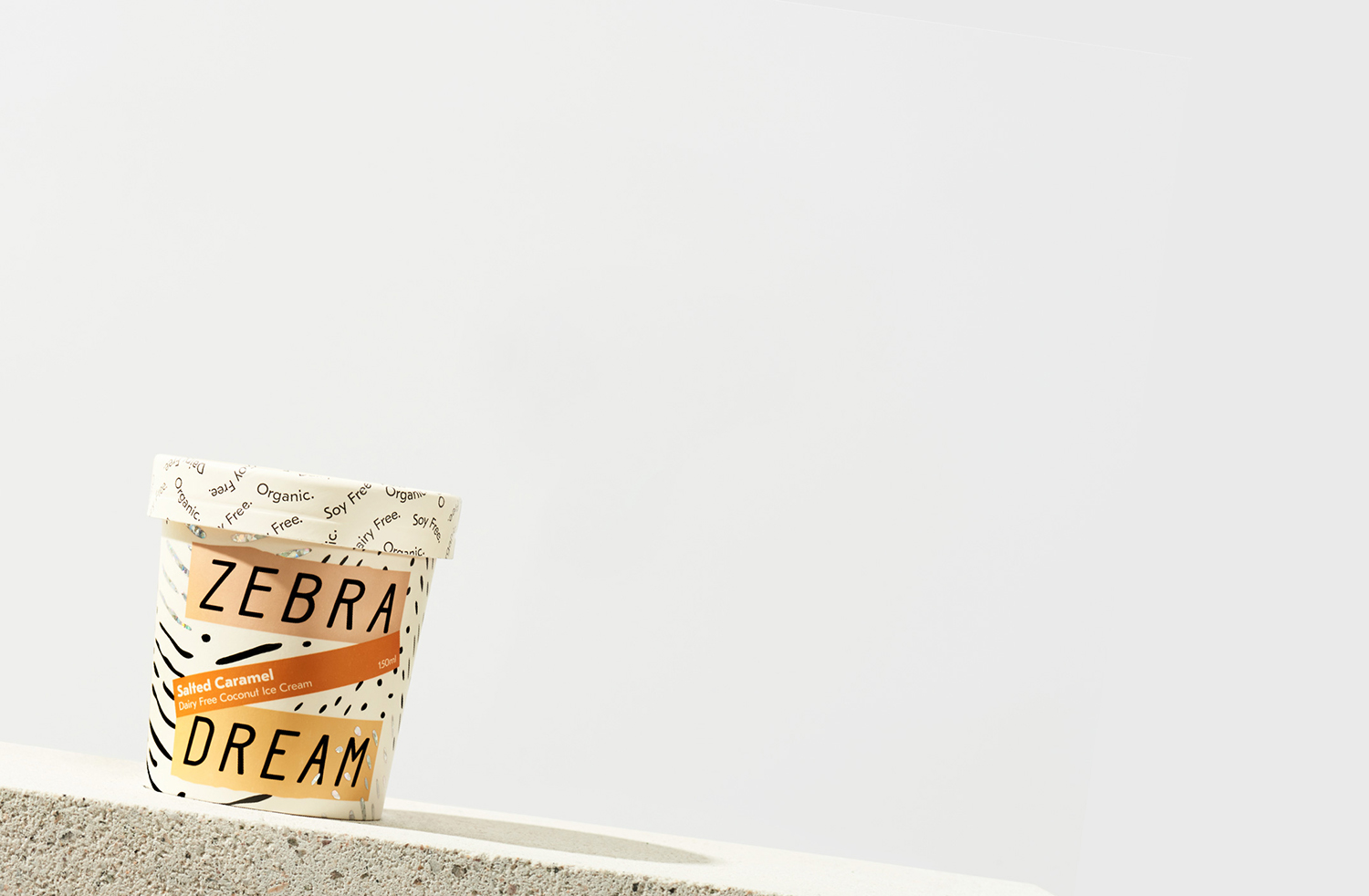
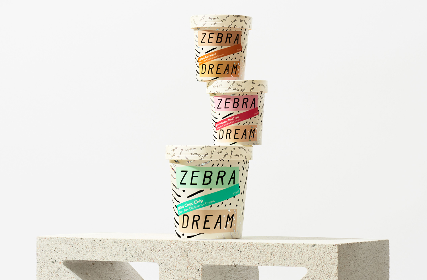
Zebra Dream is a range of organic, soy and dairy-free coconut based ice-creams made from fair-trade ingredients. With a desire to capture a larger portion of the market whilst retaining its die-hard following, Australian design studio The Company You Keep (TCYK) reimagined the brand from the ground up, redesigning Zebra Dream’s graphic identity and packaging, taking it from a dark pack with a conventional and expected zebra pattern, to a light and airy treatment with an individual character and a surprising material flourish.
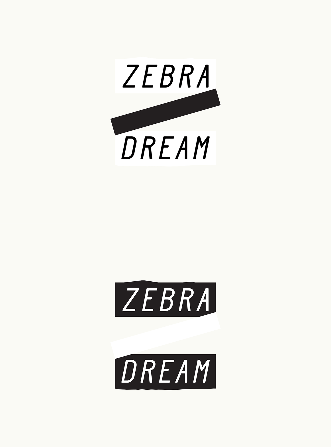
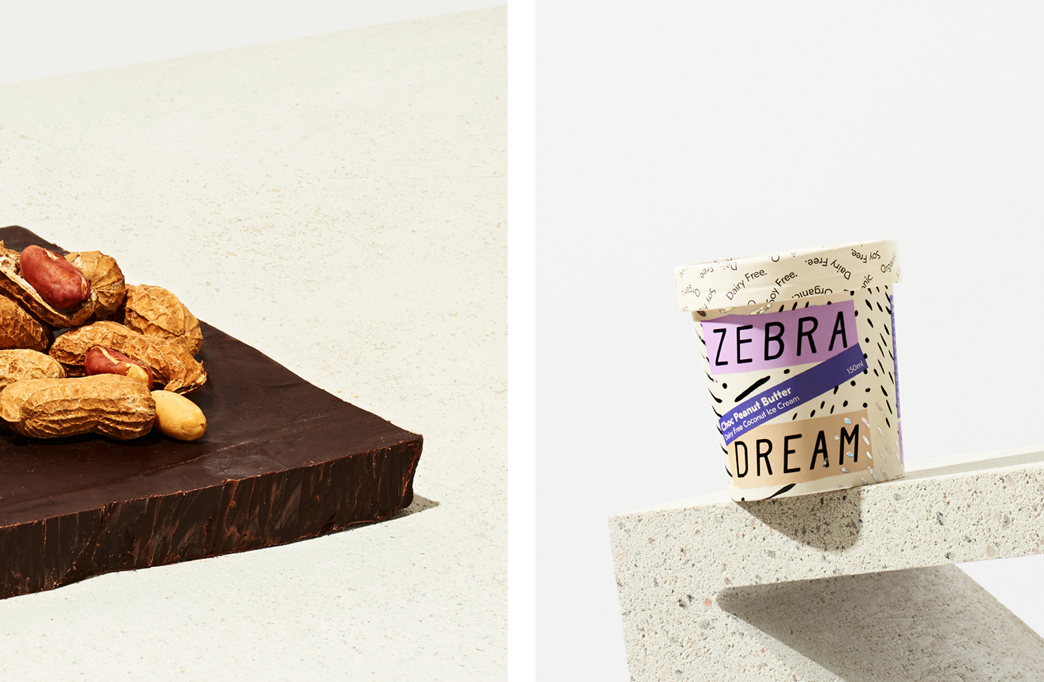
Zebra Dream’s previous packaging employed some tired conventions and blunt visual association. These included black as luxury and indulgent, literal zebra patterns as a play on the name, and a type pairing that existed somewhere between, at best, Victorian circus and, at worst, safari adventure, alongside a more recent script. While structural design remains the same—a familiar and common off-the-shelf tub and slip-on lid—TCYK’s graphic treatment is a significant departure and a far more sophisticated direction with a strategic eye on differentiation and clearer positioning.
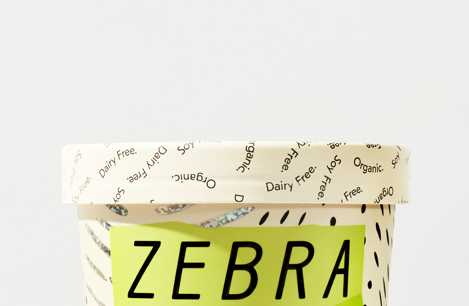
Visual texture, in conjunction with contrasting blocks of modern colour and an unexpected holographic block foil print finish, manage to resolve Zebra Dream’s lighter and healthier qualities with the indulgence of flavourful swirls, chunks and surprises. Art direction plays with something similar in the intersection of thick carmel and fresh fruit, and the texture, mixed composition and rather left-field detail of a breeze block.
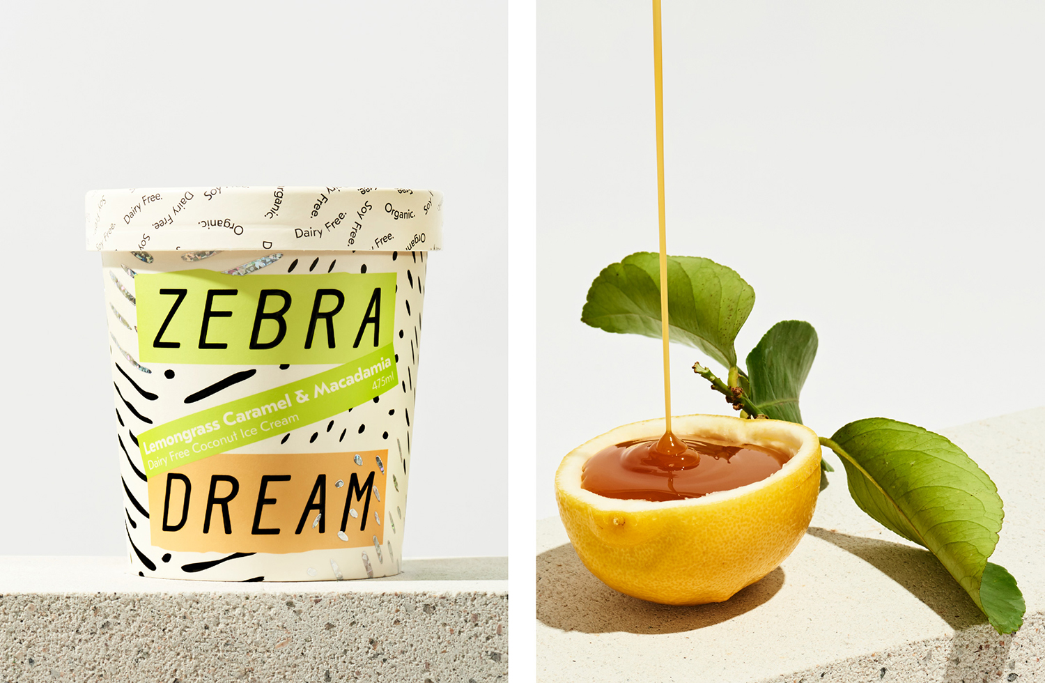
Although there is a lot of detail, the balance of irregular pattern, type as pattern, solid blocks of colour and space feel well-resolved. There is plenty of personality, moments of contrast and continuity, and some lovely touches. These include a more elegant zebra-inspired pattern. This brings together the wild-sided character implied by the name but also implying ripples of flavour or splashes of cream. The container of the wordmark, which forms a Z, effectively creates a focal point, a sense of foreground and the iconic, whilst also holding flavour variety and reinforcing this through compelling and unique colour combinations. And finally, the way organic, dairy-free and soy-free become a swirling pattern, neatly drawing a relevant aesthetic value from value statements, making these a critical part of graphic language.
As a side note, it is good to see back of pack, a complex design challenge often hidden from case studies, yet a useful tool in which to express holistic competency. Here, this is simple but considered, placing nutritional insight and other information within separate coloured boxes that make a stylistic link to the front. Pattern also serves to link the two, with a radial and rotating quality across the surface of packaging.
There also a contextual sensitivity to the work. Within the space and light of a unique LED backlit freezer, small holographic block foil details cast colour and light outwards, comparable to a glitter-ball. It is creative and playful flourish subtly worked into pattern. While it is difficult to really get a sense of how well this works, the finish interprets indulgence, surprise and special occasion in a new and unexpected way. TCYK bring a lot of character and distinction to a conventional structural design, effectively touching upon the experiential and compositional qualities of product through a cheerful graphic language, while establishing a farvmore memorable visual identity. More work by TCYK on BP&O.
Design: TCYK. Opinion: Richard Baird.
