The Best of BP&O — January 2018
Opinion by Richard Baird Posted 30 January 2018
January’s highlights included Bedow’s work for German brewery St. ERHARD, Carl Nas Associates work with illustrator Syd Brak and TangentGC, and Bond’s book Kape 24h for Scandinavian chef Kari Aihinen. There were, however, five projects that stood out, and have made it into BP&O’s Best Of Series. These typically balance a strong singular concept, or an appropriate confluence of ideas, with a compelling visual character and clear communicative intention that appropriately plays with form, colour, type and layout, as well as material, texture, image and print finish.
BP&O, in this end of month review, tries to recognise both the smart use of small budgets—those that channel spending into the most appropriate assets—and those projects with a broad and holistic quality, establishing a continuity (conceptual and/or visual) across multiple touch points.
Throughout the month BP&O also continued to expand on its collections series as another way to jump through to older posts on the site. New additions to this were Wine and Block Foiling. Updated projects during January included Commission’s packaging for Old Spike and Two Times Elliott’s graphic identity for The Dayrooms.
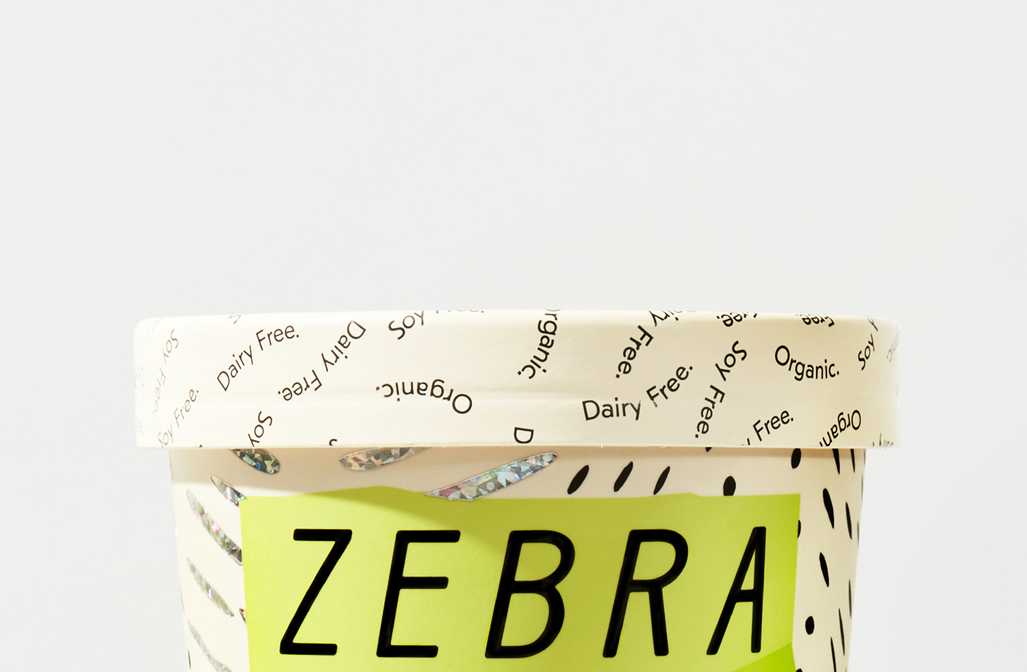
Zebra Dream by TCYK
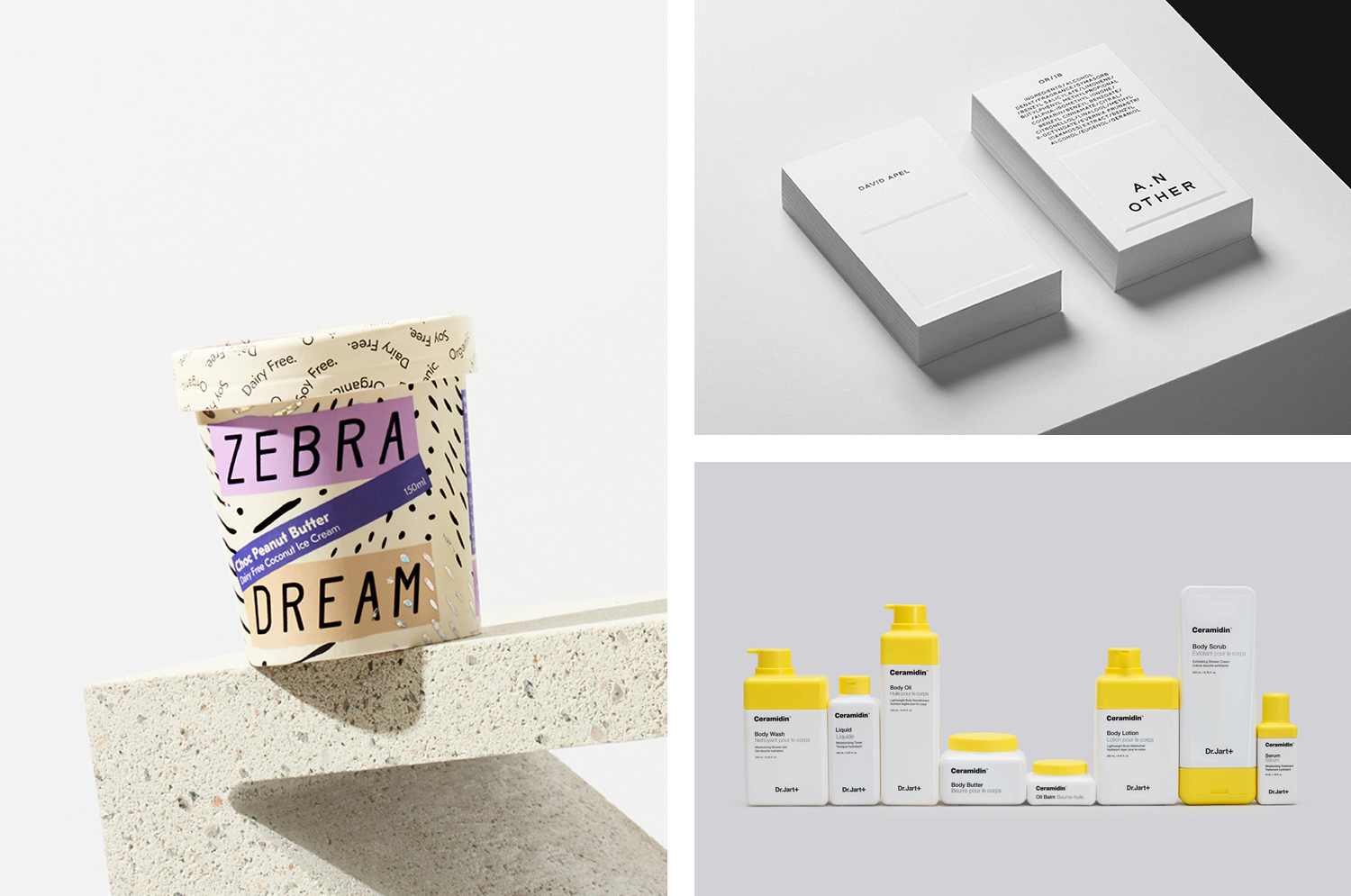
Zebra Dream is a range of organic, soy and dairy-free coconut based ice-creams made from fair-trade ingredients. With a desire to capture a larger portion of the market whilst retaining its die-hard following, Australian design studio The Company You Keep (TCYK) reimagined the brand from the ground up, redesigning Zebra Dream’s graphic identity and packaging, taking it from a dark pack with a conventional and expected zebra pattern, to a light and airy treatment with an individual character and a surprising material flourish.
See more of this project here
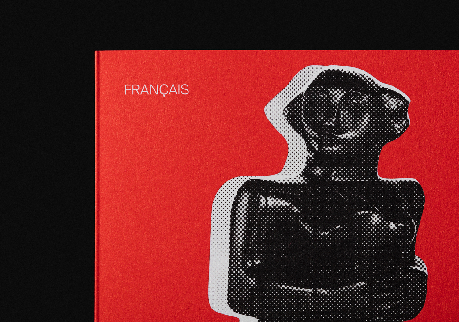
Sumer And The Modern Paradigm by Clase bcn
Sumer And The Modern Paradigm is an exhibition at Barcelona’s contemporary art gallery Fundació Joan Miró, and runs from 28th October 2017 to 21st January 2018. It intends explore and attempt to explain the influence of Mesopotamian art on modern artists, with a particular focus on the interwar period. The exhibition analyses work produced between the twenties and forties, takes a look at the documentation of Mesopotamian art that modern artists encountered and were inspired during this time, and looks to find the reasons for their fascination with the discoveries of ancient Near East artefacts. This relationship between between antiquity and modernity is expressed through the graphic identity of the exhibition, designed by Spanish studio Clase bcn, using a contrast of form and colour. This links a variety of printed communications and merchandise that included posters and flyers as well as tote bags and books.
See more of this project here
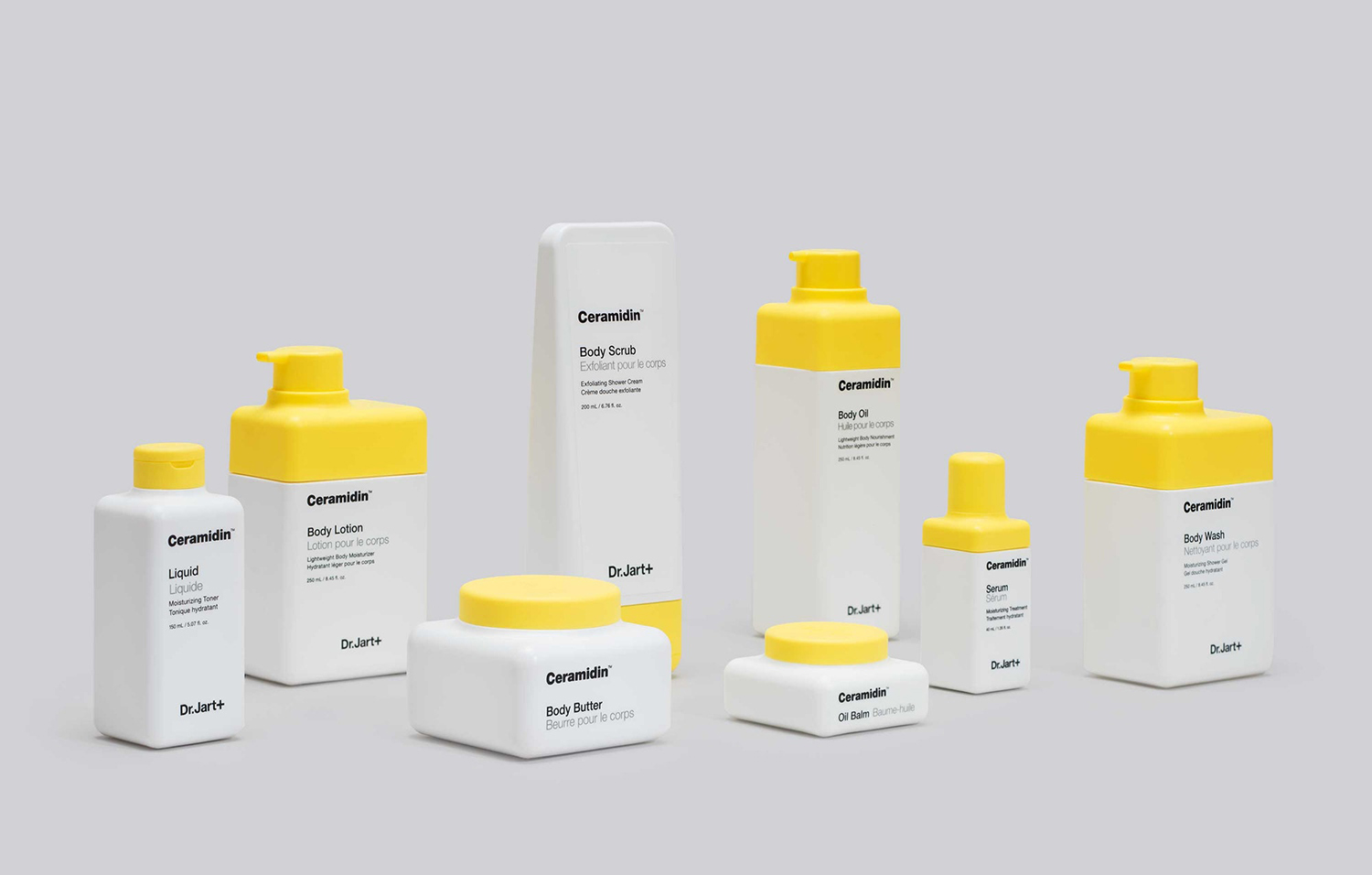
Dr Jart+ by Pentagram
Dr Jart+ is a South Korean skincare brand that formulates its various ranges to tackle specific conditions, and derives its name from the positioning phrase “Doctor Joins Art”, an articulation of the brand’s unique fusion of dermatological science and art, presumably, something along the lines of pragmatism combined with creative leaps.
The balance between the psychological and physiological components of skincare—internal feelings and external sensation, the aesthetic and the remedial—are touched upon, alongside practical considerations such as a spacial sensitivity, shelf impact and range fragmentation, in the design of Dr Jart+’s new packaging and graphic identity, developed by Pentagram’s Paula Scher and team.
The design currently links Dr Jart+’s Ceramidin creams and liquids, which were launched in South Korea during 2017 and are due to roll out internationally in 2018, but will go on to include other ranges. These will share the same form language, but will be differentiated by colour and material.
See more of this project here
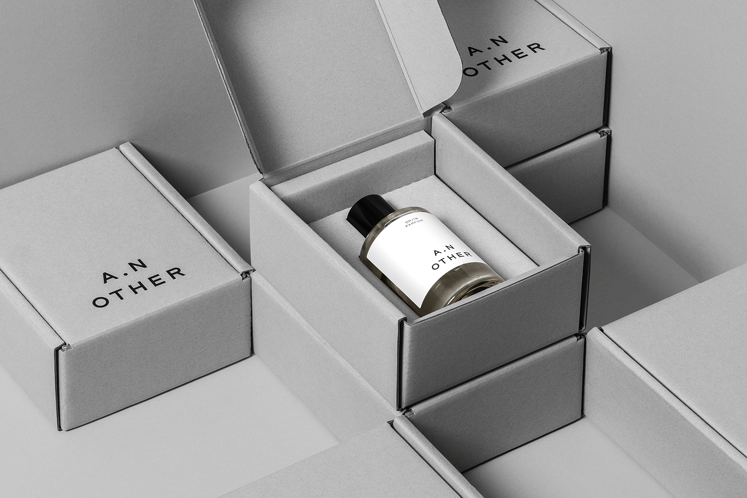
A.N Other by Socio Design
A. N Other gives its perfumers the creative room to craft limited edition, luxury and high concentration fragrances free from the pressures of consumer trends, market segmentation and budgetary constraints. These are then sold directly to consumers through its website. A.N Other places greater value on the internal composition of each of its fragrances, and the inspirations and aspirations of its creators, than the outward expression and associated expense of boutique spaces, lavish adverts, glossy magazine coverage and celebrity endorsements. This direct to consumer approach and a focus on ingredient quality, concentration and sustainability, as well as perfumer and fragrance story, is distilled down and projected by graphic identity, developed by Socio Design, initially online through website, and continuing into packaging. These are linked by naming and strategy, and by details that include bespoke typeface and logotype, brand imagery and copywriting, also created by Socio Design.
See more of this project here
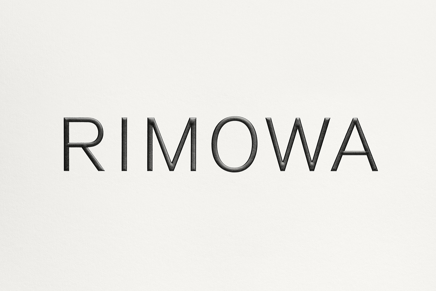
Rimowa by Commission
Rimowa, an abbreviation and then compound of founder Richard Morszeck Warenzeichen name, is a Cologne based manufacturer of luxury luggage. It has a significant history, beginning in 1898 as a travel and leather goods maker known for its innovative approach, and growing to become an international brand with a distinctive line of polycarbonate and aluminium products.
Rimowa’s first fully aluminium designs were created following a fire in 1937. This destroyed all the materials except for the metal, and led to the development of durable and light weight aluminium product which is now complimented by an equally light weight and durable range constructed from polycarbonate. Both feature Rimowa’s distinctive ribbed relief across their surfaces.
To help reaffirm Rimowa’s position as a global leader and celebrate its 120th year, Commission worked with Chief Executive Alexandre Arnault and Chief Brand Officer Hector Muelas to develop a new “timeless” and “stylish” graphic identity to support future activities and deliver a considered and cohesive brand experience for Rimowa customers.
Commission introduce a monogram, new typographic style, colour palette and pattern motif to the workmark designed by Munich-based Bureau Borsche. And through graphic identity, material language and mechanism link a variety of touch points. These include packaging, retail experience and in-luggage items, as well as giftboxes, retail bags, owner manuals, guarantee cards, luggage tags, dust bags and liquids bags.
See more of this project here

