Tale London by Two Times Elliott
Opinion by Richard Baird Posted 12 February 2018

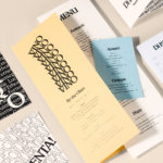
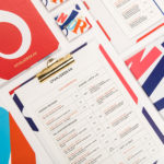
Tale London creates photorealistic renderings for both interior design and architectural clients across a diverse range of projects, from the traditional and rich to the modern and simple. Their sensitivity to both exterior structure and interior materiality, as well as associated considerations and a stylistic breadth is expressed by Tale London’s visual identity, designed by Two Times Elliott, in the graphic and the material, the way the two intersect and a system that affords Tale London a visual variety across different channels of communication.
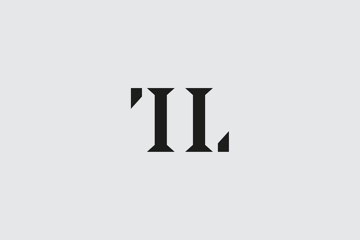
Tale London creates photorealistic visualisations for architects and interior designers. Graphic identity touches upon each, finding a way to resolve the two in a distinct and discernible way and reflect some of their respective considerations in a simple and concise manner.
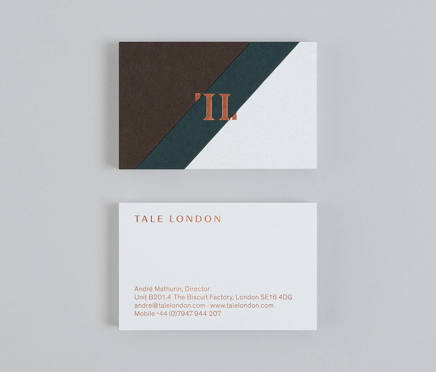
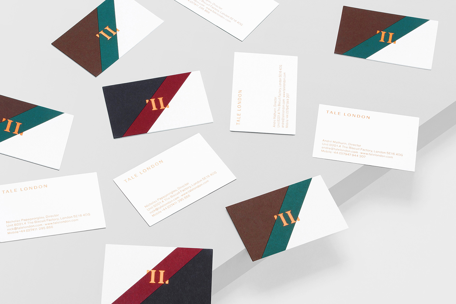
Colour is perhaps the most distinct and pronounced expression. It leans into the furnishing of interior with colour and texture and links these with a diagonal device, a systematic way to bridge the material variety employed between vastly different projects, and a tool for adjusting visual tone whilst remaining cohesive.
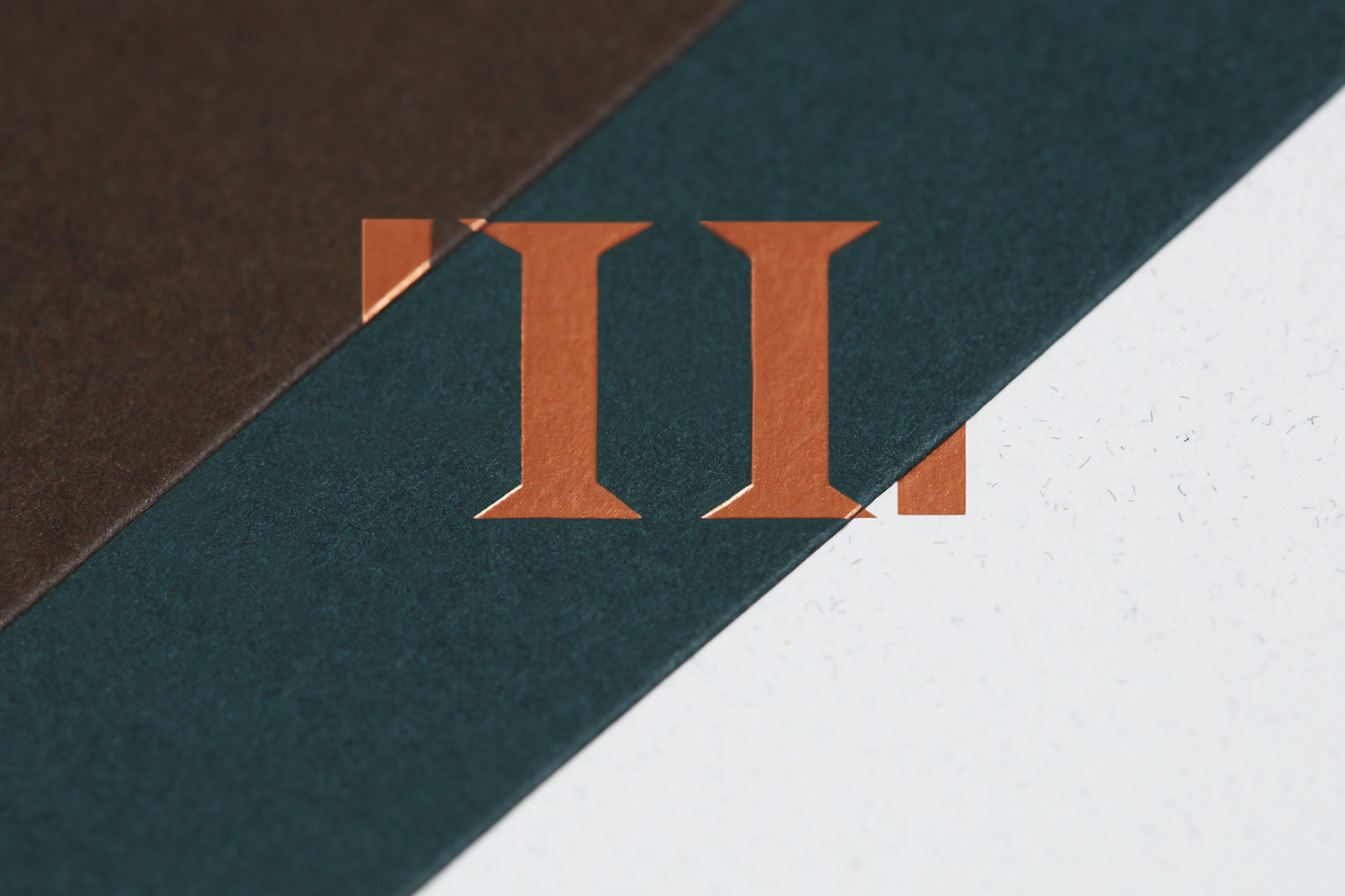
The diagonal also functions as an architectural motif, one rooted in structure and stability, and brought out further in the build of the monogram in its interplay of reductive form, positive and negative balance and the robustness of two central columns. The monogram has a satisfying duality to it, with an element of ying and yang, interior and exterior to it. It is simple yet distinctive and serves as an anchor at the centre of a colour, material and image variety.
Type has a similar duality to it. The calligraphic high contrast strokes of Beausite and the technical and monolinear lines and forms of Theinhardt speak of craft and technical insight. Both have a lightness and sensitivity to space and arrangement that creates an element of continuity.
Different boards, dyed and mixed fibre, the use of paper marquetry to unifiy them and the design craft that sees a very neat intersection of paper and print finish, is a useful material metaphor, an articulation of a very real sensitivity to the material, particularly when the work is digitally generated.
The result initially appears simplistic, yet this belies a variety of interesting considerations and a system that can accommodate a variety of visual expressions, each affording Tale London a tonal variety, from the modern and architectural, to the ornamental and traditional. More work by Two Times Elliott on BP&O.
Design: Two Times Elliott. Opinion: Richard Baird. Fonts Used: Beausite & Theinhardt.
