Designed by Two Times Elliott

Hello Klean by Two Times Elliott
Beauty is, of course, in the eye of the beholder, but there’s no denying that objectively, its branding and identity design has undergone some huge changes over the past decade or so. Gone are the days of faux-luxurious designs that were all about swathes of abstract silk; women coiffured to within an inch of their life; a microscopic lens on...
Compound by DesignStudio
What does ‘healthcare’ look like today, especially when we’re increasingly talking about preventative treatment? For Parsley Health and GlycanAge, which promote functional medicine, it’s serene – all blush pink, forest green and rounded corners; for Modern Age, which focuses on longevity, it’s more clinical, with high-resolution botanical imagery and classical icons; Ezra, which offers full-body MRIs as cancer prevention, goes...
PAIST by Two Times Elliott
Toothpaste hasn’t historically needed to do a lot, design-wise: it’s a category based on functionality and efficacy, over trends and aesthetics – sensitive teeth, whitening processes, goth-adjacent charcoal formulas, weird little crystals, and so on and so forth. That function over form thing has meant that over the years, toothpaste packaging has become incredibly monotonous – usually a predominantly white,...
Kettle Kids by Two Times Elliott
The once laudable claim to have started a thriving business with ‘a small loan’ from a doting family member may have been muddied beyond recognition by the truth-stretching of serial tax-offender and part-time Presidential candidate Donald Trump. Despite this, turning ‘one thousand pounds from nan’ into a luxury watch and diamond dealership with a sparkling flagship store in Mayfair remains...
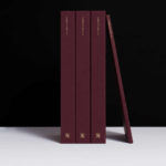
Christopher Hall Somata Collection by Two Times Elliott
Christopher Hall is an internationally renowned furniture and interior designer from New Zealand with studios in London and Istanbul, with a third due to open in Barcelona soon. His interiors and bespoke furniture collections are characterised by a sensitive integration of the classical and the contemporary, a material refinement and sculptural elegance. Somata, his latest collection of 32 handcrafted pieces, is an...

Tale London by Two Times Elliott
Tale London creates photorealistic renderings for both interior design and architectural clients across a diverse range of projects, from the traditional and rich to the modern and simple. Their sensitivity to both exterior structure and interior materiality, as well as associated considerations and a stylistic breadth is expressed by Tale London’s visual identity, designed by Two Times Elliott, in the graphic...

2LG Studio by Two Times Elliott
2LG is an award-winning London-based interior design studio, offering residential and commercial interior design, styling and consultation services, founded by creative duo Jordan Cluroe and Russell Whitehead. The studio’s work is characterised by a use of signature colour, high quality material texture and moments of significant contrast, and emerges from a process rooted in creative partnership and a sensitivity to both...

Disrepute by Two Times Elliott
Disrepute is a members-only bar, located in London’s Soho, described by Two Times Elliott, the design studio behind its brand identity, as having a heritage of “establishment and scandal”. The bar features a rich interior design of high quality material detail that elegantly plays with shape, pattern and symmetry, solid colour and texture, the geometric and the organic. There is...

The Dayrooms by Two Times Elliott
The Dayrooms is a multi-label womenswear store, located in the London district of Notting Hill, created by Aytan Mehdiyeva and Zumrud Mammadova. The store gives a UK platform to emerging Australian designers and is an expression of Aytan and Zumrud’s shared passion for fashion and travel, and Aytan’s love of photography, textiles and Australian craftsmanship. This is reflected throughout The Dayroom’s graphic identity, developed by Two Times...
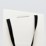
Wadha by Two Times Elliott
Wadha is a Islamic fashion brand for women, established in 2010 in the city of Doha, Qatar, by Wadha Al Hajri. Garments by Wadha are characterised by unique fabrics and cuts, contemporary, clean and slightly irregular shapes, and single colour. This aesthetic is reflected throughout Wadha’s brand identity, designed by British graphic design studio Two Times Elliott, not only in typographic form and...

MDD9 by Two Times Elliott
MDD9 is a Hong Kong and London based multidisciplinary architectural and interior design studio, founded in 2009, that is engaged in a variety of building and construction projects that include new developments and renovations, urban planning, lighting, landscape and acoustic design. The studio’s visual identity, developed by Two Times Elliott, reflects the “dynamic outlook” of the individual architects as well...