V&A Exhibition Road Quarter by dn&co
Opinion by Richard Baird Posted 19 February 2018
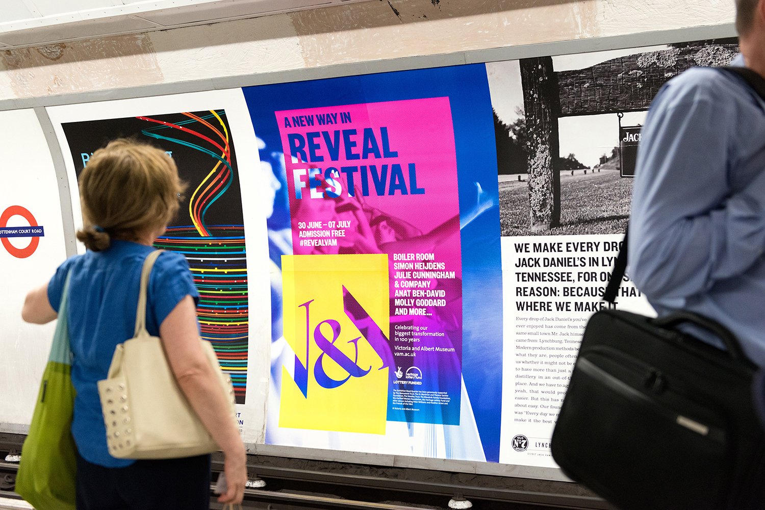
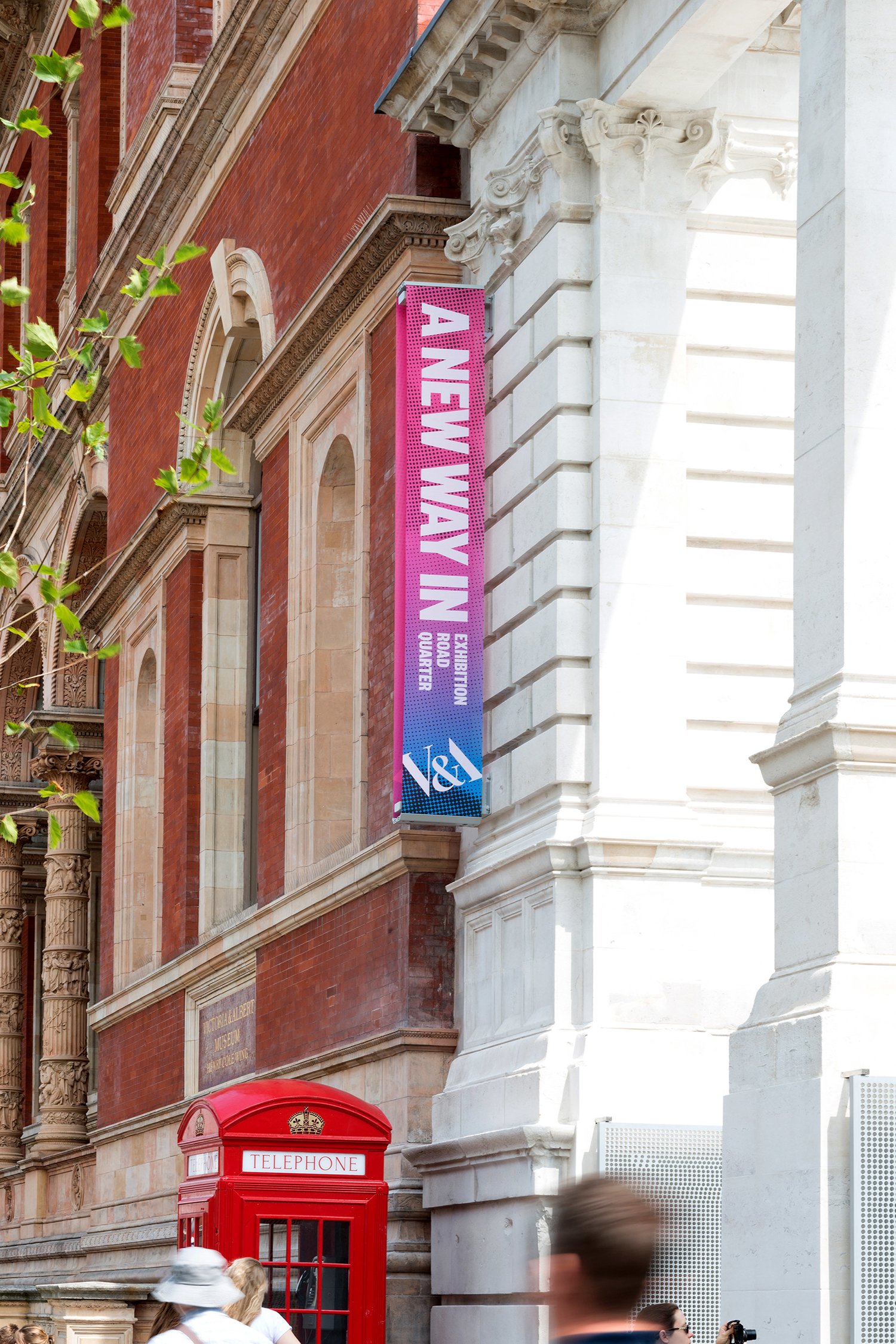
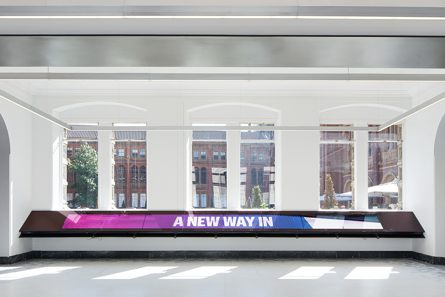
Exhibition Road Quarter is a new gallery built under and an extension of The Victoria and Albert Museum, London, the world’s largest museum of decorative arts and design. Although the V&A is known for its commitment to innovation its spaces within an early twentieth century Grade 1 listed building set limitations, with temporary retro-fitted interiors proving to be cramped and inflexible. Without the possibility of outward expansion, the V&A explored the subterranean, embracing innovation in architecture and engineering to create new modern spaces with greater scale and opportunity beneath. To celebrate the distinctive structure created by AL_A, and to tease and then announce the grand opening design studio dn&co. worked with the V&A to develop a campaign of posters and banners. These were unified by the line “A New Way In” and were based around the concept of concealing and then revealing through layers.
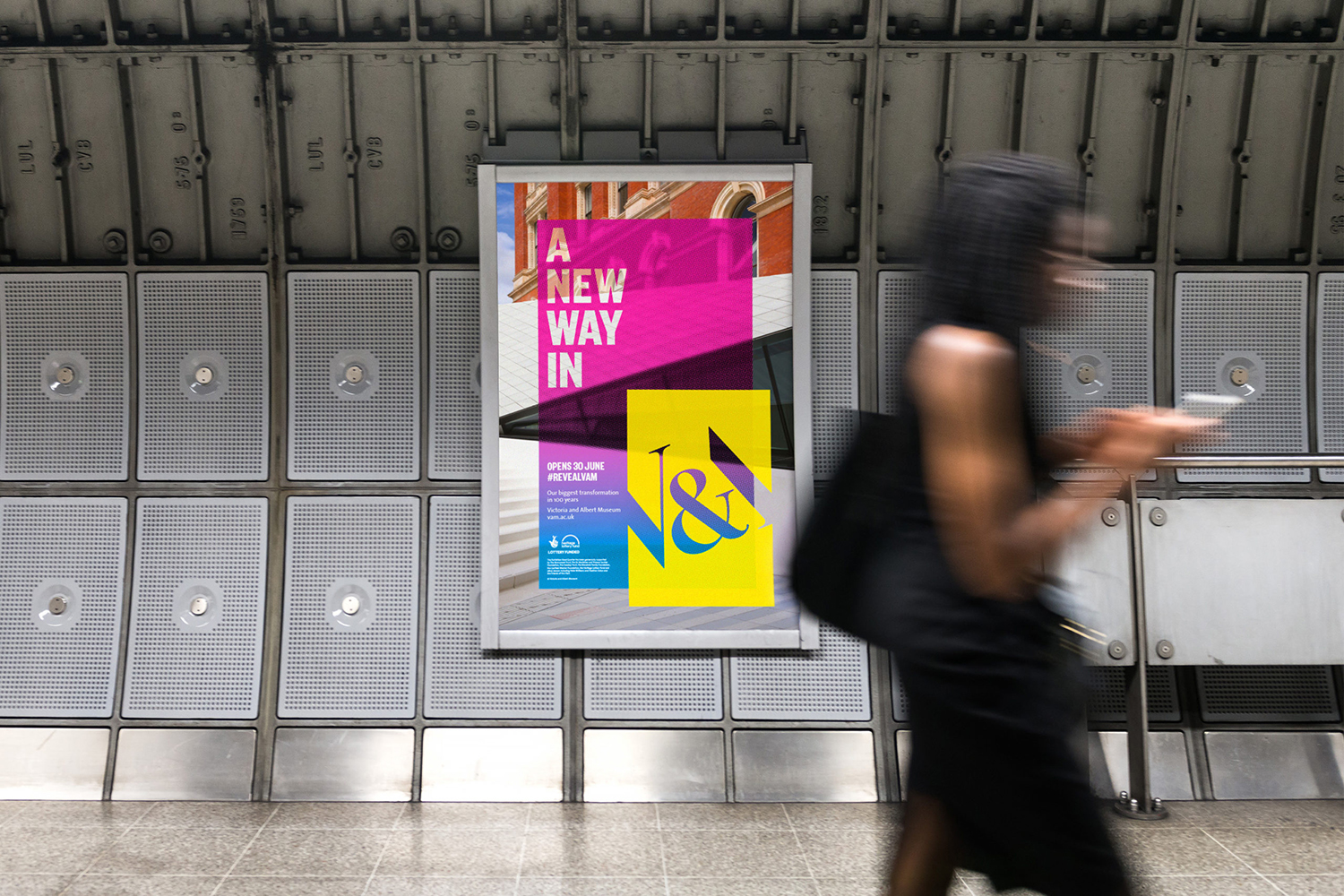
Although the inside of the museum confidently curated the past, present and future of art and design the building spoke of the immovable and period. It also had the (in)flexibility to match. Exhibition Road Quarter is the V&A’s biggest transformation in 100 years. It looks, feels and functions quite differently. dn&co.’s campaign captures this spirit of newness in a few different ways whilst also tying it clearly to the legacy of the museum. This initially comes through in the interplay and opposition of bright colour and geometric form alongside the period flourishes of architecture and monogram. Subtle considerations such as the angle of the V&A and the silhouette and lines of the new entrance play with commonality and critical relationships.
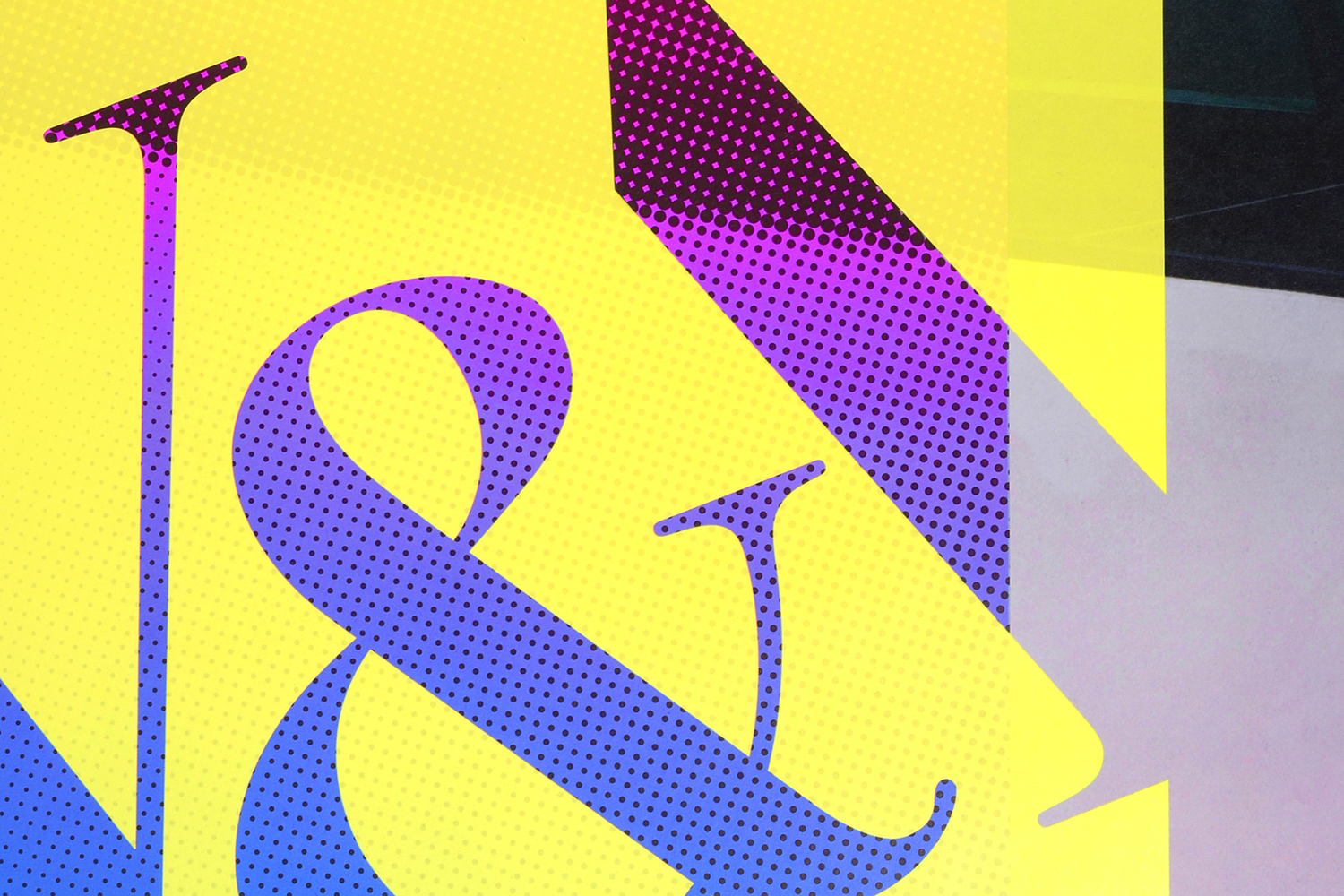
There are a few different elements that make up the campaign, details that speak of the museum’s evolving identity and innovative positioning but never at the expense of its world-renowned heritage.
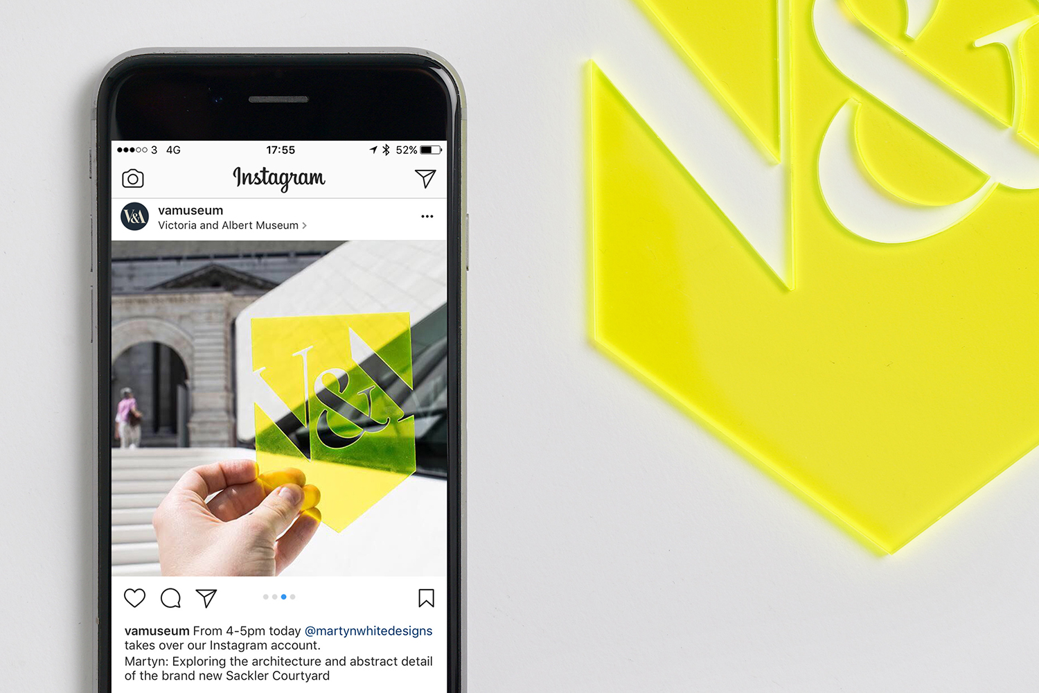
The layers motif functions well to hold together a number of interesting ideas. The initial impression is in the immediacy of colour. Nothing really speaks of now more than bright spot colours well-handled and deployed strategically within a grey urban environment. Transparency serves as a way to connect, alongside form, both the old and new structures.
London’s enduring relationship with building underground, the way campaign proliferates The Underground and the new subterranean exhibition space is a satisfying parallelism.

Layering and sequence serve as a smart visual language. The tight cropping of structure, the eventual widening of angle and the slow removal of layers between posters over a period of time work well to imply a countdown. It is not explicit, rather inferred, with a contextual sensitivity that considers routes into the city as a way to connect different and posters and establish some form of story. It is a great opportunity to play with both continuity and change over time.
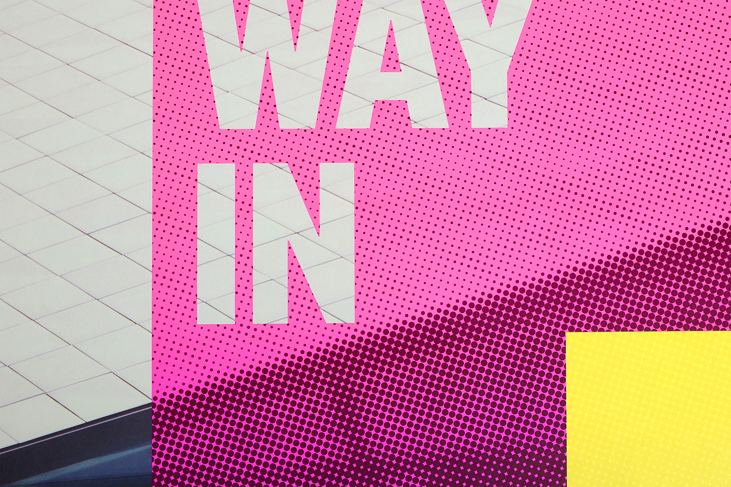
Banners also manage to invoke their own visual language in the juxtaposition between cheerful modern colour and enduring stone architecture, the relationship between the halftone effect and the holes of the gates to the museum, and a beautiful use of size and proportionality to imply and place emphasis on the theme of space. This suggestion of space also permeates some of the final posters in the arrangement of type, placing it into corners.
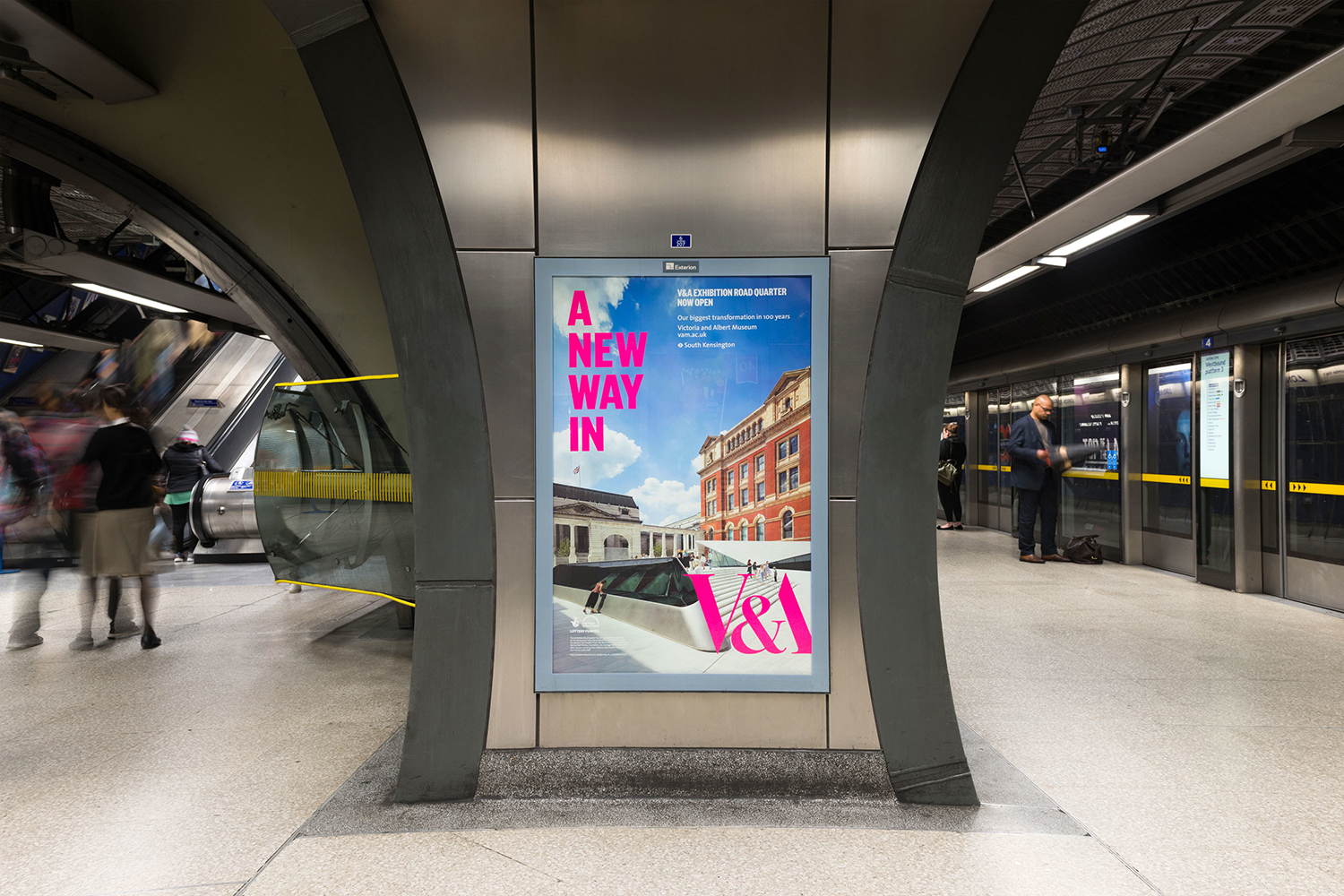
Much like transparency, the cutting of type through solid blocks serves to connect old and new. And working with small details like the angle, size and recognition of the V&A monogram, the halftone effect and the standard paper-like proportionality of the colour blocks, lend the campaign a more traditional material quality where colour feels modern and screen-based, essentially creating two points on a broad spectrum that feels fitting for the museum, and the art and design it contains. More from dn&co. on BP&O.
Design: dn&co. Opinion: Richard Baird. Fonts Used: TBC.
