BP&O Collections — Inserts
Opinion by Richard Baird Posted 23 February 2018
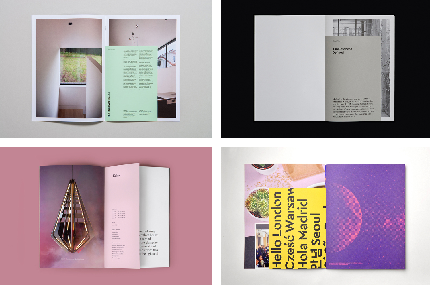
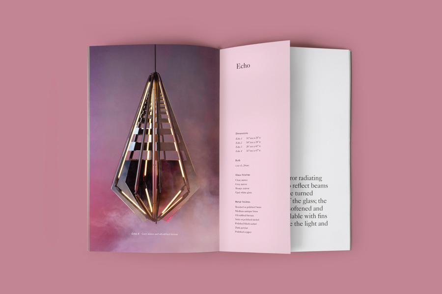
A continually updated gallery of graphic identity design work, reviewed and published on BP&O, that feature an insert component. Where inserts have traditionally sat loosely within newspapers and magazines, quite separate from content and often adverts, the examples here are bound in and characterised by a proportional difference, either smaller than the cover, punctuating content in size, colour and content, or oversized, protruding from cover, teasing content. Their intentions vary, some simply divide content and signal change, others augment image with technical insight, or build layers, juxtaposing image to emphasis or bring new meaning.
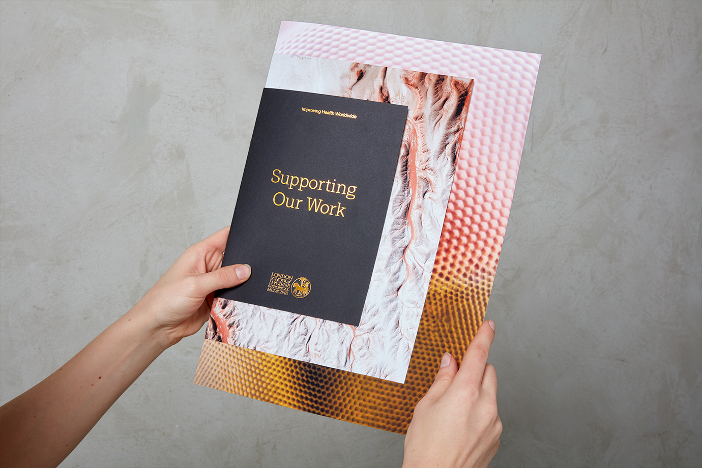
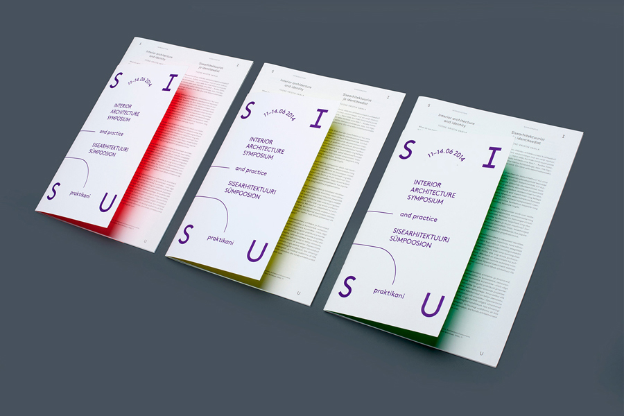
This post features work by Kurppa Hosk, Multiadaptor and Richards Partners, and covers a variety of projects, from architecture and property development to university prospectus’ and exhibitions. Highlights include AKU’s use of fluorescent colour reflected onto oversized inserts, the oversized portfolio-like cover of Studio Hi Ho’s brochure for Whitlam Place, and the layering and contrast employed by Spy for their work with London School of Hygiene & Tropical Medicine.
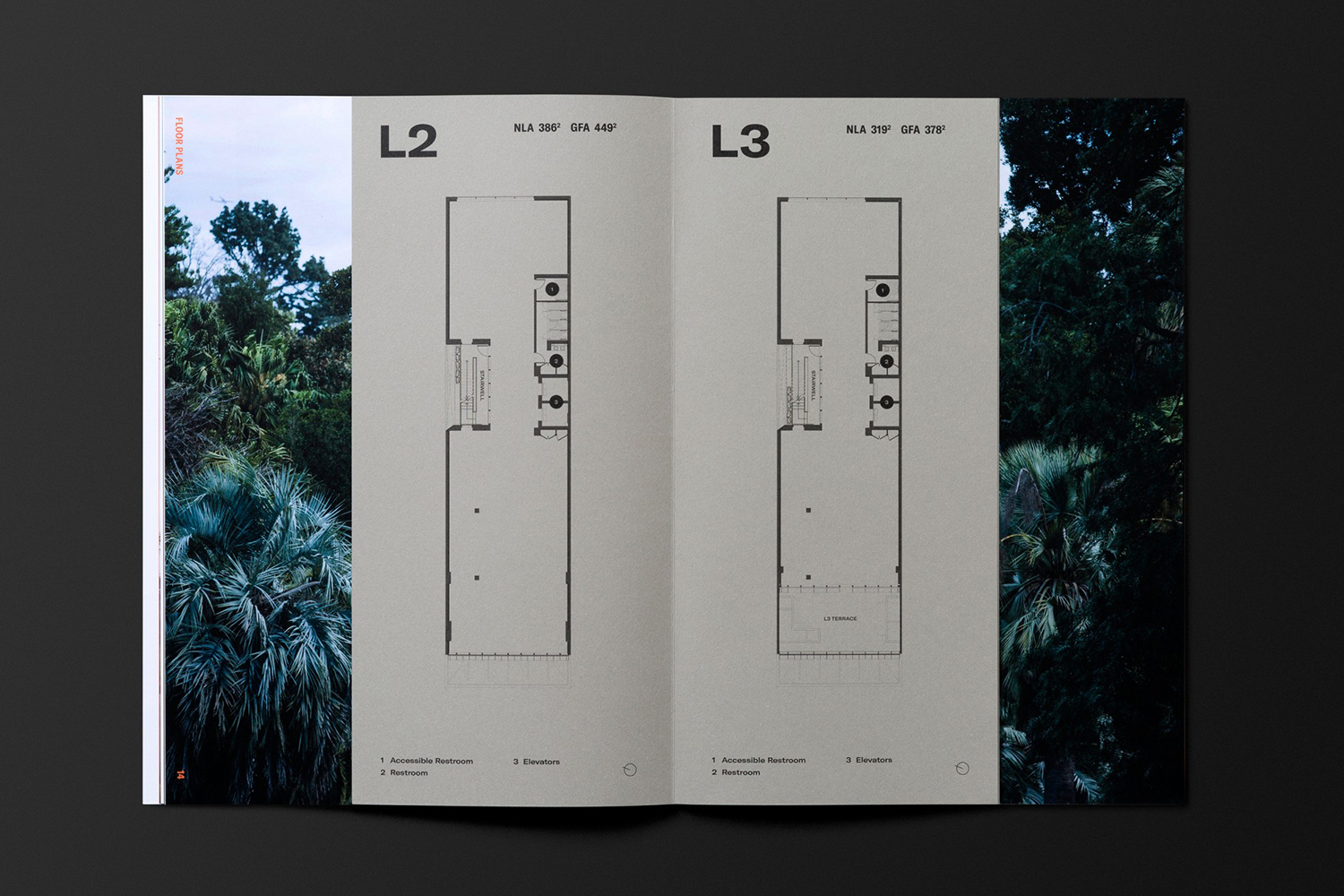
OneFourFive Clarendon by Studio Brave, Australia
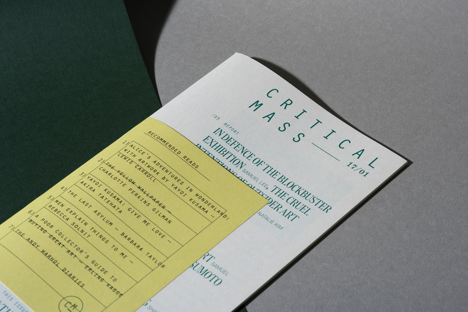
Critical Mass by Foreign Policy, Singapore
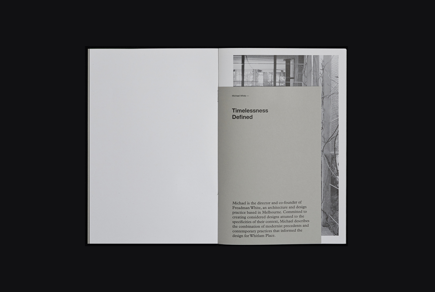
Whitlam Place by Studio Hi Ho, New Zealand
Morris+Company by Bob Design, United Kingdom
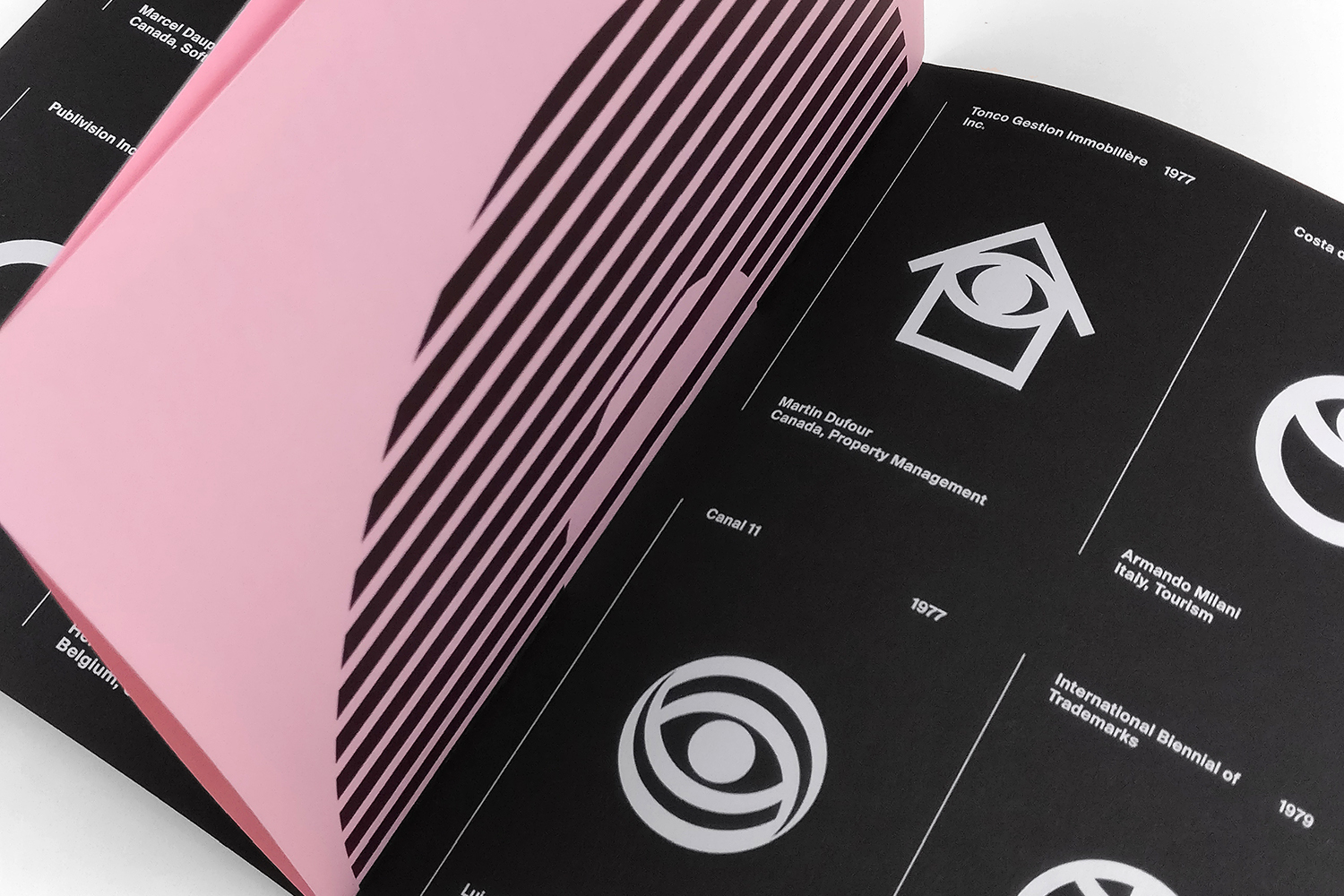
LogoArchive Issue 2 by BP&O, United Kingdom
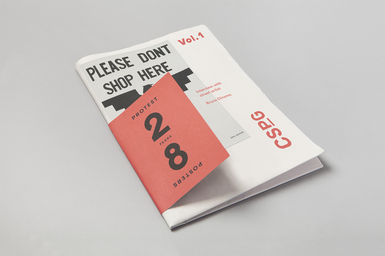
Centre for the Study of Political Graphics by Blok, Canada
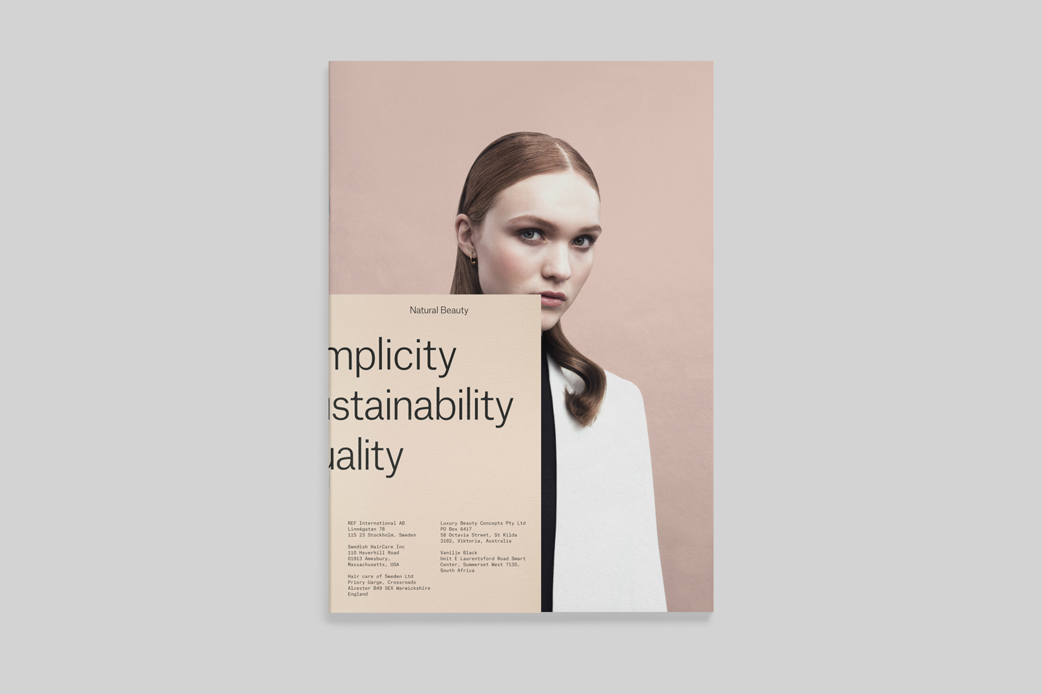
REF by Kurppa Hosk, Sweden
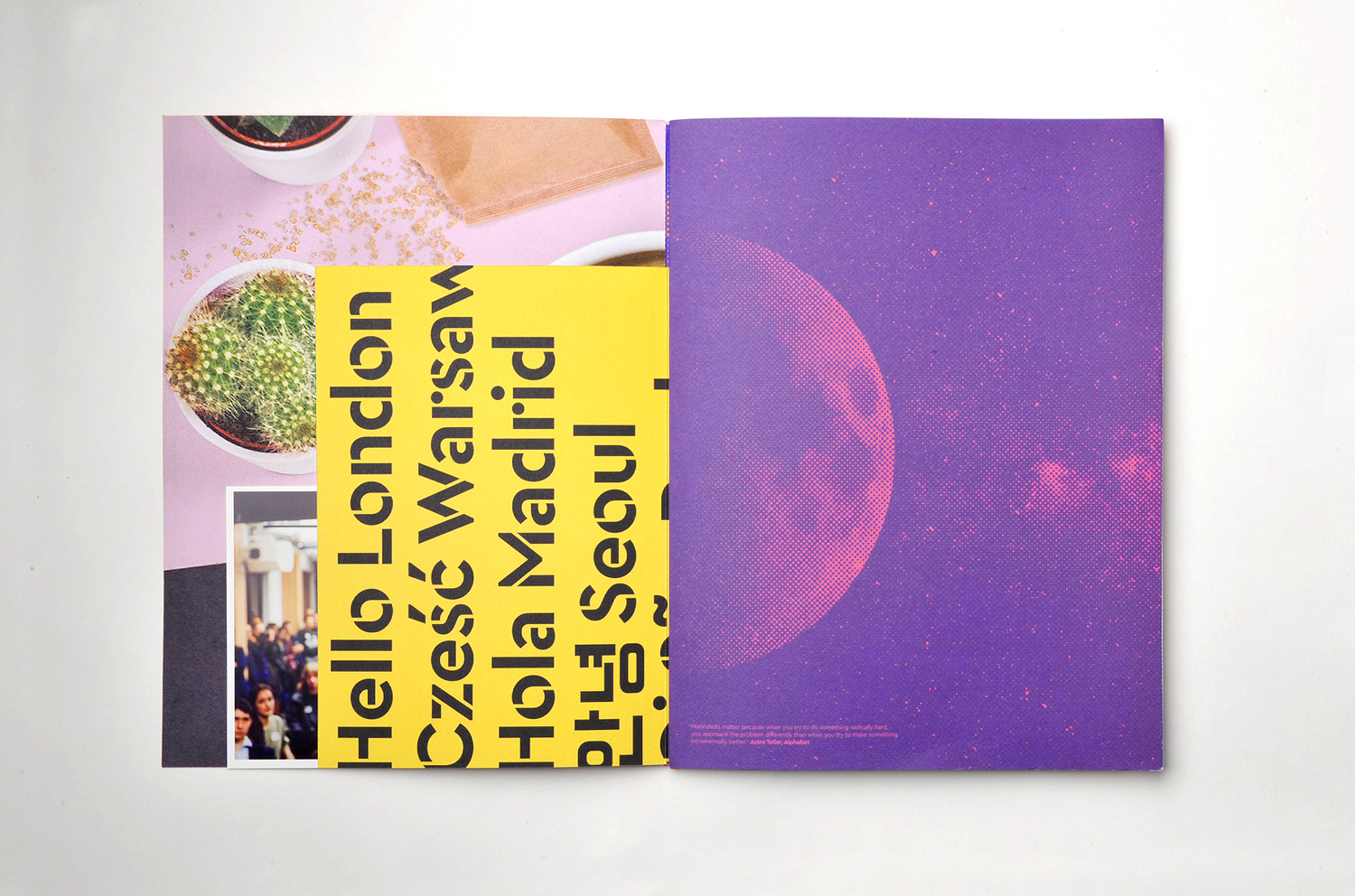
London School of Hygiene & Tropical Medicine by Spy, UK
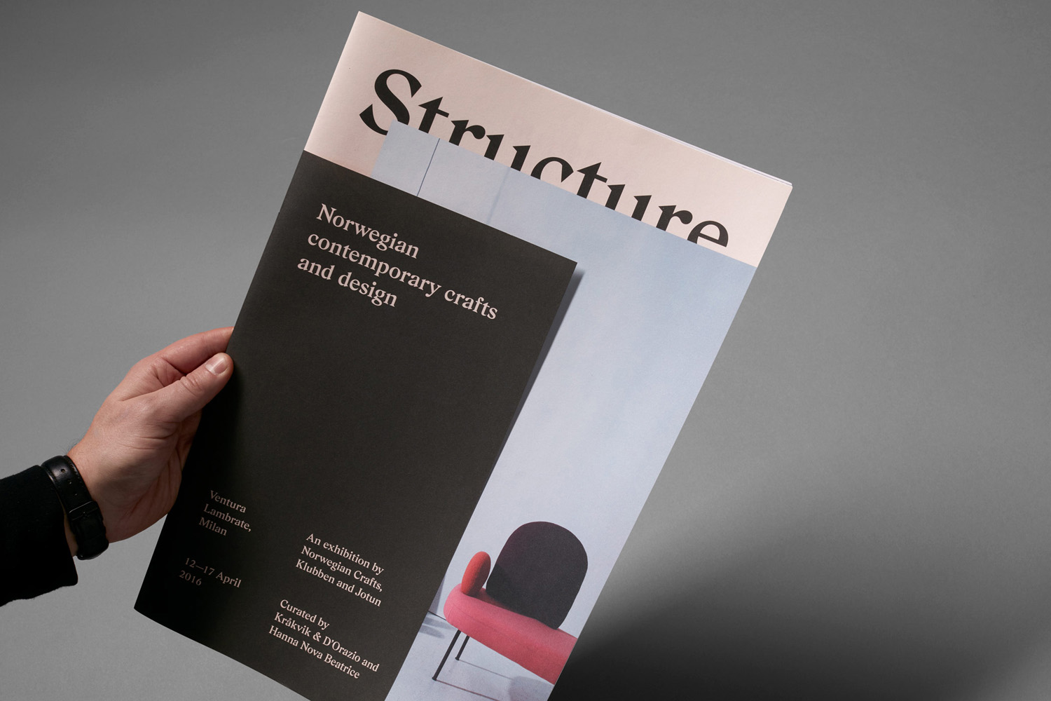
Norwegian Structure by Bielke&Yang, Norway
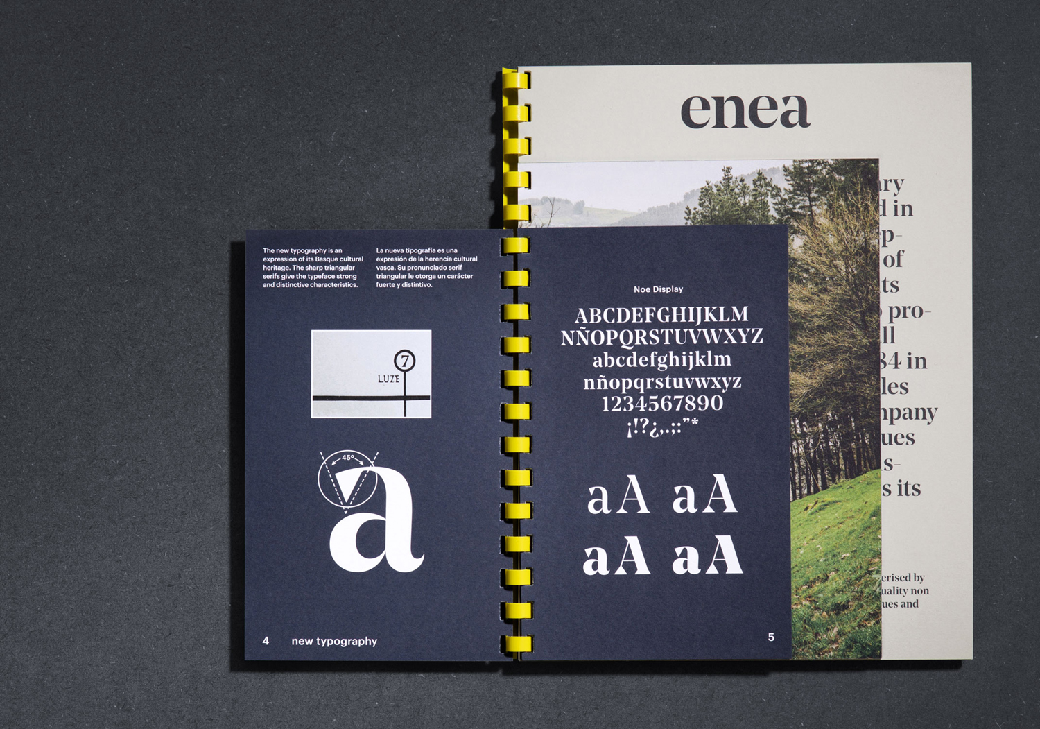
Enea by Close bcn, Spain
Campus by Multiadaptor, United Kingdom
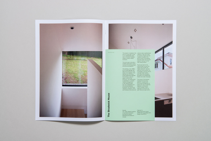
Space Division by In house, New Zealand
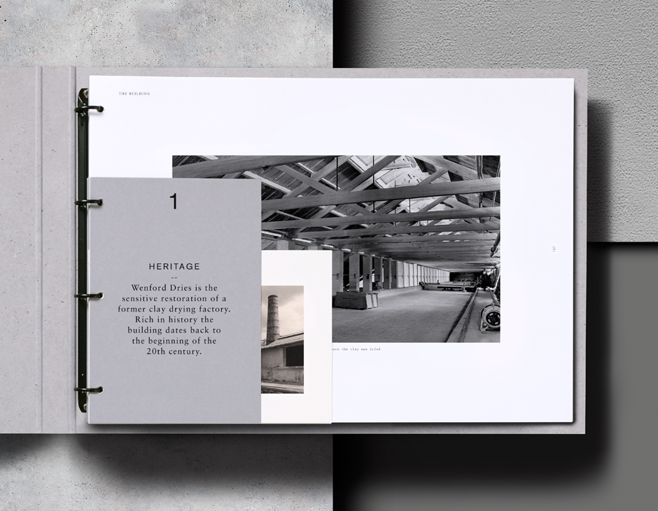
Wenford Dries by ico Design, United Kingdom
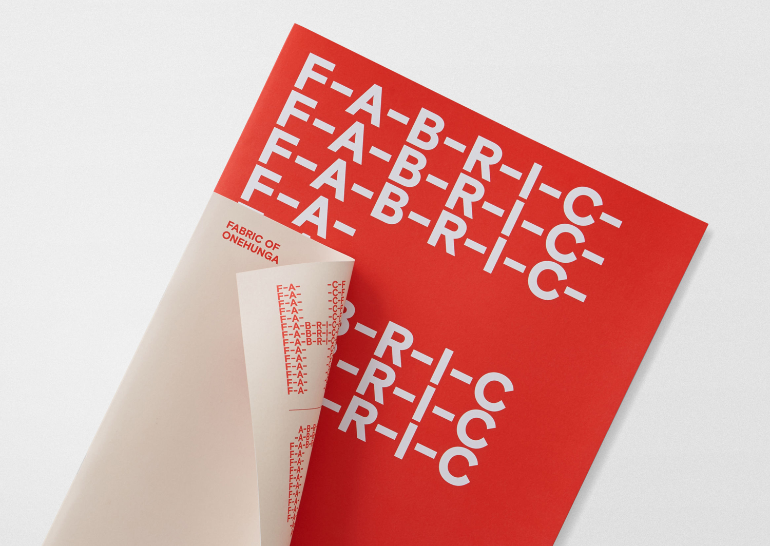
Fabric of Onehunga by Richards Partners, New Zealand
Bec Brittain by Lotta Nieminen, United States
Interior Architecture Symposium by AKU, Estonia
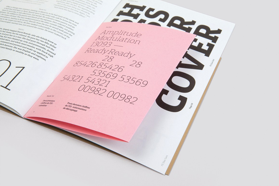
FS Silas by Believe In, United Kingdom
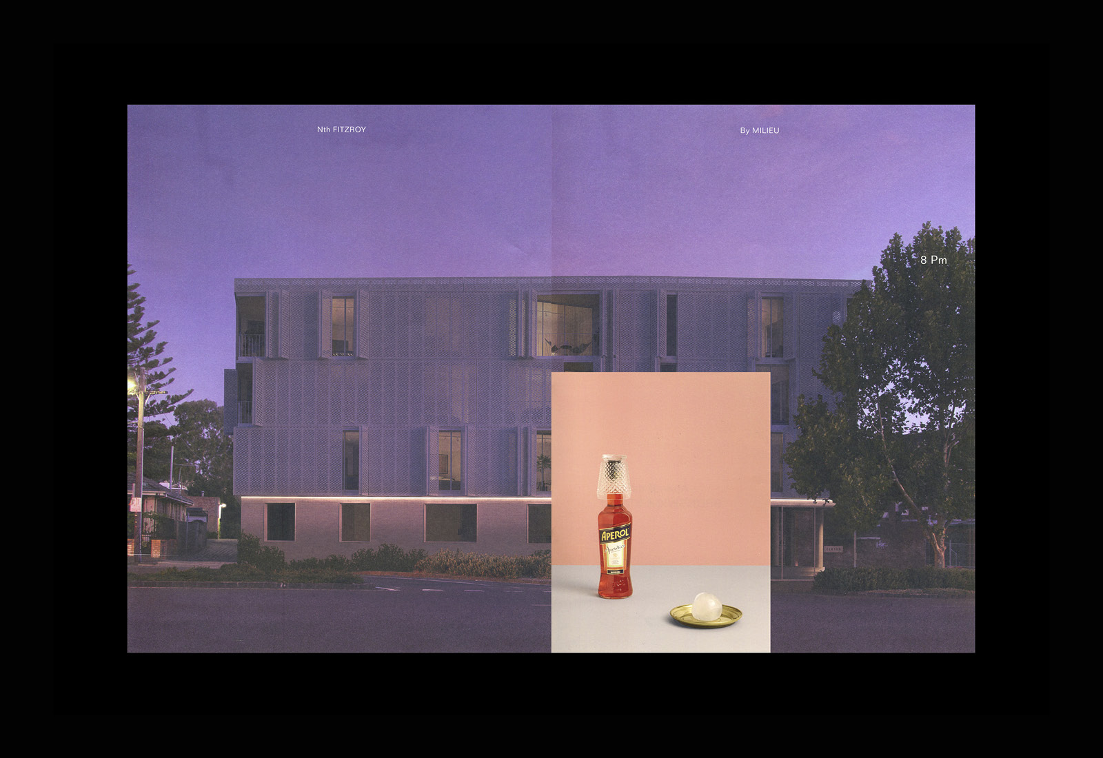
Nth Fitzroy by Studio Hi Ho, New Zealand
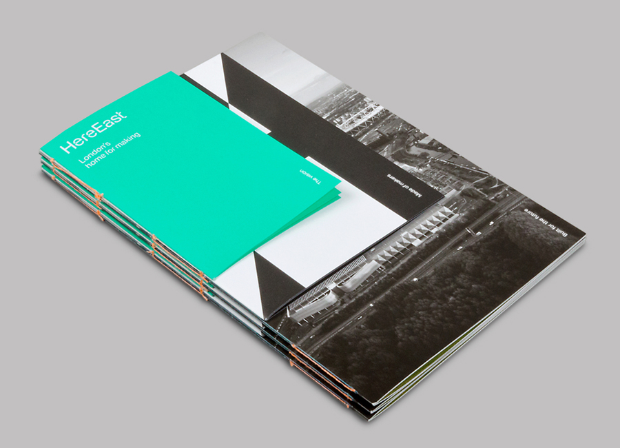
Here East by dn&co., United Kingdom
