Chus x Chus by Pentagram
Opinion by Richard Baird Posted 28 February 2018
Spanish jewellery designer Chus Burés is recognised for the avant garde quality of his work and his ongoing collaborations with a wide variety artists and designers. These have included American-French artist Louise Bourgeois, American-Cuban painter Carmen Herrera and French fashion designer Agnès B.
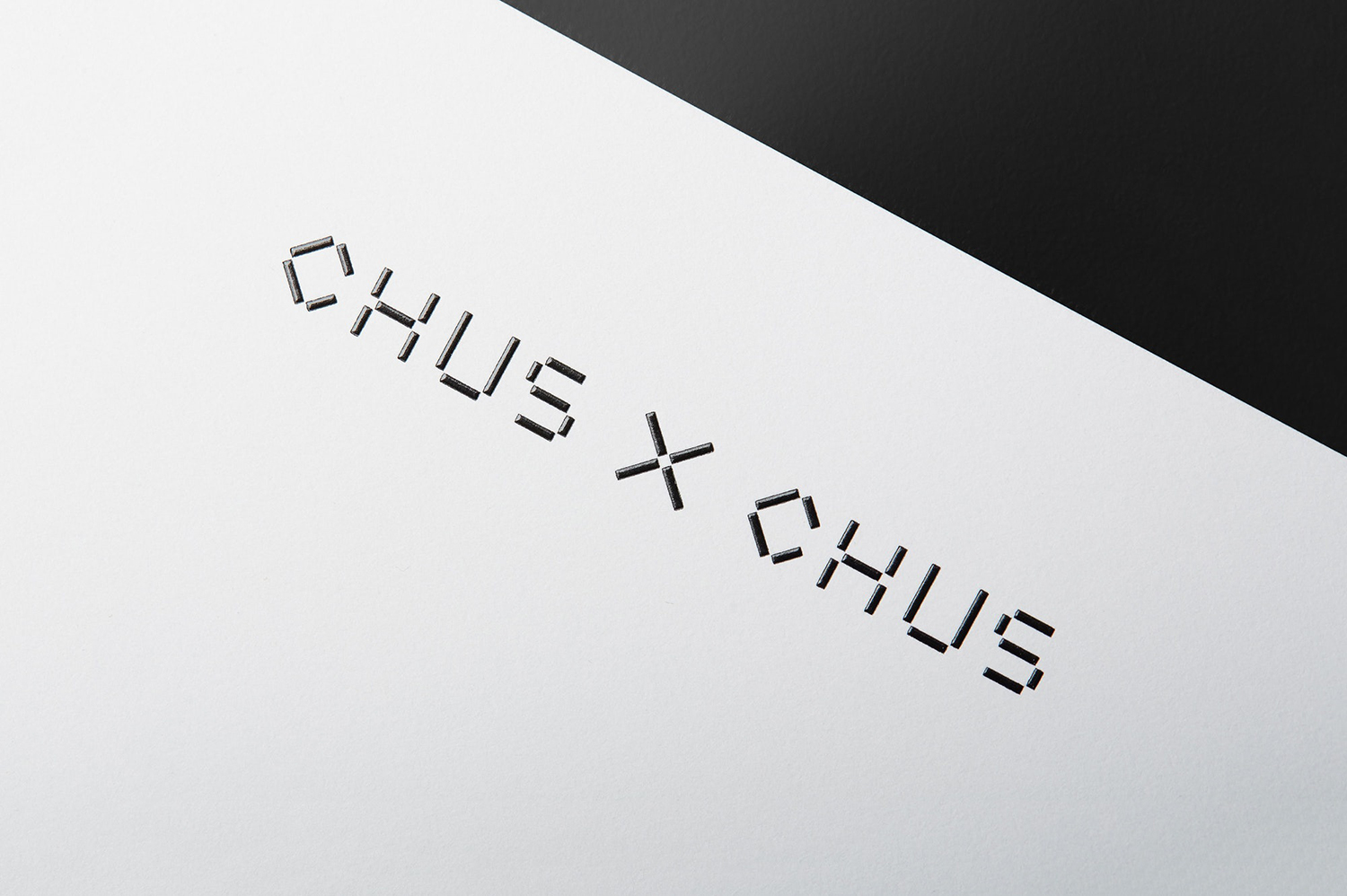
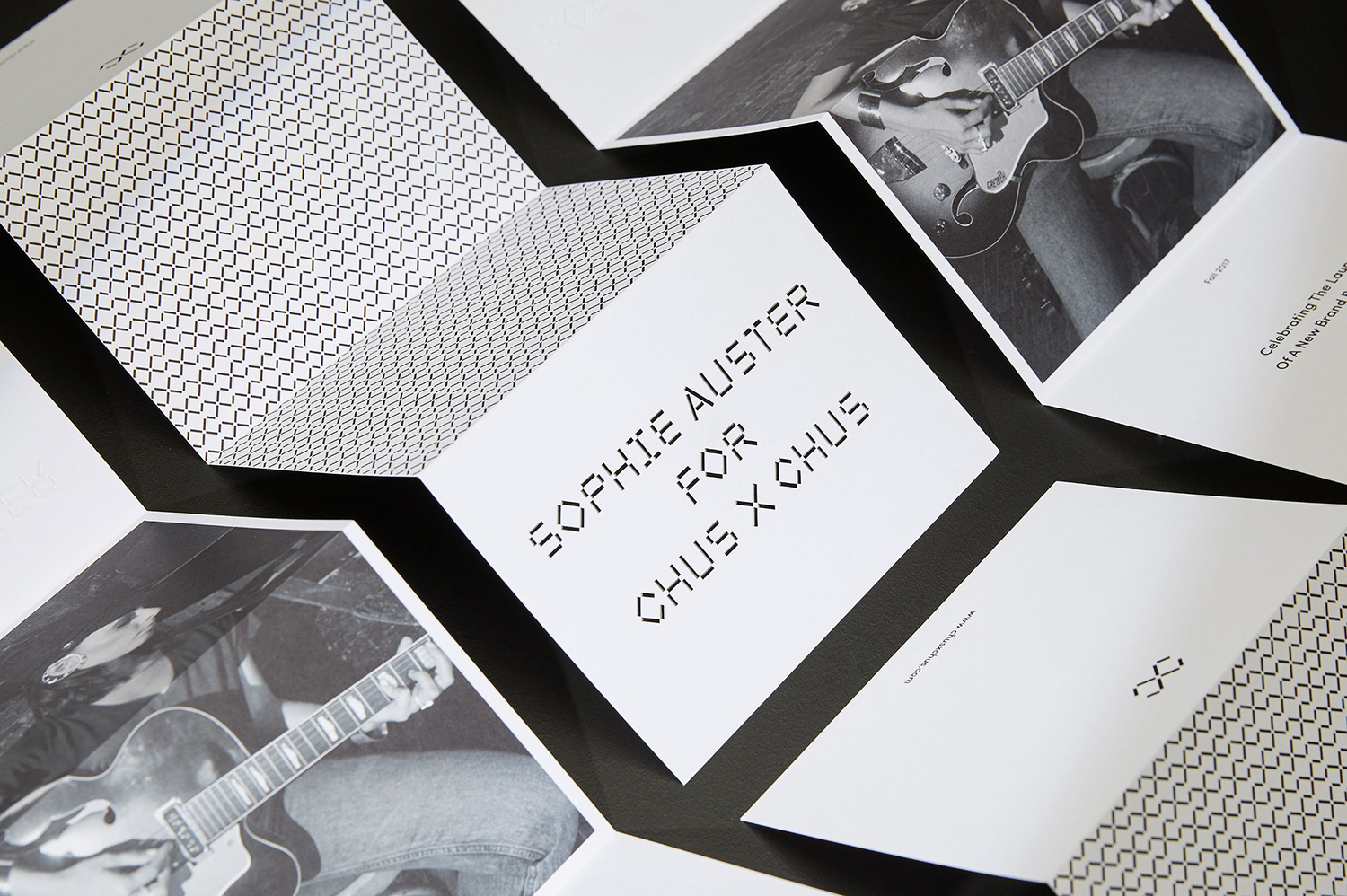
Working with those in the fields of contemporary art, fashion, cinema and music, Chus Burés has developed CHUS X CHUS, a new range that intends to appeal to a younger audience. This range is characterised by a back to the fundamentals philosophy; everyday pieces created in partnership with emerging artists. This is expressed by the brand’s launch campaign which features the singer-songwriter Sophie Auster, who was photographed by Andres Serrano, and through a graphic identity of custom typeface, website and art direction developed by Pentagram partner Natasha Jen and team.
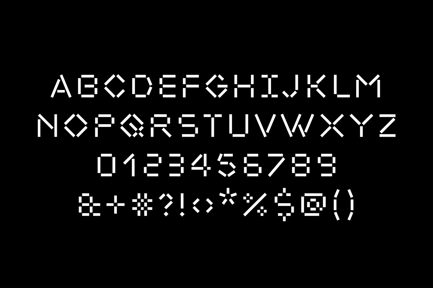
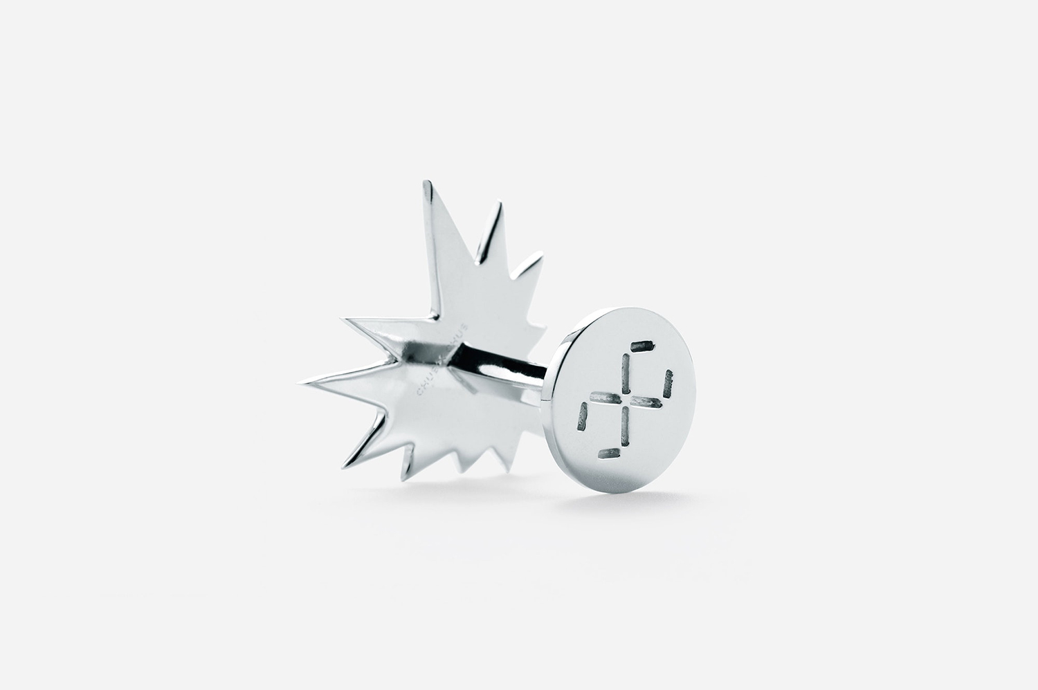
The range has a distinct and graphic quality to it in shape and the relationship between recurring forms. Drawing on these Pentagram developed a custom typographic solution, one built around a strong modular sensibility with a link-like foundation and a reference to the beaded structure of metalwork. This not only serves to establish an identifiable visual language, but also makes a literal connection with those that Chus Burés collaborates with through letterform and words.
Emphasis has been largely placed upon custom typeface over, say, unusual structural design. Be that in form, mechanism or surface. This feels strategic, establishing a useful and clear continuity between digital and material assets—something that is sensitive to and acknowledges the way a younger market engage with brands—and finding a distinctive graphic expression that reflects both the physical and conceptual qualities of the range.
Aesthetically, as a display typeface within the context of jewellery, it is unexpected, has the qualities of linked jewellery, perhaps something of the structural and a little of the digital in there as well. It really begins to shine when given colour and is punctuated by the organic black and white qualities of Monica Stevenson’s photography.
Website, as documented here, plays with an interesting intersection of the graphic, the photographic and typographic, something that suggests an element of the avant-garde. It has an impact and immediacy, one that carries with it a modernity and difference in visual communication and presentation of jewellery. Unusual cropping and art direction of black and white photography lend the work a slightly mysterious quality, while literal and implied motion gives it a youthful energy. The reality of the website is quite different. Custom typeface appears infrequently and much of the imagery, aside from the scroll, is static.

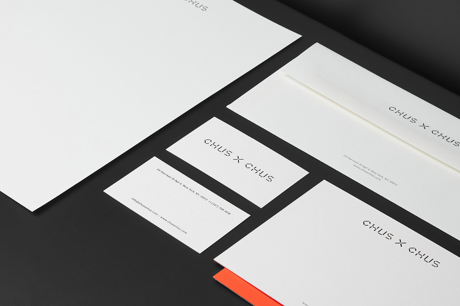
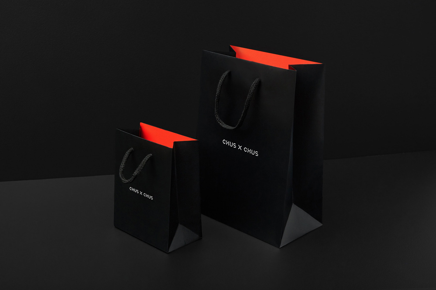
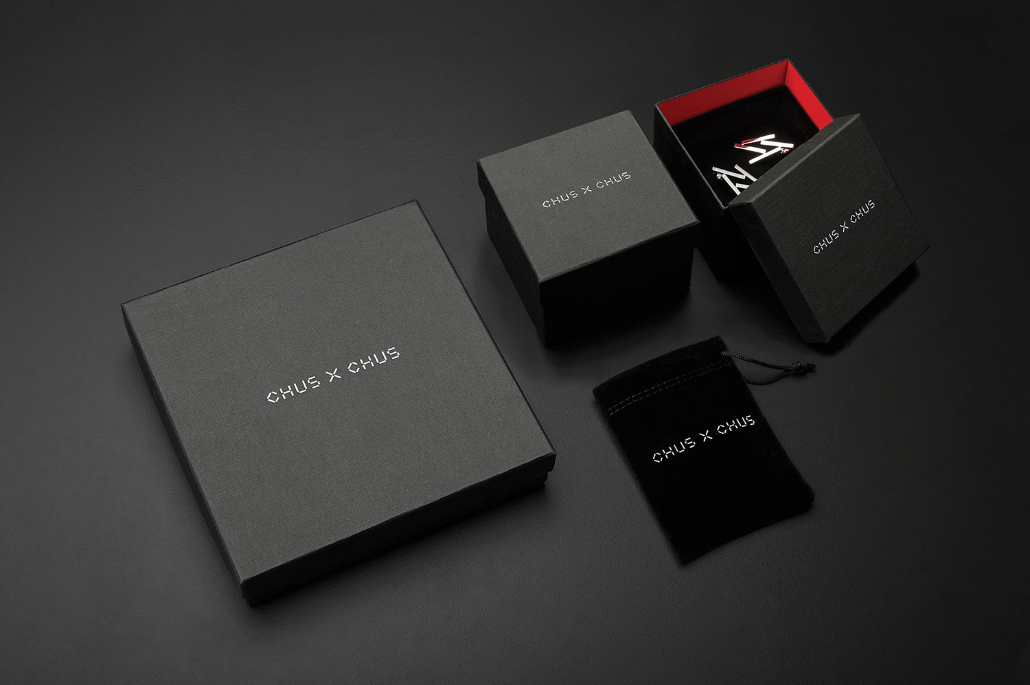
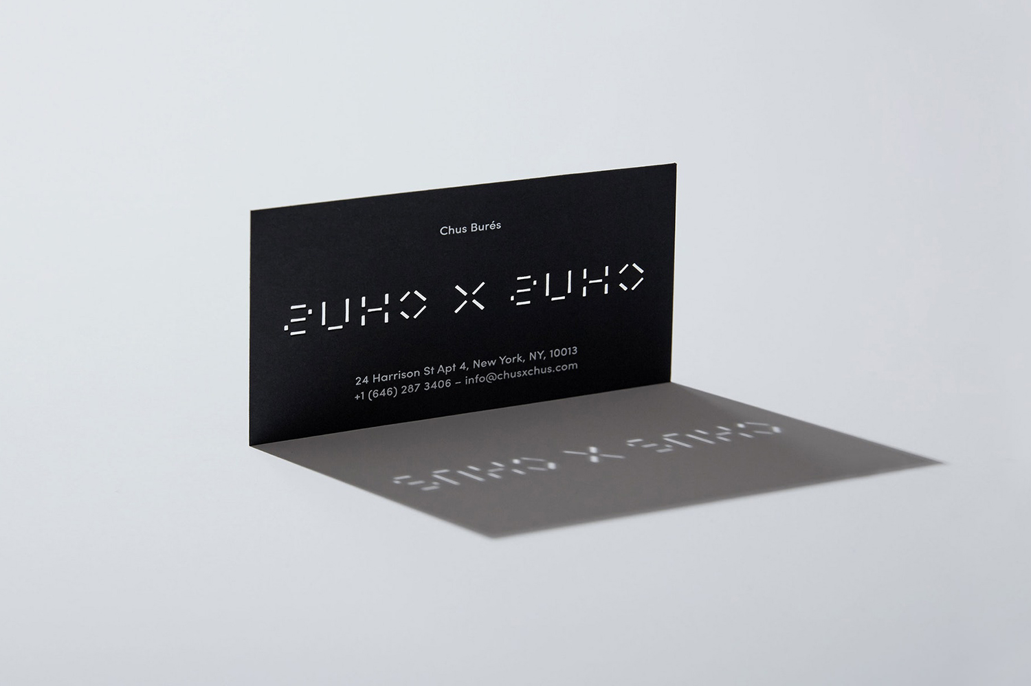
The material qualities of stationery and packaging are perhaps a little underserved. A simple black block foil emboss across white paper, a die cut through business cards, a bright fluorescent shot of colour on interior walls and black textured surfaces offer a degree of visual and tactile impact, but really only on the surface, a final flourish rather than an idea like the typeface. Colour and type together work well to create a link between the digital and material, acknowledge the intended audience, and price point. More work by Pentagram on BP&O.
Design: Pentagram. Partner In Charge: Natasha Jen. Team: Javier Arizu. Photography: Monica Stevenson. Opinion: Richard Baird.
