Colours May Vary by Build
Opinion by Richard Baird Posted 7 March 2018
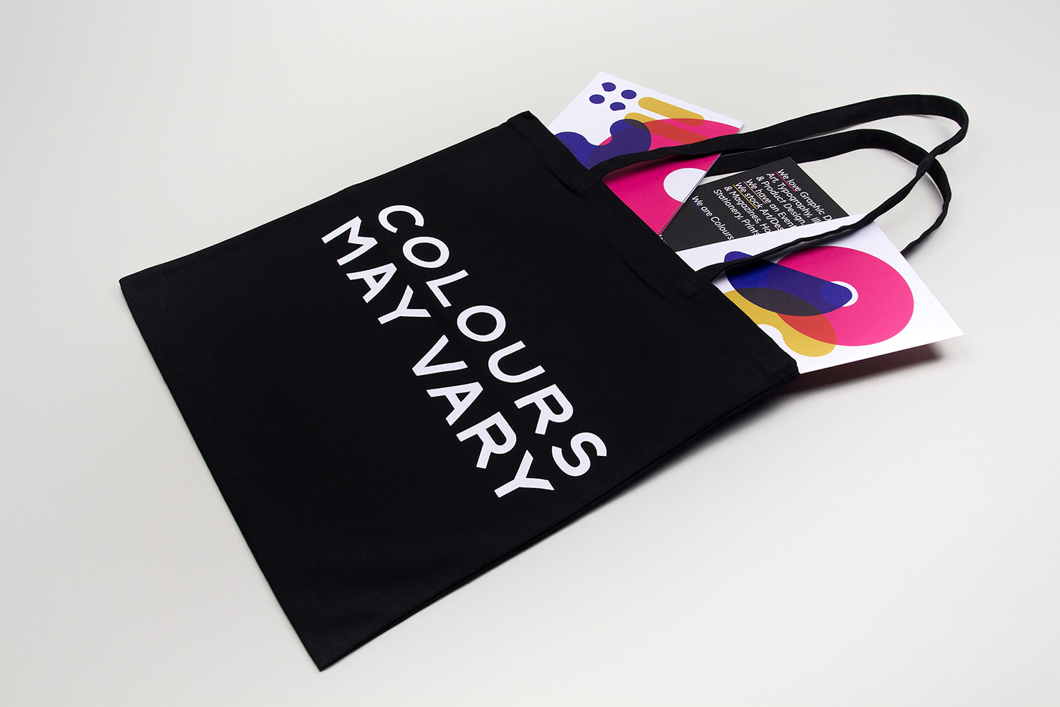
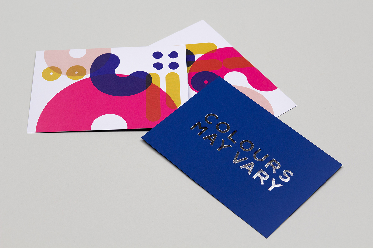
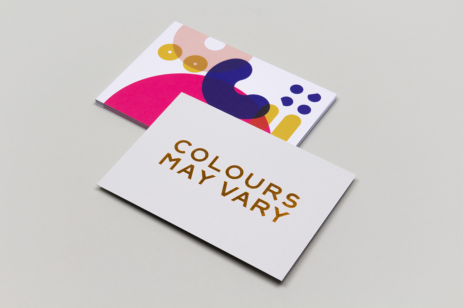
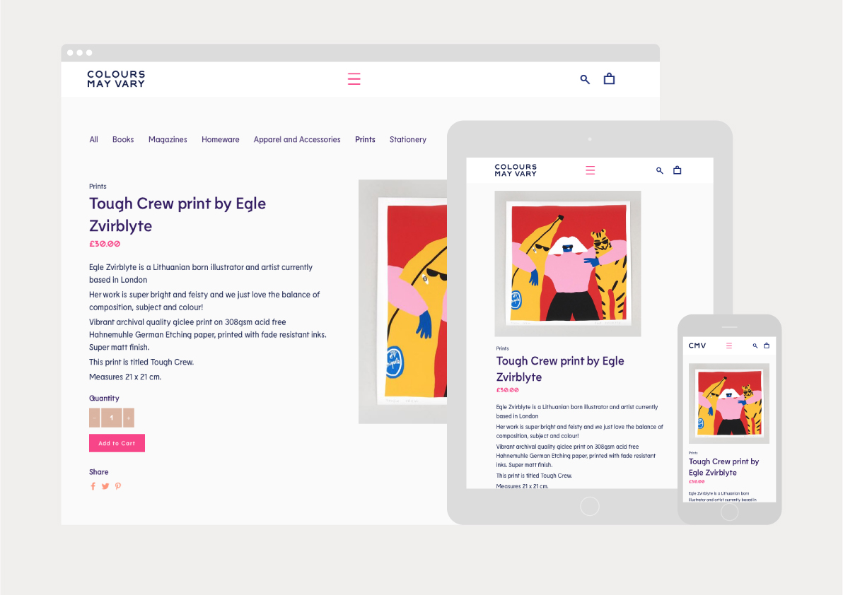
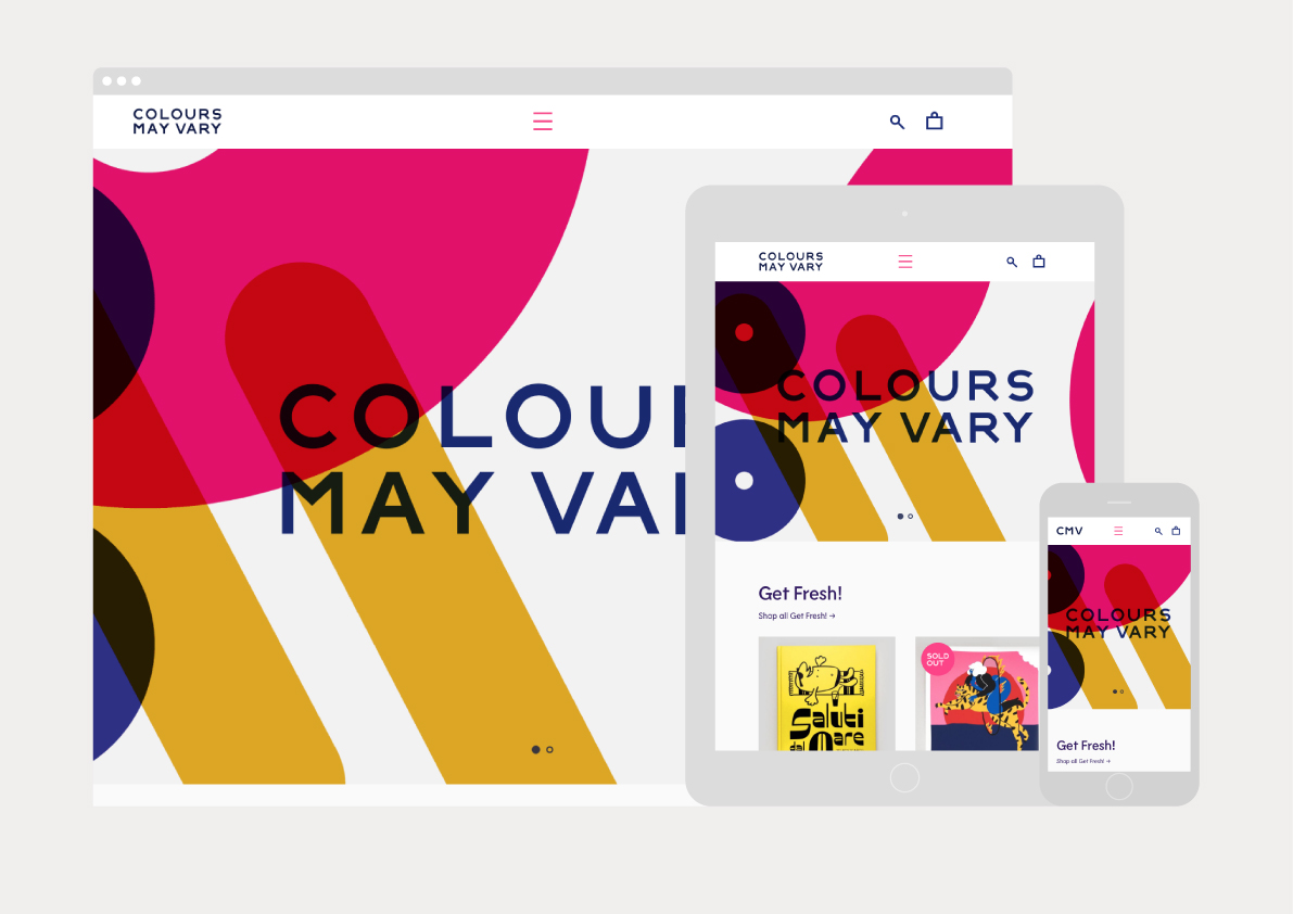
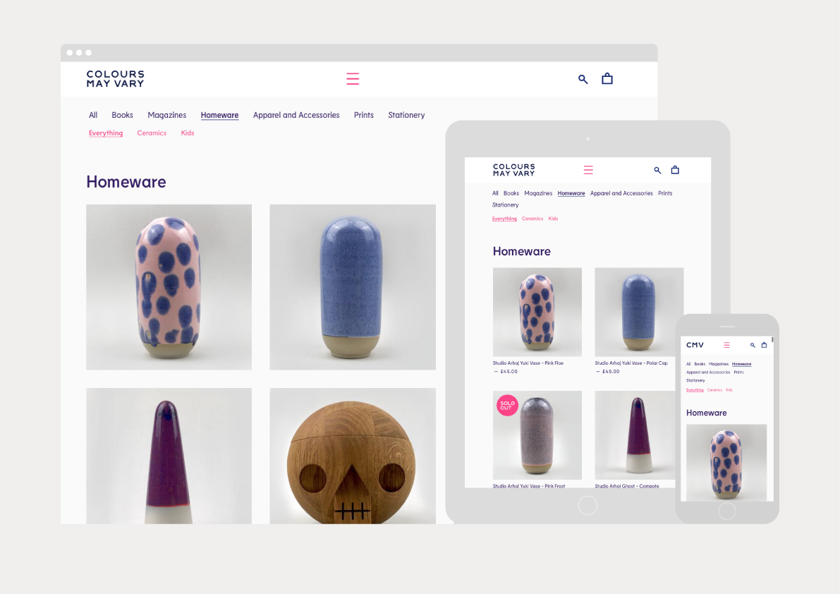
Colours May Vary is a Leeds based creative lifestyle store, independent bookshop and events space. Its physical and digital stores are filled with a variety of products, from riso prints, books and magazines to ceramic sculptures, cards and banners. There is a variety to these objects, yet a curatorial through line of beauty and usefulness that makes the Colours May Vary name appropriate. Developing this, design studio Build created a visual identity of shape play, typographical modernity and idiosyncrasy, colour and form contrast, and a meeting of striking graphic expression and high quality material finish. This links a variety of assets. These included printed items such as tote bags, postcards, loyalty cards, carrier bags and stickers, as well as digital components like social media icons, promotional images, newsletter template and a website designed and built by Hungry Sandwich Club.
Colours May Vary places equal weight on physical store and digital presence. There is a diversity to the objects on display within both contexts, yet a cheerful and creative continuity. This, much like the variety and vibrancy implied by the name, is expressed by the store’s visual identity, and is effectively conveyed by the choice of colour and in the creation of form. There is further diversity to both of these in their intersection. New shapes and shades emerge from the use of transparency and overlaying. This gives shape a material quality, calling to mind cut acrylic. On screen there is something of the mechanical and industrious in the use of motion. It feels like there is an allusion to rotating gears and sliding conveyor belts, an activity and busyness well-suited to a multi-purpose and modular space for retail and events. These are simple shapes, but a lot of variety and association is drawn from them, working as bold singular icons across tote bags, or collectively as eye-catching panels of colour and form.
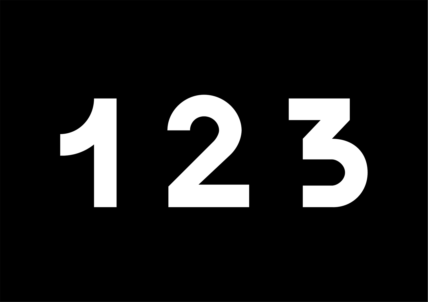
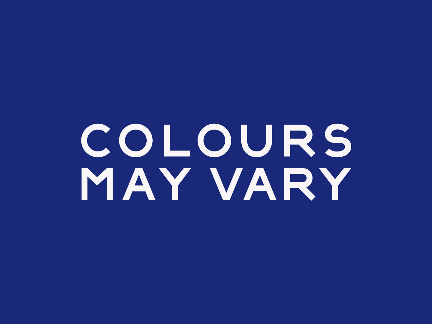
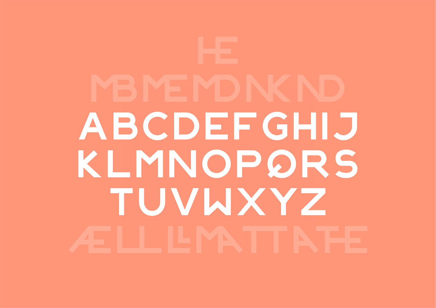
Much like the shapes, a limited custom typeface has something of a made quality in its unusual forms and unexpected quirks. It feels intentionally imperfect rather than refined or sophisticated, and in this sense reduces the perceived distance between customer and maker. There is also a modernity and a commonality with graphic expression in line weighting and shape. Custom type feels grounded in a singular and very particular personality with Tightype’s Lemur stepping in and working as a close facsimile of its tone online.
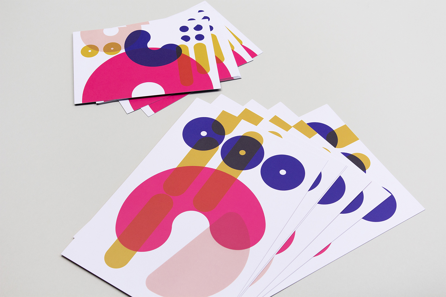

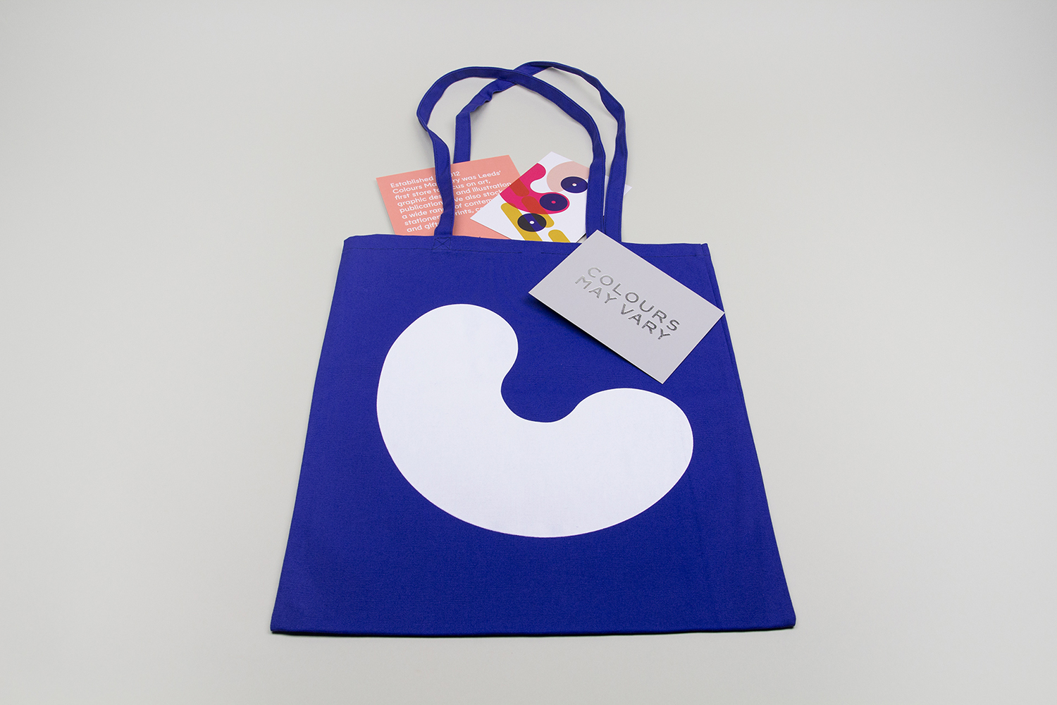
Gold and silver block foiling plays up the material, leveraging the well-established and enduring visual language of high quality. Finish gains a lot from its use in conjunction with custom type. Finish and typographical form feel playfully oppositional. Contrast is used effectively elsewhere, with solid blocks of colour emphasising graphic detail, or making a hero of simple shapes. The result is cheerful, playful and personable. It has an immediate graphic impact, but follows up with some pleasant little details in print, in motion and within custom typeface. More work by Build on BP&O.
Design: Build. Website: Hungry Sandwich Club. Opinion: Richard Baird. Fonts: Lemur
