Fluvia by Folch
Opinion by Richard Baird Posted 23 March 2018
Fluvia is a range of adaptable lighting solutions from LED Simon that intends to offer a creative freedom in commercial and private lighting projects. Design, rather than an absolute utility, is an essential and unifying quality of the range with products developed to be attractive and convenient, easy to use and deploy within a space, and broken down and recycled.
To cast aside its corporate image and convey a sense of contemporary elegance, Fluvia worked with Spanish graphic design studio Folch to develop a richer and more distinct graphic identity. This repositioned the brand’s communications away from technical details and superfluous elements to focus on product, to develop an identity for each, drawing out their distinctive character and core functionality.
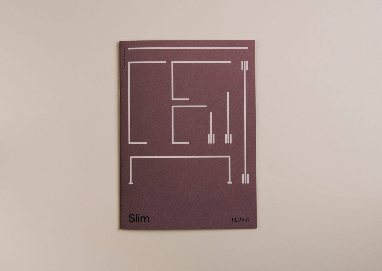
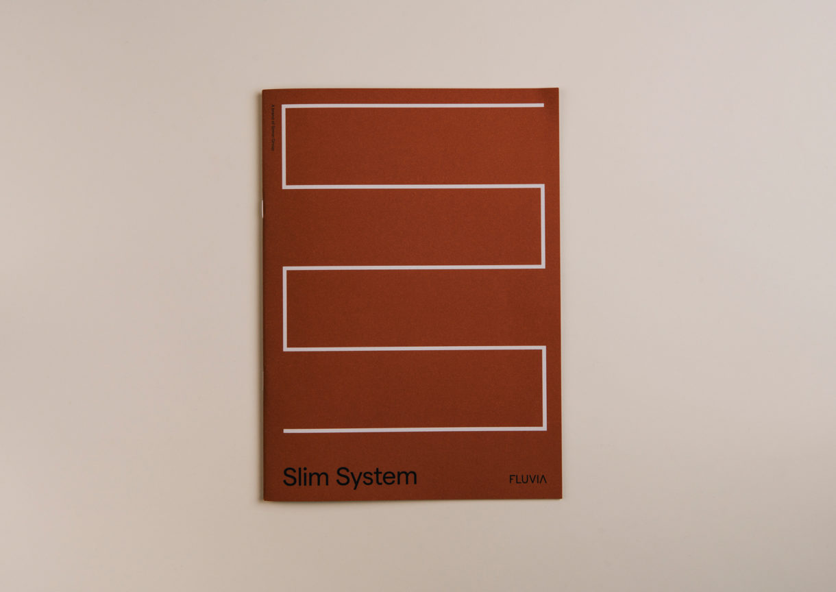
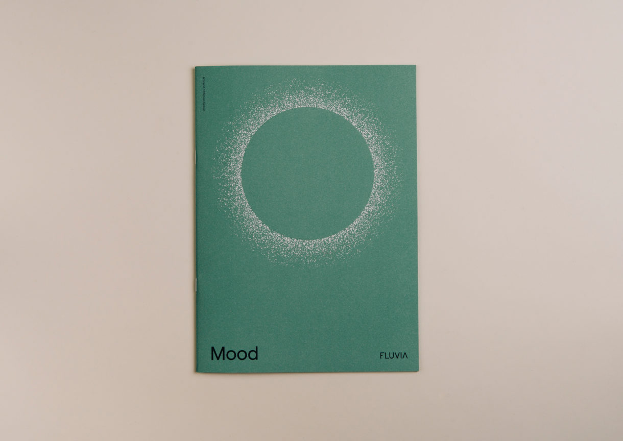
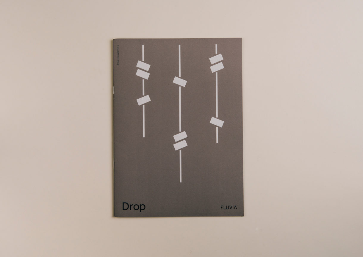
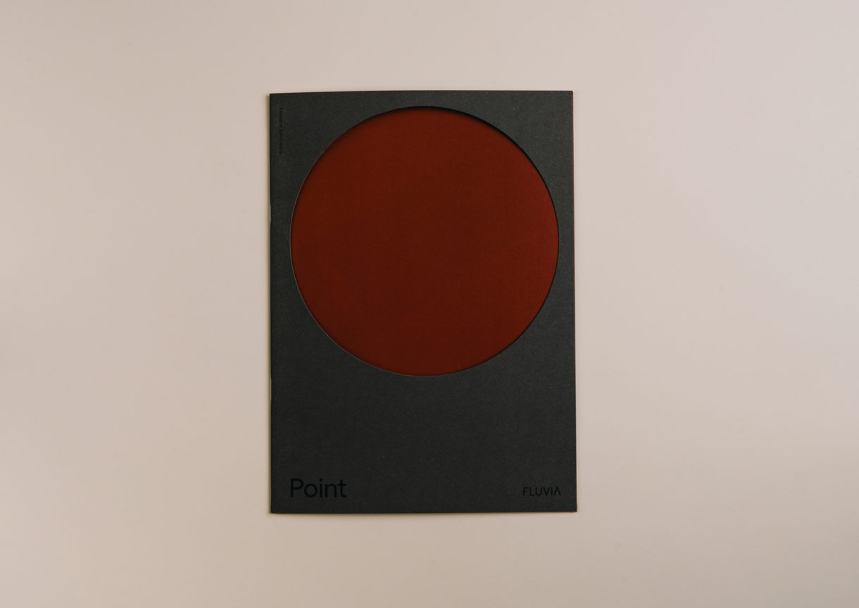
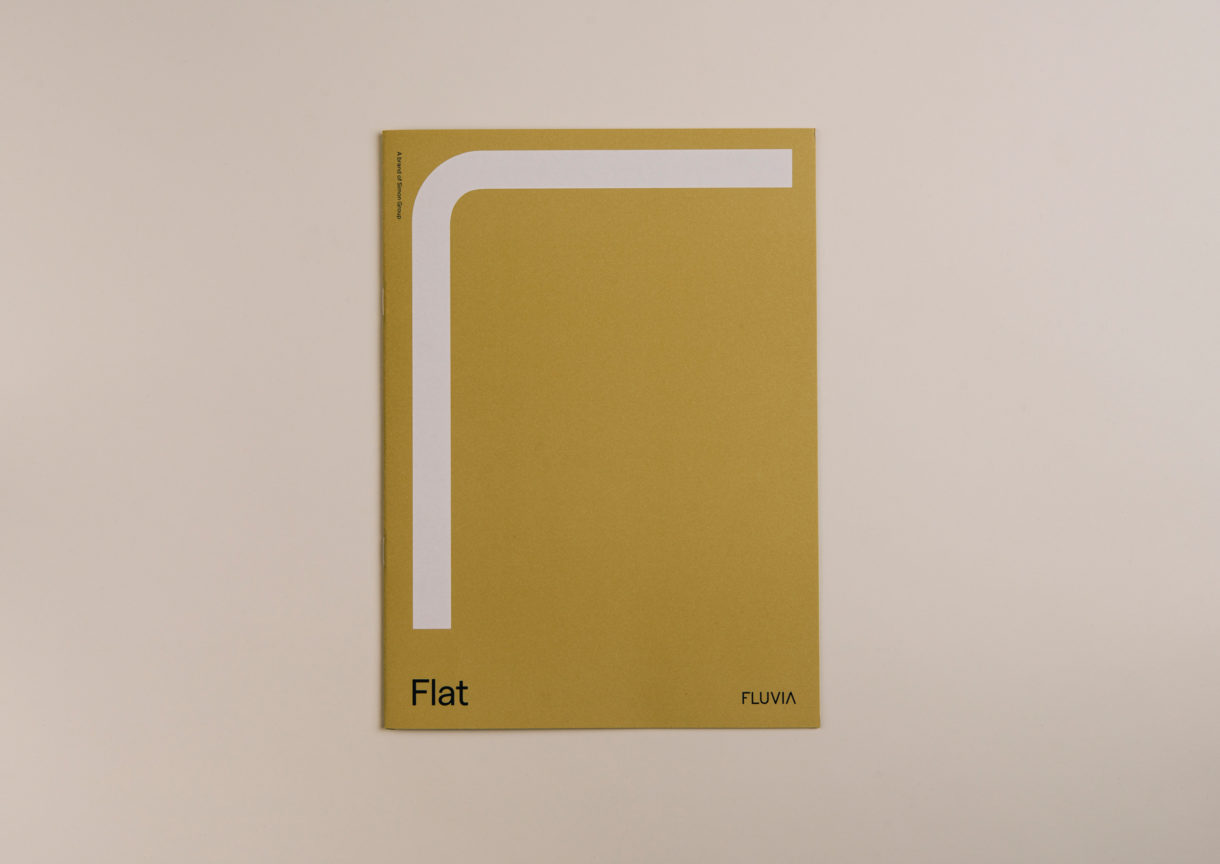
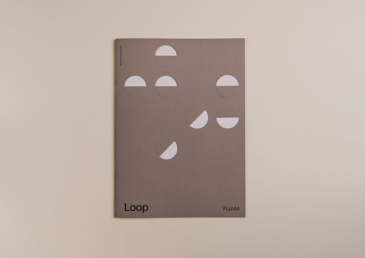
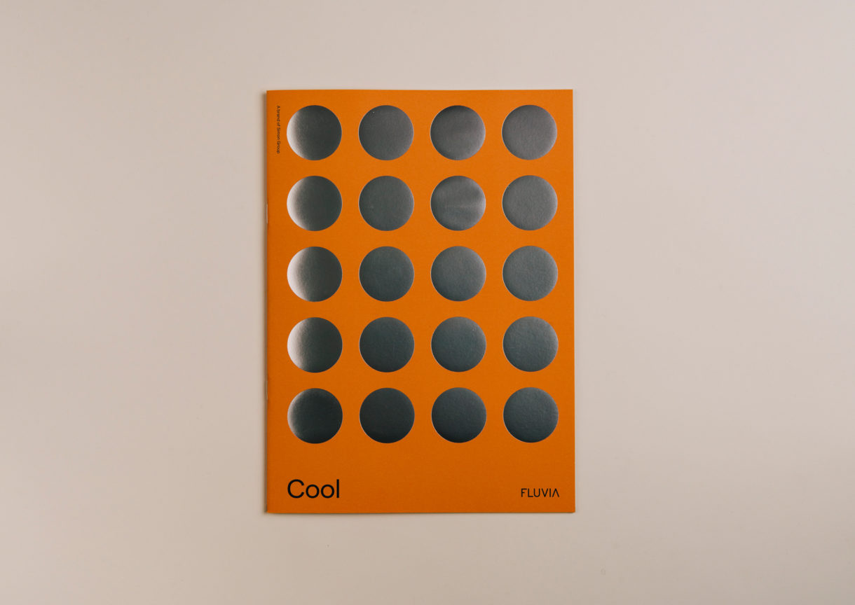
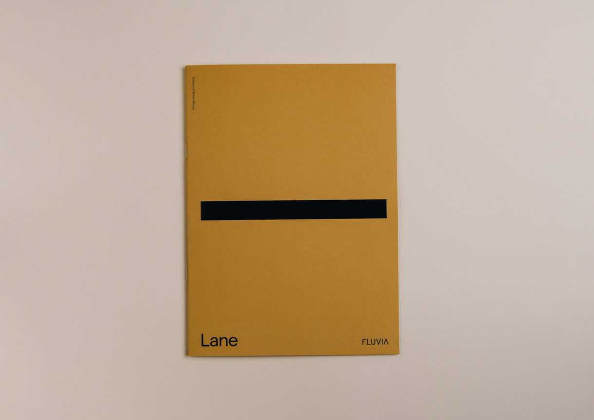
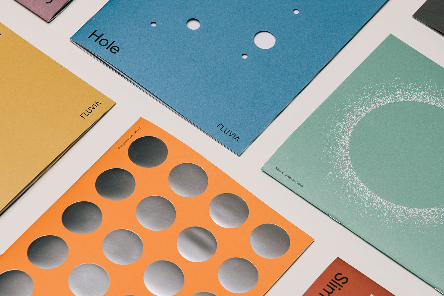
This was done through three key components; new product photography, individual product brochures with a strong graphic and material quality, and the creation of a central online hub that will connect a series of satellite sites dedicated to each product and provide quick access to a granular level of insight for those that need it.
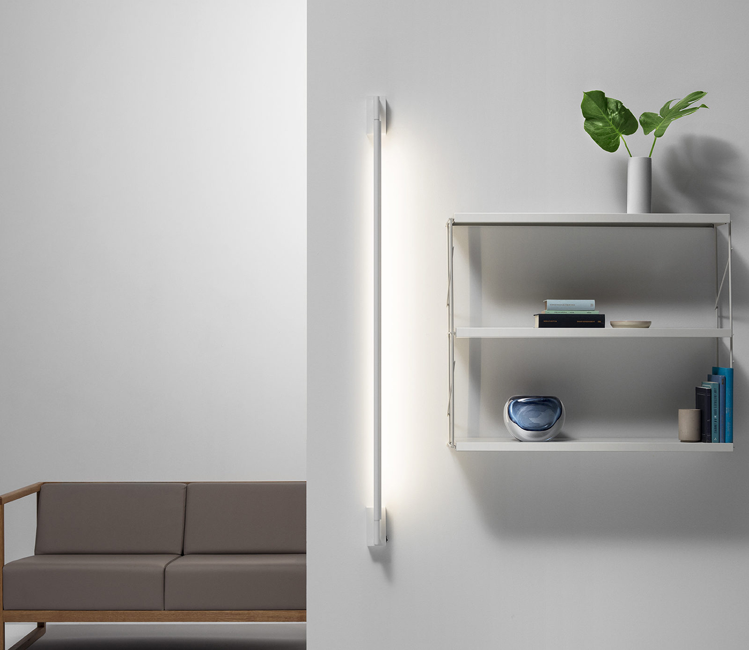
Fluvia products bridge the gap between statement design and an invisible lighting solution. Light, the way it is delivered into and can shape the mood of a space was a critical consideration. The beauty of the range lies in its simplicity and precision. So elevating the brand required a sensitivity, a way to capture this spirit without falling into an oppositional visual language of excess.
Folch draw on architecture, art and fashion, taking characteristics from each of these creative industries and applying them to what they describe as the Fluvia universe. This is explored through art direction, which saw unique sets built to control focal points, light diffusion and mood, and in the exploration of colour, form and materiality in print as a way to express character and creativity.
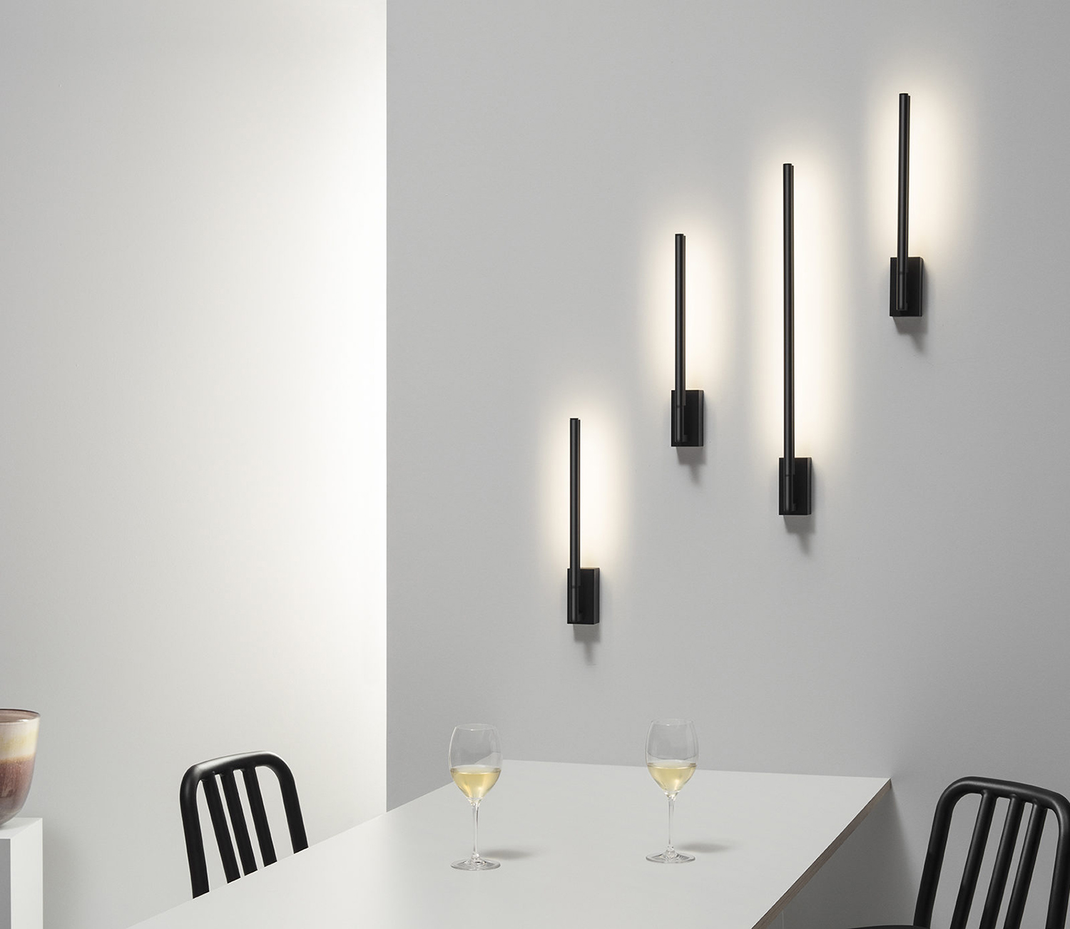
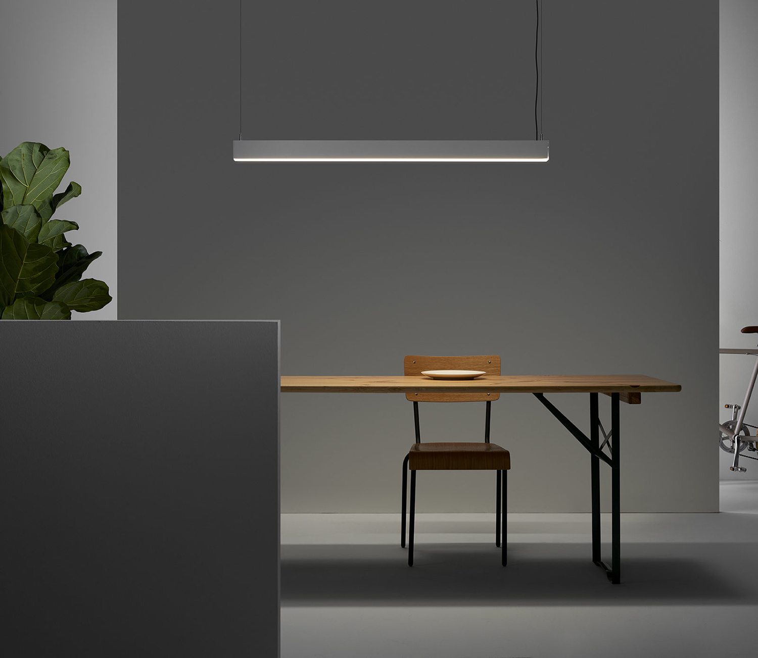
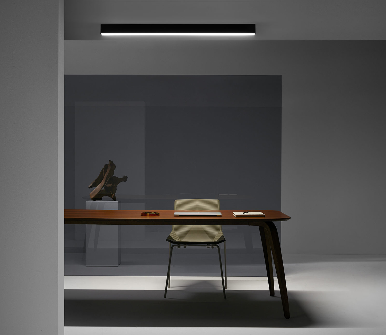
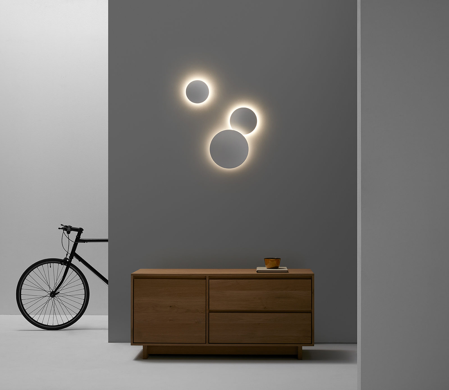
Fluvia products are often set into the structure of the building. They offer functionality rather than occupying excess space yet, through their shape and control over light, are stylistically sophisticated. In order to shoot the lamps effectively Folch’s production company White Horse built a series of stage sets to re-create the environments in which the lamps would normally be installed. To create a cohesive visual landscape.
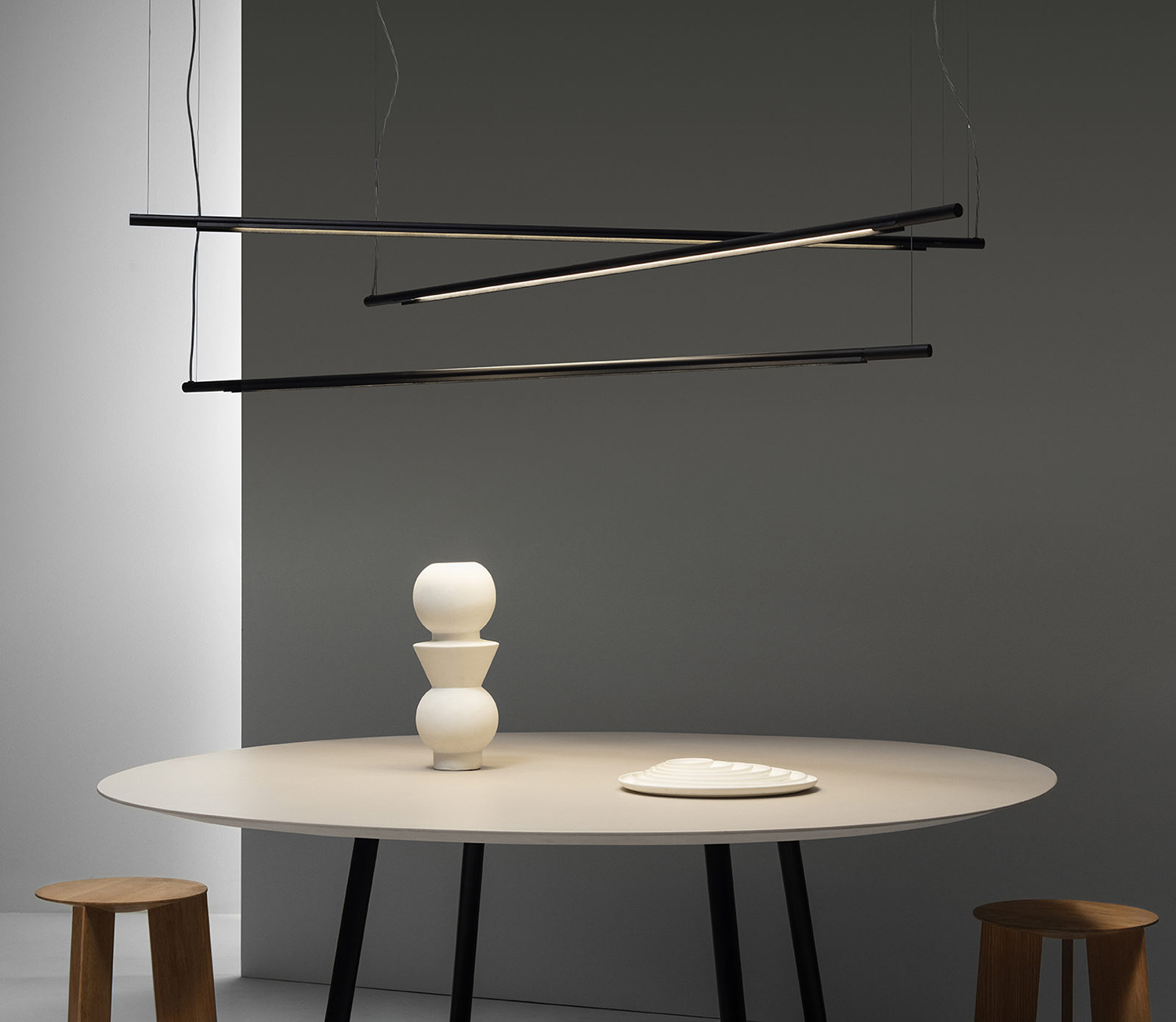
Working with Cristina Ramos, a specialist in set design, Folch created a series of unique and ideal spaces for each product while photographer Marçal Vaquer, chosen for his passion for objects and light, captured a distinct ambience for each type of light.
Art direction blurs the line between modern still life and more familiar product photography. These explore a mood, a dialogue between space and product, light and shade. Colour, set dressing and image proportionality find a way to both bring to light the aesthetic qualities and individuality of product, yet their ability to avoid drawing the eye.
The intention here was to evoke an emotional rather than a pragmatic response. Lighting participates but does not dominate its contexts. More spaces and less renders serve to do this, and separate the brand from the more practical, utilitarian approaches of its competitors.
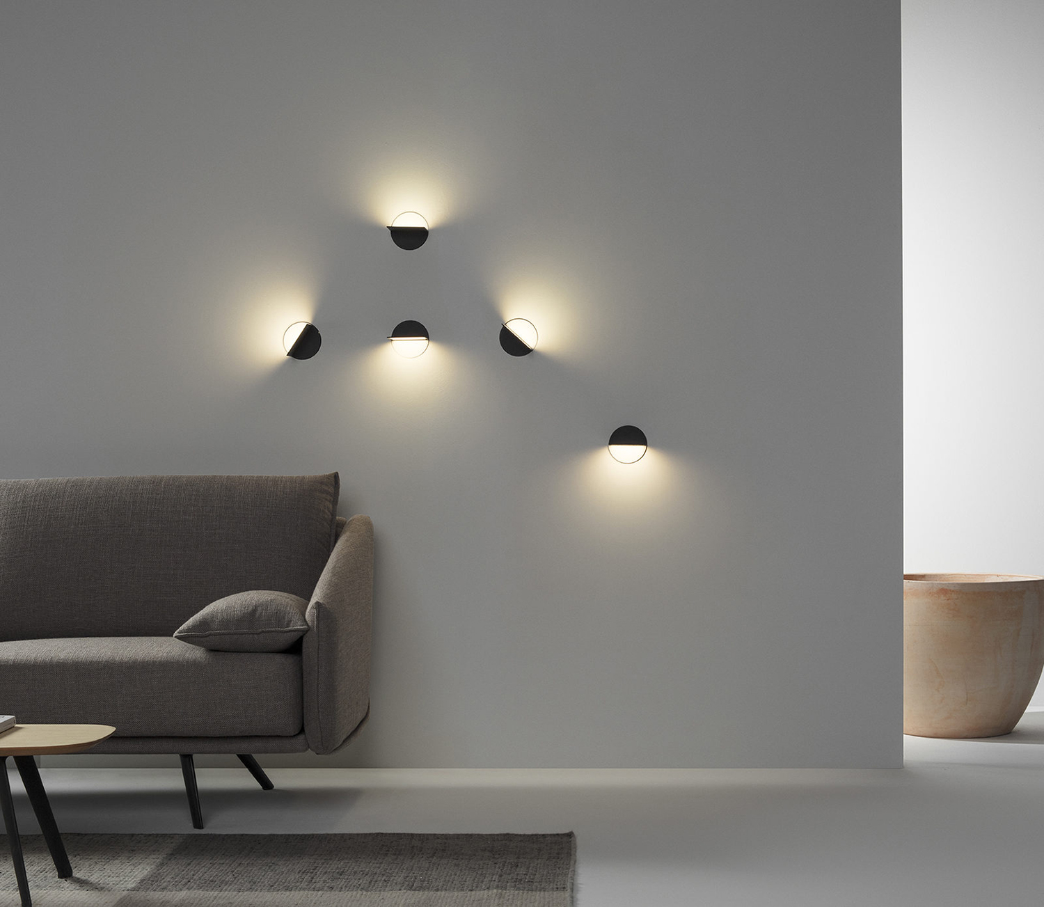
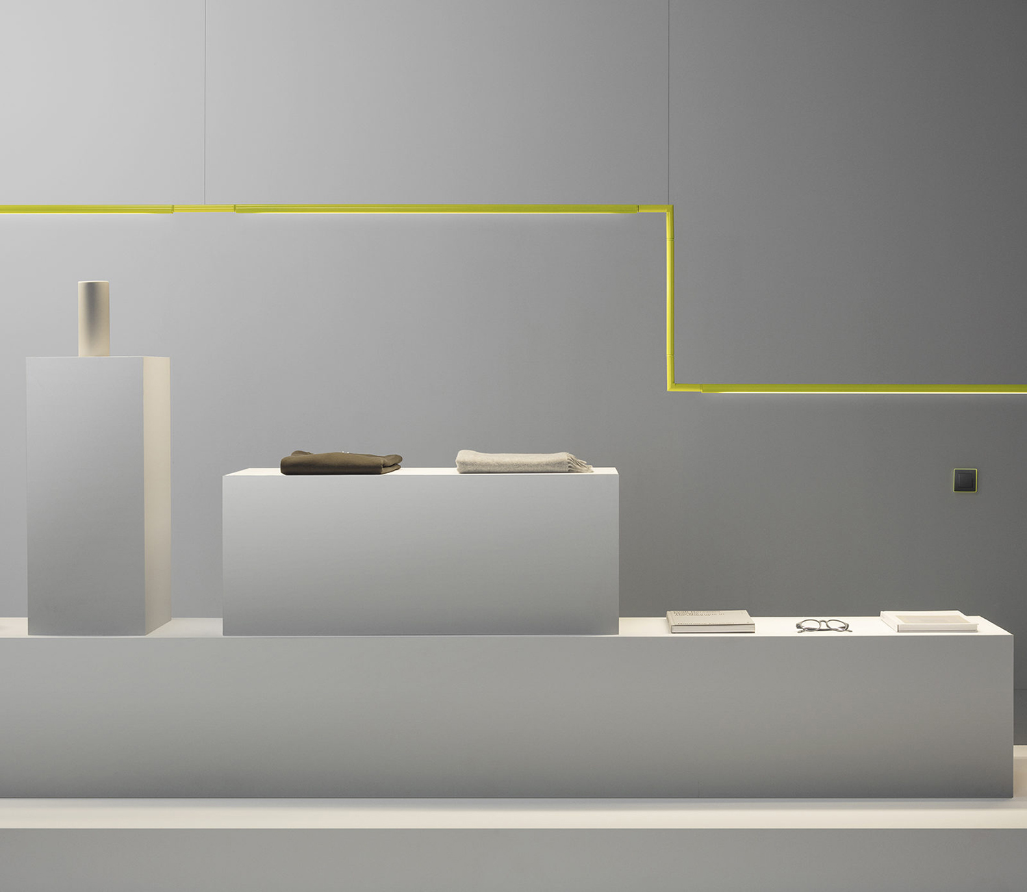
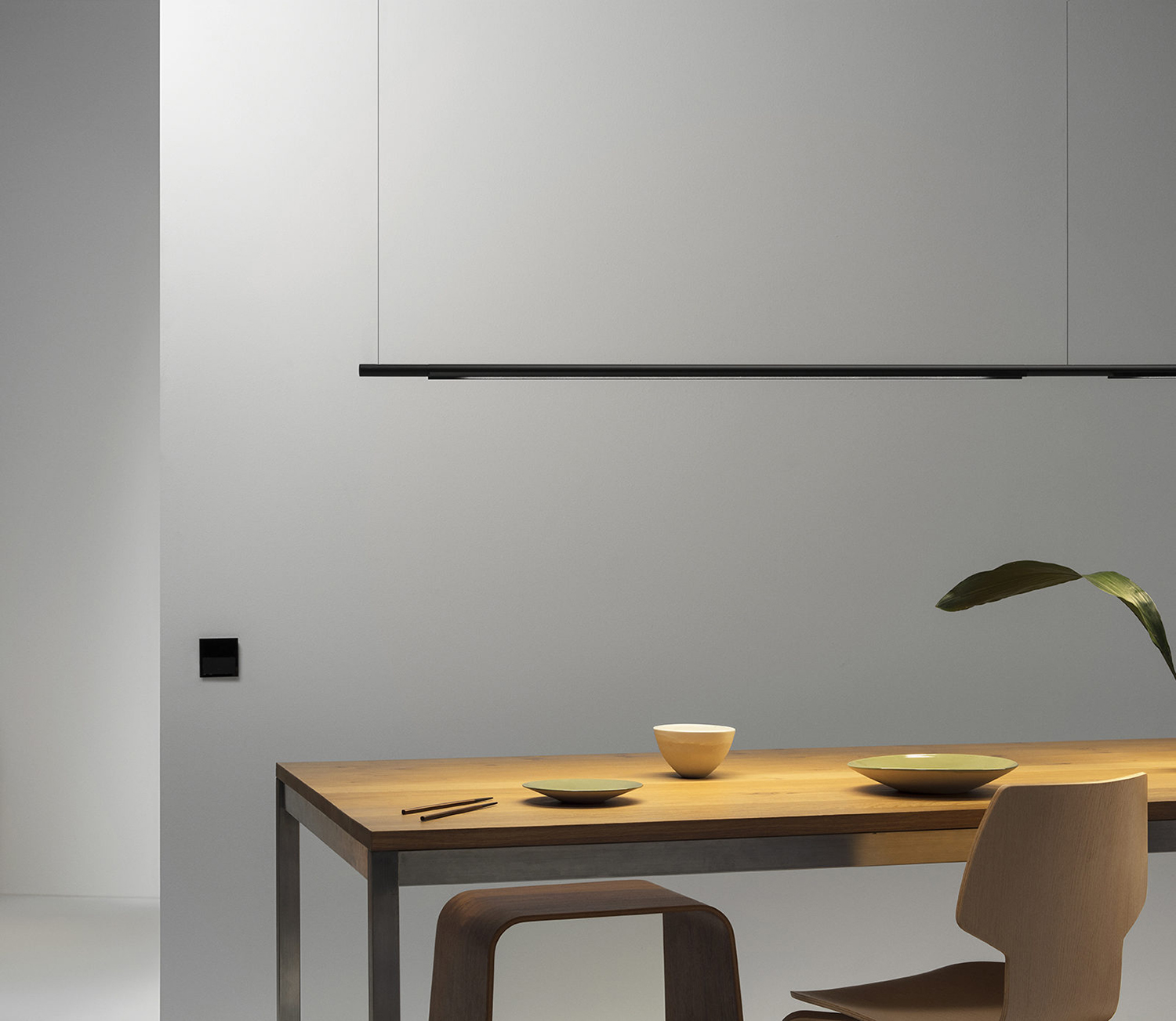
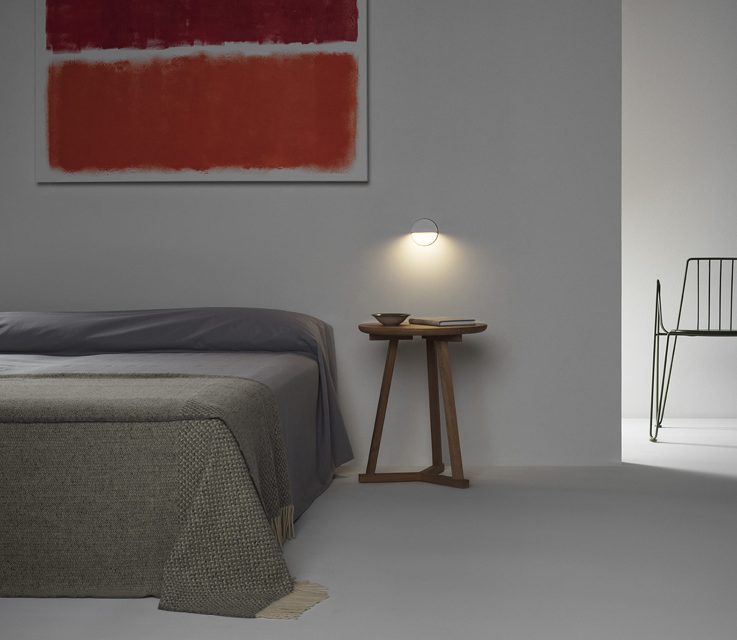
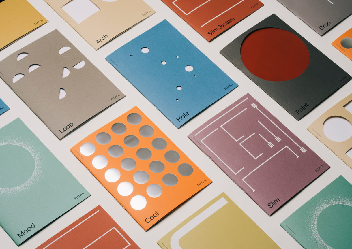
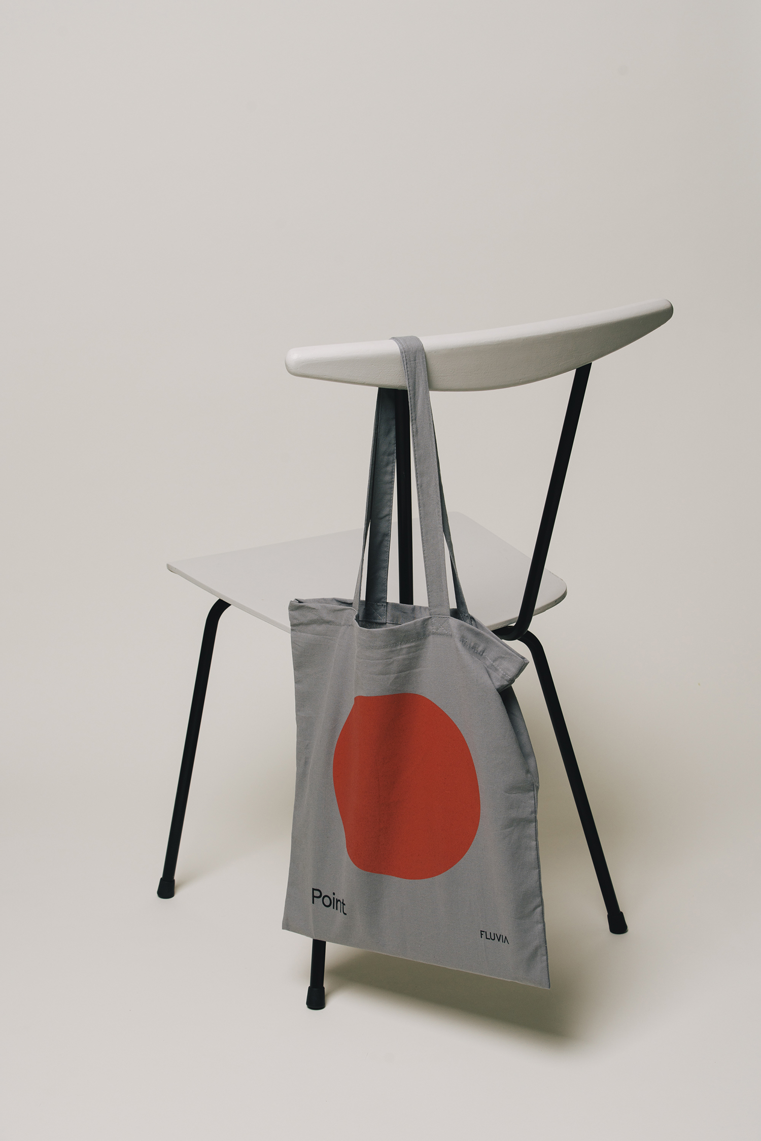
Positive and negative space, arrangement, repetition and flow, the reflective, the die cut and the blind embossed all explore the materiality, shape and light diffusion of the range. These bring a creative life and something of a mid-century modernity to Fluvia that feels distinctive and compelling. It draws on the material quality and build of each product through design craft, touches on the often graphic nature of the products, and through colour and form serves to give bring to light the individuality of each, which is translated online as minisites, in conjunction with photography.
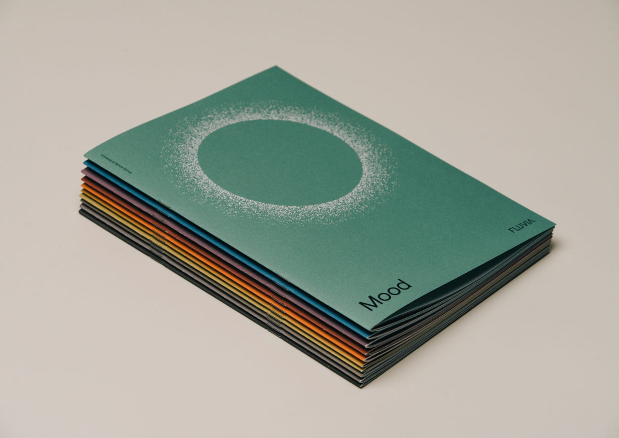
A move from Futura to Matter, a similarly geometric typeface, feels far more current. It is warmer yet shares some of the qualities of the range, in shape and the amplitude of typographic spaces. The Fluvia logotype sees a moderate change, removing a lateral cut that implied something of a tired industriousness in its familiar stencil cutting implication. It feels a touch out of place in its typesetting but does establish an element of continuity as everything else changes.
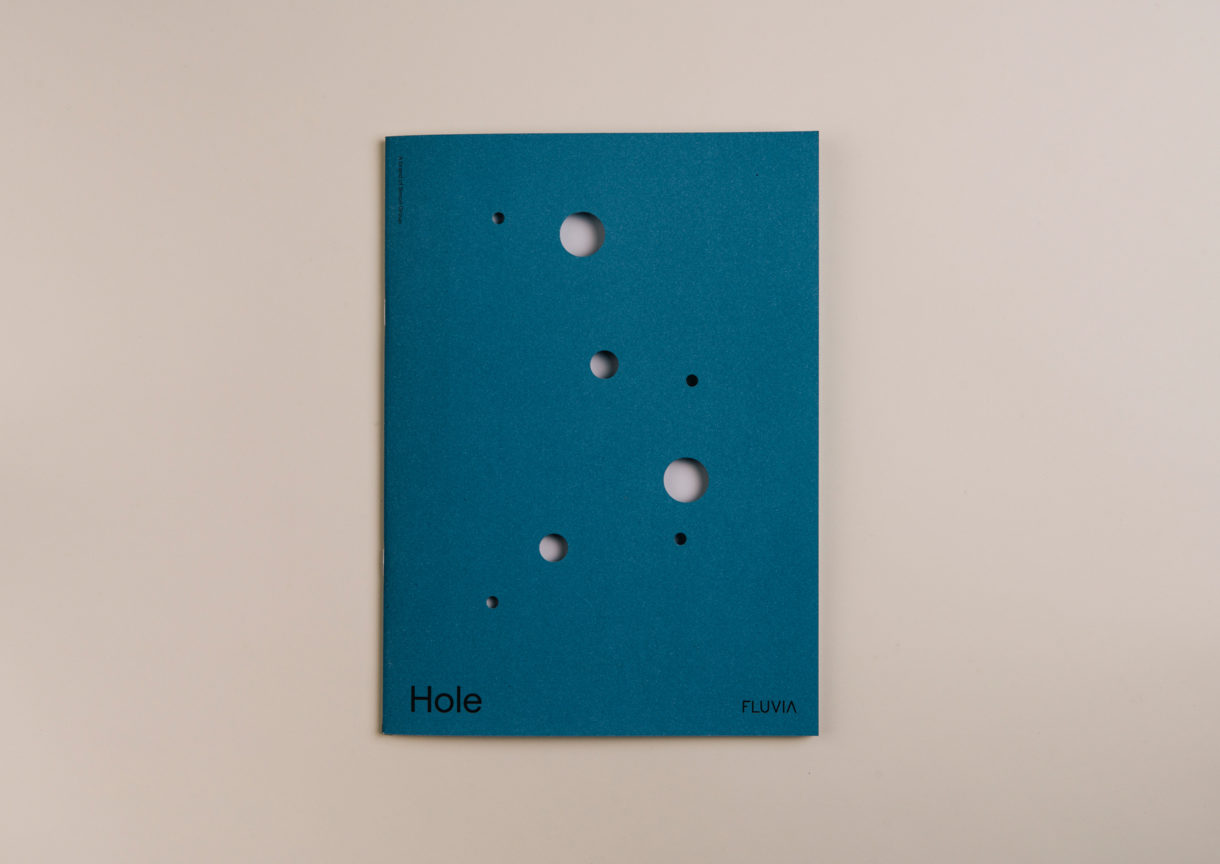
The work stands out for its dialogue between an abstract graphic expression rooted in creativity and strong singular statements, both visual and material, and the more emotive qualities and detail of art direction. Folch effectively amplifies the qualities each in their moments of contrast and commonality. See more work by Folch on BP&O.
Design: Folch. Photography: Marçal Vaquer. Set Design: Cristina Ramos. Set Build: White Horse. Opinion: Richard Baird. Fonts Used: Matter.
