Daechung Park Cafe by Studio fnt
Opinion by Richard Baird Posted 29 March 2018
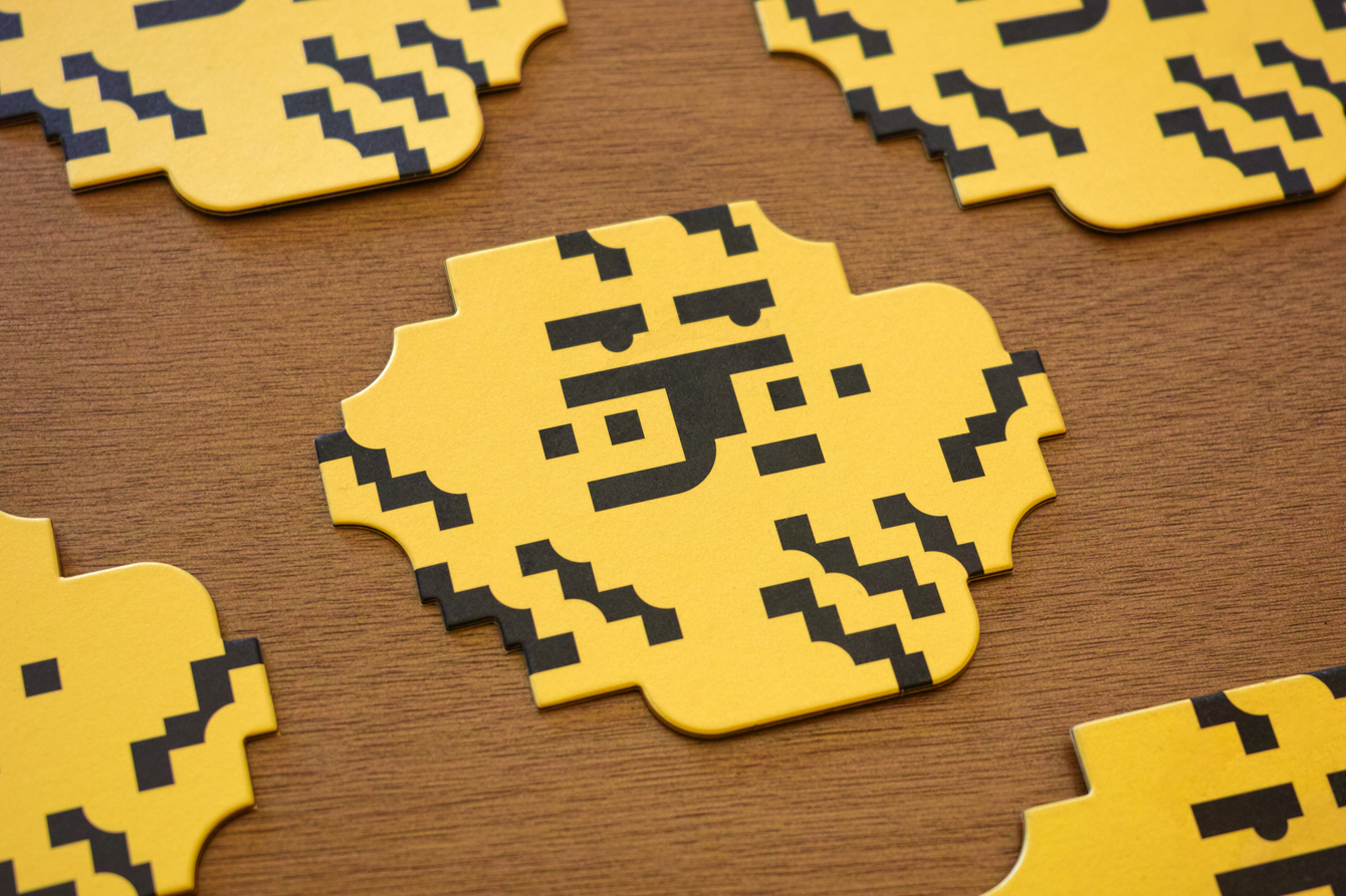
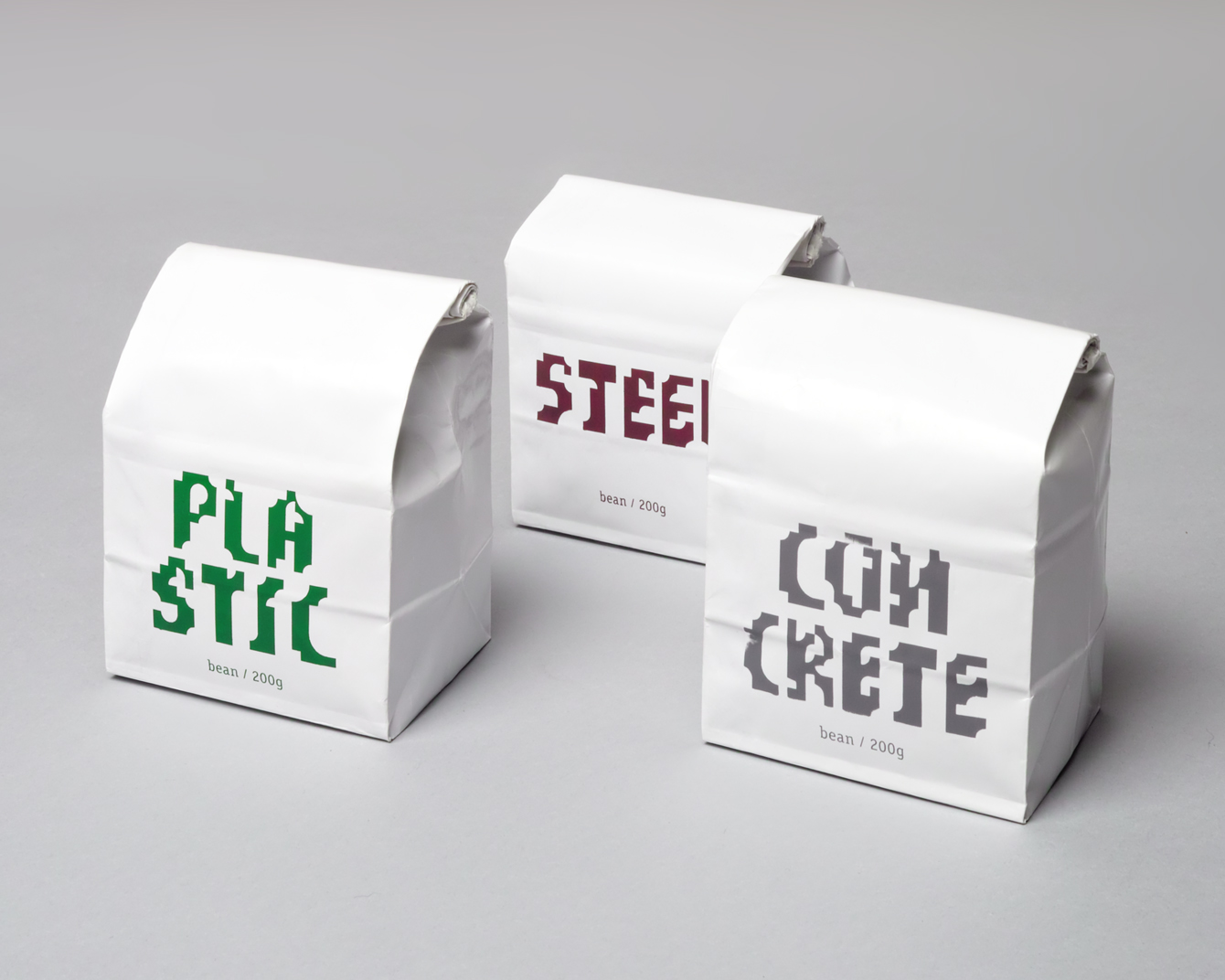
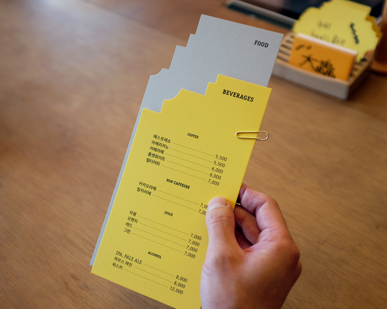
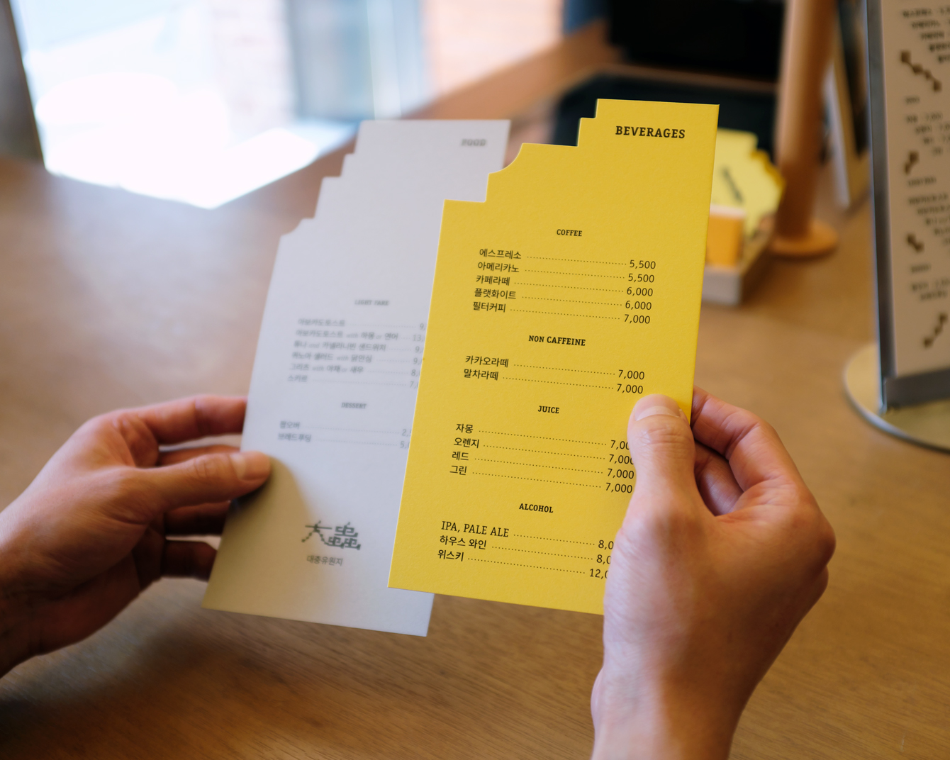
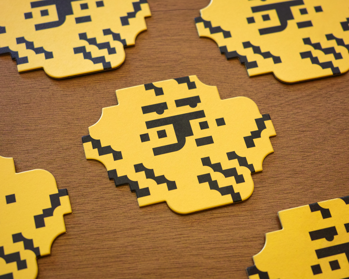
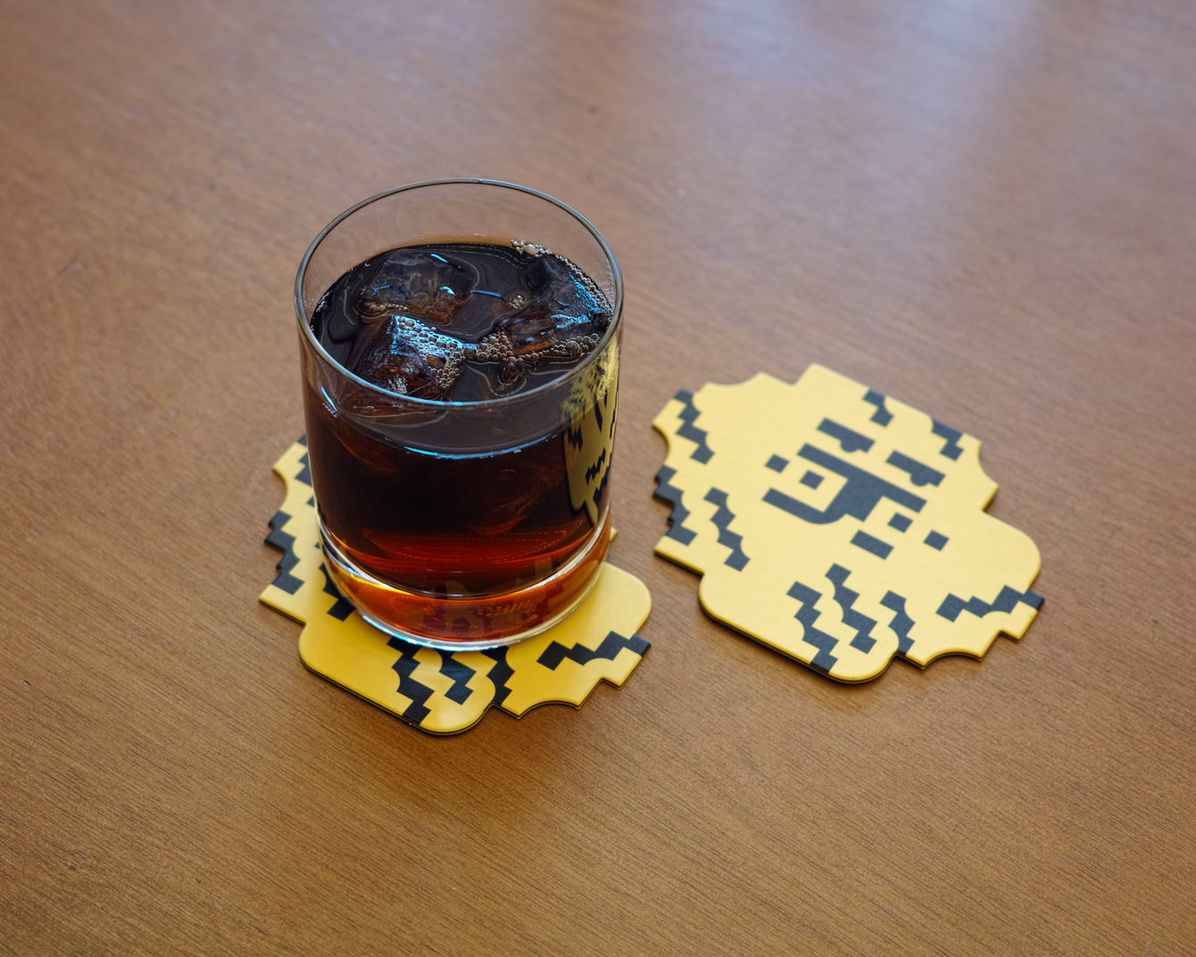
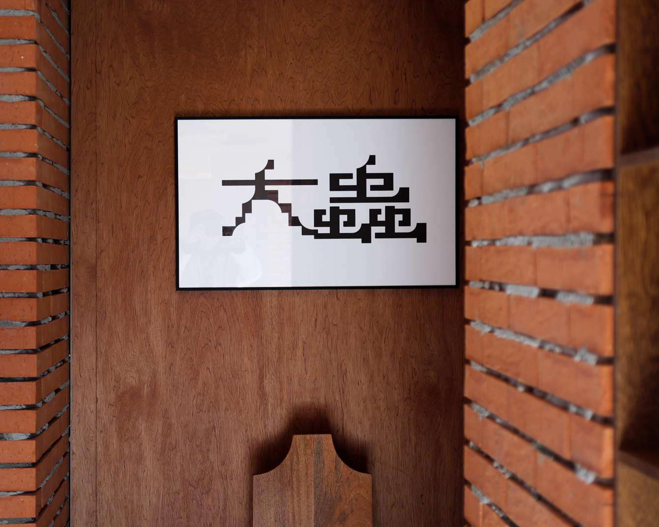
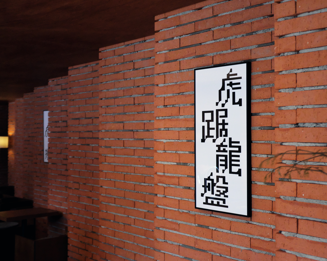
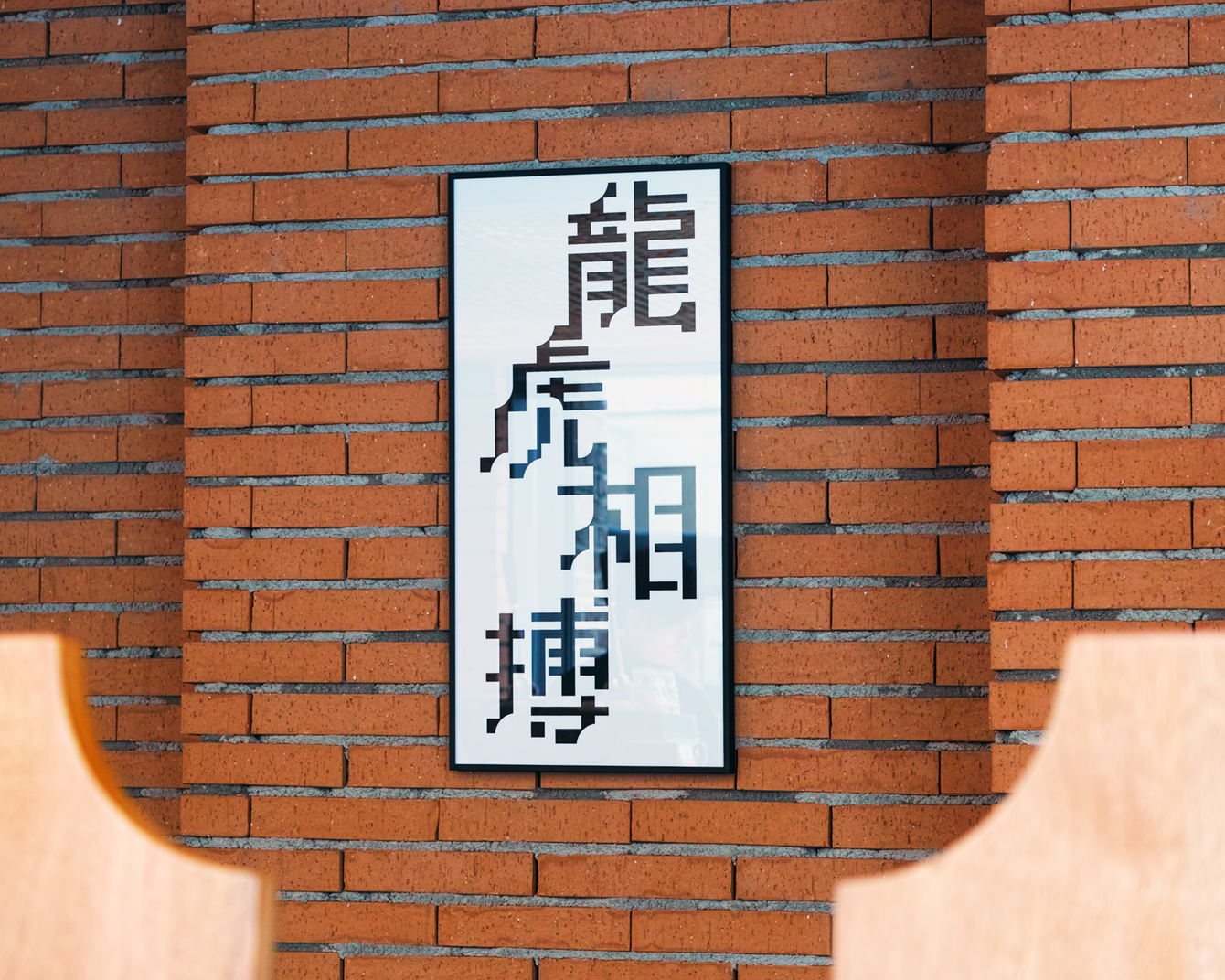
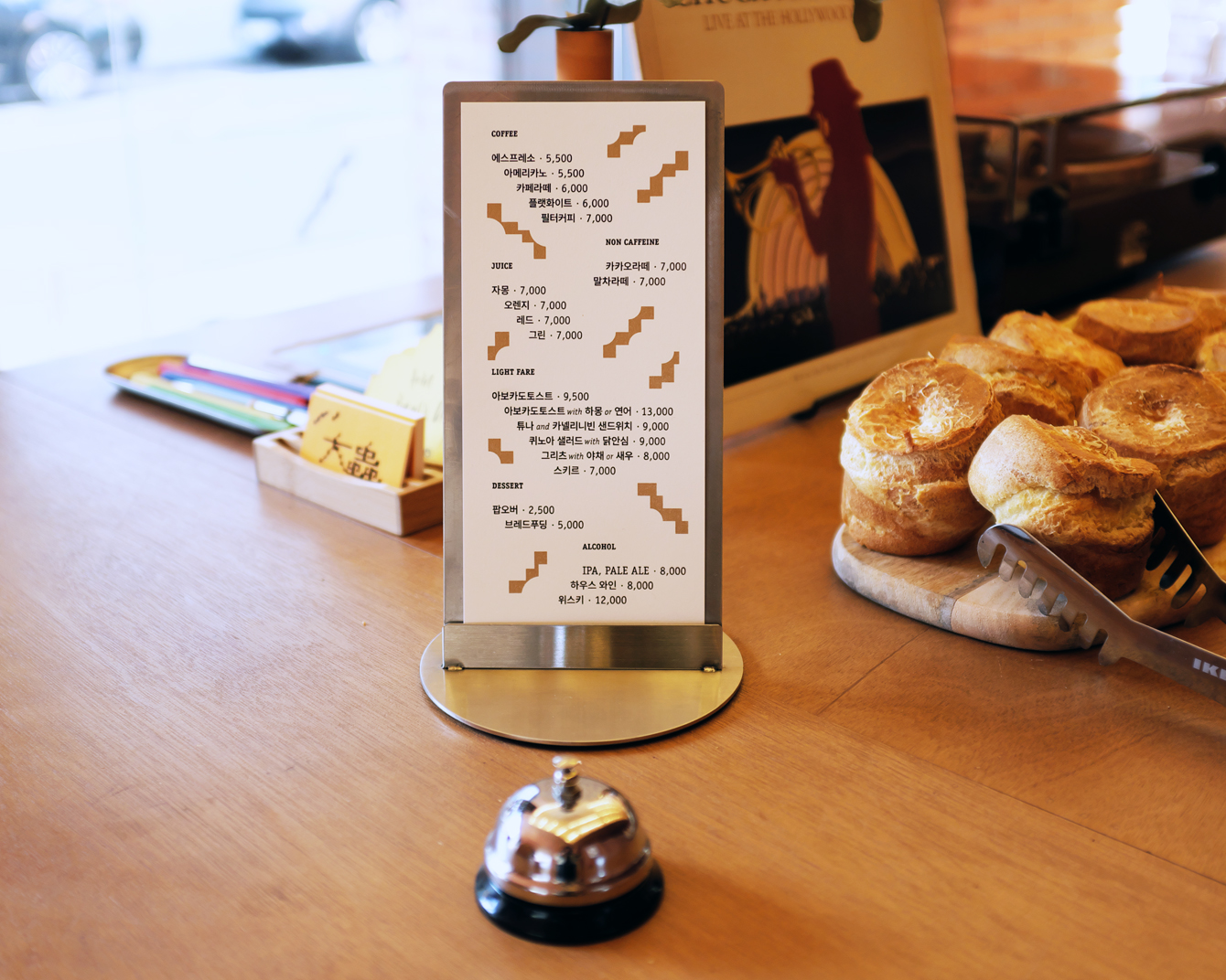
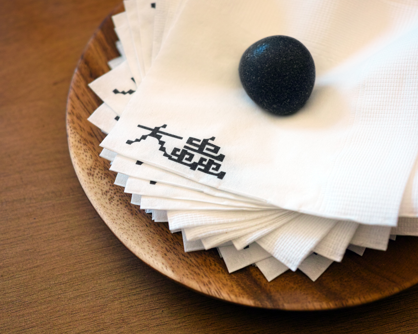
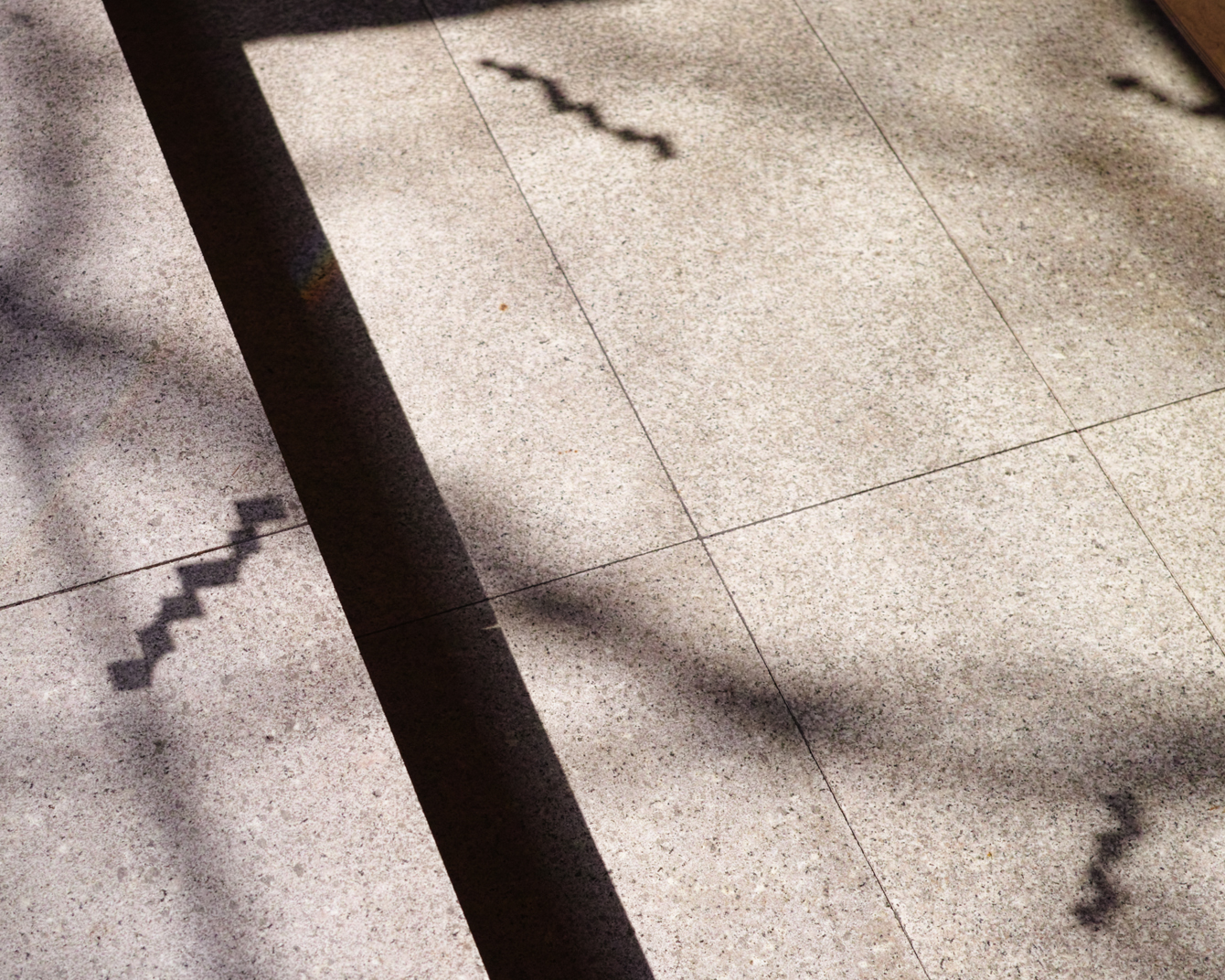
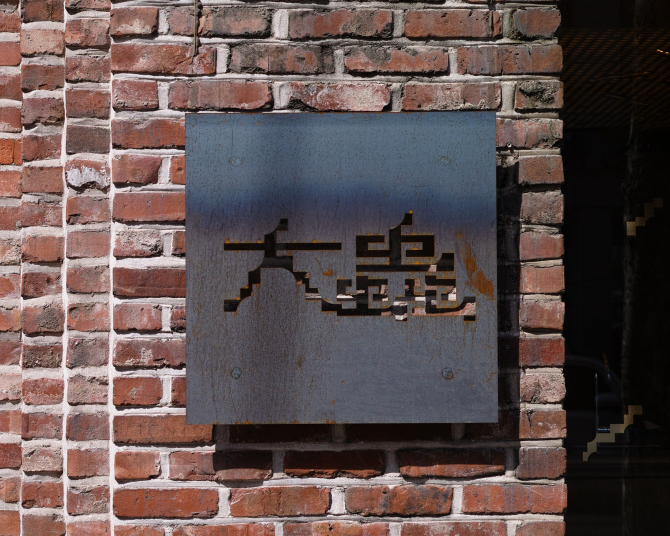
Daechung Park / 대충유원지 is a cafe located in the South Korean capital of Seoul. It features a distinctive interior of wood and stepped brick walls developed by FHHH Friends, furniture and objects by studio COM and a graphic identity designed Studio fnt. Graphic identity is expressed through menus, coasters, packaging and framed calligraphic posters, but also through small details within the interior and in the shaping of furniture.
Although Daechung translates as half-heartedness and has a kitschy Korean association the design of the cafe is not. It is a space with a clear purpose and mood, a place to unwind, to kick back and relax.
Each element; interior, furniture, objects, graphic identity and calligraphy establish a multi-disciplinary continuity and a shared form language. This draws its inspiration from architectural and digital landscapes but also from the other translation of Daechung, a word used in old Asia to describe tigers.
The literal translation of Daechung is (Dae, 大) big (Chung, 蟲) bug, a homonym made up of Chinese characters and an affectionate term for the tiger, an animal of cultural significance in Korea. These often appear as friendly characters in fables and folk paintings, and more recently as Olympic mascots. Here, the tiger reference appears as a character on coasters and posters, as stripes and patterns woven into the interior, or bringing a modernity to the traditional craft of calligraphy.
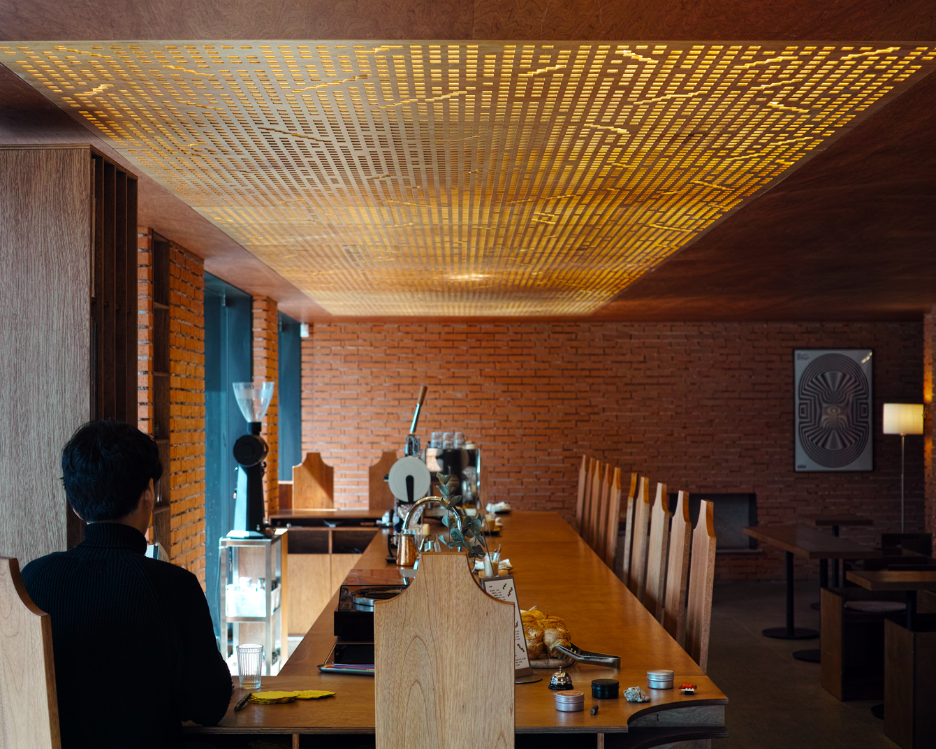
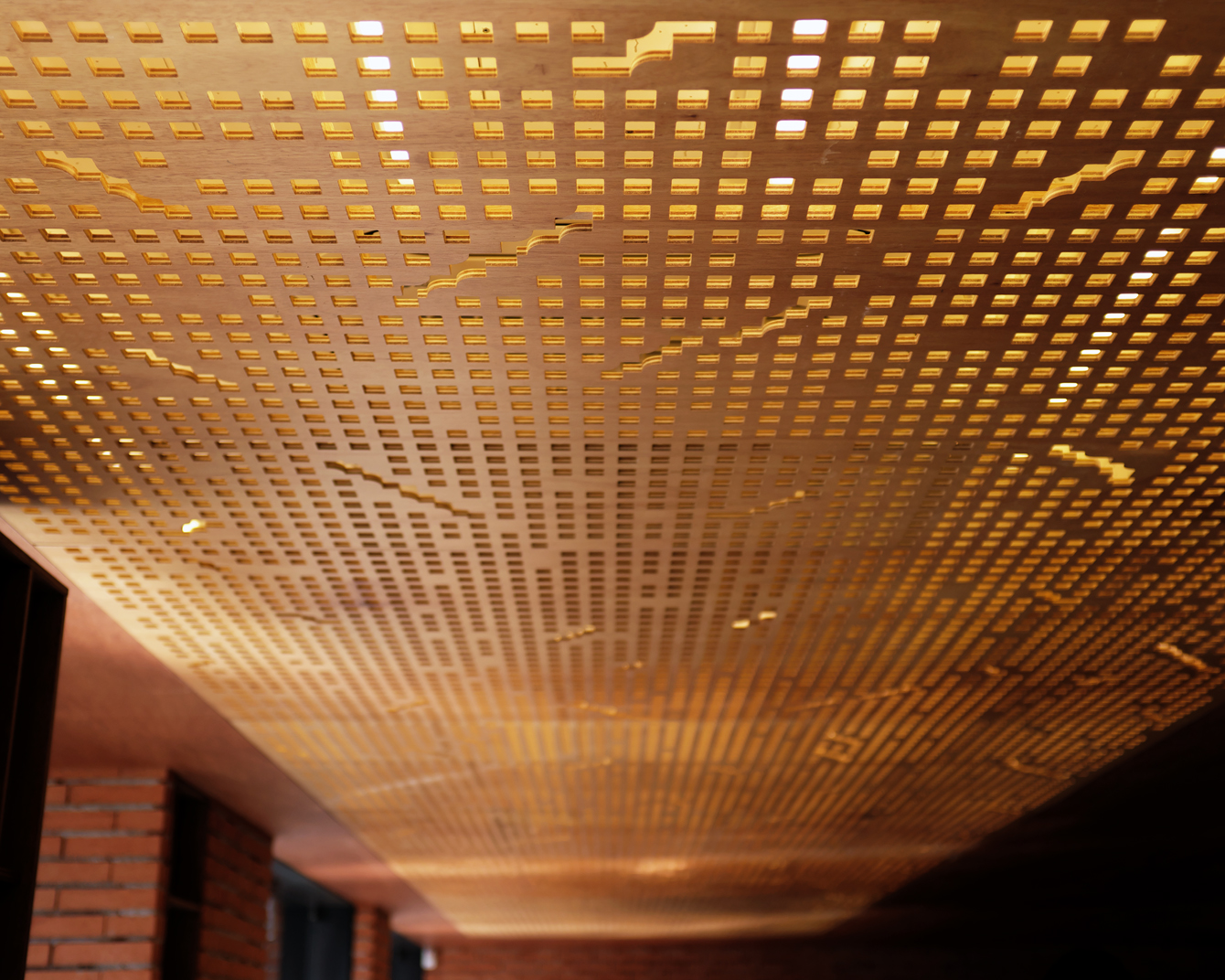
Shape plays a foundational role in the end-to-end design of Daechung Park. It is the connective tissue that links an interior design of stepped walls separating the kitchen from the store, long bricks and a patterned lighting installation, furniture with quarter circle cuts and long or tall profiles, and a graphic identity made up of circles and rectangles that build tiger patterns and illustration or are employed as die cuts across menus and coasters.
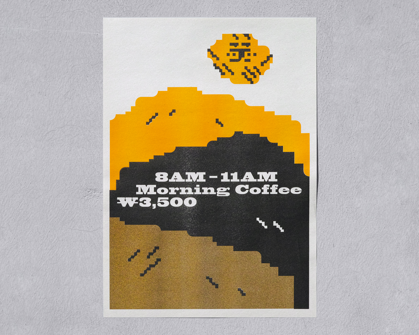
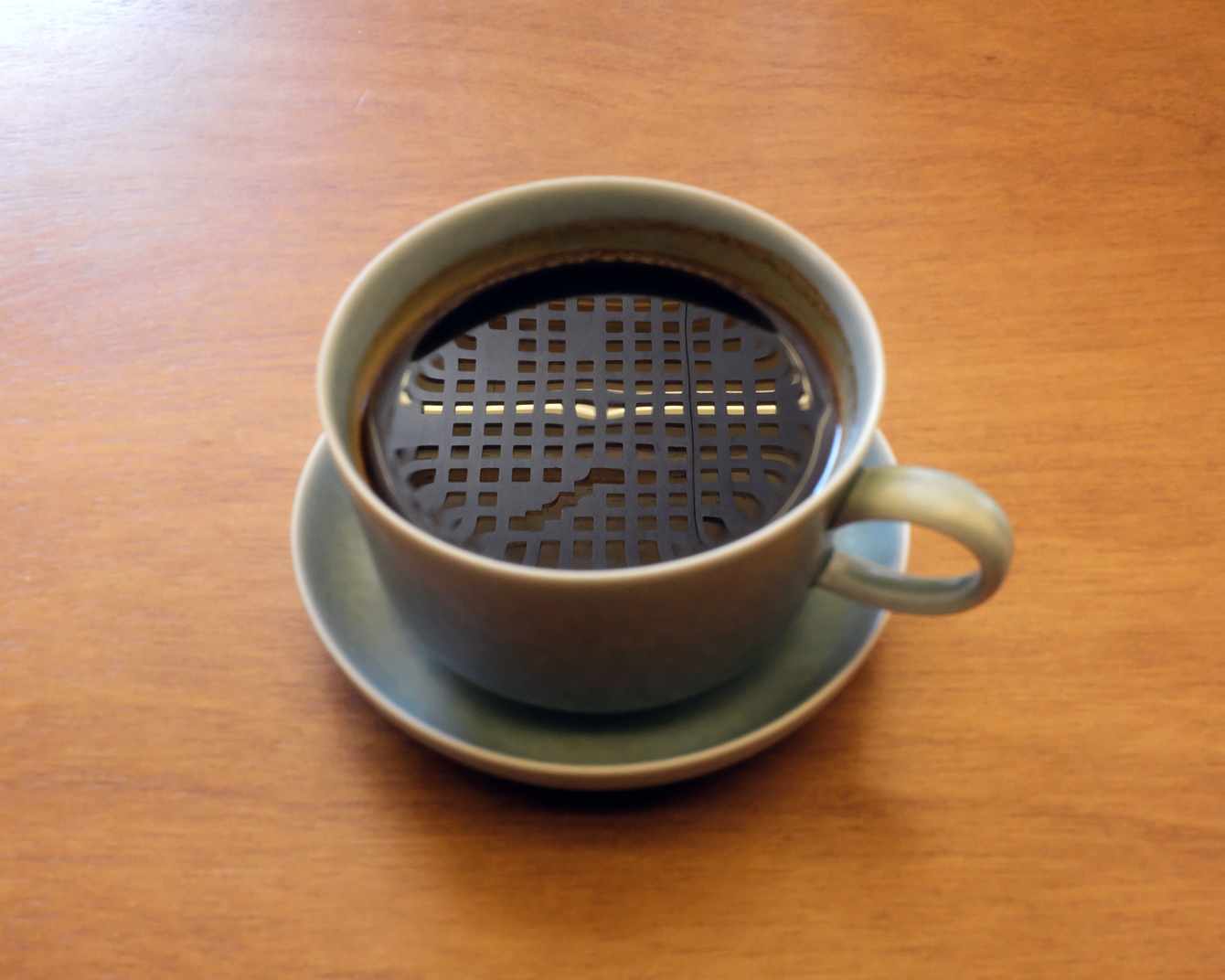
The confluence of modern architectural form and the enduring cultural significance of the tiger makes for a distinctive and layered expression. These references are modulated throughout. They are alluded to in colour, direct in illustration and implied in the cuts in print and furniture. These serve as a unifying factor, a considered whole, yet have individual character. There are some pleasant variations. Highlights include the patterned lighting installation, the die cut shapes of the menus, the blocks of colour in conjunction with shape around the surface of the coffee cups, and the slab serif that shares many similar qualities.
The modern architectural infringement into traditional Chinese calligraphy—phrases often placed in the home to bless family reconciliation and health—and deployed as framed posters espousing tiger related phrases, as well as the quirky Latin characters across coffee bags, lean into something of the digitised, of modern life. This gives the work further depth. An antagonist to the material and the traditional.
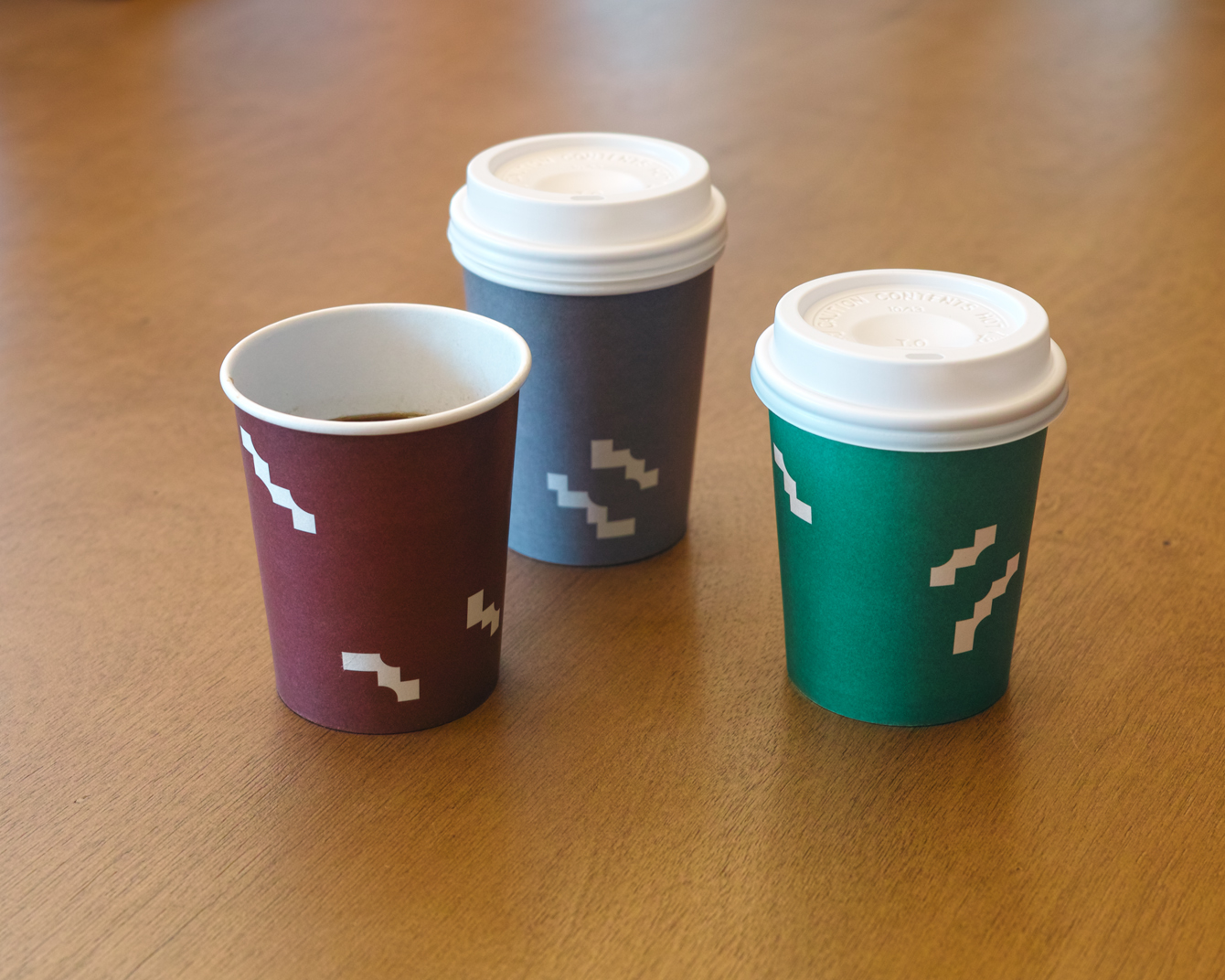
Studio fnt needed to offset the mischievous and ironic name of the cafe, created by the owners, with a design that had clear concept and distinctive character that would serve to connect many different components, both the graphic and material. Repetition of form, its references and associations, the line between animal and architecture, modernity and tradition do this in a way that feels cheerful and thoughtful. There is a synergy between structure, furniture and graphic pattern. Each of these things feels part of an intelligible concept, a natural confluence of forms and ideas that are culturally and contextually relevant. More work by Studio fnt on BP&O.
Design: Studio fnt. Photography: Jaemin Lee & Heesun Kim. Opinion: Richard Baird.
