National Theatre of Korea Repertory 2017/18 by Studio fnt
Opinion by Richard Baird Posted 9 April 2018
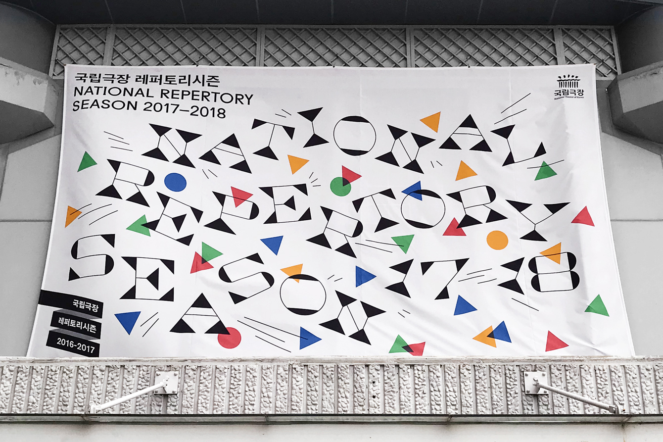
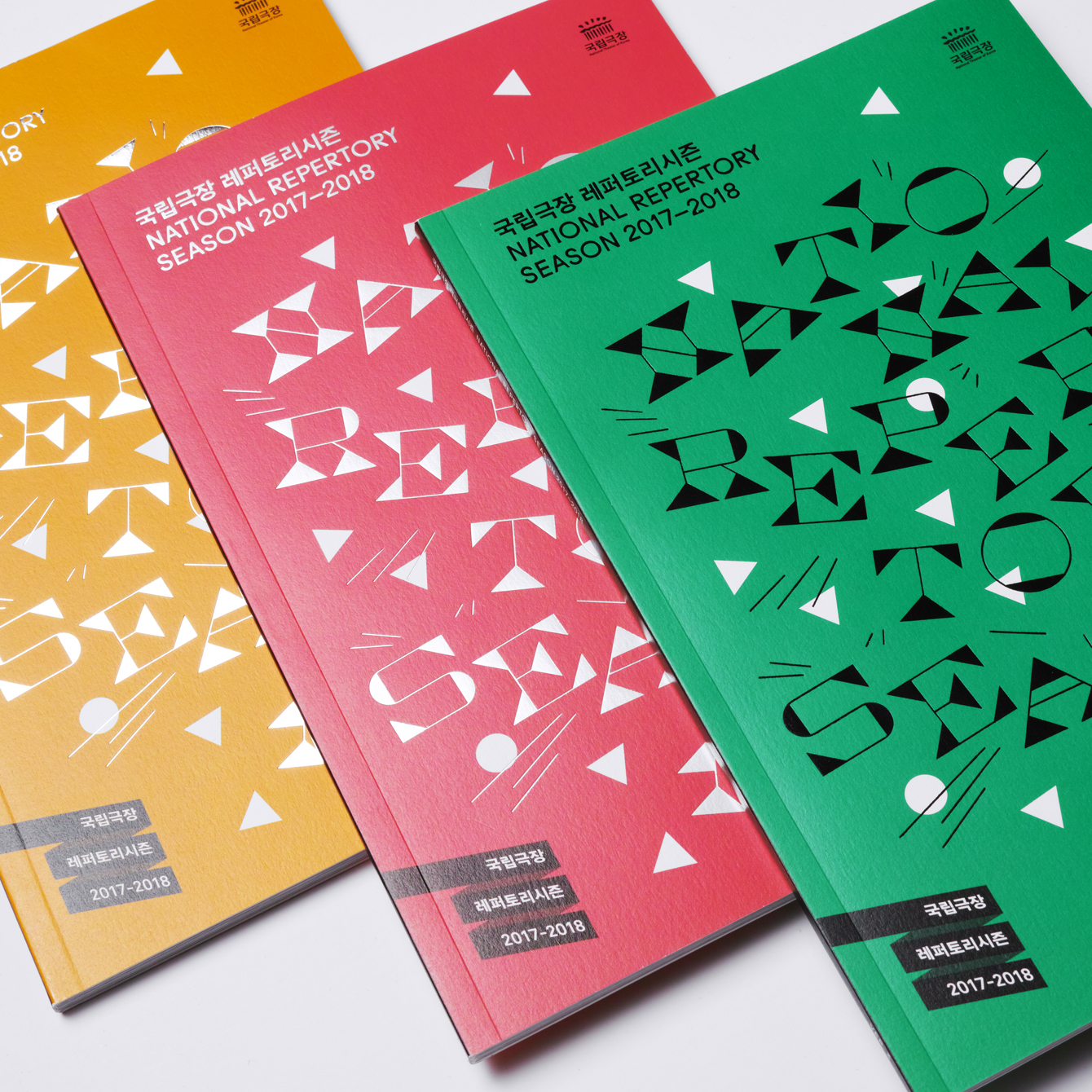
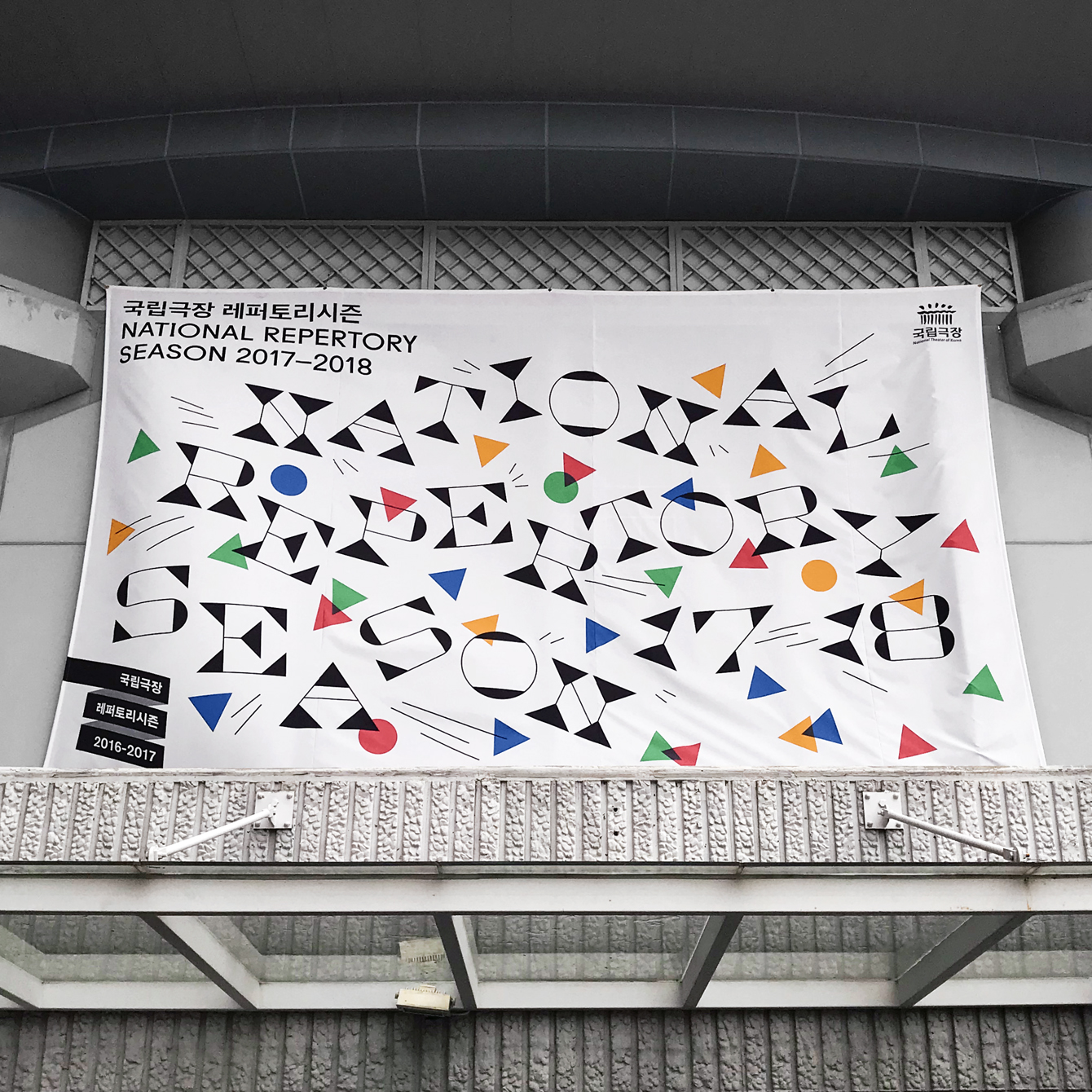
The National Theater of Korea is the first nationally managed theatre in Asia. It is something of a brutalist building of textured and geometric concrete located in the neighbourhood of Jung-gu, South Korea. Each season it plays host to a broad and diverse contemporary art program of dance, music and performance, one-off events and festivals. To celebrate and announce the new season the theatre worked with Studio fnt to develop a campaign identity for 2017–18. This took the form of a bold typographic expression which links posters, large format banners and printed programs.

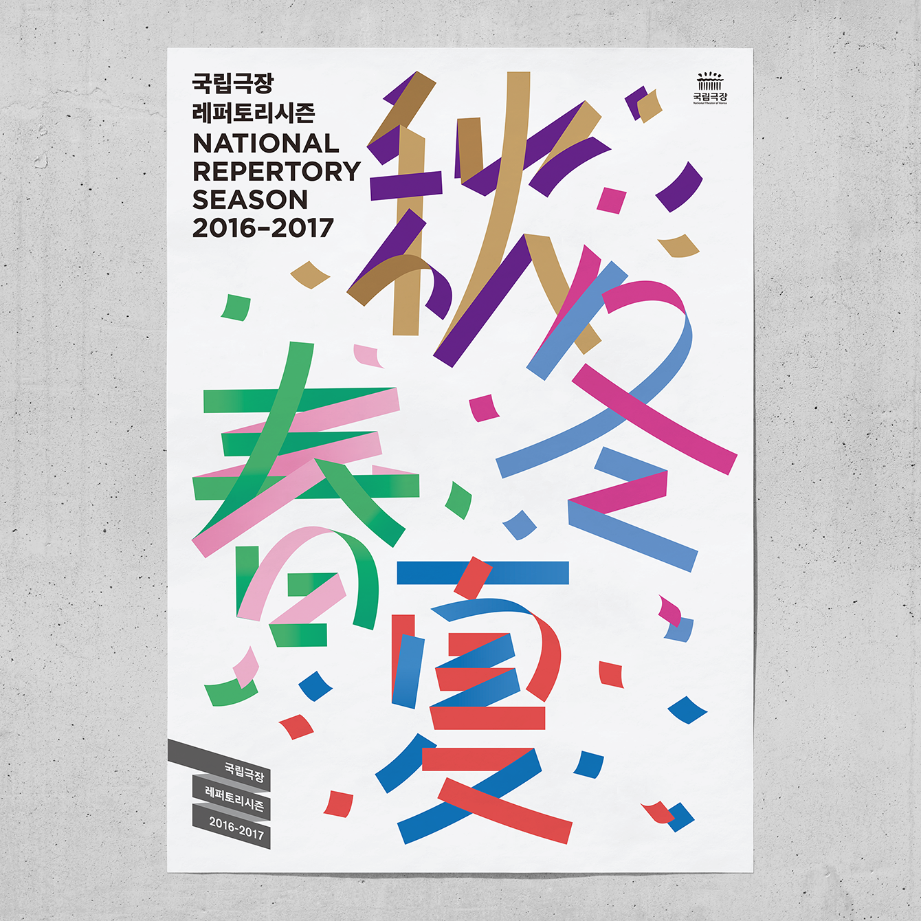
Although the National Theater of Korea plays host to a diverse program these are typically linked by an energy and the intention of celebrating contemporary talent in all of its forms. Much like the previous year’s campaign, also designed by Studio fnt, 2017–2018 is a characterised by a confluence of implied motion and celebration, moving from ribbons and ribbon type to a confetti of colour and geometric typographic forms.
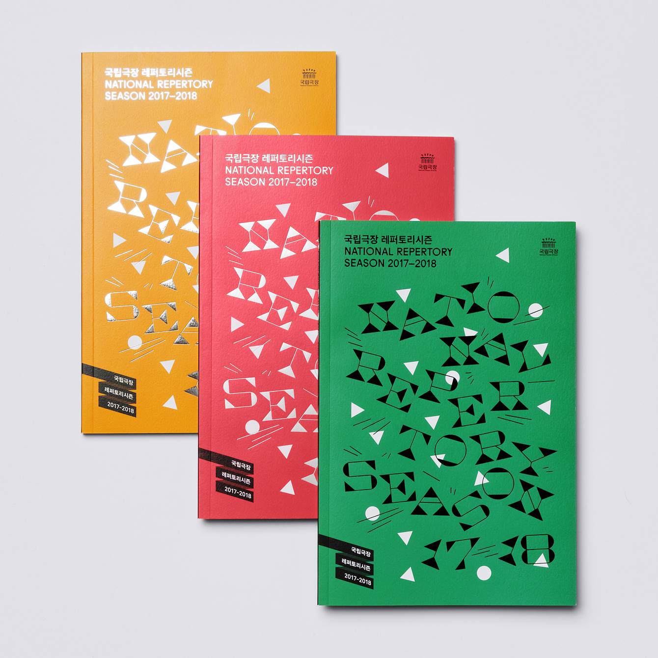
It is an eye-catching visual gesture. Its motion and celebration clear in the use of colour and arrangement. The reverse stress lettering, the accentuated serifs and geometric shape feel clear in their modernity. There is a pleasant relationship between coloured shapes and letterforms, helped by the fine strokes, yet with enough difference in colour and direction for these to remain distinct. An inward motion gives much of this a feeling of fusion, a coming together rather than an explosion, which feels fitting for a cohesive program of events.
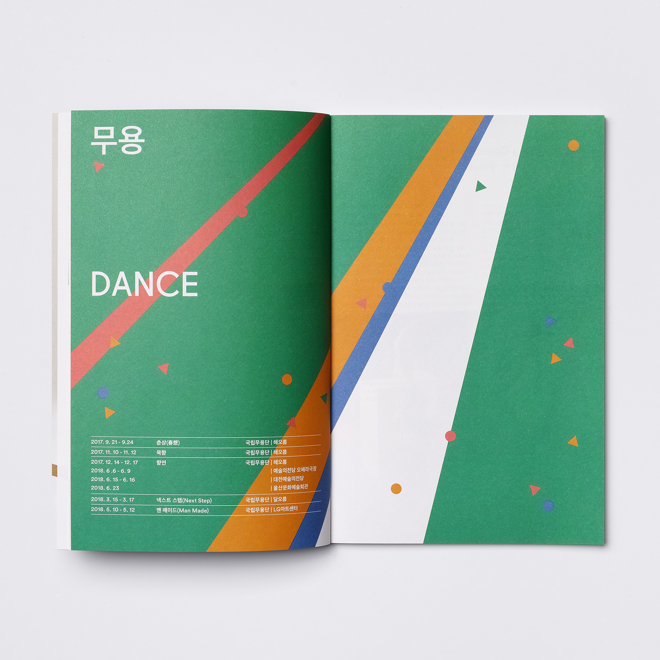
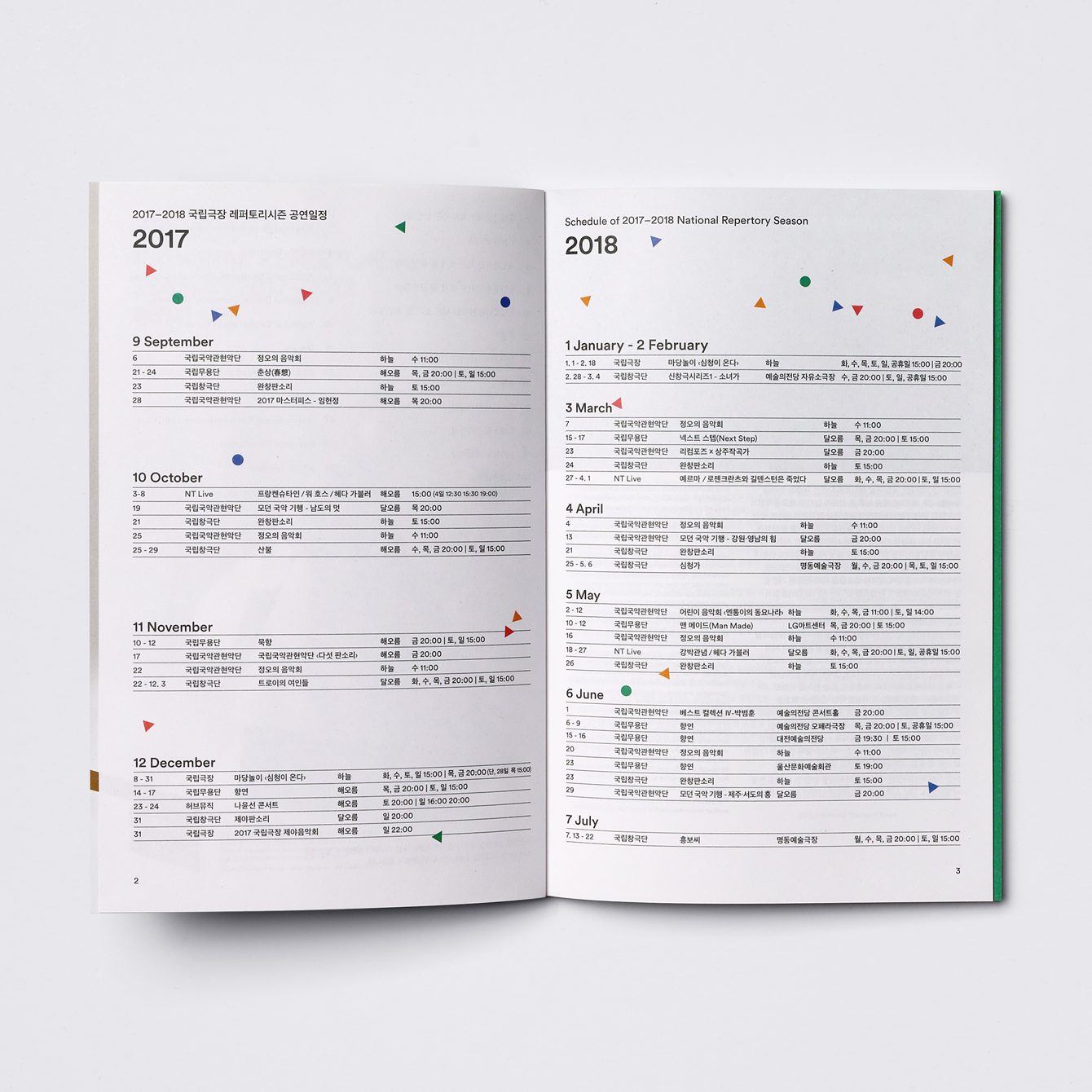
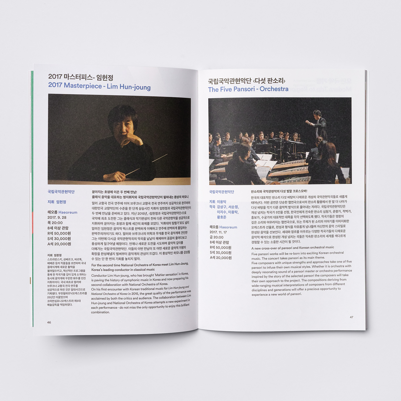
Shapes and letterforms share something in common with the concrete structure of the theatre and the bursts of colour draw an element from the theatre logo, a loose and irregular combination of brush strokes. Solid background colours and foil print finish serve to bring a little more variety to the covers of programs, although perhaps lack the impact of the white of poster and banner, while inside colourful shapes peppered across spreads have a confetti and celebratory quality to them. This serves to bring an element of the main graphic component into more conventional layouts. More work by Studio fnt on BP&O.
Design: Studio fnt. Opinion: Richard Baird.
National Theatre of Korea Repertory Season 2016/17
