GoGo Daddy by Studio South & Egle Zvirblyte
Opinion by Richard Baird Posted 12 April 2018

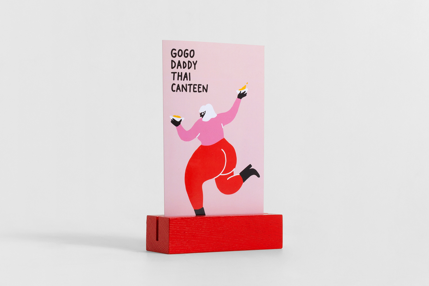
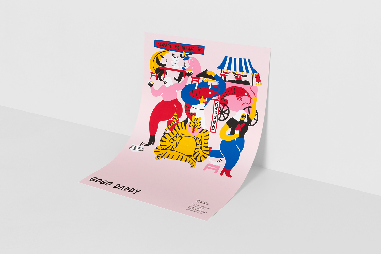
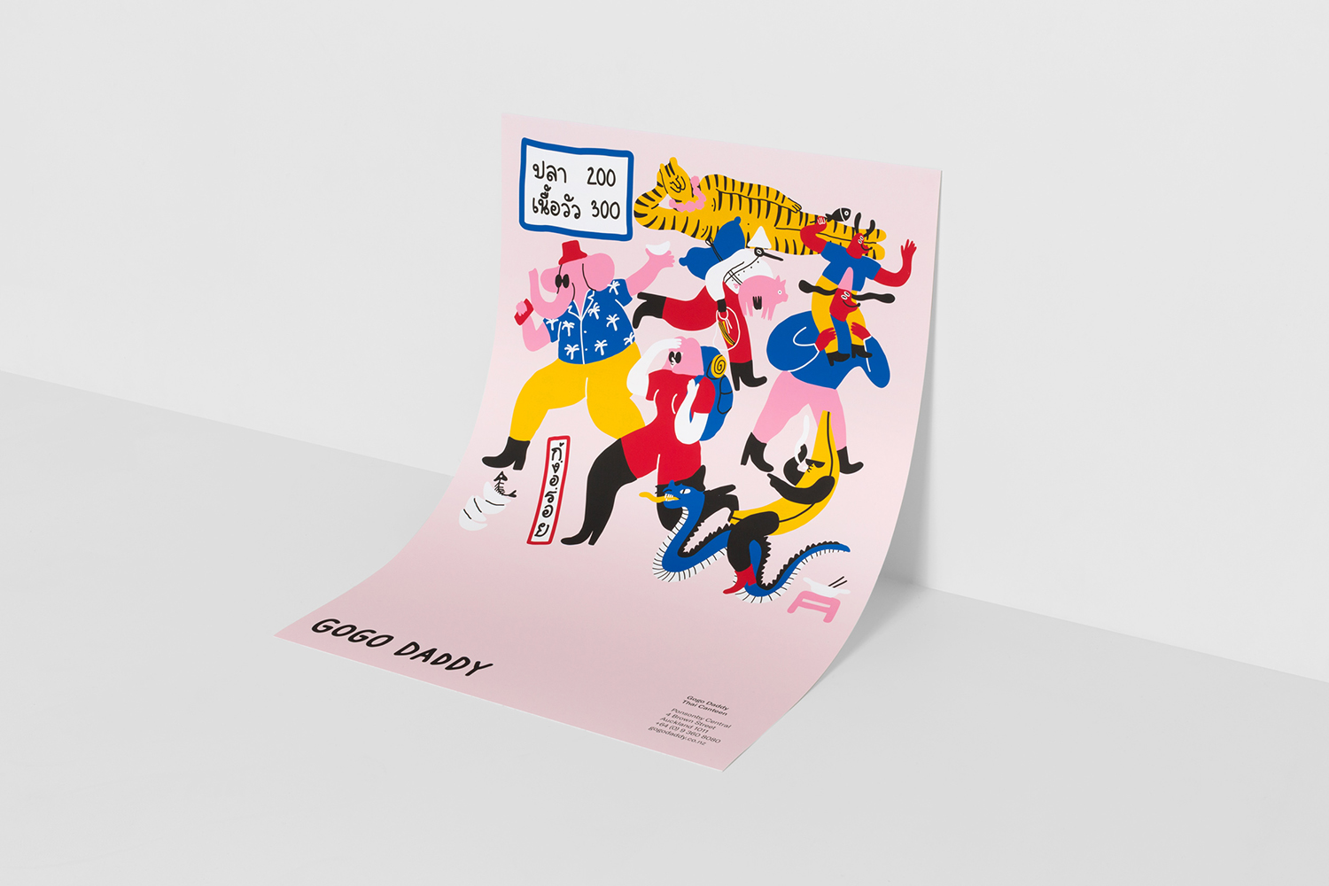
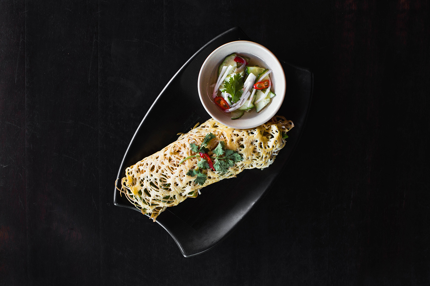
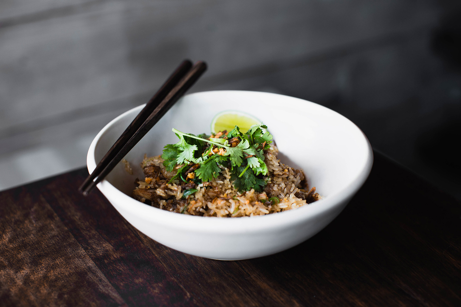
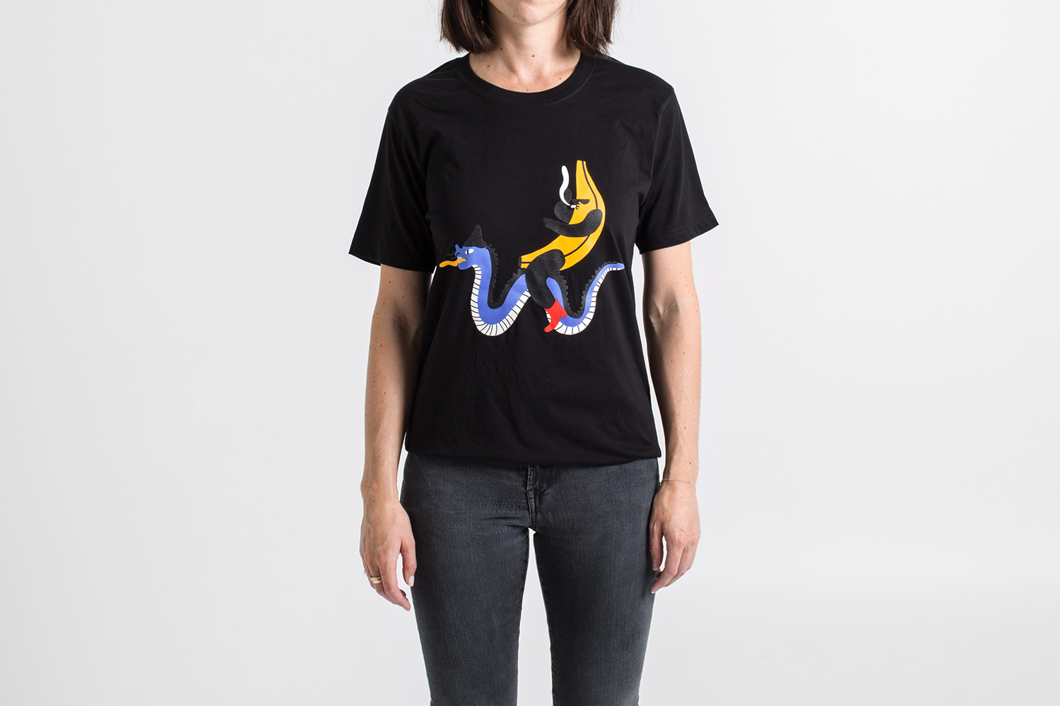
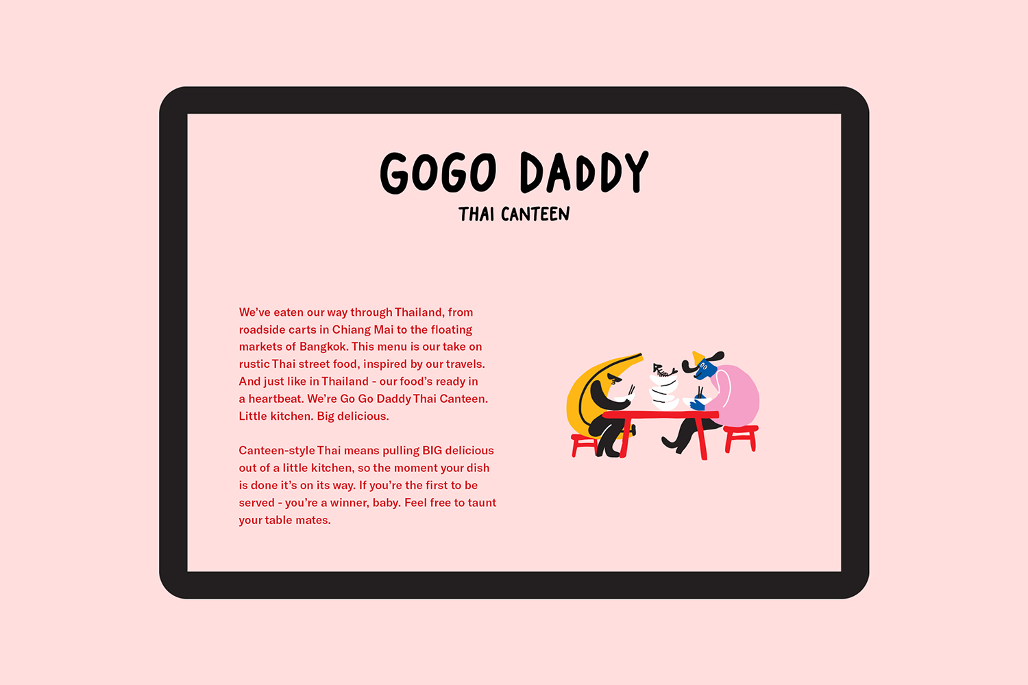
New Zealand based Studio South worked with Lithuanian illustrator Egle Zvirblyte to build a graphic identity up of colourful characters for Mark Wallbank and Che Barrington’s new Thai canteen Gogo Daddy which is located in Ponsonby Central, Auckland. GoGo Daddy’s menu is inspired by Mark and Che’s extensive travels, and is a take on the rustic Thai street food they experienced throughout Thailand; from the roadside carts in Chiang Mai to the floating markets of Bangkok. This diversity of experience, the theme of big flavours from a little canteen, and an interpretation on a distinctly rich and quick to prepare culinary legacy is captured in Egle Zvirblyte’s illustrative panels and individual characters. These link posters, menus, staff t-shirts, table markers, house-made drink labels, mural, website and social media profiles.
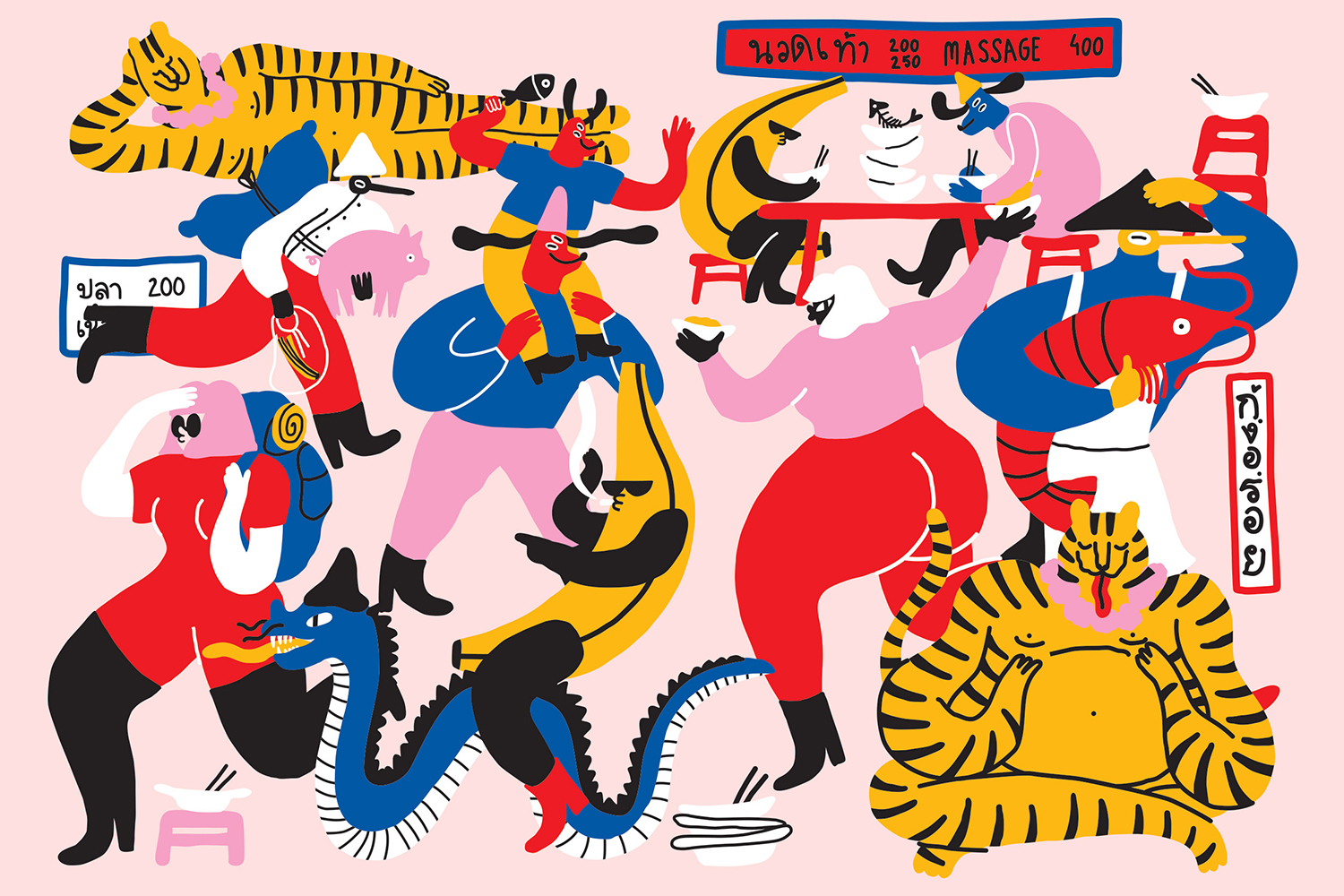
Egle Zvirblyte’s work is characterised by a loose irregularity, an immediacy in colour, and a sense of the spontaneous, energetic and humorous. There is an appealing idiosyncrasy at play, a blend of modern western style and traditional Thai cultural iconography, a mix of sitting down and sharing and individuals on the go, backpackers and travel references. Given the theme of bustling streets, the jostling for street food, a distinct cultural reference point given a Western context, these feel distinctive, eye-catching and well-suited.
Illustrations work as a single panel, delivering impact from a distance and plenty of detail up close, and as single images punctuating menus and website. The continuity between print and digital is clear and the addition of a bit of motion brings a bit more life and variation to a simple site design.
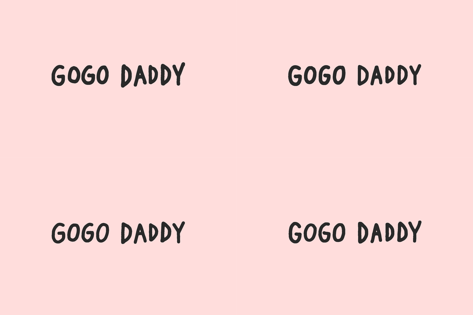
Logotype and illustration share a loose line continuity. Its motion adds something of jostling and bustling quality that is implied in the compact composition of illustrative panels or the direction and flow of individual images. Each of these is deployed in a straightforward manner, in a way that maximises their impact. This is helped by solid blocks of colour and plenty of space throughout. More work by Studio South on BP&O.
Design: Studio South. Illustration: Egle Zvirblyte. Opinion: Richard Baird. Fonts: GT America.
