Näsby Slottspark by Bedow
Opinion by Richard Baird Posted 21 May 2018
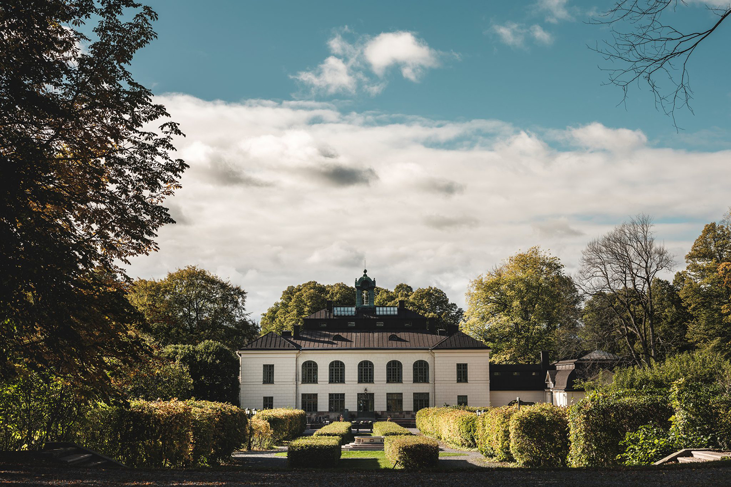
Näsby Slottspark is a residential property development located in Täby, a municipality situated north of Stockholm. The development is built around a 17th-century castle and its gardens, and is made up of three distinct structural groupings, Södra Parken, Norra Parken and Strandängarna. Each of these is characterised by a Scandinavian simplicity, lightness and truth to materials inside and out and by their surroundings, a landscape of natural grasses, hedgerows and parkland. This mix of regional legacy, natural beauty and modern structure is expressed by the development’s visual identity, designed by Bedow, through logo design, type choice, illustration and photography online and in the material composition, finish and layout of brochures.
Logo functions as a simple distillation of the property’s proposition; modern builds surrounded by natural landscapes and a significant regional heritage. Everything else works to give this more depth and range. The line weight and forms of the symbol find a comfortable meeting point between a natural leafy environment and an articulation of the modern, while Gareth Hague’s Sabre, in its carved triangular serifs taking cues from the work of stonemasons, expresses something of a legacy and material craft. There is visual contrast rather than continuity between logotype and symbol that serves to emphasise the communicative intention and careful balance of each. These intentions are evident, but not blunt.

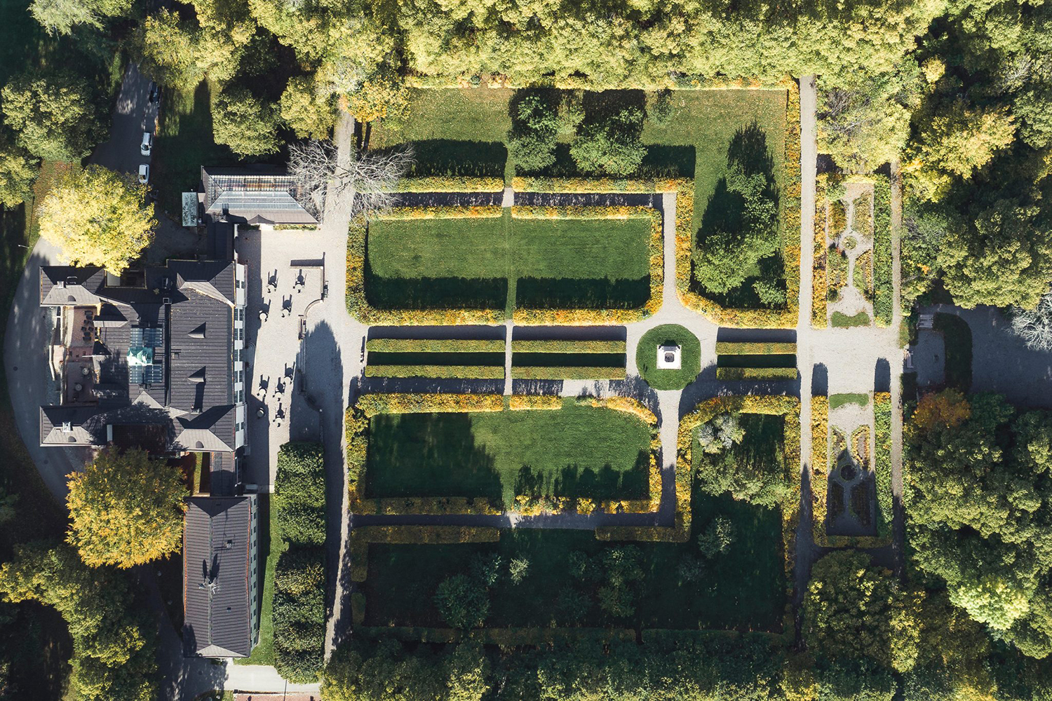
Photography is effectively used to establish the natural leaf covered topography of the area, hinted at by the marque. The mix of the aerial and the macro provides a useful overview and something far more immediate, a smart visual and communicative contrast that also touches upon the managed gardens of the castle and the more natural parkland that surrounds it.
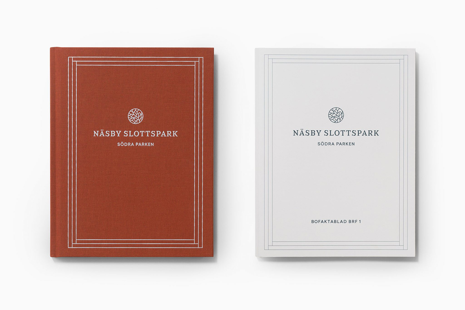
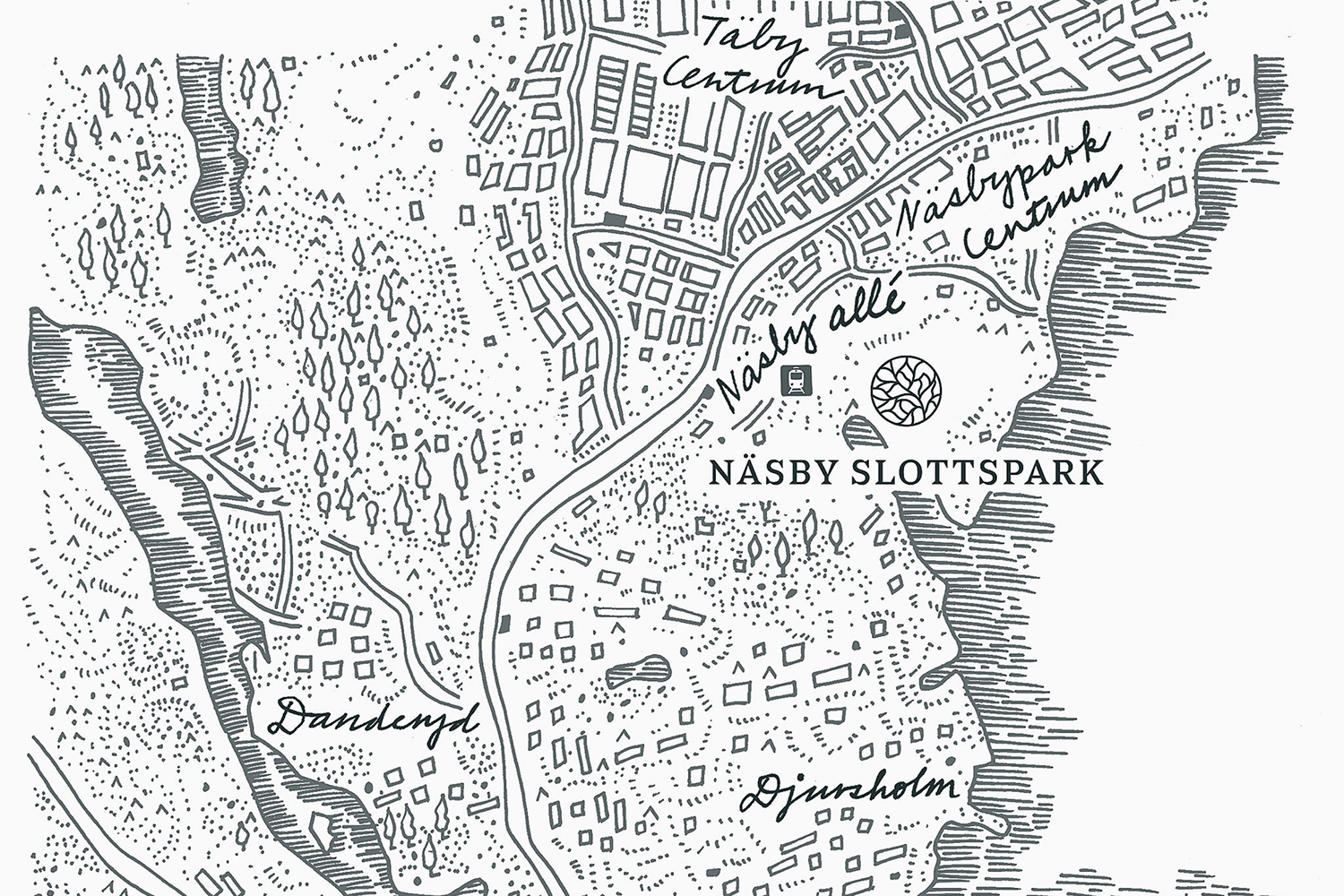
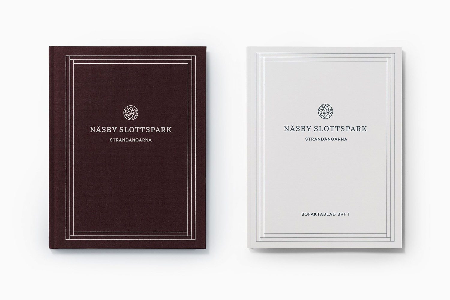
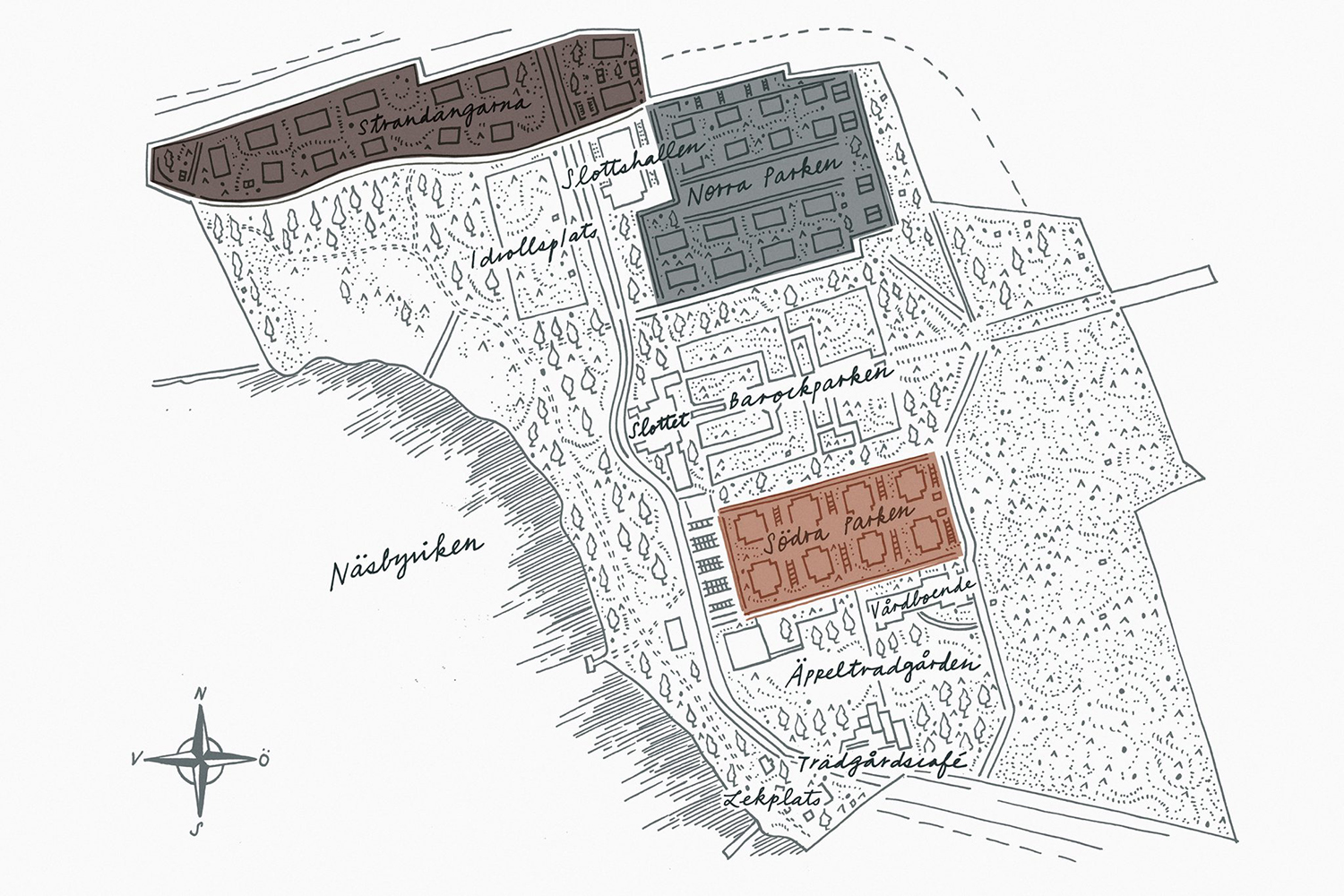
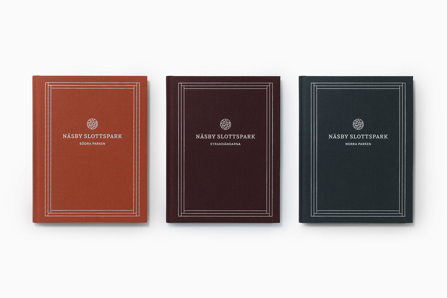
Södra Parken, Norra Parken and Strandängarna have been given their own brochure. These are distinguished by a range of natural and classical colour, yet share a similar approach to materiality, finish and layout. The craft and period implied by Sabre and the theme of regional heritage are worked together in a series of illustrations. These have something of the past and present in the approach to form, shading and the writing of text.
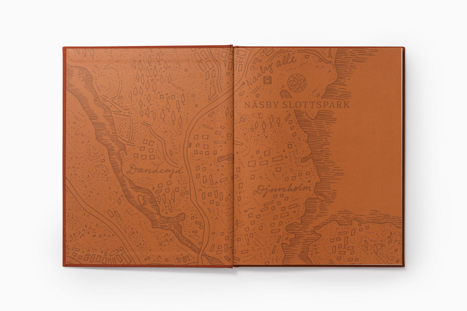
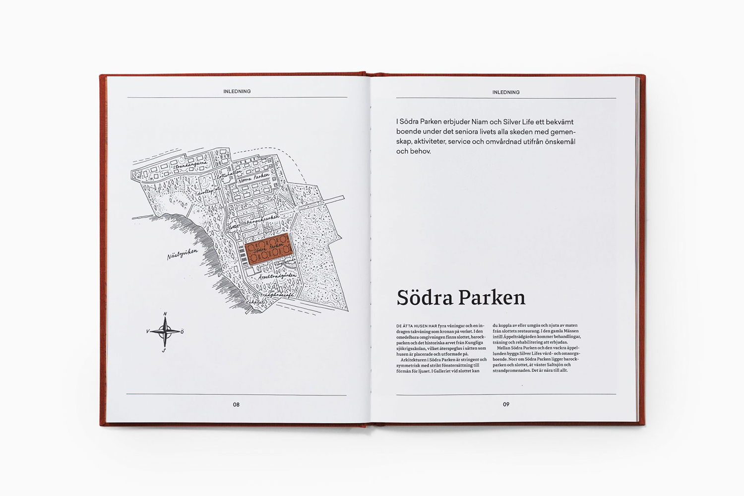
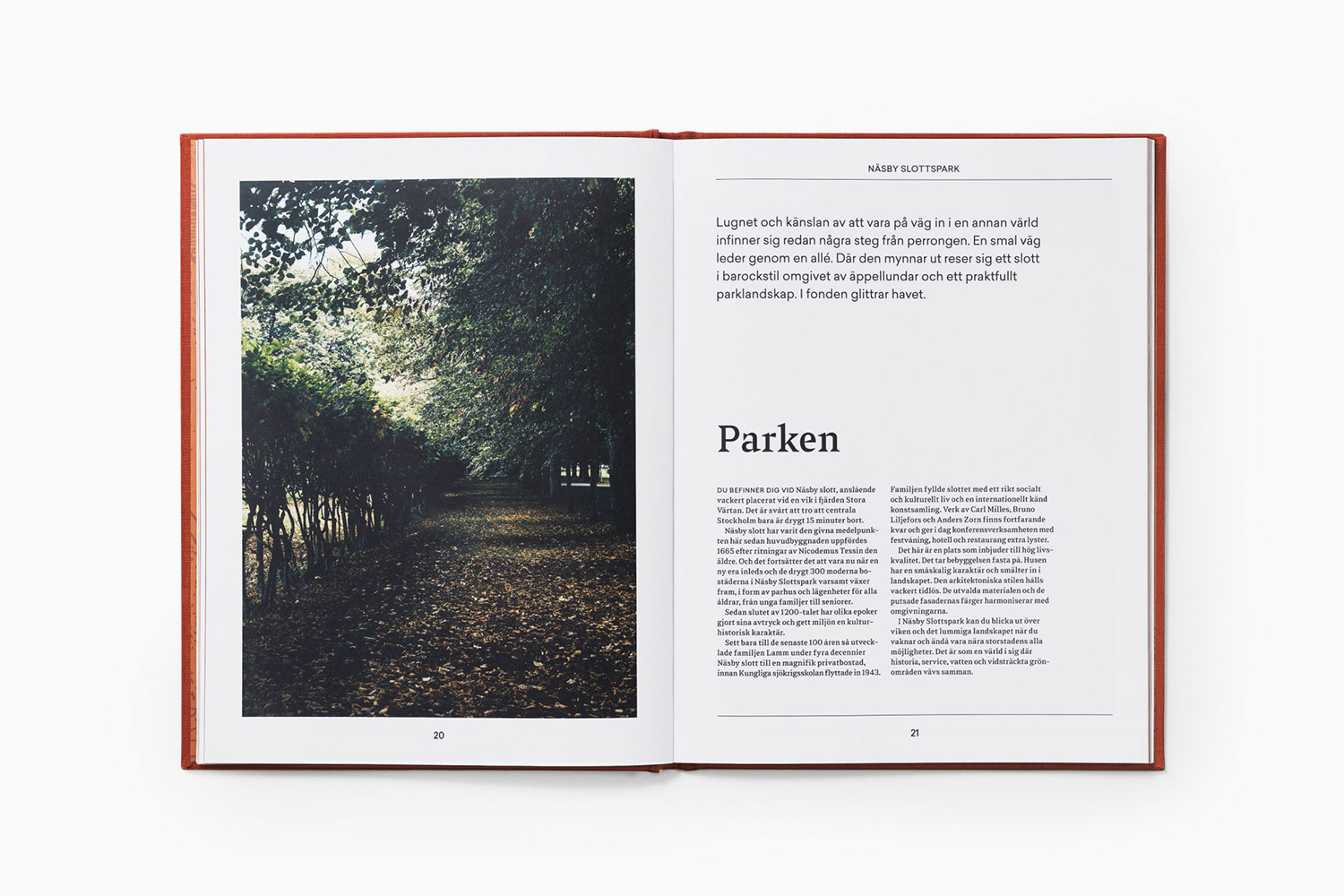
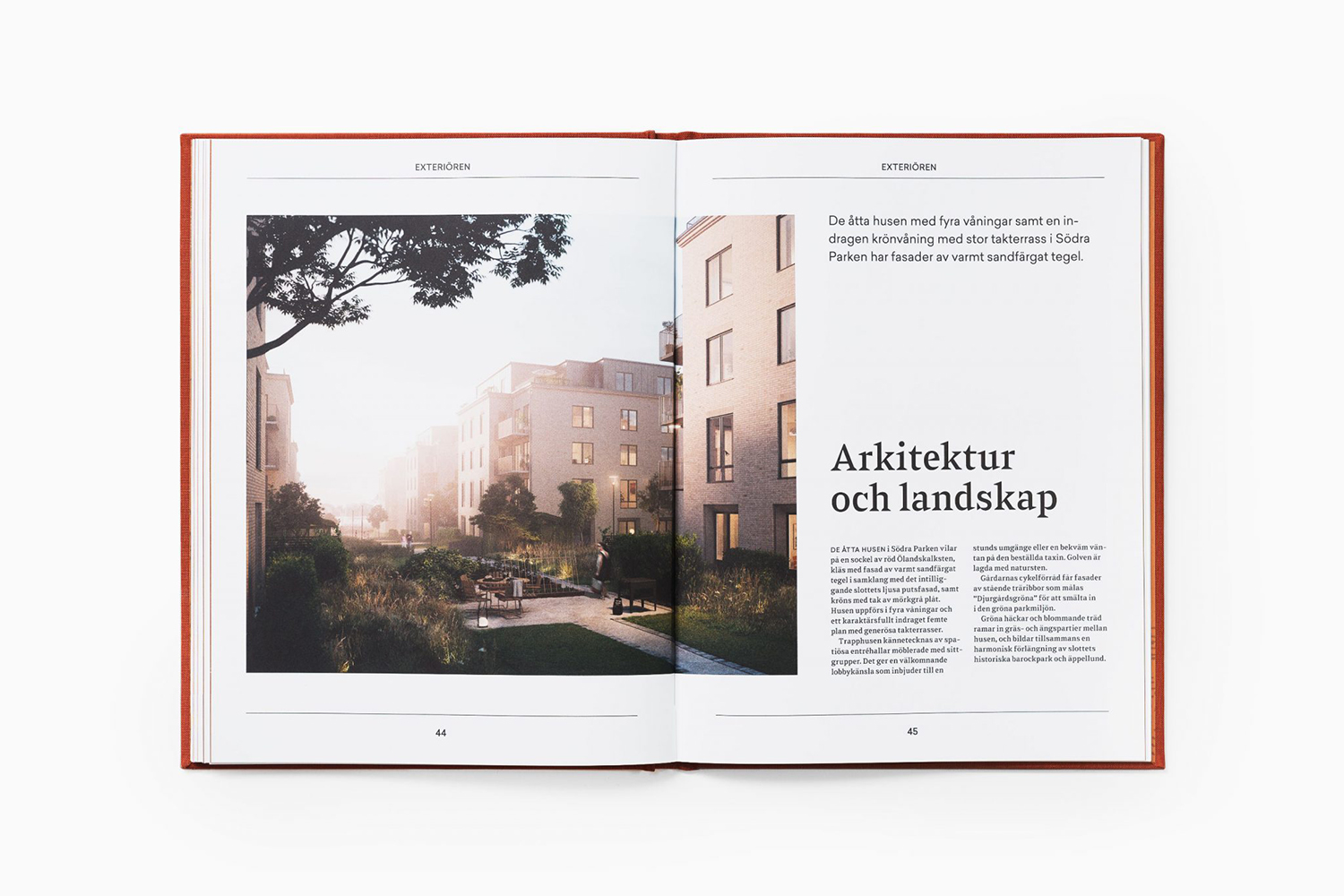
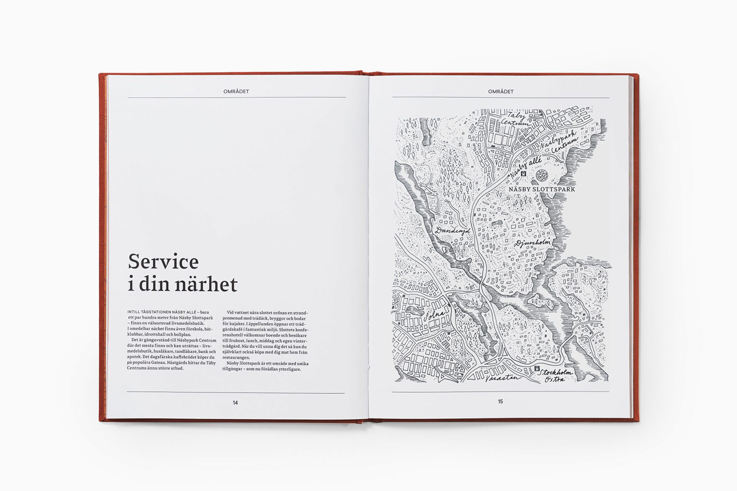
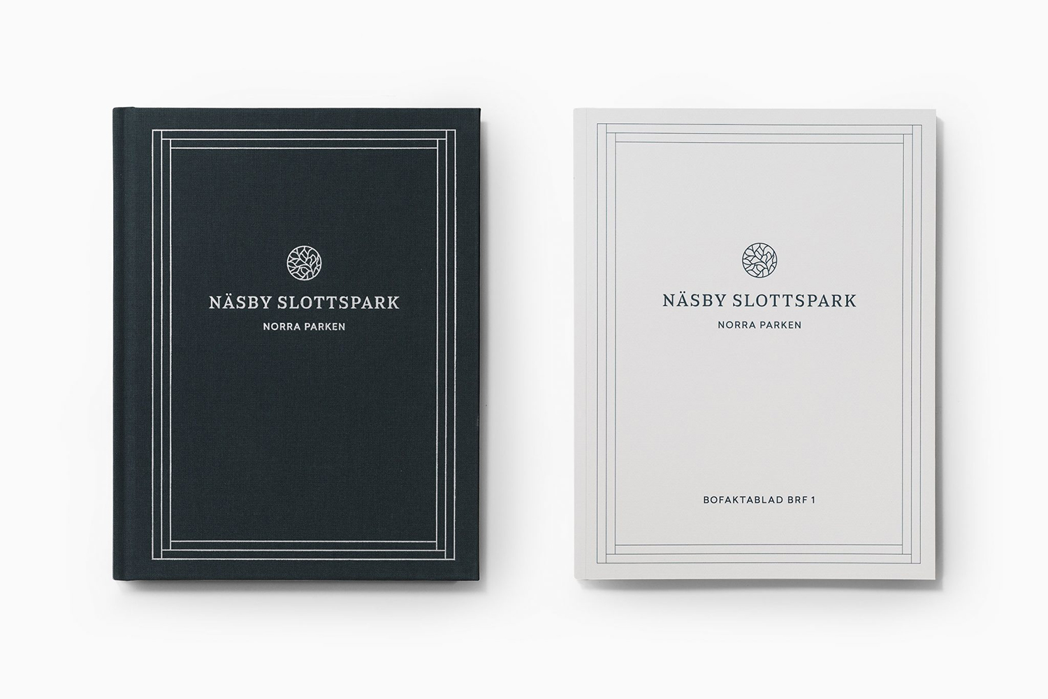
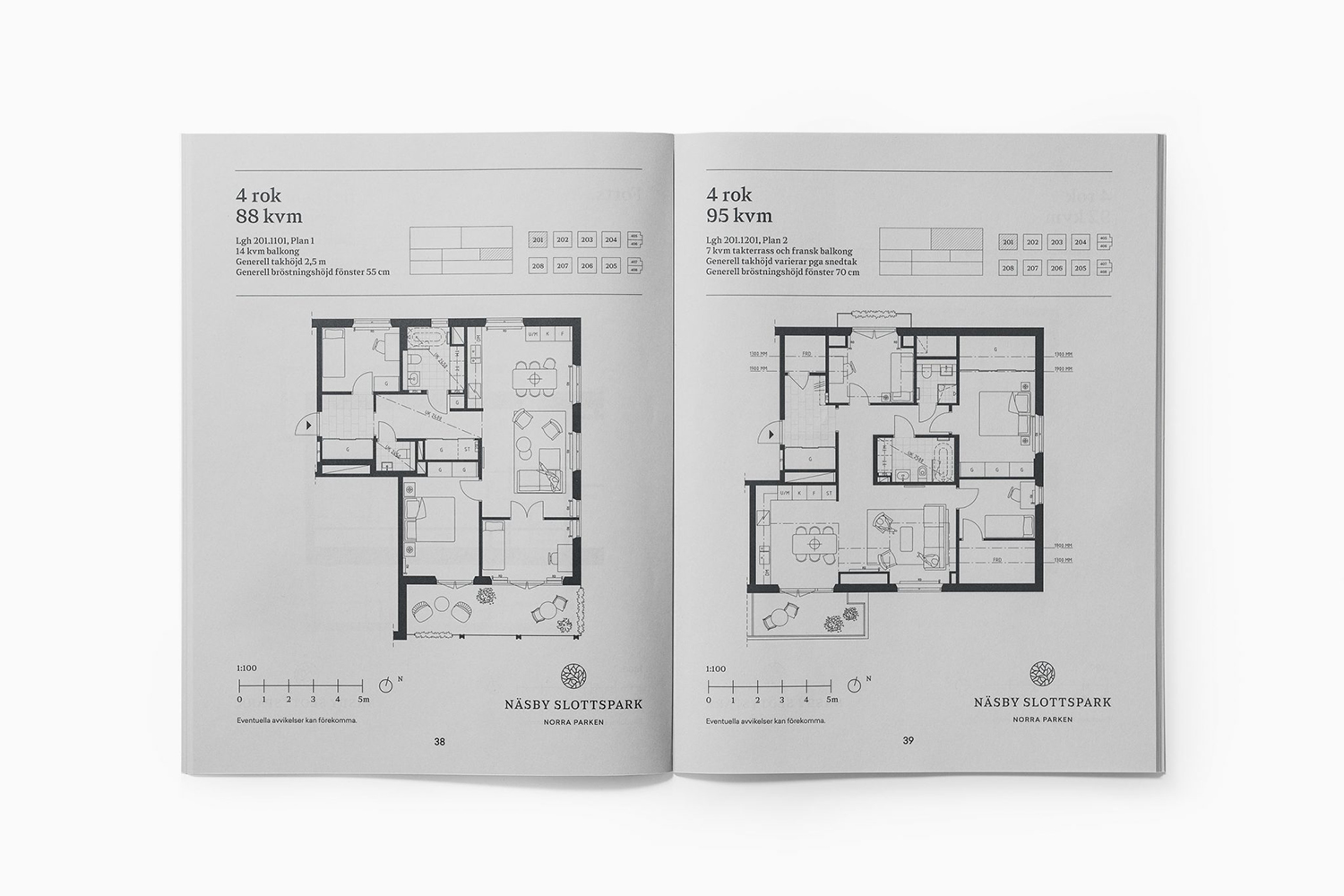
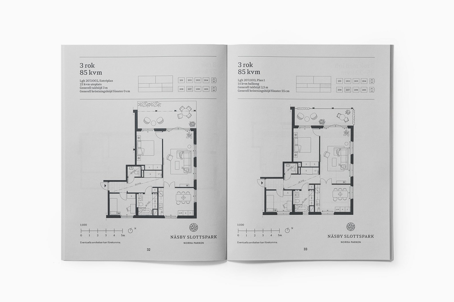
Block foiled borders, weighted similarly to symbol, fabric covers, the use of space and double and single columns, the framing of image with white space and fine lines, and a secondary sans-serif typeface alongside the chiselled lines of Sabre effectively resolve a sense of current and enduring material and visual cues. These work well to touch upon and allude to the inside, outside and surroundings of the development. More work by Bedow on BP&O.
Design: Bedow. Opinion: Richard Baird. Fonts: Sabre
